10,000 search results
(0.177 seconds)
- Fuuld by That That Creative,
$20.00 Fuuld is a brutalist condensed modern display font that mixes organic and geometric, hand made, and digital production. it has a contemporary look perfect for logos, posters, branding, magazines, and avant garde social media accounts be it instagram, TikTok, or whatever. The cool thing about this font besides how cool it looks is that it uses less ink than a regular font in its weight. this makes it perfect for any environmentally conscious print projects. Try the font with no fill and a stroke for a whole new style.
 - Heraklion by Andrew Sinn,
$14.50 Heraklion letters are drawn with their gravity in the metric vertical – instead of resting on a baseline, they dance acrobatically on a string. This allows for a more drastic variation among the glyphs, which no longer have a fixed x-height. In order to create a simplistic and mathematic character, shapes are constrained to circles and straigh lines. The design principles result in a playful expressive set that is surprisingly clear. “A choreography where the individual actors freedom of expression is enclosed in foundational rules that create interconnectivity and belonging.”
 - Satimela by Scoothtype,
$5.00 Meet Satimela Script, a modern wedding calligraphy font that lends a modern edge to wedding stationery, elegant logos and branding, websites, calligraphy quotes, and more! Included are a full set of beginning and ending lowercase swashes, for a custom handwritten look. Satimela Script Features - Full Set of standard - Alphabet and punctuation - Extra set of Beginning - Ornament - Extra set of beginning swashed lowercase - Three full sets of ending lowercase alternates - Extra stylistic alternates and ligatures PUA Encoded - no special software needed to access extra swashed characters Multilingual Characters (ÁÂÄÀÅÃÆÇÐÉÊËÈÍÎÏÌÑÓÔÖÒØÕŒÞÚÛÜÙẂŴẄẀÝŶŸỲ áâäàåãæçðéêëèíîïìñóôöòøõœþßúûüùẃŵẅẁýŷÿỳŠšŽž€£¥ªº)
 - Carson by Supfonts,
$15.00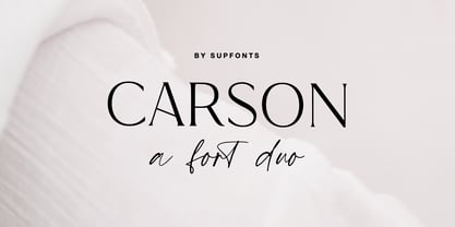 Carson Font Duo is a combination of a sophisticated serif typeface and a relaxed handwritten script. It has a contemporary and uncomplicated design that adds an elegant and tidy touch to various projects such as websites, logos, branding, social media quotes, wedding stationery, and more. I appreciate you visiting my shop. Don't hesitate to contact me if you have any inquiries. -Dima Carson Font Features: - Full Set of standard alphabet and punctuation - Ligatures - PUA Encoded - no special software needed to access extra characters - Language support: All European languages - Multilingual Characters AÁĂÂÄÀĀĄÅÃÆBCĆČÇĊDÐĎĐEÉĚÊËĖÈĒĘẼFGĞĢĠḠHĦIIJÍÎÏİÌĪĮĨJKĶLĹĽĻŁMNŃŇŅÑ OÓÔÖÒŐŌØÕŒPÞQRŔŘŖSŚŠŞȘẞTŤŢȚUÚÛÜÙŰŪŲŮŨVWẂŴẄẀXYÝŶŸỲỸZŹŽŻ aáăâäàāąåãæbcćčçċdðďđeéěêëėèēęẽfgğģġḡhħiıíîïìijīįĩjȷkķlĺľļłmnńňņñoóôöòőōøõœpþ qrŕřŗsśšşșßtťţțuúûüùűūųůũvwẃŵẅẁxyýŷÿỳỹzźžż
 - Pursue Your Passion by Seemly Fonts,
$12.00 Pursue Your Passion presents a sophisticated handwritten font meticulously crafted to infuse your designs with a touch of artistic elegance. Its natural flow and unique style make it a versatile choice for a diverse range of projects, from branding to editorial design. This font transcends conventional boundaries, inviting creativity to soar without limitations. Its innate charm adds a layer of refinement to your visual narratives, while the impeccable attention to detail ensures seamless integration into your design arsenal. Unleash your creative potential with Pursue Your Passion, where imagination knows no bounds.
 - Pittsbrook by Fontdation,
$15.00 Pittsbrook Family, a pack of classic typefaces that inspired by the letters used in old advertisement and packagings. Its rigid shape gives you strong, sharp and blocky feelings, no curves were harmed in the making of these typefaces. Comes in three styles; Sans, Serif and Outline, all of them are consistently mouse-crafted characters, we spent a lot of attention to every details. Suits best for any classic/vintage design project, such as E-Sport logo, liquor/food label, packaging, headline, space-filler, logotype, typographic quote writings, etc.
 - Grenda by Yukita Creative,
$14.00 Grenda is a modern and elegant serif font. This serif font is inspired by Arabic and European art. Serif fonts are perfect for you, a creative worker who wants to make something modern and elegant. Perfect for branding, logos, headings, advertising, product packaging, web design, print design, film covers, youtube, & more! Serif typeface Ranges in style from sleek & subtle to luxurious Character set A-Z Numbers & Punctuation. Why not try Grenda Serif Font today? It comes in uppercase, lowercase, punctuation, and numbers; no more worrying about anything else.
 - Modern Elvish by Typelove Fontworks,
$9.00 Modern Elvish is a humanist sans serif typeface created for the Tengwar “English” mode as popularized in the Lord of the Rings books and films. I imagined the famous elves of this lore living in contemporary times and needing a no nonsense modern typeface for their branding, communications and UX design. Use this typeface for your RPG, LARPing or Cosplay needs. This typeface uses advanced font features such as ligatures and contextual alternates to convert any English text. I would recommend typing in English first, then converting to a font of this typeface.
 - Saki by Thinkdust,
$10.00 Saki is big and bold, presenting messages in an easy to understand, pleasant to read manner. Simple straight edges, shallow curves and sans-serif, Saki was created with legibility and minimalism in mind and its thick weight gives it great scalability. It is admirable for maintaining such close attention to form, each character fitting neatly into the space provided and slotting together smoothly for undistracted reading. For use in headlines and similar large text, Saki is the font you need to get your message across loud and clear, no ifs, ands or buts.
 - Blonde Fraktur by ParaType,
$30.00 Blonde Fraktur is a free interpretation of the Gothic theme in Cyrillic. The font is neither Fraktur nor any other Gothic script from the formal point of view, but it makes text look like Gothic script, no matter which language is used. Blonde Fraktur was written with a quill by Alexandra Korolkova and prepared in digital form by Alexandra Pushkova. The font contains a set of alternatives and swashed variations. It suits well for advertising of beer, sausages, pubs and other places where Gothic scripts are commonly used.
 - Garoa by Just in Type,
$20.00 Inspired by the 70's design, specially on Herb Lubalin's work, the typeface Garoa is a rounded mechanical display font without optical compensations, ideal for large bodies. The medium weight has lower case for short texts, and the Bold versions have singular upper case glyphs, with some alternates (at least one alternate per letter – some with OpenType features some using caps on the keyboard). The Garoa Hacker Clube Bold version is free and contains no OpenType features, but the glyphs have the same design as on Garoa Bold.
 - Karben 105 by Talbot Type,
$19.50 Karben 105 is inspired by the classic, no nonsense DIN, and has a form that follows its highly legible function. Based on a lozenge, it has a clean and pure geometry with even stroke weights. Karben 105 is available in a family of five weights, and is also available with character variations as Karben 205. There are also monospaced variants of both Karben 105 and Karben 205 and a stencil version. All of the Karben fonts feature an extended character set, including accented characters for Central European languages.
 - Biscuit Boodle by insigne,
$11.00 Biscuit Boodle is a fun and uplifting script from Portland Studios Illustrator Justin Gerard. The characters are brush drawn with a slight texture. The font comes packed with OpenType alternates and ligatures. Included are small caps, old style figures, titling alternates and ending swashes. Sixty-four optional ligatures add a slapdash quality to your copy and make sure that no two letters in a word are alike, and auto replacing word ligatures add to the fun. The Biscuit Boodle family also includes an even more spontaneous alternate and even ornaments for even more creative options.
 - Germania by Wiescher Design,
$29.50 Germania is a Sans font based on classic roman proportions and forms based on my Imperia font. But I added that distinct, rigid, no-nonsense German touch. This monoline font with its classic proportions and personality is good for lots of occasions. And – I designed three »real« italic typefaces – not just slanting the straight ones. I corrected the stroke thicknesses and changed the lowercase a, e, f, g and q. I put in a collection of very interesting uppercase ligatures for free. Your classical type designer - Gert Wiescher
 - Psychophante by Kenn Munk,
$15.00Remember back in the day when medals where for The Beatles and foreign dictators only? No more! Psychophante is a 64 pixel medal-building dingbat. Make fresh pixly medals (like the 'I Really Like Your 'fro medal' and the 'Best Hotel Booker medal') for yourself and/or for friends who deserve them. Each medal is made up of three interchangable parts: - Uppercase consonants are the top of the medal. - Vowels are the middle. - Lowercase consonants are the dangly bit. Numerals are special characters, to be followed by a lowercase consonant - Special Edition JNL by Jeff Levine,
$29.00 The Teapot Dome scandal was a 1920s bribery scandal involving Secretary of the Interior Albert Bacon Fall. Fall leased Navy petroleum reserves at Teapot Dome in Wyoming [along with some California reserves] at low rates with no competitive bidding. The San Francisco Examiner for Feb. 20, 1924 ran the two line headline “U.S. Senator Named as Oil Stock Speculator; Whitney to Face Quiz Today on Slush Fund”. The headline was set in a condensed, slightly squared sans serif typeface. This is now available as Special Edition JNL in both regular and oblique versions.
 - Magical Daisy by Supfonts,
$12.00 Magical Daisy is a cute handwritten signature font. Perfect for greeting cards, wedding stationery, photographer watermarks logos, modern websites, apparel design and more. Magical Daisy features handwritten ligatures and beginning and end swashes for lowercase letters. Thanks so much for checking out my shop, and please get in touch if you have any questions! --- Magical Daisy Font Features - Full Set of standard alphabet and punctuation - Extra set of beginning and ending swashed lowercase - 78 handwritten ligatures - PUA Encoded - no special software needed to access extra characters - Multilingual Characters AÁĂÂÄÀĀĄÅÃÆBCĆČÇĊDÐĎĐEÉĚÊËĖÈĒĘẼFGĞĢĠḠHĦIIJÍÎÏİÌĪĮĨJKĶLĹĽĻŁMNŃŇŅÑ OÓÔÖÒŐŌØÕŒPÞQRŔŘŖSŚŠŞȘẞTŤŢȚUÚÛÜÙŰŪŲŮŨVWẂŴẄẀXYÝŶŸỲỸZŹŽŻ aáăâäàāąåãæbcćčçċdðďđeéěêëėèēęẽfgğģġḡhħiıíîïìijīįĩjȷkķlĺľļłmnńňņñoóôöòőōøõœpþ qrŕřŗsśšşșßtťţțuúûüùűūųůũvwẃŵẅẁxyýŷÿỳỹzźžż
 - Aardvark Dreams by Hanoded,
$15.00 Aardvark Dreams… Yes, I guess this is the first font ever to have an aardvark in its name! Aardvark Dreams is a bit of an unusual font. It is didone-ish in style, but the glyphs are slightly warped, giving them an almost liquid appearance. The Vark is a cute font for children’s books, games, posters and artwork. It could also work on psychedelic record-sleeves, but I guess they don’t make ‘em no more. Aardvark Dreams comes with a bunch of ligatures and a whole lotta diacritics!
 - Collingethon by Namara Creative Studio,
$20.00 Collingethon is chic handwritten script font with a calligraphy flair, Perfect for creating handwritten-style logos, wedding stationery, photographer watermarks logos, modern websites, and more. For those of you who are needing a touch of elegant, chic and modernity for your designs, this font was created for you! Font Features Full Set of standard alphabet and punctuation. Beginning and ending swashed lowercase. Alternates, ligatures and multilingual characters. PUA Encoded | no special software needed to access extra characters. Feel free to follow, like and share. Thanks so much for checking out my shop!
 - DINfun Pro Plain by CheapProFonts,
$10.00 This is my version of the classic DIN 1451 Mittelschrift, complete with a large multilingual character set. I have made it primarily because I want to have a bit of fun with it by experimenting with giving it some very different expressions - far removed from its serious and no-nonsense roots. Time to spice up that DIN profile! Check out the "Buying choices" tab for all the themed variants! :) ALL fonts from CheapProFonts have very extensive language support: They contain some unusual diacritic letters (some of which are contained in the Latin Extended-B Unicode block) supporting: Cornish, Filipino (Tagalog), Guarani, Luxembourgian, Malagasy, Romanian, Ulithian and Welsh. They also contain all glyphs in the Latin Extended-A Unicode block (which among others cover the Central European and Baltic areas) supporting: Afrikaans, Belarusian (Lacinka), Bosnian, Catalan, Chichewa, Croatian, Czech, Dutch, Esperanto, Greenlandic, Hungarian, Kashubian, Kurdish (Kurmanji), Latvian, Lithuanian, Maltese, Maori, Polish, Saami (Inari), Saami (North), Serbian (latin), Slovak(ian), Slovene, Sorbian (Lower), Sorbian (Upper), Turkish and Turkmen. And they of course contain all the usual “western” glyphs supporting: Albanian, Basque, Breton, Chamorro, Danish, Estonian, Faroese, Finnish, French, Frisian, Galican, German, Icelandic, Indonesian, Irish (Gaelic), Italian, Northern Sotho, Norwegian, Occitan, Portuguese, Rhaeto-Romance, Sami (Lule), Sami (South), Scots (Gaelic), Spanish, Swedish, Tswana, Walloon and Yapese.
 - Wedge Gothic by HiH,
$12.00 Bold, muscular, vaguely oriental, Wedge Gothic ML is the original name of this font released by Barnhart Bros. and Spindler of Chicago in 1893. The straight-forward, no-nonsense name tells us exactly what to expect: sans-serif letterforms based on wedge-shaped vertical strokes. The typeface was dropped for awhile -- it does not appear in the 1907 catalog for example -- but reappeared in 1925 as Japanette. What is the opposite of "straight-forward" anyway? According to McGrew, Wedge Gothic was originally created for the Chicago Herald newspaper. The designer is unknown. A distinctive display face, useful when a strong and unusual statement is desired. Wedge Gothic ML features: 1. Glyphs for the 1250 Central Europe, the 1252 Western Europe, the 1254 Turkish and the 1257 Baltic Code Pages. Total of 335 glyphs. 2. OpenType GSUB layout features: pnum, ornm, hist & salt. 3. 66 kerning pairs. 4. Both tabular & proportional numbers. 5. Alternate bullets. The zip package includes two versions of the font at no extra charge. There is an OTF version which is in Open PS (Post Script Type 1) format and a TTF version which is in Open TT (True Type)format. Use whichever works best for your applications.
 - Scotch by Positype,
$29.00 Clean, crisp, rational, familiar, modern… serifed. Positype Scotch reaches back to history just enough to produce something warm and easy on the eyes. No corners were cut, no quick tricks… this type suite was drawn for specificity: Text, Display, and Deck… ALL in 3 widths that now include Condensed and Compressed. Each unique, each inter-connected, each part of the whole. Scotch Text is offered in 6 weights with matching true italics. Drawn for economy and an easy read, the family is a workhorse for long-passage text settings. 4 sets of numerals, well-proportioned small caps, and a plethora of extras round out each font. Scotch Display is not just a thinner version of Scotch Text wrapped in a higher contrast. Display sports shorter ascenders and descenders, a unique footprint, great contrast, and a more folded, calligraphic italics. Display subtly oozes sophistication and provides an attractive, exhuberant companion to Scotch Text. Scotch Deck rounds out the offering by choosing to be specific to its offering. Deck utlitizes traits and proportions shared between Text and Display, but alters its overall mass to balance out the needs for settings that require subheadlines, callouts and other similar uses. Essentially, something not so high-contrast and not so stress dense that works great for middle-sizes.
 - Kulture Grotesk by SilverStag,
$19.00 I am thrilled to present you the KULTURE GROTESK, a brand new sans serif font meticulously crafted to elevate your design projects to new heights. This contemporary typeface seamlessly blends modernity, chic aesthetics, and boundless creativity to offer a truly unique and captivating visual experience. With its clean lines and refined forms, this grotesk font embodies a perfect balance of simplicity and sophistication. Designed with the utmost attention to detail, it brings a breath of fresh air to the world of typography. Its versatility knows no bounds, making it the ideal choice for a wide range of applications, from editorial design and branding to web design and advertising. Whether you are looking to create a sleek corporate identity or add a touch of elegance to your personal projects, this font will undoubtedly leave a lasting impression. One of the most exciting features of the new font is the inclusion of over 300 alternate letters and ligatures.These unique characters offer a world of possibilities, allowing you to create stunning and original typography. From distinctive logo designs to captivating headlines, this grotesk font enables you to break free from the ordinary and infuse your creations with a touch of individuality. KULTURE GROTESK - Modern Sans Serif Font Includes: Over 300 ligatures and alternate letters Numerals & Punctuation Language Support Web Font Kit is included as well Detailed instructions on how to use alternates in most of the apps on your computer as well for Canva Would you like to get 5 completely free fonts worth over $75? No tricks, no hidden words, terms or anything. Just subscribe to my newsletter, make sure to check your email to approve the subscription, add me to your contacts so that the emails don't end up in spam folder and you will get 5 fonts for free. The fonts are packed with alternates, ligatures and some even come with extra goodies. Happy creating everyone!
 - St Croce Pro by Storm Type Foundry,
$29.00 Our eye is able to join missing parts of worn letters back into undisturbed shapes. We tend to see things better than they really are. Thanks to this ability we ignore faults of those close to us as we can’t accept the fact that every once in a while we convene with an impaired entity. Typography is merely a man’s invention, hence imperfection and transience, albeit overlooked, are its key features. This typeface is based on worn-out letterings on tombstones in the St. Croce basilica in Florence. For hundreds of years, microscopic particles of marble are being taken away on the soles of visitors: the embossed figures become fossilised white clouds, fragments of inscriptions are nearing the limits of legibility. First missing are thin joins and serifs, then the main strokes finally slowly diminish into nothingness over time. Unlike an archaeologist, for whom even completely featureless stele is valuable, the typographer must capture the proper moment of wear, when the type is not too “new” but also not too much decimated. Such typeface is usable for catalogue jackets, invitations and posters. Calligraphy is a natural human trait. To write is to create characters of reasonable beauty and content, according to the nature of the writer. A natural characteristic of architecture is to create an aesthetic message very similar to the alphabet. A doric column, the gabled roof, the circle of the well plan: these are the basic shapes from which all text typeface is derived.
 - Society Column JNL by Jeff Levine,
$29.00 The title card for the 1938 screwball comedy "Four's a Crowd" (starring Errol Flynn, Olivia de Havilland and Rosalind Russell) offered a classic, thin Art Deco type design with stylized letter forms. This is the basis for Society Column JNL; which derives its name from the newspaper columns popularized in that era detailing the whereabouts of the "upper crust" of society.
 - 99 Names of ALLAH Minimal by Islamic Calligraphy75,
$12.00 We have transformed the “99 names of ALLAH” into a font. That means each key on your keyboard represents 1 of the 99 names of ALLAH Aaza Wajal. The fonts work with both the English and Arabic Keyboards. We call this Calligraphy "Minimal" because of the minimal decoration and simplistic design. The first "Alef" has a "hamzit wasel", this indicates that the name can be pronounced both as "AR-RAHMAAN" or "R-RAHMAN" (in the zip file you will find a pdf file explaining the differences in the "harakat", pronunciation and spelling according to the Holy Quran). This calligraphy is not only minimal in its design but easy to read, very few letters overlaps and the decorative symbols are at minimum. Decorative letters used in this calligraphy: "Mim, Aain, Sin, HHe, He & Saad". Purpose & use: - Writers: Highlight the names in your texts in beautiful Islamic calligraphy. - Editors: Use with kinetic typography templates (AE) & editing software. - Designers: The very small details in the names does not affect the quality. Rest assured it is flawless. The MOST IMPORTANT THING about this list is that all the names are 100% ERROR FREE, and you can USE THEM WITH YOUR EYES CLOSED. All the “Tachkilat” are 100% ERROR FREE, all the "Spelling" is 100% ERROR FREE, and they all have been written in accordance with the Holy Quran. No names are missing and no names are duplicated. The list is complete "99 names +1". The +1 is the name “ALLAH” 'Aza wajal. Another important thing is how we use the decorative letters. In every font you will see small decorative letters, these letters are used only in accordance with their respective letters to indicate pronunciation & we don't include them randomly. That means "mim" on top or below the letter "mim", "sin" on top or below the letter "sin", and so on and so forth. Included: Pdf file telling you which key is associated with which name. In that same file we have included the transliteration and explication of all 99 names. Pdf file explaining the differences in the harakat and pronunciation according to the Holy Quran. Here is a link to all the extra files you will need: https://drive.google.com/drive/folders/1Xj2Q8hhmfKD7stY6RILhKPiPfePpI9U4?usp=sharing ---------------------------------------------------------------------------------------------------------------------------
 - 99 Names of ALLAH Subhanahu by Islamic Calligraphy75,
$12.00 We have transformed the “99 names of ALLAH” into a font. That means each key on your keyboard represents 1 of the 99 names of ALLAH Aaza Wajal. The fonts work with both the English and Arabic Keyboards. We call this Calligraphy "Subhanahu Wa Ta'ala" because we have added "Subhanahu Wa Ta'ala" to each and every name. The first "Alef" has a "hamzit wasel", this indicates that the name can be pronounced both as "AR-RAHMAAN" or "R-RAHMAN" (in the zip file you will find a pdf file explaining the differences in the "harakat", pronunciation and spelling according to the Holy Quran). The calligraphy is rectangular shaped, and the "fatha" is big and covers almost the entire name, in most of the names. Decorative letters used in this calligraphy: "Mim, Aain, Sin, HHe, He, Ta, Kaf & Saad". Purpose & use: - Writers: Highlight the names in your texts in beautiful Islamic calligraphy. - Editors: Use with kinetic typography templates (AE) & editing software. - Designers: The very small details in the names does not affect the quality. Rest assured it is flawless. The MOST IMPORTANT THING about this list is that all the names are 100% ERROR FREE, and you can USE THEM WITH YOUR EYES CLOSED. All the “Tachkilat” are 100% ERROR FREE, all the "Spelling" is 100% ERROR FREE, and they all have been written in accordance with the Holy Quran. No names are missing and no names are duplicated. The list is complete "99 names +1". The +1 is the name “ALLAH” 'Aza wajal. Another important thing is how we use the decorative letters. In every font you will see small decorative letters, these letters are used only in accordance with their respective letters to indicate pronunciation & we don't include them randomly. That means "mim" on top or below the letter "mim", "sin" on top or below the letter "sin", and so on and so forth. Included: Pdf file telling you which key is associated with which name. In that same file we have included the transliteration and explication of all 99 names. Pdf file explaining the differences in the harakat and pronunciation according to the Holy Quran.
 - Xmas by Linotype,
$29.99Christmas cookies have already slowly crept onto your local supermarket's shelves -- the Linotype Xmas Fonts just can't wait any longer! Ravishingly friendly and universally applicable: Fuenfwerken -- a design studio from Wiesbaden, Germany -- is proud to present its latest Fun Font Family. Bringing variety to the dry Christmas card genre, these fonts can also be used on posters to spread holiday cheer at home. No limits are placed on your creativity here! The family has three different fonts, each with more than 60 symbols inside: Xmas Story includes the whole figure palette necessary for a classical Christmas story. From a cute little Baby Jesus to the Three Wise Men and woolly Aramaic sheep and everything that one needs to add special flair to a letter to grandma, or to set up a Nativity Scene at home for the kids is included. Customers who aren't searching for a biblical font should check out Xmas Essentials. This font contains typical non-denominational end-of-the-year holiday ornaments, such as snowflakes, decorated Christmas trees, nutcrackers, and stars. Last but not least is the Xmas Modern font. Just as global warming poses severe risks to snowmen, this font will make recipients of your holiday and New Year's cards melt. Glyphs such as Santa Claus riding on a Vespa -- complete with iPod -- speed away from normal, stuffy holiday seriousness, and signal that the Fun Generation has arrived! The best choice, of course, is to treat yourself to all three fonts this Christmas. Then you'll be prepared for every situation. Happy Holidays! - Coal Brush by Hanoded,
$15.00 Coal Brush is a bit of a misleading name. It looks as though it was made with a brush, but it was, in fact, made with a almost dried out old marker pen. But a font named ‘dried out old marker pen’ doesn’t really fly, so I decided to pimp the name. There you have it, you can’t even trust an honest typographer! Marker pen or brush, Coal Brush is a very sweet little font. It is all caps, but upper and lower case differ and can be mixed freely. Plus there’s a hidden stash of alternates for the lower case letters and an alternate ampersand! I actually threw that in to make up for my lie. So, use it for your books, your posters, your rap albums, rock operas, grilled food restaurants and designer BBQ sauces. It’s yours for the taking!
 - Fleete by Greater Albion Typefounders,
$5.95 Fleete is a modern homage to the many late 19th century typefaces; often used for book titles, posters and newspaper headlines; which have an extreme contrast between hairline horizontal stems and serifs and heavy vertical stems. Greater Albion Typefounders have taken this basic idea, to be found across very many faces of the period and used just that one concept as the basis of a new typeface design, which manages to be elegant yet modern all at once. IF you need something for a section heading which stands out from body text, this is the font family for you. If you need headings on a poster or large scale web-page headings, this is the face you should try. If you need several weights of heading-no problem; Fleete comes in Regular, Bold and Shadowed, as well as a newly designed Sans Serif form.
 - Italiko by Luca Bolognese,
$11.00 Italiko is a calligraphic font. The letters have been hand-drawn individually to extract the common strokes. The strokes have then been re-composed to give the font a more unified appearance. It comes in Black, Bold, Regular, and Thin. The Thin version is different as the extreme contrast in the font makes the thinner lines disappear. It is likely best used as a display font. There are ligatures for the combination of letters that can be written more quickly by using a single stroke and letters that are slightly different from the ‘Italic canon.’ You can select which one to use in your application (i.e., Word) using combinations of italic/bold: No selection -> Regular Bold -> Bold Italic -> Thin Bold Italic -> Black If you end up using the font, get in touch at https://github.com/lucabol/Italiko. Feel free to suggest improvements or let me know if you encounter problems.
 - Something Exquisite by Ana's Fonts,
$12.00 Something Exquisite is a cute but elegant font family which includes: - a script font with accents, numbers, symbols, punctuation, and ligatures for the double letters - an all caps font with different uppercase and lowercase letters - a small caps font based on the all caps - two sets of swashes, including 1 swash for each uppercase letter and 2 swashes for each lowercase - a set of ornaments and frames you can access easily through A-Z, a-z, and 0-9 (0b-9b for textured frames) keys respectively Something Exquisite is perfect for both short and longer texts, and can be used for making postcards and notes, creating logotypes, social media posts, branding and packaging. Please note: No special software is needed in order to access the small caps and swashes, as they are in different font files. You simply access them directly in your font bar.
 - Salma Alfasans by Alifinart Studio,
$10.00 Salma Alfasans is a modern sans serif font, created on February 25, 2021. The main inspiration for this font is its modern geometry and bold design, but looks elegant and smooth. This font is well-crafted and has almost no contrast at all. The advantage of the Salma Alfasans font is that it is very appropriate when used as a heading, but also looks good when used as body text. With many weight options, you can freely adjust the design scenario based on your needs. Salma Alfasans is very good for logos, branding, books (headings, sub headings, and body text), invitations, business cards and others. SALMA ALFASANS UPDATE VERSION 2.0 Update Details: - New designs and mayor changes - Tabular and proportional lining figures - Tabular and proportional oldstyle figures - Stylistic set for a, l, y, and G - Numerator, denominator, and fractions - New ligatures for ff, fi, fj, ft, fk, ffk, and more - Case sensitive, and - Arrows Language Support: Afrikaans, Albanian, Asu, Basque, Bemba, Bena, Breton, Catalan, Chiga, Cornish, Danish, Dutch, English, Estonian, Filipino, Finnish, French, Friulian, Galician, German, Gusii, Indonesian, Irish, Italian, Kabuverdianu, Kalenjin, Kinyarwanda, Luo, Luxembourgish, Luyia, Machame, Makhuwa-Meetto, , Makonde, Malagasy, Manx, Morisyen, North Ndebele, Norwegian Bokmål, Norwegian Nynorsk, Nyankole, Oromo, Portuguese, Quechua, Romansh, Rombo, Rundi, Rwa, Samburu, Sango, Sangu, Scottish Gaelic, Sena, Shambala, Shona, Soga, Somali, Spanish, Swahili, Swedish, Swiss German, Taita, Teso, Uzbek (Latin), Volapük, Vunjo, Zulu. Thank you. Alifinart Studio alifinart@gmail.com Instagram | Behance
 - Contenu by Hackberry Font Foundry,
$24.95 Because Contenu is designed for text use, it is spaced for body copy in the 9-12 point range. That is far too much spacing for heads, subheads, and the like. So I made the display version of Contenu Book to use for headers. In the process of tightening the spacing at the very large sizes, I also made some minor modifications to the glyph shapes to make this version a little more elegant. Contenu Opentype has two Opentype families for print design. Contenu Book has five fonts: Regular, Italic, Bold, Bold Italic, and Display. Contenu has Medium, Medium Italic, Black, and Black Italic. The name is French for content and this is what the family is designed for: text, body copy, and book layout. If it has a style, it is a modern take on oldstyle serif font using Jenson as a mask. There are no plans for display versions of the bolder weights or the italics. If you want them, use Contenu Medium, Book Bold, Contenu Black, or any of the four italics and tighten the tracking.
 - Contenu Book by Hackberry Font Foundry,
$24.95Because Contenu is designed for text use, it is spaced for body copy in the 9-12 point range. That is far too much spacing for heads, subheads, and the like. So I made the display version of Contenu Book to use for headers. In the process of tightening the spacing at the very large sizes, I also made some minor modifications to the glyph shapes to make this version a little more elegant. Contenu Opentype has two Opentype families for print design. Contenu Book has five fonts: Regular, Italic, Bold, Bold Italic, and Display. Contenu has Medium, Medium Italic, Black, and Black Italic. The name is French for content and this is what the family is designed for: text, body copy, and book layout. If it has a style, it is a modern take on oldstyle serif font using Jenson as a mask. There are no plans for display versions of the bolder weights or the italics. If you want them, use Contenu Medium, Book Bold, Contenu Black, or any of the four italics and tighten the tracking. - Sassoon Infant by Sassoon-Williams,
$48.00 An upright typeface family developed to meet the demand for letters to produce pupil material for handwriting as well as for reading. Upright letters with extended ascenders and descenders are ideal on screen. They facilitate word recognition. The exit strokes link words together visually, and in handwriting they lead to spontaneous joins along the baseline leading logically to a joined-up hand. Teachers can print desk strips, charts of letter families and alphabet friezes, as well as consistent material across the curriculum. Together these typefaces provide a valuable resource for special needs teachers. When starting point and stroke direction has been learned, the arrow font (Tracker B) can be dropped and the simpler Tracker font used. Tracker B font, with its direction arrows helps pupils to start in the correct place. Motor movements can be refined by keeping inside the line. When starting and direction is no problem, the arrow can be dropped and the plain Tracker font used. When starting point and stroke direction have been learned, the arrow font (Dotted B) can be dropped and the simpler Dotted font used. Free to download resources How to access Stylistic Sets of alternative letters in these fonts Purchasers of this font package may use their Order Number to receive a free Copybook PDF by Rosemary Sassoon recommended for effective teaching
 - Kambegi by Sealoung,
$25.00 Kambegi is a bold retro serif font with a casual feel and a clean, great modern retro aesthetic. Use this Kambegi serif font to add a special retro modern touch to any design idea you can think of. This font is PUA encoded which means you can access all glyphs and swashes easily via Character map or Character Viewer on mac! Feature : Uppercase & lowercase Numbers and punctuation Multilingual Alternates, swash & ligatures PUA encoded We highly recommend using a program that supports the OpenType feature and the Glyphs panel such as many Adobe and Corel Draw applications, so that you can view and access all variations of Glyphs.
 - Radicals by ITC,
$29.99Calligrapher Margaret Layson works in partnership with Australian typographer Harry Pears, bringing designs such as the wonderful Lindisfarne Nova family to life. They both work on the digital incarnation in a true collaboration. Originally from the UK, Margaret began her professional career as a geophysicist. After arriving in Australia in 1968, she began to work as a freelance calligrapher. Over the years she has maintained an interest in the history of writing, particularly the scripts and decorations in manuscripts. - Cahuenga by LuxTypo,
$50.00 Cahuenga embodies clarity in text and distinction in display. Throughout the development process, references were sought out only as moments for consideration presented themselves. Thus, the development was long and complex with Cahuenga not prescribing to a single distinctive model as a foundation. Exploration around formal traits was influenced as much by aesthetics as they were by desired functional outcomes. Cahuenga organically holds a tone and pitch that is sincere. The name is emblematic of many who drive through the Hollywood area of Los Angeles. As in many parts, the driving route is convoluted from point A to point B. However, it seems more often than not, that when in the Hollywood area, one usually ends up on Cahuenga Boulevard at some point.
 - Bodiam by Hanoded,
$15.00 Two years ago I went on a camping holiday in England with my wife and (then two) small children. The first stop was a nature campsite near the village of Bodiam in East Sussex. My son wanted to see a real castle, so I figured Bodiam Castle was the 'realest' of them all! He loved it, as the castle had a moat, crenellated walls, a bunch of towers and a guy dressed up as a knight. Bodiam font is a rough didone-ish affair. It is all caps, but you can freely mix upper and lower case. It would be ideal for book covers, posters and maybe even for castles. Comes with a treasure chest of diacritics.