10,000 search results
(0.086 seconds)
- Ring Wind by Ochakov,
$9.00 Typography exists to honor content. Like oratory, music, dance, calligraphy-like anything that lends its grace to language – typography is an art that can be deliberately misused. It is a craft by which the meanings of a text ( or its absence of meaning) can be clarified, honored and shared, or knowingly disguised. When we long for life without difficulties, remind us that oaks grow strong in contrary winds and diamonds are made under pressure. The Ring Font Family continues to grow strong.
 - Mavel by Arodora Type,
$40.00 Mavel is a large font family where you can find simplicity and elegance together. With this font, you can create impressive presentations and increase their contrast by using sub-family members. You can create unique looking layouts and banners. The luxury logo will look great for your work. Apart from its wide family, this aesthetic font offers you alternative characters, ligatures and many more usage features.
 - DuckyCowgrrrlLuvsRudyCowboy - Unknown license

- Quta by Fo Da,
$15.00 Quta is a sans serif typeface produced by FoDa foundry, that meets all the needs of professionals who search a family of clean geometric font, very well suited for headlines, newspaper and many purposes. With a basic character set in Five weights with their italics. Quta covers many features like: -Five main weights (Light, Regular, Medium, Bold and Extra Bold) -Matching italics for all weights. -language support for many Latin-based scripts -Ligatures and many other OpenType features.
 - Christfully by Rashatype,
$10.00 Christfully is a lovely and delicate script font that exudes elegance and class. This font is PUA encoded which means you can access all glyphs and swashes with ease!
 - Daiquiri by Wiescher Design,
$39.50 Daiquiri is a revival of a handlettered font in two weights, from an ad for Puerto Rico Rum dating back to the forties or fifties. I found the ad on a French antique market on my last visit for Mardi Gras in Nice. The ad read "Breeze through the heat, be a Daiquiri fan". That's why they had this "fan" in the illustration! Did they want you to rotate like a fan when you had enough Daiquiris? Or did they just do it for that little "Jeu des mots"? Anyway I found the handlettering very pretty, so I took those few letters and made a whole font out of them. I think Daiquiri has that touch that brings those happy and uncomplicated times back when advertising was still fun. I started something like 20 years later in advertising and things had gotten more stringent. We already had to satisfy those marketing guys with their scholarly attitude. They have taken all the fun out of the job, for the creators as well as for the consumers. I would like to see more uncomplicated ads like this again, yours Gert Wiescher
 - Festive by TypeSETit,
$49.95 It's Festive! But don't let the name fool you... It's a fun script font (plus a Roman) accompanied by an assortment of exciting ornamental dingbats. In fact, it's the ornamentals that make this font so much fun! At first glance, Festive appears to be suited only for the Christmas holiday season. But wait… you can use the ornamental dingbats for any occasion where festivities abound— New Years, Valentines, St. Patty's Day, Back to School, Graduation, Baby & Wedding Showers, Halloween, Thanksgiving, and much more— even Sports. The base font works well with bodies of copy, while the alternate fonts can be used to swap out individual characters to give a custom, hand written look. Be sure to scroll thru to see all 14 fonts in this package—especially the fun ornamental dingbats. Festive Regular is included with all the alternate fonts (Festive One thru Ten) which are sold as two font sets. The PRO version contains all the glyphs of the family plus OpenType programming to easily access alternates. The Festive family of fonts are PUA encoded, so you can access them easily. So, get in the mood and have FESTIVE fun!
 - Merodine by Letterhend,
$19.00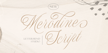 Merodine Script. A Beautiful and classy script that has many swashes that allows you to create beautiful lettering instantly. it has many stylistic set alternates that you can choose from. This font perfectly made to be applied especially in logo, and the other various formal forms such as invitations, labels, logos, magazines, books, greeting / wedding cards, packaging, fashion, make up, stationery, novels, labels or any type of advertising purpose. Features : uppercase & lowercase numbers and punctuation multilingual ligatures alternates swashes PUA encoded We highly recommend using a program that supports OpenType features and Glyphs panels like many of Adobe apps and Corel Draw, so you can see and access all Glyph variations.
 - Built by Typodermic,
$11.95 In the world of journalism, headlines are the lifeblood of a publication. They need to be compact, sturdy, and project a voice that exudes trust and neutrality. Enter Built, the font family designed specifically for creating striking headlines that grab the reader’s attention. With its wraparound curves and subtle curls, Built evokes a feel of a bygone newspaper era without being too old-fashioned. The font family is available in five weights, ranging from Extra-Light to Bold, each with its own unique character and style. But what sets Built apart from other fonts is its ability to scale up without sacrificing readability. Lighter typefaces may look great on paper, but on-screen, they can quickly become unreadable if not properly designed. With Built, however, the font becomes narrower as it becomes lighter, allowing designers to set oversized page titles without worrying about copyfitting. In addition to its unique scaling capabilities, Built also offers a simple solution to the problem of aligning numbers in headlines. By disabling kerning, Built ensures that all numerals, monetary symbols, and most math symbols will line up perfectly, saving designers time and frustration. Built also includes a range of other typographical features, such as fractions, primes, ordinals, and vertically compact accents. And as the font becomes lighter, the asterisk grows more legs, allowing it to appear tonally even in Extra-Light. So whether you’re designing a front page for a major newspaper or simply need to create eye-catching headlines for your blog, Built is the font family that can deliver the perfect balance of style and readability. With its range of weights and styles, it’s the perfect choice for any journalist or designer looking to make a bold statement on-screen. Most Latin-based European writing systems are supported, including the following languages. Afaan Oromo, Afar, Afrikaans, Albanian, Alsatian, Aromanian, Aymara, Bashkir (Latin), Basque, Belarusian (Latin), Bemba, Bikol, Bosnian, Breton, Cape Verdean, Creole, Catalan, Cebuano, Chamorro, Chavacano, Chichewa, Crimean Tatar (Latin), Croatian, Czech, Danish, Dawan, Dholuo, Dutch, English, Estonian, Faroese, Fijian, Filipino, Finnish, French, Frisian, Friulian, Gagauz (Latin), Galician, Ganda, Genoese, German, Greenlandic, Guadeloupean Creole, Haitian Creole, Hawaiian, Hiligaynon, Hungarian, Icelandic, Ilocano, Indonesian, Irish, Italian, Jamaican, Kaqchikel, Karakalpak (Latin), Kashubian, Kikongo, Kinyarwanda, Kirundi, Kurdish (Latin), Latvian, Lithuanian, Lombard, Low Saxon, Luxembourgish, Maasai, Makhuwa, Malay, Maltese, Māori, Moldovan, Montenegrin, Ndebele, Neapolitan, Norwegian, Novial, Occitan, Ossetian (Latin), Papiamento, Piedmontese, Polish, Portuguese, Quechua, Rarotongan, Romanian, Romansh, Sami, Sango, Saramaccan, Sardinian, Scottish Gaelic, Serbian (Latin), Shona, Sicilian, Silesian, Slovak, Slovenian, Somali, Sorbian, Sotho, Spanish, Swahili, Swazi, Swedish, Tagalog, Tahitian, Tetum, Tongan, Tshiluba, Tsonga, Tswana, Tumbuka, Turkish, Turkmen (Latin), Tuvaluan, Uzbek (Latin), Venetian, Vepsian, Võro, Walloon, Waray-Waray, Wayuu, Welsh, Wolof, Xhosa, Yapese, Zapotec Zulu and Zuni.
 - Bastonello by Robert Corseanschi,
$14.99 Bastonello is designed for a wide range of uses. It can be used for logos, business cards, websites, newspapers and many other graphic designs. This font has a nice feel and can be used everywhere, it is just awesome. It is available in light, regular and bold weights with corresponding italics.
 - Black Sigra by Sign Studio,
$12.00 Black Sigra comes in 3 styles (regular, blur, and shadow) so it can be more versatile. Adapting to a simpler fracture calligraphy style. Has sufficient thickness to dominate a design page. Supports multiple languages and each character has a PUA code which means everything can be accessed on most common software.
 - Neuarc by CozyFonts,
$25.00 Neuarc Font Family This is the 20th font family of CozyFonts Foundry, established 10 years ago in 2012 with the release of Aladdin Bold. Neuarc is based loosely on arcs and curves, hence it’s naming. As shown in one of the font posters that serves to showcase this font, a collage of rough sketches is displayed as the poster’s background. These hand drawn pencil drawings were worked and reworked and The final drawings were scanned and built in Adobe Illustrator and transferred to glyph windows, glyph by glyph, in Fontlab 8. The 5 styles, so far, are reminisscent of The Art Deco Era of Design between the 1030s and 1950s. Neuarc also has it’s own footprint with several characters that stand out, eg. A, 8, &, B, ?, $, 5, w, x, a, c, e, etc. giving the reason for the ’Neu’ in the naming. These letterforms & Numbers work extremely well in monograms. Each styles has it’s own personality. From the ultra chic Light style to the dominant cool Bold style, this family maintains a uniform legibility at small to large sizes. Meant primarily for display uses, Neuarc works well for posters, logos, headlines, packaging, branding, signage for a myriad of applications. The Neuarc Deco style font will work well in titles and numbers of any application.
 - History Agnes by Lettersams,
$18.00 History Agnes is a beautiful modern calligraphy font. This font is available with several modern swirls that can make your work look elegant, sweet and perfect. Can be used for various purposes such as post, wedding invitations, brands, signatures, logos, t-shirts, labels, news, posters, and more. History Agnes includes changes in the OpenType language style and international support for most Western languages. To activate the OpenType Stylistic alternative, you need a program that supports OpenType features such as Adobe Illustrator CS, Adobe Indesign & CorelDraw X6-X7, Microsoft Word 2010 or newer versions. History Agnes is coded with Unicode PUA, which allows full access to all additional characters without having to design special software. Mac users can use Letter Book, and Windows users can use Character Maps to view and copy any of the additional characters to be included in your favorite text editor / application. If you need help or have questions, let me know or send an email to lettersams@gmail.com. I am happy to help. Thank you & Happy Designing.
 - Walklike by Cerulean Stimuli,
$17.00 You've searched for "Egyptian" but, thanks to a quirk of type jargon history, much of what you found is not what you had in mind for the voice of Thoth in your comic book, or the hints in your Mummy's Tomb game. And you don't want to fall back on You-Know-What. Fear not; now there's Walklike! Pyramids, reeds, the Eye of Horus, and other recognizable symbols inspire the letterforms of Walklike to create the feel of Ancient Egyptian hieroglyphs while remaining fully legible. The strokes are casual but careful, at home in ink or stone alike, and kept interesting and natural-looking automatically with ligatures and some contextual alternates. The air of ancient mystery is unmistakable!
 - TessieOddsNends by Ingrimayne Type,
$9.00 A tessellation is a shape that can be used to completely fill the plane—simple examples are isosceles triangles, squares, and hexagons. Tessellation patterns are eye-catching and visually appealing, which is the reason that they have long been popular in a variety of decorative situations. These Tessie fonts have two family members, a solid style that must have different colors when used and an outline style. They can be used separately or they can be used in layers with the outline style on top of the solid style. For rows to align properly, leading must be the same as point size. To see how patterns can be constructed, see the “Samples” file here. TessieOddsNEnds contains shapes that did not fit into the other Tessie fonts: TessieStandingBirds, TessieFlyingBirds, TessieMoreBirds, TessieXtraBirds, TessieSpinners, TessiePuzzlePieces, TessieAnimals, TessieBugs, TessieMiscellaneous, and TessieMoreStuff. (Earlier tessellation fonts from IngrimayneType, the TessieDingies fonts, lack a black or filled version so cannot do colored patterns. The addition of a solid style that must be colored makes these new fonts a bit more difficult to use but offers far greater possibilities in getting visually interesting results.)
 - As of my last update in April 2023, "Houndtime" designed by Bree Gorton may not be widely recognized within the mainstream font databases or among popular typeface discussions. However, let me create...
- Prismatic Spirals Pro by MMC-TypEngine,
$182.00 PRISMATIC SPIRALS PRO FONT! The Prismatic Spirals PRO is a Decorative Type-System and ‘Assembling Game’, itself. Settled in squared pieces modules or tiles, embedded by unprecedented Intertwined Prismatic Structures Design, or intricate interlaced bars that may seem quite “impossible” to shape. Although it originated from the ‘Penrose Square’, it may not look totally as an Impossible Figures Type of Optical Illusions. More an “improbable” Effect in its intertwined Design, that even static can seem like a source of Kinetical Sculptures, or drive eyes into a kind of hypnosis. Prismatic Spirals Pro has two related Typefaces both more basic or easier to use versions, the Default Family plus its “bold” braided version Prismatic Interlaces… PRO provides a more advanced, complex, and twisted Design, plus requires to be typed alternating caps. Instructions: Use the Map Font Reference PDF as a guide to learn the 'tiles' position on the keyboard, then easily type and compose puzzle designs with this font! All alphanumeric keys are intuitive or easy to induce, you may easily memorize it all! Plus, often also need to consult it! *Find the Prismatic Spirals Pro Font Map Reference PDF Here! (!) Is recommended Print it to have the Reference or open the PDF to also copy and paste, when consulting is required or when it may be difficult to access, depending on the keyboard script or language. The 2 glyphs sets are separated in colors for facilitating. Also use the Map Font with key captions or switch to it for ensure that the characters are alternating between both uppercase and lowercase letters as other Keys as numbers, marks, and punctuation along the strings, holding Shift one by one or actually two by two. As a Tiles Type-System, the line gap space value is 0, this means that tiles line gaps are invisibly grouted, so the user can compose designs, row by row, descending to each following row by clicking Enter, same as line break, while advances on assembling characters. Background History: The first sketches of my Prismatic Knots or Spirals Designs dates back then from 2010, while started developing hand-drawn Celtic Knots and Geometric Drawings in grid paper, while engage to Typography, Sacred Geometry and the “Impossible Figures” genre… I started doing modulation tests from 2013, until around 2018, I got to unravel it in square modules or tiles from the grid, then idealized it as fonts, along with other Type projects. This took 13 years to come out since the first sketches and 6 months in edition. During the production process some additional tiles or missing pieces were thought of and added to the basic set, which firstly had only the borders, corners, crossings, nets, Trivets connectors or T parts and ends, then added with nets and borders integrations. Usage Suggestions: This type-system enables the user to ornate and generate endless decorative patterns, borders, labyrinthine designs, Mosaics, motifs, etc. It can seem just like a puzzle, but a much greater tool instead for higher purposes as to compose Enigmas and use seriously. As like also to write Real Text by assembling the key characters or pieces, this way you can literarily reproduce any Pixel Design or font to its Prismatic Spirals correspondent form, as Kufic Arabic script and further languages and compose messages easily… This Typeface was made to be contemplated, applied, and manufactured on Infinite Decorative Designs as Pavements, Tapestry, Frames, Prints, Fabrics, Bookplates, Coloring Books, Cards, covers or architectonic frontispieces, storefronts, and Jewelry, for example. Usage Tips: Notice that the line-height must be fixed to 100% or 1,0. In some cases, as on Microsoft Word for example, the line-height default is set to 1,15. So you’ll need to change to 1,0 plus remove space after paragraph, in the same dropdown menu on Paragraph section. Considering Word files too, since the text used for mapping the Designs, won't make any literal orthographical sense, the user must select to ignore the Spellcheck underlined in red, by clicking over each misspelled error or in revision, so it can be better appreciated. Also unfolding environments as Adobe Software’s, the Designer will use the character menu to set body size and line gap to same value, as a calculator to fit a layout for example of 1,000 pts high with 9 tiles high, both body size and line gap will be 111.1111 pts. Further Tips: Whenever an architect picks this decorative system to design pavements floor or walls, a printed instruction version of the layout using the ‘map’ font may be helpful and required to the masons that will lay the tiles, to place the pieces and its directions in the right way. Regarding to export PNGs images in Software’s for layered Typesetting as Adobe Illustrator a final procedure may be required, once the designs are done and can be backup it, expanding and applying merge filter, will remove a few possible line glitches and be perfected. Technical Specifications: With 8 styles and 4 subfamilies with 2 complementary weights each (Regular and Bold) therefore, Original Contour, Filled, Decor, with reticle’s decorations and 2 Map fonts with key captions. *All fonts match perfectly when central pasted for layered typesetting. All fonts have 106 glyphs, in which 96 are different keys with 2 versions of each of both caps and shift keys, plus a few repeated for facilitating. It was settled this way in order for exchanging with its Prismatic relative fonts which has only 48 different keys repeated twice. Concerning tiles manufacturing and Printed Products as stickers or Stencils, any of its repeated pieces was measured and just rotated in different directions in each key, so when sided by other pieces in any direction will fit perfectly without mispatching errors. Copyright Disclaimer: The Font Software’s are protected by Copyright and its licenses grant the user the right to design, apply contours, plus print and manufacture in flat 2D planes only. In case of the advent of the same structures and set of pieces built in 3D Solid form, Font licenses will not be valid or authorized for casting it. © 2023 André T. A. Corrêa “Dr. Andréground” & MMC-TypEngine.
 - TELETYPE 1945-1985 - Unknown license

- Type Maestro by VP Creative Shop,
$39.00 Type Maestro is an exquisite ligature serif font that exudes creativity and elegance. With over 100 meticulously crafted ligatures, this font is the perfect choice for designers looking to elevate their projects to new heights. One of the key features of Type Maestro is its extensive language support, boasting compatibility with 87 different languages. This makes it an incredibly versatile font that can be used for a wide range of projects, no matter where your audience is located. But what truly sets Type Maestro apart are its alternate glyphs. These unique characters add a touch of individuality and personality to your text, allowing you to create truly one-of-a-kind designs. Whether you're designing a logo, a website, or a social media post, Type Maestro has the flexibility and style to help you stand out from the crowd. Language Support : Afrikaans, Albanian, Asu, Basque, Bemba, Bena, Breton, Chiga, Colognian, Cornish, Czech, Danish, Dutch, Embu, English, Estonian, Faroese, Filipino, Finnish, French, Friulian, Galician, Ganda, German, Gusi,i Hungarian, Indonesian, Irish, Italian, Jola-Fonyi, Kabuverdianu, Kalenjin, Kamba, Kikuyu, Kinyarwanda, Latvian, Lithuanian, Lower Sorbian, Luo, Luxembourgish, Luyia, Machame, Makhuwa-Meetto, Makonde, Malagasy, Maltese, Manx, Meru, Morisyen, North Ndebele, Norwegian, Bokmål, Norwegian, Nynorsk, Nyankole, Oromo, Polish, Portuguese, Quechua, Romanian, Romansh, Rombo, Rundi, Rwa, Samburu, Sango, Sangu, Scottish, Gaelic, Sena, Shambala, Shona, Slovak, Soga, Somali, Spanish, Swahili, Swedish, Swiss, German, Taita, Teso, Turkish, Upper, Sorbian, Uzbek (Latin), Volapük, Vunjo, Walser, Welsh, Western Frisian, Zulu Ligatures : IS, FO, OD, FA, TY, EX, NN, EY, SS, LL, FU, US, UT, AS, AN, AM, CI, LO, ES, RO, ET, TE, CK, OH, OO, OE, OC, KO, KE, KC, CH, SE, EA, UR, RS, KS, TH, TU, TT, TK, TL, HE, RG, EP, ER, RE, RC, LE, ND, ED, OF, HA, EN, CT, ST, NT, ON, ME, MO, NG, NC, UG, UC, OU, GH, OR, OP, EE, YO, VE, IT, WE, TI, VO, WO, SA, MA, OL, VA, YP, YR, OX, XO, BA, OT, TO, BE, RU, KU, TW, EN, NT, FAS, FAST, CKS, OOD, FOOD, FOO, TEE, TOR, TOP, TWE, NTY, TYP, OUT, UST, URS, WAS, THE, WES, EST, EEN, ERS, EAS, LES, ENT, FOR, OUG, ERE, TER, YOU, VER, HER, THER, THA, AND, ITH, THI, MENT, WERE, WER, ROM, THE, ERG, ERE, ERC, ERU, ERO, NTH, FOU, HRO, HRE, HRC, HRU, TWO, GHT, OUR, OUP, STO, VEN, ORT, MEN How to access alternate glyphs? To access alternate glyphs in Adobe InDesign or Illustrator, choose Window Type & Tables Glyphs In Photoshop, choose Window Glyphs. In the panel that opens, click the Show menu and choose Alternates for Selection. Double-click an alternate's thumbnail to swap them out. Mock ups and backgrounds used are not included. Thank you! Enjoy!
 - Ginseng JNL by Jeff Levine,
$29.00 Ginseng JNL evokes the mysticism and grandeur of the Far East. The font was originally conceived as either electricity in motion or glass shards, but the design simply built itself into a typeface that pays homage to the hand lettering of the Orient.
 - Savigny by insigne,
$22.00 Savigny began as an offshoot of Le Havre. Le Havre met my design objective of a geometric sans serif with a strong art deco touch. Le Havre’s primary inspiration came from the art deco titling of the 1930’s, and the lower case was just icing. The art of the 1930’s is of particular interest to me, and I love the art deco era and its art, and the simplicity of geometric shapes. I am mostly interested in designing display typefaces. In many ways Le Havre was the exact opposite of another popular insigne offering, Aviano Sans. Le Havre has very high ascenders, a lower case and is very condensed. Aviano Sans has no lowercase and extremely extended capitals. With the rise of webfonts I began to see Le Havre being used frequently online. It’s short x-height and very tall ascenders made it difficult to read in on screen text settings as it was intended as display type. With this observation, I felt that there is more room for a geometric sans in the insigne catalog. So I set about to design a new geometric sans using the successful skeleton of the Le Havre family. Although I planned to extend the Le Havre line, the new family is so drastically different I decided on a new name: Savigny. The face evolved and began to take on a few humanist touches. Designed from the very beginning as a webfont, the design is open and pleasing to the eye, with a tall x-height. To optimize it for onscreen settings, the spacing is generous. In addition, it includes extended and condensed members, making it insigne’s first superfamily. The family includes over 100 OpenType alternate characters. These include several style sets. Some are stemless, others are purely geometric, and in a nod to Savigny’s origins, Art Deco titling alternates. Please see the informative .pdf brochure to see these features in action. OpenType capable applications such as Quark or the Adobe suite can take full advantage of the automatically replacing ligatures and alternates. This family also includes the glyphs to support a wide range of languages. Savigny is a great choice for a professional designer who wants a well rounded typeface family that is ready for the web.
 - Hotrod by Otto Maurer,
$25.00 HotRod the Flame Font. Hot Font in 50th Flames Style. Made for all US Custom Cars Fans. The Font comes with many Graphics for Vintage Cars like Dices and Skulls
 - Bert Watson by Letterhend,
$19.00 Bert Watson is a beauty script based on a modern calligraphy with natural hand writing look and feel. It can be used as digital signature as well. It has many alternates and ligatures which contain many swashes that you can play with. This type of font perfectly made to be applied especially in logo, and the other various formal forms such as invitations, labels, logos, magazines, books, greeting / wedding cards, packaging, fashion, make up, stationery, novels, labels or any type of advertising purpose. Features : uppercase & lowercase numbers and punctuation multilingual alternates and ligatures swashes PUA encoded We highly recommend using a program that supports OpenType features and Glyphs panels like many of Adobe apps and Corel Draw, so you can see and access all Glyph variations. How to access opentype feature : letterhend.com/tutorials/using-opentype-feature-in-any-software/
 - Qashim by Cocodesign,
$10.00 Qashim is a beauty script based on a modern calligraphy with natural hand writing look and feel. It can be used as digital signature as well. It has many alternates and ligatures which contain many swashes that you can play with. This type of font perfectly made to be applied especially in logo, and the other various formal forms such as invitations, labels, logos, magazines, books, greeting / wedding cards, packaging, fashion, make up, stationery, novels, labels or any type of advertising purpose. Features : uppercase & lowercase numbers and punctuation multilingual alternates and ligatures swashes PUA encoded We highly recommend using a program that supports OpenType features and Glyphs panels like many of Adobe apps and Corel Draw, so you can see and access all Glyph variations. How to access opentype feature : letterhend.com/tutorials/using-opentype-feature-in-any-software/
 - Selfie Neue Rounded by Lián Types,
$29.00 INTRODUCTION When I started the first Selfie back in 2014 I was aware that I was designing something innovative at some point, because at that time there were not too many, (if any) fonts which rescued so many calligraphy features being at the same time a monolinear sans. I took inspiration from the galerías’ neon signs of my home city, Buenos Aires, and incorporated the logic and ductus of the spencerian style. The result was a very versatile font with many ligatures, swashes and a friendly look. But… I wasn’t cognizant of how successful the font would become! Selfie is maybe the font of my library that I see the most when I finally go out, (type-designers tend to be their entire lives glued to a screen), when I travel, and also the font that I mostly get emails about, asking for little tweaks, new capitals, new swashes. Selfie was used by several renowned clients, became part of many ‘top fonts of the year’ lists and was published in many magazines and books about type-design. These recognitions were, at the same time, cuddles for me and my Selfie and functioned as a driving force in 2020 to start this project which I called Selfie Neue. THE FONT "Selfie for everything" Selfie Neue, because it’s totally new: All its glyphs were re-drawn, all the proportions changed for better, and the old and somehow naive forms of the first Selfie were redesigned. Selfie Neue is now a family of many members (you can choose between a Rounded or a Sharp look), from Thin to Black, and from Short to Tall (because I noticed the feel of the font changed notoriously when altering its proportions). It also includes swashy Caps, which will serve as a perfect match for the lowercase and some incredibly cute icons/dingbats (designed by the talented Melissa Cronenbold) which, as you see in the posters, make the font even more attractive and easy to use. You'll find tons of alternates per glyph. It's impossible to get tired with Selfie! Like it happened with the old Selfie, Selfie Neue Rounded was thought for a really wide range of uses. Magazines, Book-covers, digital media, restaurants, logos, clothing, etc. Hey! The font is also a VF (Variable Font)! So you can have fun with its two axes: x-height and weight, in applications that support them. Let me take a New Selfie! TECHNICAL If you plan to print Selfie Neue VF (Rounded or Sharp), please remember to convert it to outlines first. The majority of the posters above have the "contextual" alternates activated, and this makes the capitals a little smaller. I'd recommend deactivating it if you plan to use Selfie for just one word. Use the font always with the "fi" feature activated so everything ligatures properly. The slant of the font is 24,7 degrees, so if you plan to have its stems vertical, you may use Selfie with that rotation in mind. THANKS FOR READING
 - Running Board JNL by Jeff Levine,
$29.00 During the early years of the 20th Century, America's fascination with automobiles was just beginning. The cover for a 1916 piece of sheet music for the comedy song "On the Old Back Seat of the Henry Ford" had the title hand lettered by a round nib pen in an Art Nouveau style. This is now available digitally as Running Board JNL.
 - Arial by Monotype,
$45.99 Arial is one of the most widely used designs of the last 30 years. Drawn in 1982 by Robin Nicholas and Patricia Saunders for use in an early IBM® laser printer, Arial has become a staple for textual content. While it is widely believed that Arial's design was based on Helvetica, it is more accurate to consider Monotype Grotesque as its ancestor.
 - Chicken Feet by BA Graphics,
$45.00An irresistible design by my (11 year old) Granddaughter; it brings that child innocence to font design. When she first showed it to me I was so impressed I could not resist I had to make it into her very own font. Alexandra is also the designer of the font flag and says she is working on new font ideas. - Bellinzo by Zealab Fonts Division,
$9.00 Bellinzo sans serif font is a set of 3 weights and it is good for making creative displays and it has urban / street wear touch. It’s a lovely and unique sans serif font, allowing you to make each word look completely stylish! Bellinzo is the unique typeface for creating elegant headlines, fashion magazine covers, book covers, templates and creative displays and logo designs.
 - Basketto by Mike Zuidgeest,
$12.50 Basketto is a carefully crafted, handmade sans serif font. Completely built from scratch in Adobe Illustrator. The glyphs are nice and bold, with sharp corners. Use Basketto for your product packaging, out of home adverting, food truck posters, festivals or the travel industry. This is my official font debut, I would love to hear from you to see my font on your product!
 - Cool Crayon by Hanoded,
$15.00 Cool Crayon is a nice typeface I created with the black crayola from my 3 year old son's crayola box. It was broken (because he tends to throw them around), but I managed to get the glyphs onto a sheet of paper. Cool Crayon is similar to Crayon Crumble, but is rounder and thicker. Cool Crayon comes with extensive language support.
 - Industrialist JNL by Jeff Levine,
$29.00 The chamfered block style of lettering has been a workhorse for years. From the early signage of the 1800s to military markings to the techno fonts of the 1980s and beyond, its clean and simple look gets the message across easily and boldly. Industrialist JNL and its oblique partner were modeled from the title on a piece of sheet music from the 1940s.
 - Printers Impressions JNL by Jeff Levine,
$29.00 Printers Impressions JNL is an assortment of various letterpress ornaments, corner pieces, catch words and other designs, along with some shipping labels with perforated edges; all re-drawn from vintage source material. For the shipping labels, print them in red and you will recreate the standard form of gummed label so popular for years before self-adhesives took over the market.
 - Raspberry Jam by CounterPoint Type Studio,
$29.99 A whimsical and fun calligraphy style font that is perfect for informal and fun occasions. The design was inspired by a series of scrapbooking style fonts that I have been exploring over the past couple of years. Inspired by a hand lettered sample in a lettering how to book. Contains language support for both Latin-based and most Eastern European languages.
 - Local Druggist JNL by Jeff Levine,
$29.00 Inspired by an image of the chamfered block lettering of a semi-faded “ghost sign” for the Thomas Drug Co. in Thomas, Oklahoma, Local Druggist JNL is available in both regular and oblique versions. “Ghost Signs” are the visible remnants of hand-painted signs on buildings where the original business had long closed or moved, yet the lettering had survived the passing years.
 - 825 Lettrines Karolus by GLC,
$20.00 We have created this font as a complement for the 825 Karolus. It is a set of decorated letters in the style of those used by the scribes during the early medieval era. It is inspired from a manuscript copy of "The Hobbit" (in Caroline style) that we obtained in the year 2000 as a present for our daughter’s 15th birthday.
 - Stymie by Linotype,
$40.99In 1931, Morris Fuller Benton created the Stymie typeface for the American Type Founders (ATF). Stymie is a reworking of a slab serif type that was popular in Europe at that time, Memphis. For the past one hundred fifty years, slab serif types (sometimes called Egyptian or Egyptienne-style faces) have been a popular choice for headline text in newspapers, magazines, and advertising. - Becker Monoline Modern NF by Nick's Fonts,
$10.00The first in a series of typefaces based on the work of legendary lettering artist Alf Becker, whose works appeared in Signs of the Times magazine for almost thirty years. Originally titled "Extreme Thin Gothic", this was Becker’s 185th design for the magazine. Both versions of the font include the 1252 Latin and 1250 CE character sets (with localization for Romanian and Moldovan). - Santa Mensch by Vic Fieger,
$1.99Let's say a San Francisco punk group used letters from a theatre marquee to create a flyer in 1979 for one of their shows. Then the flyer showed up in the background of a newspaper photograph, and the photo, twenty-five years later, was enlarged and the lettering on the flyer was turned into a font. Santa Mensch has arrived. - Coquillage by Hanoded,
$15.00 Coquillage is French for seashell or shellfish. Since I’m going to France this year for a camping holiday with my family, I thought it was a good idea to give this charming connected script a ‘holiday name’! Coquillage was handmade with a Japanese pen. It is a lovely connected script and comes with double-letter ligatures and a full range of diacritics.

