5,498 search results
(0.02 seconds)
- Oman by Par Défaut,
$35.00 With five weights and four contrasts, all grouped in three version : sans-serif, slab, serif and all this doubled by a true italic, Oman regroup 120 different styles declined in four variables. Perfect from headlines to text, Oman will meet your needs with a many languages to support (Latin pro, Cyrillic), 14 OpenType features (Fraction, Numerator, Denominator, Tabular figure, Oldstyle figure, Small capital, Small capital from capital, Ordinal, Stylistic set, Case sensitive, Discretionary ligature, Contextual alternate and All access alternate). • Numerator and Denominator includes numerals and currency • Tabular Figure includes : numerals, currency, OldStyle numerals, small capital numerals, small capital currency. • Small Capital features includes the Latin & Cyrillic alphabet with the accents. • Ordinal feature includes the Latin & Cyrillic alphabet. • Two Stylistic set for “a” & “g” includes accents. • Discretionary Ligature includes “AE”, “AÉ”, “IJ”,“OE”, available in lowercase, small capital and ordinal. • Contextual Alternate includes ligatures for arrows : <-->^|v|<->v^|. Add n, d or +, for numerator, denominator or case arrows. All Case sensitive characters become after the uppercase and number.
 - Ryman Gothic by W Type Foundry,
$25.00 Ryman Gothic is inspired by American Wood Types and Gothic Typefaces, mainly in the work of Edwin Allen and Morris Fuller Benton. The result is a hybrid combining gothic proportions with the contrast of wood types. While drawing consonants guided by gothic proportions, vowels were designed slightly wider, making them not only more legible when it comes to long text designs, but also more attractive. Ryman Gothic comes in 8 weights plus its matching italics, ranging from Thin to Heavy. Each weight includes extended language support (Latin + Cyrillic + Greek), ligatures, arrows and more.
 - Roxane Display by FoxType,
$11.00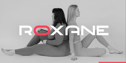 Roxane Display is a Unique Modern Elegant Typeface with Web-fonts. It's a very versatile font that works great in large and small sizes. Roxane Font would perfect for branding, logos, headlines, Captions. or simply as a stylish text overlay to any background image. Strong capitals and a smooth, open lowercase are effective in a variety of applications. It's shown a clean, minimalist, warmth, quirky, yet still purposed to be versatile and easy to read. 4 Weights Included. Free updates and feature additions.
 - Romic SH by Scangraphic Digital Type Collection,
$26.00
- Purely Woman by Sronstudio,
$23.00 Purely Woman - Monoline Font This elegant script font features fluid strokes and delicate serifs that exude sophistication and luxury. Its detailed and precise letters are perfect for adding a touch of refinement to wedding invitations, branding, packaging, and more. With its timeless style and versatility, this font adds a touch of class to any project. Features: Uppercase and lowercase letters Alternates Ligatures Multilingual, numerals, and punctuation Thank You!
 - Blushing Woman by Balpirick,
$15.00 Blushing Woman is a Modern Handwritten Font. Whether you’re using it for crafts, digital design, presentations, or making greeting cards, this font has the potential to become your favorite go-to font, no matter the occasion! - also multilingual support Enjoy the font! Feel free to comment or feedback! Thank you!
 - Letraset Romic by ITC,
$40.99Typeface designer and Letraset type director Colin Brignall created the font Romic. The character of the strokes as well as the serif forms give the font its calligraphic look. The placement of the serifs, on the upper left and lower right of a character, also distinguishes this typeface and allows the figures to be set very close to one another. The dots on the i and j do not hang in the air, rather, they are connected to the rest of the letter with a light, serif-like stroke. The elegant and lively Romic font is legible even in smaller point sizes. It is best used in middle length texts and headlines and wherever an individual and sophisticated image is the goal. - Alpha Romanie Outline G98 - Unknown license

- The Romantic Absolute Duo by Lettersams,
$12.00 The Romantic Absolute Script and Sans are a beautiful and romantic combination of two fonts that have a lot of lovely characters that are very interesting. This font has a beautiful and balanced character, making it suitable for a variety of purposes. such as posters, wedding invitations, logos, product packaging, branding, titles, signs, labels, mugs, book covers, quotes, and others. The Romantic Absolute Script Script features 700+ glyphs covering characters, alternatives and ligatures, including start and end letters, alternates, binders and multiple language support. The Romantic Absolute Sans features 190+ glyphs including binding characters and multiple language support. To access all OpenType Stylistic alternates, you need a program that supports OpenType features such as Adobe Illustrator, Adobe Photoshop, CorelDraw and Microsoft word. This font is PUA encoded which means you can access all glyphs and swashes with ease! Happy designing!
 - Crème de la Rue by Benedict Herr,
$39.00 Crème de la Rue is an urban-art-influenced stencil font. Cut outs and spraying or painting in huge sizes are possible as well as display use for headlines or short paragraphs in mid and large scale. The Stencil cut is available with 246 glyphs, numbers, accents, arrows and ligatures.
 - Narrow Roman Stencil JNL by Jeff Levine,
$29.00 Narrow Roman Stencil JNL was modeled from a vintage brass sign for identification of a ballroom.
 - New Thin Roman JNL by Jeff Levine,
$29.00 The 1912 publication "Essentials of Lettering" has an example of a hand lettered, condensed spurred serif design called "Compressed Roman". This is now available digitally as New Thin Roman JNL in both regular and oblique versions.
 - PB Roman Uncial Vc by Paweł Burgiel,
$32.00 PB Roman Uncial Vc is a font face designed for imitate Roman uncial writing style found in manuscripts from 4th to 5th century. All characters are handwritten by use ink and reed pen (calamus), scanned, digitized and optimized for best quality without lost its handwritten visual appearance. Character set support codepages: 1250 Central (Eastern) European, 1252 Western (ANSI), 1254 Turkish, 1257 Baltic. Include also additional characters for Cornish, Danish, Dutch and Welsh language, spaces (M/1, M/2, M/3, M/4, M/6, thin, hair, zero width space etc.), historical characters (overlined Roman numerals, abbreviations, I-longa, historical ligatures for "nomina sacra" and "notae communes") and wide range of ancient punctuation. OpenType TrueType TTF (.ttf) font file include installed OpenType features: Access All Alternates, Localized Forms, Fractions, Alternative Fractions, Ordinals, Superscript, Tabular Figures, Proportional Figures, Stylistic Alternates, Stylistic Set 1, Historical Forms, Historical Ligatures. Include also kerning as single 'kern' table for maximum possible backwards compatibility with older software. Historical ligatures for "nomina sacra" and "notae communes" are mapped to Private Use Area codepoints.
 - Times New Roman Seven by Monotype,
$67.99In 1931, The Times of London commissioned a new text type design from Stanley Morison and the Monotype Corporation, after Morison had written an article criticizing The Times for being badly printed and typographically behind the times. The new design was supervised by Stanley Morison and drawn by Victor Lardent, an artist from the advertising department of The Times. Morison used an older typeface, Plantin, as the basis for his design, but made revisions for legibility and economy of space (always important concerns for newspapers). As the old type used by the newspaper had been called Times Old Roman," Morison's revision became "Times New Roman." The Times of London debuted the new typeface in October 1932, and after one year the design was released for commercial sale. The Linotype version, called simply "Times," was optimized for line-casting technology, though the differences in the basic design are subtle. The typeface was very successful for the Times of London, which used a higher grade of newsprint than most newspapers. The better, whiter paper enhanced the new typeface's high degree of contrast and sharp serifs, and created a sparkling, modern look. In 1972, Walter Tracy designed Times Europa for The Times of London. This was a sturdier version, and it was needed to hold up to the newest demands of newspaper printing: faster presses and cheaper paper. In the United States, the Times font family has enjoyed popularity as a magazine and book type since the 1940s. Times continues to be very popular around the world because of its versatility and readability. And because it is a standard font on most computers and digital printers, it has become universally familiar as the office workhorse. Times?, Times? Europa, and Times New Roman? are sure bets for proposals, annual reports, office correspondence, magazines, and newspapers. Linotype offers many versions of this font: Times? is the universal version of Times, used formerly as the matrices for the Linotype hot metal line-casting machines. The basic four weights of roman, italic, bold and bold italic are standard fonts on most printers. There are also small caps, Old style Figures, phonetic characters, and Central European characters. Times? Ten is the version specially designed for smaller text (12 point and below); its characters are wider and the hairlines are a little stronger. Times Ten has many weights for Latin typography, as well as several weights for Central European, Cyrillic, and Greek typesetting. Times? Eighteen is the headline version, ideal for point sizes of 18 and larger. The characters are subtly condensed and the hairlines are finer." - Show Card Roman JNL by Jeff Levine,
$29.00 Art Nouveau serif capitals and numerals in the 1917 instructional book “A Roman Alphabet and How to Use It” were the inspiration for Show Card Roman JNL; available in both regular and oblique versions.
 - HWT Roman Extended Fatface by Hamilton Wood Type Collection,
$24.95 The design of the first "Fat Face" is credited to Robert Thorne just after 1800 in England. It is considered to be the first type style designed specifically for display or jobbing, rather than for book work. The first instance of Fat Face in wood type is found in the first wood type specimen book ever produced: Darius Wells, Letter Cutter 1828. This style was produced by all early wood type manufacturers. The style is derived from the high contrast, thick and thin Modern style of Bodoni and Didot developed only decades previously. The extended variation makes the face even more of a display type and not at all suitable for text. This type of display type was used to compete with the new Lithographic process which allowed for the development of the poster as an artform unto itself. This new digitization by Jim Lyles most closely follows the Wm Page cut. The crisp outlines hold up at the largest point sizes you can imagine. This font contains a full CE character set.
 - Roman Wood Type JNL by Jeff Levine,
$29.00 Roman Wood Type JNL is based on a partial set of wood type in the style of Clarendon Condensed that was seen in an online auction.
 - Nimbus Roman No. 9 by URW Type Foundry,
$35.00
- PB Roman Uncial IIc by Paweł Burgiel,
$32.00 PB Roman Uncial IIc is a font face designed for imitate Roman uncial writing style found in manuscripts from 1st to 2nd century. All characters are handwritten by use ink and reed pen (calamus), scanned, digitized and optimized for best quality without lost its handwritten visual appearance. Character set support codepages: 1250 Central (Eastern) European, 1252 Western (ANSI), 1254 Turkish, 1257 Baltic. Include also additional characters for Cornish, Danish, Dutch and Welsh language, spaces (M/1, M/2, M/3, M/4, M/6, thin, hair, zero width space etc.), historical characters (overlined Roman numerals, I-longa, historical ligatures for "nomina sacra" and "notae communes") and wide range of ancient punctuation. OpenType TrueType TTF (.ttf) font file include installed OpenType features: Access All Alternates, Localized Forms, Fractions, Alternative Fractions, Ordinals, Superscript, Tabular Figures, Proportional Figures, Stylistic Alternates, Stylistic Set 1, Historical Forms, Historical Ligatures. Include also kerning as single 'kern' table for maximum possible backwards compatibility with older software. Historical ligatures for "nomina sacra" and "notae communes" are mapped to Private Use Area codepoints.
 - Dual Line Roman JNL by Jeff Levine,
$29.00 Spotted amongst the online page scans from a vintage lettering book, the typeface originally called “Didot Moderne” served as the basis for Dual Line Roman JNL, which is available in both regular and oblique versions. Caps Only Fonts.
 - Times New Roman WGL by Monotype,
$67.99 In 1931, The Times of London commissioned a new text type design from Stanley Morison and the Monotype Corporation, after Morison had written an article criticizing The Times for being badly printed and typographically behind the times. The new design was supervised by Stanley Morison and drawn by Victor Lardent, an artist from the advertising department of The Times. Morison used an older typeface, Plantin, as the basis for his design, but made revisions for legibility and economy of space (always important concerns for newspapers). As the old type used by the newspaper had been called Times Old Roman," Morison's revision became "Times New Roman." The Times of London debuted the new typeface in October 1932, and after one year the design was released for commercial sale. The Linotype version, called simply "Times," was optimized for line-casting technology, though the differences in the basic design are subtle. The typeface was very successful for the Times of London, which used a higher grade of newsprint than most newspapers. The better, whiter paper enhanced the new typeface's high degree of contrast and sharp serifs, and created a sparkling, modern look. In 1972, Walter Tracy designed Times Europa for The Times of London. This was a sturdier version, and it was needed to hold up to the newest demands of newspaper printing: faster presses and cheaper paper. In the United States, the Times font family has enjoyed popularity as a magazine and book type since the 1940s. Times continues to be very popular around the world because of its versatility and readability. And because it is a standard font on most computers and digital printers, it has become universally familiar as the office workhorse. Times?, Times? Europa, and Times New Roman? are sure bets for proposals, annual reports, office correspondence, magazines, and newspapers. Linotype offers many versions of this font: Times? is the universal version of Times, used formerly as the matrices for the Linotype hot metal line-casting machines. The basic four weights of roman, italic, bold and bold italic are standard fonts on most printers. There are also small caps, Old style Figures, phonetic characters, and Central European characters. Times? Ten is the version specially designed for smaller text (12 point and below); its characters are wider and the hairlines are a little stronger. Times Ten has many weights for Latin typography, as well as several weights for Central European, Cyrillic, and Greek typesetting. Times? Eighteen is the headline version, ideal for point sizes of 18 and larger. The characters are subtly condensed and the hairlines are finer."
 - HWT Roman Extended Lightface by Hamilton Wood Type Collection,
$24.95 The Roman alphabet has seen endless variations in interpretations of its classical form, and various wood type styles managed to explore everything from XXX condensed to hyper extended and expanded. This delicate and handsomely proportioned extended Roman was issued by Page Manufacturing Co. in 1872 and released as simply “No. 251” after Page was acquired by Hamilton. It is a rare font to find in print shops, most likely due to the very fine lines that would no doubt be less durable that bolder gothic jobbing fonts. While being quite wide, it still holds the elegant grace of wide Romans such as Craw Modern. This new digitization features a full Western and Eastern European Character set as well as ligatures and alternate characters.
 - Sackers Solid Antique Roman by Monotype,
$29.99Sackers Roman is an engraver, all-capitals family for invitations and stationery. The letters have strong contrast between thin and thick strokes. See also Sackers Gothic, Sackers Square Gothic, Sackers Script, and Sackers Classic Roman. - Johnny The Hook Roman by Letterhead Studio-VV,
$29.99
- Times New Roman PS by Monotype,
$67.99In 1931, The Times of London commissioned a new text type design from Stanley Morison and the Monotype Corporation, after Morison had written an article criticizing The Times for being badly printed and typographically behind the times. The new design was supervised by Stanley Morison and drawn by Victor Lardent, an artist from the advertising department of The Times. Morison used an older typeface, Plantin, as the basis for his design, but made revisions for legibility and economy of space (always important concerns for newspapers). As the old type used by the newspaper had been called Times Old Roman," Morison's revision became "Times New Roman." The Times of London debuted the new typeface in October 1932, and after one year the design was released for commercial sale. The Linotype version, called simply "Times," was optimized for line-casting technology, though the differences in the basic design are subtle. The typeface was very successful for the Times of London, which used a higher grade of newsprint than most newspapers. The better, whiter paper enhanced the new typeface's high degree of contrast and sharp serifs, and created a sparkling, modern look. In 1972, Walter Tracy designed Times Europa for The Times of London. This was a sturdier version, and it was needed to hold up to the newest demands of newspaper printing: faster presses and cheaper paper. In the United States, the Times font family has enjoyed popularity as a magazine and book type since the 1940s. Times continues to be very popular around the world because of its versatility and readability. And because it is a standard font on most computers and digital printers, it has become universally familiar as the office workhorse. Times?, Times? Europa, and Times New Roman? are sure bets for proposals, annual reports, office correspondence, magazines, and newspapers. Linotype offers many versions of this font: Times? is the universal version of Times, used formerly as the matrices for the Linotype hot metal line-casting machines. The basic four weights of roman, italic, bold and bold italic are standard fonts on most printers. There are also small caps, Old style Figures, phonetic characters, and Central European characters. Times? Ten is the version specially designed for smaller text (12 point and below); its characters are wider and the hairlines are a little stronger. Times Ten has many weights for Latin typography, as well as several weights for Central European, Cyrillic, and Greek typesetting. Times? Eighteen is the headline version, ideal for point sizes of 18 and larger. The characters are subtly condensed and the hairlines are finer." - Loo Snoo Roman NF by Nick's Fonts,
$10.00Here's a fresh version of an old favorite, Loose New Roman, from the Schaedler Studio of New York. Easy, breezy and carefree, it's a natural for happy headlines. Both versions of the font contain the complete Unicode Latin 1252 and Central European 1250 character sets. - Romantis Natalies Duo by Rastype Studio,
$12.00 Romantis Natalies Script and Sans are beautiful and romantic writing fonts. Looks amazing on wedding invitations, thank you cards, quotes, greeting cards, logos, business cards and any other design. This font is PUA encoded which means you can access all glyphs and swashes with ease! The font includes OpenType features with alternative styles, ligatures, and multiple language support.
 - BAHAMAS TWO PERSONAL USE - Personal use only

- MTT Roma by MTT Type Firm,
$39.99 MTT Roma is designed to re-create the atmosphere of the city of Rome of the 21st century. The studio for the letterform evolved from the Trajan Column alphabet. Suitable for both display and body-text usage, stylistically MTT Roma aims to distance itself from the proliferation of geometric sans-serif families of its time. The result is a sharp, subtly humanist typeface inspired by modern day Rome, the city of contrasts and eternal beauty. Featuring an extended character set to support Central and Eastern European as well as Western European languages, the typeface comes with six weights – from thin to black — with matching italics.
 - Bodoni Roma by BA Graphics,
$45.00An elegant take on Bodoni, with its subtle flared serifs that give it a very beautiful distinguished look. - Roma Invicta by Maulana Creative,
$13.00 Roma Invicta Font Give your designs an authentic handcrafted feel. "Roma Invicta Font" is perfectly suited to signature, stationery, logo, typography quotes, magazine or book cover, website header, clothing, branding, packaging design and more. Thanks for use this font ~ Maulana
 - KR Woman Oh! - Unknown license

- Neue Reman Gt by Propertype,
$49.00 Neue Reman Grotesk It has 70 font styles in total family + 1 Variable. This typeface is designed to be used very practically. Each style can be changed easily. Has a variety of alternative letters that can be selected to make typography designs more attractive. The family comes in 7 weights with matching italics + Variable Font File and includes multilingual latin pro characters. 1. Extra Light - Condensed - Expanded - Slanted Italic 2. Light - Condensed - Expanded - Slanted Italic 3. Regular - Condensed - Expanded - Slanted Italic 4. Medium - Condensed - Expanded - Slanted Italic 5. Semi Bold - Condensed - Expanded - Slanted Italic 6. Bold - Condensed - Expanded - Slanted Italic 7. Heavy - Condensed - Expanded - Slanted Italic Neue Reman Grotesk contains 750 glyphs, a Latin Pro Fonts. This is the second version of Neue Reman Family. Complete with Stylistic Alternates, Stylistic Set, Caps Swashes Letter, Standard Ligatures, Discretionary Ligatures, Tabular Figures, Proportional Figures, Superscript, Subscript, Scientific Inferiors, Fractions, Ordinals, Arrows and a variety of figures and fractions. Neue Reman typeface suitable to use in multipurpose projects such as on websites, systems, printing, embedding, servers, screens, display, digital-ads, branding, logos, titles, headlines, teks, and everything else. Need something else? Get in touch with us on propertype.foundry@gmail.com Thank you
 - Rowan Oak NF by Nick's Fonts,
$10.00This “very elegant and British alphabet” was originally released in the 1920s as "Richmond Oldstyle" by the Blackfriars Type Foundry of London. Touted as highly artistic and graceful, it is exceptionally “at home” wherever style and charm are called for. Both versions of this font contain the complete Unicode Latin A character complement, with support for the Afrikaans, Albanian, Basque, Bosnian, Breton, Catalan, Croatian, Czech, Danish, Dutch, English, Esperanto, Estonian, Faroese, Fijian, Finnish, Flemish, French, Frisian, German, Greenlandic, Hawaiian, Hungarian, Icelandic, Indonesian, Irish, Italian, Latin, Latvian, Lithuanian, Malay, Maltese, Maori, Moldavan, Norwegian, Polish, Portuguese, Provençal, Rhaeto-Romanic, Romanian, Romany, Sámi, Samoan, Scottish Gaelic, Serbian, Slovak, Slovenian, Spanish, Swahili, Swedish, Tagalog, Turkish and Welsh languages, as well as discretionary ligatures and extended fractions. - Neue Reman Sans by Propertype,
$45.00 Neue Reman Sans 1.0 --- New Update! CONDENSED - SEMI CONDENSED - SEMI EXPANDED - EXPANDED It has 70 fonts style in total family + 2 Variable Style. --- It is a Roman, Humanist, Grotesk and Geometri sans serif family. The family comes in 7 weights with matching italics + Variable Font File and includes multilingual latin characters. Neue Reman Sans contains 306 glyphs - this is the first version of Neue Reman Family with standard ligatures and a variety of figures and fractions. We create Neue Reman typeface to use in multipurpose project such as on website, systems, printing, embedding, servers, screens, display, digital-ads, branding, logos, titles, headlines, teks, and everything else. This font is a project that we are working on for the long term. We has updating the Condensed and Expanded versions. Then we plan to continue working on Latin Pro, Greek and Cyrillic. It all will be updated gradually. So, hope you would like the first version of Neue Reman Sans Serif Typeface. Thank you very much.
 - Times New Roman PS Cyrillic by Monotype,
$67.99In 1931, The Times of London commissioned a new text type design from Stanley Morison and the Monotype Corporation, after Morison had written an article criticizing The Times for being badly printed and typographically behind the times. The new design was supervised by Stanley Morison and drawn by Victor Lardent, an artist from the advertising department of The Times. Morison used an older typeface, Plantin, as the basis for his design, but made revisions for legibility and economy of space (always important concerns for newspapers). As the old type used by the newspaper had been called Times Old Roman," Morison's revision became "Times New Roman." The Times of London debuted the new typeface in October 1932, and after one year the design was released for commercial sale. The Linotype version, called simply "Times," was optimized for line-casting technology, though the differences in the basic design are subtle. The typeface was very successful for the Times of London, which used a higher grade of newsprint than most newspapers. The better, whiter paper enhanced the new typeface's high degree of contrast and sharp serifs, and created a sparkling, modern look. In 1972, Walter Tracy designed Times Europa for The Times of London. This was a sturdier version, and it was needed to hold up to the newest demands of newspaper printing: faster presses and cheaper paper. In the United States, the Times font family has enjoyed popularity as a magazine and book type since the 1940s. Times continues to be very popular around the world because of its versatility and readability. And because it is a standard font on most computers and digital printers, it has become universally familiar as the office workhorse. Times?, Times? Europa, and Times New Roman? are sure bets for proposals, annual reports, office correspondence, magazines, and newspapers. Linotype offers many versions of this font: Times? is the universal version of Times, used formerly as the matrices for the Linotype hot metal line-casting machines. The basic four weights of roman, italic, bold and bold italic are standard fonts on most printers. There are also small caps, Old style Figures, phonetic characters, and Central European characters. Times? Ten is the version specially designed for smaller text (12 point and below); its characters are wider and the hairlines are a little stronger. Times Ten has many weights for Latin typography, as well as several weights for Central European, Cyrillic, and Greek typesetting. Times? Eighteen is the headline version, ideal for point sizes of 18 and larger. The characters are subtly condensed and the hairlines are finer." - Times New Roman Small Text by Monotype,
$67.99In 1931, The Times of London commissioned a new text type design from Stanley Morison and the Monotype Corporation, after Morison had written an article criticizing The Times for being badly printed and typographically behind the times. The new design was supervised by Stanley Morison and drawn by Victor Lardent, an artist from the advertising department of The Times. Morison used an older typeface, Plantin, as the basis for his design, but made revisions for legibility and economy of space (always important concerns for newspapers). As the old type used by the newspaper had been called Times Old Roman," Morison's revision became "Times New Roman." The Times of London debuted the new typeface in October 1932, and after one year the design was released for commercial sale. The Linotype version, called simply "Times," was optimized for line-casting technology, though the differences in the basic design are subtle. The typeface was very successful for the Times of London, which used a higher grade of newsprint than most newspapers. The better, whiter paper enhanced the new typeface's high degree of contrast and sharp serifs, and created a sparkling, modern look. In 1972, Walter Tracy designed Times Europa for The Times of London. This was a sturdier version, and it was needed to hold up to the newest demands of newspaper printing: faster presses and cheaper paper. In the United States, the Times font family has enjoyed popularity as a magazine and book type since the 1940s. Times continues to be very popular around the world because of its versatility and readability. And because it is a standard font on most computers and digital printers, it has become universally familiar as the office workhorse. Times?, Times? Europa, and Times New Roman? are sure bets for proposals, annual reports, office correspondence, magazines, and newspapers. Linotype offers many versions of this font: Times? is the universal version of Times, used formerly as the matrices for the Linotype hot metal line-casting machines. The basic four weights of roman, italic, bold and bold italic are standard fonts on most printers. There are also small caps, Old style Figures, phonetic characters, and Central European characters. Times? Ten is the version specially designed for smaller text (12 point and below); its characters are wider and the hairlines are a little stronger. Times Ten has many weights for Latin typography, as well as several weights for Central European, Cyrillic, and Greek typesetting. Times? Eighteen is the headline version, ideal for point sizes of 18 and larger. The characters are subtly condensed and the hairlines are finer." - Times New Roman Windows compatible by Monotype,In 1931, The Times of London commissioned a new text type design from Stanley Morison and the Monotype Corporation, after Morison had written an article criticizing The Times for being badly printed and typographically behind the times. The new design was supervised by Stanley Morison and drawn by Victor Lardent, an artist from the advertising department of The Times. Morison used an older typeface, Plantin, as the basis for his design, but made revisions for legibility and economy of space (always important concerns for newspapers). As the old type used by the newspaper had been called Times Old Roman," Morison's revision became "Times New Roman." The Times of London debuted the new typeface in October 1932, and after one year the design was released for commercial sale. The Times New Roman World Version is an extension of the original Times New Roman with several other scripts like with the Helvetica World fonts. It is part of the Windows Vista system. The following code pages are supported:1250 Latin 2: Eastern European 1251 Cyrillic 1253 Greek 1254 Turkish 1255 Hebrew 1256 Arabic Note: The Roman and Bold versions include the arabic scripts but they are not part in the corresponding italic versions. 1257 Windows Baltic 1258 Windows Vietnamese
- Nimbus Roman No. 9 L by URW Type Foundry,
$89.99 - Times New Roman PS Greek by Monotype,
$67.99In 1931, The Times of London commissioned a new text type design from Stanley Morison and the Monotype Corporation, after Morison had written an article criticizing The Times for being badly printed and typographically behind the times. The new design was supervised by Stanley Morison and drawn by Victor Lardent, an artist from the advertising department of The Times. Morison used an older typeface, Plantin, as the basis for his design, but made revisions for legibility and economy of space (always important concerns for newspapers). As the old type used by the newspaper had been called Times Old Roman," Morison's revision became "Times New Roman." The Times of London debuted the new typeface in October 1932, and after one year the design was released for commercial sale. The Linotype version, called simply "Times," was optimized for line-casting technology, though the differences in the basic design are subtle. The typeface was very successful for the Times of London, which used a higher grade of newsprint than most newspapers. The better, whiter paper enhanced the new typeface's high degree of contrast and sharp serifs, and created a sparkling, modern look. In 1972, Walter Tracy designed Times Europa for The Times of London. This was a sturdier version, and it was needed to hold up to the newest demands of newspaper printing: faster presses and cheaper paper. In the United States, the Times font family has enjoyed popularity as a magazine and book type since the 1940s. Times continues to be very popular around the world because of its versatility and readability. And because it is a standard font on most computers and digital printers, it has become universally familiar as the office workhorse. Times?, Times? Europa, and Times New Roman? are sure bets for proposals, annual reports, office correspondence, magazines, and newspapers. Linotype offers many versions of this font: Times? is the universal version of Times, used formerly as the matrices for the Linotype hot metal line-casting machines. The basic four weights of roman, italic, bold and bold italic are standard fonts on most printers. There are also small caps, Old style Figures, phonetic characters, and Central European characters. Times? Ten is the version specially designed for smaller text (12 point and below); its characters are wider and the hairlines are a little stronger. Times Ten has many weights for Latin typography, as well as several weights for Central European, Cyrillic, and Greek typesetting. Times? Eighteen is the headline version, ideal for point sizes of 18 and larger. The characters are subtly condensed and the hairlines are finer."


