5,498 search results
(0.021 seconds)
- Rodia by Monotype,
$25.00 Rodia is an Oddball Geometric Sans Typeface consisting of nine weights in both roman and oblique. It’s a geometric sans with a twist that’s perfect for branding and identity projects – it will also give your body text a unique voice. Inspiration came from the iconic “RADIO” signage that was once in place at 5041, Pico Boulevard, Los Angeles in 1985 (documented at https://tinyurl.com/y2krt2ox). With its distinctive leg, the /R/ provides a personality trait to define the style of the character set. You can clearly see how this characteristic separates Rodia from other geometric sans families – the /k/v/w/x/y/K/R/V/W/X/Y/ glyphs all display the distinctive ‘feet’ and ‘hands’ as terminals to legs and arms. Then there is the /A/ with its triangular crossbar – this triangular motif has been used to embellish alternates in Stylistic Set 1 for /A/E/F/G/H/Q/S/ glyphs. These will add another layer of versatility for your typographic projects. Rodia features an extensive character set covering all Latin European languages. Key features: 9 weights in Roman and Oblique Full European character set (Latin only) 400+ glyphs per font.
 - View Slant Black ExtExp - Personal use only

- Gill Sans Nova by Monotype,
$61.99 The Gill Sans® Nova typeface, by Monotype Studio designer George Ryan, expands the much-loved Gill Sans family from 18 to 43 fonts and features a coordinated range of roman and condensed designs. Several new display fonts are available, including a suite of six inline weights, shadowed outline fonts that were never digitized and Gill Sans Nova Deco that was previously withdrawn from the Monotype library. A variety of OpenType® features are supported that make it possible to include experimental characters from different points in Gill Sans’s long history, including pointed diagonals on ‘A’, ‘V’ and ‘W’ and alternatives for ‘b’, ‘d’, ‘p’ and ‘q.’ Proportional figures are also available as an alternative to the tabular designs. The Gill Sans Nova family has a large character set that supports Latin, Greek and Cyrillic languages. The display weights support Latin only. “Gill Sans was fast to strike a chord with people after its initial 1928 release and quickly became popular,” explains Ryan. “It’s been adapted for every publishing technology, from mechanical typesetting to digital imaging – always receiving the best treatment from Monotype in each iteration. This is especially true with all that we’ve added to the new series, while still retaining the familiarity of Gill Sans. My goal was to ensure clarity across digital environments, add missing weights, and bring more personality to the family with new display fonts, as well as Gill-inspired alternate characters.” The Gill Sans Nova typeface family is part of the new Eric Gill Series, drawing on Monotype's heritage to remaster and expand and revitalize Eric Gill’s body of work, with more weights, more characters and more languages to meet a wide range of design requirements. The Series also brings to life new elements inspired by some of Gill’s unreleased work, recently discovered in Monotype’s archive of original typeface drawings, designer correspondence and documents from the last century.
 - Malik by Zetafonts,
$39.00 Taking its name from the arabic word for "king", Malik is a flared sans serif typeface family designed in 2020 by Andrea Tartarelli. The designer wanted to find a way to bridge the classical letterforms of Roman Old Style typefaces with the readability of contemporary sans typefaces. This was achieved by using the so-called flared serif that emerges gradually from the stem of the letter, ending in a sharp angle. It's something that also reminds of the peculiar shapes of the Simoncini Method, invented by italian type designer Francesco Simoncini to get a sharper definition of letterforms. To this blend of classical elegance and modernist expertise, Malik adds the calligraphic influence of modern masters like Frederic Goudy or Ed Benguiat, visible in signature details like the reverse contrast uppercase B, or the calligraphic lowercase k. Malik also means "owner", and this font surely wants to rule the page. It manages to be extremely readable when used in body text size, but looks surprising and expressive in display use. The inclusion of the Malik Heavy Display weight, with its black texture balanced by deep inktraps, allows for striking logo design. The weight range of the family is extremely wide, including a Book alternative to the Regular weight for fine-tuning readability, a range of light display weights and a solid choice of bold weights for branding, all coming with matching true italics. The 16 cuts of Malik have been equipped with all the features you need to solve your editorial and design challenges, including a wide language coverage (thanks to over one thousand latin and cyrillic characters) and a complete set of open type features (including small capitals, positional numbers, case sensitive forms). Alternate characters and stylistic sets allow you to fine-tune your editorial and branding design by choosing variant letter shapes. Malik is the typeface for everyone who wants to design like a king...or like he doesn't care who the king is!
 - Fleur by Lián Types,
$39.00 La vie est une fleur dont l'amour est le miel Fleur is the French for flower and I've chosen this language for a good reason. Over the past 5 years, I've had the opportunity to travel a lot to Paris and I've always tried to catch every moment and detail of this delightful city through the eyes of the designer inside me. Paris is full of surprises, mainly for us, artists. In fact, I believe the city is a museum itself. Every corner of any street has something inspiring. But, there’s something I particularly love and I want to address here: The Palais Garnier. Built between 1861 and 1875, this opera house is a dream made true for many of us, who love somptuosité. Garnier, the architect of this magnificent building, said that the style he proposed was not Grecian nor Roman/baroque, he created something new and called it Napoleonic: Luxurious at its best. Fleur is inspired in this palace which, in fact, has some similar letters inside. Garnier put his name at the ceiling of the Rotonde des Abonnés: Letters are interlacing each other with nicely done art nouveau curves. I thought I could take this idea and achieve something very delicate and imposing at the same time if the font consisted entirely of caps with the logic of a didone and a bit of art-nouveau. This mix of elegance and flamboyance gave birth to Fleur which has a wide range of uses but was mainly intended for perfumes, fashion magazines, storefronts, book covers or logos. Not only you'll find many decorative glyphs, but also a vast amount of unique ligatures will make you really adore this font. Get Fleur and profite de la vie TECHNICAL As suggested above, the font has many open-type coded alternates and a vast amount of unique ligatures. Install the font in applications that support them, like Adobe Illustrator or Photoshop.
 - Avenir Next by Linotype,
$97.99 Avenir Next Pro is a new take on a classic face—it’s the result of a project whose goal was to take a beautifully designed sans and update it so that its technical standards surpass the status quo, leaving us with a truly superior sans family. This family is not only an update though, in fact it is the expansion of the original concept that takes the Avenir Next design to the next level. In addition to the standard styles ranging from UltraLight to Heavy, this 32-font collection offers condensed faces that rival any other sans on the market in on and off—screen readability at any size alongside heavy weights that would make excellent display faces in their own right and have the ability to pair well with so many contemporary serif body types. Overall, the family’s design is clean, straightforward and works brilliantly for blocks of copy and headlines alike. Akira Kobayashi worked alongside Avenir’s esteemed creator Adrian Frutiger to bring Avenir Next Pro to life. It was Akira’s ability to bring his own finesse and ideas for expansion into the project while remaining true to Frutiger’s original intent, that makes this not just a modern typeface, but one ahead of its time. Complete your designs with these perfect pairings: Dante™, Joanna® Nova, Kairos™, Menhart™, Soho® and ITC New Veljovic®. Avenir Next Variables are font files which are featuring two axis, weight and width. They have a preset instance from UltraLight to Heavy and Condensed to Roman width. The preset instances are: Condensed UltraLight, Condensed UltraLight Italic, Condensed Thin, Condensed Thin Italic, Condensed Light, Condensed Light Italic, Condensed, Condensed Italic, Condensed Demi, Condensed Demi Italic, Condensed Medium, Condensed Medium Italic, Condensed Bold, Condensed Bold Italic, Condensed Heavy, Condensed Heavy Italic, UltraLight, UltraLight Italic, Thin, Thin Italic, Light, Light Italic, Regular, Italic, Demi, Demi Italic, Medium, Medium Italic, Bold, Bold Italic, Heavy, Heavy Italic. Featured in: Best Fonts for PowerPoints
 - P22 Tyndale by IHOF,
$24.95Quill-formed roman/gothic with an olde-worlde flavor. Some background in the designer's own words: "A series of fonts came to mind which would be rooted in the medieval era -for me, a period of intense interest. Prior to Gutenberg's development of commercial printing with type on paper in the mid-1400s, books were still being written out by hand, on vellum. At that time, a Bible cost more than a common workman could hope to earn in his entire lifetime. Men like William Tyndale devoted their energies to translating the Scriptures for the benefit of ordinary people in their own language, and were burned to death at the stake for doing so. Those in authority correctly recognized a terminal threat to the fabric of feudal society, which revolved around the church. "This religious metamorphosis was reflected in letterforms: which, like buildings, reflect the mood of the period in which they take shape. The medieval era produced the Gothic cathedrals; their strong vertical emphasis was expressive of the vertical relationship then existing between man and God. The rich tracery to be seen in the interstices and vaulted ceilings typified the complex social dynamics of feudalism. Parallels could be clearly seen in Gothic type, with its vertical strokes and decorated capitals. Taken as a whole, Gothicism represented a mystical approach to life, filled with symbolism and imagery. To the common man, letters and words were like other sacred icons: too high for his own understanding, but belonging to God, and worthy of respect. "Roman type, soon adopted in preference to Gothic by contemporary printer-publishers (whose primary market was the scholarly class) represented a more democratic, urbane approach to life, where the words were merely the vehicle for the idea, and letters merely a necessary convenience for making words. The common man could read, consider and debate what was printed, without having the least reverence for the image. In fact, the less the medium interfered with the message, the better. The most successful typefaces were like the Roman legions of old; machine-like in their ordered functionality and anonymity. Meanwhile, Gutenberg's Gothic letterform, in which the greatest technological revolution of history had first been clothed, soon became relegated to a Germanic anachronism, limited to a declining sphere of influence. "An interesting Bible in my possession dating from 1610 perfectly illustrates this duality of function and form. The text is set in Gothic black-letter type, while the side-notes appear in Roman. Thus the complex pattern of the text retains the mystical, sacred quality of the hand-scripted manuscript (often rendered in Latin, which a cleric would read aloud to others), while the clear, open side-notes are designed to supplement a personal Bible study. "Tyndale is one of a series of fonts in process which explore the transition between Gothic and Roman forms. The hybrid letters have more of the idiosyncrasies of the pen (and thus, the human hand) about them, rather than the anonymity imbued by the engraving machine. They are an attempt to achieve the mystery and wonder of the Gothic era while retaining the legibility and clarity best revealed in the Roman form. "Reformers such as Tyndale were consumed with a passion to make the gospel available and understood to the masses of pilgrims who, in search of a religious experience, thronged into the soaring, gilded cathedrals. Centuries later, our need for communion with God remains the same, in spite of all our technology and sophistication. How can our finite minds, our human logic, comprehend the transcendent mystery of God's great sacrifice, his love beyond understanding? Tyndale suffered martyrdom that the Bible, through the medium of printing, might be brought to our hands, our hearts and our minds. It is a privilege for me to dedicate my typeface in his memory." - Kaligrafia Galana by Lián Types,
$14.95 Intended mainly for invitations, Galana is available in 4 styles: Uno, Dos, Tres, and Alt. The first three styles use the Open-Type ligature function for a better legibility. Alt style was thought for those who love swashes and flourishes. Galana was designed to look elegant and sentimental, each glyph being unique and hard to forget.
 - Capsa by DSType,
$26.00Capsa is a typeface designed for use in books. Although inspired by Gros Romain Ordinaire and Saint Augustin Gros Oeil from the Type Specimens of Claude Lamesle, this typeface does not intend to be a revival or an interpretation. The Vignettes and Patterns provide a very classic yet contemporary look to the design. - Ceriburn by Typeskets,
$18.00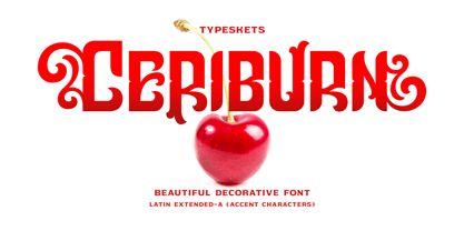 Ceriburn is inspired by the sweetness and richness of cherries. It easily evokes impressions of nature, elegance, and romanticism. You can use this stunning decorative font for logos, packaging, business cards, crafts, books, labels, headlines, invitations, print templates, and a multitude of other design ideas! Letter, Number & Punctuation, Accent Characters, Alternates Features.
 - Cordelia by PintassilgoPrints,
$20.00 Impacting and vibrant, Cordelia family draws inspiration from covers of 'cordel literature’, small booklets of popular story-poems that played an essential role on the folk-popular cultural life of Brazil. Printed in coarse paper, usually with an woodcut illustration and lettering in the front, these booklets were sold on the streets, in marketplaces and town squares, hung in a cord - therefore the name ‘cordel’. The work of these humble printers and poet-singers of northeastern Brazil strongly served as source for acclaimed romances and movies and still inspires writers of all genres, movie makers, painters, musicians. And type designers too :) Cordelia doesn’t bring a picture font yet, but it goes pretty well with Chronic and Manicuore illustrations. It goes well with and without them. It definitely goes well. You bet!
 - Quiroh by Hashtag Type,
$32.00 Quiroh is a functional typeface that expresses both artistic life and emotion. Taking its inspiration from the industrial revolution of the 19th Century where romance and science coincided. With a cushioned finish and designed according to traditional conventions, the sentiment is equally as important as the reason, resulting in a very pleasurable read. Quiroh includes both heavy display weights and lighter weights for small copy, it's a perfect tool for communicating to the masses. Tall ascenders and descenders give the typeface a distinctive look with an elegant feel, and while these expressive forms invite the reader to observe its visible shape and appearance, its rhythm and function invites the reader to peruse at their leisure. Full details include 7 weights from thin to heavy with over 470 characters, manually edited kerning and OpenType features.
 - Loving Ambros by Say Studio,
$15.00 Introducing Loving Ambros - Luxury Typeface Loving Ambros typeface is a Luxury beautiful typeface and inspiring mix of classic calligraphy with 50 unique alternates and 69 unique ligatures. come with 2 versions regular & italic. Loving Ambros is made mainly for headlines, titles, and other short texts and is well-suited for advertising, vintage mood board, branding, logotypes, packaging, titles, editorial design, modern logos, websites, social media quotes, wedding branding, modern and vintage design. These a fonts are perfect for designs with the concept of elegant, luxury, romance, fashion and so on. What you get: Accessible in the Adobe Illustrator, Adobe Photoshop, Coreldraw, even work on Microsoft Word. PUA Encoded Characters – Fully accessible Fonts include multilingual support. If you need a custom license or have questions, please email to: romandpio3793@gmail.com
 - TT Slabs by TypeType,
$29.00 TT Slabs update 1.110 What’s new: Case Sensitive Forms Tabular Figures Fractions Numerators Denominators Superiors Scientific Inferiors TT Slabs useful links: Customization options | Instagram | Facebook | Website About TT Slabs: World needs a beautiful, simple and high-quality fonts. We need simple and geometric fonts. Slab is a form of serifs, which gave its name to the font family. If you are looking for a versatile font with wide proportions for your projects—TT Slabs will suit you perfectly. Optimized for the websites, mobile applications, and printing materials. We offer you to have a look at this font’s narrow version—TT Slabs Condensed. TT Slabs language support: Acehnese, Afar, Albanian, Alsatian, Aragonese, Arumanian, Asu, Aymara, Banjar, Basque, Belarusian (cyr), Bemba, Bena, Betawi, Bislama, Boholano, Bosnian (cyr), Bosnian (lat), Breton, Bulgarian (cyr), Cebuano, Chamorro, Chiga, Colognian, Cornish, Corsican, Cree, Croatian, Czech, Danish, Embu, English, Erzya, Estonian, Faroese, Fijian, Filipino, Finnish, French, Friulian, Gaelic, Gagauz (lat), Galician, German, Gusii, Haitian Creole, Hawaiian, Hiri Motu, Hungarian, Icelandic, Ilocano, Indonesian, Innu-aimun, Interlingua, Irish, Italian, Javanese, Judaeo-Spanish, Judaeo-Spanish, Kalenjin, Karachay-Balkar (lat), Karaim (lat), Karakalpak (lat), Kashubian, Khasi, Khvarshi, Kinyarwanda, Kirundi, Kongo, Kumyk, Kurdish (lat), Ladin, Latvian, Laz, Leonese, Lithuanian, Luganda, Luo, Luxembourgish, Luyia, Macedonian, Machame, Makhuwa-Meetto, Makonde, Malay, Manx, Maori, Mauritian Creole, Minangkabau, Montenegrin (lat), Mordvin-moksha, Morisyen, Nahuatl, Nauruan, Ndebele, Nias, Nogai, Norwegian, Nyankole, Occitan, Oromo, Palauan, Polish, Portuguese, Quechua, Rheto-Romance, Rohingya, Romansh, Rombo, Rundi, Russian, Rusyn, Rwa, Salar, Samburu, Samoan, Sango, Sangu, Scots, Sena, Serbian (cyr), Serbian (lat), Seychellois Creole, Shambala, Shona, Slovak, Slovenian, Soga, Somali, Sorbian, Sotho, Spanish, Sundanese, Swahili, Swazi, Swedish, Swiss German, Swiss German, Tagalog, Tahitian, Taita, Tatar, Tetum, Tok Pisin, Tongan, Tsonga, Tswana, Turkish, Turkmen (lat), Ukrainian, Uyghur, Vepsian, Volapük, Võro, Vunjo, Xhosa, Zaza, Zulu.
 - TT Corals by TypeType,
$29.00 TT Corals useful links: Graphic presentation | Customization options TT Corals is a modern humanist sans-serif which has many typical traits of the beginning of the 20th century. For increased functionality, we created 6 styles of various weights: thin, light, regular, bold, extrabold and black. Its distinctive smooth lines and separate elements allow TT Corals to be used for a variety of design applications. It fits classical literature or music perfectly, and is appropriate for any creative or innovative content. TT Corals inspires new ideas for your creativity and art with its freshness and novelty. FOLLOW US: Instagram | Facebook | Website TT Corals language support: Acehnese, Afar, Albanian, Alsatian, Aragonese, Arumanian, Asu, Aymara, Banjar, Basque, Belarusian (cyr), Bemba, Bena, Betawi, Bislama, Boholano, Bosnian (cyr), Bosnian (lat), Breton, Bulgarian (cyr), Cebuano, Chamorro, Chiga, Colognian, Cornish, Corsican, Cree, Croatian, Czech, Danish, Embu, English, Erzya, Estonian, Faroese, Fijian, Filipino, Finnish, French, Friulian, Gaelic, Gagauz (lat), Galician, German, Gusii, Haitian Creole, Hawaiian, Hiri Motu, Hungarian, Icelandic, Ilocano, Indonesian, Innu-aimun, Interlingua, Irish, Italian, Javanese, Judaeo-Spanish, Judaeo-Spanish, Kalenjin, Karachay-Balkar (lat), Karaim (lat), Karakalpak (lat), Kashubian, Khasi, Khvarshi, Kinyarwanda, Kirundi, Kongo, Kumyk, Kurdish (lat), Ladin, Latvian, Laz, Leonese, Lithuanian, Luganda, Luo, Luxembourgish, Luyia, Macedonian, Machame, Makhuwa-Meetto, Makonde, Malay, Manx, Maori, Mauritian Creole, Minangkabau, Moldavian (lat), Montenegrin (lat), Mordvin-moksha, Morisyen, Nahuatl, Nauruan, Ndebele, Nias, Nogai, Norwegian, Nyankole, Occitan, Oromo, Palauan, Polish, Portuguese, Quechua, Rheto-Romance, Rohingya, Romanian, Romansh, Rombo, Rundi, Russian, Rusyn, Rwa, Salar, Samburu, Samoan, Sango, Sangu, Scots, Sena, Serbian (cyr), Serbian (lat), Seychellois Creole, Shambala, Shona, Slovak, Slovenian, Soga, Somali, Sorbian, Sotho, Spanish, Sundanese, Swahili, Swazi, Swedish, Swiss German, Swiss German, Tagalog, Tahitian, Taita, Tatar, Tetum, Tok Pisin, Tongan, Tsonga, Tswana, Turkish, Turkmen (lat), Ukrainian, Uyghur, Vepsian, Volapük, Võro, Vunjo, Xhosa, Zaza, Zulu.
 - TT Drugs by TypeType,
$29.00 TT Drugs useful links: Graphic presentation | Customization options Font family TT Drugs—fonts that are specifically designed for the pharmaceutical industry and for household chemicals. Then to make a text layout for package of any medicine, toothpaste or laundry detergent? The answer is—Drugs. Font family has a range from thin to black font and can be used on any surface: paper, cardboard, metal, glass and others. We offer you to have a look at this font’s narrow version—TT Drugs Condensed. FOLLOW US: Instagram | Facebook | Website TT Drugs OpenType features: Case Sensitive Forms, Tabular Figures, Fractions, Numerators, Denominators, Superiors, Scientific Inferiors. TT Drugs language support: Acehnese, Afar, Albanian, Alsatian, Aragonese, Arumanian, Asu, Aymara, Banjar, Basque, Belarusian (cyr), Bemba, Bena, Betawi, Bislama, Boholano, Bosnian (cyr), Bosnian (lat), Breton, Bulgarian (cyr), Cebuano, Chamorro, Chiga, Colognian, Cornish, Corsican, Cree, Croatian, Czech, Danish, Embu, English, Erzya, Estonian, Faroese, Fijian, Filipino, Finnish, French, Friulian, Gaelic, Gagauz (lat), Galician, German, Gusii, Haitian Creole, Hawaiian, Hiri Motu, Hungarian, Icelandic, Ilocano, Indonesian, Innu-aimun, Interlingua, Irish, Italian, Javanese, Judaeo-Spanish, Judaeo-Spanish, Kalenjin, Karachay-Balkar (lat), Karaim (lat), Karakalpak (lat), Kashubian, Khasi, Khvarshi, Kinyarwanda, Kirundi, Kongo, Kumyk, Kurdish (lat), Ladin, Latvian, Laz, Leonese, Lithuanian, Luganda, Luo, Luxembourgish, Luyia, Macedonian, Machame, Makhuwa-Meetto, Makonde, Malay, Manx, Maori, Mauritian Creole, Minangkabau, Montenegrin (lat), Mordvin-moksha, Morisyen, Nahuatl, Nauruan, Ndebele, Nias, Nogai, Norwegian, Nyankole, Occitan, Oromo, Palauan, Polish, Portuguese, Quechua, Rheto-Romance, Rohingya, Romansh, Rombo, Rundi, Russian, Rusyn, Rwa, Salar, Samburu, Samoan, Sango, Sangu, Scots, Sena, Serbian (cyr), Serbian (lat), Seychellois Creole, Shambala, Shona, Slovak, Slovenian, Soga, Somali, Sorbian, Sotho, Spanish, Sundanese, Swahili, Swazi, Swedish, Swiss German, Swiss German, Tagalog, Tahitian, Taita, Tatar, Tetum, Tok Pisin, Tongan, Tsonga, Tswana, Turkish, Turkmen (lat), Ukrainian, Uyghur, Vepsian, Volapük, Võro, Vunjo, Xhosa, Zaza, Zulu.
 - TT Drugs Condensed by TypeType,
$29.00 TT Drugs useful links: Graphic presentation | Customization options TT Drugs Condensed—a modern font family which consists of 5 condensed sans serifs with a special contrast formula of lines and stems. TT Drugs Condensed is a condensed version of the TT Drugs font family. These fonts are perfect for design in the pharmaceutical industry: packaging, posters, blissery. However, those fonts can also be used in any other design, for example, in printing, logotypes and websites. Font family includes 10 most popular typefaces: thin, light, regular, bold, black and 5 appropriate italics. TT Drugs Condensed—a versatile tool for any design tasks. FOLLOW US: Instagram | Facebook | Website TT Drugs OpenType features: Case Sensitive Forms, Tabular Figures, Fractions, Numerators, Denominators, Superiors, Scientific Inferiors. TT Drugs language support: Acehnese, Afar, Albanian, Alsatian, Aragonese, Arumanian, Asu, Aymara, Banjar, Basque, Belarusian (cyr), Bemba, Bena, Betawi, Bislama, Boholano, Bosnian (cyr), Bosnian (lat), Breton, Bulgarian (cyr), Cebuano, Chamorro, Chiga, Colognian, Cornish, Corsican, Cree, Croatian, Czech, Danish, Embu, English, Erzya, Estonian, Faroese, Fijian, Filipino, Finnish, French, Friulian, Gaelic, Gagauz (lat), Galician, German, Gusii, Haitian Creole, Hawaiian, Hiri Motu, Hungarian, Icelandic, Ilocano, Indonesian, Innu-aimun, Interlingua, Irish, Italian, Javanese, Judaeo-Spanish, Judaeo-Spanish, Kalenjin, Karachay-Balkar (lat), Karaim (lat), Karakalpak (lat), Kashubian, Khasi, Khvarshi, Kinyarwanda, Kirundi, Kongo, Kumyk, Kurdish (lat), Ladin, Latvian, Laz, Leonese, Lithuanian, Luganda, Luo, Luxembourgish, Luyia, Macedonian, Machame, Makhuwa-Meetto, Makonde, Malay, Manx, Maori, Mauritian Creole, Minangkabau, Montenegrin (lat), Mordvin-moksha, Morisyen, Nahuatl, Nauruan, Ndebele, Nias, Nogai, Norwegian, Nyankole, Occitan, Oromo, Palauan, Polish, Portuguese, Quechua, Rheto-Romance, Rohingya, Romansh, Rombo, Rundi, Russian, Rusyn, Rwa, Salar, Samburu, Samoan, Sango, Sangu, Scots, Sena, Serbian (cyr), Serbian (lat), Seychellois Creole, Shambala, Shona, Slovak, Slovenian, Soga, Somali, Sorbian, Sotho, Spanish, Sundanese, Swahili, Swazi, Swedish, Swiss German, Swiss German, Tagalog, Tahitian, Taita, Tatar, Tetum, Tok Pisin, Tongan, Tsonga, Tswana, Turkish, Turkmen (lat), Ukrainian, Uyghur, Vepsian, Volapük, Võro, Vunjo, Xhosa, Zaza, Zulu.
 - Fracktif by Degarism Studio,
$30.00 NEW UPDATE Ver 2.0 Now is support font Variable with 2 axes (Weigh + Italic) + Adding selected Emoji Fracktif typeface is a modern Grotesk, Reveals a strong constructivist identity with classic type character proportions. Inspired by the historical German classic Grotesk designed by Genzsch & Heyse in 1874. Fracktif develops with simplicity in mind and refers to radical shapes by combining with calligraphic contrast logic there are many distinctive letters with clear modernist roots and a strongly contemporary finish, They were solid designs, suitable for advertisements, titles, and posters. Fracktif typeface family consists of 7 weight plus matching italics, Designed with powerful OpenType features such as alternate characters, Standard ligatures, discretionary ligature, case-sensitive forms, fractions, super- and subscript Language Support: anguages Support: Afrikaans, Albanian, Arapaho, Alsatian, Aragonese, Aromanian, Arrernte, Asturian, Asu, Aymara, Basque, Belarusian (lacinka), Bislama, Bemba-lang., Bena, Bokmål, Bosnian, Breton, Catalan, Cebuano, Chamorro, Cheyenne, Cimbrian, Corsican, Chichewa (nyanja), Croatian, Czech, Danish, Demo, Dutch, English, Esperanto, Estonian, Faroese, Finnish, French, French (creole), Frisian, Fijian, Friulian, Galician, German, Genoese, Gilbertese, Greenlandic, Gusii-lang., Hungarian, Haitian (creole), Hawaiian, Hiligaynon, Hmong, Hopi, Icelandic, Italian, Ibanag, Iloko (ilokano), Indonesian, Interglossa (glosa), Interlingua, Irish (gaelic), Istro-romanian, Jerriais, Kashubian, Kurdish (kurmanji), Latinbasic, Latvian, Lithuanian, Ladin, Lojban, Lombard, Low (saxon), Luxembourgeois, Malagasy, Makonde, Maltese, Malay (latinized), Manx, Māori, Megleno (romanian), Mohawk, Morisyen, Norwegian, Nahuatl, Norfolk (pitcairnese), Northern (sotho), North-Ndebele-lang., Occitan, Oromo, Pare, Polish, Portuguese, Pangasinan, Papiamento, Piedmontese, Potawatomi, Quechua, Romanian, Rhaeto-romance, Romansh, Rombo, Rotokas, Rukiga, Rundi, Rwa, Rwandan, Sami (lule), Samoan, Serbian, Slovak, Slovenian, Spanish, Sardinian, Scots (gaelic), Sena, Seychelles (creole), Shona, Sicilian, Somali, Soga, Southern (ndebele), Southern (sotho), Swahili, Swati (swazi), Turkish, Tagalog (filipino), Taita, Tahitian, Tausug, Teso, Tetum, Tok (pisin), Tongan, Tswana, Turkmen (latinized), Tuvaluan, Ubasic, Uyghur (latinized), Volapuk, Veps, Votic (latinized), Vunjo, Walliser German, Walloon, Warlpiri, Xhosa, Yapese, Zulu.
 - Rapor by Hurufatfont,
$22.00 Rapor is a powerful and elegant combination, built from a combination of sans serifs with strong gemometric foundations such as Futura, and grotesque fonts based on the equal-width system. Its slightly softened evenly converging diagonal corners add distinctiveness to it. It has 10 weights ranging from Thin to Black. It consists of twenty styles with matching italics. Rapor is equipped for professional typography with rich opentype features. Rapor OpenType features: aalt, locl (Romanian, Moldovian, Dutch, Catalan, Turkish, Azeri, Crimen Tatar, Kazakh), ordn, locl, case, frac, sinf, subs, sups, numr, dnom, tnum, onum, lnum, pnum, ss01 (Alternative a), ss02 (Alternative g), ss03 (Alternative r), ss04 (Alternative M), ss05 (Circled Figures), ss06 (Apostrophe), ss07 (Dingbats Ligature), dlig, liga, salt, cpsp, calt. Rapor Language Support: Afrikaans, Albanian, Alsatian Aragonese, Arapaho, Aromanian, Arrernte, Asturian, Aymara, Basque, Belarusian (Lacinka), Bislama, Bosnian, Breton, Catalan, Cebuano, Chamorro, Cheyenne, Chichewa (Nyanja), Cimbrian, Corsican, Croatian, Czech, Danish, Dutch, English, Esperanto, Estonian, Faroese, Fijian, Finnish, French, French Creole (Saint Lucia), Frisian, Friulian, Galician, Genoese, German, Gilbertese (Kiribati), Greenlandic, Haitian Creole, Hawaiian, HiligaynonHmong, Hopi, Hungarian, Ibanag, Icelandic, Iloko (Ilokano), Indonesian, Interglossa (Glosa), Interlingua, Irish (Gaelic), Istro-Romanian, Italian, Jèrriais, Kashubian, Kurdish (Latinized Kurmanji), Ladin, Latvian, Lithuanian, Lojban, Lombard, Low Saxon, Luxembourgian, Malagasy, Malay (Latinized), Maltese, Manx, Maori, Megleno-Romanian, Mohawk, Nahuatl, Norfolk/Pitcairnese, Northern Sotho (Pedi), Norwegian, Occitan, Oromo, Pangasinan, Papiamento, Piedmontese, Polish, Portuguese, Potawatomi, Quechua, Rhaeto-Romance, Romanian, Romansh (Rumantsch), Rotokas, Sami (Inari), Sami (Lule), Samoan, Sardinian (Sardu), Scots (Gaelic), Seychellois Creole (Seselwa), Shona, Sicilian, Slovak, Slovenian (Slovene), Somali, Southern Ndebele, Southern Sotho (Sesotho), Spanish, Swahili, Swati/Swazi, Swedish, Tagalog (Filipino/Pilipino), Tahitian, Tausug, Tetum (Tetun), Tok Pisin, Tongan (Faka-Tonga), Tswana, Turkish, Turkmen, Turkmen (Latinized), Tuvaluan, Uyghur (Latinized), Veps, Volapük, Votic (Latinized), Walloon, Warlpiri, Welsh, Xhosa, Yapese, Zulu
 - XLeefMeAlone by Ingrimayne Type,
$14.95 XLeafMeAlone is a collection of leaf silhouettes from common Indiana trees based on actual leaves. Various leaves, selected for their good looks not their intelligence, were scanned and hand-traced. Some species, such as some oaks, are over-represented because they are more picturesque than others, such as apple or peach. LeafMeAlone was featured in the “Type Drawer” column of Personal Publishing (later renamed Business Publishing--I do not know if it still exists) in November of 1990.
 - Adenium by Inumocca,
$17.00 Adenium Typeface inspired by the Shape of the Adenium Tree, Vintage Display typeface , Classic Taste with some Curly and Curved its Great flexible typeface. unique Stylictic Set and Beautiful Ligature, Really playful typeface to covering your Project, like Lettering, Website Interface, Bookcover or Book Content, Magazine cover, Branding, Poster, wedding invitations, Quotes Lettering, Logos, and more your project design. - Unique glyphs - Multilingual Characters - UPPERCASE - Lowercase - Numeric - Symbol - Punctuation Character - Ligature - SS01, SS02, SS03, SS04 inumoccatype Studio
 - Verdure by Sanyukt Foundry,
$12.00 The roundness of fresh Dewey leaves, the bending branches of canopy trees and the curvy luscious greens of dense forests; are all the things that inspire this clean display font. Its effortless and natural aesthetic makes it perfect for organic and luxurious brands. The strokes have a great contrast to give it a beautiful end to a long journey. The easy and elegant flow of the font brings one back right into the comforting arms of nature.
 - Springwood by Hanoded,
$12.00 Spring is in the air! At least, where I live. My two pear trees are in bloom, bees are buzzing and everything turns a brighter shade of green. Time for a new and fresh font package with a spring-inspired name! Springwood is a handmade set of fonts, ranging from a fat display font to a messy script font. Use it for your freshest ideas, your coolest designs or just anything that needs a bit of springtime.
 - Pragmata Pro by FSD,
$73.00PragmataPro™ is a condensed monospaced font optimized for screen, designed by Fabrizio Schiavi to be the ideal font for coding, math and engineering. More than 9000 characters optimized from 9pt to 48pt to guarantee the best possible readability. Designed for every programming language and context: Haskell, Agda, APL, Needle, IPA Phonetics, HTML 5 entities, all the Unicode arrows, Symbols for Legacy Computing, Git tree command line, Agnoster, Poker cards and all the functional programming languages. - Mr Cyrk by Hipopotam Studio,
$18.00 Hand drawn typeface designed for one of our books. You can layer different styles over the background style to achieve lots of colorful effects. Use just one style to get a single color letter or set the fillOne and fillTwo over the background style to get a full, tree color mode. Mr Cyrk has only uppercase characters with alternate glyphs in place of lowercase letters. You can have one style for $18 or all of them for $30.
 - Chevalon by Asenbayu,
$15.00 Chevalon is a versatile serif font consisting of 7 styles. Inspired by medieval roman letter, the Chevalon is like a glorious horse that has a strong yet elegant appearance. Each Chevalon letter is carefully crafted. Chevalon fonts can help you complete various projects such as luxury brand logos, journals, business cards, headlines, products, social media posts, web and much more. If you are involved in a project that requires strong, elegant and professional writing, Chevalon font is perfect to help you get it done.
 - Newark JNL by Jeff Levine,
$29.00 Inspired by a set of vintage alphabet game tile pieces, Newark JNL has similar traits to other slab serif Romans, but enough 'quirky' letter widths to break the rules and have it stand out on its own merits. The name derives from font work files in progress, often saved as 'new work' until a fitting name is decided upon. It seemed only right that this phrase be turned around into a font name itself. Newark JNL is available in both regular and oblique versions.
 - Bonaventure by Greater Albion Typefounders,
$9.95 Bonaventure is a Roman display family full of the spirit of the Art Nouveau era, and joins our popular related group of families which also includes Bonning, Bonnington and BonaVia. Three weights are offered, including a shadowed black form, in a choice of three widths: regular, condensed and Expanded. It's the ideal family for signage with a period feel, as well as for posters, headings and certificates. A combination of Bonaventure with Bonning and its other related faces will bring a harmonious design ethos to any project.
 - Pen Elegant JNL by Jeff Levine,
$29.00 A 1918 lettering instruction book by William Hugh Gordon presented a number of lettering styles that were geared toward sign and show card painters along with tips and tricks regarding the correct construction of such signs for maximum effect. One pen lettered Roman alphabet with a beautiful set of numerals has been recreated digitally as Pen Elegant JNL, which is available in both regular and oblique versions. To note, Gordon was the co-inventor of the Speedball lettering pen with Ross F. George in 1915.
 - Antique Packaging JNL by Jeff Levine,
$29.00 The box cover of “Drawing Stencils No. 3 for Use on Slate or Paper” [a children’s drawing set produced by Montgomery, Ward & Company of Chicago circa the 1890s] had its title in an elegant spurred Roman type face. Working from the few letters available, a complete character set was created that resulted in Antique Packaging JNL, which is available in both regular and oblique versions. To note, this is the 1500th font release from Jeff Levine Fonts since its inception in January of 2006.
 - Telephone Extended by K-Type,
$20.00 Telephone Extended is a geometric semi-slab family with block serifs positioned to assist wordflow. The typeface evolved from an italic wordmark designed in 1966 for the British GPO by the Banks & Miles agency to publicize all-figure telephone dialling (all-number calling), and the new fonts retain that italic spirit, even in the upright romans. The squarish glyphs, with a mix of rounded and angular corners, have a post-modern feel suggesting technological advance, innovation and vitality. A normal width family, Telephone, is also available.
 - MFC Sansome Monogram by Monogram Fonts Co.,
$19.00 The inspiration source for MFC Sansome Monogram is a decorative serif lettering style that comes from the book Henderson's Sign Painter from 1906. Known as "Rustic Roman" and originally designed by John F. Irwin, this fantastic typeface has been digitally revived and expanded for monogram designs. While the original lettering did not include numerals and was never originally intended for monograms, its ornate nature lends itself so wonderfully to the craft. A PDF guidebook for MFC Sansome Monogram is available under the Gallery tab.
 - New Clear Era by fontBoy,
$35.00 New Clear Era is part of a large ongoing project investigating classicism and legibility. The regular version is the base font. Numerous permutations will be performed on this underlying skeleton. Also investigated are the ideas of an extended type family, and trying to understand what makes a contemporary legible, serif typeface. The Mix versions combine characters from the Roman and Display to make quirky fonts that can be comfortably used for setting text. Mix One is the most quirky; Mix Three is the least.
 - Hecate by Océane Moutot,
$32.90 Hécate is a contemporary serif typeface designed with sharp serifs, smooth and dynamic lines and high contrast. Inspired by the Garalde style with its tilted axis, Hécate brings uniqueness and modernity to this more traditional style. Its large variety of glyphs, including accents, old-style numbers and ligatures will give you freedom for all of your projects. It offers a large choice of uses such as magazine, branding, edition and so on. Hécate is available in 16 styles from thin to black, in roman and italic.
 - Telephone by K-Type,
$20.00 Telephone is a geometric semi-slab family with block serifs positioned to assist wordflow. The typeface evolved from an italic wordmark designed in 1966 for the British GPO by the Banks & Miles agency to publicize all-figure telephone dialling (all-number calling), and the new fonts retain that italic spirit, even in the upright romans. The squarish glyphs, with a mix of rounded and angular corners, have a post-modern feel suggesting technological advance, innovation and vitality. A wide version, Telephone Extended, is also available.
 - Mediator by ParaType,
$30.00 Mediator is a balanced contemporary sans serif typeface that performs well both in display sizes and body text. The family contains 30 fonts in 3 widths: 8 romans with matching italics, of slightly extended proportions, from Thin to Black; 7 narrow and 7 condensed, from Thin to ExtraBold. The character set in normal upright faces was expanded to include small caps and all faces include old style figures. The typeface was designed by Manvel Shmavonyan with the participation of Alexander Lubovenko and released by ParaType in 2016.
 - Calima by JCFonts,
$30.00 Calima is a humanist sans serif typeface available in six weights. The idea behind this family was simply to try to bring the spontaneity of an italic to an upright roman typeface. The result is a fresh and dynamic sans with clean shapes, well suited for short texts and display use. The fonts, available in Opentype format, include diacritics for most European languages and a variety of Opentype features: oldstyle and tabular figures, subscript and superscript, fractions, case-sensitive forms, localized forms and more.
 - Bastardre Hand by DC Design,
$32.00Bastardre Hand is a beautiful calligraphic face based on medieval miniscule script. With characters closer together yet still recognizable and easy to read, this font works well for illuminated text designs and wherever the look of a scribe's hand is desired. Bastardre Hand has punctuation and diacritics for: Afrikaans, Albanian, Bassa, Cebuano, Danish, Dutch, English, Estonian, Faeroese, Finnish, Flemish, French, Frisian, Gaelic, German, Haitian Creole, Hiligaynon, Hmong, Indonesian, Italian, Iloko, Kurmanji Kurdish (Roman script), Marshallese, Norwegian, Papiamento, Portuguese, Spanish, Swahili, Swedish, Tagalog, Trukese, Wolof, Xhosa, Zulu. - Decennie Express JY Pro by JY&A,
$45.00 JY Décennie Express was developed as a sans serif workhorse complement to JY Décennie. The basic roman design shares characteristics, and in some cases, characters (e, o, and others) with the serif version, making JY Décennie Express work particularly well with its progenitor. The design is friendly and approachable, as opposed to stark (the effect one usually has with Helvetica and other over-used typefaces). On closer inspection, straight lines blend into curves on the outlines: the characters are in fact complex but appear simple.
 - Castine by Three Islands Press,
$29.00 There's a cemetery in Castine, Maine, a lovely coastal town perhaps best known for Maine Maritime Academy and a surviving crop of stately old American elms, with headstones dating back into the 18th century -- the standard old headstone shape, often topped by winged skulls. Thanks to a local historical society volunteer, I got my hands on a couple rubbings; these show a particular style of stonecarving that proved captivating to the point of typeface design. Castine has a full character set in both roman and italic styles.
