10,000 search results
(0.025 seconds)
- Atelier Femme by PeachCreme,
$14.00 Introducing our new font trio "Atelier Femme"! Featuring an elegant upright serif, light and clean italic, and a casual handwritten script, this trio brings a splendid, clean visage to websites, logos, brand identities, quotes, and anything else you can think of! Atelier Femme Serif - being something between light and regular, Atelier Femme Serif is a versatile font that gives your projects a modern and minimalist look. Atelier Femme Italic - is a classy and supremely legible font that stands out in both large and small designs be it a display or body text. Atelier Femme Script comes with adorable lowercase beginning and ending swashes and 68 quirky ligatures for a custom handwritten look.
 - Ongunkan Enochian Script by Runic World Tamgacı,
$60.00 I drew this font staying true to the original design. The letter table in the relevant book was taken as reference. Enochian (/ɪˈnoʊkiən/ ə-NOH-kee-ən) is an occult constructed language[3] — said by its originators to have been received from angels — recorded in the private journals of John Dee and his colleague Edward Kelley in late 16th-century England.[4] Kelley was a scryer who worked with Dee in his magical investigations. The language is integral to the practice of Enochian magic.
 - Dong - Unknown license

- Brush Type Michiko by Brush Art Design Office,
$45.00I have created the brush font named “ BrushType Michiko” in my unique brush style. This is wider than “BrushType Standard ”. I made it for ad designers. I believe this is the only one brush font in the world, so using it will enable them to get easily satisfied on their work. Brush handwriting in Japan has a long and proud Tradition and History. I tried to interject this feeling of Tradition into my font designs for you to comprehend its true meaning. I trust I have succeeded to convey my feelings to you. In addition, I can say each letter of the “ BrushType Michiko” is truly art. I am a pioneer of Brush Art. You are the first person to see and use it in the world. - Vinyle by Lián Types,
$37.00 Bold, rounded and super cool. Those are the attributes of my latest font “Vinyle”, french for vinyl. In this epoque where all fields of Design are giving a lot of importance and attention to Typography and Lettering, I felt it was my duty to contribute with something that could really stand alone and ‘say something else’ that just words to be read. I've found that lately in the world, regarding a finished piece of design, the role of Typography (and of letters in general) went from being secondary, (like a minor player or a supporting actor) to the most important one. People are starting to understand the beauty of a well-done letter: they want their storefronts with unique scripts, they want to drink coffee surrounded by lettered blackboards, they want to buy books with astonishing covers with swashes ‘por doquier’. I'm more than happy to be alive in a present where even the most unimaginable friends of mine, (who couldn't spot differences between comic sans and helvetica before) are now conscious of the importance of a letter, or let’s say: Of the ‘voice’ of Typography. With Vinyle I tried to make a font with power. Following the nowadays trend of, let me say, “the vintage sans renaissance”. This time I put my brushes and nibs aside and experimented with something new. It wasn't easy, if you will pardon, for me to see swashes all over the place withouth the classic calligraphic ‘thick and thins’, but with after some weeks of work I started to love them. Like I already showed you in other creations (1) let me finish with the phrase: GEOMETRY IS SEXY! TIPS Vinyle has a lot of attitude, it shouts “here I am!” it really can ‘design an entire piece’ for you with just a word or two: It was designed with a 10 degree slant on purpose so the user may rotate it (like on the posters) that amount of degrees in order to see better results. Use Vinyle with the ‘fi’ standard ligatures activates for better kerning and ligatures! NOTES (1) See my font Selfie , the ‘little sister’ of Vinyle.
 - Franklin Gothic Raw by Wiescher Design,
$19.50 When drawing a new font, there is a time when the final form is found – almost – but the curves are not slick and clean yet, that's what I call the "raw" form. Raw – no sweeteners added! In this family I tried to redefine this moment in type development for the eternally beautiful "Franklin Gothic". I call the design "Franklin Gothic Raw", not to be confounded with "rough". The family can be used like any good normal typeface, you hardly see any difference to a conventionally cut "Franklin Gothic" in small sizes. The charm of the design becomes obvious the bigger it becomes, then it enhances your design with its imperfections in the outline. "Franklin Gothic Raw" is therefore an extremely versatile family. I created the cuts, that I considered necessary for the seasoned designer who knows what he's doing. Enjoy!
 - Eiffel in love by Letterara,
$13.00 Eiffel in love is a beautiful high fashion font trio, consisting of 2 sans fonts and 1 script font. With a strong modern style sans and beautiful script, this is perfect for branding, logos, printed quotes, badge, insignia, packaging, headline, poster, t-shirt/apparel, greeting card and many more. Use your inspiration and your design will be perfect!
 - Blackberry Macarons by PeachCreme,
$13.00 Say hello to the Blackberry Macarons Font Trio! Heart-warming Script, Display, and Sans Serif fonts that will brighten your design. Blackberry Macarons Display - includes all caps regular and multilingual letters, punctuation, numbers, and as a bonus the letters A, K, M, Q, R with beautiful swashes to keep your designs attractive :) Blackberry Macarons Script - has all uppercase and lowercase letters, numerals, punctuation, and 42 fancy ligatures as well to add a cheesy flair to your words. Blackberry Macarons Sans - a cute and fun hand-drawn typeface with a little imperfect look that works great to add a handmade touch to your projects. Includes a full set of regular letters, numbers, and punctuation. Sweet and quirky, the Blackberry Macarons Font trio is perfect for recipes, book illustrations, lettering, fun packaging, greeting cards and so much more!
 - Pixel Grid by Caron twice,
$39.00 Pixel Grid is a font that lets us know that we have entered the digital age. We know about grid systems from the very first computers and electronic LED boards. Pixel Grid offers three types of grid resolution as well as many incarnations of individual segments. It is an electronic game: characters can be animated, overlapped, and played with in different ways. If you need a font that is strictly technical in nature, you can use tried-and-true square and round points. You can save ink by using them on receipts, for example, so the font can be used sustainably. Pixel Grid is suitable for engraving, or it can be used as a stencil. This complete font family aims to gain an extensive selection covering the early digital font style, facilitating the use of the style in professional applications today. Specimen: http://carontwice.com/files/specimen_Pixel_Grid.pdf
 - Ash - Unknown license

- Bitmap by Tipos do aCASO,
$22.90Building a modular digital typeface is like playing with the pieces of a Lego. Possible combinations are induced by the shapes of the pieces. All designers must have tried something like this once. Bitmap is a simple unpretentious font. It is the first pixel font made by the Brazilian typeface designer Buggy in 2001. - Air Crash by Jehansyah,
$12.00 Air Crush is a modified font of the previous design, I tried to give it a touch of brush, because it will look very strong and bold, and after finishing this boomb the result, looks very energized and very exotic, very suitable for all kinds of designs, titles, books, movies, t-shirts, and much more
 - Comic Hand by Tom Chalky,
$16.00 Need to grab attention? Look no further than these three lovingly legible handwritten typefaces oozing with personality and style. Full of charismatic imperfections, this powerful trio is ready for battle!
 - Jumble by Laura Worthington,
$29.00 Jumble is friendly and cute treat for the eyes. Jumble draws you in with its thick, curvy strokes, jaunty counters, and a whimsical variety of counterforms with no two alike. For even more variety, Jumble includes 104 alternates for plus a handful of ligatures. Jumble conveys humor and warmth without being silly; its lack of straight lines and sharp edges makes it perfect for evoking tasty treats like frosted cakes or pies, or child-friendly toys and games. See what’s included! http://bit.ly/1RDnJjY This font has been specially coded for access of all the swashes, alternates and ornaments without the need for professional design software! Info and instructions here: http://lauraworthingtontype.com/faqs/
 - Growing Garden by Wyarecreatype,
$7.00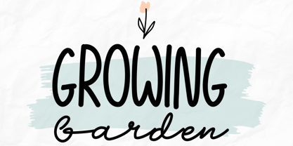 Growing Garden is an elegant and natural trio handwritten font. This original look will appeal to a wide range of crafty ideas. It looks stunning on wedding invitations, thank you cards, quotes, greeting cards, logos, business cards and every other design which needs a handwritten touch. Includes: Uppercase and lowercase For every questions or help, Please contact me. Happy Creating! Thanks!
 - Marmellata Jar 02 by Fontscafe,
$39.00 So you just designed a night club brochure, and now need to change gears to help you make a design that oozes with love and togetherness? Let our Marmellata fonts help you get into the mood! A part of our Marmellata package and also available individually, the Jar 02 is something to be tried to be believed. This font takes you to that special place in your heart, reserved for your most cherished memories... It is great because of its simplicity, very much like all things from childhood! Don’t get us wrong though, this is not just a ‘childish’ font. While it would work great for children’s designs, we believe it would also be very fitting in designs that call for a touch of nostalgia, love, comfort, well-being and happiness. And yes, we agree that all children remind us of all of the above!
 - Kandel 205 by Talbot Type,
$19.50 Kandel 205 is a geometric, tri-line, display and headline font available in a family of three weights. Its bold, graphic styling gives it great stand-out qualities and a highly individual look. It’s particularly well suited to bringing energy to designs, or for designs with a sporting theme. It’s also available with character variations as Kandel 105 .
 - Kandel 105 by Talbot Type,
$19.50 Kandel 105 is a geometric, tri-line, display and headline font available in a family of three weights. Its bold, graphic styling gives it great stand-out qualities and a highly individual look. It’s particularly well suited to bringing energy to designs, or for designs with a sporting theme. It’s also available with character variations as Kandel 205 .
 - Nokrios by Twinletter,
$17.00 Nokrios is a font specifically inspired by the sport of racing. adopts the speed and power it tries to fully reflect to make a bold statement that stands out. We designed it to be a heavy-duty, functional add-on option for big, bold titles or small add-on types. This font features two different font options and two italic options. This font is perfect for adding punch to your projects without losing readability or impact at small sizes. What’s Included : - File font - All glyphs Iso Latin 1 - Alternate, Ligature - Simple installations - We highly recommend using a program that supports OpenType features and Glyphs panels like many Adobe apps and Corel Draw, so you can see and access all Glyph variations. - PUA Encoded Characters – Fully accessible without additional design software. - Fonts include Multilingual support
 - KG Lego House - Personal use only

- ND Minion by NeueDeutsche,
$25.00 A whimsical and playful font that harks back to the charm of childhood toys and creative imagination. Inspired by classic peg and construction toys, this font brings a delightful twist to typography. It's as if each letter has been carefully sculpted from colorful pegs, inviting you to assemble words like a puzzle, creating your own visual narrative.
 - Printing Set JNL by Jeff Levine,
$29.00Printing Set JNL by Jeff Levine comes from a toy rubber stamp printing set imported from Japan in the 1950s and 1960s that's been revived, but is now imported from China. The font has a serif letter so typical of import toys of the day, but actually reads quite nicely in short headlines and specialty ad copy. - Savigny by insigne,
$22.00 Savigny began as an offshoot of Le Havre. Le Havre met my design objective of a geometric sans serif with a strong art deco touch. Le Havre’s primary inspiration came from the art deco titling of the 1930’s, and the lower case was just icing. The art of the 1930’s is of particular interest to me, and I love the art deco era and its art, and the simplicity of geometric shapes. I am mostly interested in designing display typefaces. In many ways Le Havre was the exact opposite of another popular insigne offering, Aviano Sans. Le Havre has very high ascenders, a lower case and is very condensed. Aviano Sans has no lowercase and extremely extended capitals. With the rise of webfonts I began to see Le Havre being used frequently online. It’s short x-height and very tall ascenders made it difficult to read in on screen text settings as it was intended as display type. With this observation, I felt that there is more room for a geometric sans in the insigne catalog. So I set about to design a new geometric sans using the successful skeleton of the Le Havre family. Although I planned to extend the Le Havre line, the new family is so drastically different I decided on a new name: Savigny. The face evolved and began to take on a few humanist touches. Designed from the very beginning as a webfont, the design is open and pleasing to the eye, with a tall x-height. To optimize it for onscreen settings, the spacing is generous. In addition, it includes extended and condensed members, making it insigne’s first superfamily. The family includes over 100 OpenType alternate characters. These include several style sets. Some are stemless, others are purely geometric, and in a nod to Savigny’s origins, Art Deco titling alternates. Please see the informative .pdf brochure to see these features in action. OpenType capable applications such as Quark or the Adobe suite can take full advantage of the automatically replacing ligatures and alternates. This family also includes the glyphs to support a wide range of languages. Savigny is a great choice for a professional designer who wants a well rounded typeface family that is ready for the web.
 - Approach by Emtype Foundry,
$69.00 Approach is a modern approximation to the early grotesques. An utilitarian low contrast font, a bit mechanic but plenty of character. One of its characteristic elements is a kind of ‘elbow pipe’ shape that is present in many letters like the tail of the a, f, j, t, R, Q or 1 among others. Besides, the synthetic punctuation and quotes give it a more contemporary appearance. Approach tries to feel fresh against all odds, being familiar but different. For more details see the PDF.
 - Tawakkal Sans by Fontdation,
$15.00 New month means new font. Let us introduce our latest (another) sans serif; Tawakkal Sans. This font is a mix of modern and classic style, its cleanliness and irregular shapes represent the future, while its elegant curve mimicking old style typography. Tawakkal Sans is highly versatile, you can use it on many designing fields, ex: headline, editorial, quote-writing, tees/poster design, logo, etc. Packed with lots of glyphs (including OpenType chars), this font is a must have weapon on your designing arsenal. Enjoy!
 - Trilium JNL by Jeff Levine,
$29.00Trilium JNL is a tri-line sans serif font that was modeled from some 1970s retail packaging. - Anti Grotesk by 60 KILOS,
$20.00 Anti Grotesk is a personal and internal fight. It tries to build elements capable of building personality, message, and introspection through their own shapes. How to escape from trends being part of them, how to design not establishing commercial and economical interests. Why you started designing and why are you designing today, are some of the concepts that build the universe of Anti Grotesk.
 - Pathita Script by Krafted,
$10.00 Everything has beauty, but not everyone sees it - Confucius Fully realize your boldness and show your lavish side with the Pathita Script. The Pathita Script will be the perfect addition to aid you in your journey to be who you really are. Let the world see you and your beauty, bring it out through your handiwork and give your viewers a new perspective!
 - Lina by Roy Cole,
$34.00 The Lina typeface family was designed by Roy Cole and completed in 2003. The roman font, Lina 30, was drawn originally by hand and later its character set extended and digitally redrawn with the aid of Fontographer. The five additional fonts, 60, 90, and the italics 33, 66, 99 followed and were all produced digitally from scratch. Lina is characterized by economy, lightness and evenness of weight. The capitals and figures are not as tall as the lower-case but retain the latter’s weight, and the figures are designed to provide enhanced recognition. The characters are relatively large on the body and text and benefit from additional leading. Lina is essentially a typeface for text composition. Roy Cole's other typeface families are Zeta, Colophon and Coleface.
 - Sutro Shaded by Parkinson,
$25.00 My affection for Slab Serifs began in the early 1960s in Kansas City when Rob Roy Kelly was at the Kansas City Art Institute, teaching and writing his book on American Wood Type. I got to know him just well enough to gain access to his fabulous collection of wood type and wood type catalogs. Later, in the1970s, I tried to re-create a Nebiolo Egiziano for Roger Black at New West magazine. And again for Roger, in the 1980s, I designed a Slab Serif logo for Newsweek Magazine. Finally, in 2003, designed the Sutro Family. There were things I didn't like about it, so, over time, I’ve been adding some things and dressing it up a little. Sutro Shaded has existed for a few years as a one color, outlined, drop-shadowed display font. It seemed like it was just dying for a little color. I added five more fonts: Fill, Gradient, Hatching, Rules and HiLite. These fonts can be used in different combinations to achieve various effects. There is a downloadable SUTRO SHADED USER MANUAL PDF in the Gallery section for this family.
 - Comixed RP by BluHead Studio,
$20.00Comixed RP Bold and Comixed RP Bold Outline are two new fonts designed by British designer Roy Preston and released by BluHead Studio, LLC. Comixed is a bold, condensed cap-only typeface, with a lively, animated charm. The Outline version turns up the fun factor by adding a drop shadow. Used alone or together, both are great for snappy, eye-catching headlines! - Sussan by Estudio Calderon,
$20.00 The Sussan type family is a hand lettering collection designed by Felipe Calderón. It contains sixteen different hand-drawn fonts and a set of funny illustrations designed by Jhony Velasco. On this occasion, we tried to match several font concepts to create nice pieces with them and each one is equipped with automatically exchanging alternates, ligatures, swash letters and some other feature.
 - Zipper by Présence Typo,
$36.00Zipper tries to give the feeling of a typeface made with pieces of bold and thin letters pasted together. - Mireyle by Letterhend,
$17.00 Let Mireyle add a classic of personality to your designs! This bold font makes it ideal for a variety of design projects, including posters, invitations, greeting cards, logos, and more. Whether you're creating a children's book or designing a catchy brand identity, this font is sure to bring a right answer. Features : Uppercase & lowercase Numbers and punctuation Alternates & Ligatures Multilingual PUA encoded We highly recommend using a program that supports OpenType features and Glyphs panels like many of Adobe apps and Corel Draw, so you can see and access all Glyph variations.
 - Fancy Dancing JNL by Jeff Levine,
$29.00 The 1938 movie musical "Carefree" starring Fred Astaire and Ginger Rogers featured the song "Change Partners" by Irving Berlin. A copy of the sheet music for this song had the title hand lettered in a wonderful tri-line design that has been recreated in the digital typeface Fancy Dancing JNL.
 - Space Deco JNL by Jeff Levine,
$29.00 Hand lettering used on the packaging of a space-themed rubber stamp toy set is the basis for Space Deco JNL. Blending the classic thick-and-thin line weights of the Art Deco style with sharply angled cross strokes evoked a sense of movement and "future" in this unique lettering design.
 - 1790 Royal Printing by GLC,
$38.00 From 1702 to 1811 the French "Royal", then "Imperial", Printers, neglected Garamond and Fournier's designs and used only the font called "Romain du Roy", carved (1693 to 1723) by Philippe Grandjean by order of the king Louis XIV. 1790 Royal Printing was inspired by various variants of Romain du Roy that were in use during this period. Our sources were mainly official and legal documents printed in the late royal period, and in the beginning of the French revolution. There was no bold style. The 1790 Royal Printing Caps fonts contain small caps, plus titling caps for headlines as 1790 Royal Printing capitals are intended to be used preferably for text.
 - Camber by Emtype Foundry,
$69.00 Camber is the last in a personal series of squarish sans. It is a noiseless typeface with a geometric base, it has a synthetic and clean design, but with a human sensitivity where the geometry fails. It tries to be more versatile and simpler than its predecessors, with a pragmatic approach, having less visual noise and virtually removing the disturbing elements. The family is generous in width meeting a certain shortage of wider fonts. Camber works well in both display and text, it is a multipurpose font suited for magazine, branding and web. The type family consists of 14 styles, 7 weights (Thin, UltraLight, Light, Regular, Medium, SemiBold and Bold) plus italics and it’s available in Open Type format. For more details please see the Camber PDF.
 - Yule Love It by Just My Type,
$25.00 YuleLoveIt or Yule not. What else can be said about holiday toys that are also letters? We just said it.
 - Vulcano by Type-Ø-Tones,
$40.00 Vulcano is the mesmerising creation of Salvador –Tori– Alimbau, the one-type-man who gave us this maze. José Manuel Urós took months to devise a negative-positive system for these characters. Hypnotic, charming sophisticated.


