10,000 search results
(0.05 seconds)
- Blowing Vesicle by Letterhend,
$19.00 Blowing Vesicle is a retro bold font which will bring you back to 60s feel. This font perfectly made to be applied especially in logo, and the other various formal forms such as invitations, labels, logos, magazines, books, greeting / wedding cards, packaging, fashion, make up, stationery, novels, labels or any type of advertising purpose. Features : uppercase & lowercase numbers and punctuation multilingual ligatures alternates swashes PUA encoded We highly recommend using a program that supports OpenType features and Glyphs panels like many of Adobe apps and Corel Draw, so you can see and access all Glyph variations.
 - Monoicono by astroluxtype,
$40.00 Monoicono is a graphics font which contains various iconography related to environmental, health, weather, emergency, quality control, and synergy. There are a total of sixty-six items which includes a light version in the lowercase letters and a bold version in the uppercase letters as well as various numbers that have additional icons. See the poster examples provided for all the dingbats/icons in the font. Recommended size usage would be approximately 62 points or above in size, although some icons will read fine much smaller. Note parenright and left, braceright and left have additional icons.
 - Brrrrr by Ingrimayne Type,
$14.95 Brrrrr is supposed to represent snow-covered letters, though it could also be letters covered with frosting. The lower case letters are identical to the upper-case letters. Buried in the font is another set of letters on Christmas tree ornaments. (They are on unicode characters in the 2400 block, circled digits and letters. See here.) The OpenType Stylistic Sets feature makes accessing these letters easier than using unicode, and another font, InsideLetters-Christmas, develops them further. The Brrrrr-Icing style can be used in a layer over Brrrrr to give the snowcap any color, not just the background color.
 - Temporal by Comicraft,
$19.00 You're trapped in an endless now... seconds seem to be stretching out interminably... There’s an eternity between every tick, every tock of the clock... Your consciousness is stretched to the limit as time is expanded to fill the void between each microsecond. There’s a signpost up ahead... the letters appear to stretch into infinity. Anyone know the name of the font it’s set in? See the families related to Temporal Shift & Gap Expanded: Temporal Shift & Gap & Temporal Shift & Gap Compressed Features Four fonts (Shift Regular, Shift Bold, Gap Regular & Gap Bold) with upper and lowercase characters.
 - Aprillia Wijaya by Allouse Studio,
$16.00 Proudly Presenting, Aprillia Wijaya a Handmade Lettering Font. Aprillia Wijaya come with Stylistic-Alternates, Swash and Multi-Lingual Support which will fulfill your need with many choices. We highly recommend using a program that supports OpenType features and Glyphs panels like many of Adobe apps and Corel Draw, so you can see and access all Glyph variations. Aprillia Wijaya is perfect for any tittle, logo, product packaging, branding project, megazine, social media, wedding, or just used to express words above the background. Enjoy the font, feel free to comment or feedback, send me PM or email. Thank You!
 - Fake Nice by Allouse Studio,
$16.00 Proudly Present, Fake Nice a Handwritten Font which will give you an abstract impression with rough detailed brush. Fake Nice come along with Multi-Lingual Support to fulfill your need. We highly recommend using a program that supports OpenType features and Glyphs panels like many of Adobe apps and Corel Draw, so you can see and access all Glyph variations. Fake Nice is perfect for any tittle, logo, product packaging, branding project, megazine, social media, wedding, or just used to express words above the background. Enjoy the font, feel free to comment or feedback, send me PM or email. Thank You!
 - XPawnShop by Ingrimayne Type,
$5.00 XPawnShop is a typographical chess font; the pieces are letters. The Pawn is an awkward letter P, the knight is a horse in the shape of an h, the bishop is a decorative letter B, the rook is an elephant with an R shape, the queen is a Q, and the king is an ornate K. Two other XPawnShop fonts are made of very simple pieces, but as a bonus, both have the set of dominoes from the unicode block 1F030 to 1F093. The key layout is a bit complicated; see the key guide for detailed information on how to position pieces correctly.
 - Arturico by Letterhend,
$17.00 Arturico is a high contrast font with classy and classic look with vintage feel, inspired by 60s and 70s signages. This font perfectly made to be applied especially in logo, and the other various formal forms such as invitations, labels, logos, magazines, books, greeting / wedding cards, packaging, fashion, make up, stationery, novels, labels or any type of advertising purpose. Features : numbers and punctuation multilingual & alternate PUA encoded We highly recommend using a program that supports OpenType features and Glyphs panels like many of Adobe apps and Corel Draw, so you can see and access all Glyph variations.
 - GEOspeed SC - Personal use only

- Changstein - Unknown license

- Eknaton by T4 Foundry,
$21.00The powerful Eknaton comes with slanted slabserifs, a new way to add some spring to the old Egyptian slabs. Eknaton echoes the tradition that started with Napoleon's Egyptian campaign 1798, and the simultaneous looting of Egyptian art. The imports led to new ladies fashion in Europe, new architecture and new typefaces like Antique (Figgins, 1815) and Egyptian (Caslon, 1816). The Egyptian faces were also the origin of the famous Clarendon (1845) and Ionic No.5 (1925) as well as the rest of "the legibility types". In the 20th century the slabserifs became popular again with Bauhaus incarnations like Memphis (Wolf, 1929) and Beton (Jost, 1931). The Bauhaus movement, otherwise anti-serif, liked the architectural influence in Egyptian slabserifs. The Bo Berndal design of Eknaton puts some speed into the old Sphinx - the cat is back, in better form than ever! Bo Berndal, born 1924, has been designing typefaces for 56 years, for Monotype, Linotype and other foundries. Eknaton comes in five different widths, from Tight to Expanded, and is an OpenType typeface for both PC and Mac. Swedish type foundry T4 premiere new fonts every month. Eknaton is our eleventh introduction. - Madigna by Kartiny Type,
$12.00 Madigna Script is one of the Elegant script fonts that comes with a very beautiful character change, a kind of classic copper decorative script with a modern touch, designed with high detail to present an elegant style. You will get: File Madigna Madigna Script is interesting because the typeface is pleasing to the eye, clean, feminine, sensual, glamorous, simple and very easy to read, because of the many luxurious letter connections. I also offer a number of decent stylistic alternatives for some of the letters. The classic style is very suitable to be applied in various formal forms such as invitations, labels, restaurant menus, logos, fashion, make up, stationery, novels, magazines, books, greeting / wedding cards, packaging, labels or all kinds of advertising purposes. . . Madigna has alternate characters, including multiple language support. With OpenType features with alternative styles and elegant ligatures. The OpenType features don't work automatically, but you can access them manually and for best results your creativity will be required in combining variations of these Glyphs. If you need help or have any questions, let me know. I'm happy to help. Thanks & Happy Designing.
 - Moderately by Alex Jacque,
$35.00 Introducing Moderately, a chunky and friendly typeface that makes a bold statement. This high-impact font is specifically crafted for designers seeking a display typeface with presence, perfect for applications where large, expressive type is a must. The defining features of Moderately include a generous x-height, soft curves, and tight spacing, ensuring a punchy and fresh aesthetic. Moderately is a deliberate departure from your contemporary sans with nary a straight line to see, embracing the organic and dynamic qualities reminiscent of blocky Art Nouveau typefaces, notably inspired by the works of Alfred Roller. While drawing influence from psychedelic / Art Nouveau revival typefaces of the 1960s, Moderately strikes a contemporary balance, delivering a design that is both impactful and approachable. Each glyph in Moderately attempts to maximize its space within the em square, incorporating slim carve outs for counters and apertures. The name "Moderately" adds a touch of irony, as this typeface is anything but plain – it exudes affable confidence and subtle flair. Created with versatility in mind, Moderately offers broad support for Latin-based languages, ensuring its adaptability for a wide range of creative projects.
 - Museum Ornaments by T4 Foundry,
$7.00Museum Borders and Ornaments is part of a typographical treasure, the Norstedts type collection in Sweden. Type designer Torbjörn Olsson has painstakingly translated the original 34 Ornament matrices in the collection to Open Type. Among them are several of Granjon's arabesques, as well as symbols from both Swedish and Danish typefoundries. The signs were cut in the 16th, 17th and 18th centuries. The old Swedish name for these "type trademarks" were "rössjor". Museum Borders and Ornaments is an OpenType creation, for both PC and Mac. Swedish type foundry T4 premiere new fonts every month. Museum Borders and Ornaments is our tenth introduction. Museum Borders and Ornaments is part of the growing Museum type family. Museum also includes Museum Tertia Cursive, an exquisite 1700's typeface with modern additions, and Museum Fournier, a set of Rococo capitals designed by Pierre Simon Fournier le Jeune circa 1760. - Hello Anggela by Gian Studio,
$12.00 Hello Anggela Script a new fresh & modern script with a handmade calligraphy style, decorative characters and a dancing baseline! So beautiful on invitation like greeting cards, branding materials, business cards, quotes, posters, and more!! Hello Anggela Script come with 275+ glyphs. The alternative characters were divided into several Open Type features such as Swash, Stylistic Sets, Stylistic Alternates, Contextual Alternates. The Open Type features can be accessed by using Open Type savvy programs such as Adobe Illustrator, Adobe InDesign, Adobe Photoshop Corel Draw X version, And Microsoft Word. And this Font has given PUA unicode (specially coded fonts). so that all the alternate characters can easily be accessed in full by a craftsman or designer. How to access and use font glyphs on a Windows PC : https://designbundles.net/design-school/how-to-access-use-font-glyphs-windows Accessing Font Glyphs with Font Book on Mac : https://designbundles.net/design-school/access-font-glyphs-mac Can't find Glyphs on Mac? Make sure you are in Repertoire Mode! https://designbundles.net/design-school/cant-find-font-glyphs-mac NOTE : Tail is available only for lowercase letters. Thank you
 - Linotype Syntax Lapidar Serif Text by Linotype,
$29.99Modeled on the writings chiseled in stone in the second century B.C., Syntax™ Lapidar is an energetic, spirited typeface designed by Hans Eduard Meier in 2000. Linotype Syntax Lapidar Text and Linotype Syntax Lapidar Serif Text have five weights each, with both cap and lowercase letterforms. Lapidar Display and Lapidar Serif Display also have five weights each, with mostly all cap letterforms and many alternates. It's a terrifically fun and inventive family, and if you look closely, you can see the resemblance to the more modern and restrained Syntax™ relatives. Great for menus, artist books, travelogues, or advertising - and if used very sparingly, it could add just the right element of lapidary significance to corporate documents. - Linotype Syntax Lapidar Serif Display by Linotype,
$29.99Modeled on the writings chiseled in stone in the second century B.C., Syntax™ Lapidar is an energetic, spirited typeface designed by Hans Eduard Meier in 2000. Linotype Syntax Lapidar Text and Linotype Syntax Lapidar Serif Text have five weights each, with both cap and lowercase letterforms. Lapidar Display and Lapidar Serif Display also have five weights each, with mostly all cap letterforms and many alternates. It's a terrifically fun and inventive family, and if you look closely, you can see the resemblance to the more modern and restrained Syntax™ relatives. Great for menus, artist books, travelogues, or advertising - and if used very sparingly, it could add just the right element of lapidary significance to corporate documents. - Allotropic by The Flying Type,
$24.00 Allotropic is a pretty decorative face with a remarkable art nouveau flair. It loosely draws inspiration from a 1914 untitled alphabet by J.M. Bergling, a then "Modern Alphabet", and from its interpretation by Photo-Lettering, from the sixties. Allotropic comes in two styles, regular and bold, both with extended language coverage, as well as stylistic alternates and a couple of ornaments. It's decidedly a fab choice not only for vintage and retro designs (ça va sans dire!), but also for creative contemporary uses in print and on screen. Play it on book covers, packaging, branding, editorial, web, advertising, apparel, uses are endless. Just give Allotropic a go, let the inspiration flow, and keep on creating!
 - Linotype Syntax Lapidar Display by Linotype,
$29.99Modeled on the writings chiseled in stone in the second century B.C., Syntax™ Lapidar is an energetic, spirited typeface designed by Hans Eduard Meier in 2000. Linotype Syntax Lapidar Text and Linotype Syntax Lapidar Serif Text have five weights each, with both cap and lowercase letterforms. Lapidar Display and Lapidar Serif Display also have five weights each, with mostly all cap letterforms and many alternates. It's a terrifically fun and inventive family, and if you look closely, you can see the resemblance to the more modern and restrained Syntax™ relatives. Great for menus, artist books, travelogues, or advertising - and if used very sparingly, it could add just the right element of lapidary significance to corporate documents. - Layfort by Identity Letters,
$29.00 What do you get when you cross Industrial Revolution with Art Déco? The raw force of steam-powered vessels with the panache of dashing streamliners? A sturdy industrial grotesque with a swanky stylized sans? We don't know, but our Layfort is a strong contender. It's a contrasted sans-serif typeface with old-style proportions: varying letter widths create a more vivid texture than your usual contemporary sans, and the true italics are narrower than the uprights. Layfort is elegant enough for fashion, art, and luxury; yet sufficiently sincere for serious business. And at 16 styles & 750 glyphs, it's ready for complex typographic demands (try the round dots at SS09). Let your designs fly!
 - Discordia by Naipe Foundry,
$60.00 Discórdia is a type-family of contrasting contrasts. Each of the four members of the family has a different contrast type. Regular has broad-nib contrast, Bold has horizontal contrast, the Italic is monoline, which means it has no apparent contrast, and Bold Italic is... Well, it’s probably best if see for yourself. These different design structures were fine-tuned to work well together in the same line, creating emphasis and hierarchy through a mini-super-family that groups a wedge-serif Regular, a slab-serif Bold, a sans-serif-ish Italic and a twisted Bold Italic. Naipe teamed up with Ben Nathan of Hafontia to extend Discórdia and give full Hebrew Support. Coming soon!
 - Gilway by Art Grootfontein,
$20.00 Gilway is a playful, rounded display with tons of personality. This versatile typeface is inspired by the earliest examples of rounded types from the 19th century, such as Caslon Rounded (1836) and Schmale Runde Grotesk (1885). Gilway has a distinctive hand-lettered feel because of its subtle variances, which make it powerful and impactful yet incredibly friendly. Layered options allow you to combine the various styles, and a unique Opentype feature makes your letters dance! To take full advantage of Gilway's features, please download this one-sheet pdf file. Please take a look at this video demo to see Gilway family in action ! Gilway’s design is suited for a wide range of uses, including headlines, displays, packaging and logotypes.
 - Stargation by Letterhend,
$19.00 Stargation is a display script that has unique anatomy with thin and condensed glyhps which brings out a casual and playful feel. Works well to be applied to logos and the other various formal forms such as invitations, labels, magazines, books, greeting / wedding cards, packaging, fashion, make up, stationery, novels, labels or any type of advertising purpose. Features : uppercase & lowercase numbers and punctuation multi-lingual support ligatures alternates swashes PUA encoded We highly recommend using a program that supports OpenType features and Glyphs panels like many of Adobe apps and Corel Draw, so you can see and access all Glyph variations. Email us to letterhend@gmail.com if you need something! Happy Designing!
 - Eagle Lake Pro by Stiggy & Sands,
$29.00 A Practical Calligraphic Hand. Eagle Lake Pro is based on the calligraphic lettering style known based on the practical Running Book Hand. It has shorter capitals that create a visually taller x-height lending to high legibility and fluidity. Classic, clean, and casual, Eagle Lake Pro fits a lot of design uses. The SmallCaps and extensive figure sets only work to further expand the usefulness of the typeface across a wider breadth of applications. See the 5th graphic for a comprehensive character map preview. Opentype features include: - SmallCaps. - Full set of Inferiors and Superiors for limitless fractions. - Tabular, Proportional, and Oldstyle figure sets (along with SmallCaps versions of the figures). - Stylistic Alternates for Caps to SmallCaps conversion.
 - Fortuita by Typographias,
$28.00 Fortuita is a versatile sans fit for text or display. The name carries some of its history as it was born from logo sketches that fortuitously grew into a type family over eight years. It comes with a tall x-height, rendering it readable at smaller sizes. It has sixteen weights, eight regular ones, and their italics, each with small caps, something you may not see very often with sans serifs. It counts with old-style numbers that can switch to its lining, small caps, or tabular versions through open-type features. The family carries a distinct personality in its design that will lend itself to its subject, all the while without becoming distracting or detracting from it.
 - Voice by Hubert Jocham Type,
$39.00 In comparison to most of my typefaces that tend to be fairly expressive, I wanted Voice to be simple, effective and easy to use. Voice was designed to work well in a wide range of sizes, and also in narrow tight columns with a wide range of weights. Those are some criteria for a good corporate typeface that I could clearly see in all my corporate branding projects. It is not that a brand needs all the weights but some appropriate weights can be chosen from that wide range. In copy you should not use heavier than Heavy. ExtraBold and UltraBold work best in display. Recommended uses: corporate branding, magazines and other publications.
 - Linotype Syntax Lapidar Text by Linotype,
$29.99Modeled on the writings chiseled in stone in the second century B.C., Syntax™ Lapidar is an energetic, spirited typeface designed by Hans Eduard Meier in 2000. Linotype Syntax Lapidar Text and Linotype Syntax Lapidar Serif Text have five weights each, with both cap and lowercase letterforms. Lapidar Display and Lapidar Serif Display also have five weights each, with mostly all cap letterforms and many alternates. It's a terrifically fun and inventive family, and if you look closely, you can see the resemblance to the more modern and restrained Syntax™ relatives. Great for menus, artist books, travelogues, or advertising - and if used very sparingly, it could add just the right element of lapidary significance to corporate documents. - Pastrami on Rye by Typodermic,
$11.95 Introducing Pastrami on Rye—the comic-style font that is anything but conventional. With its rough-hewn appearance and constructed style, this font adds a unique edge to any design project. Unlike other comic-style fonts that are based on pen and ink, Pastrami on Rye is inspired by cut paper and fabric. The result is a bold, organic look that is both playful and professional. One of the standout features of this font is the serifed “I” in the capital position. This adds a touch of elegance to the font and is perfect for personal pronouns or acronyms. But that’s not all—if you’re using an OpenType savvy application, you can enjoy the benefit of automatic shuffling of letters and numerals. This means your designs will have a more natural, hand-drawn effect without any additional effort on your part. Pastrami on Rye is a font that works well in any application that supports OpenType standard ligatures. Whether you’re designing a logo, creating a comic book, or adding a unique touch to a marketing campaign, this font is sure to stand out. Why settle for a boring, generic font when you can add the organic, bold look of Pastrami on Rye to your designs? Try it today and see the difference for yourself! Most Latin-based European writing systems are supported, including the following languages. Afaan Oromo, Afar, Afrikaans, Albanian, Alsatian, Aromanian, Aymara, Bashkir (Latin), Basque, Belarusian (Latin), Bemba, Bikol, Bosnian, Breton, Cape Verdean, Creole, Catalan, Cebuano, Chamorro, Chavacano, Chichewa, Crimean Tatar (Latin), Croatian, Czech, Danish, Dawan, Dholuo, Dutch, English, Estonian, Faroese, Fijian, Filipino, Finnish, French, Frisian, Friulian, Gagauz (Latin), Galician, Ganda, Genoese, German, Greenlandic, Guadeloupean Creole, Haitian Creole, Hawaiian, Hiligaynon, Hungarian, Icelandic, Ilocano, Indonesian, Irish, Italian, Jamaican, Kaqchikel, Karakalpak (Latin), Kashubian, Kikongo, Kinyarwanda, Kirundi, Kurdish (Latin), Latvian, Lithuanian, Lombard, Low Saxon, Luxembourgish, Maasai, Makhuwa, Malay, Maltese, Māori, Moldovan, Montenegrin, Ndebele, Neapolitan, Norwegian, Novial, Occitan, Ossetian (Latin), Papiamento, Piedmontese, Polish, Portuguese, Quechua, Rarotongan, Romanian, Romansh, Sami, Sango, Saramaccan, Sardinian, Scottish Gaelic, Serbian (Latin), Shona, Sicilian, Silesian, Slovak, Slovenian, Somali, Sorbian, Sotho, Spanish, Swahili, Swazi, Swedish, Tagalog, Tahitian, Tetum, Tongan, Tshiluba, Tsonga, Tswana, Tumbuka, Turkish, Turkmen (Latin), Tuvaluan, Uzbek (Latin), Venetian, Vepsian, Võro, Walloon, Waray-Waray, Wayuu, Welsh, Wolof, Xhosa, Yapese, Zapotec Zulu and Zuni.
 - Quela by Mokatype Studio,
$20.00Quela is Reverse Serif Font with round nuances, inspired by retro style. Quela builds as a clean and versatile letterform that fits any display graphics design purposes. And still, this font can be used for extended text like quotes and etc. What's you get : Standard glyphs Ligatures (Opentype features) Web Font International Accent Works on PC & Mac Simple installations Accessible in Adobe Illustrator, Adobe Photoshop, Adobe InDesign, and even work on Microsoft Word. PUA Encoded Characters - Fully accessible without additional design software. Fonts include multilingual support Image used: All photographs/pictures/vectors used in the preview are not included, they are intended for illustration only. Thank You - Deckissa by Mokatype Studio,
$24.00 Deckissa is a reverse contrast serif font that is suitable for headlines and logos. Deckissa is built with a light stem, simple design, and nice curve that makes this font look elegant and luxurious. This font includes some ligature that you can combine to create a Headline, poster, or logo. Works on PC & Mac, simple installations, accessible in Adobe Illustrator, Adobe Photoshop, Adobe InDesign, and even works on Microsoft Word. PUA Encoded Characters - Fully accessible without additional design software. Fonts include multilingual support Image used: All photographs/pictures/vectors used in the preview are not included, they are intended for illustration only. Thank You
 - Fruit Shake by Epiclinez,
$17.00 Fruit Shake is a smooth and bold script font with a relaxed theme, featuring a lovely style. No matter the topic, this font will be an incredible asset to your fonts’ library, as it has the potential to elevate any design. So what's included: Basic Latin, numbers, symbols, punctuations, and ligatures Simple Installations: works on PC & Mac Multilingual Support includes Afrikaans Albanian Catalan Danish Dutch English Estonian Finnish French German Italian Norwegian Portuguese Spanish Swedish Zulu. Accented Characters : ÀÁÂÃÄÅÆÇÈÉÊËÌÍÎÏÑÒÓÔÕÖØŒŠÙÚÛÜŸÝŽàáâãäåæçèéêëìíîïñòóôõöøœšùúûüýÿžß Accessible in Adobe Illustrator, Adobe Photoshop, Adobe InDesign, even works on Microsoft Word PUA Encoded and fully accessible without additional design software Thank you! We hope you enjoy our font!
 - Boldini by Luxfont,
$18.00 Introducing the unique family of COLORED fonts "Boldini" with minimalistic clean letters of a harmonious form in the style of modern POP culture. You no longer need to adjust the gradient for each letter, letters are immediately printed in gradient! Gradient fonts is perfect for headlines for fashion websites, magazines, and print design, and the basic solid font is suitable for branding boutique signs as well as for large amounts of text, because the font is very readable in a small size. Font family has two thicknesses - bold & regular, 6 gradient directions, gradient fonts also 2 type - with transparency and without transparency, as well as 2 basic monochrome fonts. Font consists of letters of the same height without division into uppercase and lowercase glyphs. *See also these fonts, which based on this family: Culoare & Anaglyph. Which means that if necessary you can combine these families and they will be absolutely stylistically identical and complement each other. Check the quality before purchasing and try the FREE DEMO version of the font to make sure your software supports color fonts. Features: Such color combinations in gradients are universal and very convenient for repainting. IMPORTANT: - OTF SVG fonts contain vector letters with gradients and transparency. - Multicolor OTF version of this font will show up only in apps that are compatible with color fonts, like Adobe Photoshop CC 2017.0.1 and above, Illustrator CC 2018. Learn more about color fonts & their support in third-party apps on www.colorfonts.wtf - Don't worry about what you see all fonts in black and not in multicolor in the tab “Individual Styles” - all fonts are working and have passed technical inspection, but not displayed in multicolor they, just because the website MyFonts is not yet able to show a preview of colored fonts. Then if you have software with support colored fonts - you can be sure that after installing fonts into the system you will be able to use them like every other classic font. Question/answer: How to install a font? The procedure for installing the font in the system has not changed. Install the font as you would install the classic OTF | TTF fonts. How can I change the font color to my color? · Adobe Illustrator: Convert text to outline and easily change color to your taste as if you were repainting a simple vector shape. · Adobe Photoshop: You can easily repaint text layer with Layer effects and color overlay. Try to experiment, it is so interesting and very easy! ld.luxfont@gmail.com
 - Ontime by Fontysia,
$15.00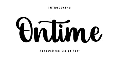 Ontime is a modern handwritten script font! This font is perfect for shirt designs, websites, branding, quotes, children's designs, blogs, logos, invitations and more!
 - Butter Milky by FHFont,
$19.00 Butter Milky is script font with handwritten vintage calligraphy style, with OpenType feature include of the font. Suitable for design, element design, event, logo.
 - Tracker by Device,
$39.00 Tracker is a geometric twin-line font reminiscent of space-age disco designs of the 60s and 70s, but entirely reexamined, rationalised, redesigned and updated for contemporary use. Best seen in shorter, punchier settings and at larger sizes. The font includes connecting ligatures that can be toggled an and off in the Opentype palette to further customise your text.
 - Jack History by Ditatype,
$29.00 Jack History is a unique, amazing font inspired by creative, experimental handwritings of which letters are always connected to each other to create surprising, dynamic flows, and adopt unconventional proportions and variations. Some of the letters may actually seem bigger or smaller than the others in free moving and curvy lines to express bravery and freedom nuances of the font. Differences in proportions and letter style changes of the font have become the design’s integral parts. Despite the absence of strict rules, creativity and courage to combine the connected letters in a unique way is all that matters because this script font offers extraordinary attractiveness and uniqueness in all designs. Furthermore, the connected letter flows in various proportions reflect some explorations and innovations in the handwritings. You may then apply this font for big text sizes for a legibility reason and enjoy the available features here. Features: Alternates Ligatures Multilingual Supports PUA Encoded Numerals and Punctuations Jack History fits best for any design projects requiring artistic, elegant displays such as wedding invitations, greeting cards, merchandise designs, and more. For such artistic and elegant displays, this script font is also applicable for logo designs, posters, and packaging. Find out more ways to use this font by taking a look at the font preview. Thanks for purchasing our fonts. Hopefully, you have a great time using our font. Feel free to contact us anytime for further information or when you have trouble with the font. Thanks a lot and happy designing.
 - Yummy Foodies by Scratch Design,
$9.00Yummy Foodies is an authentic handwritten font, this font is complete with all punctuations and multi-languages support. This font will applicable to comic book text, poster, menu design, stationery design kit, presentation for education, youtube text and title, and many more with casual concept design. This font also supports for mac and windows. Enjoy this font, and make some cool stuff! - Buthick by Asenbayu,
$16.00 Buthick is a unique decorative display font. This font is characterized by being bold and conveys a pleasant image. This font also has a modern feel with a sans serif outline. You can use this font in both modern and retro designs. This font is suitable for trendy packaging label designs, unique desired logos, poster designs, fashion and many more.
 - Remind by Din Studio,
$29.00 Introducing Remind Font. Remind is a modern serif font. Create from our talented font designer. The design of typeface will make your design more beautiful and inspiring. This font will suitable for any project, like branding, print template, logo and etc. Includes : Remind (OTF) Features : PUA encoded Stylistics Set Numerals and Punctuation (OpenType Standard) Full Support Thanks for visiting and purchasing my font!
 - Quire Sans by Monotype,
$155.99 My goal was to make a design that might fit in anywhere,” says Jim Ford about his Quire Sans™ typeface. “I wanted it to be highly functional and sexy at the same time.” With one foot comfortably in the realm of oldstyle design and traditional book typography, and the other in evolving electronic media, the Quire Sans family does, indeed, fit in just about anywhere. As for sexy, someone once quotably wrote, “A great figure or physique is nice, but it's self-confidence that makes someone really sexy.” Yes, Quire Sans is sexy, performing confidently in virtually any setting. 2014-06-26 00:00:00.000 57.9900 F43063-S193385 42831 Neue Frutiger World Monotype https://www.myfonts.com/collections/neue-frutiger-world-font-monotype-imaging https://cdn.myfonts.net/cdn-cgi/image/width=417,height=208,fit=contain,format=auto/images/pim/10000/279026_ed8c8093fe1ac59ebe9e3ee1d9262c8e.png Neue Frutiger World is designed for global use with an impressive range of 10 weights, from Ultra Light to Extra Black, with matching italics. It embodies the same warmth and clarity as Adrian Frutiger’s original design, but allows brands to maintain their visual identity, and communicate with a consistent tone of voice, regardless of the language. Neue Frutiger World supports more than 150 languages and scripts including Latin, Greek, Cyrillic, Georgian, Armenian, Hebrew, Arabic, Thai and Vietnamese. “Before Neue Frutiger World it was not an easy task for western brands to find families in Arabic, Hebrew, Thai and Vietnamese which match with their Latin,” says Monotype type director Akira Kobayashi, who led the Neue Frutiger World project. “They may find a type with closer expression, but there was no guarantee if the bold version in the non-Latin family matches the bold in their Latin. Neue Frutiger World offers a better solution.” In addition to Neue Frutiger World’s linguistic versatility, it works hard across environments – suited to branding and corporate identity, advertising, signage, wayfinding, print, and digital environments. The Neue Frutiger World fonts can be paired with Monotype’s CJK fonts: M XiangHe Hei (Chinese), Tazugane Gothic (Japanese), Tazugane Info (Japanese), and Seol Sans (Korean). These were all designed to address brands’ needs to expand into Asian cultures and solve for global typographic challenges.

