625 search results
(0.017 seconds)
- Blackberry Macarons by PeachCreme,
$13.00 Say hello to the Blackberry Macarons Font Trio! Heart-warming Script, Display, and Sans Serif fonts that will brighten your design. Blackberry Macarons Display - includes all caps regular and multilingual letters, punctuation, numbers, and as a bonus the letters A, K, M, Q, R with beautiful swashes to keep your designs attractive :) Blackberry Macarons Script - has all uppercase and lowercase letters, numerals, punctuation, and 42 fancy ligatures as well to add a cheesy flair to your words. Blackberry Macarons Sans - a cute and fun hand-drawn typeface with a little imperfect look that works great to add a handmade touch to your projects. Includes a full set of regular letters, numbers, and punctuation. Sweet and quirky, the Blackberry Macarons Font trio is perfect for recipes, book illustrations, lettering, fun packaging, greeting cards and so much more!
 - Signatria - Personal use only

- Katydid JNL by Jeff Levine,
$29.00 Vintage sheet music for a song from the Broadway Musical “Kiss Me Kate” is the inspiration for Katydid JNL. The play’s name was written in a ball-and-line type of lettering which somewhat resembles either 'Tinker Toys' or celestial mapping.
 - Hellshock by Comicraft,
$19.00 Check into your local lunatic asylum with this font, etched on the walls of his padded cell by Comicraft's left-handed right-hand man, Dave Lanphear, for Jae Lee's Image comic 'Hellshock'. Artwork from Elephantmen: War Toys by Starkings & Moritat
 - Sugar Joint by PizzaDude.dk,
$15.00 Sugar Joint is a simple and legible sans serif font. It has a loose and easy look, which makes it very suitable for children's books or toys, candy labels, cereal, or perhaps even labels for organic products. It's 100% handmade!
 - Boldu by Ryzhychenko Olga,
$4.00 Boldu is a simple grotesque font. I created it using simple forms. I love geometry and tried use only one size of lines. Boldu was created being impressed by works of beginning of 20th century - period of strict and geometric forms
 - Artios Pro by DBSV,
$70.00 There are a lot of narrow passages... like the Straits of Gibraltar, Hormuz, of Malacca, of Thermopylae, the Dardanelles, the Dervenakion, Magellan, Rentina of Naruto, Kerch etc. I tried to pass into mine closely with the name «Artios Pro". Walking on the same considerations as the previous series (Khamai/Aeolus/Corset) I tried to give some sense of diversity for narrow passages of the letters. These twelve style are the result. And here, the "Rail" engage with "Semi Bold" in the same way as the previous series. This series is composed and includes 12 fonts with 625 glyphs each, with true italics and supports Latin, Greek and Cyrillic.
 - Samarquand by BluHead Studio,
$29.00 Samarquand is a handwritten script design from Roy Preston. Based on the handwriting of a friend, Roy has expanded this friendly, semi-connecting script to include three weights, Light, Regular and Bold, opening up even more design possibilities. The Samarquand fonts support an extended character set, as well as some ligatures, inferior and superior numbers, and unlimited fractions. There are some really nice letterforms in these fonts, particularly that uppercase W! Peruse the posters to see. I'm kind of partial to the Light weight, which is really quite elegant in use, but that Bold can really make a strong statement! Samarquand. Check it out for yourself.
 - 1790 Royal Printing by GLC,
$38.00 From 1702 to 1811 the French "Royal", then "Imperial", Printers, neglected Garamond and Fournier's designs and used only the font called "Romain du Roy", carved (1693 to 1723) by Philippe Grandjean by order of the king Louis XIV. 1790 Royal Printing was inspired by various variants of Romain du Roy that were in use during this period. Our sources were mainly official and legal documents printed in the late royal period, and in the beginning of the French revolution. There was no bold style. The 1790 Royal Printing Caps fonts contain small caps, plus titling caps for headlines as 1790 Royal Printing capitals are intended to be used preferably for text.
 - TOMO Nara by TOMO Fonts,
$20.00 TOMO Nara adds plenty of joy to any logo, layout or UI. Geometric shapes and a funny look come together in this font – thus, Nara might be the perfect choice for toys, books, packaging, posters or even webapps! Let’s have some fun!
 - P22 Vidro by IHOF,
$24.95 Vidro is a glass technique introduced by the Dutch in Japan in the 16th century. Vidro glassworks, such as decorations and children's toys, enrich the live of Japanese people. P22 Vidro is comprised of simple forms that express both irregularity and fluidity.
 - Spacelord by Die Typonauten,
$25.00 Spacelord is inspired by vintage toys from the 1950s and 1960s. It refers to the box art of robots, spaceships, x-ray-guns and other cosmic trash treasures of this golden science fiction age. Aboard the lord: four, three, two, one, zero!
 - Shakilla by Zamjump,
$17.00 Pleased to introduce you to Shakilla new handwritten kid's fun font! This is a cute kids handwritten font that would be perfect for Comic, books, greeting cards, toys, posters, picture books, branding, logo or anything that requires a fun and happiness look!
 - PM Eckmore by Paper Moon Type & Graphic Supply,
$15.00 Eckmore is a modern psychedelic variation of the Art Nouveau font Eckmann. It is inspired by 1970s concert posters of The Filmore in the San Francisco Bay Area. Its casual vibe is perfect for everything from retro fashion marketing to toy packaging.
 - Hestia by Fidan Fonts,
$18.70 Hestia is an uppercase creative font inspired by flames of fire. We've tried to create a dynamic font based on sans-serif fonts. It's works perfectly for headlines, logos, posters, packaging, T-shirts, postcards and many more. Latin-based Language Support. Happy creating!
 - Scribe by Wiescher Design,
$49.50 Scribe is an elaborate typeface somewhere in between Bodoni and an English script. It has interwoven capitals and joining lowercase letters. I have tried to make something new that has this old, settled touch. I think I like it. Yours sincerely, Gert Wiescher
 - Sutro Shaded by Parkinson,
$25.00 My affection for Slab Serifs began in the early 1960s in Kansas City when Rob Roy Kelly was at the Kansas City Art Institute, teaching and writing his book on American Wood Type. I got to know him just well enough to gain access to his fabulous collection of wood type and wood type catalogs. Later, in the1970s, I tried to re-create a Nebiolo Egiziano for Roger Black at New West magazine. And again for Roger, in the 1980s, I designed a Slab Serif logo for Newsweek Magazine. Finally, in 2003, designed the Sutro Family. There were things I didn't like about it, so, over time, I’ve been adding some things and dressing it up a little. Sutro Shaded has existed for a few years as a one color, outlined, drop-shadowed display font. It seemed like it was just dying for a little color. I added five more fonts: Fill, Gradient, Hatching, Rules and HiLite. These fonts can be used in different combinations to achieve various effects. There is a downloadable SUTRO SHADED USER MANUAL PDF in the Gallery section for this family.
 - Black Hymned Script by Letterhend,
$17.00 Black Hymned - Font Trio is a font package containing three style with same vibes!. Each font contains lowercase, uppercase, numbers, symbols and also supports multi languages. You will get TTF and OTF. This font can use in any software without problem! A simple font. Features: uppercase & lowercase numbers and punctuation multilingual PUA encoded Please like and follow as appreciation, Thank You,
 - Growing Garden by Wyarecreatype,
$7.00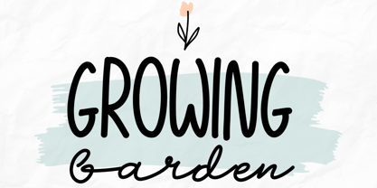 Growing Garden is an elegant and natural trio handwritten font. This original look will appeal to a wide range of crafty ideas. It looks stunning on wedding invitations, thank you cards, quotes, greeting cards, logos, business cards and every other design which needs a handwritten touch. Includes: Uppercase and lowercase For every questions or help, Please contact me. Happy Creating! Thanks!
 - Tallahassee Chassis JNL by Jeff Levine,
$29.00Tallahassee Chassis JNL was modeled from a toy alphabet rubber stamp set made in Japan and imported to the U.S. during the late 1950s and early 1960s. The lettering style somewhat resembled that found on the side of old railroad cars, buses or trolleys. - Custard by Device,
$39.00 Playful and funky. The ideal choice for candy wrapping, teen magazines, toy packaging and the like. The reweighted condensed is useful where space is at a premium, and mixing the two weights freely leads to intriguing results. Use with bright fresh colors for added "bounce".
 - Zodor JNL by Jeff Levine,
$29.00Zodor JNL is modeled from the packaging for injection-molded plastic letters used as a teaching toy for youngsters in the early 1960s. The hand-drawn alphabet on the sides of the package was quirky enough to merit being made into a digital font. - Morris by HiH,
$10.00 Morris is a four-font family produced by HiH Retrofonts and based on the work of the very English William Morris. William Morris wanted a gothic type drawn from the 14th century blackletter tradition that he admired both stylistically and philosophically. He drew from several sources. His principal inspiration for his lower case was the 1462 Bible by Peter Schoeffer of Mainz; particularly notable for the first appearance of the ‘ear’ on the g. The upper case was Morris’s amalgam of the Italian cursive closed caps popular throughout the 12th through 15th centuries, a modern example of which is Goudy’s Lombardic Capitals. The gothic that Morris designed was first used by his Kelmscott Press for the publication of the Historyes Of Troye in 1892. It was called “Troy Type” and was cut at 18 points by Edward Prince. It was also used for The Tale of Beowulf. The typeface was re-cut in at 12 points and called “Chaucer Type” for use in The Order of Chivalry and The Works of Geoffrey Chaucer. Morris' objective is designing his gothic was not only to preserve the color and presence of his sources, but to create letters that were more readable to the English eye. ATF copied Troy and called it Satanick. Not only was the ATF version popular in the United States; but, interestingly, sold very well in Germany. There was great interest in that country in finding a middle ground between blackletter and roman styles -- one that was comfortable for a wider readership. The Morris design was considered one of the more successful solutions. Our interpretation, which we call Morris Gothic, substantially follows the Petzendorfer model used by other versions we have seen, with the following exceptions: 1) a larger fillet radius on the upper arm of the H, 2) a more typically broadpen stroke in place of the foxtail on the Q, which I do not like, 3) inclusion of the aforementioned ear on the g and 4) a slightly shorter descender on the y. We have included five ornaments, at positions 0135, 0137, 0167, 0172 and 0177. The German ligatures ‘ch’ & ‘ck’ can be accessed using the left and right brace keys (0123 & 0125). Morris Initials One and Morris Initials Two are two of several different styles of decorative initial letters that Morris designed for use with his type. He drew from a variety of 15th century sources, among which were Peter Schoeffer’s 1462 Mainz Bible and the lily-of-the-valley alphabet by Gunther Zainer of Augsburg. Each of the two initial fonts is paired with the Morris Gothic lower case. Morris Ornaments is a collection of both text ornaments and forms from the surrounding page-border decorations.
 - Coleface by Roy Cole,
$34.00 Coleface was created by the British typographer Roy Cole, completed shortly before his death in 2012. It comprises six fonts: Coleface 30, 60, 90 and the italics 33, 66, 99. As with his earlier typeface families - Lina, Zeta and Colophon - Coleface is a highly-readable sans serif typeface that offers significant flexibility in terms of its potential uses. Roy Cole studied typographic design under the tutelage of Emil Ruder at the Gewerbeschule in Basel, at a time when typographic history was being made through the creation of a style that epitomized modernity. Consequently the principles of order, simplicity and legibility, fused with experimentation, became a hallmark of his practice, as exemplified in his last font Coleface.
 - Oggie Marker by Dear Sue,
$15.00 Oggie Marker is a hand drawn thick marker display font with a textured edge. It has a raw but whimsical feel, which makes it perfect for posters, signage, menus, comics and toys/ product/ packaging for kids. Try it on themes of summer, Halloween, camping/ outdoors, and more!
 - Vinque by Typodermic,
$- Vinque is an interpretation of a nineteenth century Arts & Crafts revival of medieval lettering. British type designer William Morris completed Troy in 1891—a splendid blackletter typeface in the medieval style. It’s beautiful but some modern uses like UI and video game text require a less ornate gothic appearance. Vinque is simple. It avoids strong vertical blackletter strokes which can present problems for contemporary readers. The end result is an uncomplicated, crisp typeface that successfully conveys medievalness to the reader. Vinque was released in 2002 in one style: Regular. In 2019, Vinque was expanded to seven weights and italics. Language support was bolstered to support most current Latin based languages as well as Greek and Cyrillic. OpenType fractions, f-ligatures and old-style numerals are supported.
 - Brigade by Alan Meeks,
$45.00 In searching for a Roman to use, I found there were bits of Bembo, Times, Garamond, etc., that I liked and bits that I did not. So I set out to take the best bits of all my favorite Romans and tried to create the ultimate Roman Typeface.
 - Lina by Roy Cole,
$34.00 The Lina typeface family was designed by Roy Cole and completed in 2003. The roman font, Lina 30, was drawn originally by hand and later its character set extended and digitally redrawn with the aid of Fontographer. The five additional fonts, 60, 90, and the italics 33, 66, 99 followed and were all produced digitally from scratch. Lina is characterized by economy, lightness and evenness of weight. The capitals and figures are not as tall as the lower-case but retain the latter’s weight, and the figures are designed to provide enhanced recognition. The characters are relatively large on the body and text and benefit from additional leading. Lina is essentially a typeface for text composition. Roy Cole's other typeface families are Zeta, Colophon and Coleface.
 - Fancy Dancing JNL by Jeff Levine,
$29.00 The 1938 movie musical "Carefree" starring Fred Astaire and Ginger Rogers featured the song "Change Partners" by Irving Berlin. A copy of the sheet music for this song had the title hand lettered in a wonderful tri-line design that has been recreated in the digital typeface Fancy Dancing JNL.
 - Space Deco JNL by Jeff Levine,
$29.00 Hand lettering used on the packaging of a space-themed rubber stamp toy set is the basis for Space Deco JNL. Blending the classic thick-and-thin line weights of the Art Deco style with sharply angled cross strokes evoked a sense of movement and "future" in this unique lettering design.
 - Mister B by Bogstav,
$17.00 Mister B is my go on a handmade organic font. The letters are clumsy, with the width and height somewhat off here and there. Nevertheless, the result is a naive and charming font, which is suitable for most things that has to do with kids toys, organic products or comics.
 - Bunny Hop by Larin Type Co,
$10.00 Bunny Hop - funny playful bold typeface. Will not leave you indifferent, thanks to its brave forms. It is great for creating your project, it can be used to create beautiful inscriptions on t-shirts, children's books, branding, book covers, stationery, marketing, color, toy branding, a blog, magazines and much more.
 - Dreamy Night by Fidan Fonts,
$18.40 Dreamy Night is an uppercase decorative font. We've tried to create a cute and simple hand-lettered bubbly sans serif font. This font would be perfect for party invitations, baby showers, birthday cards and more. It includes uppercase basic characters, multilingual symbols, numerals and punctuation. Latin-based Language Support. Happy creating!
 - General Merchandise JNL by Jeff Levine,
$29.00 Antique X Condensed is a condensed slab serif font found with the pages of a Rob Roy Kelly book of wood type designs. It was introduced around 1840 by Wells and Webb, and the example served as the model for General Merchandise JNL, which is available in both regular and oblique versions.
 - DonJulio by Autographis,
$39.50 DonJulio is a handwritten most-of-the-time connecting script, that dates back to the 1930s in Germany. We tried to keep it as true to the original as possible, conserving the shaky and uneven appearance of those days. DonJulio can be mixed together with its very embellished sister font Donna Julia.
 - Aristide by Jonahfonts,
$29.95 There are many fonts inspired by Toulouse-Lautrec. I felt this one was needed and tried to get that loose brush-stroke appearance typical of Toulouse’s style of his famous French Cabaret posters. Aristide Bruant a dancer and comedian made famous by Lautrec’s posters can now be further immortalized with this font.
 - Purista by Suitcase Type Foundry,
$39.00Purista is a strict, orderly typeface based on a well-tried principle of geometric sans serifs from mid-20th century. Its obsession with technological precision makes it perfect for use in corporate systems and visual communications of technocratic businesses. Thanks to its broad range of cuts, it is also ideal for display advertising. - Caliny by Marc Lohner,
$21.00 This cheerful font family combines cuteness and fun, making it a great choice for any kid’s app, book, toy, packaging, movie, theme park and so much more. Caliny’s curves are drawn with care and love. It covers more than 200 languages and has some advanced typographic features, like case sensitive forms to offer.
 - Mental Duck by PizzaDude.dk,
$17.00 Drawn with a thick marker, I present to you: Mental Duck! A loose and laid back comic book font, suitable for both comics, posters, products for children, toys ... in fact anything that needs a legible and handdrawn look. Comes in three different versions: Regular, Fill and Shadow. Mix them for great results!
 - Shopping Guide by Jeff Levine,
$29.00 While watching the 1947 holiday classic “Miracle on 34th Street”, one scene in particular presented a chance to develop a retro type design. ‘Kris Kringle’ suggests to a mother visiting with her child in the Macy’s toy department to try Gimbel’s for a toy she couldn’t find at the store. The news of this behavior reaches Mr. Macy himself, who embraces the practice as a brilliant marketing strategy. A number of departments are then presented with reference books containing competitor ads, and the visual of the cover stating “R.H. Macy & Co. Shopping Guide for the Convenience of Our Customers” shows on screen. The thin, Art Deco sans serif monoline with a few serif-like hooks added onto some characters became the basis for Shopping Guide JNL, which is available in both regular and oblique versions.
