10,000 search results
(0.021 seconds)
- Heart Grow by Olivetype,
$18.00 Love is in the air—or at least it should be! Get that perfect, happy feeling with Heart Grow. This font is great for adding some personality to all your occasions, making it perfect for logos, cards, labels, and more. So what’s included : Standard Latin Numbers, symbols, and punctuations Multilingual Support. Accented Characters : ÀÁÂÃÄÅÆÇÈÉÊËÌÍÎÏÑÒÓÔÕÖØŒŠÙÚÛÜŸÝŽàáâãäåæçèéêëìíîïñòóôõöøœšùúûüýÿžß PUA Encoded and fully accessible without additional design software Simple Installations Works on PC & Mac Thank You!
 - Annexia by Koshemare Studio,
$10.00 Annexia is a serif font with a several styles from Light to Bold. Serifs and stretched letters connect two times the past and the future, creating a perfect present. This font doesn't have a specific mood. Depending on the tasks, it can show itself in different ways. The font is perfect for both text, headlines, and branding. The font was designed by Pavel Bruev and released by Koshemare studio in 2021
 - Adigen Abigel by Kartiny Type,
$12.00 Adigen Abigel is a beautiful script that's perfect for branding, wedding invitations, and other romantic projects. This love-centered look makes it perfect for use in all your design projects. Adigen Abigel is interesting because the typeface is pleasing to the eye, clean, feminine, sensual, glamorous, simple, and very easy to read. Contains full set: -Uppercase -Lowercase -Alternative -Ligature -Punctuation -Number -Multilingual support. Thank you for your purchase!
 - Wellbotth by Attype Studio,
$14.00 Introducing Wellbotth - Inspired by handwritten font cursive, signature font word that perfect for any design project you have! Wellbotth is perfect for sale design, branding, logo, invitation, stationery, wedding, product packaging, merchandise, monogram, blog design, game titles, cute style design, Book/Cover Title, movie poster, youtube thumbnail and more. Features : - Wellbotth.otf - Uppercase & lowercase - numeral & punctuation - Ligatures - underline swash - Multilingual Support --- Hope you enjoy with our font! Attype Studio
 - Green Fairy by Maria Montes,
$39.00 Green Fairy is a chromatic font family highly ornamented for display purposes. Green Fairy’s characters have been specifically designed to accommodate its loops and ornaments following a modern typeface structure. Green Fairy has four chromatic weights: 1. Green Fairy Outline 2. Green Fairy Dots 3. Green Fairy Stencil 4. Green Fairy Full The outline weight has been created as the base or structure for the other weights. You can combine these weights as well as add colours to obtain multiple effects and type styles. Green Fairy has also three combined weights (combos) to simplify your work flow, for these occasions when you only want to use one single colour in your font: 5. Green Fairy Dots Combo 6. Green Fairy Stencil Combo 7. Green Fairy Full Combo GREEN FAIRY ORIGINS The origin of this typeface is the lettering I designed in October 2015 as part of my illustrated cocktail artwork called “Absinthe. La Fée Verte (The Green Fairy)”. Originally, this lettering only featured eight letters “AB·SINTHE” vector drawn in Illustrator. Right after creating the full-colour artwork, I designed a fountain-letterpress print version of it, in collaboration with Ladies of Letters, A.K.A. Carla Hackett and Amy Constable from Saint Gertrude Fine Printing. At the beginning of 2016 –and thanks to the project @36daysoftype– I found the motivation, and most importantly the deadline, to draw the rest of the twenty-six letters of the uppercase alphabet using Illustrator. I started 2017 having my first two calligraphy courses sold out, so I took this amazing opportunity to devote myself to Green Fairy for a few months. In February 2017, I purchased the font software Glyphs and I started to re-draw all twenty-six letters of the uppercase alphabet again. PRODUCTION PROCESS Green Fairy started being one weight, but quickly turned into a layered/chromatic font. Things were going more or less fine till I arrived to the Dots weight: 1) I started drawing squares following a grid; 2) Then, the squares turned into diamonds following the same grid; 3) Then, the grid wasn’t working so well on the round letters so I tried randomising the position of the diamonds but it didn’t work; 4) So I went back to the grid, and this time scaled down the size of the diamonds creating a visual half-tone effect. I spent over four weeks working on the Dots weight and I felt like I was in the middle of a very long tunnel and I couldn’t see the light at the end. I encountered many other problems along the way but by June 2017, I felt I was back on track again. I kept working, tweaking, re-drawing and re-adjusting, and then the diacritics came on board… And then more re-drawing, re-tweaking, re-adjusting and then numbers… And then spacing, symbols, and currencies… And then more spacing, kerning, contextual kerning for triplets… In September 2017 I told myself “that’s it, I’m going to finish it now!” But guess what? More re-tweaking, testing, hinting, testing, rendering, testing… For those of you not familiarized with typeface design, it is extremely time consuming and it requires a lot of hard work, focus and determination. This project could not have been possible without the help of these generous professionals: Jose Manuel Urós, typeface designer based in Barcelona and my teacher twice in the past; Jamie Clarke, freelance letterer and typeface designer who has released a couple of chromatic fonts recently; Troy Leinster, Australian full-time typeface designer living and working in New York City; Noe Blanco, full-time typeface designer and hinting specialist based in Catalonia; And Nicole Phillips, typographer currently relocating from Australia to New Zealand. To all of you: THANK YOU VERY MUCH!
 - Oceanwide Pro by California Type Foundry,
$47.00 A font perfect for not just one, but many projects! Introducing Oceanwide Pro, a sans that loves to be used in just about any situation! Designed with ultra clean lines and versatility in mind, Oceanwide wants to be your new favorite sans! Oceanwide’s ultra clean letters work anywhere you want to communicate orderliness and competence, and designed to build trust and rapport with your audience. Its wide proportions make it ideal for display and logo use. Oceanwide especially shines for white/bright letters on black/dark backgrounds! That’s because the inside shapes are nearly perfect circles in many weights. Here's a quick video tour of Oceanwide Pro by Dave Lawrence, including all the great things Oceanwide can be used for! We've tested Oceanwide for these industries, with stunning results!: Tech Arts Fashion & Style Business & Branding Corporations Logistics Architecture Food and many more... Oceanwide can be used for: Headers Subheadlines Logos Even body text, if tracked. Print & Screen The styles it can take are also many. It's great for: Modern/minimalist design Flat design Cut out design User Interface (UI) Technical designs In combination with text effects, even for grunge and other situations. And many others... DESIGN FEATURES Simplicity Tall x-height Hand-sloped obliques (italics) Narrow spacing Semi-wide proportions Expert kerning Well proportioned, usable lights & extra lights Large caps Great ALL CAPS MODE Uppercase punctuation Uppercase spacing with California Type Foundry’s Smart Tracking™ Advanced fraction support Proportional lining figures Thick joins Smooth curves Sturdy—great for textures and effects Variable font available Latin Pro character set for Central European languages. That's the writing for over 782 languages and transliterations worldwide! DESIGN STORY—THE FORGOTTEN SANS by Dave Lawrence, Lead Designer, California Type Foundry Adrian Frutiger was the 20th century master of sans, but I didn't realize he had made—not one—but TWO geometric sans! It wasn't until I had purchased the book “Adrian Frutiger: Typefaces”. I had hoped to someday meet Adrian Frutiger, but he passed away that very same year. Here is the story of Frutiger's forgotten sans. Back in 1968, Frutiger was approached by Pentagram to make a design for British Petroleum. They wanted a "new version of Futura". However, they wanted him to make a couple adjustments. First, they felt that Futura was "too fiddly." By this, they meant that it narrowed too much at the joins. (Joins are for example where the round and straight parts of the 'd' meet.) This is something that is necessary for small print text (to prevent ink clogging), but is not necessary at large sizes. Second, they wanted it to be entirely geometric, using the circular shape with minimal optical corrections. Unfortunately this font was not even used very consistently in the BP brand. A haphazard mix of Futura and Frutiger's BP font ensued. It was then replaced by another font design very soon after. My design is different in several ways. First, the commas and quotes are a more modern style. I tried his original commas, but these just didn’t work to 21st century eyes. Second, in his drawings, Frutiger went for a more standard u with a downstroke on the right. However, Oceanwide has a simpler u. Third, I made more optical adjustments. At the direction of his employer, Frutiger reluctantly put no font optical corrections into the letters. So I think my optical adjustments are similar to what Frutiger would have wanted. Fourth, I extended the weight into the light and extra light ranges. Fifth, the rest of the font I created according to the principles of Adrian Frutiger, but with no sources for inspiration. Here is Frutiger’s design philosophy, in his own words: “If you remember the shape of your spoon at lunch, it has to be the wrong shape. The spoon and the letter are tools; one to take food from the bowl, the other to take information off the page... When it is a good design, the reader has to feel comfortable because the letter is both banal and beautiful.” The words about the spoon were the ones I kept in my mind as I tried to make the curves ultra smooth, and the shapes ultra simple. Hopefully this font is a worthy successor to the font that inspired it. Released on the 93rd birthday of Adrian Frutiger, to celebrate the life and achievements of this amazing designer. ——————— Simplicity. Versatility. Oceanwide.
 - Hola Sophia by Raditya Type,
$14.00 HOLA SOPHIA is a cute upper and lowercase font with alternates. It's fun and cute and perfect for your craft and design projects
 - Shadowy by Kavoon,
$15.00 Shadowy Script is modern calligraphy font. It is perfect for branding, cards, gorgeous logos, posters, wedding invitations, blog posts, social media, and more!
 - Rollgates by Cotbada Studio,
$5.00 Rollgates - An Modern Sans Serif and minimalist character! it's perfect for logos, name card, magazine layouts, invitations, headers, or even large-scale artwork.
 - Something Beautiful by IRF Lab Studio,
$11.00 Galista is a modern and casual script font. It has beautiful swashes and it’s perfect for logos, wedding invitations, branding and much more.
 - KG Falling Slowly by Kimberly Geswein,
$5.00 This is a hand-drawn font with unique quirks like the loopy lowercase l that make it perfect for anything fun and happy.
 - Ollus by Goodigital13,
$20.00 This font is perfect for many projects, such as brands, quotes, invitations, cards, product packaging, headers, logotypes, posters, apparel designs, movies, and etc.
 - La Pamalia by Fikryal,
$14.00 La Paloma is a handwritten font, and is perfect for your needs such as: logos, posters, handwriting, mockup, magazines, business cards and more.
 - Aegion by DRM Works,
$19.99 Aegion is a display typeface inspired by blackletter style. Aegion is perfect choice for people who looking for unique and powerful display heading.
 - Prick by Burghal Design,
$29.00Sharper than a cactus patch, the thorny Prick is perfect for the Goth or Heavy Metal fan that lies dormant in us all. - Janda Sparkle And Shine by Kimberly Geswein,
$5.00 This font is studded with sparkles but is still completely readable. Perfect for the holidays or for anything requiring a touch of glitz!
 - That Funky Love by Nicky Laatz,
$22.00 A fun all caps bubble font. It's fat, it's happy, and it's perfect for fun greeting cards, posters, quotes, and groovy lettering designs.
 - Continental Gothic JNL by Jeff Levine,
$29.00Continental Gothic JNL is elegant and sophisticated... perfect for an Art Deco project needing a font that is not too bold or overpowering. - The Great Escape by Kimberly Geswein,
$5.00 This cute, neat handwriting font is perfect for a variety of uses. The font features genuine handwritten flair while still maintaining complete readability.
 - Klenthing by Dieza Design,
$11.00 Klenthing is a simple typeface. It's handwritten and is perfect for invitations, branding, blog posts, greeting cards, DIY projects, labels, quotes, and more!
 - Ayalon MF by Masterfont,
$59.00 Geometric forms make this elegant font family a great companion for invitations and signs, indoor and outdoor. Proportional figures added, perfect for signage.
 - Monday Bay by Letterhend,
$9.00 Monday Bay is a cute handwriting brush font that you can use for many things. Perfect for cute quotes, branding, and much more.
 - Shunsine by Portograph Studio,
$19.00 Shunsine is a distinct and elegant display serif font. Its stylish alternates and ligatures make this font the perfect match for any project.
 - Neutraface Condensed by House Industries,
$33.00 Richard J. Neutra became an icon of Modern architecture as an artistic visionary, social commentator and outspoken defender of the environment. He refined his unique approach to design, for which he coined the term biorealism, over half a century ago. Regarding humankind and its surroundings as two inseparable halves to a greater whole, Neutra created habitats with the welfare of man and nature as his utmost concern. His ideas of evolutionary growth and adaptability compelled House Industries to develop Neutraface Condensed, built upon the original typeface and driven by the enduring spirit of the revolutionary who inspired it. “I have tried to be a feeling observer of life in all its manifestations, not a cold rationalist.” House Industries adopted this precept of Neutra as the guiding principle when the foundry commissioned Christian Schwartz to draw Neutraface Condensed. Instead of being exactingly compressed, the new companion fonts were composed around a complementary structural framework in order to better reflect the sensibilities of their predecessor. The result is an individualistic design with a restrained exuberance that shuns stylistically ersatz imitation. This compact yet lively presence allows Neutraface Condensed to lend flexibility and economy to headlines without sacrificing the simplicity and charm of the original. Like all good subversives, House Industries hides in plain sight while amplifying the look, feel and style of the world’s most interesting brands, products and people. Based in Delaware, visually influencing the world.
 - Kitsch by Zetafonts,
$39.00 Designed by Francesco Canovaro with help from Andrea Tartarelli and Maria Chiara Fantini, Kitsch is a typeface happily living at the crossroads between classical latin and medieval gothic letterforms. But, rather than referencing historical models like the italian Rotunda or the french Bastarda scripts, Kitsch tries to renew both its inspirations, finding a contemporary vibe in the dynamic texture of the calligraphic broad-nib pen applied to the proportions of the classical roman skeleton. The resulting high contrast and spiky details make Kitsch excel in display uses, while a fine-tuned text version manages to keep at small sizes the dynamic expressivity of the design without sacrificing legibility. Both variants are designed in a wide range of weights (from the almost monolinear thin to the dense black), and are fully equipped with a extended character sets covering over two hundred languages that use latin, cyrillic and greek alphabets. Special care has been put in designing Kitsch italic letterforms, with the broad-nib movements referencing classical italian letterforms to add even more shades to your typographic palette. The resulting alternate letter shapes have also been included in the roman weights as Stylistic Alternates - part to the wide range of Open Type features (Standard and Discretionary Ligatures, Positional Numerals, Small Caps and Case Sensitive Forms) provided with all the 32 weights of Kitsch. Born for editorial and branding use, Kitsch is fashionable but solid, self-confident enough to look classic while ironic enough to be contemporary.
 - Richie by Monotype,
$29.99 The Richie™ typeface grew out of a lettering experiment inspired by the work of Czech type designer Oldrich Menhart (1897-1962). Menhart’s typefaces were primarily text designs with a strong personal calligraphic influence. Monotype Studio designer, Jim Ford, wondered what a display typeface from Menhart might look like, and began drawing bold script characters with a broad-tipped chisel marker. “It was a familiar but laborious exercise,” explains Ford, “I tried to achieve an authentic – yet controlled – randomness that would serve as the foundation of a typeface.” Ford first drew a large suite of characters using the marker. All the drawings were then carefully adjusted, and scanned. Ford then pieced together a typeface from the best versions of letters, and refined those further. The result is a rugged, somewhat eccentric and playful script built on an obvious hand-drawn foundation. In a world of smooth scripts, the Richie design is heavy, chunky and rough. Its hand-made feel and vigorous rhythm put the power of raw brush lettering into the typographer’s hands. OpenType® fonts of Richie include standard, contextual and discretionary ligatures, in addition to contextual and stylistic alternates, old style, lining and superior figures, plus a large complement of swash characters. The name “Richie”? It grew out of Ford’s original premise for the design. “I wondered what it might it look like if ‘Old Richie’ had designed a heavy display face or script.”
 - Brasserie by Wilton Foundry,
$29.00Brasserie, the font, is a tribute to all brasseries since they are wonderful places to relax and enjoy food, wine and friends. It is also a salute to Parisian neon sign makers who continue in their difficult quest to adapt type, including script, into fragile, gas-filled, electric glass tubes. I tried to capture the spirit of these neon signs and combined it with the loosely styled handwritten menus written on blackboards that are usually placed outside Brasseries. You will find Brasserie to be very useful in many situations where you need clarity with style in a reasonably compact width. It is also creates an unusually even texture in sentences. Brasserie is a fairly upright script with a large x-height, which helps to save on overall width. Like a brasserie, the font is a relaxed and informal script, useful for logo, packaging, menus, editorial, advertising, invitations, etc and is available for Mac and PC in Opentype, Truetype and Postscript versions. In France, a brasserie is a café doubling as a restaurant with a relaxed setting, which serves single dishes and other meals. It can be expected to have professional service and printed menus (unlike a bistro which may have neither), but has more informal eating hours than a full-fledged restaurant. Typically, a brasserie is open every day of the week and the same menu is served all day. The word 'brasserie' is also French for brewery and, by extension, "the brewing business". - ITC Chivalry by ITC,
$29.99ITC Chivalry is a calligraphic hybrid that honors the tradition of combining Roman capitals with italic lowercase letters. Drawn by Missouri lettering artist Rob Leuschke, who used a flat-nib pen on textured watercolor stock and then converted the drawings into a digital font, the design combines an old world" feel with "new world" legibility. A companion set of black letter caps completes the suite of characters. "I've loved drawing letters for as long as I can remember," says Leuschke. "Even in kindergarten, I tried to draw letters like my teacher." After graduating from college, Leuschke worked for a short time at a sign company in St. Louis, and in the early 1980s began working at Hallmark Cards in Kansas City. His talent as a calligrapher and lettering artist eventually brought him back to St. Louis to begin a freelance career. Since then Leuschke has created over 250 fonts, primarily for the greeting card industry, that are now being used on work for his clients all over the world. Leuschke first conceived of the face as just the black letter caps; he later added the Roman letters to give the design more versatility. The Roman caps of ITC Chivalry combined with the lowercase are well suited to blocks of copy, while the more decorative black letter caps are ideal for showcasing short text of just a few words. Both sets of capitals also make great initial letters." - Condell Bio by Letritas,
$9.00 Condell Bio is part of the bigger Condell family: a project that involves series of typographies and whose early conception and development began in 2006. Unlike its Poster version , with its excessive and eccentric forms, Condell Bio tries to adapt itself to a monolinear shape, but conserving at the same time the organic character of its forms and endings. In this way Condell Bio is able to expanse its typographical use fields to a vaster scale. Condell’s endings and organic strokes haven’t been conceived in a structural way but stylistically. This means that Condell’s high readability doesn’t change and its original personality and idiosyncrasy as well. Condell can be said the ideal typography for connoting the corporation and brand identity, because of its high readability; especially its “eatable” forms, who collects images of food, are easily adaptable to food industry. Condell is highly recommended for the following products groups: cleansers, dish soaps, toothpastes, all sorts of personal hygiene products (shampoos, soaps,..), industrial cleanser products and also for products which refer to its softness, volatility and smoothness. Condell’s soft forms and nice endings, inspired through spontaneous brush strokes, give to the typography a very peculiar pleasant connotation. Its Italic (10 degrees inclination) has been produced singularly and not automatically calculated by the software. Condell Bio is composed of 16 fonts: from thin to black, whose weights are in regular and italic. Each singular weight has 600 characters and is composed of 206 languages.
 - Benjoet by Forberas Club,
$16.00 Benjoet is a fun and whimsical paint brushed display font. This font is perfect for children themed designs, especially when combined with bright colors.
 - So love by Sulthan Studio,
$12.00 So Love is a cute and adorable handwritten script font. It’s perfect for branding, logos, wedding invitations, diaries, cups, mugs, greeting cards, and more.
 - Schein by Almarkha Type,
$29.00 Schein – Sans & Slab inspired by the famous minimalist logo and perfect for the purposes of designing templates, brochures, videos, advertising branding, logos and more.
 - Ankle by VType,
$8.00 An elegant sans serif typeface with style. Fashionable, classy but still modern! Designed and shared by Vikers | RerdSystems. Perfect for logos, posters and more.
 - Faux Angst by The Arborie,
$11.00 This rough and angsty font is perfect to add a punk edge to any project. It's asymmetrical and handwritten for the authentically angsty font.
 - TAN Aegean by TANTypeCo.,
$17.00 TAN AEGEAN is an elegant display serif. It's classic and versatile with a touch of playfulness, it's perfect for any of your design needs.
 - Yahukimo by ErlosDesign,
$17.00 Yahukimo is a serif font with a modern style, perfect for posters, web design, magazine covers, album covers, branding, and many other creative ideas.
 - Antique Embellishments JNL by Jeff Levine,
$29.00Antique Embellishments JNL collects more vintage wood type ornaments and embellishments from the late 1800s and is a perfect companion to Antique Ornaments JNL. - LD Little Buggy by Illustration Ink,
$3.00LD Little Buggy is an enjoyable, outlined font that is perfect in adorning invitations, digital projects or just adding some flavor to a page. - Haelynn by ReivNick,
$12.00 Haelynn has its own characteristics with the style of monoline. Haelynn is perfect for invitations, signatures, blogs, social media, business cards, and product brands.
 - Ontime by Fontysia,
$15.00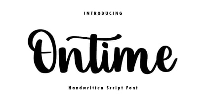 Ontime is a modern handwritten script font! This font is perfect for shirt designs, websites, branding, quotes, children's designs, blogs, logos, invitations and more!