4,982 search results
(0.108 seconds)
- Krimhilde by FDI,
$25.00 Krimhilde was originally designed by Albert Auspurg and released in 1933 with the type foundry Ludwig & Mayer. The design mixes elements of German blackletter typefaces and geometric sans-serif designs, which became popular in the 1920s in the movement known as New Typography. The FDI version of Krimhilde offers both original styles (regular and bold) as “version A” with a full Latin 1 character set. “Version B” has alternative shapes for some letters to make the design more legible for people who are not familiar with the German blackletter shapes. In addition, there are optional display styles available (outline, shadow and fill), which can be used separately or together to create a chromatic layout.
 - Monkton Incised by Club Type,
$39.00 The inspiration for this typeface family came from my childhood experiences at West Monkton, amidst an historic part of the South West of England. Studies of the original incised capitals of the Trajan column in Rome were analysed and polished for this modern version. The lower case letterforms and numerals were then created in sympathy, taking their proportions from the incised letters of local gravestones. Its name honours not only the area where the original alphabet was conceived and drawn, but also the people responsible for fostering my initial interest in letters. These stylized incised typefaces give a depth to the letterforms that can be exploited in your typography - evoking the carved monumental inscriptions of the Roman era.
 - Eixample Villa by Type-Ø-Tones,
$55.00 The Eixample project is inspired by modernist signage of various examples found in the Eixample neighbourhood in Barcelona. The name of each subfamily is related to its location or to specific elements of the original sign. Villa is the abbreviation for Carrer Villarroel (Villarroel Street), where the Villarroel Pharmacy has been displaying this sign since the first quarter of the twentieth century. The Eixample Villa typeface system consists of sturdy letters free of ornaments with an industrial aspect. Only the treatment of the curves borrows modernist features. Like the rest of the families in the Eixample series, Villa shows its origin as a display font, but it has been engineered to give good results at small sizes as well.
 - Neue Haas Grotesk Text by Linotype,
$33.99The original metal Neue Haas Grotesk™ would, in the late 1950s become Helvetica®. But, over the years, Helvetica would move away from its roots. Some of the features that made Neue Haas Grotesk so good were expunged or altered owing to comprimises dictated by technological changes. Christian Schwartz says Neue Haas Grotesk was originally produced for typesetting by hand in a range of sizes from 5 to 72 points, but digital Helvetica has always been one-size-fits-all, which leads to unfortunate compromises."""" Schwartz's digital revival sets the record straight, so to speak. What was lost in Neue Haas Grotesk's transition to the digital Helvetica of today, has been resurrected in this faithful digital revival. The Regular and Bold weights of Helvetica were redesigned for the Linotype machine; those alterations remained when Helvetica was adapted for phototypesetting. During the 1980s, the family was redrawn and released as Neue Helvetica. Schwartz's revival of the original Helvetica, his new Neue Haas Grotesk, comes complete with a number of Max Miedinger's alternates, including a flat-legged R. Eight display weights, from Thin to Black, plus a further three weights drawn specifically for text make this much more than a revival - it's a versatile, well-drawn grot with all the right ingredients. The Thin weight (originally requested by Bloomberg Businessweek) is very fine, very thin indeed, and reveals the true skeleton of these iconic letterforms. Available as a family of OpenType fonts with a very large Pro character set, Neue Haas Grotesk supports most Central European and many Eastern European languages. - Ainslie Sans by insigne,
$- Say g'day to Ainslie Sans, insigne Design’s new typeface. Like its big brother, the new face incorporates a mix of influences from Oz, although Sans is pared down from the original semi-serif. The original Ainslie was inspired by Mt. Ainslie and the city of Canberra’s inner suburb of the same name. Canberra is Australia’s capital--a planned city designed by American architect Walter Burley Griffin. Griffin’s style and geometric design for the city, which include Mt. Ainslie, are now also the same structure that make up the foundation of Ainslie Sans. Unlike the original Ainslie family member, though, Ainslie Sans does away with much of the aboriginal-inspired touches by eliminating the semi-serifs, forcing the font to borrow more heavily than its predecessor from Canberra’s distinct, geometric design and style. The result’s a spiffy Australian font that’s usable within a wide array of applications. The trendy typeface incorporates a multitude of alternates. You can access these in any OpenType-enabled application. Alternates, swashes and alternate titling caps allow you to customize the look and feel. Also incorporated are capital swash alternates, old style figures, and compact caps. Check out the PDF brochure to view these options in action. OpenType enabled applications can take complete benefit of your automatic replacing ligatures and alternates. This font also presents the glyphs to help a wide array of languages. Try it for copy. Try it for a headline. Try it alongside the original Ainslie. Whichever way suits you best, give it a burl. You won't be sad you did.
 - Haarlemmer by Monotype,
$29.00 Haarlemmer is a recreation of a never-produced Jan Van Krimpen typeface that goes one step beyond authentic: it shows how he wanted it to be designed in the first place. The original, drawn in the late 1930s, was created for the Dutch Society for the Art of Printing and Books and was to be used to set a new edition of the Bible, using Monotype typesetting. Hence the problem: fonts for metal typesetting machines like the Linotype and Monotype had to be created within a crude system of predetermined character width values. Every letter had to fit within and have its spacing determined by a grid of only 18 units. Often, the italic characters had to share the same widths as those in the roman design. Van Krimpen believed this severely impaired the design process. The invasion of Holland in World War II halted all work on the Bible project, and the original Haarlemmer never went into production. Flash forward about sixty years. Frank E. Blokland, of The Dutch Type Library, wanted to revive the original Haarlemmer, but this time as Van Krimpen would have intended. Blokland reinterpreted the original drawings and created a typeface that matched, as much as possible, Van Krimpen's initial concept. While Van Krimpen's hand could no longer be on the tiller, a thorough study of his work made up for his absence. The result is an exceptional text family of three weights, with complementary italic designs and a full suite of small caps and old style figures. Van Krimpen would be proud.
 - Transport New by K-Type,
$20.00 Transport New is a redrawing of the typeface designed for British road signs. In addition to the familiar Heavy and Medium weights, Transport New extrapolates and adds a previously unreleased Light weight font originally planned for back-lit signage but never actually applied. Version 3.0 of Transport New features significant improvements including numerous outline and spacing refinements, and a full complement of Latin Extended-A characters. Also, to align Transport New with the 2015 release of Motorway, the other typeface used for UK road signage, Italic fonts for all three weights have been added. Originally designed by Jock Kinneir and Margaret Calvert beginning in 1957 and first published on the Preston bypass in 1958, the original Transport font has subtle eccentricities which add to its distinctiveness, and drawing the New version involved walking a tightrope between impertinently eliminating awkwardness and maintaining idiosyncrasy. The Grotesk roots of the glyphs were investigated and cheekily fine-tuned – uncomfortably close terminals of characters such as 5, 6, C, G, and e were shortened, the S and s were given a more upright aspect and their protruding lower terminals tucked in, overly wide glyphs like the number 4 were narrowed, and some claustrophobic counters were slightly opened up. The question mark was redesigned and parentheses given some stroke contrast. The x height was edged fractionally even taller. The Heavy font is actually more of a Bold, and the Light is pretty much a regular weight, but the original nomenclature has been retained for old times’ sake.
 - Lost and Foundry by Fontsmith,
$15.00 Breaking the cycle of homelessness We are partnered with The House of St. Barnabas, a private members club in Soho Square, whose work as a not for profit charity aims to break the cycle of homelessness in London. Each purchase (of the family pack) comes with a one month membership to The House and 100% of the proceeds from sales of fonts go directly to the charity to help their essential work. This unique collection of 7 typefaces is based on the disappearing signs of Soho, at risk of being lost forever due to the ever changing landscape of the area. By re-imaging the signage as complete fonts, we have rescued this rich visual history from the streets and present the typefaces into a contemporary context for a bright optimistic future. FS Berwick Thanks to its humble tiled origins, this Egyptian serif type maintains a uniform character width, creating the irregular letter proportions found in the final alphabet. Broad-shouldered, the bracketed serifs firmly ground the font, whilst its extreme hairlines become a necessity due to the uniform width. Of note is the upside down ‘S’, to be found on the original sign on Berwick Street. Perhaps due to its ceramic origins, there is a surprising ‘slippiness’ to its final appearance. FS Cattle Cattle & Son is best described as a wide, but not overly extended, grotesque-style sans serif, showing a uniform width and carrying a robust strength to its form. Whilst lightly functional overall, the purposeful diagonal legs of the ‘K’, ‘R’ and the tail of the ‘Q’ add an urgency to its appearance. The reduced size of the ampersand gives away Cattle & Son’s hand-painted origins, and the oblique compacted ‘LTD’ found on the original sign is also included in the final set. This beautiful sign is tucked away under an arch in Portland Mews, sheltering from the weather. Perhaps this is why it has lasted so long. FS Century This somewhat elongated set of Roman capitals was originally rendered in paint circa 1940, but its roots trace back to the Trajan Column in Rome. Witness the slightly unbalanced ‘W’ and the painter’s hand is revealed. Century’s flared serif style is extremely short, sharp and bracketed. The ‘M’ is splayed and has no top serifs. Century has a uniform appearance of width, probably due to its sign-written origins. Yet is elegant, classic and exudes sophistication. FS Charity A true Tuscan letterform, the original is located on The House of St. Barnabas in ceramic tiles and was revealed in all its broken glory in 2014. FS Charity retains the option of using these incorrect characters (try typing lowercase in the test drive above and compare with the more uniform uppercase characters). FS Charity features fishtailed terminals on its strokes, a curious branched ‘T’ and the ‘S’ displays tear-drop ends to its serifs. Almost uniform in width, the ‘A’, ‘M’ and ‘W’ are the widest characters in this set. FS Marlborough The elongated Marlborough features diagonal terminals to some characters and numerals. Also retained is the space-saving contracted ‘T’ glyph from the original sign, while the ‘R’ features a distinctive wedge-shaped leg. Highly individual in this form, similar signage appears around Soho, but featuring a variety of widths in their design. FS Portland The sister type to Cattle & Son, Portland is oblique rather than italic. The serifs are not overly long, yet still enhance its rather rigid cap height and baseline appearance. Its ‘A’ has a top serif, the ‘M’ is square and the ‘G’ foregoes any spur. Particularly delightful is the open ampersand. Numerals align to encourage the horizontal flavour of the oblique style. Overall, Portland is both confident and graceful. FS St James A lineal Continental style, St James also displays a true sense of ‘Londoness’ in its titling form, perhaps influenced by early Underground signage. Irregular letterforms display a continental flavour, particularly evident in its Deco style ‘W’, ampersand and numerals. The rather high cross bar in the ‘A’ is also reflected in the raised middle strokes of the ‘M’. Noteworthy are the distinctive unions found on all of the characters and the additional small caps. The original lettering is still located on Greek St.
 - Anywhere - Unknown license

- Aristotle Punk - Personal use only

- Hand Drawn by ITC,
$29.00Hand Drawn is a faithful adaptation of the original typeface of hte Letraset range by Michael Gills. A set of numerals was added to complete the font. Hand Drawn has all the charisma of the 1950s brush style and should be set closely for the best impact. - Makalu by Juraj Chrastina,
$29.00 Makalu is a funny flower font inspired by the lovely drawings of the famous illustrator Zdeněk Miler (best known for his small mole). His flowers are at the same time cartoony and realistic. Enjoy this choice of 27 original and distinctive illustrations while creating your designs.
 - Prospect by ParaType,
$25.00 PT Prospect™. An original serif family designed in 1997-2001 by Natalia Vasilyeva and licensed by ParaType. A face of wide proportions and free lettershapes. The serifs have slanted edges. Based partially on the hand lettering of the author. For use in titling and display composition.
 - Eccentric by Solotype,
$19.95Here's another old-timer that needed a lowercase, so we drew one. Originally issued as a caps-only type by The American Type Founders Company about 1898, this font found its way into Craftsman period design. It was the inspiration for Galadriel, a dry transfer sheet alphabet. - Architect by Australian Type Foundry,
$30.00Based on the text on architect's plans. The designer asked friends and relatives for the plans for their house extensions, and he studied plans in the public library, then blended the best features of all the characters he could find. Architect was designed originally in 1999. - Sophisticated Lady NF by Nick's Fonts,
$10.00Legendary lettering artist Alf Becker called his original offering “Aristocrat”; this version is a little less pretentious, but still suitably snooty. Graceful and elegant, but with a few amusing turns. Both versions of this font contain the complete Latin 1252 and Central European 1250 character sets. - Letter Gothic MT by Monotype,
$29.99Letter Gothic font was designed by Roger Roberson for IBM sometime between 1956 and 1962. Inspired by Optima, the typeface originally had flared stems. A monospaced sans serif font designed for use on an IBM Selectric typewriter, Letter Gothic font is a good choice for tabular material. - Palatine by Larin Type Co,
$14.00 Palatine - this bold display typeface is a stylish and original, multipurpose font in a modern style with many alternatives, ligatures and swash that are very attractive, with their help you can make your project unique. And also use the main set to highlight exactly what you need.
 - Fell Type Premium by MAC Rhino Fonts,
$59.00 A new take on the classic typeface used at Oxford University Press. Carefully crafted from original sources and updated for the modern times. Size specific weights and meant to act as a work horse for longer texts. A joint venture between Stefan Hattenbach and Johan Ström.
 - Sheepfold by Letterara,
$14.00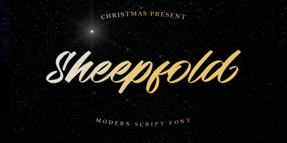 Sheepfold is a casual and natural handwritten font, with an incredibly friendly feel and a stunning brush texture. It is the perfect font for making original and outstanding designs. This font is PUA encoded which means you can access all of the glyphs and swashes with ease!
 - KD Arguru Stencil by Kassymkulov Design,
$20.00 KD Arguru Stencil is a geometric display font that will give your projects an elegant look. It breaks away from traditional stencil faces by using circle as a main design element. Originally published in 2014, it's now been updated with changes to letter shapes, curves, OT features.
 - Erlissa by Epiclinez,
$18.00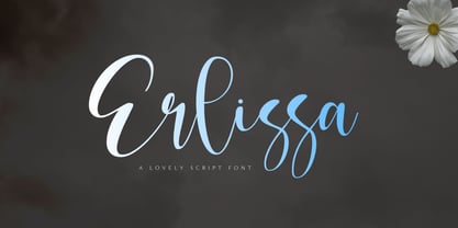 Erlissa is a sweet and elegant handwritten script font. This original look will appeal to a wide range of crafty ideas, from letterheads and titles to stationery. So what's included : Basic Latin A-Z & a-z Numbers, symbols, and punctuations Ligatures Accented Characters : ÀÁÂÃÄÅÆÇÈÉÊËÌÍÎÏÑÒÓÔÕÖØŒŠÙÚÛÜŸÝŽàáâãäåæçèéêëìíîïñòóôõöøœšùúûüýÿžß Thank you
 - Pixeloza 01 by Fontsphere,
$12.00 Pixeloza 01 is a pixel-style, grid-based, display typeface. Pixeloza 01 is available in two complementary options: Pixeloza 01 Regular and Pizeloza 01 Skewo Regular. It is distinguished by its simplicity and original form. It gives a lot of possibilities in creating unconventional, creative, unique projects.
 - Pacific Classic by Holland Fonts,
$30.00The Pacific Standard Bold was originally designed as a - capital only - poster typeface for a poster for the 30th International Film Festival Rotterdam in 2001 in the Netherlands. Theme of the festival was 'ports'. The design is inspired by the unpretentious typography often seen in ports. - WIP Symbol by WIP Fonts,
$49.00WIP Symbol is a font of illustrations and icons drawn by hand for office communication and beyond; a perfect companion for the WIP handwriting fonts: FirstLady, GrandMa, MachoMan, MoneyMaker, SugarBaby and ThePresident. Originally designed in 1995 the font was extended and the paths were simplified in 2005. - Foolish Hand by Sipanji21,
$10.00 Foolish Hand is a handwritten font written in original handwriting, this font is good for various graphic designs, such as making children's drawings, coloring book covers, packaging, advertising, movie covers, posters and for any crafting. I hope this font is useful for you, have a nice day.
 - P22 Sherwood by IHOF,
$24.95 Sherwood is a reproduction of an unusually small wood type font from England, dating from the last years of the 18th century. Somewhat reminiscent of Caslon Old Face. The original wood type is used at Sherwood Letterpress and can be seen on the Sherwood home page.
 - Larou by Emily Lime,
$29.00 Larou was created to be original and fun, imperfect and quirky. Letters are not uniformly sized... they are created such that the final product is unexpected and interesting. Larou includes alternates and ligatures - to assist with readability and letter flow. Try it, you will fall in love!
 - Bergling Fantasia NF by Nick's Fonts,
$10.00This quirky little gem was patterned after single-stroke handlettering originally crafted by John M. Bergling, whose peregrinations through pulchritudinous penmanship also provided the inspiration for Erehwon Roman NF. Both versions of this font include the complete Unicode 1252 Latin and Unicode 1250 Central European character sets. - Book& by Holland Fonts,
$30.00A design reminiscent to school script and handwriting, yet slightly off beat, with a gracious and elegant motion. Originally designed for invitations for a book store, the typeface likes to think it refers refers to book typography of the 40s and 50s of the last century. - Pacific Standard by Holland Fonts,
$30.00The Pacific Standard Bold was originally designed as a - capital only - poster typeface for a poster for the 30th International Film Festival Rotterdam in 2001 in the Netherlands. Theme of the festival was 'ports'. The design is inspired by the unpretentious typography often seen in ports. - Qallegro by Rochart,
$12.00 Qallegro typeface is original handcrafted font. Qallegro typeface is great for Branding, Logo Design, Lettering,Logotype, Clothing, Poster, magazine and other design project. Qallegro has 8 styles, one of which gives you the ability to change colors in one style, so that makes your design more amazing!
 - Elk Grove JNL by Jeff Levine,
$29.00Elk Grove JNL is both historical and original in design. Inspired by a small sampling of letters from an 1800s wood type called Facade, Jeff Levine created the remaining characters. Because of its highly condensed design, it's best when used in large headlines and short phrases. - Urmeba JNL by Jeff Levine,
$29.00 Urmeba JNL has an odd history. Originally conceived a few years back as a... well... ‘barf’ font, this limited-character type design was revised by Jeff Levine into a less-offensive idea... that of friendly little amoebas (such as you'd find in a glass of water).
 - Vanities by Solotype,
$19.95A Victorian type which, like so many others, was originally offered without a lowercase. As we do so often, we designed a matching lowercase for it. We also added a shaded version of the caps, figures and points of our earlier Vanities font. A nice companion face. - Brogads by Stringlabs Creative Studio,
$25.00 Brogads is a magical script font carefully created with a touch of elegance. This is a beautiful combination of timeless elegance and authentic calligraphy. It features an incredibly classic style, while still keeping a friendly feel. Brogads is the perfect font for making original and outstanding designs.
 - OK Corral by FontMesa,
$20.00 OK Corral is a revival of a very old Italian font that you may have seen in the past under the original name of Italian Print. The Lined version of this font has never been known to have a lower case set of letters until now.
 - Bajka by Posterizer KG,
$16.00 Bajka (or Fairy tale in English) is a Baskerville font family made for children’s fairy tale books. Originally designed in 2010 ([www.behance.net/gallery/483582/Fairy-tale-font Fairy tale Font]). Today the family contains Regular, Bold, Italic, Bold Italic, Symbols and Ornaments (Latin, Cyrillic, dingbats, ornamental caps).
 - Kids Touch by Sipanji21,
$15.00 Hello, this is kids touch typeface, it is original and natural kids handwritten font. This article is good for a variety of designs, such as: packaging, advertising, crafting, merchandise, banner posters, titles, book covers, tote bags, and other designs. make your design more natural with Kids Touch.
 - Raw by Device,
$29.00 Raw was designed in 2006 for Shelter, the UK homeless charity. It was originally called “Cathy”, after the film “Cathy Come Home”, which was instrumental in inspiring the founding of the charity. Now reworked with more “inkiness”, it is released as part of the Device range.

