853 search results
(0.006 seconds)
- LineWire by The Northern Block,
$16.70 A modern geometric typeface influenced by the work of Dutch designer Wim Crouwel . The angular nature of the design lends itself strongly towards large display applications but because each character is formed from a consistent grid, stylish body copy can also be achieved. Details include 6 weights, a complete character set, manually edited kerning and Euro symbol.
 - Project Fairfax by Miller Type Foundry,
$15.99 Project Fairfax is a unique stencil typeface designed on a strict grid. It is perfect for any stencil design, especially a military look. It comes in three styles, sans, regular, and slab; each with a non stencil counterpart. It comes with a full Latin character set, tabular and lining figures, numerous ligatures, and stars and arrows for ornaments.
 - Stay Gladin by IM Studio,
$19.00 Stay Gladin Script Font Trio is a new modern script font with an irregular baseline. Stylish and feminine. Stay Gladin Script looks beautiful in wedding invitations, thank you cards, quotes, greeting cards, logos, business cards and more. Perfect for use in ink or watercolor. Includes start and end letters, alternatives and support for many languages. Thanks You.
 - Bipolar by VersusTwin,
$39.00 The Bipolar family of fonts is a synthetic blend of digital grid and historical blackletter forms, combining readability and ornamentation into a single modern interpretation. If you feel like you recognize this font style, you may have seen it as the menu font in the popular RockBand series of games. This trendy neo-medieval revival is hot!
 - Baksheesh by HamburgerFonts,
$25.00 The Baksheesh family comes in three weights with accompanying italics and small caps. The catalyst for the development of the typeface came from the desire to create a contemporary family of constructed letterforms built upon a flexible system. The aesthetic of the font is influenced by the characters drawn by Wim Crouwel in 1976 for Olivetti’s typewriter font that could support varying character widths, hence Baksheesh’s faux-monospace appearance. Each of the characters has been designed according to an intricate grid, helping to rationalise the letterforms into a system that can be translated across the various styles. The flexibility of the grid also allows for optical adjustments to be made, for example stroke thinning at junctions and baseline/x-height overshoot for enhanced definition throughout. Baksheesh is suitable for setting small amounts of text as a distinguishable and legible headline font.
 - Acton by Device,
$29.00 Acton is a deceptively simple, grid-based design. Though derived from a 2 by 3 arrangement of blocks, it uses white spaces to allow for more complex shapes – for example as the R – where the underlying 3 by 5 arrangement is apparent. It also departs from this strict grid-based logic for characters such as the the T, L, f and r, whose cross-bars are shorter than they would otherwise be in order to promote optical evenness. No elegant solution could be found for the V, which in geometric fonts can appear very similar to the U, lacking as it does the cross-bar that can differentiate a square A from the capital form of the n. However, the resultant diagonal retroactively proved useful on the lower-case e and a, characters that otherwise would have more uninteresting design solutions.
 - Merchande by Tom Chalky,
$19.00 Introducing the 'Merchande' Font Trio Inspired by a variety of midcentury typefaces, the Merchande trio was designed to add pizzazz to your branding, packaging, advertising, and print projects. What's Inside? The serif is fantastic for headlines, logos, and anything that needs to grab attention. Its tall, condensed, and confident appearance is a great head-turner, made even better when combined with the two below. The script is perfect when a premium touch is needed for your work. Its use immediately adds a charming, personal quality. The best part, it's wonderfully legible in any size. While the sans works fantastic as a large display font, it truly shines when used for its intended purpose. Small text. Evidence of this is scattered throughout the presentation images. Tip: Increase the space between the letters (tracking), it looks awesome. Thanks for looking! Tom
 - Blackberry Macarons by PeachCreme,
$13.00 Say hello to the Blackberry Macarons Font Trio! Heart-warming Script, Display, and Sans Serif fonts that will brighten your design. Blackberry Macarons Display - includes all caps regular and multilingual letters, punctuation, numbers, and as a bonus the letters A, K, M, Q, R with beautiful swashes to keep your designs attractive :) Blackberry Macarons Script - has all uppercase and lowercase letters, numerals, punctuation, and 42 fancy ligatures as well to add a cheesy flair to your words. Blackberry Macarons Sans - a cute and fun hand-drawn typeface with a little imperfect look that works great to add a handmade touch to your projects. Includes a full set of regular letters, numbers, and punctuation. Sweet and quirky, the Blackberry Macarons Font trio is perfect for recipes, book illustrations, lettering, fun packaging, greeting cards and so much more!
 - Dixplay by Emtype Foundry,
$69.00 Dixplay, a typeface based on a pixel grid, is available in two weights: regular and black. Inspired by video game aesthetics of the 80s, was originally intended for display applications, but it works fine on paper as well. The font has been conceived in 20 px size allowing more freedom to manipulate it and making a big difference with other fonts of its kind, this difference it’s more evident in Dixplay Black. As a result, it’s optimized for screen use at 20 px and its multiples. Spacing is one of the most outstanding aspects of Dixplay. While pixel fonts doesn't have kerning pairs, Dixplay offers more than 300 manually done that fit perfectly to the grid. It is available in Open Type format and supports Western European Languages that uses the Latin alphabet. For more details see the PDF.
 - Pacioli by MADType,
$29.00 This font is based on an alphabet published by Luca Pacioli in his 1509 mathematical treatise De divina proportione. In this book, Pacioli describes how to build the Roman alphabet geometrically using lines, squares and circles. Pacioli was not the first or the last man in his era to describe the building of letters mathematically. Felice Feliciano did this before Pacioli, and Albrecht Dürer further developed these forms years after. According to Pacioli, the thick strokes should be 1/9th of the height, and the thin strokes should have 1/2 the weight of the thick strokes. I felt that this beautiful alphabet needed to be restored to its full geometric glory and set out to construct an accurate replica using Pacioli's instructions. Included in the font you'll find the letters that have the grid overlay and also the letters without the grid. The letters J, W, U, and Z were not included in the book, so I have created my own versions of these characters that fit into Pacioli's grid. Pacioli shows two different Os in the book, so I have included the second O as well as a second J, Q, and Z as OpenType stylistic alternates. Also included in the font are border patterns and a fleuron taken from the cover of the book.
 - Signatria - Personal use only

- Boldu by Ryzhychenko Olga,
$4.00 Boldu is a simple grotesque font. I created it using simple forms. I love geometry and tried use only one size of lines. Boldu was created being impressed by works of beginning of 20th century - period of strict and geometric forms
 - Artios Pro by DBSV,
$70.00 There are a lot of narrow passages... like the Straits of Gibraltar, Hormuz, of Malacca, of Thermopylae, the Dardanelles, the Dervenakion, Magellan, Rentina of Naruto, Kerch etc. I tried to pass into mine closely with the name «Artios Pro". Walking on the same considerations as the previous series (Khamai/Aeolus/Corset) I tried to give some sense of diversity for narrow passages of the letters. These twelve style are the result. And here, the "Rail" engage with "Semi Bold" in the same way as the previous series. This series is composed and includes 12 fonts with 625 glyphs each, with true italics and supports Latin, Greek and Cyrillic.
 - Hestia by Fidan Fonts,
$18.70 Hestia is an uppercase creative font inspired by flames of fire. We've tried to create a dynamic font based on sans-serif fonts. It's works perfectly for headlines, logos, posters, packaging, T-shirts, postcards and many more. Latin-based Language Support. Happy creating!
 - Scribe by Wiescher Design,
$49.50 Scribe is an elaborate typeface somewhere in between Bodoni and an English script. It has interwoven capitals and joining lowercase letters. I have tried to make something new that has this old, settled touch. I think I like it. Yours sincerely, Gert Wiescher
 - Athletic Dept by Hustle Supply Co,
$15.00 Athletic Dept This typeface is a hand drawn, vintage inspired athletic display font. This typeface was drawn on grid paper, scanned and vectorized in illustrator. The roughness and imperfections vary slight for each letter, giving your project an authentically handcrafted look. This typeface comes with Western European Characters as well as some special Characters. It also includes OTF, TTF & Web Font Files.
 - Black Hymned Script by Letterhend,
$17.00 Black Hymned - Font Trio is a font package containing three style with same vibes!. Each font contains lowercase, uppercase, numbers, symbols and also supports multi languages. You will get TTF and OTF. This font can use in any software without problem! A simple font. Features: uppercase & lowercase numbers and punctuation multilingual PUA encoded Please like and follow as appreciation, Thank You,
 - Facto by The Northern Block,
$39.00 A simple, mechanical typeface without distractions. Slightly condensed curves are developed from a compact grid layout to produce a crisp, fresh and legible type family. The unadorned letterforms work perfectly with complex information-based applications such as user interfaces, mobile devices and websites. Details include six weights with italics, 480 characters, five variations of numerals, stylistic alternatives, manually edited kerning and Opentype features.
 - Topographic Sans JNL by Jeff Levine,
$29.00 A 1940s-era book from the U.S. Army Corps of Engineers entitled "Topographic Drafting" features a page for "lettering construction and spacing" in the process of map making. The letters and numbers were formed on grids using that mechanical drafting process for uniformity in stroke width. This was the basis for Topographic Sans JNL, which is available in both regular and oblique versions.
 - Growing Garden by Wyarecreatype,
$7.00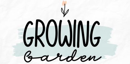 Growing Garden is an elegant and natural trio handwritten font. This original look will appeal to a wide range of crafty ideas. It looks stunning on wedding invitations, thank you cards, quotes, greeting cards, logos, business cards and every other design which needs a handwritten touch. Includes: Uppercase and lowercase For every questions or help, Please contact me. Happy Creating! Thanks!
 - Grigory by Hanoded,
$15.00 I have always been fascinated by Grigory Rasputin, the rogue ‘monk’ who influenced the Russian Tsar Nicholas and - according to rumours - bedded the Tsarina. Grigory font was handmade with the use of a Chinese marker pen and rough paper. Grigory comes with all the trimmings; some alternate glyphs, a few double letter ligatures, a great amount of diacritics and basic Cyrillic as well.
 - Yalla Pro by Borutta Group,
$39.00 Yalla PRO was inspired during a trip Mateusz Machalski took to Cairo (Egypt). The vast array of strong Arabic headline type, geometric forms working in interesting ways and contrasting with smooth, calligraphic details fed the design. Due to the same proportions and heights, Yalla works great together with Afronaut. Yalla was extended in 2024 by Mateusz Machalski & Małgorzata Bartosik with new weights.
 - Reznik by The Northern Block,
$32.00 A compact sans serif with a technical origin. Each character was drafted out from a grid template and then refined through the application of subtle curved detailing. The result is a precise, contemporary typeface best suited to identity, mobile and video game development. Details include 9 weights with italics, 500 characters, 5 variations of numerals, stylistic alternatives, manually edited kerning and Opentype features.
 - II Balfron by Increments,
$19.00 Inspired by Ernö Goldfinger's east London tower block of the same name, II Balfron is an imposing, all caps, one-weight typeface. Brutalist in form, the characters embody the principles of the distinctive 27-storey concrete profile with unexpected angles set within a rigid, structural grid. Much like Goldfinger's humanist, utopian housing ideals, the font is best viewed at large scale.
 - MB Picture House by Ben Burford Fonts,
$30.00 Small caps art deco font inspired by the golden age of Hollywood and childhood trips to the Majestic Cinema. Two styles, each with three weights. Picture House One is sharp and crisp, Picture House Two has a slightly 'Out of Focus' look to it. Both come with extended language support and oldstyle numbers, giving a lot of scope for may uses.
 - ITC Kokoa by ITC,
$29.99ITC Kokoa is the work of German graphic designer Jochen Schuss. Schuss found the seeds of inspiration on a trip to Ghana and expanded and experimented with the idea on the computer. It includes an array of symbols and borders to complement its stylized letters. ITC Kokoa retains a touch of its African roots but is overall a modern, funky font. - Raeling by Volcano Type,
$19.00Raeling is a display font inspired by a visit to Luxembourg, capturing shadows falling intricately from park railings appearing as broken-script lettering. A mixture of manmade / natural, traditional / new, ugly / beautiful reflecting the paradox and contradictions of the city. A single curve and stroke developed into a grid block from which characters emerged and broke free of their barriers and conformity. - Bix Metric by S6 Foundry,
$20.00 Bix Metric is a stylistic display font developed within a set grid. The mono-spaced first set of the family comes in 3 styles in both upper and lowercase glyphs allowing mixing of infinite combinations. Perfectly suited for headlines, large-format prints, brand identities, social media, advertising, editorial design, posters, magazines, logos, headings, digital and more. With multi-language support.
 - Structorator by Furiosum,
$15.00 Structorator is a grid-based, experimental display font. This typeface emerged from experiments with generative type design. It evolved from a piece of code into a fully usable opentype font. The two main features are its rigid but playful design and a multitude of alternate glyphs. These features make it possible to create interesting lettering when using the default spacing. The glyphs are constructed from a limited set of patterns which are arranged within a predefined grid. The line thickness corresponds to the different cuts. Due to the rather complex shape this font will look best in larger sizes and resolutions. Its best suited for headline, display or illustrative work. - 3 weights: light, medium and heavy - 5 character sets - 3 number sets - Basic punctuation - Seperate diacrits - Ornamental glyphs - Access via stylistic sets *OT feature - Random access from the whole range of chars *OT feature - Total of 1062 Glyps
 - Syom by Luxfont,
$38.00 Take a trip back in time with our unique color font family Syom! The rounded and inflated shapes of the letters embody the atmosphere of decades of the last century, while remaining relevant in modern design. Features: - Real 3D effect - Extras - Multilingual - Ability to adapt 3D letters to other languages - Kerning IMPORTANT: - Check the glyphs in the font before buying! - SVG fonts contain raster letters.
 - Pixeloza 03 by Fontsphere,
$12.00 Pixeloza 03 is a pixel-style, grid-based, display typeface. Compared to Pixeloza 01&02 the lightest and clearly narrow version. The font is characterized by its simplicity, attention to detail, and original forms. You can use it in a wide variety of projects. It gives many possibilities for creating graphics. Pixeloza 03 is available in two options: Pixeloza 03 Regular (FREE) and Pizeloza 03 Skewo Regular.
 - Matryoshka by Volcano Type,
$19.00 Matryoshka is a display layering type family which is inspired by the Russian wooden doll. The family contains eight different weights from XXS (thin) to XXL (fat) + Pregnant (all in one). The design is based on an elaborate and complex grid, so each font fits perfectly into the other. With the Matryoshka family the typographer can create millions of new solutions. Play with it!
 - Stink Buster by Bogstav,
$16.00 There’s nothing stinky about this font, don’t worry! But what’s is up with Stink Buster is a whole lot of serifs gone bad! Each letter is loosely based upon the classic slab serif style, but influence by grafitti and comics just made them crooked and off the grid. But despite that, the font works great if you have a message that you want shouted out loud!
 - Kg Stuttgart 1930 by Martin L'Allier,
$10.00KgStuttgart1930 -- Kunstgewerbeschule Stuttgart 1930 -- is based on a printed sample of a font designed in 1930 at the Stuttgart School of Applied Arts. Found in the book ABZ, more alphabets and other signs by J. Rothenstein and M. Goodings. I recreated the grid and kept some awkward letters of this bauhaus-era inspired design. I created the missing glyphs and added alternate versions of already existing ones. - Psyleidoscope by Designpiraten,
$19.00 Imagine a font that reveals more and more details the closer you get. Clearly readable in small sizes and illustrative when blown up to large scales. A psychedelic trip, a kaleidoscope of discoveries – that is Psyleidoscope. Use it in extreme sizes – large and small – to get all the fun out of it. There are two styles, Regular and Bold, with glyphs that support 207 different languages.
 - Breuckelen by Glyphobet,
$14.99 Breuckelen was inspired by the regular patterns of the New York City plan. The grid of any large modern city is immediately recognizable by the distinctive pattern of major roads curving or slanting through it. This face is intended to be recognizable in the same way. It is named after the Dutch town after which Brooklyn is named, a word which also roughly translates as "broken land".
 - Bedford by Stereo Type Haus,
$25.00 Inspired by mosaic lettering by Heins & LaFarge, architects of the IRT (Interborough Rapid Transit) in New York City. Bedford hints at the station names on platform walls which date back to 1904 but modernize it through a rigid grid system and rounded corners. The family consists of two styles, Bitmap for web usage with a perfect pixel snap, and Rounded for a softer and bolder look.
 - Zenga by The Northern Block,
$29.99 Zenga is a contemporary typeface that fuses precise geometry with subtle hints of blackletter forms. The concept was to adapt core values from the gothic style and develop a design suitable for grid and pixel based platforms. Details include five distinctive weights with italics, over 500 characters, five variations of numerals with stylistic zero's, ten alternative characters, extended symbols including chess pieces and OpenType features.
 - FI Hover by Furkan İlbay,
$10.00 FI Hover is a great geometric display font for your hi-tech, futuristic and industrial projects. Bold, edgy and geometric characteristics of the glyphs make this font a really god fit for mechnanical equipments, techno-oriented music posters and computer-related designs. Because all of the glyphs made out of a hexagon grid, you can really sync this type with triangles, rectangels and other geometric shapes easily.
 - Sign Kit JNL by Jeff Levine,
$29.00During trips to the Miami Beach Public Library as a youth, Jeff Levine first caught sight of the signs made with a product called the Webway Sign Cabinet, manufactured by the Holes- Webway company of St. Cloud, MN. Having purchased an old set, Jeff has carefully re-drawn the alphabet and unique contrasting numbers from the original assortment, adding in an extended character set to his font.
