10,000 search results
(0.022 seconds)
- Digital Sans Now by Elsner+Flake,
$59.00 Digital Sans Now combines and completes the many diverse requests and requirements by users of the past years. By now, 36 versions for over 70 Latin and Cyrillic languages have become available, including Small Caps. Digital Sans Now is also available as a webfont and reflects, with its simplified and geometric construction and its consciously maintained poster-like forms as well as with its ornamental character, the spirit of the decorative serif-less headline typefaces of the 1970s. The basic severity of other grotesque typefaces is here repressed by means of targeted rounds. Exactly these formal breaks allow the impression that it could be used in a variety of visual applications. Short texts, headlines and logos of all descriptions are its domain. It is because of this versatility that the typeface has become a desirable stylistic element, especially in such design provinces as technology, games and sports, and that, for many years now, it appears to be timeless. Additional weights designed on the basis of the original, from Thin to Ultra, the Italics, Small Caps and alternative characters allow for differentiated “looks and feels”, and, with deliberate usage, give the “Digital Sans Now” expanded possibilities for expression. The basis for the design of Digital Sans Now is a headline typeface created in 1973 by Marty Goldstein and the Digital Sans family which has been available from Elsner+Flake since the mid-1990s under a license agreement. The four weights designed by Marty Goldstein, Thin, Plain, Heavy and Fat, were originally sold by the American company Visual Graphics Corporation (VGC) under the name of “Sol”. Similarly, the company Fotostar International offered film fonts for 2” phototypesetting machines, these however under the name “Sun”. The first digital adaptation had already been ordered in the mid 1970s in Germany by Walter Brendel for the phototypesetting system Unitype used by the TypeShop Group, in three widths and under the name “Digital Part of the Serial Collection.” Based on the versions by VGC, Thin, Plain, Heavy and Fat, new versions were then created with appropriate stroke and width adaptations for data sets for the fonts Light, Medium and Bold as well as for the corresponding italics
 - Old Towne Pro by RMU,
$40.00 Classic Western-style slab serif font extended to include Cyrillic and Greek letter forms.
 - Berengard Caps Two by Intellecta Design,
$12.00 a classical wood type era box ornament using blackletter... a beautiful arrangement for publishing edition and other jobs
 - Two Lines Loop by Kaer,
$21.00 Alphabet set made of two white parallel lines. They are looked like infinite looped icons. Ideal for dynamic app, minimalism design, sports identity, technology adv. What's included? Uppercase (lowercase are the same) Numbers Symbols Punctuation Multilingual support Please feel free to request any help you need: kaer.pro@gmail.com Best, Roman.
 - Wake Up Now by Seemly Fonts,
$12.00 Wake Up Now is a cute and simple lettered handwritten font that can be used for all chalkboard quotes or teaching material! Its authentic look will add a realistic feel to your designs.
 - Precious Sans Two by G-Type,
$60.00 Precious Sans Two is a complete reworking of the 2002 design which was only ever available in PostScript format. Over a decade later G-Type’s Nick Cooke decided to re-appraise the typeface, scrutinise the old letterforms and overhaul the family. Make no mistake though, Precious Sans Two is no rudimentary re-release; nearly every character has been redrawn, re-proportioned, respaced and improved. Precious Sans Two is now in cross-platform compatible OpenType format with extended Latin language support for Western & Central Europe, the Baltics & Turkey. The original quirkier glyphs (f, g, I) have been retained as an OT style set feature and the typeface now contains small caps and an extensive set of discretionary ligatures as well as both proportional & tabular figures. The character set is further enhanced with the addition of 20 directional single and double arrows in each of the six weights which range from Thin through to Black, all with accompanying italics. Precious Sans Two is a distinctively modern typeface, well equipped for advanced typographic use in print, web and digital publishing environments.
 - Kristall Now Pro by Elsner+Flake,
$49.00 The design of Kristall Grotesk Now is based on a cut by Wagner & Schmidt, Leipzig, from the 30s of the last century as well as the digital version Kristall Grotesk MdK, created for the Stiftung Werkstattmuseum für Druckkunst. The implementation of the Kristall Grotesk MdK, a headline font, was deliberately created as a replica to create a faithful reproduction of the original. The design of the complete family Kristall Grotesk Now is based on the one cut Kristall Grotesk Buchschrift by Johannes Wagner GmbH, 1937, with its function as a text family. Designer: in parts Johannes Wagner GmbH, Redesign Elsner+Flake, Hamburg Designdate: 1937, 2009 Publisher: Elsner+Flake Design Owner: Elsner+Flake Original Foundry: in parts Johannes Wagner GmbH
 - Futura Now Variable by Monotype,
$383.99 For nearly 90 years, Paul Renner’s Futura has been as popular as it is versatile—from children’s books to fashion magazines to the plaque on the Moon. Futura is a typographic icon. Futura Now offers designers a chance to see Futura with fresh eyes. It’s more truly Futura-like than any digital version you’ve ever worked with. “It brings some much-needed humanity back to the world of geometric sans serifs,” says Steve Matteson, Monotype’s Creative Type Director who led the design team. “Despite its reputation as the ultimate modern typeface, Futura Now is surprisingly warm,” he explains. “It’s just as at home set next to a leafy tree as it is next to a stainless-steel table, because it skillfully navigates the border between super-clean geometry and humanist warmth.” Futura Now—the definitive Futura—contains 102 styles, including: new Headline and Text weights; new Script and Display weights and styles; and new decorative variants (outlines, inlines, shadows, and fill). Its contemporary alignment of names and weights makes the family easier to understand and use, and its comfortable Text and judicious Headline subfamilies provide instantly refined spacing. With a large Latin, Greek, and Cyrillic character-set, Futura Now serves a wider international creative community. Futura Now is available both as individual OpenType fonts and as a set of Variable fonts, delivering limitless styles in a tidy digital footprint.
 - Funky Chicken Town by Comicraft,
$19.00 Ripped from the pages of the Art and Crazy Paving Lettering of The Lord of THE BEEF, SHAKY KANE, Comicraft Proudly Presents a font so wacky, so snakey, so achy-breaky, we could only call it FUNKY CHICKEN TOWN. And if that isn’t wacky ENOUGH — FUNKY CHICKEN TOWN features three — count ‘em — THREE versions of each letter!!! Opentype will automatically cycle between the alternates of each letter. FUNKY CHICKEN TOWN features solid and outline weights which can be layered in any number of funky ways, and features Comicraft’s trailblazing — often imitated never equalled -- Crossbar I Technology™ which automatically places capital “I” in i words like i, I’m, I’ll and I, and removes them from words like Chicken and Comics! Artwork by Shaky Kane from THE BEEF, available on Comixology.com
 - Toy Letters JNL by Jeff Levine,
$29.00 A vintage set of die-cut letters and number by Village Toys (circa 1930s or 1940s) featured a playful, bold serif typeface. This is now available digitally as Toy Letters JNL, in both regular and oblique versions.
 - Dez Now Sans by Dezcom,
$28.00 Dez Now Sans is a humanistic typeface family that was begun in 2005 by Chris Lozos of Dezcom. Since then, it has been nurtured, revised, and expanded to include 12 weights in both upright roman and true italics totaling 24 variations. This allows the user to choose the weights which best work for type-size, output device, and reproduction process. There is often a difference of opinion on what the best weight to use for normal text when setting type. The truth is, there is more than one answer. When you consider the size, weight, leading and set width—along with paper and ink specifications, you may find the need for several. The subject matter of the text with the specifics of the target audience, also increase the demand for expanding choices. Dez Now Sans was designed with several potential text weights to address any circumstance. Dez Now Sans gives you a full and varied toolbox of fonts to choose from.
 - Town Meeting JNL by Jeff Levine,
$29.00 Town Meeting JNL (available in both regular and oblique versions) is a modified version of Mud Creek JNL (which was based on Tuscan Egyptian – a classic wood type). The side spurs were removed and the split serifs were replaced by slab serifs.
 - Christmas Doodles Too by Outside the Line,
$19.00 Christmas Doodles Too is the follow up font to Christmas Doodles. More Christmas icons including a tree, fun new ornaments, a dove, gifts, pine trees, a church, drinks, sleigh, tree lights, drum, horn, Santa hat, holly, snowflakes, stockings, candy, and mistletoe. This font works well with Holiday Doodles and Holiday Doodles Too which also have Christmas icons in them.
 - Circle Two Letter by Fauzistudio,
$12.00 Cilcle TwoLetter Monogram Logo Font Family with OpenType magic that can adjust to front and back letters, there are 10 frame variations that you can access at numbers 0-9 how to activate it simply by adding a number in front of your initials, typing something (0AB - 9AB) it will automatically compose . you can use it on any Logo project it is perfect to add to your collection. Cilcle TwoLetter font FAMILY – includes 9 weights (Thin, Extra light, Light, Regular, Medium, Semi Bold, Bold, Extra Bold, Black) : Cilcle TwoLetter Thin Cilcle TwoLetter Extralight Cilcle TwoLetter Light Cilcle TwoLetter Regular Cilcle TwoLetter Medium Cilcle TwoLetter Semibold Cilcle TwoLetter Bold Cilcle TwoLetter Extra Bold Cilcle TwoLetter Black Hope you enjoy. Intuisi Creative
 - Bornholm Tejn Low by Trine Rask,
$25.00 Bornholm Tejn is named after a village »Tejn« on the only rocky island in Denmark »Bornholm« Bornholm Tejn Low is the lowercase variant of Bornholm Tejn, released in 2012, the first face in a series of rough stone cut typefaces, that shares proportions, but differs in any other aspect like different pieces of rock. It is a powerful face, but still very friendly. Good for very big sizes, but can be used for small texts, movie titles, cartoons … Bornholm Tejn Low has a large x-height which supports the heavy and black look of the typeface. It contains tabular and proportional old style and lining figures.
 - Display Art Two by Gerald Gallo,
$20.00 Display Art Two is a display font inspired by the art nouveau fonts popular at the turn of the 20th century. It is not intended for text use. It was designed specifically for display, headline, logotype, branding, and similar applications. Display Art Two has an uppercase alphabet, numbers, and punctuation.
 - Pentagram Two Letter by Fauzistudio,
$9.00 Pentagram TwoLetter Monogram Logo Font Family with OpenType magic that can adjust to front and back letters, there are 10 frame variations that you can access at numbers 0-9 how to activate it simply by adding a number in front of your initials, typing something (0AB - 9AB) it will automatically compose . you can use it on any Logo project it is perfect to add to your collection. Pentagram TwoLetter font FAMILY – includes 9 weights (Thin, Extra light, Light, Regular, Medium, Semi Bold, Bold, Extra Bold, Black) : Pentagram TwoLetter Thin Pentagram TwoLetter Extralight Pentagram TwoLetter Light Pentagram TwoLetter Regular Pentagram TwoLetter Medium Pentagram TwoLetter Semibold Pentagram TwoLetter Bold Pentagram TwoLetter Extra Bold Pentagram TwoLetter Black Hope you enjoy. Intuisi Creative
 - Front Row JNL by Jeff Levine,
$29.00 Front Row JNL is an all-caps reinterpretation of Morris Fuller Benton's 1937 type design "Empire", and is available in both regular and oblique versions. As is often the case when a digital type font is based on a few letter examples found on a printed sample [in this case, the sheet music of the 1946 Guy Lombardo hit "What More Can I Ask For"], the missing characters were drawn from scratch.
 - Ovoid Two Zero by No Bodoni,
$35.00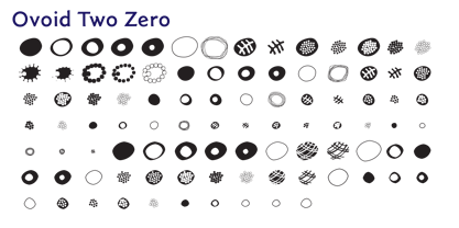
- Metro New Two by JAB'M,
$15.00The main inspiration is from Art Nouveau which flourished in Europe at the end of the 19th and beginning of the 20th centuries. This design included furniture (Majorelle, Lalique) and architecture (Victor Horta, Henry Van de Velde, Gaudi, Alfons Mucha). But Hector Guimard remains the favorite for all aspects of its art and, of course, its typefaces used on the Parisian Metropolitan posters. In particular, the various kerning of the various letters he used to make the poster a whole design from singular designs, leading to numerous variations. As a designer, I initially worked a first version, called Metro New One, which is more geometric and traditional. This design "Two" has more flexible shapes and long vertical hooks. It can be used to enhance specific parts in letters and books in the context of Art, specially Art Nouveau and Art Deco of course, posters of any kind. - Gothic Initials Two by Gerald Gallo,
$20.00 Gothic Initials Two was inspired by the beautifully-written gothic scripts of medieval scribes. The font contains the upper case letters A through Z under both the character set and shift+character set. This font is intended for use as initials, monograms, drop caps or wherever fancy letters are desirable.
 - Now Appearing JNL by Jeff Levine,
$29.00Now Appearing JNL is a digital version of some hand-lettering spotted on an early 1960s ad for a Miami Beach night club. Its fun, casual appearance makes it perfectly suitable for any project that conveys a relaxed atmosphere. The font was intentionally not kerned, so the free-flowing form of the lettering is at its best, but it can be set tight by hand if a more compact look is desired. - Citix Two Condensed by Eurotypo,
$58.00 Citix Two Condensed is a new font derived from Citix Regular –a traditional pen-formed flowing script–, but containing a complete new set of capital letters, titling, ligatures and swashes. This font may be a good option to combine with Citix Regular, specially in fine tune and accurate works, suitable for commemorative letters, invitations cards, lettering, logotype design and the most elegant visual communications projects. This font comes with five different kinds of capitals, Contain full OpenType features to work with: a full set of swashes, stylistic alternates, standard and discretional ligatures. Small caps, Central European Languages, Case sensitive forms, Old style numerals, ornaments and tails.
 - Ten Ton Truck by PizzaDude.dk,
$20.00Ten Ton Truck is a heavy, but very legible font. Works very well with massive text, as well as headlines and such. - Heart Doodles Too by Outside the Line,
$19.00Heart Doodles Too is the follow up font to Heart Doodles . This one is a bit fussier and fancier and more detailed. 41 hearts for all your Valentine and Wedding needs. - Display Digits Two by Gerald Gallo,
$20.00 Display Digits Two is a display number font with eight sets of variations of the same digits. The digits 0 through 9, with period and comma in appropriate variations, are prepared as (1) solid, (2) outline, (3) solid with contour outline, (4) outline with 3-D shadow, (5) 3-D shadow only, (6) outline with drop shadow, (7) positive in circle, (8) negative in circle.
 - Chi Town NF by Nick's Fonts,
$10.00A 1931 poster for the film The Man from Chicago provided the pattern for this quirky Deco delight. Although the fonts is all uppercase, tasty variants have been added in the lowercase positions, and all possible letter combinations have been kerned, so you can mix the forms freely. This font contains the complete Latin language character set (Unicode 1252) plus support for Central European (Unicode 1250) languages as well. - Top Hat JNL by Jeff Levine,
$29.00Top Hat JNL is an new treatment given to Jeff Levine's Art Lover JNL capturing the classic look of Art Deco at its boldest. - Helvetica Now Variable by Monotype,
$328.99 Helvetica Now Variable Helvetica Now 2.0 builds on the groundbreaking work of 2019’s Helvetica Now release—all of the clarity, simplicity, and neutrality of classic Helvetica with everything 21st-century designers need. In this 2021 release, we introduce Helvetica Now Variable and add condensed weights to the Helvetica Now static fonts. Helvetica Now 2.0 includes 96 fonts in three distinct optical sizes (Micro, Text, and Display), now with 48 new condensed weights. The Helvetica Now Variable fonts include even more: 144 instances—48 normal, 48 condensed, and 48 compressed. Helvetica Now Variable gives you over a million new Helvetica styles in one state-of-the-art font file (over two-and-a-half million with italics!). Use it as an extension of the Helvetica Now family or make custom-blends from its weights (Hairline to ExtraBlack), optical sizes (four point to infinity), and new Compressed and Condensed widths. Create infinite shades of expression, incredible typographic animations, and ultra-refined typography. Its single font file makes it easier to use and wickedly fast. Load one file and access a million fonts—in a fraction of the size of a traditional font family. More freedom. More expression. More power. More. Helvetica. Now. Each one of the Helvetica Now static fonts has been carefully tailored to the demands of its size. The larger Display versions are drawn to show off the subtlety of Helvetica and spaced with headlines in mind, while the Text sizes focus on legibility, using robust strokes and comfortably loose spaces. Helvetica Now's Micro designs are simplified and exaggerated to maintain the impression of Helvetica in tiny type. There's also an extensive set of alternates, which allow designers the opportunity to experiment with and adapt Helvetica's tone of voice. The new Condensed weights put more type into smaller spaces—for intense emphasis, sophisticated contrast, or just everyday space-fitting. Helvetica Now 2.0 is, quite simply, more: more versatility; more power; and more creative possibilities. “For more than six decades, Helvetica has been the essential typeface,” says Monotype Type Director Charles Nix. “The release of Helvetica Now insures that it will be a typographic force for decades to come.”
 - Numbers Style Two by Gerald Gallo,
$20.00 Each style includes 6 fonts of 100 characters each of circle, square, and diamond in positive and negative. For ordering purposes, each style (6 fonts) counts as 1 font.
 - Linotype Down Town by Linotype,
$29.99Linotype Down Town is part of the Take Type Library, chosen from the contestants of Linotype’s International Digital Type Design Contests of 1994 and 1997. The cheerful character of this fun font from German designer Critzler is perfect for comics or posters. The figures dance across the base line, swinging between thick and thin, big and small. Linotype Down Town is intended exclusively for headlines and short texts in at least 18 point. - Toy Decals JNL by Jeff Levine,
$29.00 For decades, cereal companies have included premiums [promotional gifts] inside their packages, printed on the cartons or to send for with a special coupon and redemption instructions. During the 1940s, Pep cereal [a long-discontinued Kellogg's brand] offered a series of water-applied decals within its boxes. Most likely made by the Meyercord Company (one of America's largest transfer decal manufacturers at the time), one decal in particular had an alphabet in gold letters with black outlines. (One can only presume the marketing strategy was to have kids bug their parents to buy more Pep cereal if the child needed more than one letter of the alphabet for his or her initials!) Those decal letters have inspired a digital version as the outline character font Toy Decals JNL, which is available in regular oblique, solid and solid oblique styles.
 - Wedding Doodles Too by Outside the Line,
$19.00Wedding Doodles Too is the follow-up font to the popular Wedding Doodles. This font gives you all you need to make your own invitations, announcements, RSVP cards, save your date cards and thank you notes. Font includes 3 sets of hand-lettered words… save our date, thank you and RSVP. Just add a wedding cake, flowers, top hat, wedding bell, heart or flower and you are done. Check out Wedding Doodles, you may need both. - Quilt Patterns Two by Gerald Gallo,
$20.00 Quilt Patterns Two was inspired by the patchwork designs used in quiltmaking in early America. There is an assortment of 94 patterns located under the character set and shift+character set keys. Quilt Patterns Two is based on the nine patch pattern, a block that is 3 squares by 3 squares, the most basic and most common. The nine patch pattern can be subdivided into 6 squares by 6 squares, 9 squares by 9 squares, etc. Characters of Quilt Patterns Two can be typed in a vector drawing program and then converted to paths/outlines, color may then be added to various parts of a given pattern. Patterns can be stacked horizontally and vertically creating an infinite number of quilt designs.
 - Holiday Doodles Too by Outside the Line,
$19.00 If you liked Holiday Doodles you will love Holiday Doodles Too as it is more of the same. 42 icons to decorate your year. Birthdays, babies, Summer, weddings, presents, St. Pat’s Day, 4th of July, Valentine’s Day, Fall, Christmas, Hanukkah and more. This font is a great clip art addition to the Doodles font family from Outside the Line. For best results use in larger point sizes.
 - ITC Tot Spots by ITC,
$29.99The symbols in ITC TotSpots include everything from a child's life, except maybe the mess. In this font you'll find diaper pins, alphabet blocks, teddy bears, and even an inchworm-everything a digital baby would need. Polish-Canadian designer Victor Gad has specialized in editorial illustration, and also has extensive experience in poster design. These illustrations maintain his original sketchbook quality, despite being digital renderings. ITC TotSpots offers a clear, new style of symbols, which might be the perfect fit for your next project! - Two Beers Free by SynFonts,
$39.00 - Cattle Town JNL by Jeff Levine,
$29.00 In the 1946 French lettering book “100 Alphabets Publicitaires” (“100 Advertising Alphabets”) is a hand-lettered “Western” font called “Italian". This served as the basis for Cattle Town JNL, which is available in both regular and oblique versions.
 - Groove Town Sans by Dino Feed,
$20.00 Fonts should be living, breathing organisms. Dino Feed wanted to see a font with character, so we created Groove Town Sans. This hand-drawn font has 122 glyphs and is made for Latin-based languages. Play around with the font and make it original; we like to keep everything lowercase. See more @dinofeed on Instagram or at dinofeed.com.
 - Logopedia Now Rounded by Bülent Yüksel,
$19.00 What makes "Logopedia Now Rounded" unique is that it has a strong body, upper and lower case letters are the same size and work in perfect harmony. All letters in the character have "alternatives" in various numbers. This feature provides you variety in your designs. It is possible to take your designs to the next level by using "Logopedia Now Rounded". "Logopedia Now Rounded" is ideal for especially logo design, advertising and packaging, branding and creative industries, banners and billboards and signage as well as web and screen design. "Logopedia Now Rounded" provides advanced typographical support for Latin-based languages. An extended character set, supporting Central, Western and Eastern European languages, rounds up the family. The designation “Logopedia Now Rounded 500 Regular” forms the central point. "Logopedia Now Rounded" comes 3 weights and italics total 6 types. The family contains a set of 543 glyphs. Classes and Features, Stilistic Style, Fractions and Old Style Numerator just one touch easy In all graphic programs. "Logopedia Now Rounded" is the perfect font for web use. Be sure to check out the other siblings of "Logopedia". Logopedia Now Logopedia Now Rounded Logopedia Next Logopedia Next Rounded You can enjoy using it.