10,000 search results
(0.043 seconds)
- Luizane by Panatype Studio,
$17.00 LUIZANE is a psychedelic inspired typeface. It's retro, bold, and playful. Perfect for your designs that want to have fun, and carefully crafted for all graphic design needs. LATIN EXTENDED ( Western European, Central European, South Eastern European ) Thank You
 - Engineer by GRIN3 (Nowak),
$15.00 Engineer is a new, completely redesigned and improved version of my font TechnicznaPomoc, which was released for the first time in 2001. Language support includes Western, Central and Eastern European character sets, as well as Baltic and Turkish languages.
 - Fontazia Floradot by Deniart Systems,
$20.00 Fontazia FloraDot features 62 unique dotted floral patterns. These simple swaying FloraDot blooms will add flair to any font library - they're great for backgrounds, greeting cards, posters, summer themes or any project where florals say just the right thing!
 - Coins Coupes NF by Nick's Fonts,
$10.00 Chamfer, released by Barhart Brothers & Spindler in the late nineteenth century, provided the pattern for this simple, elegant headline face. Both flavors of this font feature the 1252 Latin, 1250 Central European, 1254 Turkish and 1257 Baltic character sets.
 - Game Rules JNL by Jeff Levine,
$29.00 While this bold, chamfered typeface may look like a sports font, it actually came from the opening credits for the 1955 Western film “The Man from Bitter Ridge”. Game Rules JNL is available in both regular and oblique versions.
 - Oksana Std by AndrijType,
$25.00 Oksana Std has only the Western Latin characters from multilingual Oksana. It has six weights with real italics, and Alt faces with Old Style figures, alternative characters -a-g-k-y- and ampersand. German großes Eszett is also included.
 - Bewick Roman NF by Nick's Fonts,
$10.00 In 1905, artist and illustrator Will Bradley devised the pattern for this charming face. A little bit quirky and a whole lot of fun. Both versions support the Latin 1252, Central European 1250, Turkish 1254 and Baltic 1257 codepages.
 - Miscellany JNL by Jeff Levine,
$29.00 Miscellany JNL collects numerous images of various genres into one dingbat font. There are vintage stencil patterns, old-time ad cuts and decorations, line spacers [number keys 1 through 7], conversation balloons, parking lot symbols and other assorted goodies.
 - Minuet by Canada Type,
$24.95 Minuet, an informal script with crossover deco elements giving it an unmistakable 1940s flavor, is a revival and expansion of the Rondo family, the last typeface drawn by Stefan Schlesinger before his death. This family was initially supposed to be a typeface based on the strong, flowing script Schlesinger liked to use in the ads he designed, particularly the ones he did for Van Houten’s cocoa products. But for technical reasons the Lettergieterij Amsterdam mandated the face to be made from unattached letters, rather than the original connected script. Schlesinger and Dooijes finished the lowercase and the first drawings of the uppercase just before Schlesinger was sent to a prison camp in 1942. Dooijes completed the design on his own, and drew the bold according to Schlesigner’s instructions. The typeface family was finished in February of 1944, and Schlesinger was killed in October of that same year. Though he did see and approve the final proofs, he never actually saw his letters in use. It took almost four more years for the Lettergieterij Amsterdam to produce the fonts. The typeface was officially announced in November of 1948, and immediately became a bestseller. By 1966, according to a memo from the foundry, the typeface had become “almost too popular”. This digital version of Schlesigner’s and Dooijes’s work greatly expands on the metal fonts. Both weights include a complete set of lowercase alternates — based on Schlesinger’s own drawings, as well as alternative variations for some of the capitals, a few ligatures, and extended language support covering Western, Eastern and Central European languages, plus Baltic, Celtic/Welsh, Esperanto, Maltese and Turkish. Minuet is available in all popular formats. The OpenType version, Minuet Pro, takes advantage of internal font programming to combine the main and alternate fonts into a single file per weight, making all alternates and ligatures automatically available at the push of a button in OpenType supporting programs.
 - Super Chill MC by Saja TypeWorks,
$12.00 There is nothing wrong with your computer screen. Do not attempt to adjust the picture. We will control the horizontal. We will control the vertical. You are about the experience the awe and mystery which is Super Chill. Super Chill Mind Control (MC) mixes super narrow letterforms with gothic inspiration, lulling you to sleep and also given you a freak out! The font includes: - A complete set of uppercase and lowercase letters, basic punctuation, numerals and currency figures, and diacritics - Stylistic Opentype Alternates to avoid letter crashing - Fun dingbats all sorts of nefarious purposes - Western Europe language support Need an extended license? Simply email us at hello@sajatypeworks.com and we’ll be happy to help! A collaboration between Dave Savage of Savage Monsters and Aaron Bell of Saja Typeworks. Get in touch: We’re here to help! If you have any questions or need assistance, please DM or contact us via hello@sajatypeworks.com Languages supported: Abneki, Afaan Oromo, Afar, Albanian, Alsatian, Amis, Anuta, Aragonese, Aranese, Arrernte, Arvanitic (Latin), Asturian, Aymara, Basque, Bikol, Bislama, Breton, Cape Verdean Creole, Cebuano, Chamorro, Chavacano, Chickasaw, Cofán, Corsican, Dawan, Delaware, Dholuo, Drehu, English, Faroese, Fijian, Filipino, Folkspraak, French, Frisian, Friulian, Galician, Genoese, German, Gooniyandi, Guadeloupean Creole, Haitian Creole, Hän, Hiligaynon, Hopi, Ido, Ilocano, Indonesian, Interglossa, Interlingua, Irish, Italian, Jamaican, Javanese (Latin), Jèrriais, Kala Kagaw Ya, Kapampangan (Latin), Kaqchikel, Kikongo, Kinyarwanda, Kiribati, Kirundi, Klingon, Latin, Lojban, Lombard, Makhuwa, Malay, Manx, Marquesan, Meriam Mir, Mohawk, Montagnais, Murrinh-Patha, Nagamese Creole, Ndebele, Neapolitan, Ngiyambaa, Norweigan, Novial, Occidental, Occitan, Oshiwambo, Palauan, Papiamento, Piedmontese, Portuguese, Potawatomi, Q’eqchi’, Quechua, Rarotongan, Romansh, Rotokas, Sami (Southern Sami), Samoan, Sango, Saramaccan, Sardinian, Scottish Gaelic, Seri, Seychellois Creole, Shawnee, Shona, Sicilian, Slovio (Latin), Somali, Sotho, Spanish, Sranan, Sundanese (Latin), Swahili, Swazi, Swedish, Tagalog, Tetum, Tok Pisin, Tokelauan, Tshiluba, Tsonga, Tswana, Tumbuka, Tzotzil, Uzbek (Latin), Volapük, Walloon, Waray-Waray, Warlpiri, Wayuu, Welsh, Wik-Mungkan, Wiradjuri, Xhosa, Yapese, Yindjibarndi, Zapotec, Zulu.
 - Hamptons BF by Bomparte's Fonts,
$40.00 Hamptons BF is a beautiful, elegant sans serif with dramatic individuality. A font that steps out in Art Deco style. As a design movement Art Deco came into prominence during the 1920s and 30s when forms were typically sleek, symmetrical, geometric or highly stylized. Today the influence of this enduring style can be clearly seen in architecture, industrial design, fashion, art, graphic design, and yes, even type design. Art Deco style exemplifies luxury, glamour and modernity. I believe Hamptons BF captures something of that retro look in a nod to the past without ever looking dated, all the while retaining a contemporary flair. Named after the well-known New York resorts synonymous with style and elegance, this gothic or sans serif type is based upon University Roman, an early 1970s serif design which in turn was influenced by yet another serif design called Forum Flair (late 1960s); and that in turn owes its pedigree to the late 1930s’ Stunt Roman, which is the original source of inspiration for all of these. Quite a family tree! There’s dynamic interplay between certain wide, full-round letters such as C, D, G, O, P, Q, R, S and narrow ones like A, E, F, H, K, L, M, N, U, etc. This contrast repeats throughout certain lower case letters and serves to create a unique look of distinction. Light and Regular weights communicate a romantic, feminine appeal while the Bold offers a complementary emphasis. The font is somewhat versatile as in addition to its primary purpose for display, Hamptons BF also succeeds in settings containing short blocks of large text. It’s right at home in a variety of typographic environments: branding, packaging, signage logos, magazine headlines, invitations, menus, trendy cafes and more. Among the included OpenType features are Stylistic Alternates, Automatic Ligatures and Fractions. There is extended language support for Western, Central and Eastern Europe and Turkish.
 - Bunyan Pro by Canada Type,
$39.95 Bunyan Pro is the synthesis of Bunyan, the last face Eric Gill designed for hand setting in 1934 and Pilgrim, the machine face based on it, issued by British Linotype in the early 1950s — the most popular Gill text face in Britain from its release until well into the 1980s. Gill’s last face doesn't date itself anywhere near as obviously as Gill’s other serif faces, which were all really products of their time, heavily influenced by the richly ornamental and constantly changing aesthetic trends of the interwar period. When compared to Gill’s previous work, Bunyan seems like a revolution in the way he thought and drew. It’s as if he was shrugging off all heavy burden of what was popular, and going back to the basics of older standards. Bunyan had no bells and whistles, doesn't risk functionality with contrasts that are too high or too low, and didn't venture far outside the comfortable oldstyle rhythm Gill grew up with. By interbellum standards, this was utter austerity, a veritable denial of deco excess. Surprisingly, even without all the cloying trivialities, Bunyan still stood indisputably as an aesthetically pleasing, space saving design that could have been made only by Eric Gill. Bunyan Pro comes in three weights and their italics. The main font is intended for use between 8 and 14 points. The medium and the bold are great for emphasis but also have good merit in larger sizes, so can make effective display types as well. All six fonts include small caps, ligatures, alternates, six sets of figures, and three original Gill manicules. We tried to keep the best features of the handset (Bunyan) and machine (Pilgrim) versions while building a text face that can function in today’s immersive reading media. Deciding on which useful letterpress features to preserve for aesthetic importance was hell on our eyeballs — which lead to complex and painstaking ways of ironing out irregularities and inconsistencies related to metal technologies, in order to provide something with authenticity. The result is a unique typeface based on a Gill design that, to a much greater extent than any of his other faces, works well as a text face that can be used for entire books and magazines. For more information on Bunyan Pro’s character set, features, development process and some print tests, please consult the PDF in the gallery section of this page.
 - Spearhead by Solotype,
$19.95Once again we have added a lowercase to a caps-only type from late Victorian times. We made quite a few changes from the original to make words flow better. - Aramis - Unknown license

- Neue Frutiger Paneuropean by Linotype,
$79.00During planning for the new Roissy Charles de Gaulle airport in Paris at the beginning of the 1970s, it was determined that the airport's signage system had to include the clearest and most legible lettering possible. The development of all signage was put into the hands of Adrian Frutiger and his studio. The team carried out their task so effectively that a huge demand for their typeface soon arose from customers who wanted to employ it in other signage systems, and in printed materials as well. The Frutiger® typeface not only established new standards for signage, but also for a range of other areas in which a clear and legible design would be required, especially for small point sizes and bread-and-butter type. The typeface family that which emerged as a result of this demand was added into the Linotype library as "Frutiger" in 1977. Frutiger Next, created in 1999, is a further development of Frutiger, not necessarily a rethinking of the design itself. It was based on a new concept, the most obvious visual characteristics of which is the larger x-height, as well as a more pronounced ascender height and descender depth for lower case letters in relation to capitals. This new design created a balanced image and included considerably narrower letterspacing. Frutiger Next meets the demand for a space-saving, modern humanist sans. 2009's Neue Frutiger is a rethink of the 1977 Frutiger family, now revised and improved by Akira Kobayashi in close collaboration with Adrian Frutiger. Despite the various changes, this "New Frutiger" still fits perfectly with the original Frutiger family, and serves to harmoniously enhance the weights and styles already in existence. The perfect mix, guaranteed Neue Frutiger has the same character height as Frutiger. As a result of this, already existing Frutiger styles can be mixed with Neue Frutiger where necessary. Likewise, Neue Frutiger is perfect for use alongside Frutiger Serif. Newly added are the "Neue Frutiger 1450" weights. Especially for the requirements of the newly released German DIN 1450 norm we have built together with Adrian Frutiger specific weights of the Neue Frutiger. The lowercase l" is curved at the baseline to better differentiate between the cap "I", additionally the number "0" has a dot inside to better differentiate between the cap "O", and the number "1" is now a serifed 1. The font contains additionally the origin letterforms from the regular Neue Frutiger font which can be accessed through an Opentype feature." - Neue Frutiger Cyrillic by Linotype,
$89.00During planning for the new Roissy Charles de Gaulle airport in Paris at the beginning of the 1970s, it was determined that the airport's signage system had to include the clearest and most legible lettering possible. The development of all signage was put into the hands of Adrian Frutiger and his studio. The team carried out their task so effectively that a huge demand for their typeface soon arose from customers who wanted to employ it in other signage systems, and in printed materials as well. The Frutiger® typeface not only established new standards for signage, but also for a range of other areas in which a clear and legible design would be required, especially for small point sizes and bread-and-butter type. The typeface family that which emerged as a result of this demand was added into the Linotype library as "Frutiger" in 1977. Frutiger Next, created in 1999, is a further development of Frutiger, not necessarily a rethinking of the design itself. It was based on a new concept, the most obvious visual characteristics of which is the larger x-height, as well as a more pronounced ascender height and descender depth for lower case letters in relation to capitals. This new design created a balanced image and included considerably narrower letterspacing. Frutiger Next meets the demand for a space-saving, modern humanist sans. 2009's Neue Frutiger is a rethink of the 1977 Frutiger family, now revised and improved by Akira Kobayashi in close collaboration with Adrian Frutiger. Despite the various changes, this "New Frutiger" still fits perfectly with the original Frutiger family, and serves to harmoniously enhance the weights and styles already in existence. The perfect mix, guaranteed Neue Frutiger has the same character height as Frutiger. As a result of this, already existing Frutiger styles can be mixed with Neue Frutiger where necessary. Likewise, Neue Frutiger is perfect for use alongside Frutiger Serif. Newly added are the "Neue Frutiger 1450" weights. Especially for the requirements of the newly released German DIN 1450 norm we have built together with Adrian Frutiger specific weights of the Neue Frutiger. The lowercase l" is curved at the baseline to better differentiate between the cap "I", additionally the number "0" has a dot inside to better differentiate between the cap "O", and the number "1" is now a serifed 1. The font contains additionally the origin letterforms from the regular Neue Frutiger font which can be accessed through an Opentype feature." - Neue Frutiger 1450 by Linotype,
$71.99 During planning for the new Roissy Charles de Gaulle airport in Paris at the beginning of the 1970s, it was determined that the airport's signage system had to include the clearest and most legible lettering possible. The development of all signage was put into the hands of Adrian Frutiger and his studio. The team carried out their task so effectively that a huge demand for their typeface soon arose from customers who wanted to employ it in other signage systems, and in printed materials as well. The Frutiger® typeface not only established new standards for signage, but also for a range of other areas in which a clear and legible design would be required, especially for small point sizes and bread-and-butter type. The typeface family that which emerged as a result of this demand was added into the Linotype library as "Frutiger" in 1977. Frutiger Next, created in 1999, is a further development of Frutiger, not necessarily a rethinking of the design itself. It was based on a new concept, the most obvious visual characteristics of which is the larger x-height, as well as a more pronounced ascender height and descender depth for lower case letters in relation to capitals. This new design created a balanced image and included considerably narrower letterspacing. Frutiger Next meets the demand for a space-saving, modern humanist sans. 2009's Neue Frutiger is a rethink of the 1977 Frutiger family, now revised and improved by Akira Kobayashi in close collaboration with Adrian Frutiger. Despite the various changes, this "New Frutiger" still fits perfectly with the original Frutiger family, and serves to harmoniously enhance the weights and styles already in existence. The perfect mix, guaranteed Neue Frutiger has the same character height as Frutiger. As a result of this, already existing Frutiger styles can be mixed with Neue Frutiger where necessary. Likewise, Neue Frutiger is perfect for use alongside Frutiger Serif. Newly added are the "Neue Frutiger 1450" weights. Especially for the requirements of the newly released German DIN 1450 norm we have built together with Adrian Frutiger specific weights of the Neue Frutiger. The lowercase l" is curved at the baseline to better differentiate between the cap "I", additionally the number "0" has a dot inside to better differentiate between the cap "O", and the number "1" is now a serifed 1. The font contains additionally the origin letterforms from the regular Neue Frutiger font which can be accessed through an Opentype feature."
 - Bourton Text by Kimmy Design,
$25.00 Bourton Text is a modern sans-serif typeface family perfect for both text type settings and display purposes. While it’s not a layering type family like its brother, Bourton, it come packed with features, extras and over 2,000 characters that make it stand on its own. HISTORY Bourton Text is a new take of the Bourton family that was one of the best-selling and favorite fonts of 2016. After countless requests for lowercase alphabet, or suggestions for a font pairing with Bourton, this new text setting family is based on the original shapes of Bourton. DESIGN & CREATION In taking Bourton Base was the starting point as they narrowest width and boldest weight. From there, lowercase shapes were designed that matched the aesthetic and details of the popular capitals. As Bourton was a heavy display font, some small tweaks were done to make it more fitting for smaller text settings, including reducing the letter-spacing and reworking some counters. Some areas needed complete reconstruction, such as the figures. The design of those began anew with a style that worked with the capitals and lowercase but also as a standalone set. Currency shapes were updated to match the numerals. Punctuation was also reimagined to work better in smaller type settings. Diacritics and extended language support was also updated and expanded to include full Latin plus language support for 219 latin based language spoken in 212 countries. Once the basic alphabet for Bourton Text Bold Narrow was formed, the font was expanded in both weight and width. Taking the weight from Bold down to Hairline, it allowed for more range in use. The typeface needed to be expanded in order to reach better as a book weight and width, in addition to a regular width, a wider version was create as well. FEATURES Once the extremes were set in place, small capital forms were designed for text and display purposes. These also allow for nested capital letters, lifted small caps and other display features offered in the typeface. One of the most popular fonts in the Bourton layering font family is Bourton Line. This led to an experimentation with rounded Bourton Text completely and thus a complete set of duplicated characters with rounded terminals. By using the Opentype Panel, a rounded font is a single click away. Every feature has been carefully thought out and updated across the entire font. In total, Bourton boasts over 2,300 glyphs, 42 font files with 3 widths and 7 weights in upright and italic.
 - Bank Sans EF by Elsner+Flake,
$35.00 With its extended complement, this comprehensive redesign of Bank Gothic by Elsner+Flake offers a wide spectrum for usage. After 80 years, the typeface Bank Gothic, designed by Morris Fuller Benton in 1930, is still as desirable for all areas of graphic design as it has ever been. Its usage spans the design of headlines to exterior design. Game manufacturers adopt this spry typeface, so reminiscent of the Bauhaus and its geometric forms, as often as do architects and web designers. The creative path of the Bank Gothic from hot metal type via phototypesetting to digital variations created by desktop designers has by now taken on great breadth. The number of cuts has increased. The original Roman weight has been augmented by Oblique and Italic variants. The original versions came with just a complement of Small Caps. Now, they are, however, enlarged by often quite individualized lower case letters. In order to do justice to the form changes and in order to differentiate between the various versions, the Bank Gothic, since 2007 a US trademark of the Grosse Pointe Group (Trademark FontHaus, USA), is nowadays available under a variety of different names. Some of these variations remain close to the original concept, others strive for greater individualism in their designs. The typeface family which was cut by the American typefoundry ATF (American Type Founders) in the early 1930’s consisted of a normal and a narrow type family, each one in the weights Light, Medium and Bold. In addition to its basic ornamental structure which has its origin in square or rectangular geometric forms, there is another unique feature of the Bank Gothic: the normally round upper case letters such as B, C, G, O, P, Q, R and U are also rectangular. The one exception is the upper case letter D, which remains round, most likely for legibility reasons (there is the danger of mistaking it for the letter O.) Because of the huge success of this type design, which follows the design principles of the more square and the more contemporary adaption of the already existing Copperplate, it was soon adopted by all of the major type and typesetting manufacturers. Thus, the Bank Gothic appeared at Linotype; as Commerce Gothic it was brought out by Ludlow; and as Deluxe Gothic on Intertype typesetters. Among others, it was also available from Monotype and sold under the name Stationer’s Gothic. In 1936, Linotype introduced 6pt and 12pt weights of the condensed version as Card Gothic. Lateron, Linotype came out with Bank Gothic Medium Condensed in larger sizes and a more narrow set width and named it Poster Gothic. With the advent of photoypesetters and CRT technologies, the Bank Gothic experienced an even wider acceptance. The first digital versions, designed according to present computing technologies, was created by Bitstream whose PostScript fonts in Regular and Medium weights have been available through FontShop since 1991. These were followed by digital redesigns by FontHaus, USA, and, in 1996, by Elsner+Flake who were also the first company to add cursive cuts. In 2009, they extended the family to 16 weights in both Roman and Oblique designs. In addition, they created the long-awaited Cyrillic complement. In 2010, Elsner+Flake completed the set with lowercase letters and small caps. Since its redesign the type family has been available from Elsner+Flake under the name Bank Sans®. The character set of the Bank Sans® Caps and the Bank Sans® covers almost all latin-based languages (Europe Plus) as well as the Cyrillic character set MAC OS Cyrillic and MS Windows 1251. Both families are available in Normal, Condensed and Compressed weights in 4 stroke widths each (Light, Regular, Medium and Bold). The basic stroke widths of the different weights have been kept even which allows the mixing of, for instance, normal upper case letters and the more narrow small caps. This gives the family an even wider and more interactive range of use. There are, furthermore, extensive sets of numerals which can be accessed via OpenType-Features. The Bank Sans® type family, as opposed to the Bank Sans® Caps family, contains, instead of the optically reduced upper case letters, newly designed lower case letters and the matching small caps. Bank Sans® fonts are available in the formats OpenType and TrueType.
 - Keep Calm by K-Type,
$20.00 Keep Calm is a family of fonts developed from the now famous World War 2 poster that was designed in 1939 but never issued, then rediscovered in 2000. As well as the original Keep Calm font, the medium weight of the poster, new weights are now available – Keep Calm Book (regular weight), Heavy and Light – and each weight comes with a complimentary italic. Version 2.0 (2017) is a comprehensive update which consists of numerous refinements and improvements across all weights. The family now contains a full complement of Latin Extended-A characters, Welsh diacritics and Irish dotted consonants. The four italics have been optically corrected with revised, ‘true italic’ forms of a and f. The crown motif from the top of the Keep Calm poster is located at the plus minus ± and section § keystrokes (Alt 0177 and Alt 0167 on Windows). The lowercase g follows the Gill/Johnston eyeglass model, but also included is an alternative, single-story g at the Alt G keystroke (Alt 0169 on a Windows keyboard), the normal location of the copyright symbol which has been relocated elsewhere in the fonts. An alternative lowercase t, without the curved wedge cutaway, is provided at the Alt T (dagger) keystroke (Alt 0134 on Windows). When I first saw the Keep Calm and Carry On poster, I wrongly assumed the letters to be Gill Sans. Recent research at the National Archive by Dr. Bex Lewis of Manchester Metropolitan University has revealed that the original poster was hand drawn by the illustrator and painter, Ernest Wallcousins. The Gill Sans influence is apparent, in the R particularly, the M’s perfectly pointed vertex is redolent of Johnston’s Underground, and the most anomalous character, the C, resembles the ‘basic lettering’ of engineers that provided the vernacular sources for the Gotham typeface. Developing the Keep Calm typeface has been an exercise in extrapolation; an intriguing challenge to build a whole, high quality font family based on the twelve available capitals of the Keep Calm poster, and on similar lettering from the other two posters in the original series. This has required the creation of new lowercase letters that are believably 1939; that maintain the influence of Gill and Johnston while also hinting at the functional imperative of a wartime drawing office. Wallcousins’s lettering balanced intuitive human qualities and the pure pleasure of drawing elegant contemporary characters, against an underlying geometry of ruled lines, perfect circles, 45° terminals, and a requirement for no-nonsense clarity.
 - Gelato Script by Eclectotype,
$40.00 The original Gelato Script has been updated and improved, not once, but twice. This version is kept here for legacy and compatibility issues, but I would encourage new users to check out Gelato Luxe or Gelato Fresco instead. Gelato Script is a smooth-flowing typeface with an air of familiarity. Influenced by both formal scripts and mid-Twentieth Century hand lettering. The power of OpenType is used with precision in the Contextual Alternate feature to make sure letters connect seamlessly, t’s cross where they can and swashes don't crash into neighboring glyphs. 781 glyphs make up this font, which is capable of speaking in many different languages. Alternate forms are grouped into stylistic sets to make it easy to change the mood of the text. For example, ss01 makes droopable letters drop below the baseline to break it up a little if required. I recommend using it sparingly, one glyph at a time, but if you do enable it for a whole chunk of text, the clever OpenType programming ensures that it doesn't go overboard. Sets 2, 3 and 4 bring about alternate forms of S, s, B and Q. Set 5 changes AE and OE to some perhaps controversial Upper/lowercase ligatures. Engage ss06 for the underline feature. After a word, simply type two or more underscores and a line extends backwards under the word you just typed. Don't worry if you have to break for a descender, the OpenType programming will take care of making sure it connects properly to the preceding character. Sets 7 and 8 are for alternate ampersands, and ss09 swaps the script r for a regular shaped r. There are swash capitals available for most uppercase letters, and the OpenType programming makes sure there is room for them under or over the following letters. There’s also a good amount of ligatures thrown in. The localised forms feature can be set for Polish, where acutes get steeper and lslash takes on its script form; Dutch, where IJ and ij digraphs become cool ligatured combinations; and Romanian and Moldovan, where cedillas are subsituted for comma accents. The stylistic alternates feature groups together a few of the stylistic sets for users that can't get to them directly. Gelato Script is a highly usable, powerful typeface. Perfect for everything from food packaging to wedding invitations, sports team logos to magazine headings. Use it however you see fit. Just one thing - it’s not designed for all-caps settings, so avoid that at all costs!
 - Albert Einstein by Harald Geisler,
$29.00 Harald Geisler wants to make you as brilliant as Albert Einstein. Or at least let you write like him. Or at least write in his handwriting. — The Wall Street Journal Imagine you could write like Albert Einstein. The Albert Einstein font enables you to do exactly that. In an joined effort, creators Harald Geisler and Elizabeth Waterhouse, spend over 7 years on finalising the project. It was made possible with the help of the Albert Einstein Archive, the Albert Einstein Estate, and funding by a successful Kickstarter Campaign of 2, 334 backers. The outcome was worth the effort: a font unprecedented in aesthetic technique and a benchmark for handwriting fonts. To create a result that is true to the original, Harald Geisler developed a method to analyse the movement of the famous writer. Letter by letter, every glyph was digitally re-written to create a seamlessly working font. It is the only font that holds 5 variations for each lowercase and uppercase-letter, number, and punctuation sign. Each based on meticulous detail to the original samples of Albert Einstein’s handwriting. The OpenType contextual alternates feature dynamically arranges the letters automatically as you type to ensure that no repeated letter forms are placed next to each other. Stylistic variants can also be accessed through stylistic sets. The font has 10 fine-tuned weights ranging from extra-light to fine and extra bold to heavy. The result is a vivid handwritten text true to the original. A PDF documentation, showing step by step how the font was made and comparing numerous original samples, is included with the font and can be downloaded here. The work has been recognised internationally, by press, Einstein fans, and designers. Some quotes used in images: “The font is beautiful“ — Washington Post “If you could write like Einstein, would it help you to think like Einstein?” — The Times (London) “Finally, if your colleagues aren’t taking you seriously, then perhaps you could start sending e-mails in a new font that mimics the handwriting of Albert Einstein.” — Physics World “Geisler and Waterhouse are really asking deeper questions about the diminishing (or evolving) role of our flawed, variable penmanship as a conduit of thought in today’s pixel-perfect landscape.” — QUARTZ “Your writing will look imaginative — which is exactly what Einstein would've wanted." — Huffington Post Arts & Culture "Forget Myriad Pro, Helvetica or Futura. The only font you’ll ever need" — Gizmodo “Capture a piece of Einstein's genius in your own writing." — Mashable
 - Boldini by Luxfont,
$18.00 Introducing the unique family of COLORED fonts "Boldini" with minimalistic clean letters of a harmonious form in the style of modern POP culture. You no longer need to adjust the gradient for each letter, letters are immediately printed in gradient! Gradient fonts is perfect for headlines for fashion websites, magazines, and print design, and the basic solid font is suitable for branding boutique signs as well as for large amounts of text, because the font is very readable in a small size. Font family has two thicknesses - bold & regular, 6 gradient directions, gradient fonts also 2 type - with transparency and without transparency, as well as 2 basic monochrome fonts. Font consists of letters of the same height without division into uppercase and lowercase glyphs. *See also these fonts, which based on this family: Culoare & Anaglyph. Which means that if necessary you can combine these families and they will be absolutely stylistically identical and complement each other. Check the quality before purchasing and try the FREE DEMO version of the font to make sure your software supports color fonts. Features: Such color combinations in gradients are universal and very convenient for repainting. IMPORTANT: - OTF SVG fonts contain vector letters with gradients and transparency. - Multicolor OTF version of this font will show up only in apps that are compatible with color fonts, like Adobe Photoshop CC 2017.0.1 and above, Illustrator CC 2018. Learn more about color fonts & their support in third-party apps on www.colorfonts.wtf - Don't worry about what you see all fonts in black and not in multicolor in the tab “Individual Styles” - all fonts are working and have passed technical inspection, but not displayed in multicolor they, just because the website MyFonts is not yet able to show a preview of colored fonts. Then if you have software with support colored fonts - you can be sure that after installing fonts into the system you will be able to use them like every other classic font. Question/answer: How to install a font? The procedure for installing the font in the system has not changed. Install the font as you would install the classic OTF | TTF fonts. How can I change the font color to my color? · Adobe Illustrator: Convert text to outline and easily change color to your taste as if you were repainting a simple vector shape. · Adobe Photoshop: You can easily repaint text layer with Layer effects and color overlay. Try to experiment, it is so interesting and very easy! ld.luxfont@gmail.com
 - Colarino by Luxfont,
$18.00 Introducing the incredible, multicolored Colarino family. They are a unique family with perfect color transitions. Modern color combination was used. Letters do not just have a banal linear gradient, here the colors are randomly mixed in a different order, which resembles a watercolor paint or a complex vector mesh. Some variants resemble a sunset, others a sea wave and a cote d'azur. Color in the letters is complemented by transparency, which allows them to perfectly fit into both light and dark backgrounds - the letters take on the background color and do not look superfluous. Unique multi-colored design. Perfect for trending covers and headlines. Looks great in advertising and attracts attention. Very original and versatile family. This font family is based on the Regular font Pacardo - which means that if necessary you can combine these two families and they will be absolutely stylistically identical and complement each other. Check the quality before purchasing and try the FREE DEMO version of the font to make sure your software supports color fonts. P.s. Have suggestions for color combinations? Write me an email with the subject "Colarino Color" on: ld.luxfont@gmail.com Features: · Free Demo font to check it works. · Uppercase and lowercase the same size but different colors. · Transparency in letters. · Mega high-quality coloring of letters. · Kerning. IMPORTANT: - Multicolor version of this font will show up only in apps that are compatible with color fonts, like Adobe Photoshop CC 2017.0.1 and above, Illustrator CC 2018. Learn more about color fonts & their support in third-party apps on www.colorfonts.wtf -Don't worry about what you can't see the preview of the font in the tab "Individual Styles" - all fonts are working and have passed technical inspection, but not displayed, they just because the website MyFonts is not yet able to show a preview of colored fonts. Then if you have software with support colored fonts - you can be sure that after installing fonts into the system you will be able to use them like every other classic font. Question/answer: How to install a font? The procedure for installing the font in the system has not changed. Install the font as you would install the other classic fonts. How can I change the font color to my color? · Adobe Illustrator: Convert text to outline and easily change color to your taste as if you were repainting a simple vector shape. · Adobe Photoshop: You can easily repaint text layer with Layer effects and color overlay. ld.luxfont@gmail.com
 - Bohemian Hunter by Hustle Supply Co,
$14.00 Bohemian Hunter Bohemian Hunter is an All-Caps contemporary display / spur serif typeface. It comes packed with 9 different font files including 3 weights. What's included? 9 Font Files Light, Regular, Bold Clean, Rough, Stamp Versions Western European Characters Included
 - Athabasca by Greater Albion Typefounders,
$16.00 Athabasca is "Wild West" Tuscan on steroids. Remember those stylised tall and narrow typefaces that used to appear in Wild West comics, Western movies, "Wanted" posters and so forth? Well, here’s a new, 2017 released take on the idea. Have fun!
 - Brogado JNL by Jeff Levine,
$29.00Make room for Brogado JNL! This bold, yet squat slab serif font takes command when set into headlines. Although not thoroughly in the Western mold, Brogado JNL can still exude enough macho appeal to make its point strongly, yet clearly. - Secesja Pro by GRIN3 (Nowak),
$26.00 Secesja Pro is a new, completely redesigned and improved version of my font Secesja, which was released for the first time in 2001. Language support includes Western, Central and Eastern European character sets, as well as Baltic and Turkish languages.
 - NT Tonight Show by Nurrontype,
$21.00 I was watching last episode of Tonight Show with Letterman when I develop NT Tonight Show. My idea, I want to make a font that represent showbiz industry. Voila, here's Tonight Show. A contrast, bold, versatile. With swash and alternate option.
 - Gotyk Nr7 by GRIN3 (Nowak),
$19.00 Gotyk Nr7 is a new, completely redesigned and improved version of my font Gotyk Poszarpany, which was released for the first time in 2001. Language support includes Western, Central and Eastern European character sets, as well as Baltic and Turkish languages.
 - P22 Royalist by IHOF,
$39.95 Royalist Pro is an expanded OpenType font based on "Secretary Hand" from the time of the English Civil War, circa 1632. This Pro version includes over 500 glyphs with alternate characters, ligatures and full Western and Central European Characters sets.
 - P22 Way Out West by P22 Type Foundry,
$24.95 Howdy pardner! Giddy-up and lasso yerself these renegade typefaces. Created by renowned illustrator David Lyttleton , this set presents an Englishman's unique vision of the American West. Perfect for your next hoe-down, barn raising or Western-themed cricket match.
 - Dusky Rough by Gleb Guralnyk,
$14.00 Hi there! Introducing a vintage font with rough textured effect. It's a bold western style font with slab serifs and decorative spikes. Dusky Rough supports most of west european and cyrillic languages (please check out a screenshoit with all available characters).
 - 4 Point Greek Fret by Deniart Systems,
$20.00 A whimsical array of pointers designed with semi-traditional Greek fret pattern (up/down/left/right) - great for adding directions or pointers to documents, maps, posters, greetings, or simply used as decorative elements. See also 4Point Deco and 4Point Florals.
 - Perdido by Scriptorium,
$12.00Perdido is a classic western-style font, with the added twist of the addition of a degenerated wood grain, so that the characters naturally look like aged and cracking wood. With the addition of an appropriate texture it's very convincing. - Terranova NF by Nick's Fonts,
$10.00 Another Dan X. Solo find, prosaically named Earth, provided the pattern for this family of futuristic fonts with a strong retro vibe. Both flavors of this font feature the 1252 Latin, 1250 Central European, 1254 Turkish and 1257 Baltic character sets.
 - LTC Keystone Ornaments by Lanston Type Co.,
$24.95 LTC Keystone Ornaments is a set of over 100 glyphs based on "running border" ornaments from Keystone Type Foundry of Philadelphia, circa 1903. These geometric dingbats can be used individually for decorative emphasis, or combined in repetitive lines or complex patterns.
 - Garmisch Rund NF by Nick's Fonts,
$10.00Emil Rudolf Weiss's eponymous Rundgotisch of 1937 provided the pattern for this streamlined version of classic German blackletters. All versions of this font include the Unicode 1250 Central European character set in addition to the standard Unicode 1252 Latin set. - Antreg Slapoy by Gatype,
$12.00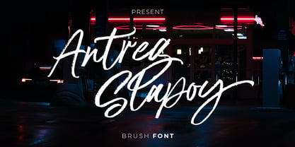 Introducing Antreg Slapoy - A handwritten brush font with authentic dry brush strokes drawn on paper. Perfect for logo design, poster design, social media, typography quotes over photos, book covers and packaging designs. International support for most Western Languages is included.
 - Ultima by TipografiaRamis,
$29.00 Ultima is a rounded geometric monoline typeface family, built in ten styles. The typeface is ideal for use in display sizes, though is quite legible in text. Ultima is released as OpenType single master with a Western CP1252 character set.
