10,000 search results
(0.045 seconds)
- Sundae by SparkyType,
$25.00Sundae is a brush script drawn with a naïve hand-made twist. The flow of curves, contrast in stroke and variations in letter heights add a human touch while the consistency in design allows for semi-extended setting. Sundae is best suited for large, confident headings where a personal impact is desired. - Nondescript JNL by Jeff Levine,
$29.00 One good pun is worth a simple description… Nondescript JNL… 'Non' - not. 'de' - of, in Spanish. script - a cursive (handwritten) letter form. So… while nondescript generally means lacking any defining description, in this case it also means "not of a script"… which is precisely what a typeface such as this one is!
 - Jason Barry by Insan Perkasya,
$12.00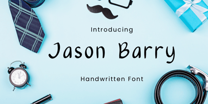 Jason Barry is a handwritten font with a simple and minimalist character. Crafted with sincerity, each letter reflects a friendly and full-of-character personality. This font is perfect for various designs, from greeting cards to branding projects that seek a minimalistic and appealing touch. If you have any question, please contact us.
 - Oakland by Greater Albion Typefounders,
$9.50 Oakland is a Streamline era design inspired by some hand-drawn lettering on a 1930's French poster advertising a certain brand of Car (Automobile for our American cousins). It's ideal for giving poster and design work that late 1930s to mid 1950s feel. Make a bold statement with this all capitals typeface!
 - Filmstrip BF by Bomparte's Fonts,
$29.00 Imagine words and letters, all caps, cut out of 35mm film. Then imagine Filmstrip BF —a font of film and movie-related catchphrases. They’re all ordered in more or less alphabetical order as seen in a glyph palette, beginning with “A”, which is accessible by typing a number (#) symbol. Numerals zero through nine, however, are mapped to their usual keyboard locations. For a better fit between numbers, be sure to enable the Ligature feature in an OpenType-capable application. All catchwords contained in this font are listed as shown, across the three posters in the slide carousel above. For future reference, you might select and copy all of the glyphs indicated below, paste into your application document, then convert them to Filmstrip BF. This would display all content. #$%&’()*+,./0123456789:;=>?@ABCDEFHIJKLNOPQRSTUVWXYZ[\]^_`abdefghijklmnopqrstuvwxyz{|}~ÄÅÇÉÑÖÜáàâäãåçéèêëíìîïñóòôöõúùûü†°¢£§•ß®©™´¨≠ÆØ∞±≤≥¥∂∑∏πªºæø¿¡¬√≈«»…ÀÃÕŒœ–—“”‘’÷ÿŸ⁄€‹›fifl‡·‚„‰ÂÊÁËÈÍÎÏÌÓÔÒÚÛÙıˆ˜¯˘˙˚¸˝˛ˇÐðŁ¹¼łŠš³¾² When used in a creative way, Filmstrip BF can be successfully incorporated into a variety of projects such as product packaging, logos, posters, signage, headlines and more.
 - Fresno by Parkinson,
$15.00 Fresno is a two-font family. Fresno Inline and Fresno Black. Fresno Black is a recent addition. It can be used alone, and it is carefully tailored to fit behind the Inline font to add color to the inline. There are alternate characters: A, M & N in the caps and lowercase key positions. Fresno is a square gothic style typical of Mid-20th Century Showcard Lettering. A lettering genre known as “Gaspipe.” Signage samples similar to this still exist on buildings in my home town, Oakland, California. I have designed over a half dozen variations of this form over the years. Including Amboy. Golden Gate Initials, Matinee, Motel, and Hotel. Designed in 2001 by Jim Parkinson, Fresno has recently been refreshed, enhanced, and re-released.
 - Amboy by Parkinson,
$20.00 Amboy is a two-font family. Amboy Inline and Amboy Black. Amboy Black is a recent addition. It can be used alone, but it is carefully tailored to fit behind the Inline font to add color to the inline. There are alternate characters: A, M & N in the caps and lowercase key positions. Amboy is a square gothic style typical of Mid-20th Century Showcard Lettering. A lettering genre known as “Gaspipe.” Signage samples similar to this still exist on buildings in my home town, Oakland, California. I have designed over a half dozen variations of this form over the years. Including Golden Gate Initials, Matinee, Motel, Hotel and Fresno. Designed in 2001 by Jim Parkinson, Amboy has been refreshed, enhanced, and re-released.
 - Brume by Creativemedialab,
$16.00 Brume font is a bold, attractive and beautiful font. "Easy to read, modern and elegant look but stylist", this will be the first words that your client says to your design using this font. Comes with uppercase and lowercase. It has many alternates character with nice curve that you can arrange to create a nice logo lettering, or use it as a display face on a poster and add a few alterations to it to make a beautiful eye catching words. Brume font is best for logo lettering, headlines, product packaging, t-shirt design, wedding theme, poster, book cover, wedding invitation, Christmas and more To access alternate: In Adobe Photoshop go to Window - glyphs In Adobe Illustrator go to Type - glyphs
 - Gardner Sans by Lewis McGuffie Type,
$35.00 Gardner Sans is a humanist sans serif with a range of weights, italics, small caps stylistics alternates and a set of decorative ornaments. The light and regular faces work at smaller sizes and the heavier weights are good for display lettering. It is inspired by a few historical sources including Stephenson Blakes' Granby, Gill Sans, as well as some old hand-done lettering for sales tickets. The name (and the basis for the small caps) derives in-particular from the Roy Gardner collection of sales tickets from early 20th century that can be found on spitalfieldslife.com The heavier weights were particularly influenced by a later cut of Gill Sans, Extra Bold 321. The italic is more of a contemporary mix of humanist styles.
 - Myhota by Ingrimayne Type,
$7.00Myhota is a condensed sans-serif face that has a bit of rawness to it. It is condensed and has a very high x-height, so it more useful for display than text. Myhota-Bold and Myhota-Light were designed in 1990 and the other seven weights were added in 2021 as were the italic and backslanted styles. There is rarely a use for backslanted type, but when it is needed, Myhota provides an option. Myhota-Hatched was an attempt to see if a readable text font could be hatched out of Myhota by lowering the x-height and widening the letters. The result is a face with rather squarish letters. The regular and bold were original styles with the medium and italic styles added in 2021. - Myhota Hatched by Ingrimayne Type,
$7.00 Myhota is a condensed sans-serif face that has a bit of rawness to it. It is condensed and has a very high x-height, so it more useful for display than text. Myhota-Bold and Myhota-Light were designed in 1990 and the other seven weights were added in 2021 as were the italic and backslanted styles. There is rarely a use for backslanted type, but when it is needed, Myhota provides an option. Myhota-Hatched was an attempt to see if a readable text font could be hatched out of Myhota by lowering the x-height and widening the letters. The result is a face with rather squarish letters. The regular and bold were original styles with the medium and italic styles added in 2021.
 - Niemeyer by Latinotype,
$36.00 Oscar Niemeyer is one of the greatest architects of our time—his unique way of mixing straight lines and abstract curves gives rise to an unmistakable and characteristic style. This typeface is my own tribute to Brazilian architect Oscar Niemeyer. The design process started when my wife and I visited Brazil while she was running a series of workshops on calligraphy. In my spare time, I would walk through the streets of beautiful cities like Rio de Janeiro or São Paulo, enjoying the local architecture and urban life. I had also the opportunity to attend to some of the workshops during which I was able to observe the organic of calligraphy and people. Then, I started to draw some shapes that reflected everything about this beautiful place: Niemeyer’s architecture and work and, in his own words ‘the curves on the body of the beloved woman’. This versatile typeface comes in 8 weights with matching italics, alternative characters, oldstyle figures and much more! Niemeyer is well-suited for logotypes, advertising, publishing, branding and corporate use. Special thanks to everyone in the Latinotype Team (especially to César Araya) for their support, help with corrections and digital editing.
 - Halogen by Positype,
$29.00 Who doesn't want or need an expansive contemporary extended sans that has a sense of style and swagger… what if it had a lowercase, small caps and various numeral options… how could you say no? This was the foundational argument I made for myself when I drew the initial alphabet on my birthday last year (something I do each year, draw a new font, kind of a fun OCD thing). I wanted to see a wide, utilitarian sans that had more to it than just a basic character set and didn't resemble standard geometric models. As I continued sketching, the letterforms were being influenced more by my 'lettering tendencies' than the normal mechanical trappings of drawing flat, wide letters. The letters have retained aspects of letters created by hand — stresses, modulation, naturally ending terminals. Truncation and quick clipping of strokes became antithetical to the letterforms I drew, so I continued this once I brought the design into the computer. I kept it precise and dependable, but made every attempt to keep a conscientiously crafted typeface and not let it devolve into a grid-based drone. As such, it works just as well looking back in time as much as it does assuming a lead role in a sci-fi movie. Halogen does deliver and opts not to take a short cut and provide an anemic offering of glyphs — a modern typeface offered today must provide more than just the basics and this one does — lowercase, smallcaps, old style numerals, tabular forms, stylistic and titling alternates, fractions, case-sensitive features, and even an alternate uppercase ordinal set is included. So go make cool print and digital things with it, now.
 - Fleur Bleue by DM Studio,
$30.00 The Fleur Bleue Beautiful Romantic Font is a graceful and elegant typeface that encapsulates the beauty and romance of delicate flowers. With its flowing letterforms and intricate details, this font brings a touch of sophistication and romance to your designs, making it perfect for wedding invitations, love letters, branding, and other projects that require a touch of enchantment. Features: Romantic and Elegant Style: The Fleur Bleue Font exudes a romantic and enchanting aesthetic. Its graceful letterforms and delicate details create an air of elegance and beauty, making it ideal for projects that require a touch of romance and sophistication. Beautiful Floral Design: The font’s intricate details and floral elements add a touch of enchantment and whimsy to your typography. It captures the essence of delicate flowers, bringing a sense of natural beauty to your designs. Versatile Application: This font is versatile and well-suited for various design projects that aim to evoke emotions of love and romance. Use it in wedding invitations, love letters, branding, packaging, and more to add a touch of beauty and enchantment to your designs. Uppercase and Lowercase Letters: The font includes both uppercase and lowercase letters, providing flexibility and creative freedom in your designs. Mix and match the cases to create visually appealing and harmonious typography. Stylistic Alternates: The Fleur Bleue Font offers a selection of stylistic alternates that enhance the visual interest of your text. These special characters create unique connections between letters and alternate forms, allowing you to create beautiful and captivating typography. Punctuation and Symbols: In addition to the alphabet, the Fleur Bleue Font includes a comprehensive set of punctuation marks, numerals, and common symbols. This ensures consistency and ease of use when incorporating the font into your design projects. Easy to Use: Installing and utilizing the Fleur Bleue Font is hassle-free. It is compatible with both Windows and Mac operating systems and seamlessly integrates into popular design software such as Adobe Photoshop, Illustrator, and InDesign. This ensures a smooth and efficient design workflow. Infuse your designs with the grace and romance of the Fleur Bleue Beautiful Romantic Font. Let its flowing letterforms and intricate details bring a touch of sophistication and enchantment to your wedding invitations, love letters, and branding. Embrace the timeless beauty of this font and create designs that evoke feelings of love and admiration.
 - Filson Soft by Mostardesign,
$25.00 Filson Soft is the rounded version of the popular Filson Pro . At first sight, the main feature of Filson Soft are the distinctive letters ‘K’, ‘Q’ and especially ‘R’ that make the font family very elegant. With its rounded terminaisons, this font family is also perfect for original titles and will give you future creations a nicely friendly aspect. But with all these originals features, Filson Soft is highly legible and quite versatile. Its large x-height, even performs nicely in small sizes. Filson Soft comes in 8 weights - Thin, Light, Book, Regular, Medium, Bold, Black, Heavy with a professional range of Opentype functions such as lining and oldstyle figures, stylistic alternates, case sensitive forms, localized forms, stylistic set, arrows and f-ligatures. For better typographic control, Filson Soft also includes an OpenType class kerning with thousands of kerning pairs.
 - BIFASER by Twinletter,
$17.00 Get to know Bifaser, the classic Victorian font that will bring the era’s mesmerizing beauty to your design projects! With an elegant and classy classic Victorian theme, this font is the perfect choice to bring a strong and alluring black letter feel to each creation. Biphaser perfectly describes the elegance and splendor of the classic Victorian typography style. Each letter has exquisite detailing and well-proportioned composition, creating a sophisticated and classy impression. In every project, Bifaser is able to exude the enchanting power and charm of black letters. Not only that but Bifaser is also equipped with great features such as ligatures and alternative characters that provide flexibility in creating unique and interesting letter combinations. With ease, you can explore creative and attractive design variations. Bifaser also supports multilingualism, allowing you to easily and broadly reach an international audience. Whatever language you use, Bifaser will be a loyal partner who is ready to give beauty and excellence to each of your designs. With Bifaser, you can create works that reflect the power and luxury of black letters. Show a strong, classy, and stunning style in every touch of your design. Don’t miss the chance to own this eye-catching classic Victorian font. Biphaser will be the right choice to give beauty and charm to your design project. What’s Included : File font All glyphs Iso Latin 1 Alternate, Ligature Simple installations We highly recommend using a program that supports OpenType features and Glyphs panels like many Adobe apps and Corel Draw so that you can see and access all Glyph variations. PUA Encoded Characters – Fully accessible without additional design software. Fonts include Multilingual support
 - Raph Lanok by Alit Design,
$12.00 Introducing Raph Lanok Typeface which has a elegant hand lettering brush style. So it looks natural like a handmade, because Raph Lanok family have a more choice characters. This font is best used for your design project that have the concept of fun, brave and sporty. Can also be applied to the design of a logotype, header website, making some lettering for a quote, t-shirt design etc. Raph Lanok has three font styles that are similar but with a different character, named Raph Lanok Future and Raph Lanok Rusty but that you also get Raph Lanok Swash with a line fast brushed of a used font. Raph Lanok Typeface deserve to be in your fonts collections, because it is unique and has many options of alternative glyphs. Thank you and enjoy :)
 - KG Call Me Maybe by Kimberly Geswein,
$5.00 Thin, neat handwritten letters.
 - Babylonica by TypeSETit,
$24.95 Calligraphic, hand-lettered script.
 - Caramel Family ROB by TypeSETit,
$19.95 Fun, hand-lettered script.
 - Horror Dingbats - Unknown license

- Melatti by Awanstudio,
$15.00 Melatti allows you to create stunning and easy hand-lettering in an instant. Ideal for the logo, quotes, wedding, product label/packaging, fashion, letter, advertising, invitation, poster, merchandise, greeting cards, etc.
 - Thaun by Scholtz Fonts,
$19.00 I can best describe the Thaun family as a general purpose display family, inspired by Scholtz Fonts' " "Delikat". I wanted to produce a display font that was more robust than Delikat, without losing the delicacy of the original. In order to do this I thinned solid, curved strokes toward the baseline, and let them dwindle to gently rounded points. As a graphic designer I became aware that designs that used a number of styles from the same family seemed to work well. This was easily done using a standard sans serif font such as Arial or Helvetica. However, when a different look is needed, display fonts do not always have a the variety of different styles that are necessary to produce a coherent design. Thus with Thaun, the challenge was to create a coherent family based on a display font. The archetype of this family is Thaun Regular with six different widths forming closely related styles. There are also two variants of the archetype i.e. Thaun Black & Thaun Rough to add variety to the primary style. An additional sub-family, Thaun Accord, appears in two widths. Thaun Jazz is a wide three dimensional variation. Thaun has all the features usually included in a fully professional font. Language support includes all European character sets, Greek symbols and all punctuation. Opentype features include automatic replacement of some characters and discretionary replacement of stylistic alternatives.
 - PS Fournier Std by Typofonderie,
$59.00 Style and elegance in 14 styles PS Fournier, created by Stéphane Elbaz, is designed in tribute to Pierre Simon Fournier. Fournier was the prolific Parisian type designer whose work is best known for its iconic representation of French transitional style. PS Fournier elegantly represents the transition to the modern era of typography. Featuring three optical sizes, PS Fournier is designed to perform in any context. The Pierre Simon Fournier heritage Pierre Simon Fournier (1712—1768) was a leading innovative type designer of the mid-18th century. Early in his career, the young Pierre Simon developed a strong aesthetic that he cultivated throughout his life. His art is representative of the pre-revolutionary “Age of Enlightenment” (Siècle des Lumières). Precursor of the Modern style, Fournier’s body of work deeply influenced his times, and created the fertile ground from which the Didot family and Giambattista Bodoni developed their own styles. During the historical period of the 18th century, Fournier exemplified the intellectual pursuits of the times with his own research on type, documenting in detail the typefounding process. He also offered a unique vision: he is the first to clearly comprehend the concept of “type family,” sorting a set of similarly styled alphabets by sizes, width, and by x-heights. In addition, Fournier is one of the earliest advocates of the point system to organize the practice of typography, the point system that contemporary typographers continue to use to this day. The refined and discreet elegance of PS Fournier With a close look at the family, one finds you’ll find that the difference between the optical sizes (Petit, standard and Grand) is more than a contrast variation between the thin and the thick; the eye can also denote a palette of distinct tones: More streamlined and robust in the smaller sizes (Petit), more refined and detailed in the larger sizes (Grand). The PS Fournier standard family is designed to adapt to any situation with its intermediate optical size, from body copy to headlines. With a bit of tracking, PS Fournier Petit will make the smallest captions perfectly readable. However, Petit family is not limited to body and captions — its “slabby robustness” will make a relevant headline choice as well. PS Fournier Grand presents a higher contrast adapted to large text sizes, displays or banners. Its refined elegance makes it a perfect choice for Design, Fashion or Luxury publications. As a “modern” type PS Fournier Grand features a larger x-height than the preexistent old style typefaces such as Garamond or Jenson. These proportions provide any basic text set in PS Fournier Grand a strong typographic texture. As a result, the PS Fournier global family is a versatile alternative to the Modern typefaces commonly used in the publishing industry. The optical sizes, the large range of weights, and the design variations make this family adaptable to captions, paragraphs, and pages, as well as to large texts and displays. A leading-edge typography in the 18th century In the spirit of modernity, Pierre Simon Fournier did not find any use for the conventional swashes still produced by peers such as Caslon or Baskerville. Nevertheless the French designer created many inventive elements to decorate the page and set delightful variations in the text itself. To this regard PS Fournier includes a large set of glyphs variations, ligatures and more than one hundred glyphs for borders, rules and ornaments or — as called in French — “vignettes.” PS Fournier: A tribute to the French modern typography era by Stéphane Elbaz
 - Bright Flicks by Nathatype,
$29.00 Bright Flicks is a delightful script font that embodies a playful and whimsical spirit. With its rounded letterforms and charming swings at the ends of some letters, this typeface adds a joyful and lively touch to your designs. The defining feature of this script lies in its rounded shape, which gives the font a friendly and approachable appearance. The letterforms flow smoothly, creating a sense of fluidity and movement. Each letter flows into the next, creating a harmonious and lively composition. The uppercase letterforms are crafted with precision and creativity, maintaining legibility while embracing the playful nature of the font. Adding to its character are the swings at the ends of select letters, adding a touch of playfulness and spontaneity. Bright Flicks captures the essence of creativity and imagination. The rounded shapes evoke a sense of warmth and friendliness, while the swings at the ends of certain letters add a touch of whimsy and fun. This font brings a sense of joy and positive energy to your designs. You can also enjoy the various features available in this font. Features: Stylistic Sets Ligatures Multilingual Supports PUA Encoded Numerals and Punctuations Bright Flicks fits in logos, branding materials, packaging, and any design project that aims to evoke a sense of cheerfulness and creativity. Whether you're working on invitations, greeting cards, posters, or any project that needs a touch of playfulness, this font will bring a vibrant and lively vibe. Find out more ways to use this font by taking a look at the font preview. Thanks for purchasing our fonts. Hopefully, you have a great time using our font. Feel free to contact us anytime for further information or when you have trouble with the font. Thanks a lot and happy designing.
 - Benda by Suitcase Type Foundry,
$45.00 Benda is a modern geometric script font with roots in the calligraphy and lettering of legendary artist Jaroslav Benda. With bold, predominantly low joins, the robust monolinear character strokes shine in one-word and short inscriptions as well as in longer headlines. The practical letterforms do not clutter the space with loops and curlicues, while the emphasised baseline helps to underline the importance of the message. What’s more – Benda is a smart font, automatically replacing conflicting characters with suitable alternatives as you write so that the final text flows seamlessly. Because Benda is the sequel to Jaroslav, it derives the slant, colour, and geometric characteristics from the sans typeface, forming the perfect companion to the font. So much so, it can serve as a second italic emphasis in long texts.
 - Playful Garden by Yumna Type,
$25.00 Playful Garden is a display font inspired by garden plants, such as flowers, leaves, and other plants. The letters are round and organic portraying natural shapes of garden views. This font’s unique characteristic is that all of the letters are in capitals to show dramatic, prominent displays. Such big letter sizes help emphasize the messages delivered. Furthermore, such a garden-themed display font is able to create calm, quiet situations to apply for nature designs or organic and eco-friendly products. Overall, it is the right option for you to show unique, interesting displays. Moreover, Playful Garden provides a clipart in accordance with the font theme as a bonus and features you can enjoy. Features: Multilingual Supports PUA Encoded Numerals and Punctuations Playful Garden fits best for various design projects, such as brandings, headings, magazine covers, quotes, printed products, merchandise, social media, etc. Find out more ways to use this font by taking a look at the font preview. Thanks for purchasing our fonts. Hopefully, you have a great time using our font. Feel free to contact us anytime for further information or when you have trouble with the font. Thanks a lot and happy designing.
 - Railway Gank by IKIIKOWRK,
$17.00 Proudly Present Railway Gank - Street Marker Type, created by ikiiko The free-spirited brush strokes of hand lettering and the strong, urban attitude of street markings combine electrifyingly to create Railway Gank. This font effortlessly jumps out and attracts attention because it embodies the fervor of the streets and the unvarnished reality of graffiti. Railway Gank's brush-style aesthetics give it a handcrafted, real charm. Its flaws and differences give it a unique personality and capture the actual spirit of street art, where each stroke is distinctive. Railway Gank uppercase letters exude confidence and flare, while the lowercase letters give off a more laid-back and welcoming vibe. It is a versatile option for numerous design concepts because of the contrast's ability to create a pleasing equilibrium. This typeface is perfect for an poster event, book cover, movie title, streetwear stuff, magazine layout, quotes, or simply as a stylish text overlay to any background image. What's Included? Uppercase & Lowercase Numbers & Punctuation Alternates Multilingual Support Works on PC & Mac Get also a good offer & FREEBIE at our site : www.ikiiko.com Enjoy our font and if you have any questions, you can contact us by email : ikiikowrk@gmail.com
 - Wicked Hearts by Set Sail Studios,
$26.00 Wicked Hearts Is a chunky Serif font with an edge - it's a cool modern take on a retro classic, and it's ready to make a lasting impression on your merchandise, quote designs, header text, logos & branding, advertisements and much more. It's packed with plenty of alternates and ligatures to really bring it to life, and give you a wide range of customisation options. FAQs; Accessing Alternate Characters • Many letters of this font have multiple alternate versions (see image). In order to access each one, simply make sure 'Standard Ligatures' are enabled, and follow your letter with a number. For example, typing 'A1, A2, A3, A4' will generate the 4 alternate versions for capital A. Accessing Ligatures • There are 12 lowercase ligatures (double letters) included. In order to access these, simply make sure 'Standard Ligatures' are enabled, and the ligatures will automatically generate as you type. Standard Ligatures are supported by most desktop graphics & text software (not just the fancy ones!), including Photoshop, Illustrator, InDesign, Word, Pages & Keynote. Language Support • Wicked Hearts supports the following languages; English, French, Italian, Spanish, Portuguese, German, Swedish, Norwegian, Danish, Dutch, Finnish, Indonesian, Malay, Hungarian, Polish, Croatian, Turkish, Romanian, Czech, Latvian, Lithuanian, Slovak, Slovenian
 - Vintage Monograms by Intellecta Design,
$16.00 A Monogram is a lettering character made up of the main letters of a name and sometimes all of them. It is a kind of design which dates from the earliest times of our history. It is a distinctive mark that everyone could have themselves, to apply to documents and many purposes. The signatures of ancient Kings were Monograms. Today this brand, for the people of taste, must have the cachet of this era or the evocative feelings of ancient times. Our predecessors knew how to create it by using the capital that preceded Gothic and the other characters. The Vintage Monograms collection contain hundreds of ready to use in alarge of shape of the letters, with styles from Victorian, to Art Nouveau and to mediaeval like in the old manuscripts. Ready to use fonts, Vintage Monograms collection is a classic that features elegant and intricate monograms perfect for branding and personalization. Its ornate designs evoke the timeless style of vintage logos and can be used to add a touch of sophistication to invitations, stationery, and packaging. Monogram brings an air of refinement and exclusivity to any project.
 - Trailmade by Adam Ladd,
$18.00 Trailmade is a rugged and stylish brush font with regular, italic, and extras styles. Explore an adventurous path with this typeface that ventures a little outside the typical brush script genre but still carries echoes of it. The upright design of the regular style has a confident appearance, while the italic style gives a little more of a signature look. Hand-lettered with a brush pen on paper, Trailmade includes swash characters, automatic double-letter ligatures, and a complete second set of lowercase stylistic alternates to switch in and out for a more authentic feel. There is also a matching Extras font featuring a variety of lines and dingbats that will complement your typography. All alternates, swashes, and ligatures are PUA-encoded for more accessibility in a variety of programs. This font has extensive Latin language support for Western, Central, and Eastern European.
 - Artemis JY by JY&A,
$39.00Mark Geard’s Artemis is a contemporary humanist sans serif. Its flourishes and unusual cuts give the typefaces huge distinctiveness—yet they remain highly legible. Glyphs begin with something that resembles a serif, leading the eye across their body and on to the next letter. - Old Bikers by Fractal Font Factory,
$8.00 Introducing a new font - an old biker. It is a multilayer vintage typeface with 5 styles. The font contains stylistic alternatives for uppercase and lowercase letters. Numbers, punctuation and multilingual characters for each style. The font design is inspired by gothic, biker and rock culture.
 - Travelling by Ake,
$12.00 Travelling is a captivating display font designed to ignite wanderlust. Perfect for book covers, logos, and lettering, its bold and expressive design adds an enchanting touch to your creative projects. Embark on a typographic journey with "Travelling" and let your designs explore new horizons.
 - Post Production JNL by Jeff Levine,
$29.00 A title card listing the supporting cast of the 1950 Humphrey Bogart and Gloria Grahame drama “In a Lonely Place” provided the hand lettered slab serif type design that served as the model for Post Production JNL – available in both regular and oblique versions.
 - Little Apple by Bale Type,
$13.00 Little Apple is a cute and tall sans serif font. It is both friendly and fun and can be used for various creations that require a neat touch. You can combine the uppercase and lowercase to get more natural lettering. Little Apple support multi language.
 - Preferred Shares JNL by Jeff Levine,
$29.00 A bold, condensed slab serif face A July 9, 1935 trade paper ad for Paramount Pictures’ 1st quarter film releases sported hand lettering with chamfered slab serifs. This condensed type design is now available as Preferred Shares JNL in both regular and oblique versions.
 - P22 Sparrow by IHOF,
$24.95 P22 Sparow is based on handwritten lettering executed with a fine-pointed steel "crow-quill" pen. Designed for use in small sizes of continuous text setting such as poetry. This style was originally designed for a series of hand-crafted calligraphic booklets in 1963.
 - Really Love by Selvia Design,
$14.00 "Really Love" is a very unique and beautiful retro font. This font is decorated with a heart shape on each letter. equipped with uppercase, lowercase, swashes, uppercase alternates, numerals, punctuations, and multilingual support. It is suitable for Valentine's Day moments, weddings, engagements, photography, and others.
 - Stockville JNL by Jeff Levine,
$29.00 Stockville JNL is a total rebuild of the wood type design originally found in Arvada JNL. All angular lines were straightened to give the lettering a more classic look. Bold, brash and block style, this headline typeface is available in both regular and oblique styles.
