10,000 search results
(0.028 seconds)
- Lichtner - Unknown license

- Joe DiMaggio - Unknown license

- Mackay by René Bieder,
$39.00 Mackay is a powerful transitional serif in 6 weights plus matching italics, designed for screen and print. The eccentric serifs on uppercase letters like E, F, L and T are inspired by Alexander Kay’s “Ronaldson” from 1884, working as the starting point for the family. The lowercase letters follow the traditional Antiqua model with attributes tracing back to drawings from the early 20th century. The “grotesk” lowercase a, as well as the sharp lowercase s, derived from the closed shapes of uppercase letters like C, G or S, create a compact and bold appearance while a large x-height and small descenders add a modern look. In favor of a dynamic and elegant impression, the design of the italic cuts come with a strong calligraphic influence. This results in completely new shapes for letters like lowercase a or g, ensuring a smooth integration into their surrounding letters while maintaining a distinctive appearance when combining with romans. The family comes with a variety of opentype features like case sensitive shapes, old style figures, fractions, ordinals and many more. Additional attention was given to the standard and discretionary ligatures, extending the structure of the basic glyphs with elegantly designed letter combinations for g/i, i/t or s/t. According to their dynamic architecture, the italic weights are equipped with additional initial swash characters to subtle accentuate the calligraphic roots. As a result of a high stroke contrast the family works great in paragraphs with medium to large font sizes like headlines, short paragraphs or logos. With its 12 cuts, the family meets all requirements on high quality typography.
 - Fred by E-phemera,
$20.00The Fred family is based on the casual hand lettering of Fred G. Cooper: cover artist, cartoonist, and letterer for Life magazine in the 1920s and '30s. His relaxed style captures the flavor of the Roaring Twenties, and the digital font was developed for use in the credits and title cards for a 1920s-style silent movie, The Call of Cthulhu. In an effort to keep the hand-lettered look, the OpenType font has numerous discretionary ligatures and contextual alternates, along with fleurons and ornaments. - Lichtner Italic - Unknown license

- Dummies - Unknown license

- Armin Soft by W Type Foundry,
$25.00 As a graphic designer, sometimes it’s impossible not to be inspired by the Swiss Style, specifically the work of Armin Hofmann, who is one of its best exponents. Grids and grotesk and neo-grotesk typefaces are a fundamental part of the tools that make this aesthetic possible. A visual language that has caused full admiration since we were students. Therefore, we decided to design Armin as an homage to Hofmann’s work. Technically, we added stylistic sets applied to the letters –G, R, a, g, h, l, m, n, r, t, u, y– to make Armin more eclectic and suitable for the creation of any visual language. Armin Soft is the softest version of Armin Grotesk with its Variable file.
 - Celtic Lines by Kaer,
$21.00 Happy to introduce you Medieval initials set made of twisted beast, lions, birds and spiral pattern. Ornamental type for history identity, ethnic prints, tribal posters, etc. It's not a color font! You can color glyphs yourself and use bright version. If you have any questions or issues, please contact me: kaer.pro@gmail.com Best, Roman.
 - MardiParty AOE by Astigmatic,
$19.95 MardiParty is a totally wild latin typestyle with inlines that grow out of it. Inspired by hand-lettering from a 1950's Haiti travel brochure, where the original lettering was just the word "Haiti", this font proved a fun challenge to flesh out. The end result, a funktastical tribute to its origins, perfect for any celebration themed invitations, logotypes, or outlandish branding.
 - Blackminster by Hanoded,
$10.00 Blackminster is a Gothic font, inspired by a handwritten set of letters (designed by Harry Lawrence Gage) I found in a 1916 book about lettering. I only had the ABC/abc to work with, so I designed the remaining glyphs myself. Use Blackminster for your Metal album covers, skateboards and downhill mountain bikes, or just anything that requires a bit of a Gothic look! Comes with a serious amount of diacritics and an alternate, swashy, g and y.
 - Hamburger by FontMesa,
$29.00 Our new Hamburger font is based on the old classic Brush Script design with many new additions. We've added many alternates to the design including lowercase swash tail letters, swash underscores and a few alternate uppercase letters. Upright scripts are popular these day so new to this old type design is a near upright script version, a lot of hand work went into producing it. One of the biggest problems with the old Brush Script font is that people use it as all caps, which doesn't look good because of the extended swash on the top left side of the caps letters. We've fixed that problem by making an all caps version where the caps in the lowercase position have the top left swash tucked in to help the letters display better as an all caps font. We've also created a small caps version, again the small caps lowercase have all the top left swashes tucked in to bring the letters closer together for a better display. Also new to this font are two higher x-height versions that are ideal for signage. The first is Hamburger X which stands for extra x-height and the second is Hamburger SPX which stands for super x-height. Both of these higher x-height fonts are suitable for signage on a building, billboard and vehicle lettering where you're looking for faster readability from moving traffic. We've designed a new lowercase b and moved the original to an alternate position. We've also redesigned the uppercase C bringing the bottom up to the baseline and moved the original C to an alternate position. The original lowercase g was open at the top, we've closed it and we're not offering the original g as an alternate.
 - Vibertus by Cercurius,
$19.95 A revival of “Gras Vibert”, a French fat face originally cast by the Didot typefoundry in Paris. It was cut in 1840 by Vibert, an engraver employed by the foundry. The capitals are heavier than the lowercase letters, and the characters g, k, y and & are rather peculiarly shaped, exaggerating the vertical stress. The font is designed for large sizes.
 - Fruehling by RMU,
$30.00 Fruehling, first released by the Klingspor Brothers foundry in 1914, is a rather calligraphic blackletter font designed by Rudolf Koch. This font was completely redrawn and redesigned for contemporary usage. The font comes with old-style figures, and the letters d, e, g, n, and t have swash variants. It is recommended to use also the OT feature Discretionary Ligatures.
 - Futura ND Alternate by Neufville Digital,
$45.25 The genuine Futura takes up Paul Renner’s earliest sketches and brings back to life the original stylistic alternatives of the letters a, g, m, and n. Another of its peculiarities is the curved ends of the j, l, and t. It retains its genetic heritage, maintaining a perfect geometry, but with a fresher air than ever. Futura is a Trademark of BauerTypes SL
 - Oakes Grotesk by Studio Few,
$12.00 Oakes Grotesk is a more corporate take on the Oakes typeface. It explores a set of brand new metrics that allow it to be more legible in body text as well as headings. The letter 'g' has been tweaked to become double-story as well as the refinement of other characters. This is all whilst maintaining the subtle curves of the Oakes typeface.
 - Ciabatta by Sudtipos,
$39.00 Ciabatta is a luscious font made especially for packaging. Thanks to 5 weights, it can be used for all eventualities; powerful in headlines or as lettering, yet very legible in small texts. Its shapes are slightly narrow and based on classical italics but Ciabatta includes alternates with a double-storey ‘a’ and ‘g’ which offer a more formal appearance upright.
 - RMU Gilgengart by RMU,
$30.00 RMU Gilgengart is a revival of Hermann Zapf’s beautiful calligraphic blackletter font which was cut and first released by Stempel in 1952. This font comes with fine ligatures and swash letters. Before working with this font it is recommended to activate both OT features Standard and Discretionary Ligatures in order to get access to all ligatures. RMU Gilgengart contains the following swash letters: D, L, h, f, g, k, round s, and t, whereby you should use the small letters at the end of a word or slogan only.
 - Lichtner Ex - Unknown license

- Lichtner Wd - Unknown license

- Sthlm graffiti - Unknown license

- ITC Posterboy by ITC,
$29.99If you are looking for a friendly type design that jumps off the page, ITC Posterboy might be for you. Although not quite a script, the font displays strong brush-stroke overtones. The design's inspiration, according to designer Chester Wajda, came from the window-poster lettering in my neighborhood grocery store." The slight top-heavy quality of the design is most noticeable in characters like the 'F,' 'G,' and 's.' ITC Posterboy also has a charming sense of naïveté which is most evident in letters like the cap 'S' and 'J' and lowercase 'f'' and 'g.' ITC Posterboy is a brilliant display design that adds spark and charm to the most mundane display copy. A multifaceted artist, Wajda has been an art director, multimedia and print designer, illustrator, cartoonist, animator, writer, typographer, and infographic designer. ITC Posterboy is his second typeface created for ITC." - HGB Bacco by HGB fonts,
$23.00 Since 2005, I have repeatedly attempted to create a neutral-looking grotesque with a humanistic character. I wanted a pleasant, soft typeface. The typeface should appear similar to Helvetica or Univers, but with more open shapes and therefore better readability. The features are deliberately reserved with 4 gradations plus italics. The onum feature for Old Style Figures contains additional alternative letters such as a looped g. The italics have a swash feature with some decorative shapes. As a sans serif, HGB Bacco does not appear to be technically constructed, but has a friendly, open character and is also suitable for longer texts.
 - Afrobeat by Resistenza,
$39.00 Inspiration The pounding tribal rhythms of Afrobeat music is expressed through this psychedelic brand new font, Afrobeat. Every letter becomes art as every letter is elegantly placed side by side, like music notes, creating music for the eyes. Afrobeat is a musical style performed by many African artists such as Fela Kuti, Femi Kuti, Antibalas and many more, which is a fusion of jazz,funk, and psychedelic rock, originating from the 60s and was based on the political movements of Nigeria. The Font This font is perfect for when you want to use eye-catching big texts for anything from posters and flyers for concerts, events, parties, to CD covers, advertisements, and art, but it’s especially striking for printed projects. Check out also ‘Afrobeat light’
 - Geodec Bruce Ornamented by Intellecta Design,
$16.00A tribute to George Bruce . - Katrina - 100% free

- Yzerfontein by Vic Fieger,
$11.99Yzerfontein is an angular variation on the classic German blackletter that started with a sketch of a lowercase 'g'. - HGB Info OSF by HGB fonts,
$20.00 It's nice when a font provides old style figures, small caps and alternate letters. But what to do if my typesetting program doesn't support Open Type features? The solution may be old-fashioned, but it's effective: the variants are placed in separate font families: Standard, Old Style Figures (OSF), and Small Caps (SC). Any word processor can handle it. As a special feature, my OSF fonts also contain alternative letters such as a looped g or descenders in the italic f.
 - Bebigel by The Ampersand Forest,
$25.00 Meet Bebigel! (Say "bɛ'-bi-gɛl," with a hard g). Bouncy and fun, but also a strong Clarendon slab serif in four weights, supporting Latin and all Cyrillics. Great for branding, titling, packaging and signage — wherever strong letters with big personality are required. And if you need a little less personality, just turn on Stylistic Set One ("Butch it up!") and find simpler versions of the more ornate letters. Dedicated to the great Robert Love and made with love in The Ampersand Forest.
 - Bohate by Sulthan Studio,
$12.00 Introduce Bohate - is a font from handwriting on paper then made it come alive and I removed some of the smudges to make it look neat with an alternative for each letter that goes up and down differently like the letters b,d,f,g, h, j, k, l, p, t, y etc has a total of 713 glips featuring uppercase, lowercase, numbers, punctuation, language support, swash, alternatives and binders. very natural you can try it and enjoy your work with this handwriting
 - Voyager Mono by Anton Kokoshka,
$29.00 Voyager Mono is a geometric monospaced grotesque family. It has two width styles - Voyager Mono (630em) and Voyager Mono Cond (580em). Available in 7 weights plus matching italics and alternate styles without slope with italic letters "a" and "g". Particular attention was paid to the problematic letters for monospaced fonts - "m" and "w". The optimal solution was found so that all signs looked good even in black style. Voyager Mono is perfect for the brand design, advertising, logo, gaming and packaging.
 - Kellnear-Italic - Unknown license

- Grill Sans - Unknown license

- People Talk JNL by Jeff Levine,
$29.00 A title card with cast credits for the 1935 movie “The Whole Town’s Talking” (starring Edward G. Robinson and Jean Arthur) formed the basis for People Talk JNL. The hand lettered names were done in a slightly condensed slab serif – mostly rectangular in shape with rounded corners. A few characters take on their own unique appearance. People Talk JNL is available in both regular and oblique versions.
 - Garked by Linecreative,
$16.00 Garked is a font typeface inspired by ancient nordic runes, you want to customize a logo, brand or other design with ethnic or tribal style, this font is perfect for your choice. What you get, you will get: 1. Garked – Clean San serif font including Uppercase & Lowercase (ALL CAPS) characters, 2. Numbers and Punctuation 3. Support Multi language (Western Europe Latin)
 - Neue Thannhaeuser by RMU,
$40.00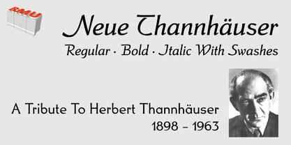 Neue Thannhaeuser - a tribute to Herbert Thannhaeuser .
 - Child's Play - Unknown license

- Poor Richard by Red Rooster Collection,
$45.00 Based on the Keystone Type Foundry design, circa 1919. The l/c ‘g’ appears as an alternate character in our font.
 - Chorus by Soneri Type,
$23.00 Chorus is a collective effort to sing in harmony. Similarly, each letter is designed to reflect harmony when used together to form a letter, sentence or paragraph. Letters like B, D, P and R have curved stroke (instead of straight line) while joining vertical stem. Letter K, k, and R have similar disjoint point in middle and unique plus stylish curve at foot. Letter C and G has distinct horizontal cut at top as compared to other letters in typeface e.g. S. Letter like b, h, m, n, and p have consistent stroke joint style with vertical stem. Ink traps in various letters are designed such that they blend with the letter form at certain degree instead, getting emphasised. The family comes in various styles in weight and width.
 - Manteiga by Plau,
$49.00 Julia Child once said: the secret to great french cooking is butter, butter, butter. Thus, we present to you Manteiga - butter in Portuguese! - a typeface for heart-melting, word-spreading goodness. The idea we had was to play with brush lettering - a style we love - and go as far as we can with the shapes of the letters while finding balance between positive and negative space. We wanted biiiig personality. And small inconsistencies - the ones that add texture and life to lettering. We left extensive OpenType features and technical stuff aside for a moment, adding later only what we thought was necessary, like different shapes for the Q, a and g - for example. All caps setting was something we wanted from the beginning. In text case, the x-height is rather short for a brush script, and this lends a quirky voice. Spacing is ultra tiiiiight so don’t go too small, but make it as big as you want! Ah! And there are some fun dingbats thrown in for good measure.
 - Heck Italic by E-phemera,
$20.00 Heck Italic is based on captions, labels and legends appearing on 19th-century maps and natural history engravings by J. G. Heck.


