10,000 search results
(0.039 seconds)
- Orange Gush by PizzaDude.dk,
$20.00Orange Gush is a playful font with curls and unpredictable funky and funny curves! Comes in Open Type with different alternate letters! Note: you will need to use OpenType supporting applications to use the autoligatures. - Cabaret by ITC,
$29.00Cabaret was designed by Alan Meeks, a light-hearted, fun font. From the shapes of the letters to the shading within the outline forms, Cabaret displays a variety of details making it unique and appealing. - Sablon Class by Roman Cernohous Typotime,
$29.00 Sablon is back! This time on the edge in Thick & Thin version, keeping its significant features especially in letters B, G, M and N. With new expressive figures best suitable in headlines and packaging graphics.
 - Speedster by Vozzy,
$10.00 Introducing a vintage label font named Speedster. This strong typeface is perfect for lettering on vintage style posters, t-shirts, greeting cards, logo etc. All available characters and styles you can see at the preview.
 - Sandy House by Sronstudio,
$15.00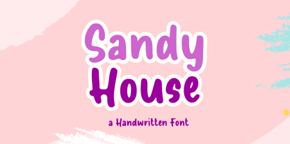 Sandy House is a fun Handwritten Font, this font Is perfect for lproduct packaging, product designs, label, photography, watermark, special events or anything. Sandy House comes with uppercase and lowercase letters, multilingual symbols, numerals, punctuation
 - Passing Stranger by Bogstav,
$17.00 Say hello to my all caps wannabe typewriter font. It’s distressed, but still perfectly legible! I have added 5 slightly different versions of each letter for a more handmade feeling, and of course multilingual support!
 - FM Easter Pro by The Fontmaker,
$24.00 FM Easter Pro consists of 26 hand-lettered Easter greetings like Happy Easter, Easter Joy, Easter Greetings etc. All the words and phrases are original and handwritten - a high quality calligraphy for your holiday projects.
 - Fander by Roman Melikhov,
$23.00 Fander font family is designed to create minimalist logos, wordmarks, titles, taglines. Each letter of the font has up to 12 alternates. You can mix default characters and alternate characters to get the best combinations.
 - Artiste by ITC,
$29.00A casual, open brush script style designed with a shadow effect for a three-dimensional impression by British designer Martin Wait. This typeface looks best with tight letter and word spacing in large display settings. - Merriment JNL by Jeff Levine,
$29.00 Within the pages of the 10th edition of the Speedball Lettering Book (1927) is an alphabet called “Vanitie”. This had been redrawn digitally as Merriment JNL, and is available in both regular and oblique versions.
 - Holo by Missin Glyphs,
$25.00 Inspired by 'Neon Sign' lettering, Holo is a modern, modular, mechanical & industrial display font constructed entirely with polygonal shapes. Holo is suitable for large display settings like sports jerseys, shop fronts, billboards and neon signs.
 - Sackers Script by Monotype,
$40.99Sackers Roman is an engraver, all-capitals family for invitations and stationery. The letters have strong contrast between thin and thick strokes. See also Sackers Gothic, Sackers Square Gothic, Sackers Script, and Sackers Classic Roman. - Sightseeing Boat JNL by Jeff Levine,
$29.00 The free form hand lettering comprising the titles and credits for the 1966 romantic comedy “The Glass Bottom Boat” were the model for Sightseeing Boat JNL, which is available in both regular and oblique versions.
 - Merry With Dream by Seemly Fonts,
$12.00 Merry with Dream is a cute and simple lettered handwritten font that can be used for all chalkboard quotes or teaching material! Its authentic look will add a personal and realistic feel to your designs.
 - Shirah Joie by LightHouse,
$49.00The main challenge with Shirah Joie was how not to design just another monoline font, and how to add liveliness while condensing the letters a little bit. Shirah Joie is an OpenType/TTF Unicode font. - Opportoonity JNL by Jeff Levine,
$29.00Opportoonity JNL is loosely based on lettering from 1940s cartoons. It's the perfect typeface for anything representing fun and carefree situations. There is a slightly limited character set and no kerning on this particular font. - Freich by Nasir Udin,
$15.00 Freich is a mighty bold typeface with a vintage vibe and rebellious feeling. Perfect choice for posters with super hero or propaganda themes. Its sharp and strong letter forms will make any statements more powerful.
 - Silent Comedy JNL by Jeff Levine,
$29.00 A poster for the 1917 Charlie Chaplin comedy “Easy Street” had Chaplin’s name hand lettered in thick, round cornered block characters. This inspired Silent Comedy JNL, which is available in both regular and oblique versions.
 - Black Queen by Gleb Guralnyk,
$14.00 Presenting the vintage style typeface "Black Queen". It includes font files for each decorative element which can be useful for manipulating colors and effects. Black Queen font has multilingual support and several alternative letter glyphs.
 - Dead Bear by Sakha Design,
$12.00 Dead Bear is a cool and creepy display font. It is imposing and features uniquely shaped letters, and as a result, it will easily match a wide range of creations that require a distinct touch.
 - Glazed Donuts by DainType,
$15.00 The letters are reminiscent of shiny and tasty glazed donuts. There are three type families, and you can mix them all up to create a decently fun typography. Great for promotional material or package design.
 - Progreso by CastleType,
$59.00 Progreso is a condensed, unicase, serif gothic type design inspired by the hand-lettering on Russian posters from the 1920s. Supports most European languages, including modern Greek and most languages that use the Cyrillic alphabet.
 - Amestina by Aqeela Studio,
$20.00 Amestina’s most recent letter styles are ideal for projects that call for a handwritten aesthetic, including wall displays, wedding invitations, social media post logos, commercials, product packaging, product designs, labels, photographs, watermarks, invitations, and stationery.
 - Summer Holiday JNL by Jeff Levine,
$29.00 Hand lettered production credits for the1930 film “Holiday” inspired the digital type revival Summer Holiday JNL; available in both regular and oblique versions. An Art Nouveau influence is reflected in this pleasant, casual serif typeface.
 - Creepy Events JNL by Jeff Levine,
$29.00 The 1963 German release poster for "What Ever Happened to Baby Jane?" features a creepy, sinister, hand-lettered type design that became the model for Creepy Events JNL, available in both regular and oblique versions.
 - Sackers Classic Roman by Monotype,
$29.99Sackers Roman is an engraver, all-capitals family for invitations and stationery. The letters have strong contrast between thin and thick strokes. See also Sackers Gothic, Sackers Square Gothic, Sackers Script, and Sackers Classic Roman. - October Story by Sronstudio,
$15.00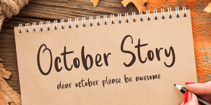 October Story is a fun Handwritten Font, this font Is perfect for product packaging, product designs, label, photography, watermark, special events, or anything. October Story comes with uppercase and lowercase letters, multilingual symbols, numerals, punctuation.
 - Pumpkin Story by Sronstudio,
$15.00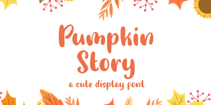 Pumpkin Story is a fun Handwritten Font, this font Is perfect for lproduct packaging, product designs, label, photography, watermark, special events or anything. Pumpkin Story comes with uppercase and lowercase letters, multilingual symbols, numerals, punctuation.
 - Arialic Hollow is a distinctive typeface designed by GemFonts | Graham Meade, a creation that stands out for its unique approach to the visualization of letters and words. This font is part of the br...
- Allrounder Antiqua by Identity Letters,
$40.00 Timeless Renaissance looks, gently updated. For novels and billboards alike. Allrounder Antiqua is an old-style serif member of the Allrounder superfamily. A timeless typeface based on classical proportions, Allrounder Antiqua is perfectly suitable for advanced book and editorial design well as packaging and branding. True: its main purpose is to set flawless body copy and to generate an evenly textured page—but its refined shapes work fantastically in display applications, too. Some details, such as the small and sharp bowl of the lowercase a, are fully appreciated in large sizes only. If you need a sophisticated serif typeface for packaging, food, fashion, consumer goods, or lifestyle branding, Allrounder Antiqua is up for it. It's also apt as an outstanding corporate typeface, be it for a more conservative venture or the latest hipster start-up. This classy serif typeface comes in four weights with corresponding true italics. Just like its sans-serif counterpart, Allrounder Grotesk, Allrounder Antiqua is equipped with plenty of Opentype Features like small caps, six sets of figures, case-sensitive forms, superiors, fractions and many ligatures. You will find alternate letters with swashes within this extended character set, as well as all the accented glyphs necessary to support more than 200 Latin-based languages. Historical Background The (French) Renaissance-influenced typeface started as Moritz Kleinsorge's graduation project within the "Expert Class Type design" course of the Plantin Institute for Typography, located in the famous Museum Plantin-Moretus in Antwerp, Belgium. There, Moritz Kleinsorge decided to create a revival of Robert Granjon's "Ascendonica Romain", described as "a beautiful face; typical of Granjon's mature style" in the inventory list of available material. "To touch punches and matrices cut by Robert Granjon back in 1567 was an invaluable inspiration", Moritz explains. Over time, the typeface moved away from being a true revival. Rather, it evolved into a Granjon-inspired typeface. That typeface is now available as Allrounder Antiqua. Perfect Pairing: Allrounder Antiqua + Allrounder Grotesk Allrounder Grotesk is the ideal complement to Allrounder Antiqua. They both share common vertical metrics and a common color. This allows you to pair both typefaces within the same layout—even within the same paragraph—without creating visual disruption. Head over to the Family Page of Allrounder Grotesk to get more information about this typeface. Design Trick: Bilingual Design With the Allrounder Superfamily Combining Allrounder Grotesk with Allrounder Antiqua is an ideal approach for bilingual designs, wherein both languages get the same emphasis yet are distinguished with two different typefaces. It's also best practice to set headlines in a different typeface than the body text if they harmonize with each other. Allrounder Grotesk and Allrounder Antiqua provide you with the perfect pair for this purpose.
 - Diane Script by GroupType,
$27.00 In 1995, FontHaus came upon a rare opportunity to create a revival of Aries, a little known and previously unavailable typeface by the legendary Eric Gill. Discovering a lost typeface by one of the major designers of the 20th Century, was the discovery of a buried treasure, and being the first type company to release it was an honor. Thirteen years later, FontHaus came across another little known typeface treasure: Diane. Designed by the legendary French designer Roger Excoffon in 1956, this remarkable script has never been faithfully recreated until now. In close collaboration with Mark Simonson, FontHaus and Mr. Simonson painstakingly researched rare type books, publications, European metal type services, and period showings from the United States, England, Germany and from the University of Groningen in the Netherlands. Finding full specimens of the font turned out to be quite a challenge. In most cases, only the caps and lowercase were shown. Furthermore, the more we researched Diane, many curious facts came to light. The caps in earlier specimens of Diane are completely different from specimens published later, suggesting that the face was redesigned at some point, perhaps in the mid-1960s. So we are left with two different sets of caps. The original had very elaborate, swirly strokes, very characteristic of Excoffon¹s gestural designs for posters and logos. Later on, these appear to have been replaced by a set of simpler, more traditional script caps. The original caps are criticized in one source Mark found (Practical Handbook on Display Typefaces, 1959) as being "exquisite" but "not highly legible". Perhaps this is what led to the simpler caps being introduced. Nevertheless, FontHaus's release includes not only both sets of caps, but a range of alternates and a number of new characters not originally available such as the Euro, and a magnificent alternate Ampersand to name a few.
 - Generis Slab by Linotype,
$29.00The idea for the Generis type system came to Erik Faulhaber while he was traveling in the USA. Seeing typefaces mixed together in a business district motivated him to create a new type system with interrelated forms. The first design scheme came about in 1997, following the space saving model of these American Gothics. Faulhaber then examined the demands of legibility and various communications media before finally developing the plan behind this type system. Generis’s design includes two individually designed styles; each of with is available with and without serifs, giving the type system four separate families. Each includes at least four basic weights: Light, Regular, Medium, and Bold. Further weights, small caps, old style figures, and true italics were added to each family where needed. The Generis type system is designed to meet both optical criteria and the highest possible measure of technical precision. Harmony, rhythm, legibility, and formal restraint make up the foreground. Generis combines aesthetic, technical, and economic advantages, which purposefully and efficiently cover the whole range of corporate communication needs. The unified basic form and the individual peculiarity of the styles lead to Generis’ systematic, total-package concept. The clear formal language of the Generis type system resides beneath the information, bringing appropriate typographic expression to high-level corporate identity systems, both in print and on screen. The condensed and aspiring nature of the letterforms allows for the efficient setting of body copy, and the economic use of the page. A range of accented characters allows text to be set in 48 Latin-based languages, offering maximal typographic free range. This previously unknown level of technical and design execution helps create higher quality typography in all areas of corporate communication. Optimal combinations within the type system: Generis Serif or Generis Slab with Generis Sans or Generis Simple. - Generis Serif by Linotype,
$29.00The idea for the Generis type system came to Erik Faulhaber while he was traveling in the USA. Seeing typefaces mixed together in a business district motivated him to create a new type system with interrelated forms. The first design scheme came about in 1997, following the space saving model of these American Gothics. Faulhaber then examined the demands of legibility and various communications media before finally developing the plan behind this type system. Generis’s design includes two individually designed styles; each of with is available with and without serifs, giving the type system four separate families. Each includes at least four basic weights: Light, Regular, Medium, and Bold. Further weights, small caps, old style figures, and true italics were added to each family where needed. The Generis type system is designed to meet both optical criteria and the highest possible measure of technical precision. Harmony, rhythm, legibility, and formal restraint make up the foreground. Generis combines aesthetic, technical, and economic advantages, which purposefully and efficiently cover the whole range of corporate communication needs. The unified basic form and the individual peculiarity of the styles lead to Generis’ systematic, total-package concept. The clear formal language of the Generis type system resides beneath the information, bringing appropriate typographic expression to high-level corporate identity systems, both in print and on screen. The condensed and aspiring nature of the letterforms allows for the efficient setting of body copy, and the economic use of the page. A range of accented characters allows text to be set in 48 Latin-based languages, offering maximal typographic free range. This previously unknown level of technical and design execution helps create higher quality typography in all areas of corporate communication. Optimal combinations within the type system: Generis Serif or Generis Slab with Generis Sans or Generis Simple. - Gill Sans MT by Monotype,
$45.99 Gill Sans is a humanistic sans serif family that, while is considered by many to be quintessentially British in tone and concept, has been used in virtually every country and in nearly every application imaginable. Gill Sans has reached this level of near-ubiquity for one simple—and very good—reason: it is an exceptionally distinctive design with a potential range of use that is almost limitless. This toolkit family includes a wide range of styles including the standards such as Light—which is open and elegant—and a Regular that, with its flat-bottomed d, flat-topped p and q and triangular-topped t, has a more compact and muscular appearance. Its Bold styles tend to echo the softer, more open style of the light while the extra bold and ultra bold have their own vivid personalities, but each of them would make for an eye-catching headline. Take into account the family’s many weights, including condensed and extra condensed designs, and extended language support and you have yourself a tool you’ll be thrilled to return to, time and again. Gill Sans was designed by Eric Gill: a versatile, brilliant, and prolifically successful designer of the early part of the last century. One of the main reasons for the enduring success of his namesake design is that it is based on Roman character shapes and proportions, making it unlike virtually any other sans serif out there. Gill also worked his own warmth and humanity into his design, resulting in a typeface in which each weight retains a distinct personality of its own. Pair with serif fonts like Gill's own Joanna; or more modern offerings like Frutiger® Serif, Malabar™, Syntax® Serif, FF Scala®, or DIN Next™ Slab.
 - Generis Simple by Linotype,
$39.00The idea for the Generis type system came to Erik Faulhaber while he was traveling in the USA. Seeing typefaces mixed together in a business district motivated him to create a new type system with interrelated forms. The first design scheme came about in 1997, following the space saving model of these American Gothics. Faulhaber then examined the demands of legibility and various communications media before finally developing the plan behind this type system. Generis’s design includes two individually designed styles; each of with is available with and without serifs, giving the type system four separate families. Each includes at least four basic weights: Light, Regular, Medium, and Bold. Further weights, small caps, old style figures, and true italics were added to each family where needed. The Generis type system is designed to meet both optical criteria and the highest possible measure of technical precision. Harmony, rhythm, legibility, and formal restraint make up the foreground. Generis combines aesthetic, technical, and economic advantages, which purposefully and efficiently cover the whole range of corporate communication needs. The unified basic form and the individual peculiarity of the styles lead to Generis’ systematic, total-package concept. The clear formal language of the Generis type system resides beneath the information, bringing appropriate typographic expression to high-level corporate identity systems, both in print and on screen. The condensed and aspiring nature of the letterforms allows for the efficient setting of body copy, and the economic use of the page. A range of accented characters allows text to be set in 48 Latin-based languages, offering maximal typographic free range. This previously unknown level of technical and design execution helps create higher quality typography in all areas of corporate communication. Optimal combinations within the type system: Generis Serif or Generis Slab with Generis Sans or Generis Simple. - Generis Sans by Linotype,
$29.00The idea for the Generis type system came to Erik Faulhaber while he was traveling in the USA. Seeing typefaces mixed together in a business district motivated him to create a new type system with interrelated forms. The first design scheme came about in 1997, following the space saving model of these American Gothics. Faulhaber then examined the demands of legibility and various communications media before finally developing the plan behind this type system. Generis’s design includes two individually designed styles; each of with is available with and without serifs, giving the type system four separate families. Each includes at least four basic weights: Light, Regular, Medium, and Bold. Further weights, small caps, old style figures, and true italics were added to each family where needed. The Generis type system is designed to meet both optical criteria and the highest possible measure of technical precision. Harmony, rhythm, legibility, and formal restraint make up the foreground. Generis combines aesthetic, technical, and economic advantages, which purposefully and efficiently cover the whole range of corporate communication needs. The unified basic form and the individual peculiarity of the styles lead to Generis’ systematic, total-package concept. The clear formal language of the Generis type system resides beneath the information, bringing appropriate typographic expression to high-level corporate identity systems, both in print and on screen. The condensed and aspiring nature of the letterforms allows for the efficient setting of body copy, and the economic use of the page. A range of accented characters allows text to be set in 48 Latin-based languages, offering maximal typographic free range. This previously unknown level of technical and design execution helps create higher quality typography in all areas of corporate communication. Optimal combinations within the type system: Generis Serif or Generis Slab with Generis Sans or Generis Simple. - Maiola by TypeTogether,
$49.00 Being inspired by early Czech type design, Maiola is clearly a contemporary typeface, that is mindful of its historical heritage, implementing old-style features and calligraphic reminiscence, more frankly so in the Italic. Nevertheless, through its personality, it attempts to create a welcoming tension on the page, without shouting too loudly at the reader. It handles its expressive tendencies with care and in doing so increases its usability, with legibility being of great importance. Subtle irregularities of the letterforms enhance furthermore the dynamic spirit and liveliness of the typeface. With the advent of Opentype, allowing for bigger character-sets and better language support, as a natural consequence, Maiola Multiscript covers Latin A, Cyrillic and Greek. Although basically independent from each other, they are, however, designed in the same spirit as the Latin, and harmonize well in multilingual text settings. The update to this beautiful font family includes the addition of over 240 glyphs featuring new ornaments, stylistic alternates, ligatures, superior letters, fractions and more. Furthermore, several glyphs were significantly improved and the kerning was fine tuned for better performance. Originally released in 2005, Maiola was an immediate success. It won the renowned TDC competition in 2004 where it was also recognized as a “judge’s choice”, was part of the touring exhibition e-a-t, and was selected in the Creative Review design competition in 2005.
 - Hand Scribble Sketch Times by TypoGraphicDesign,
$19.00 CHARACTERISTICS A state-of-the-art OpenType-Feature (like Contextual Alternates (calt) and Stylistic Alternates (salt)) of “Hand Scribble Sketch Times” is, that each uppercase and each lowercase letter has automatically alternated two variations to bring humanly-random characteristics of handwriting to life. The character of the rough, ruggend and raw handwritten classic serif typeface is a very unique warmly atmosphere. An pro-version of the font “Hand TIMES”. APPLICATION AREA warmth, love, handmade. For support of human warmth. Of cooking recipes, menus in the restaurant across party flyer, music cover Art to logo (word marks), headings in magazines and websites. TECHNICAL SPECIFICATIONS ? Font Name: Hand Scribble Sketch Times ? Font Weights: Regular, Rough, Invert ? Font Category: Grunge Serif Display for Headline Size ? Font Format: OTF (OpenType Font for Mac + Win) ? Glyph coverage: 601 ? Language Support: Basic Latin/English letters, Central Europe, West European diacritics, Baltic, Romanian, Turkish ? Specials: Alternative letters, Standard & Discretionary Ligatures, extras like symbols, dingbats, Old-style Digits, Lining Figures, accents & €, incl. OpenType-Features like Contextual Alternates (calt), Glyph Composition/Decomposition (ccmp), Discretionary Ligatures (dlig), Kerning (kern), Standard Ligatures (liga), Numerators (onum), Ordinals (ordn), Stylistic Alternates (salt), Stylistic Set 01 (ss01), Stylistic Set 02 (ss02), Stylistic Set 03 (ss03), Slashed Zero (zero), Lining Figures (lnum), Tabular Figures (tnum), Old Style Figures (onum), Proportional Figures (pnum) ? Design Date: 2013 ? Type Designer: Manuel Viergutz
 - St Croce Pro by Storm Type Foundry,
$29.00 Our eye is able to join missing parts of worn letters back into undisturbed shapes. We tend to see things better than they really are. Thanks to this ability we ignore faults of those close to us as we can’t accept the fact that every once in a while we convene with an impaired entity. Typography is merely a man’s invention, hence imperfection and transience, albeit overlooked, are its key features. This typeface is based on worn-out letterings on tombstones in the St. Croce basilica in Florence. For hundreds of years, microscopic particles of marble are being taken away on the soles of visitors: the embossed figures become fossilised white clouds, fragments of inscriptions are nearing the limits of legibility. First missing are thin joins and serifs, then the main strokes finally slowly diminish into nothingness over time. Unlike an archaeologist, for whom even completely featureless stele is valuable, the typographer must capture the proper moment of wear, when the type is not too “new” but also not too much decimated. Such typeface is usable for catalogue jackets, invitations and posters. Calligraphy is a natural human trait. To write is to create characters of reasonable beauty and content, according to the nature of the writer. A natural characteristic of architecture is to create an aesthetic message very similar to the alphabet. A doric column, the gabled roof, the circle of the well plan: these are the basic shapes from which all text typeface is derived.
 - Sign Panels JNL by Jeff Levine,
$29.00Alf R. Becker was a noted sign painter, designer and the creator of hundreds of unique alphabets which were published in the trade magazine Signs of the Times during the 1930s through the 1950s. Thanks to Tod Swormstedt of ST Media [and who is also the curator of the American Sign Museum in Cincinnati], Jeff Levine received some reference material on Becker's work. Becker displayed many of his type styles within decorative panels—a popular trend in the days when signs were hand-lettered. Using the reference material as a guide, Jeff has re-drawn twenty-six sign panels for adaptation to digital print work. While the designs in themselves are not thoroughly unique to Alf Becker, he has left behind some tangible examples of how sign painters embellished their lettering work. With the use of complementary colors and tones, these panels—joined with vintage lettering - classically recreate the warm and attractive advertising of years ago.