10,000 search results
(0.062 seconds)
- Fat Albert BT by Bitstream,
$50.99 Ray Cruz releases another typeface family, this time inspired by 1970's pop culture. Fat Albert Regular, Outline and Shadow are bold poster types that evoke the fun and funk of an era gone by. Go on bro, get Fat Albert and get down.
 - Flashie by Gerald Gallo,
$20.00 Flashie is an all caps, very bold contemporary sans serif font. Under the lowercase keys are alternate characters for A, C, E, F, K, L, M, N, R, S, U, W, X, Y. It is ideal for headlines, titles, branding and small blocks of text.
 - FM Secessionist by FontMeister,
$24.95 Art Nouveau typeface ‘Secessionist’ draws inspiration from Wiener Secessionist Joseph Maria Olbrich's handwriting, as seen on his architectural drawings from the 1920’s. You can use these fonts to create posters, greeting cards, scrapbooks, CD labels, T-shirts, coffee mugs, digital videos websites and banners.
 - Roller Girl by Surplus Type Co,
$9.00 Roller Girl is a bubbly ligature filled 70's inspired retro font. Roller Girl has easy going curves and a laid back aesthetic. It has a ton of ligatures in both upper and lower case that can help you create unique designs that stand out.
 - Mercurial by Grype,
$16.00 Geometric/Technical style logotypes have been developed for car chrome labels since the early 1980’s, but automobile companies don't monopolize the style by any means. During the 80’s and 90’s, a lot of these logos leaned towards the geometric sans styles and the swiss styling of fonts like Handel Gothic, while playing with varying degrees of squared rounds and varying expanded widths per logotype. Mercurial has this flavor, but it wasn’t derived from logotypes. Instead, it began as a digitization of a film typeface from LetterGraphics in the early 70's known as "Sam". It visual ties to this genre of automotive logotypes and fonts like Handel Gothic lend a familiarity to it, yet it has an identity all its own. As with so many automotive logotypes, this singular style film typeface, lacked an expansive family which shows off all potential the logotypes have and what they "could" be and do. And that's where we come in. What originally began as this family’s Regular Width - Bold Style has been expanded into a collection of 3 Width Families, each containing 5 Weights. Here’s what’s included with the Mercurial Complete bundle: 396 glyphs per style - including Capitals, Lowercase, Numerals, Punctuation and an extensive character set that covers multilingual support of latin based languages. (see the final poster graphics for a preview of the characters included) 3 widths in the collection: Narrow, Regular, & Wide 5 weights in each width family: Light, Book, Regular, Medium & Bold. Here’s why the Mercurial Family is for you: - You’re in need of stylish sans font family with a range of widths and weights. - You’re love those 80’s automotive logos, but want more range of use. - You’re looking for an alternative to Handel Gothic. - You’re looking for a clean techno typeface for your rave poster designs. - You just like to collect quality fonts to add to your design arsenal.
 - Bisco Condensed by Galapagos,
$39.00Bisco Condensed is a small capital design inspired by hand lettered memorial wall art from the Harlem section of New York City. As a memorial, this design is dedicated to a type design colleague who lost his long battle with cancer. This font is a tribute to his strength and his liveliness. The original idea for Bisco Condensed was to capture the energy of those unique "streetforms" in a text/display design and encapsulate them into a lively & fluid type design with a high level of readability at all point sizes. Bisco Condensed is an excellent type for expressive display layouts. It works well as an independent design or a long with contemporary sans serifs that complement Bisco's irregular contours, weighting and bounce. - JWX Western by Janworx,
$19.95 The term Old West conjures up memories of vintage movies and TV shows featuring saloons and dancehall girls. Old wanted posters and cowboys. Rowdy prospectors in the Goldrush, mountains and lots of wide open space. Many of the lettering styles of those days are still in use, reflecting the past, present, and probably the future here. Western style fonts appear in the signage of bars, restaurants, casinos and ski areas. It's a style that speaks of the way it once was in a nostalgic way. This family of three fonts pays tribute to the Old West and its colorful history, with a semi-plain style, a decorated style, and a really lively rendition of our gaudy and raucous history from a century or more ago.
 - FS Me Paneuropean by Fontsmith,
$90.00Mencap When most of us go about everyday tasks, we take for granted the reading that’s involved, on instructions, labels and so on. For people with learning disabilities, reading is made much harder by certain fonts. FS Me is designed specifically to improve legibility for people with learning disabilities. The font was researched and developed with – and endorsed by – Mencap, the UK’s leading charity and voice for those with learning disabilities. Mencap receive a donation for each font license purchased. Every letter of FS Me was tested for its appeal and readability with a range of learning disability groups across the UK. Inclusive Fontsmith were determined to design a font that was accessible to those with learning disabilities without standing out as such – one that was inclusive of all readers. It should comply with accessibility guidelines and work best at 12pt, but still have a character of its own that was warm and approachable. “So much accessible design is done separately to the main body of brand work,” says Jason Smith. “We wanted to make a typeface that covered both brand tone and neutrality, and that could be used legitimately as a brand font as well as in accessible design.” Me, you, everyone FS Me is about design that doesn’t patronise. People with learning disabilities are often treated as inferior by childlike design. FS Me is designed for adults, not children – a beautifully-designed font for everyone. Its features include very subtle distinguishing elements of each letter to aid the reading and comprehension of texts, and tails, ascenders and descenders that have been extended for extra clarity. What the people said... Here is a sample of comments from the extensive research groups that helped to shape the letterforms of FS Me: “I want something round, clear and friendly.” “We like movement in the letters but don’t want anything childish.” “The ‘b’ and ‘d’ need to be different as they can be confused.” “I prefer the handwriting-style ‘a’.” “It’s important to have an accessible ‘a’ and ‘g’. Teachers sometimes complain that learners cannot read or understand the inaccessible ‘a’ and ‘g’.” - FS Me by Fontsmith,
$80.00 Mencap When most of us go about everyday tasks, we take for granted the reading that’s involved, on instructions, labels and so on. For people with learning disabilities, reading is made much harder by certain fonts. FS Me is designed specifically to improve legibility for people with learning disabilities. The font was researched and developed with – and endorsed by – Mencap, the UK’s leading charity and voice for those with learning disabilities. Mencap receive a donation for each font license purchased. Every letter of FS Me was tested for its appeal and readability with a range of learning disability groups across the UK. Inclusive Fontsmith were determined to design a font that was accessible to those with learning disabilities without standing out as such – one that was inclusive of all readers. It should comply with accessibility guidelines and work best at 12pt, but still have a character of its own that was warm and approachable. “So much accessible design is done separately to the main body of brand work,” says Jason Smith. “We wanted to make a typeface that covered both brand tone and neutrality, and that could be used legitimately as a brand font as well as in accessible design.” Me, you, everyone FS Me is about design that doesn’t patronise. People with learning disabilities are often treated as inferior by childlike design. FS Me is designed for adults, not children – a beautifully-designed font for everyone. Its features include very subtle distinguishing elements of each letter to aid the reading and comprehension of texts, and tails, ascenders and descenders that have been extended for extra clarity. What the people said... Here is a sample of comments from the extensive research groups that helped to shape the letterforms of FS Me: “I want something round, clear and friendly.” “We like movement in the letters but don’t want anything childish.” “The ‘b’ and ‘d’ need to be different as they can be confused.” “I prefer the handwriting-style ‘a’.” “It’s important to have an accessible ‘a’ and ‘g’. Teachers sometimes complain that learners cannot read or understand the inaccessible ‘a’ and ‘g’.”
 - Chanse Fresh by ArtGarbage,
$10.00 Graffiti is all repetition. Style, like brand logos, makes the repetition more recognizable, but style should never keep you from reading the word. Chanse Fresh was a project to make a handstyle font that wasn't self-concious and overworked - the font is clearly readable and fresh AF. Round is the base font with a thin version to create hierarchy or for longer pieces of text. Both round and thin have a "wet" drippy mop tag version best for key text. The font is all caps with alternates, so you can sub in capitals as needed with repetitive letters to change things up. There's a full latin alphabet so you can type all the words with accent marks natively and a ton of discretionary ligatures and accessory glyphs like arrows, stars, and crowns to make your lettering extra fresh.
 - Primitivus by PizzaDude.dk,
$18.00 It all started with making of a simple all-caps font. I drew the whole alphabet, numbers all else needed - but something wasn't quite right...the lettershapes were fine, but quite boring. Then I took a drastic decision: I started all over again ... meaning, I printed the whole thing, messed it up using a wet cloth and wrinkled the paper - then scanned it all again, and imported all the graphics yet again. A lot of work, yes - but personally I think it was worth it! But anyway, that's the story of how Primitivus was made ... well, almost, but not quite ... but that's another story! Use Primitivus for anything that needs that special kind of look were handdrawn letters meets grunge! Play around with the 4 different versions of each letter to make your text look even more random and natural!
 - Dubrove by Dima Pole,
$36.00 Dubrove is a wedge serif typeface inspired by Moravian (Czech) type designs of the 1930-50s. The character font is expressive: free, daring and graceful, delicious and attractive. Here are more than 1100 glyphs, all 102 European languages, all Ancient Slavic Alphabet (49 characters), Latin and Slavic small capitals and OpenType features with many solutions. Dubrove has several stylistic sets, historical forms, localized forms of several languages, interest contextual ligatures and many other delicacies. In the Dubrove typeface several stylistic sets of Slavonic lowercase letters are made. In addition to font basic style (in fact it is close to the natural lowercase character) is a traditional [ss02] set (postpreliminary, the Soviet Union, when most copy lowercase letters are uppercase) and lowercase the natural character [ss03], the style of which, in particular, is often used in the Bulgarian script.
 - Beware The Neighbors by Intellecta Design,
$23.90 Beware The Neighbors is based on “Personality Script”, a rough alphabet originally drawn by Ross F. George, and published in one of the Speedball series of lettering catalogs that ran from 1935 to 1948. The design is something of a minor classic, and several foundries have recreated digital fonts based on it. However, mostly of these interpretations are very “geometric”, formed using straight lines. Intellecta preferred to create a new interpretation using smoother, curved lines to create a creepy appearance. Also included are several ligatures and OpenType stylistic alternates. This version also has an extended character set for use in Central as well as and West European countries, plus Baltic, Turkish and Romanian. Check out Intellecta’s Clarvoyant for another creepy experience based on lettering from old Speedball catalogs. CLOSE THE DOORS AND WINDOWS AND BEWARE OF YOUR NEIGHBORS!
 - Monkton News by Club Type,
$36.99 This classified version of Monkton, with its expanded proportions and extended serifs can be used at small sizes for classified advertising, newspaper text or larger displays. Its semi-medium weight (heavier than Book weight) makes it robust to be legible when smaller and cope with various printing methods. The inspiration for this typeface family came from my childhood experiences at Monkton, amidst an historic part of the South West of England. Studies of the original incised capitals of the Trajan column in Rome were analysed and polished for this modern version. The lower case letterforms and numerals were then created in sympathy, taking their proportions from the incised letters of local gravestones. Its name honours not only the area where the original alphabet was conceived and drawn, but also the people responsible for fostering my initial interest in letters.
 - Masonic Lodge by Eclectotype,
$20.00 As part of the day job I had to trace an old hand drawn logo of a Masonic Lodge from a very poor scan. When I finally got to the end of it I had almost a whole alphabet and I really liked the hand drawn uneven quality, so I made up the rest of the letters and set about making it into a font. I roughened up all the edges for an even older look, added a host of OpenType features and hey presto, Masonic Lodge was born. There are two versions of each letter and number which automatically alternate when contextual alternates are set, more alternates for O and o characters, a good amount of interlock style L and T ligatures (uppercase) and a square & compass ornament. Use it for pub signs, secret society meetings, monster movie titles and pub menus.
 - Sparkling Sunday by Prestige Artsy Studio,
$19.99 Introducing the newest addition to your font collection — Sparkling Sunday! This font is the perfect combination of vintage and modern, with bold and chunky letters that are sure to make a statement. The font is inspired by the 80s and 90s era, with a touch of modern typography. Each letter is carefully crafted with attention to detail, giving it a unique and eye-catching look. The font is perfect for posters, flyers, logos, and any design that needs a retro touch. It comes in a regular style and an extra including 26 retro graphics to allow versatility in your designs. Simply install the file as a separate and you will get to type them using the alphabets A-to-Z to access them. Get ready to take your designs to the next level with this cute Sparkling Sunday Duo.
 - Police JNL by Jeff Levine,
$29.00Police JNL was modeled from one of the many fonts created by the late Alf Becker exclusively for Signs of the Times magazine during the 1930s through the 1950s. This was a bit of a difficult design to translate into a digital font file, because the individual characters did not follow a formal structure as to the width and length of the cast shadows or the letter shapes—such is the way of the hand-lettered alphabet. Special thanks to Tod Swormstedt of ST Publications (and curator of the American Sign Museum in Cincinnati) for providing the archival material to work from in creating this font. Police JNL has a limited character set. The basic A-Z character is on the upper and lower case keys, along with numbers, some punctuation and the dollar and cents signs. - Geometrico Sans by FSdesign-Salmina,
$39.00 Are you looking for a modern typeface? Geometrico. Round without Compromises. Now 12 Italic Styles added. Even more futuristic than the classical Bauhaus typeface Futura, “Geometrico” is a geometric typeface based on round shapes as suggested by its name. Designed without compromises, neither in form nor in function: Geometrico is ideal for logotypes, headlines and other modern typographic purposes. Would Paul Renner be delighted? Or would he turn around in the grave? Make your own opinion. Try Geometrico for free. Download a free trial version of Geometrico with a reduced character set. Check it out!
 - Agilo Handwriting Pro by SoftMaker,
$15.99 Digitized handwriting fonts are a perfect way to give documents the “very special touch”. Invitations look simply better when handwritten than when printed in bland Arial or Times New Roman. Short handwritten notes look authentic and appealing. There are numerous occasions where handwritten text makes a better impression. Agilo Handwriting Pro is an upright, medium weight handwriting font with a simplified, slightly sloped print (non-connecting) style that mimics true handwriting closely. Use Agilo Handwriting Pro to create stunningly beautiful designs easily. This typeface comes with many pre-made ligatures and alternative characters for sophisticated typography – all easily accessible as OpenType features. A “random” feature even allows for automated random switching between variations of the same character, resulting in type that looks authentically handwritten.
 - Azoft Sans - 100% free

- Proba Pro by Mint Type,
$- Proba Pro is a geometric sans with lowered x-height, prominent ascenders and descenders and a subtle humanist touch. It comes in 7 weights + matching italics each supporting numerous Latin-based languages as well as major Cyrillic languages. It is packed with OpenType features like ligatures, small caps, 4 sets of digits, 2 stylistic sets, superiors and inferiors, fractions, ordinals, and respective punctuation varieties including all-cap punctuation. There are also language-specific alternates for Romanian Ș/ș, Catalan punt volat, and correct small-cap versions for i/ı in Turk languages. Some of the styles of Proba Pro can be found in Mint Type Editorial Bundle together with other fonts which make some great pairs. Check it out!
 - Pinkponk by madeDeduk,
$14.00 Hello I'm really excited to introduce Pinkponk designed to become a groovy and vintage, this font has the potential to bring each of your creative ideas to the highest level. Combine with ligatures and special alternative glyphs so you can create a lots with layouts and compositions. Pinkponk brings a touch of 80's and 90's era bespoke custom typography to logos, websites, social media quotes, wedding branding, and more. Whats Included ? Uppercase & Lowercase Number & Symbol International Glyphs Multilingual support Thank you so much for checking out my shop, and please get in touch if you have any questions! at: dedukvic@gmail.com find more previews on my Instagram here : https://www.instagram.com/acekelgondolayu/?hl=en
 - The Kanderlic by Ekahermawan,
$15.00 Kanderlic is a retro bold script for any display use. Kanderlic also includes a bunch of alternate characters (PUA Encoded) and ligatures to give you a wide range for create an unique typographic design results. Kanderlic is versatile font for many different projects which will bring you back in late 60's untill 70's such as logo, branding, poster, magazines, labels, merchandise, invitation, presentation, advertising, quotes and so much more! FEATURES: OpenType support Playfull to use (with ligatures and alternates options) Multilingual support PUA Encoded If you need support or more information about this item please kindly contact me : ekahermawanputu@gmail.com Thank you so much I really hope you enjoy when using it!
 - Stepford by Joanne Marie,
$10.00 A typographic playground Stepford is a versatile semi-serif boasting 6 styles - regular and italic, sketch and italic and outline and italic. It includes 231 glyphs, ligatures and multilingual support. These six styles make it the perfect display typeface for any kind of project. Absolutely sweet for editorial design - mainly headers and sub-headers but can also be used for body text too. This typographic trio is based on the vintage 50’s and 60’s style scripts and modernised for the present day. It’s another powerful typeface to add to your arsenal of design assets that command attention. That’s what design is all about! For regular updates and freebies follow me on Instagram at joannemarie_cm
 - Cabo Soft by Design A Lot,
$15.00 Cabo Soft is the 2.0 version of our original Cabo Rounded Typeface, created back in 2015. With this new version, Cabo Soft, we have brought multiple upgrades and updates compared with the original version. Some of those consist in the addition of more glyphs and accents, alternate designs for many of the glyphs (including an alternate for @, #, some of the numbers and more), and most importantly, we have done a slight update in the design of the letters, which we'll give more details in the following paragraphs. The main style and thought behind our Cabo fonts has always been the rounded corners and the soft and welcoming vibe that it gives. It's friendly and familiar, but also modern and slightly elegant, especially the Thin and Light styles. With Cabo Soft we have worked on adding an extra touch to the design of the letters by working on the termination edges of each letter. If Cabo Rounded had an exact round termination for each letter, with Cabo Soft we have developed a unique non-equally rounded shape that is applied to all types of terminations for each letter. This new design approach makes it have a more clean style, a more modern and unique look, but it also gives stylish, exclusivist and elegant vibes, while still being friendly and familiar. Thanks to it's variety in weights and styles, you can use Cabo Soft in almost any design project. It works well with headlines and paragraphs, it's a perfect match for logo design and branding, but can also do wonders in videos, signage and many other elements. The typeface covers most likely the entire Latin Alphabet, it comes with multiple design alternates for many of the letters, glyphs and numbers, with accents applied for all of the available alternates. As a finishing note, with the help of our Cabo Soft typeface you can create an friendly and welcoming designs, as well as stylish, elegant and exclusivist. It has all the necessary glyphs and accents for any Latin Alphabet projects, and you can play around with all of the alternates to create unique designs right from the start.
 - Runde Wien by Wannatype,
$36.00 Runde Wien Pro, the rounded sans serif by Ekke Wolf. Typeface lovers looking for a modern, well-developed sans serif font with a touch of retro and warm, individual lettering will get excited about a new addition to the font market. The more than complete Runde Wien Pro front comes in three styles and four different weights. In addition to the upright Runde Wien Pro there is the Runde Wien Pro Oblique with a moderate 6° slant and the Runde Wien Pro Superoblique with an 18° slant. Available weights are light, regular, medium, bold and black. These fonts are equipped with extended Latin alphabet for Central and Eastern Europe and also Cyrillic and Greek alphabet. The set of characters includes nine different sets of numbers, plus its own set for the small caps, as well as alternative characters and groovy ligatures. In addition, all Runde Wien Pro styles are also available as unicase with upper case and lower case x-height alignment. The style, metrics and proportions of Runde Wien Pro combine perfectly with the Liebelei Pro and the script fonts of the Calafati Pro.
 - ChefScript by Andinistas,
$79.95 Chef Script is an experimental font designed by Carlos Fabian Camargo G. Its fantasy design contains 1463 glyphs to compose words, phrases and short messages on small and large sizes. The idea was born in a sketchbook that was perfected again by hand and achieving "non-neutral drawings" on tracing paper. With bezier digitization the empty and full parts of letters appeared with soft and eloquent curves as calligraphic result produces optimal readability. Chef Script combines warmth and good humor running in countless design applications such as labels and base plates, covers, posters, movie titles, seals and any printed design that needs an unusual typographic tool. In that sense, Chef Script is influenced by Speedball lettering manual (1957), Ross F. George. The illustrative nature of "ChefScript-complete" does not look anything like the traditional type design hierarchies. Therefore offers 7 hierarchical resource groups to design comfortable contexts flavored with illustration and typography: • ChefScript-Basic: Letters with horizontal and vertical thrifty proportions mimic an uninterrupted calligraphy brush made with flat tip. Thus its letters have ascenders and descenders strokes perpendicular to its base line and equal to the height of the lowercase. • ChefScript-Swashes: Letters expressive and unique flourishes to design highlighted words or phrases. • ChefScript-Caps: Uppercase with lowercase height give the impression of interrupted uppercase italics writing within what is written with uninterrupted lowercase letters producing strong contrast within a paragraph fragment. • ChefScript-Containers: Container drawings designed to exchange with infinite possibilities each order so that its inferior serve to store information written or drawn. • ChefScript-Dingbats: Pictograms that communicate: kitchen, chef, restaurant, food, etc. • ChefScript-Numbers: Bulky and useful numbers to highlight prices or figures containing points or dollar signs. • Chef Script-Words: Predesigned words with uninterrupted letters diagonally leveled highlighting various thoughts in writing.
 - Display Dots Two Serif by Gerald Gallo,
$20.00 Display Dots Two Serif is a display font not intended for text use. It, along with its sans counterpart were designed specifically for display, headline, logotype, branding, and similar applications. Display Dots Two Serif has an uppercase alphabet, numbers, and punctuation.
 - Analfabeto by Type-Ø-Tones,
$40.00 The Brazilian illustrator, Flavio Morais, devised this amusing display alphabet to have his own font for his former website. We helped to digitalize it and encouraged him to complete it with a series of “chiringuito” drawings. More about his work here.
 - Ghostly Forest Greek by RodrigoTypo,
$29.00 It is an extension or variant of the "Ghostly Forest" typeface that has been adapted to include the Greek alphabet and also incorporates many alternatives, such as Swash glyphs, for a more fun design suitable for casual or Halloween-related concepts.
 - Hello Rainy by Good Java Studio,
$20.00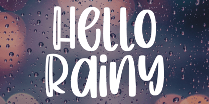 Produly Present Hello Rainy - Quirky Handdrawn Font Hello Rainy - Quirky font make from handlettering ideas in typeface. This font includes full of Alphabetical glyphs, Numerals, and punctuation. This is so perfect for invitations, monograms, wedding, fashion, branding, label, handlettering or logotype.
 - Origami Bats by Lauren Ashpole,
$15.00 The art of paper folding in dingbat form. The uppercase alphabet is made up of origami animals and the lowercase offers those shapes decorated in traditional origami paper patterns. Full patterns, flowers, and partial foldings fill out the symbols and numbers.
 - Meche Pro by RodrigoTypo,
$29.00 Meche Pro it is a geometric typeface family with a semi-formal touch, it contains 12 variants, from the Thin to Black and Stencil Thin to Black versions, plus Cyrillic alphabet with alternatives and different ligatures was added, especially for titles
 - Kaaos Pro by The Type Fetish,
$25.00 Kaaos Pro is based on the logo of the Finnish hardcore band of the same name. It was expanded to include extended Latin, extended Cyrillic and Greek alphabets so it will work with most languages in Europe and the Americas.
 - Tappatarap by Tural Alisoy,
$17.00 Tappatarap font. 559 glyph, 80+ Languages Set. Multilingual support: Latin basic, Latin Extended, Cyrillic, Central Europe, Turkish, Baltic, Romanian, Euro, West European diacritics Please test your alphabet. If you have any issues, please let me know through email turalalisoy@gmail.com.
 - Melindya by Good Java Studio,
$22.00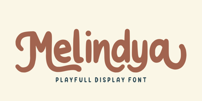 Introducing Melindya | Playfull Display Font Melindya is a playfully display font make from handdrawn ideas in typeface. This font includes full of Alphabetical glyphs, Numerals, and punctuation. This is so perfect for invitations, monograms, wedding, fashion, branding, label, handdrawn or logotype.
 - Space Captain by Patria Ari,
$15.00Space Captain is a modern all caps font with uniquely sharp and geometric shapes. Alternative wing shapes in the left and right in alphabet included in stylistic alternates. This font perfect for logotype such as technology, construction, automotive, heavyweight, etc. - Flox by ParaType,
$30.00 Flox display typeface was designed in 2000 by Vladimir Pavlikov. Cyrillic was developed in 2005. The project was aimed to create a decorative vivid alphabet of geometric shapes. For use in advertising and display typography. Licensed by ParaType in 2005.
 - Calligraffiti Pro by Open Window,
$19.95 Calligraffitti by Open Window owes its credit to mom and all her years of Calligraphic experience. This impromptu rendering of her calligraphic alphabet captures her years or formal practice blended with a rare encounter with the mood altering music of Santana.
 - Popstix JNL by Jeff Levine,
$29.00 Popstix JNL takes the childhood pastime of creating things with ice cream sticks and transferring that premise to a digital alphabet. From classroom displays to ice cream sales, this charming novelty font evokes the simpler pleasures of our younger years.
