10,000 search results
(0.056 seconds)
- Newsprint JNL by Jeff Levine,
$29.00 Newsprint JNL has its origins in an online auction image of wood type. Only the lower case a-z were shown and the type design included an extra-wide 'g' and 's'. Expanding on this idea but narrowing the 's' a bit, Jeff Levine created a capitals set and all of the necessary additional characters - even adding a generous selection of accented characters not usually found in his display fonts. Regular, oblique, narrow, narrow oblique, wide and wide oblique versions are available. All styles offer crisp, clean lettering for headlines, window signage and other display text applications.
 - Burowai by Arterfak Project,
$18.00 Burowai is an ancient font style. Inspired by the ancient greek letters and the tribal ornaments. This ethnic font inspired by the shapes of tree branches and combined with rough strokes such as ancient symbols found inscribed in caves. Perfect for the natural theme, folk, tribal, children, adventures, and social movement. Burowai is a display font, that represents brave, spirits, natural, and tradition. Perfect for the headline, logo, books, poster, signage, and more. You can mix and match the alternates characters to get more unique tribal handwritten. Fonts featured: Uppercase Allcaps Numbers & symbols Accents Alternates Hope you like it! Thank you for your support and happy designing!
 - RMU Gilgengart by RMU,
$30.00 RMU Gilgengart is a revival of Hermann Zapf’s beautiful calligraphic blackletter font which was cut and first released by Stempel in 1952. This font comes with fine ligatures and swash letters. Before working with this font it is recommended to activate both OT features Standard and Discretionary Ligatures in order to get access to all ligatures. RMU Gilgengart contains the following swash letters: D, L, h, f, g, k, round s, and t, whereby you should use the small letters at the end of a word or slogan only.
 - Tribaltypo by Otto Maurer,
$22.00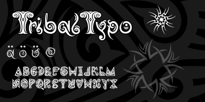 Tribal-styled Tattoo Font.
 - Ongunkan Arkaic Greek by Runic World Tamgacı,
$45.00 Many local variants of the Greek alphabet were employed in ancient Greece during the archaic and early classical periods, until around 400 BC, when they were replaced by the classical 24-letter alphabet that is the standard today. All forms of the Greek alphabet were originally based on the shared inventory of the 22 symbols of the Phoenician alphabet, with the exception of the letter Samekh, whose Greek counterpart Xi (Ξ) was used only in a sub-group of Greek alphabets, and with the common addition of Upsilon (Υ) for the vowel /u, ū/.[1][2] The local, so-called epichoric, alphabets differed in many ways: in the use of the consonant symbols Χ, Φ and Ψ; in the use of the innovative long vowel letters (Ω and Η), in the absence or presence of Η in its original consonant function (/h/); in the use or non-use of certain archaic letters (Ϝ = /w/, Ϙ = /k/, Ϻ = /s/); and in many details of the individual shapes of each letter. The system now familiar as the standard 24-letter Greek alphabet was originally the regional variant of the Ionian cities in Anatolia. It was officially adopted in Athens in 403 BC and in most of the rest of the Greek world by the middle of the 4th century BC.
 - Varvara by TeGeType,
$19.00 Varvara is a new display typefaces family create as a tribute to the work of Barbara Stepanova (1894-1958). Varvara family has light, medium and bold weights in 6 differents versions (normal, rough, screen, inline, shadow and star), all with alternates letters. All versions are provided in latin, cyrillic and greek alphabets. It can be use for text as for titling applications.
 - Ministry by Device,
$39.00 A 14-weight sans family based on the original British ‘M.O.T.’ (Ministry of Transport) alphabet. A capitals-only, single-weight design was drawn up around 1933 for use on Britain’s road network, and remained in use until Jock Kinnear and Margaret Calvert’s ‘Transport Alphabet’ was introduced for Britain's first motorway in 1958. The identity of the original designer is not preserved; however, Antony Froshaug in a 1963 ‘Design’ magazine article mentions Edward Johnston as an advisor. Speculation that it was based on Johnston’s London Transport alphabet is discussed in archived government documents from 1957: “So far as I am aware, the Ministry alphabet was not based on Johnston’s design; indeed, it has been suggested that Gill got his idea from Johnston. Our alphabet was based on advice from Hubert Llewellyn-Smith (then chairman of the British Institute of Industrial Art) and Mr. J. G. West, a senior architect of H. M. Office of Works.” A 1955-57 revision of the alphabet which polished the somewhat mechanical aspects of the original may be the work of stone carver and typographer David Kindersley. For the digitisation, Rian Hughes added an entirely new lower case, italics and a range of weights. The lower case mimics the forms of the capitals wherever possible, taking cues form Gill and Johnston for letters such as the a and g, with single-tier versions in the italic. A uniquely British font that is now available in a versatile family for modern use.
 - ITC Ellipse Script by Typorium,
$30.00 The Typorium presents a new optimized and enriched version of ITC Ellipse which first appeared in 1996 in the International Typeface Corporation typeface library. ITC Ellipse Script is a complementary typeface to ITC Ellipse Neo, designed a very legible handwriting style. ITC Ellipse Script is both modern and classic. Modern in the unusual shape based on the geometric ellipse form. And classic in the structure of some letters like the lower cases c, e, g, o, s. These letters alone could come from a traditional typeface, but they fit perfectly with the atypical rest of the alphabet giving it a present-day and traditional mix. Furthermore, the ellipse shape fits naturally in the italic styles, giving the font an organic and fluid feeling. ITC Ellipse Script offers OpenType features such as alternate characters for upper and lower case, and an extended accented character set to support many languages. Five weights have been created for each style to offer a wide range of graphic possibilities in a tidy digital footprint. Designer: Jean-Renaud Cuaz Publisher: Typorium MyFonts debut: Nov 1, 2020 Le Typorium présente une nouvelle version optimisée et enrichie d'ITC Ellipse qui est apparue pour la première fois en 1996 dans la bibliothèque de caractères de l'International Typeface Corporation. ITC Ellipse Script est une police complémentaire à ITC Ellipse Neo, conçue dans un style d'écriture très lisible. ITC Ellipse Script est à la fois moderne et classique. Moderne dans le dessin inhabituel basé sur la forme géométrique de l’ellipse. Et classique dans la structure de certaines lettres comme les minuscules c, e, g, o, s. Ces lettres pourraient provenir d'une police de caractères traditionnelle, mais elles s'intègrent parfaitement avec le reste de l'alphabet plus insolite en lui donnant un mélange de modernité et de tradition. De plus, la forme de l'ellipse s'intègre naturellement dans les styles italiques, donnant à la police une sensation organique et fluide. ITC Ellipse Script offre des fonctionnalités OpenType telles que des caractères alternatifs pour les capitales et les bas de casse, et un jeu de caractères accentués étendu pour prendre en charge de nombreuses langues. Cinq graisses ont été créés pour chaque style afin d'offrir un large éventail de possibilités graphiques pour une empreinte numérique rigoureuse.
 - Diecast by Device,
$39.00 A companion piece to Mulgrave, this font is the intermediary design between the chunky Victorian style that Mulgrave reproduces and the Ministry of Transport sans introduced in 1933 and digitised as Ministry. Although they date from between 1910 and 1933, these signs show the beginnings of several features Ministry later incorporated, notably the thinner strokes and the more modern forms of the G, M, R and S. The letter widths are approaching a monospace - the L, F and E are relatively wide compared to the W and M, a feature that may have something to do to the casting process. These idiosyncracies were all ironed out when the first version of the MOT alphabet was produced. The Device digitization, as with Mulgrave, stays true to the worn and repainted original metal source material and preserves the unusual widths.
 - Stonage by Struvictory.art,
$14.00 Stonage is a minimalistic handwritten font inspired by tribal aesthetics and decorated with geometric patterns. The typeface includes Decorative and Symbol styles. Stonage Decorative is represented by thin line lowercase and ornate uppercase. Use Stonage Symbols to create unique patterns in tribal style. Stonage font family is suitable for craft products branding and packaging (needlework, minimal clothing, organic food), tourism products, surface design, music albums, typographic posters ect. Use individual letters and symbols to create logos and monograms.
 - Else NPL by Linotype,
$29.99At first glance, Else may seem to be similar to many of the Century typefaces, with its prominent figures and sturdy alphabet. But when Robert Norton, of Norton Photosetting Ltd., designed Else in 1982, he added a bit of flair to that basic model. Note the bowl of the g, the splayed legs of the M, the sharply curved G and J, as well as the leading strokes of v and w and both of the graceful ampersands. - Poynter Gothic by Font Bureau,
$40.00 Morris Fuller Benton’s drawings at the Smithsonian show a creative concern for effects of scale on typeface design. Tobias Frere-Jones began with 4pt ATF Franklin Gothic drawings, modifying proportions to mix with Poynter Oldstyle and Benton Gothic, and adjusting ends of the curved strokes of C G S a c e r s to suit news printing conditions. Poynter Gothic Text excels as subheads used with Poynter Oldstyle Text; FB 1997–99
 - Lotus Grove by Fenotype,
$25.00 Utilize the elegance of Art Nouveau in modern form with Lotus Grove. Lotus Grove is a high-contrast serif typeface with deep roots in Art Nouveau aesthetics. In contrast to its archetypal models, Lotus Grove boasts a clean-cut and smooth design, perfectly suited for modern requirements. It is a fancy typeface that suits any kind of display use. Lotus Grove is equipped with Stylistic Alternates for letters G, E, K, R, S, T and ampersand.
 - Burlesk Queen JNL by Jeff Levine,
$29.00 Burlesk Queen JNL was inspired by the hand lettered title “Gypsy” on the sheet music for "Everything's Coming Up Roses" from the movie musical based on the autobiography of famed stripper Gypsy Rose Lee. With just four basic letters to work with [G,Y,P and S], a full character set was drawn from scratch. The design features bold spur serif characters on individual ‘marquees’ bordered with lights. Burlesk Queen One JNL is the original version with white characters on black panels, while Burlesk Queen Two JNL has those panels stripped away to provide black letters on a white background.
 - Gill Sans by Monotype,
$45.99The successful Gill Sans® was designed by the English artist and type designer Eric Gill and issued by Monotype in 1928 to 1930. The roots of Gill Sans can be traced to the typeface that Gill's teacher, Edward Johnston, designed for the signage of the London Underground Railway in 1918. Gill´s alphabet is more classical in proportion and contains what have become known as his signature flared capital R and eyeglass lowercase g. Gill Sans is a humanist sans serif with some geometric touches in its structures. It also has a distinctly British feel. Legible and modern though sometimes cheerfully idiosyncratic, the lighter weights work for text, and the bolder weights make for compelling display typography. - Zulu-Ndebele Pattern by Scholtz Fonts,
$19.00Zulu-Ndebele Pattern is the first ever font to be based solely on the traditional decorative patterns of the Zulu and Ndebele tribes of Southern Africa. The designer has lived in KwaZulu (Place of the Zulu), for over 50 years and has made a life-long study of traditional Zulu beadwork and carving, and of Ndebele wall decoration. There are 52 pattern units that may be combined in many ways to create borders, backgrounds and an unlimited number of designs. The pattern units correspond to the upper and lower case letters. The reason that the Zulu and Ndebele patterns have been grouped together is that the true tribal areas are contiguous and the there has been much artistic cross-fertilization between the two cultures. Many of the patterns that are used by the two tribes are identical. - Silvestre Weygel by Intellecta Design,
$20.90 A complete figurative alphabet was published by one Peter Flotner (ca. 1485-1546) in 1534. In Flotner’s alphabet, naked or nearly-naked figures are posed singly or disposed in pairs to form the various letters. Unlike de Grassi’s alphabet, we find only human figures here, no other animals. And unlike Tory’s illustrations, these letters seem an end in themselves, rather than the means of demonstrating a design strategy. Flotner’s alphabet was imitated by other engravers. The letters G and N are reproduced from an alphabet published by one Martin Weygel in Bavaria in 1560. Peter Flötner , c.1485-1546, German medalist and artisan, possibly Swiss by birth. He was active in decorative sculpture, wood carving, and other crafts, making medals and plaques and furnishing designs of classical motifs for silversmiths. He was in Nuremberg by 1522 and did most of his work there, although he made two trips to Italy. Flötner is now regarded as a pioneer of the German Renaissance. His Kunstbuch was published in 1549. In the Metropolitan Museum are five of his bronze plaques illustrating biblical episodes. A stylistical tip : Use this caps with SchneiderBuchDeutsch, as shown in the banners above, to create a perfect historiated layout.
 - Hollie Script Pro by Estudio Calderon,
$78.99 Hello! We want to introduce you Hollie Script, Estudio Calderón`s new font. A typeface that pays tribute to all letterers that created amazing signs in magazines, walls and windows through the brush lettering during many years, especially in the 50s and 60s. This font is 100% based on the brush traces, it has 2100 glyphs, contextual ligatures from two to four characters and alternates for each ligature. Type Trailer https://vimeo.com/117619553 Check out some uses of this font here https://fontsinuse.com/typefaces/38268/hollie-script
 - Alergia Remix by Borutta Group,
$19.00 Alergia Remix, designed by Mateusz Machalski, is the younger sister of Alergia Grotesk. Remixed styles were made as a hybrid between a linear antiqua and a geometric display typeface. Alergia Remix is characterised by a lot of details, which gives it a strong character. Unpredictable construction in the letters a,s,g,e,m,h etc. in combination with a delicate contrast, makes Alergia Remix a good choice for many display purposes . The whole family has a comprehensive set of characters. In additionton to Latin letters, Alergia Remix also has a full set of characters for Vietnamese, extended Cyrillic (with Abkhasian) and Greek.
 - Gramma by CAST,
$45.00 Gramma is a compact sans with big x-height, a robust and balanced typeface that work well both for headlines and main bodies of text. The initial constructions, assembled from a few well-defined geometric modules, were later polished into more organic forms; the letters’ arches are quite squared, and the counters and other internal negative spaces push outward, creating a tension that balances the forms’ compression. Gramma’s most evident characteristic is its “bird-beak” terminals (present in many letters, including the c, e, f, s...) that replicate the unconnected junctures between stem and curve, visible in the a,b,d,g,h.
 - Chorus by Soneri Type,
$23.00 Chorus is a collective effort to sing in harmony. Similarly, each letter is designed to reflect harmony when used together to form a letter, sentence or paragraph. Letters like B, D, P and R have curved stroke (instead of straight line) while joining vertical stem. Letter K, k, and R have similar disjoint point in middle and unique plus stylish curve at foot. Letter C and G has distinct horizontal cut at top as compared to other letters in typeface e.g. S. Letter like b, h, m, n, and p have consistent stroke joint style with vertical stem. Ink traps in various letters are designed such that they blend with the letter form at certain degree instead, getting emphasised. The family comes in various styles in weight and width.
 - ITC Ellipse Neo by Typorium,
$30.00 The Typorium presents a new optimized and enriched version of ITC Ellipse which first appeared in 1996 in the International Typeface Corporation typeface library. ITC Ellipse Neo design has been lightly modified. Three weights have been added (light, Medium, Extra Bold, including Italics) to the original Regular and Bold styles. ITC Ellipse Neo is both modern and classic. Modern in the unusual shape based on the geometric ellipse form. And classic in the structure of some letters like the lower cases c, e, g, o, s. These letters alone could come from a traditional typeface, but they fit perfectly with the atypical rest of the alphabet giving it a present-day and traditional mix. Furthermore, the ellipse shape fits naturally in the italic styles, giving the font an organic and fluid feeling. ITC Ellipse Neo offers OpenType features such as alternate characters for upper and lower case, and an extended accented character set to support many languages. Five weights have been created for each style to offer a wide range of graphic possibilities in a tidy digital footprint. Designer: Jean-Renaud Cuaz Publisher: Typorium MyFonts debut: December 15, 2020 Le Typorium présente une nouvelle version optimisée et enrichie d'ITC Ellipse qui est apparue pour la première fois en 1996 dans la bibliothèque de caractères de l'International Typeface Corporation. Le design de ITC Ellipse Neo a été légèrement modifié. Trois graisses ont été ajoutées (léger, moyen, extra gras, y compris les italiques) aux styles originaux Regular et Bold. ITC Ellipse Neo est à la fois moderne et classique. Moderne dans le dessin inhabituel basé sur la forme géométrique de l’ellipse. Et classique dans la structure de certaines lettres comme les minuscules c, e, g, o, s. Ces lettres pourraient provenir d'une police de caractères traditionnelle, mais elles s'intègrent parfaitement avec le reste de l'alphabet plus insolite en lui donnant un mélange de modernité et de tradition. De plus, la forme de l'ellipse s'intègre naturellement dans les styles italiques, donnant à la police une sensation organique et fluide. ITC Ellipse Neo offre des fonctionnalités OpenType telles que des caractères alternatifs pour les capitales et les bas de casse, et un jeu de caractères accentués étendu pour prendre en charge de nombreuses langues. Cinq graisses ont été créés pour chaque style afin d'offrir un large éventail de possibilités graphiques pour une empreinte numérique rigoureuse.
 - Suorva by Sign Studio,
$15.00 Suorva from the sans serif family is made for display needs. Each side of his body is well-measured and consistent. Has a Stylistic Alternate Set ( S, Y, a, e, g, k, y) and also Discretionary Ligatures (uppercase). All Glyphs have PUA Encoded which will make it easier to use in general editor software.
 - Silly Behavior by Jeff Levine,
$29.00 Silly Behavior JNL is based on a hand lettered alphabet found within the pages of the vintage lettering book “100 Alphabets Publicitaires” (100 Advertising Alphabets). The fun, haphazard arrangement of the letters and numbers convey a casual approach to titling.
 - Balgin by Studio Sun,
$12.00 Balgin brings back the nostalgic era of 90's. The 90’s were a magical time – a time of the Docs, Game Boys, and Cartoon. As everything that was once old is new again, the 90’s are making a come back. The basic of typeface are from geometric/basic shapes (Triangle, Square, Circle) form. Some character in Display font are modified, like 'R'K' stroke are more dynamic. and the tail of 'g' are more generic. Balgin are available in 3 Flavour Typefaces (Display - Normal - Text) and have 6 different weights (For Normal are available on 5 Widths). Available with Variable Fonts on Balgin Display & Balgin Normal
 - ZRex - Unknown license

- Tabac Mono by Suitcase Type Foundry,
$75.00 A big advantage of the font family is a consistent width of all sixteen styles, so it is possible to switch between them without changing the typesetting. Tabac Mono extends the means of expression of the other fonts in the font superfamily, with which it shares several OpenType functions, including indexes, fractions, several types of numbers and alternative shapes of the most distinctive letters of the Latin alphabet (a, g, Q), which you can use to significantly influence the character of the final composition.
 - 19th Century Retro by Matthias Luh,
$35.00 19th Century Retro is a re-design of an official German font style (called ‘Fraktur’) which was used in official documents in the 19th and early 20th century. There is an alternative small letter ‘s’ which you generate by typing the @ sign. This alternative letter was the original small letter s which was printed in the middle and at the beginning of a word originally (for example in the words ‘slightly’ and ‘best’). However, if the s was at the end, the normal small letter s was used (for example in the words ‘it's’ and ‘columns’). For readability reasons I decided to put the normal small letter s onto the s-key on your keyboard.
 - Rorschach by Kenn Munk,
$15.00How to use The Rorschach dingbat: q,w,e,r,t,y,u,i,o,p create the start of an inkblot a,s,d,f,g,h,j,k,l create a middle, you can use any number of middle-elements z,x,c,v,b,n,m create the ending. Your Rorschach is now finished, get analysing! - Romena by Brenners Template,
$19.00 It is a modern grotesque family that can feel strong power. Hairline Styles are designed to be thinner than the average Thin Styles and have a lower x-height than Black Styles. So when you design your typography using the entire font family, you get a great sense of balance and harmony. And with creative Alternates, you can make your logo and product branding design work unique. Cropped glyphs provide meaningful metaphors for logo design. Be sure to try the Stylistic Alternates and Ligatures this family has to offer. OpenType Features Stylistic Alternates - C, G, K, N, R, S, a, e, g, i, o, s, u, y Standard Ligatures - ff, ffi, fi Discretionary Ligatures - tt, rr Fractions Oldstyle Figures Tabular Figures Circled Numbers Multilingual Support Western Europe, Central/Eastern Europe, Baltic, Turkish, Romanian Basic Cyrillic Ukraine
 - Paradox Runa by Dawnland,
$13.00 Paradox Runa is based on the futhark, norse elder runes. “Missing” characters has been replaced with either other “real” runes, or “new” ones have been “invented” so that the font hold all characters for the latin alphabet (A-Z + swedish Å Ä & Ö) + “Numbers” 0-9. I do not claim that this rune alphabet is totally authentic nor correct! All upper and lower-case letters are the same except for the letter S. “Ligatures” have been created for the th, ng and eo sounds. These are accessed by writing TH, NG and EO (in upper case letters). Space is automatically replaced by a ‘colon’ (':') - if you want a “real” space, write an underscore! (open type version of the font and open type compatible layout application required). Paradox Runa goes perfect with the font Paradox X (regular yet enigmatic hand drawn latin letters)!
 - Beverly Hills by Monotype,
$29.99Beverly Hills is an all-caps display face in the Art Deco style. Its design features dramatically low crossbars, and each letter has a fine inline highlight. The most prominent letters in this typeface are clearly the E, F, G, and K, while the elegantly narrow S is sure to delight. A classy offering like Beverly Hills should only be set very large, either as a magazine headline, a store sign, or on the cover of a fine invitation. If you like Beverly Hills, you make enjoy other high-contrast Art Deco designs in Linotype's library, including ITC Anna, Avenida, Broadway, Jazz, and ITC Manhattan. - Hedwig Pro by Ingo,
$42.00 A modern sans serif with open round forms. The ”round“ letters emphasize the condensed open oval; the light counter forms provide the rhythm of the typeface, causing the typeface to appear gentle and pleasing. The ”modern“ design of a and g being especially contributive here. All of the letters are recognizably narrow, almost ”condensed,“ the forms being very functionally shaped. The construction of the ”triangular“ upper case letters A M N V W as well as v and w, especially catches the eye with the shafts joined together as beams are stacked upon each other. With this construction Hedwig displays a down-to-earth touch. Contrary to the classical sans serifs, a few letters were given light echoes of serifs which promote fluency: a d l are displayed below the line in a reading direction and end in a compressed but also very short serif style; on m n p r the upstroke is gently displayed and on u the downstroke. For all the typo-maniacs among you designers there are alternative forms for a number of letters in Hedwig: A B D G I M R W and a d f g j l ß u. Even an antiquated ”long“ s and an upper case ß is available. Plus, Hedwig includes numerous ligatures which can save that little bit of space where required and which allow the typeface to appear more variable: ch, ck, ct, fi, fj, fl, ff, ffi, ffl, ft, mm, ti, tt, tz.
 - Afolkalips by Arterfak Project,
$15.00 Introducing 'Afolkalips' a tribal display font. Inspired by hinterland culture in the world, especially Papua Tribe, Indonesia. The Papuan Culture has many native tribes based on their location, culture and different ancestors. The equation is, they have a culture of decorating the body with paint from plants. The motives are also diverse, but with the characteristics of firm lines. In addition to various line motifs, Papuan hinterland people also explore colors that distinguish one tribe from another. You can see it on face decoration, as well as their body parts. The tools they used to paint their faces were usually with wood or leaves. Clear lines are etched, producing a natural, rough and authoritative form. It is this form that inspires us in designing the 'Afolkalips' typeface. All-capitals font with strong strokes that very recommended for headline or display on a traditional theme. Complete with 50+ custom ligatures that give you more variations. Also featured with 28 accents. This font also has ornament swashes to give your design more tribal looks, you can use the swashes as a frame or decoration. Suitable for your design such as poster, flyer, t-shirt design, logo, magazine, signage, or billboard. Afolkalips is a minimalist-joyful font which is flexible to apply in bright theme or elegant style. What you'll get : - Uppercase - Lowercase - Numbers - Punctuations - Symbols - Stylistic alternates - Ligatures - Accents Hope you like it! Thank you for your support and happy designing!
 - Ancient Totem Two by Putracetol,
$24.00 Ancient Totem is Ethnic Tribal Font With Two Model Font. Ancient Totem has a fun character and display typeface. Ancient totem is a font inspired by traditional tribal and ethical styles. This font is perfect for projects with tribal and ethnic themes. But this font is also suitable for logos, branding, greeting cards, invitation cards, advertisements, titles, healines, book titles, stickers, packaging, quotes, posters, t-shirts/apparel, billboards and others. This font can be used and supported in various programs and OS, such as procreate, cricut, windows, macOS and others. This font is also support multi language.
 - FourJuly by Ingrimayne Type,
$7.95 FourJuly contains three patriotic fonts that might be fun to use in July. They are also very hard to read, but perhaps not as hard as the somewhat similar letters in the fonts of FlagDay. FourJuly A has square, blocky letters with star interiors. FourJuly G and FourJuly H add diagonal stripes. FourJuly G and FourJuly H can be layered on top of FourJuly A to create bicolored letters. See the example here.
 - Gothicus by Aerotype,
$29.00 From original samples of Rudolf Koch's Maximilian, Gothicus and Gothicus Alternate have Fraktur style captials, Gothicus Roman has Roman capitals. All three have the same lower case which includes three swash characters for g, s and t, available as discretionary ligatures in OpenType versions, and manually otherwise. All include two authentic ornaments, also penned by Koch. Gothicus Roman has three additional floret ornaments.
 - P22 Acropolis by P22 Type Foundry,
$24.95 P22 Acropolis is P22's tribute to the enduring contribution of Classical Greece to world culture. This set features two typefaces in the style of ancient Greek stone carvings (one modern: Now, and one of authentic ancient Greek characters: Then) and 52 graphic extras drawn from coinage and vase paintings.
 - Pounder by CozyFonts,
$20.00 Pounder Fonts were designed by Tom Nikosey / CozyFonts Foundry. This font, as all my fonts started with pencil sketches based on the letter O. Once I arrived at the comfortable shape I worked out the C, G, & Q. The H, M, T matched the visual weight and so I moved on to E & S. As the E & S are 2 of the most repeated characters in fonts' I wanted a little bit extra here. The font is obviously heavy weighted yet very legible and almost architectural in presence. There are flashes of Art Deco yet futuristic style. After sketching the feel of this font I was excited by the possibility of the numerals styling. I can see these used for many applications. Why the title Pounder? Why not it seems to fit.
 - Mafuta by Scholtz Fonts,
$19.00Mafuta is a round, happy font, named for the Zulu word for "fat". In tribal societies in Africa, where food was often scarce and almost never easily come by, it was considered desirable to appear "well fed". Roundness was a symbol of high status in the tribe, and a sign of wealth. The up-beat, bold outline of the font celebrates the confidence of people who feel comfortable being who they are. The font manages to be both contemporary and African. It is best used for posters and for headings.
