10,000 search results
(0.06 seconds)
- Tasha by Gleb Guralnyk,
$14.00 Hi, introducing a script font named Tasha. It's a trendy typeface with smooth flowing shape. Tasha font supports english and most of european latin languages and also has ukrainian cyryllic alphabet (check out the screenshot with all available glyphs). There are also 9 special underscore glyphs, you can access them by typing "_1" with turned on standard ligatures feature (Check out a presented screenshot). Please make sure that your software supports OpenType Features.
 - Aeda Rift by ZP Fonts,
$20.00 Aeda Rift is a high-contrast display typeface characterized by its sharp serifs and graceful contours, mirroring the elegance and hostility of the desert landscape. Consisting of nearly 400 glyphs, this font includes a full upper and lower case Latin-based alphabet, punctuation, symbols, diacritics, and ligatures—all together supporting over 82 languages. Perfect for headlines, pull quotes, and intro decks, Aeda Rift is carefully kerned and primed for creativity.
 - Rightly So NF by Nick's Fonts,
$10.00An entry in the Palmer and Rey 1884 specimen book named, somewhat prosaically, Geometric Gothic provided the inspiration for this rectilinear romp through the alphabet. As apt as it is for a period piece of its time, it's also oddly and equally comfortable in a retro space-age environment. Both versions include complete Latin 1252, Central European 1250 and Turkish 1524 character sets, with localization for Moldovan, Romanian and Turkish. - Barnum by Victory Type,
$9.00 Victory Type is proud to present the release of another classic American typeface. Originally a wood-type, Barnum evokes circus wagons and wanted posters from the wild west. Rugged, rustic, old-fashioned and full of character, Barnum is a charming blast from the past and great for headlines and signage. This chunky slab-serif alphabet was digitized and expanded to include full punctuation and European characters by Noah Rothschild.
 - Bebedot by Holland Fonts,
$30.00Bebedot originated from doodles and scrabbles in notebooks; irregular forms very well might contain a style for an alphabet. Once used for an intro spread in Wired magazine (#6.04, April 1998): "To keep up you need the right answers. To get ahead you need the right questions". The name was inspired by a women clothing poster at the San Francisco bus stands. The dot is for the com that never came. - Satinado by AlexBlogoodf,
$6.00 This typeface was designed specifically for your project. No matter what you create, this font is perfect for your design. A magnificent combination of lines and proportions creates a stunning and modern design. Created with passion to deliver the highest quality product. I hope that this font will help you in your work and you will create truly something unique. Latin and Cyrillic alphabets Multilingual Ligatures 555 glyphs
 - Panforte Serif by Zetafonts,
$39.00 Panforte Serif is the basic ingredient for any tasty visual feast: a prime-cut font family, deliciously readable online and offline, space-saving and organic, appealing to hipster consumers and seasoned gluttons. Hand drawn in easy big strokes, its a very condensed typeface that allows you to typeset easily long texts. Lovers of world cuisine will be delighted to discover that it supports over 190 languages using the latin alphabet.
 - Alpharain by Supfonts,
$18.00 Alpharain is a modern and at the same time absolutely incredible Serif with reverse contrast. A bright font will give the mood to your project Thanks so much for checking out my shop, and please get in touch if you have any questions! Alpharain Font Features: - Full Set of standard alphabet and punctuation - Handwritten ligatures - PUA Encoded - no special software needed to access extra characters - Multilingual Characters AÁĂÂÄÀĀĄÅÃÆBCĆČÇĊDÐĎĐEÉĚÊËĖÈĒĘẼFGĞĢĠḠHĦIIJÍÎÏİÌĪĮĨJKĶLĹĽĻŁMNŃŇŅÑ OÓÔÖÒŐŌØÕŒPÞQRŔŘŖSŚŠŞȘẞTŤŢȚUÚÛÜÙŰŪŲŮŨVWẂŴẄẀXYÝŶŸỲỸZŹŽŻ aáăâäàāąåãæbcćčçċdðďđeéěêëėèēęẽfgğģġḡhħiıíîïìijīįĩjȷkķlĺľļłmnńňņñoóôöòőōøõœpþ qrŕřŗsśšşșßtťţțuúûüùűūųůũvwẃŵẅẁxyýŷÿỳỹzźžż
 - Miraversa by Caligrafê,
$15.00 Miraversa is a display font inspired by calligraphic capitals. It's a typeface with characters of remarkable width, delicate serifs, and beautiful contrast. Most of the letterforms are round, with generous curves. It works as charming drop caps, beautiful titles, and nostalgic compositions. You can use this font on book/cover title designs, product labels, logos, posters and stationery. Features: Basic Alphabet All Uppercase and Punctuation Numbers and Symbols Language Support
 - Sickle by Eclectotype,
$20.00 The Wild West meets Russia and India in this heavy duty display face. Although it's uppercase only, most of the characters vary between the uppercase and lowercase alphabets, so it's easy to give your text a hand-made feel by mixing up your cases. OpenType savvy applications can really exploit the extra features of this font. Engage contextual alternates, and G, C, L and alternate form of E will change when placed before a letter with a crossbar to create some cool effects (see the CK and LE combinations in the poster). There are standard ligatures for ff and FF combinations, and discretionary ligatures for 'and', 'the', 'No', 'Mc' and 'Co'. Engage stylistic alternates for a reversed 3 version of E, and the obligatory backwards R for that faux-Russian effect. Also included in the font is a host of ornaments. This font is perfect for wanted posters, heavy metal band logos, Communist propaganda leaflets and no doubt a load of other things too.
 - FranklinGothicHandCond by Wiescher Design,
$39.50 FranklinGothicHandCond is another part of a series of hand-drawn fonts from way back in time – before computers changed the way we worked in advertising. When I was in advertising – before computers – a very time consuming part of my daily work was sketching headlines. I used to be able to sketch headlines in Franklin Gothic, Times, Futura, Helvetica and several scripts. We had a kind of huge inverted camera – which we called Lucy. We projected the alphabet onto a sheet of transparent paper, outlined the letters with a fineliner and then filled them in. It was very tedious work, but the resulting headline had its own charm and we had a permanent race going on who was best and fastest. I won most of the time! They used to call me the fastest "Magic Marker" this side of the Atlantic. Great days, just like today! Your sentimental type designer from the past, Gert Wiescher.
 - Hejira by Sudtipos,
$49.00 Hejira means “rupture” and this concept was the primary principle that guided the creation of this typeface: to escape conventions and take up the challenge of designing letters with an unusual and fresh approach. Unlike traditional typefaces, each member of this somewhat atypical family has its own distinct personality and formal features. A thin, spiky font that looks like its sharp serifs could pierce through. A more experimental sibling, based on the same skeleton but taken to the extreme, that is best suited to setting big titles. An odd-one-out, sans-serif style whose shapes mimic those generated by the movement of a calligraphic pen. And a quirky fat-face with a flair for combining round curves with pointy elements. Regardless of how different they may be, all four styles feel part of the same system and can be used alongside each other seamlessly. The Hejira set includes multiple ligatures and supports a wide variety of Latin alphabet-based languages.
 - FranklinGothicHandBold by Wiescher Design,
$39.50 FranklinGothicHandBold is another part of a series of hand-drawn fonts from way back in time – before computers changed the way we worked in advertising. When I was in advertising – before computers – a very time consuming part of my daily work was sketching headlines. I used to be able to sketch headlines in Franklin Gothic, Times, Futura, Helvetica and several scripts. We had a kind of huge inverted camera – which we called Lucy. We projected the alphabet onto a sheet of transparent paper, outlined the letters with a fineliner and then filled them in. It was very tedious work, but the resulting headline had its own charm and we had a permanent race going on who was best and fastest. I won most of the time! They used to call me the fastest "Magic Marker" this side of the Atlantic. Great days, just like today! Your sentimental type designer from the past Gert Wiescher
 - Bomber TV by Kustomtype,
$25.00 I was asked by a good friend of mine to design his tattoo lettering. This fellow prefered an easy stencil with no ornament, such as swirls or loops. After some preliminary design I finally accepted the challenge and while completing the whole alphabet, the idea of creating a cool font of it occured to me. Only a few months later this new font family already contained 4 weights, every weight has a companion Italic style, punctuation, numerals and mathematical operators, as well as all accented characters. Bomber TV is a brand-new font and all glyphs have been contemplated very carefully so that all characters match in a well-balanced and streaming way. In both shaped weights, the font suits extraordinary well for headings, slogans etc. The cleanly cut and powerful Bomber TV font can easily be used for logotype, games, prints, magazines, web, apps, packaging, posters, T-shirts, signage & design projects. The font is original and custom made by Kustomtype.
 - Sigmund Freud Typeface by Harald Geisler,
$29.00 “For those who regret what keyboards and touch screens have done to their penmanship, typographer Harald Geisler has an answer: Sigmund Freud.” — The Wall Street Journal Sigmund Freud was a neurologist who lived from 1856 to 1939. His research and studies led to the foundation of ‘Psychoanalysis’. When I first saw Freud’s century old letters, I was fascinated by the beauty of these historic manuscripts. It made me smile to imagine a person writing his or her shrink a letter set in Freud’s handwriting. I started to plan creating a font based on his manuscripts. I contacted the Sigmund Freud Museum Vienna and Freud Museum London. To start the creation I selected eight handwritten documents from the archive in Vienna – This selection of specimen was my orientation during the design process. The Samples were created between 1883 to 1938 and are of various character such as handwritten scientific papers, personal letters, notes and a telegram. A successful Kickstarter Campaign "The Sigmund Freud Typeface - A Letter to your Shrink" with over 1400 Backers enabled me to visit the archive in Vienna and study the original manuscripts of Sigmund Freud. After a year of preparation and design work, I finished four alphabets based on Freud’s handwriting. What are the different Versions PRO, Kurrent, #1, #2, #3 and #4 about? “This project gives people the convenience afforded by the computer while maintaining the romantic nostalgia, beauty, and character of letter writing with real handwriting.” — Daniel Vahab, The Huffington Post When you write with your hand, every letter looks a little different. When you write a text on your computer every letter looks exactly the same. In order to make type look like handwriting, I chose four different variations of each letter from Freud’s manuscripts, drew and stored them in the font. The font is then programmed to exchange letters while you are typing. This makes the rendered result on your screen or print look like unique handwriting. PRO While you are typing… the PRO Version actively combines all four alphabets and exchanges them automatically. Through this mechanism never the same two o’s will stand next to each other. With every touch a unique look is generated. This works in certain applications i.e. Word 2010(or newer), Pages, TextEdit, Editor(Pre-installed on Windows 7 or newer), InDesign, Illustrator… →Here you can see an animation of what this effect looks like in action. (Please Note: some applications like LibreOffice, OpenOffice do currently not support this feature. Date: December 2013) #1 #2 #3 and #4 The Sigmund Freud Typeface #1, #2, #3 and #4 each hold one individual lowercase alphabet based on Freud’s handwriting. Kurrent Most of Freud’s correspondence was written in German. Until the 1950′s a different handwriting was taught throughout German speaking countries (Switzerland, Austria, Germany). This style is called Kurrent. The name Kurrent and Cursive derive from the Latin word currere - to run, hurry - both styles were designed to write fast. As you can see in the samples above, Freud practiced both Kurrent and when writing english Cursive (Latin script or Joined-up). Kurrent has three significantly different letters (s,h,e). Use Kurrent to render the authentic look of an historic Sigmund Freud letter in German. Bundle On the Top of this page you can get all six fonts of the Sigmund Freud Typeface Family in a bundle. International Typeface All styles of the Sigmund Freud Typeface feature a wide range of accented letters so you can write to all your friends in Sweden (Bjørn) France (Chloé & Zoë), Ireland (Dáirine), Poland (Łucja), Germany (Jörg) and almost everywhere around the globe (Find a complete list in the tech specs). Usage recommendations I hope that this design will be valuable to you and most of all that you have fun with this typeface! 1. Point Size — To reproduce the size of Sigmund Freud’s handwriting adjust the type size between 18-24 point in your word processor. If you are using an imaging software like Photoshop set the resolution to 300dpi and adjust the point size between 18-24. 2. Line Spacing — Narrow the line hight until swashes of capital letters touch the baseline above. This also happens when you write a letter and gives the document a unique handwritten look. 3. Right Aligned — Freud had the habit to write towards the right edge of the page and start loosely on the left. Set your text alignment to ‘right’ to incorporate this dramatic expression also to your documents. What do other People say about the Sigmund Freud Typeface? “Wouldn’t you love to write a letter to your shrink using the Sigmund Freud typeface?” — Dorothy Tan, Design TAXI ''“JUST DON’T WRITE A LETTER TO YOUR MOTHER WITH IT… …until the reader looks a bit closer, and they see 70+ years of modern science weighing in on turn-of-the-century pop psychology."'' — Mark Willson, Fast Company “Doctor, what does it mean if you dream of creating a font of Freud’s handwriting?” — Ayun Halliday, Open Culture “…geekily romantic, at once artistic and scientific” — Edie Jarolim, Freud’s Butcher “…sympathisch” — Jürgen Siebert, Fontblog !WOW! Thank you for reading the complete font description! You are awesome! If you still have a question please contact me through MyFonts or my website haraldgeisler.com. Credits This project was made possible by the help of 1481 Backers on Kickstarter and the kind support of the Sigmund Freud Museum Vienna and the Freud Museum London. Thank you. All of Freud’s Manuscripts shown are © Sigmund Freud Museum Vienna. Poster Image: IN17 - Sigmund Freud, Germany 1932. © Freud Museum London. Flag Image: IN19 - Sigmund Freud 1930’s. © Freud Museum London.
 - Modern Times by Tural Alisoy,
$20.00 Modern Times font has been updated. To use the new version, go here. Modern Times font. 996 glyph, 100+ Languages Set. Multilingual support: Latin basic, Latin Extended, Cyrillic, Greek, Georgian, Central Europe, Turkish, Baltic, Romanian, Euro, West European diacritics Please test your alphabet
 - Prymityv by Malgorzata Bartosik,
$29.00 Prymityv is inspired by brutalist architecture from the Eastern Bloc. It's heavy and massive, perfect for display purposes. Prymityv contains Latin and Cyrillic alphabet, Latin with Western, Central and South Eastern European diacritics, Cyrillic with Russian, Bulgarian, Serbian and Macedonian and Ukrainian diacritics.
 - Bright Dream by Supersemarletter,
$11.00 Bright Dream is a cute and quirky handwritten font. It will add an incredibly sweet and joyful touch to your designs. Add this beautiful font to each of your creative ideas and notice how it makes them stand out! Honestly it's works perfectly for headlines, logos, posters, packaging, T-shirts and much more. Font Features : Regular Version Character set A-Z in Uppercase and Lowercase Numerals and Punctuation Accented Characters Multiple Languange Supported Format File OTF Recomended to use in Adobe Illustrator or Adobe Photoshop with opentype feature. If you have any questions, just send me a message and I'm glad to help.
 - Nasty Life by Struggle Studio,
$12.00 Nasty Life is a beautiful hand-painted script, which is organic, fun and has a dancing baseline as well as different swashes that can be applied to the beginning and ends of all lowercase. International support for most Western Languages is included. For the separate swashes font, type lowercase a-z for the beginning swashes and end swashes. This fonts can be used for various purposes such as headings, signature, logos, wedding invitation, t-shirts, letterhead, signage, labels, news, posters, badges and more. Thanks so much for looking and please let me know if you have any questions.
 - Serenita by DM Studio,
$10.00 Serenita is a casual script font that will give your design a warm, modern touch, with feminine style. It is simple, yet elegant. This font work easily to paired with another font, highly recommended to combine this font with modern Serif family. But it will looks gorgeous just to let it stand by its own. Serenita is inspired by woman's handwritten, which has it's own lovely personality. It work well for logo, branding, posters, headlines, restaurant's menus or quotes. Completed with extra 26 line swashes in different font file to help you access easily-- as easy as by typing from A to Z.
 - Jalliestha by Zeenesia Studio,
$16.00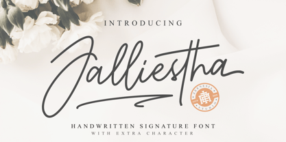 Jalliestha Signature is a monoline script font with handwritten signature Style. Jalliestha Signature font was created with original handwritting pen. This collection of scripts is perfect for personal branding. this works well for many applications. Jalliestha Signature would perfect for photography, watermark, social media posts, advertisements, logos & branding, invitation, product designs, label, stationery, photography, wedding designs, product packaging, special events, fashion, website or anything that need handwriting taste. Jalliestha Signature is equipped with many additional features that allow you to customize your text. You will get a complete set of uppercase and lowercase, multilingual, punctuation, ligatures, stylistic alternates a-z and more.
 - Heimat Sans by Atlas Font Foundry,
$50.00 Heimat Sans is the grotesque typeface family within the Heimat Collection, also containing Heimat Didone, Heimat Display, Heimat Mono and Heimat Stencil. Heimat Sans is a legible typeface family designed for contemporary typography, especially for use in headlines and on posters, but also for reading purposes. It combines an idiosyncratic appearance with the feeling of a grid-based letter construction of the late 20s. Since the design might be too extreme for some applications, Heimat Sans character set provides two alphabets, the regular one plus an alternate design that comes across as less suspenseful. Heimat Sans [732 glyphs] comes in six weights and contains an extra set of alternate glyphs, many ligatures, lining [proportionally spaced and monospaced], hanging [proportionally spaced and monospaced], positive and negative circled for upper and lower case, superior and inferior, fractions, extensive language support and many more OpenType features.
 - Heimat Stencil by Atlas Font Foundry,
$50.00 Heimat Stencil is the monospaced typeface family within the Heimat Collection, also containing Heimat Didone, Heimat Display, Heimat Sans and Heimat Mono. Heimat Stencil is a legible typeface family designed for contemporary typography, especially for use in headlines and on posters, but also for reading purposes. It combines an idiosyncratic appearance with the feeling of a grid-based letter construction of the late 20s. Since the design might be too extreme for some applications, Heimat Stencil’s character set provides two alphabets, the regular one plus an alternate design that comes across as less suspenseful. Heimat Stencil [684 glyphs] comes in six weights and contains an extra set of alternate glyphs, many ligatures, lining [proportionally spaced and monospaced], hanging [proportionally spaced and monospaced], positive and negative circled for upper and lower case, superior and inferior, fractions, extensive language support and many more OpenType features.
 - 1523 Holbein by GLC,
$28.00 This typeface is an attempt to offer as a font the well known marvelous Hans Holbein “Death Alphabet”, first published in 1523. We have tried to preserve as much as possible the spirit and appearance of the original Initials set — incredibly fine and enriched with detailed figures — trying at the same time to create a font not too complex to be usable. Neverteless, the font files are large, and when used, the decorated initials may appear on screen more slowly than ordinary characters. (Minimum size recommended : 96 pts) We are offering here two complete standard sets (no accented characters) : Initials and capitals. We have reconstructed the missing letters : J and U, Eth, Lslash, Thorn and Oslash. The font may be used with all our Humane and Garalde fonts, like 1543 Humane Jenson or 1592 GLC Garamond and others from the GLC foundry catalog.
 - Heimat Mono by Atlas Font Foundry,
$50.00 Heimat Mono is the monospaced typeface family within the Heimat Collection, also containing Heimat Didone, Heimat Display, Heimat Sans and Heimat Stencil. Heimat Mono is a legible typeface family designed for contemporary typography, especially for use in headlines and on posters, but also for reading purposes. It combines an idiosyncratic appearance with the feeling of a grid-based letter construction of the late 20s. Since the design might be too extreme for some applications, Heimat Mono’s character set provides two alphabets, the regular one plus an alternate design that comes across as less suspenseful. Heimat Mono [684 glyphs] comes in six weights and contains an extra set of alternate glyphs, many ligatures, lining [proportionally spaced and monospaced], hanging [proportionally spaced and monospaced], positive and negative circled for upper and lower case, superior and inferior, fractions, extensive language support and many more OpenType features.
 - Waite Park JNL by Jeff Levine,
$29.00Waite Park JNL is based on the smallest of the die-cut letters and numbers contained in the Webway Sign Cabinet - once manufactured by the Holes-Webway Company of Minneapolis, Minnesota. The largest of the set's sizes (2 inch) was the model for Sign Kit JNL, the medium size (1-1/8 inch) was used to make Sign Production JNL and this font is a version from the 3/4 inch size. Each size of alphabet and numerals have their own unique characteristics, although they all follow the same basic font style, which is reminiscent of classic Art Deco-era sanserif typefaces. The name Waite Park JNL was derived from a division of Holes-Webway that (for some reason lost to time) distributed their sign kits under the name Waite Park Sign Company, located in the Minnesota city of the same name. - Lethal Fake by Brush Art Design Office,
$39.80My name is Teruyoshi Matsui. I am a Brush Art Designer. My foundry ‘Brush Art Design Office’ is situated at the foot of an active volcano ‘ Mt. Aso ’ in the Kumamoto Prefecture, the southern part of Japan. I design the letters of the alphabet with a Japanese brush. I have created the brush font named ‘ Lethal Fake ’ in my unique brush style. At the beginning of making the font I was going to name it ‘BrushType Lethal’ and tell you, “ Be careful using it. That’s because it ’s Lethal ”. But actually I was very disappointed when it was finished. I tried to make it lethal, but it was not. So I changed the font name into ‘ Lethal Fake ’. This time I have to say to you, “ Be careful using it. That’s because it’s not Lethal ”. Thank you. - Tihlsand by Hart Foundry,
$20.00 Introducing a new font from Hart Foundry, Tihlsand. This rounded and rough font are made with carefully, so it look good in pair, this font are also good for Logotype, Branding or even a quotes. With this neutral font are also good for you to make a modern or vintage design, With a bunch of an alternate and ligature you can make a good combination for your design. What's Included: -Character set A-Z -Uppercase & Lowercase -Numerals & Punctuation -Multilingual -Some Ligature & Stylistic alternates -Works on PC & Mac There is the details about the font, if there any other question about this font. Do not hesitate to let me know... Thanks
 - Manila Style by Sensatype Studio,
$15.00 Manila- Modern Elegant Serif Font Manila font is a modern Elegant Serif font with a Elegant , fancy, playful, unique, and versatile vintage sans serif that you can combine to get a beautiful typography. It is a Serif font with moderate contrast that perfect for branding projects, logo, wedding designs, social media posts, advertisements, product packaging, product designs, label, photography, watermark, invitation, stationery, and any projects, it makes with a high level of legibility. What's Included: Ready 9 Weight (Thin, Extralight, Light, Regular, Medium, SemiBold, Bold, ExtraBold, Black) Character set A-Z Alternative Uppercase & Lowercase Numerals & Punctuation Accented Characters (West Europe) Works on PC & Mac Wish you enjoy our font. :)
 - saxMono - Unknown license

- Zitter by Ardyanatypes,
$10.00 Zitter Decorative Serif is a serif-style product font that looks luxurious and elegant. This font has many features that will make your designs look more beautiful and elegant. It is very suitable to be used as a type of logo and for branding your brand, and there is still much that you can do with Zitter Decorative Serif. Its unique shape adds a creative impression to it, so it can also use for any fancy, unique, vintage, and elegant themed designs. Languages Support :Afrikaans, Albanian, Asturian, Asu, Azerbaijani, Basque, Bemba, Bena, Bosnian, Breton, Catalan, Chiga, Colognian, Cornish, Croatian, Czech, Danish, Dutch, Embu, English, Esperanto, Estonian, Faroese, Filipino, Finnish, French, Friulian, Galician, German, Gusii, Hungarian, Icelandic, Igbo, Indonesian, Irish, Italian, Kabuverdianu, Kalaallisut, Kalenjin, Kamba, Kikuyu, Kinyarwanda, Latvian, Lithuanian, Low German, Lower Sorbian, Luo, Luxembourgish, Luyia, Machame, Makhuwa-Meetto, Makonde, Malagasy, Malay, Maltese, Manx, Meru, Morisyen, North Ndebele, Norwegian Bokmål, Norwegian Nynorsk, Nyankole, Oromo, Polish, Portuguese, Quechua, Romanian, Romansh, Rombo, Rundi, Rwa, Samburu, Sango, Sangu, Scottish Gaelic, Sena, Shambala, Shona, Slovak, Slovenian, Soga, Somali, Spanish, Swahili, Swedish, Swiss German, Taita, Teso, Turkish, Turkmen, Upper Sorbian, Vietnamese, Vunjo, Walser, Welsh, Western Frisian, Yoruba, Zulu A guide to accessing all alternatives can be read at http://adobe.ly/1m1fn4Y Adobe Photoshop go to Window - glyphs Adobe Illustrator go to Type - glyphs Features: A – Z Character Set a – z Characters set Numerals & Punctuations OpenType Multilingual
 - Titanium Motors by Monotype,
$29.99 There is almost no other font that conveys a sense of speed better than the bold but dynamic letters of Titanium Motors™ by Steve Matteson. Use this headline font to create exciting software titles, logos and user interfaces.
 - airbrush - Unknown license

- Tokoloshe by Scholtz Fonts,
$17.95Tokoloshe is a name in African mythology for a mischievous leprechaun-like figure that loves practical jokes and tricking people. There are many books of such African stories, for example Tales of the Tokoloshe by Pieter Scholtz. The letter shapes that I used in the Tokoloshe font have inspiration from two sources: -- the spiky character of the font was derived from the wonderfully imaginative, wooden carvings of the Makonde people of beings called "shetani". The word "tokoloshe" is used by other tribes, but from his behaviour, he is certainly a type of shetani. -- some of the letter shapes were informed by Art Deco styles of fonts, for example: Kunjani, Black Tie SF, Selznick Normal, Zaire SF, Binner Gothic and ITC Anna. But the Tokoloshe font, like its namesake, is much more freespirited. Use this font whenever you want to suggest the rich artistic, cultural and spiritual heritage of Africa. The font is fully professional in terms of its character set. It contains over 235 characters - (upper and lower case characters, punctuation, numerals, symbols and accented characters are present). In fact, it has all the accented characters used in the major European languages. - Blockrock by Volcano Type,
$9.00 Blockrock is an OpenType typeface that lets you build letters right away. Use the different weights to construct 3-dimensional letter-buildings. It is inspired by the apartment living blocks in the center of East Berlin built in the 60s. The regular font contains more complex letter buildings, while the simple font has simplified and plain letters in two different levels. Blockrock comes with kerning and a full Western and Central European language support, including Baltic and Turkish.
 - ITC Skylark by ITC,
$29.99ITC Skylark, from designer Patty King, is an alphabet with a strong handwritten character and calligraphic influences. The figures look as though they were written with a broad-tipped pen on rough paper. The result is a light stroke contrast, irregular outer contours, pointed stroke endings and a clear slant to the right. These characteristics lend the font its spontaneity and liveliness. ITC Skylark is best used for headlines and short texts in point sizes of 12 and larger. - French Armoire by DimitriAna,
$22.00 French Armoire is a subtle, modern calligraphy font that will give a casual chic look to your designs. It supports Central, Eastern, Western European, Baltic, Turkish and Greek languages and it is delivered in OpenType format. French Armoire has over a 1000 glyphs, with a variety of opentype features in Latin and Greek alphabet: Stylistic alternates, contextual (positional) alternates, swashes, 2 stylistic sets of initial and terminal forms and standard ligatures. The font is fully unicode-mapped (PUA encoded).
 - Hobo by URW Type Foundry,
$35.99 The Hobo font is a dynamically tapering face in which all strokes are accentuated curves, achieving a superb decorative effect. Hobo almost suggests a freely drawn alphabet with its unusual robust roundness. The Hobo font was designed to be used at large sizes. It has no descenders: the lower case g, p, q and y are incorporated into the x-height. The Hobo font imparts a friendly personality to display work such as invitations, menus, signage and packaging.
 - Aerovias Brasil NF - 100% free

- Sesquipedalian NF - Unknown license


