10,000 search results
(0.055 seconds)
- HKF Gold Queen DLC by Harry Kasyanov,
$5.00 Gold Queen is a vintage font family with features opentype with extension svg. Perfect for the vintage tattoo studio logos, barbershops, alcohol labels and many other. Includes a full set of character A-Z, numerals, and punctuation. Product content: HKF Gold Queen Regular - (OTF) HKF Gold Queen Drop line - (OTF) HKF Gold Queen Drop shadow (B&W) - (OTF) Color fonts (available only with Adobe illustrator CC 2018 and Photoshop CC from 2017) HKF Gold Queen Drop line (color) - (OTF SVG) HKF Gold Queen Drop shadow (color) - (OTF SVG)
 - Snoop City by Supersemarletter,
$10.00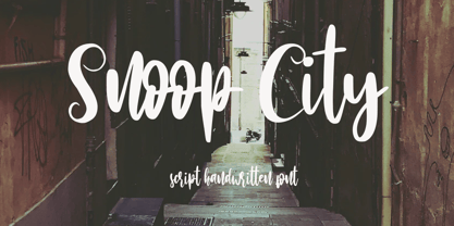 Snoop City is a flowing handwritten font, described by an elegant touch, perfect for your favorite projects. Fall in love with its incredibly distinct and timeless style and use it to create spectacular designs!. Honestly it works perfectly for headlines, logos, posters, packaging, T-shirts and much more. Font Features : • Regular version • Character set A-Z in uppercase and lowercase • Numerals & Punctuation • Accented Characters • Multiple Languages Supported Recommended to use in Adobe Illustrator or Adobe Photoshop with opentype feature. If you have questions, just send me a message and I'm glad to help.
 - Calligrapher by Arendxstudio,
$16.00 Calligrapher is an elegant font and has its own distinctive style, so it looks luxurious in every character. Calligrapher comes with OpenType features such as stylistic alternates, stylistic sets & ligatures good for logotypes, posters, badges, book covers, t-shirt design, packaging and more. Features : • Character Set A-Z • Numerals & Punctuations (OpenType Standard) • Accents (Multilingual characters) • Ligature • Alternate • Swash There it is! I really hope you enjoy it - comments and likes are always welcome and accepted. More importantly, don't hesitate to send a message if you have a problem or question.
 - Nawin Latin by Letterjuice,
$66.00 Nawin is an informal Arabic typeface inspired by handwriting. The idea behind this design is to create a type family attractive and ownable for children but at the same time a design that keeps excellent letter recognition for reading. Handwriting has been a great source of inspiration in this particular typeface. By emulating the movements of the pen, we have obtained letter shapes that express spontaneity. A bright group of letters create a lively and beautiful paragraph of text. To get closer to handwriting and the variety of letter shapes that we draw while writing, this typeface offers a large number of alternative characters, which differ slightly from the default ones. Because we have programed the «Contextual Alternate» feature in the fonts, these alternate characters appear automatically as you set a text on your computer. For instance, in the Arabic variability on vertical proportions between letters Alef and initial Lam, create movement in text and avoid the cold mechanical feel of repetition. In the case of the Latin a part from having an entire alternate basic alphabet, there are also different letterforms for characters with diacritics, this way variability becomes even greater. Nawin is quirky and elegant at the same time. Letter recognition is relevant when reading continuous text. For this reason, in the Arabic, we have added another contextual alternate feature with alternate characters that help to avoid confusion when letters with similar or the same shape repeat inside one word. This is the case of medial «beh and Yeh» repeated three times continuously in the same word. The alternate characters change in shape and length, facilitating distinction to the reader. Since this typeface is inspired by handwriting and the free movement of the hand while writing, we considered ligatures a good asset for this design. The Arabic has a wide range of ligatures that enhance movement and fluidity in text making look text alive, while the Latin achieves this same effect via contextual alternates.
 - Nawin Arabic Ltn by Letterjuice,
$107.00 Nawin is an informal Arabic typeface inspired by handwriting. The idea behind this design is to create a type family attractive and ownable for children but at the same time a design that keeps excellent letter recognition for reading. Handwriting has been a great source of inspiration in this particular typeface. By emulating the movements of the pen, we have obtained letter shapes that express spontaneity. A bright group of letters create a lively and beautiful paragraph of text. To get closer to handwriting and the variety of letter shapes that we draw while writing, this typeface offers a large number of alternative characters, which differ slightly from the default ones. Because we have programed the «Contextual Alternate» feature in the fonts, these alternate characters appear automatically as you set a text on your computer. For instance, in the Arabic variability on vertical proportions between letters Alef and initial Lam, create movement in text and avoid the cold mechanical feel of repetition. In the case of the Latin a part from having an entire alternate basic alphabet, there are also different letterforms for characters with diacritics, this way variability becomes even greater. Nawin is quirky and elegant at the same time. Letter recognition is relevant when reading continuous text. For this reason, in the Arabic, we have added another contextual alternate feature with alternate characters that help to avoid confusion when letters with similar or the same shape repeat inside one word. This is the case of medial «beh and Yeh» repeated three times continuously in the same word. The alternate characters change in shape and length, facilitating distinction to the reader. Since this typeface is inspired by handwriting and the free movement of the hand while writing, we considered ligatures a good asset for this design. The Arabic has a wide range of ligatures that enhance movement and fluidity in text making look text alive, while the Latin achieves this same effect via contextual alternates.
 - TA Regresso PRO by Tural Alisoy,
$39.00 TA Regresso PRO graphic presentation at Behance TA Regresso PRO font is inspired by Didon and Bodoni fonts. A combination of a little Bodoni and a little Didon elements and a unique style and Text, Display, Subhead and about 80 styles, it is a font that gives the user a choice. TA Regresso font supports Greek, Hebrew, Cyrillic and Latin alphabets. After starting work on the font since February of last year, the font is ready today with constant revisions. Being open to learning, I sought help from experienced designers. I must mention that Yulia Gonina, the founder of Schrifteria Foundry, also helped me a lot to make Regresso good. With her knowledge and advice, the flaws in the font were eliminated. By the way, Viktor Baltus also helped me with his valuable advices. I did some research about the alphabets of the supported languages so that Regresso is good. I paid a lot of attention to the correct design of the letters. I will fix the problems I missed in the next updates of the font. I would be happy if you send me your work when you use my font. I'm very interested in where you use my font. TA Regresso PRO contains 200+ Latin and Cyrillic, Greek, Hebrew languages. TAFT produce retail typefaces, create custom fonts and even do Greek, Hebrew and Cyrillization. Our mission is to create and distribute only carefully drawn, thoroughly tested, and perfectly optimized typefaces which are available to a wide range of customers. If you're looking for a type or logo → t@taft.work
 - Gibbard_erc_01 - Unknown license

- Eden CT by CastleType,
$39.00 Eden Light, originally designed by the American type designer Robert H. Middleton in 1934, was commissioned by Publish magazine for a redesign in 1990. When I found a specimen of Eden Bold a couple years later, I decided to digitize it also. Subsequently, I created a Medium weight. Very squared and compact with thin slab serifs, Eden includes support of all European languages that use the Latin alphabet.
 - Suerte by Resistenza,
$39.00 Say hello to Suerte. This new typeface with inverted contrast and bifurcated serifs was inspired by Caslon’s Italian type and by Aldo Novarese’s Estro, published by the turinese foundry Nebiolo. Our aim was to develop a wood type typeface adding a new personality incorporating Tuscan serifs. The complete alphabet was designed with a flat long brush and Indian ink and then vectorized. Suerte contains a big set of icons and dingbats.
 - Glorita by Gerald Gallo,
$20.00 Glorita is an original, clean and crisp, sans serif condensed font, excellent for text and at large sizes an effective display font. The font includes upper and lowercase alphabets, numbers, punctuation, accented characters, symbols, and miscellaneous characters.
 - Cross Stitch Medieval by Gerald Gallo,
$20.00 Cross Stitch Medieval is not intended for text use. It was designed specifically for use as fancy monograms or initials. Cross Stitch Medieval has an uppercase alphabet, 9 stitches tall, located under the shift+character set keys.
 - ITC Werkstatt by ITC,
$29.99ITC Werkstatt is a result of the combined talents of Alphabet Soup's Paul Crome and Satwinder Sehmi, along with Ilene Strizver and Colin Brignall. It is inspired by the work of Rudolph Koch, the renowned German calligrapher, punchcutter, and type designer of the first third of this century, without being based directly on any of Koch's typefaces. Werkstatt has obvious affinities with the heavy, woodcut look of Koch's popular Neuland, but also with display faces like Wallau and even the light, delicate Koch Antiqua. Brignall began by drawing formal letters with a 55mm cap height, which Sehmi reinterpreted using a pen with a broad-edge nib. “Not an easy process,” says Brignall, “since one of the features of Koch's style is that while it was calligraphic in spirit, most of the time his counter shapes did not bear any resemblance to the external shapes, as they would in normal calligraphy. This meant that Sehmi could not complete a whole character in one go, but had to create the outside and inside shapes separately and then ink in the center of the letters.” The process was repeated, only without entirely filling in the outlines, for the Engraved version. Crome handled the scanning and digitization, maintaining the hand-made feel while creating usable digital outlines. “The collaboration of artisans with particular skills,” says Brignall, “in a modern-day, computer-aided studio environment, seems very much in step with the 'workshop' ethos that Rudolph Koch encouraged and promoted so much.” - MFC Heathcliff Monogram by Monogram Fonts Co.,
$19.00 The source of inspiration for MFC Heathcliff Monogram is a crudely hand drawn vintage monogram transfer depicting a wider format diamond monogram. We revised numerous letters for better clarity and a more vintage industrial vibe. MFC Heathcliff Monogram is capable of traditional two and three letter format monograms, as well as gapped and hugging framing options for each. Numerals 1-9 and 0 on the keyboard for the 2 letter framing options typed before the letters, and use the shift key on the numerals for the 3 letter framing options type before the letters. It's just that easy. Looking for an MC in one of the letter slots? Just type mc on either side of MC in the middle to get it. Otherwise, just type a lowercase, a Capital, and then a lowercase to build your monogram. As one of the most popular shape based formats for monogramming since the beginning, it must be true that diamonds are forever.
 - Semikolon by URW Type Foundry,
$35.00 SemikolonPlus: Optimal readability by reduced, distinct letter forms. Appropriate for early readers of any age in schools and other educational institutions. SemikolonPlus minimizes the risk of confusing similar characters and therefore is predestinated for the use in text blocks, work sheets, educational games et cetera. Furthermore, with its accented characters, currency signs, true fractions and other special characters, SemikolonPlus is suited for numerous typographic tasks and – thanks to its distinct letter forms - offers great readability, even in lower point sizes. SemikolonPlus is recommended by the German association of alphabetization and basic education, which uses it for adult education, reading magazines, teaching material and the own YouTube-channel. SemikolonClassic: Is the familiar font with alternative character forms. E.g. it contains the lower case double level a and g, as well as glyphs harmonically formed to the typeface. The SemikolonClassic is suitable for diverse uses in various sectors. Together or in combination SemikolonPlus and SemikolonClassic offer extensive possibilities for the layout of text material with their heavy font weights.
 - Phrasa by Arrière-garde,
$12.00 Phrasa is a robust humanist sans-serif typeface family which will carry you through most of your design needs. Designed for legibility, she truly shines in running text. However her solid (yet elegant) construction allows for usage in such settings as branding or signage. Phrasa's most prominent features are: 13 weights, from hairline to black Moderate x-height Large apertures Modern capitals proportions Designed for readability… … without sacrificing good looks True Italics Small capitals Adobe Latin 3 language range Cyrillic alphabet Old-style and tabular figures The idea behind Phrasa was to create a stylish typeface but with legibility in mind. The inspiration came from history, namely from two of the most legible typefaces known: Garamond and Gill Sans. The new typeface boasts a smooth, easy-on-the-eyes texture which allows the reader to simply sink into the text. It also posses a set of true italics to compliment it. Phrasa has a broad linguistic range, spanning from extended latin alphabet to cyrillic.
 - Glupsk by Hökarängens Bokstavsfabrik,
$19.00 Do you remember that kid from Lord of the Flies? Why do I even remember that kid, I’m too young for that. However, his name was Piggy, and I wanted to make a typeface that resembled him. So this is my tribute to Piggy who got killed by that falling plastic rock in the movie. May he live forever through this typeface, on birthday cards, or maybe some sweet candy packaging or why not through an graphic identity for a toy company?
 - Cottonwood Market by Make Media Co,
$18.00 Cottonwood Market is a sweet, upright calligraphy font with loads of decorative alternates and a charming signature feel. This lovely little calligraphy font is packed with alternates, ligatures, and an authentically inked texture. It’s both romantic and delicate, with thin lines and signature glyphs. Just check out that swanky ‘k!’ Cottonwood Market has plenty of personality for branding, bridal, merchandise, signage, signatures, and more! With over 90 ligatures and alternates to play with, you can have some serious fun with this font.
 - Ceramika by Santi Rey,
$25.99 Ceramika is a modern tribute to Old Style typefaces. This design is inspired by the letterforms of the serif faces found in history books from the beginning of the 20th-century. Its sturdiness and generous X-Height makes it bold and compact; while the high-contrast strokes and recognisable shapes makes it extremely readable. All this makes Ceramika a really versatile font, perfect for logos, headlines and even body copy. It comes in 6 different weights and 2 styles — Standard and Italic.
 - Ballonest by Madhaline Studio,
$19.00 Ballonest is a handwritten font with a stylish, elegant and natural touch. It has an original feel and beautiful handwriting. Made seriously, with care and with feeling. Ballonest would perfect for photography, watermark, social media posts, advertisements, logos & branding, invitation, product designs, label, stationery, wedding designs, product packaging, special events or anything that need handwriting taste. Your download will include files; Ballonest ~ A hand-made, all characters brush font which has a complete set of A-z characters with 107 stylish ligatures. All font files are provided in both TTF & OTF font formats. Includes a range of multilingual support.
 - Open Book ING by Ingrimayne Type,
$9.00 OpenBookING is a gimmick or novelty font that has letters on pages of a book. It is caps only and monospaced. The letters on the upper-case keys are on the left-handed pages of an open book and the letters on the lower-case keys are the same letters but on the right-handed pages of an open book. One could alternate upper and lower case keys to get letters on complete books, but the Opentype feature of contextual alternatives (calt) does this automatically. Several previous typefaces from IngrimayneType used the calt feature to alternate shapes that fit together in an interlocking pattern, such as alternating concave and convex shapes. OpenBookING uses the calt feature in a different way, to alternate two halves of a symmetrical shape. To provide two copies of numbers and common symbols, some non-alphabetical characters are unavailable because their slots were taken by the second form of the number or common symbol. If stylistic set one (ss01) is turned on, spaces are replaced with empty pages. This may leave you with unwanted spaces at the end of lines, and to eliminate them, turn off the feature (or change the font) for these spaces. The empty pages can be used in a layer to add color to the text. There is also a second set of empty pages with a filled page that can also be used in layers. (See poster for examples.) These pages are on the (logicalnot multiply) and (register divide) characters for the first set and on the (ordmasculine ellipsis) and (macron trademark) keys for the second set. Finally, OpenBookING has a large set of accented characters if anyone should need them. The letters used on the books were derived from the font Myhota-Bold. For a related typeface of letters on book covers, see NewLibrary. OpenBookING has limited uses and is priced accordingly.
 - Senella Script by Aktab Studio,
$16.00 Senella is a script font with more than 350 characters and covers several languages based on the Latin alphabet; the whole font design has also been completed with extensive alternates, ligatures and swashes sets. Senella is suitable for any design project, vintage, fashion, branding, print design and whatever design you want Thank you for visits and happy branding !
 - Stencil Mark JNL by Jeff Levine,
$29.00 The set of vintage brass alphabet stencils that inspired Stencil Mark JNL was manufactured by the Chicago Firm of Meyer and Wenthe. Pete Skoglund of Unadilla, NY was selling a set of these stencils on Ebay, and was nice enough to provide Jeff Levine some images to use as models for the design of this typeface.
 - Paper Caper NF by Nick's Fonts,
$10.00This typeface is an amalgam of two cut-paper typefaces, as presented by Margaret Shepherd in her book, Calligraphic Alphabets Made Easy. Also included are a glue bottle at the bar position, and round-edge scissors at the dagger and double-dagger positions. Both versions of the font include 1252 Latin, 1250 CE (with localization for Romanian and Moldovan). - Codeworld by Par Défaut,
$49.00 Codeworld is a geometrical sans serif font family (5 weight, italic and variable) It contains more than 800 characters including the Latin, Cyrillic and Greek alphabet. There are also 13 OpenType features (Superior; Inferior; Numerator; Denominator; Fraction ; Small Capital; Small Capitals from Capitals; Contextual Alternate; Case Sensitive; Access All Alternates; Stylistic Set; Standard Ligature; Discretionary Ligature).
 - Samira by CastleType,
$29.00 I must admit that I am not a big fan of the Art Nouveau style. However, I found this particularly beautiful alphabet and decided to use it as the basis for this new font. Very graceful, elegant, and dare I say, organic. Includes some intertwined ligatures. Complete uppercase, numerals, basic punctuation. Supports most Western European languages.
 - 1512 Initials by GLC,
$20.00 This set of initial decorated letters is an entirely original creation, drawn inspired by Italian renaissance patterns. It contains two roman alphabets : one drawn in white on black background and the other in black on white. We have included a few fleurons and decorative elements. It can be used as variously as web-site titles, posters and flyers design, publishing texts looking like ancient ones, or greeting cards, all various sorts of presentations, as a very decorative, elegant and luxurious additional font... This font supports strong enlargements remaining very smart and fine. It's prefered height is about one inch equivalent to about four lines of characters. This font may be used with all blackletter fonts, but works especially well with 1543 Humane Jenson, 1557 Italique and 1742 Civilite, without any anachronism.
 - Augsburg Initials by Kaer,
$18.00 Hey! I'm happy to introduce to you my new initial's set. These drop caps I found in the "Introductorium in astronomiam" manuscript. It was printed in Augsburg in 1489 by Erhard Ratdolt. I've added some lost letters and assembled a full alphabet. Augsburg is a medieval gothic style font. Set of dim colored and monochrome grunge style emblems. Engraved initial drop caps. Perfect for vintage premium identity, Middle Ages posters, luxury packaging. If you want dark and strong medieval style concepts, please try it. --- *You can use color fonts in PS since CC 2017, AI since CC 2018, ID since CC 2019, macOS 10.14 Mojave* *Please note that the Canva & Corel doesn't support color fonts!* --- Please feel free to request any help you need: kaer.pro@gmail.com Best, Roman. Thank you!
 - FE Planking 2020 by Egor Stremousov,
$50.00 Experimental and accidental unicase grotesque. A font in which all the letters and numbers fell down and deformed under the force of gravity. Everything that was hanging fell down. Everything that was curved horizontally straightened. The form and principle of construction of each symbol in the font is dictated not by tradition, but by physics. This makes FE Planking 2020 an excellent tool for creating phrases and statements in advertising and art projects that attract attention and make your head spin. The first free version with a minimum set of Latin and Cyrillic alphabets was released in 2019, and in 2020 the font was updated and supplemented with an expanded set of characters. Dedicated to @Serge Rachok, who invented the Planking Game before it was invented by others.
 - Ziro by Wilton Foundry,
$29.00Ziro expresses itself boldly and spontaneously. It consists of two different sets of capitals to help create natural handwriting effect. The letter "I" is treated like a lowercase "I" and the letter "O" has a dot in the center. The lowercase variation does not have a dot in the center for those less adventurous applications. Ziro is loose and raw in larger sizes and therefore has many useful applications that may include restaurant logos, menus, boutiques, packaging, etc. - Trad by Powerfonts,
$13.99 Trad (Träd is Swedish for tree) is inspired by viking mythology and runic alphabets. Imagine a viking warrior crudely carving a message into a tree stump with his trusty dagger, sipping on a flagon of ale and pondering a hard days slaying. Like the blade of his blood encrusted axe, Trad is ideal for projects requiring a sharp edge, such as the cover of your next thriller, zombie flick, or death metal album.
 - Colcothar by Fabulous Rice,
$30.00 Colcothar is a font based on a calligraphic alphabet I ofter use for my comic books, my film title sequences, or my notebooks. It made sense to turn it into a font, especially since it looks hand-written and quality fonts that look hand-written are sometimes hard to find. It will look great as a header for an article, for a logo, the title of a film… or for anything you think appropriate!
 - Zulia Pro by Sudtipos,
$59.00 Zulia is located in the west of Venezuela and it is the state in where Joluvian grew up. It is a region of sunshine, high temperatures, oil and cheerful people, although we choose the name to honor his mother who is from there (zuliana) and who is proud of her land and everything that it represents the area. Zulia is also his first typographic project. It is based on two of his favourite calligraphic styles: italic and brush pen. He started with simple and contrasted strokes on paper with brush and marker. After that he developed the full alphabet and its various options for each letter, starting from a set of handmade forms that could be connected in different ways according to the user needs. What motivates him to involve this style was to create a differentiation with his daily work by generating a heavier type, contrasted and low rise. Zulia finally got life of its own with the participation of Alejandro Paul and a feedback of techniques and skills that were generated with the duo work. Zulia is not just a typeface, Zulia is his love of letters.
 - Dosca by Ardyanatypes,
$10.00 Dosca is a unique and elegant display font with a unique Sans serif style. This font offers nine different thickness options, ranging from Thin to Black, providing a variety of options for a variety of applications. Each Dosca thickness has its own unique characteristics, so you can choose the one that best suits your design aesthetic. For example, Thin may be suitable for a light and elegant design, while Black may be used for a more dramatic and bold appearance. Additionally, Dosca comes with various OpenType features. These include features such as ligatures, which allow certain characters to be combined beautifully, and alternative letterforms that provide more design options. With this feature, you can create more interesting and unique text elements in your designs. Dosca is designed to support multiple languages so it is suitable for use in many countries. This makes it very versatile and suitable for a variety of multilingual design projects. So, if you're looking for a font that combines the beauty of Sans serif with a variety of thickness options, useful OpenType features, and multilingual support, Dosca is the perfect choice to meet your design needs. A guide to accessing all alternatives can be read at http://adobe.ly/1m1fn4Y Adobe Photoshop go to Window - glyphs Adobe Illustrator go to Type - glyphs Features: A – Z Character Set a – z Characters set Numerals & Punctuations Ligatures & Alternates Multilingual
 - FranklinGothicHandLight by Wiescher Design,
$39.50 FranklinGothicHandLight is part of a series of hand-drawn fonts from way back in time – before computers changed the way we worked. When I was in advertising – before computers – a very time consuming part of my daily work was sketching headlines. I used to be able to sketch headlines in Franklin Gothic, Times, Futura, Helvetica and several scripts. We had a kind of huge inverted camera – which we called Lucy. We projected the alphabet onto a sheet of transparent paper, outlined the letters with a fineliner and then filled them in. It was very tedious work, but the resulting headline had its own charm and we had a permanent race going on who was best and fastest. I won most of the time! They used to call me the fastest "Magic Marker" this side of the Atlantic. Great days, just like today! Your sentimental type designer from the past Gert Wiescher
 - FranklinGothicHandDemi by Wiescher Design,
$39.50 FranklinGothicHandDemi is part of a series of hand-drawn fonts from way back in time – before computers changed the way we worked. When I was in advertising – before computers – a very time consuming part of my daily work was sketching headlines. I used to be able to sketch headlines in Franklin Gothic, Times, Futura, Helvetica and several scripts. We had a kind of huge inverted camera – which we called Lucy. We projected the alphabet onto a sheet of transparent paper, outlined the letters with a fineliner and then filled them in. It was very tedious work, but the resulting headline had its own charm and we had a permanent race going on who was best and fastest. I won most of the time! They used to call me the fastest "Magic Marker" this side of the Atlantic. Great days, just like today! Your sentimental type designer from the past Gert Wiescher
 - Zega Grot by Isaco Type,
$24.00 Celebrate good times with Zega Grot family! This font is the companion of Zega Text but less “serious” than its predecessor. The Grot version has old vertical proportions, with higher capitals and asc-descenders, height difference between capitals and ascenders, beyond the redesign of various glyphs, giving a less formal tone, more rounded and cheerful. The family consists of 14 styles, 7 weights plus their respective italic versions. The fonts are available in OpenType PS and have extended character set to support CE, Baltic, Turkish as well as Western European languages. You can test Zega downloading the free trial font in Extrabold version (TT only).
 - Nizzoli by Los Andes,
$19.00 This typeface is a tribute to well-known Italian designer Marcello Nizzoli. Nizzoli is a modern sans serif font that offers a wide range of alternatives—a workhorse type well suited for headlines, posters, corporate identity and advertising campaigns. This modular design is based on geometric shapes and combines straight lines with rounded corners. The whole family is composed of four 7-weight subfamilies: one normal and one alternative plus rounded versions. Each subfamily includes matching italics. This typeface is my own interpretation of those curves and shapes found in Marcello Nizzoli’s designs.
 - PF Signskript by Parachute,
$75.00 Sitting inside our offline vault and print catalogs for several years but still available for purchase, PF Signskript is part of a valuable triad of typographic gems which are finally re-released, fully updated and upgraded. Designed by Vladimir Radibratović, a foremost calligrapher, type designer and illustrator, this trilogy of script typefaces was recently revamped by our design team with full support for Latin, Greek and Cyrillic. Initially released between 2000 and 2003 these typefaces manifest a human, hand-crafted feel. Designed to excel particularly within casual and natural contexts, their names reveal their exact identity. The nostalgic charm of PF Signskript, the unique vintage and rough appeal of PF Rafskript or the organic Mediterranean essence of PF Mediterra have all attracted attention to these popular typefaces for brands on the supermarket shelves, wine labels, packaging, quotes, stationery and vintage lettering.
 - PF Rafskript by Parachute,
$75.00 Sitting inside our offline vault and print catalogs for several years but still available for purchase, PF Rafskript is part of a valuable triad of typographic gems which are finally re-released, fully updated and upgraded. Designed by Vladimir Radibratović, a foremost calligrapher, type designer and illustrator, this trilogy of script typefaces was recently revamped by our design team with full support for Latin, Greek and Cyrillic. Initially released between 2000 and 2003 these typefaces manifest a human, hand-crafted feel. Designed to excel particularly within casual and natural contexts, their names reveal their exact identity. The nostalgic charm of PF Signskript, the unique vintage and rough appeal of PF Rafskript or the organic Mediterranean essence of PF Mediterra have all attracted attention to these popular typefaces for brands on the supermarket shelves, wine labels, packaging, quotes, stationery and vintage lettering.
 - PF Mediterra by Parachute,
$75.00 Sitting inside our offline vault and print catalogs for several years but still available for purchase, PF Mediterra is part of a valuable triad of typographic gems which are finally re-released, fully updated and upgraded. Designed by Vladimir Radibratović, a foremost calligrapher, type designer and illustrator, this trilogy of script typefaces was recently revamped by our design team with full support for Latin, Greek and Cyrillic. Initially released between 2000 and 2003 these typefaces manifest a human, hand-crafted feel. Designed to excel particularly within casual and natural contexts, their names reveal their exact identity. The nostalgic charm of PF Signskript, the unique vintage and rough appeal of PF Rafskript or the organic Mediterranean essence of PF Mediterra have all attracted attention to these popular typefaces for brands on the supermarket shelves, wine labels, packaging, quotes, stationery and vintage lettering.
