10,000 search results
(0.033 seconds)
- Anca by DizajnDesign,
$49.00 Anca typeface started as a comission work for Fest Anca, an international animation festival. They needed something to complement the corporate identity of the festival. Inspiration came from a sketch made by my friend long time ago, which had a tremendous potential. As letters were digitized and the basic alphabet was completed, a very practical and universal typeface resulted. The whole type family has a playful and simple look with rounded stroke endings as well as long ascenders. The construction skeleton uses the minimum number of strokes and as a consequence, some original letter shapes (Q, w, j, &, A, §) were produced. Despite the fact that most letter shapes are based on geometry, some strokes are intentionally irregular, which creates a very natural feeling. Anca is appropriate for setting short paragraphs, headings and big inscriptions.
 - Bimbo by Zetafonts,
$39.00 Bimbo is a monoline script font family created in 2018 by Francesco Canovaro for Zetafonts as an extension & redesign of the original Arsenale White typeface created with italian illustrator Jonathan Calugi. Bimbo expands the original design with six new weights and over 300 new characters to cover over 70 languages using the latin, greek and cyrillic alphabets, while keeping the handmade aesthetic that made successful the original font. Bimbo is essentially a display font, born for minimal lettering and logos, with a handwritten sensibility enhanced by the built-in letter swapping open type feature that makes sure double letters are always different one from another. Open counters and a monoline design allow for great readability at small sizes, making Bimbo the ideal font for creating fake handwritten notes and meta-textual jokes.
 - Strokes by Favorite Fonts,
$17.00 The "Strokes" font family presented here has several styles: regular, italic, bold and bold italic. The font supports the alphabet consisting of Latin letters and symbols, Cyrillic, Tatar. The composition of the font "Strokes" includes graphemes from uppercase and lowercase letters, numbers, standard characters. The originality of the font lies in its name. The "Strokes" font is made up of many intersecting lines, forming rounded sans-serif letters, but at the same time smooth and easy to read, which will fit perfectly into your composition. The unusualness and attractiveness of the font makes it noticeable among the texts that surround us everywhere. This property is convenient to use on signs, logos, corporate identity, product packaging. The decorativeness of the font is eye-catching and will add important accents to your work.
 - Motorway by K-Type,
$20.00 MOTORWAY is the companion typeface to TRANSPORT, the British road sign lettering. The Motorway alphabet was created for the route numbers on motorway signage, and is taller and narrower than the accompanying place names and distances which are printed in Transport. However, for Motorway Jock Kinneir and Margaret Calvert created only the numbers 0 to 9, the capitals A, B, E, M, N, S and W, ampersand, slash, parentheses and a comma. So, although the lettering made its first appearance on the Preston bypass in 1958, K-Type Motorway is the first complete typeface and contains all upper and lower case letters, plus a full complement of punctuation, symbols and Latin Extended-A accented characters. As with the Transport alphabet the starting point was Akzidenz Grotesk, Motorway taking inspiration from condensed versions. Changes were mainly driven by a quest for legibility, resulting in some reduced contrast between horizontal and vertical strokes, and Gill-esque straight diagonal limbs on the 6 and 9, and high vertex for the M. Kinneir and Calvert designed the limited range of characters in two weights; a SemiBold 'Permanent' weight for use as white letters on blue motorway signs, and a Bold 'Temporary' weight for heavier black letters on yellow non-permanent signage. In addition to creating full fonts in both original weights, the K-Type family adds a new Regular weight, plus a set of italics, completing a highly usable condensed typeface which, while rooted in history, is fully functional for both print and web usage. The K-Type fonts are spaced and kerned normally, simply increase the tracking to recapture the generous spacing of motorway signage.
 - Faux Pas JNL by Jeff Levine,
$29.00 The lettering found on an 1878 Salt Lake City advertisement for the Forepaugh’s Circus inspired Faux Pas JNL, which is a bit of a pun on the circus’ name and also a commentary on how this unusual lettering style seems to break all of the rules on stroke width and balance. According to Wikipedia: “Adam John Forepaugh (February 28, 1831 - January 22, 1890) was an American entrepreneur, businessman, and circus owner. Forepaugh owned and operated a circus from 1865 through 1890 under various names including Forepaugh's Circus, The Great Forepaugh Show, The Adam Forepaugh Circus, and Forepaugh & The Wild West. In 1889, Forepaugh sold his circus acts to James Anthony Bailey and James E. Cooper and he sold his railroad cars to the Ringling Brothers. The Ringlings used the equipment to transform their circus from a small animal-powered production to a huge rail-powered behemoth, which later purchased the Barnum & Bailey Circus. Thus, in liquidating his circus assets, he indirectly contributed to the demise of his arch-rival.” Faux Pas JNL is available in both regular and oblique versions.
 - Blue Parrot JNL by Jeff Levine,
$29.00The original inspiration for Blue Parrot came from a short scene in the classic film Casablanca. For just a few seconds, the exterior of Ferrari's Blue Parrot night club is shown, complete with a wonderful hand-lettered sign... all in capital letters. Blue Parrot JNL was originally released in 2006, and it wasn't long before a few people noted that the font would also look good with a lower case alphabet. The idea of adding in lower case kicked around for a couple of years until Jeff Levine finally completed a revision of the font. In this version there's also an expanded character set thanks to the creative input of Michael Hagemann of Font Mesa. - ITC Drycut by ITC,
$29.99ITC Drycut is the work of Vancouver-based designer Serge Pichii and gives a twist to the tradition of heavy, woodcut-like typefaces. The font includes all the realistic features of a true woodcut, sharp edges, white cut marks and black slivers. The slivers around the edges suggest traces left after awkward movements of a knife, which are often visible on old woodcuts...Folk artists often didn't care much about refining their carvings and the slivers would have been left as long as the letters remained readable." The lower case alphabet is actually small caps proportioned to match the capitals. The letters of ITC Drycut have a slight slant to the right which lends the font a dynamic character." - Piercing by Linotype,
$29.99Piercing is part of a series of typographic experiments from the young Swiss designer Michael Parson. In the Piercing family, which contains three separate weights, Parson has successfully transformed the movements of points and lines into a fabulous display of alphabets. But you can use Piercing as your key to the techno scene: these letters, made up of fine lines terminated by dots, virtually groove with the beat as you set them in text. Like a musical score, they provide a fantastic look just right for your next flyer. Piercing is one of ten experiments in constructed letter design that Parson has included in the Take Type 5 collection from Linotype GmbH." - Patriotica JNL by Jeff Levine,
$29.00 Patriotica JNL was inspired by some hand lettering designed by the late Alf Becker for Signs of the Times® magazine. The alphabet was modified and the character set extended in this digital version. Special thanks to Tod Swormstedt of ST Publications, Inc. and the American Sign Museum in Cincinnati for providing a copy of the original lettering for use as a work model. Patriotica JNL is available as a complete font or in a set of two layers (stars layer and stripes layer) for creating two-color graphics. As always, keep in mind that there are some slight variations between drawing programs, so some adjustments may need to be made in the alignment of the layers.
 - Blinsithar by Hanzel Space,
$25.00 introduce our font "Blinsithar" font Happy! finally this font has been released in 2023, with full of new ideas having new character for each letter. It has beautiful curves that enhance the appearance of the font which is no less attractive. Complete with lowercase and uppercase letters, punctuation, swash and ligature. By creating this font, we hope to help your design type needs, to support your business and your business. This font is very suitable for use as branding, logos, slogans, websites, weddings, products and so on. Full Set of standard alphabet and punctuation Extra set of ending swashed lowercase Handwritten ligatures Thanks so much for checking out my shop! Happy creating! Cheers! Hanief - Hanzel Space
 - Amanzi by Scholtz Fonts,
$19.00This African font is modern and fluid. Its name means "water" in the Zulu language, and like the deep rivers that flow through the African jungles, it contains few straight lines. Use it when you want to convey a feeling of strength combined with flexibility. Use it for headings, posters and adverts when you want to create an impact. This African font includes a full character set: - all the upper and lower case letters, as well as all numerals, punctuation and special characters. The numerals are mono-spaced so that they will line up correctly in columns of figures. The letters of the alphabet are spaced according to their width and are carefully kerned to create an attractive appearance. - Monkton Incised by Club Type,
$39.00 The inspiration for this typeface family came from my childhood experiences at West Monkton, amidst an historic part of the South West of England. Studies of the original incised capitals of the Trajan column in Rome were analysed and polished for this modern version. The lower case letterforms and numerals were then created in sympathy, taking their proportions from the incised letters of local gravestones. Its name honours not only the area where the original alphabet was conceived and drawn, but also the people responsible for fostering my initial interest in letters. These stylized incised typefaces give a depth to the letterforms that can be exploited in your typography - evoking the carved monumental inscriptions of the Roman era.
 - BPmolecules - Unknown license

- Zuboni Stencil by CastleType,
$59.00 Zuboni Stencil is a bold, uppercase typeface based on a Russian design from around 1920 (original designer unknown). Its extensive character set supports most European languages that use the Latin or Cyrillic alphabets as well as modern Greek.
 - Tolkien Certar by Deniart Systems,
$10.00Based on the more usual pen stroke form of 'runes', (translation of Elvish Certar and Cirth). The richest form was also known as the Alphabet of Daeron. NOTE: this font comes with an interpretation guide in pdf format. - All Pro JNL by Jeff Levine,
$29.00All Pro JNL is a sports font embellished with stars and stripes and is perfect for team banners, sportswear and sports-oriented ads. The font contains alphabet, numerals and the most basic of punctuation with very little kerning. - Stature by Gerald Gallo,
$20.00 Stature is an original, clean and crisp, sans serif compressed font, which can be used for text or as an effective display font. The font includes upper and lowercase alphabets, numbers, punctuation, accented characters, symbols, and miscellaneous characters.
 - Totem by Cuda Wianki,
$20.00 TOTEM is simple and geometric, strong and modern. Previously it was designed for our logo and next we made the rest of the alphabet, including multi-language coverage and numbers. Totem has a nice set of ornaments too.
 - Maiers Nr 42 Pro by Ingo,
$42.00 A handwritten decorative font with brush characteristics This attractive decorative script is found in a pamphlet of script samples from around 1900 which was issued by Otto Maier publishing house in Ravensburg/Germany. The forms and flow of Maier’s Nr. 42 are obviously influenced by Art Nouveau. In the original sample, only the Latin alphabet appears. All other characters, especially the Greek and Cyrillic letters, were modeled on elements of the original. A typeface can first reveal a true "handmade" character when the letter forms do not continually repeat themselves – a completely normal occurrence with handwriting. Thanks to OpenType, some key letters of Maier’s Nr. 42 appear in various alternative forms depending on the combination of letters. For example, the difference is obvious between an e followed by i and an e followed by l. Using this principle, a number of letter combinations are presented with alternative character forms so that overall a very lively impression is created.
 - Brophy Script by Monotype,
$29.99Brophy Script is a bold connecting brush alphabet. This brush script typeface was designed in 1953 by the American type designer Harold Broderson. Broderson worked for ATF (the American Type Founders), who were the original publishers of this design. Brophy Script is a version with more handwritten letters than to its other version called Body. This a brush script face that mimics the show card style of lettering, which was very popular throughout the United States during the first half of the 20th Century. The letters appear as if they were drawn quickly and spontaneously with a wide, flat lettering brush. The lowercase letters connect to each other, cursive script style. Brophy Script is the perfect display face to provoke a nostalgic feeling for the 1950s. Anything having to do with apple pie, home cooking, or last minute sales would look great in this face. You could outfit a whole supermarket signage system in a snap with Brophy Script. - Sandwich by Suitcase Type Foundry,
$85.00The all-caps display face Sandwich was inspired by historic, hand lettered sans serif alphabets with slightly sloping terminals, as found in showcard lettering and on billboards. Besides a number of alternate glyphs located in the lowercase area of the font, the typeface features about forty 'ligatures'. These are not ligatures in the traditional sense of the word, but short two- or three-letter combinations — mostly prepositions, conjunctions, articles and so on — in different languages, which are positioned vertically, not horizontally. Since the number of such pre-fabricated ligatures in a font is limited and cannot possibly cover all the desired combinations, a special algorithm programmed into the OpenType font permits the user to compose any two- or three-letter words, provided no accented characters are used. This is why Sandwich includes five versions of each letter. Using the full possibilities offered by the OpenType format, the automatic vertical aligning of glyphs is based on a combination of optional ligatures, style sets, and modified kerning. - Sassoon Infant Pro by Sassoon-Williams,
$66.00 An upright typeface family developed to meet the demand for letters to produce pupil material for handwriting as well as for reading. Upright letters with extended ascenders and descenders are ideal on screen. They facilitate word recognition. The exit strokes link words together visually, and in handwriting they lead to spontaneous joins along the baseline leading logically to a joined-up hand. Teachers can print desk strips, charts of letter families and alphabet friezes, as well as consistent material across the curriculum. Together these typefaces provide a valuable resource for special needs teachers. Typefaces developed to meet demand for letters that can be used to produce pupil material for reading as well as handwriting. Regular and Bold typefaces covering pan-European languages: 9 Latin, 6 Cyrillic, Greek, Turkish, 13 Baltic, 8 Rusyn, 6 Nordic, Vietnamese. How to access Stylistic Sets of alternative letters in these fonts Cyrillic Stylistic Sets examples Greek Stylistic Sets examples Vietnamese Stylistic Sets examples
 - Carta Marina by insigne,
$21.99 Carta Marina is based on the titling found on the famous map drawn by Olaus Magnus in 1539. The map of northern Europe took 12 years to complete, and the total size is a huge 1.7 meters tall by 1.25 meters wide. More information about the map, as well as the high resolution reference document used to create the typeface and illustration set can be found at the James Ford Bell Library, University of Minnesota. The titling is slightly aged, very sturdy and elegant. Carta Marina includes a full set of OpenType alternates for every character in the English alphabet, oldstyle figures, historical forms, small caps and 64 discretionary ligatures. These ligatures are used to alter the appearance of the type so that the printing appears realistic and without any duplicate letters to detract from the antique appearance. The Carta Marina family also includes some of the unique illustrations that gave the map its character. It includes depictions of fanciful sea creatures, land animals and some of the inhabitants of the lands pictured.
 - Borneo Dayak by ARToni,
$24.00 Borneo Dayak Font is a decorative font inspired by the very distinctive traditional art of the Dayak tribe in Borneo or Kalimantan, Indonesia. with its unique style makes it look elegant throughout the ages. its perfect for any design project.
 - Hello August by Good Java Studio,
$20.00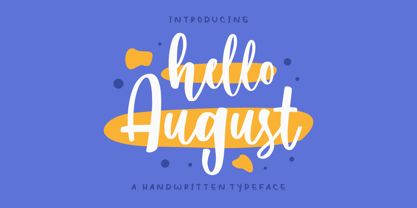 Introducing Hello August Hello August a playfully script font make from handlettering ideas in typeface. This font includes full of Alphabetical glyphs, Numerals, and punctuation. This is so perfect for invitations, monograms, wedding, fashion, branding, label, handlettering or logotype.
 - Inkblock by Turtle Arts,
$20.00Inkblock is based on various ink printing and rubbings from an ancient wood type set. Inkblock the alphabet has lots of detail, so looks great printed large. It's a good headline font or whenever an antique look is needed. - Display Dots Three Sans by Gerald Gallo,
$20.00 Display Dots Three Sans and Serif are display fonts not intended for text use. They were designed specifically for display, headline, logotype, branding, and similar applications. Display Dots Three Sans and Serif include an uppercase alphabet, numbers, and punctuation.
 - Display Dots Three Serif by Gerald Gallo,
$20.00 Display Dots Three Sans and Serif are display fonts not intended for text use. They were designed specifically for display, headline, logotype, branding, and similar applications. Display Dots Three Sans and Serif include an uppercase alphabet, numbers, and punctuation.
 - Display Dots Four Sans by Gerald Gallo,
$20.00 Display Dots Four Sans and Serif are display fonts not intended for text use. They were designed specifically for display, headline, logotype, branding, and similar applications. Display Dots Four Sans and Serif include an uppercase alphabet, numbers, and punctuation.
 - Hello Winter by Good Java Studio,
$20.00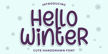 Introducing Hello Winter Hello Winteris a playfully display font make from handdrawn ideas in typeface. This font includes full of Alphabetical glyphs, Numerals, and punctuation. This is so perfect for invitations, monograms, wedding, fashion, branding, label, handdrawn or logotype.
 - Winter Sweety by Good Java Studio,
$20.00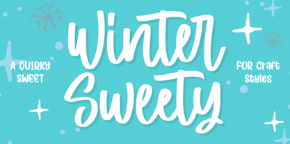 Introducing Winter Sweety Winter Sweety a playfully display font make from handdrawn ideas in typeface. This font includes full of Alphabetical glyphs, Numerals, and punctuation. This is so perfect for invitations, monograms, wedding, fashion, branding, label, handdrawn or logotype.
 - Display Dots Four Serif by Gerald Gallo,
$20.00 Display Dots Four Sans and Serif are display fonts not intended for text use. They were designed specifically for display, headline, logotype, branding, and similar applications. Display Dots Four Sans and Serif include an uppercase alphabet, numbers, and punctuation.
 - Cross Stitch Majestic by Gerald Gallo,
$20.00 Cross Stitch Majestic is not intended for text use. It was designed specifically for use as fancy monograms or initials. Cross Stitch Majestic has an uppercase alphabet, 33 stitches tall, and is located under the shift+character set keys.
 - The Crew Pro by The Type Fetish,
$25.00 The Crew Pro is based on the logo of the seminal punk band 7 Seconds. It was expanded to include extended Latin, extended Cyrillic and Greek alphabets so it will work with most languages in Europe and the Americas.
 - Cross Stitch Graceful by Gerald Gallo,
$20.00 Cross Stitch Graceful is not intended for text use. It was designed specifically for use as fancy monograms or initials. Cross Stitch Graceful has an uppercase alphabet, 48 stitches tall, and is located under the shift+character set keys.
 - Dexterous by Gerald Gallo,
$20.00 Dexterous is my interpretation of an antique typeface. The font includes upper and lowercase alphabets with alternate "E F L M S T" characters and alternate "c e m s" characters, numbers, punctuation, accented characters, symbols, and miscellaneous characters.
 - December Holidays by Good Java Studio,
$19.00 Introducing December Holidays December Holidays a playfully display font make from handdrawn ideas in typeface. This font includes full of Alphabetical glyphs, Numerals, and punctuation. This is so perfect for invitations, monograms, wedding, fashion, branding, label, handdrawn or logotype.
 - Sign Expert JNL by Jeff Levine,
$29.00 An elegant, yet informal Roman alphabet with Art Nouveau influences was found amidst the pages of the 1922 edition of “The Expert Sign Painter”. It is now available digitally as Sign Expert JNL in both regular and oblique versions.
 - DF Mercat by Dutchfonts,
$30.00 DF Mercat is a tribute to the famous marketplace situated at ‘La Rambla’ in Barcelona's historic centre. It is a picture font containing over 240 illustrations of fish, crustacean, clams, poultry, game, meat, sausages, herbs, vegetables, fruit, bread, butter, a variety of cheese, wines and spirits, small dishes, drinks (coffee, beer, soft drinks), ice cream, pastry, etc.
 - Printing Sorts JNL by Jeff Levine,
$29.00Over 75 images from the past and present comprise Printing Sorts JNL, another dingbat font from Jeff Levine paying tribute to the days of metal type and stock cuts. A PDF file is included with the font, showcasing the special feature that allows you to create arrows in varying lengths with just a few simple keystrokes.
