2,852 search results
(0.015 seconds)
- Spatchers by PizzaDude.dk,
$16.00 Spatchers is obviously a comic font - very useful when you need a fresh and legible look to whatever you design. I've made 4 slightly different versions of each lowercase letter - and they automatically cycle as you type.
 - Dirty Brush by Garisman Studio,
$18.00 Dirty Brush combines attractive curves with a fresh urban edge; delivering a stylish script which is guaranteed to add an eye-catching appeal to your logo designs, brand imagery, handwritten quotes, product packaging, merchandise & social media posts
 - Brilliant Summer by Typestory,
$15.00 Brilliant Summer is an enchanting handwritten font. This lovely and fresh script font has a wide spectrum of applications ranging from greeting cards to headlines and is guaranteed to add a romantic feel to your next projects.
 - Silver Pen by Khurasan,
$8.00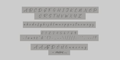 Introducing the Silver Pen script, a font that is very fresh and unique style handmade. Silver Pen script is perfectly suited to logos, signature, stationery, posters, apparel, branding, wedding invitations, cards, tagline, layout design, and much more.
 - Oh Amazing Script by Bosstypestudio,
$14.00 Oh Amazing Script is a new calligraphy font which is fresh, funny, interesting and with a cute heart that can be connected. It is suitable for greeting cards, branding materials, business cards, quotes, posters, and more! Thank You!
 - Lucky Dream by Mindtype Co.,
$25.00 Lucky Dream is a handmade font bold, new fresh & modern script with a calligraphy style. Lucky Dream can used for anything from promotional material and handwritten quotes, to product packaging, signage, labels, newsletters, posters, merchandise and branding projects.
 - Maxtield by Garisman Studio,
$15.00 Maxtield combines attractive curves with a fresh urban edge; delivering a stylish which is guaranteed to add an eye-catching appeal to your logo designs, brand imagery, handwritten quotes, product packaging, merchandise, social media post, or website font.
 - Markup by Philatype,
$20.00 Markup is a fresh, clean, handwriting font suitable for use in many applications. At large sizes, the letters showcase their smooth, natural curves. At text sizes, its sharp rhythm makes for a casual personality while still remaining legible.
 - Summer Vibrant by Sakha Design,
$10.00 Summer Vibrant is an exquisite handwritten font, masterfully designed to become a true favorite. It maintains its classy calligraphic influences while feeling contemporary and fresh. Fall in love with it and bring your projects to the highest levels!
 - Header Marker by Garisman Studio,
$19.00 Header Maker combines rough and bold curves with a fresh urban edge; delivering a stylish script which is guaranteed to add an eye-catching appeal to your logo designs, brand imagery, quotes, product packaging, merchandise & social media posts.
 - Deska Magosta by Rockboys Studio,
$10.00 Deska Magosta simplifies elegance into one truly outstanding serif font. It maintains its classy calligraphic influences while feeling contemporary and fresh. This versatility will appeal to a wide range of crafty ideas, from letterheads and titles, to stationery.
 - Milking by WAP Type,
$20.00 Milk is a bouncy and quirky display font. It will add a fresh and contemporary touch to your designs. Add this unique display font to each of your creative ideas and notice how it makes them stand out!
 - Honey Island by Sakha Design,
$10.00 Honey Island is an exquisite handwritten font, masterfully designed to become a true favorite. It maintains its classy calligraphic influences while feeling contemporary and fresh. Fall in love with it and bring your projects to the !highest levels
 - Youth Power by Khurasan,
$10.00 Youth Power is a fresh handwritten font brush, elegant and with a vintage feel character set. Youth Power includes a full set of capital and lowercase letters, as well as multi-lingual support, currency figures, numerals and punctuation.
 - Sweet Lavender by Balpirick,
$15.00 Sweet Lavender simplifies elegance into one truly outstanding handwritten font. It maintains its classy calligraphic influences while feeling contemporary and fresh. This versatility will appeal to a wide range of crafty ideas, from letterheads and titles, to stationery.
 - Goat & Qalvigo by Letterena Studios,
$17.00 Goat & Qalvigo is a stylish and distinct serif font. It maintains its classy calligraphic influences while feeling contemporary and fresh. This font is PUA encoded which means you can access all of the glyphs and swashes with ease!
 - Yellow Sunflower by Nissa Nana,
$26.00 Yellow Sunflower is an exquisite handwritten font, masterfully designed to become a true favorite. It maintains its classy calligraphic influences while feeling contemporary and fresh. Fall in love with it and bring your projects to the highest levels!
 - Fairy by Cocodesign,
$10.00 Fairy is an exquisite handwritten script font, masterfully designed to become a true favorite. It maintains its classy calligraphic influences while feeling contemporary and fresh. Fall in love with it and bring your projects to the highest levels!
 - Darelle Collins by Ronny Studio,
$21.00 Darelle Collins Font is created with a natural modern script with a fresh modern script providing a stylish script guaranteed to add eye-catching appeal to your logo designs, brand imagery, quotes, product packaging, merchandise & social media posts
 - Loure by Bunny Dojo,
$23.00 Formal yet light-hearted, Loure is an ideal font for the best of times. Modest Art Deco influences imbue a century of history behind Loure's fresh 2022 gaze, while a few unexpected swoops deliver intrigue alongside clean legibility.
 - "Black Metal Logos" isn't a specific font you'll find pre-made in font libraries, but rather it encapsulates a unique and intense style of typographic design deeply rooted in the black metal music sc...
- Intermediate JNL by Jeff Levine,
$29.00 The letters and numbers of a home movie titling kit from circa the 1950s or 1960s called the Magna Tech Titler Number 312 were die-cut from cardboard with a magnetic backing and were styled after Futura Bold. The user of this set composed the desired title or phrase onto a metalized board and the result was photographed with their 8 or 16mm camera. Because the dies of the characters were handmade, very slight variations in the shape and stroke width of the lettering would occasionally occur. These variations were incorporated into the design of the digital type face. Intermediate JNL is available in both regular and oblique versions.
 - Homenko by Apostrof,
$35.00 Homenko was the only Ukrainian typeface for metal type casting developed in the last century. It has already become a 'classic'. Vasyl Homenko worked on it from 1964 to 1967. The typeface successfully combines the qualities of lineal humanist typefaces with the Ukrainian tradition of asymmetrical slab serif. The works on its digitization and further development has been in progress since 2000. The present version contains Latin Extended characters, Cyrillic with stressed alternates and several ornaments based on Vasyl Homenko's works. It works perfectly for books for children and is ideal for publications related to culture, history, literature and traditional art of Ukraine and other nations of Eastern Europe.
 - Banco by ITC,
$29.00Banco was the first typeface work of French designer Roger Excoffon and was released in 1952. The strong forms look as though they were rolled out of sheet metal and feature upright, tapering strokes. The slight slant, the varying heights of stroke ends, and the relationships between line and curve give Banco font its sense of liveliness and dynamism. Excoffon did not design a matching lower case alphabet for his capitals, but this was accomplished later by Phill Grimshaw, who also designed the light weight. He deliberately 'underdesigned' the lower case forms, producing a more reserved alphabet based on the design ideas of the original. - Inversion by Wordshape,
$20.00 Inversion is a display typeface that is based on a rare bit of lettering from a 1910 German lettering book. What was the inspiration for designing the font? I found the base lettering years ago in a specimen and scanned it. I've used it perennially for assorted metal bands' logos, and finally decided to digitize it. What are its main characteristics and features? It is a spidery bit of lettering that would work well in Harry Potter movies or on album covers. Usage recommendations: Display type for use in materials that are meant to have a hand-wrought look circa the turn of the century.
 - Salvation by Device,
$39.00 Rough and ready, bold and urgent. Or playful and fun in bright colours. The original letters were cut from actual potatoes, then scanned in and converted to vector outlines. Lighter and more heavily inked versions were used for the three variants. Using Opentype character-substitution technology, Salvation rotates through three versions of each letter to create a naturally uneven printed effect. Unlike hot metal type, the potatoes were cut the right way around. This produced reversed prints, which were then flipped back in Photoshop. Originally produced for Hughes' Get Lettering activity book, the font was then extended to cover numbers, punctuation and full European language support.
 - Dez Yinznat Stencil by Dezcom,
$35.00 Dez Yinznat Stencil is a condensed stencil sans serif inspired by the industrial city of Pittsburgh, PA USA. Stencil type was often used in the steel mills, scrap metal yards, railroads, warehouses, and other industrial institutions of Pittsburgh and is almost a signature for the City. The name comes from combining two colloquial expressions common to Pittsburgh. “Yinz” is used there like "Y'all" is used in Southern States. "n'at" or sometimes "N@" is used to replace “and that” when ending a phrase. This font is dedicated to the hard-working people who made Pittsburgh what it is, N@. High-tech subjects can also find a friend in Dez Yinz'nat.
 - Stamped Brass Stencil JNL by Jeff Levine,
$29.00 Up until the advent of modern packing and shipping methods, the common way to mark merchandise or other items to be transported was through the use of a brass stencil. These marking devices were hand stamped (or punched) using metal dies that were struck against sheets of brass to create the letters, numbers and other symbols [unlike the steel rule die cutting method used for manufacturing paper stencils]. One such example of an antique marking stencil had letters and numbers approximately one quarter of an inch in height, and Stamped Brass Stencil JNL recreates the design complete with the unusual variations of character shapes and widths.
 - China Syndrome by Hanoded,
$15.00 A really, really long time ago, I watched a movie called ‘The China Syndrome’ (starring Jane Fonda, Jack Lemon and Michael Douglas). It was one of those disaster movies that were quite popular at the time (I also recall airports, alien viruses and skyscraper fires). Anyway, when I finished this font, I suddenly (and quite inexplicably) remembered that movie, so I named this font after it. China Syndrome is a legible brush font - ideal for your product packaging and halloween posters. Maybe use it for a metal album cover, a book about nuclear disasters or, dunno, the logo of your really strong coffee brand. Whatever. Just enjoy!
 - LTC Camelot by Lanston Type Co.,
$24.95 Camelot was the first of over 100 typefaces designed by Frederic Goudy. The upper case characters were drawn in 1896 for the Dickinson Type Foundry. Goudy was so encouraged by his check for $10 (double what he asked for the drawings), that he spent the next 50 years designing type. The lower case was added by the Dickinson foundry. This Lanston digital release includes a Text version based on the smaller point sizes of the metal type and a Display version based on the larger sizes. The two appear different in size but share the exact same line weight when at the same point size.
 - Cruller by Wordshape,
$20.00 Cruller is a display typeface that is based on a rare bit of lettering from a 1910 German lettering book. What was the inspiration for designing the font? I found the base lettering years ago in a specimen and scanned it. I've used it perennially for assorted metal bands' logos, and finally decided to digitize it. What are its main characteristics and features? It is a spidery bit of lettering that would work well in Harry Potter movies or on album covers. Usage recommendations: Display type for use in materials that are meant to have a hand-wrought look circa the turn of the century.
 - Goudy Trajan Pro by CastleType,
$59.00 Goudy Trajan Pro is based on the drawings by F.W. Goudy of his rendition of the capital letters inscribed on the Trajan column in Rome, rather than on his subsequent metal type, Trajan (Title), released in 1930. Goudy Trajan Pro includes almost 1500 glyphs in each of three weights, including: uppercase, alternates, swash caps, small caps, vertically centered small(er) caps, dozens of fleurons, and much more. Supports Latin, Cyrillic and modern Greek scripts. Many thanks to Krassen Krestev, Sergiy Tkachenko, and Adam Twardoch for their suggestions for improving the Cyrillic glyphs; and to Alex Sheldon for his suggestions for swash caps and improved OpenType features.
 - AM Floriana by URW Type Foundry,
$39.99 The origin of AM Floriana is already several decades ago. At a time when there was no photo set and the choice of metal type fonts was still very manageable, Alois Menacher received an order to design a custom business logo from a flower shop. He then created a hand-drawn lettering based on the form of leaves and plants. Now Alois Menacher professionally designed and developed AM Floriana on the basis of this lettering. AM Floriana is ideally suited for packaging design, as well as for display design and logo design. AM Floriana is available as a Bold version and will soon be complemented by further cuts.
 - Downhill Dive by Hanoded,
$15.00 I used to live in the English Lake District, where I worked in an outdoor gear store. I bought a bright red mountain bike and each day, after work, I cycled up the mountain and hurtled down - heavy metal blasting from my MP3 player. Of course, the bike was a regular MTB, so it got some serious damage after a while, but the adrenaline rush was great! Downhill Dive is a great brush font (made with actual brushes and ink on paper - no tablets involved here!). It is an ode to that wonderful time spent in England. Downhill Dive comes with some really nice ligatures.
 - Sassafras by Monotype,
$49.00Arthur Baker's display script Sassafras, designed in 1995, is based on the natural inline effect created when writing with a split-metal nibbed pen. Black and white are nicely balanced, giving this calligraphic face a remarkably smooth appearance. The regular and italic versions of Sassafras include two alternate faces: one with long, tall ascenders and regular-length descenders, and one with shortened ascenders and descenders that allow it to fit where its companion might not. In both, the ascenders increase in width as they move upward, while the descenders taper to a fine point. This variety of form makes Sassafras a very flexible choice for display work. - Lancelot Pro by Canada Type,
$39.95 When type historians look back on Jim Rimmer, they will consider him the last type designer who just couldn't let go of metal type, even though he was just as proficient in digital type. Lancelot is one definite case in point: A face designed and produced in digital as late in the game as 1999, only to spring onto the new millenium a couple of years later as a metal type cast in three sizes. That was Jim, a time traveler constantly reminding the craft of its origins. This particular time machine was originally designed as a simple set of attractive caps that emphasize the beauty of the variable conventional dialogue between the drawing tool and the intended final form, and the one exchanged within the totality of the forms themselves. Jim designed two weights, with contrast and counterspace being the main difference between them. In 2013, the Lancelot family was remastered and greatly expanded. Lancelot Pro is now a wonder of over 840 glyphs per font, including smaller versions of the caps in the minuscule slots, and alternates and ligatures that can transform the historic spirit of the original design into anything from half-uncial to outright gothic. Language support goes beyond the extended Latin stuff, to cover Cyrillic and Greek as well. 20% of the Lancelot Pro family's revenues will be donated to the Canada Type Scholarship Fund, supporting higher typography education in Canada.
 - PF Stamps Pro by Parachute,
$79.00 PF Stamps covers a wide range of applications which require the stamp effect. This is a form of lettering which was very popular in the mid-twentieth century for product labeling. Special machinery was developed by mainly two companies, one in the United States and the other in Germany. This machinery produced paper die cuts which were later used as a base for the marking with a paintbrush. PF Stamps Paint was developed to simulate this type of lettering. Two other styles, Metal and Flex, have been very popular since its original release. The first one was developed from a metallic stamp imprint, whereas the second one with its slight 3-D look simulates letters stamped on plastic. To insure realistic results, uppercase letters are different from lowercase. This is very useful when two similar letters sit next to each other. There 3 more styles: Solid (the stencil in its regular clean form), Rough and the very interesting Blur. The all new “Pro” version comes to complete this series with what was missing: 93 matching frames and frames parts which will satisfy the most demanding designer. This is a bonus font which is available only with the purchase of the whole family. Use these frames “as is” at any size, or connect the frame parts to each other to create longer frames. Finally, this series supports more than hundred languages which are based on the Latin, Greek or Cyrillic scripts.
 - Lorenzo by Canada Type,
$24.95 The lifetime of Lorenzo de Medici (1449-1492) coincides with the rise of metal type as it displaced broad pen calligraphy for the production of books. This revolution marked the end of formal Western calligraphy, as the industry employed metalworkers who designed type according to geometric measurement while calligraphers were forced to become secretaries who practiced handwriting systems. Renaissance Florence should have witnessed the marriage of calligraphy and typography, just as all the other arts and sciences flourished as classical learning was applied to technical advances; but the metalworkers and geometricians measured, dissected and recast the calligraphic letters by crude indirect methods, and in the end took all the life out of them. Here they languished until digital type has made it possible to render the precise motion of the broad pen stroke into type. Lorenzo is a confluence of many strains from the Middle Ages, brought together within the classical harmony of the capitals. It attempts to bypass metal type, using calligraphic means to achieve the precision of type while retaining the life of the stroke: a classical font that would be familiar to Lorenzo himself as well as to the modern eye. The Lorenzo family comes in four weights, ranging from light to bold. Two sets of italics, one with swashed caps and ascenders, complement each weight. The family boasts extensive language support and an offering of over fifty calligraphic ornaments/flourishes included within the character set.
 - Aryana by melifonts,
$5.00 Aryana is young, fresh, and has arrived just in time for the back-to-school season! The perfect typeface for labeling notebooks and putting together poster projects. This handcrafted font is a casual and fun addition to your library.
 - Toscography by Misprinted Type,
$25.00 Toscography is inspired by vernacular and naive hand-painted walls and signs from Brazil. It feels organic, spontaneous and fresh and it has a light texture on its characters that makes it feel like it is starting to decay.