10,000 search results
(0.038 seconds)
- GF Gesetz - Unknown license

- Mr Palker by Letterhead Studio-YG,
$35.00 A slab serif Mr Palker and grotesque Mr Palkerson build one superfamily together. These are blank types. In a way even the display ones. Typefaces for newspapers, announcements, cheap advertising and police posters. Mr Palker and Mr Palkerson will turn every language into a fence. And due to six types of faces one can choose what material should the fence be made from — from Thin steel rods to the Black stone blocks. In their simplest appearance Mrs P&P are intended for the solid blank composition in victorian or industrial style. They are quite decent, a bit old-fashioned slab serif and grotesque with closed aperture. All my types have layers. Walker and Palkerson also do. Besides the standard set of symbols, they have 4 add-ons. 1. Alternate glyphs, including unicase ones. 2. Ligatures with A letter. 3. Extra tall small caps. 4. Two-storey ligatures. All this options are intended for the complex composition. The additional letters are rather eccentric as their main function here is to imitate the victorian oddities. Imitate, parody, just not repeat. There are lower-case As and Es in the set in height of small caps and uppercases. They can turn every writing into the unicase. The lower-case A (as well as uppercase and small caps version of it) has deliberately by my taste grown a ludicrous tail. To compensate it I’ve built all the possible ligatures - ад, ал, ая. There are 35 of this ligatures all together. Take a closer look at the Russian letters D, L, K, Ya from the main set as well as their alternates. The additional glyphs are one more comic than the other — on purpose to imitate (not to repeat!) the victorian set. This sets have lowercase numbers. And small caps numbers as well. What a modern typeface without them. They also have an У-letter with a generously curvy tail. As if before the WWI. The Latin of course has alternates as well. It has letters to make the perfect French sound more like the russian provincial version of it. The tails of Js and Ts can be made a little bit more open — or a little bit closed. My favorite feature here, an invention of a kind - extra tall small caps. It allows to compose logos with the small caped uppercases directly from the keyboard. The small caps of this typefaces are usually much taller than the customary ones. This is the kind of small caps that Palker and Palkerson have. More to that, the strokes’ weight and the letters width are corresponded to the uppercases. Just a ready set for making a logo a la 1913 style. With a unicase, one has to mind! One more trick with the tall small caps is a possibility to make them work like lower uppercases. Their height is just in between of lower- and uppercases. Isn’t it great to have an additional set of uppercase working ponies in stock for the case of emergency. And finally — the trademark of Palkers family, two-storey ligatures. They are made in the height of uppercases and turn every writing into an ornament or a puzzle of a kind, while at the same time making them much shorter. Each face has 90 of them. Mainly those are twins: CC, BB, DD and so on. ll this things are for the unhasty compositing, even for lettering. Which means that for the things which are not there you always should have Command+Option+O and some patience. Also — among the two storey ligatures one also can find some belvedere villas. All my types are glasses from the one kaleidoscope. The P&Ps family was preliminary part of the victorian set, which already has 1 Cents and Clarendorf - optionally one can add Costro, Gordoni, Handy, Guardy, Surplus, Red Ring, Red Square, Babaev to the list. And also Sklad, Odessa, Dreamland, Romb, Platinum - here, at Letterhead’s, every second one is victorian. All together our typefaces can allow one to set advertisement of any kind, even the trickiest one, and compose everything, from the coffee place’s menu to the antiquarian magazine.
 - Mr Palkerson by Letterhead Studio-YG,
$35.00 A grotesque Mr Palkerson and slab serif Mr Palker build one superfamily together. These are blank types. In a way even the display ones. Typefaces for newspapers, announcements, cheap advertising and police posters. Mr Palker and Mr Palkerson will turn every language into a fence. And due to six types of faces one can choose what material should the fence be made from — from Thin steel rods to the Black stone blocks. In their simplest appearance Mrs P&P are intended for the solid blank composition in victorian or industrial style. They are quite decent, a bit old-fashioned slab serif and grotesque with closed aperture. All my types have layers. Walker and Palkerson also do. Besides the standard set of symbols, they have 4 add-ons. 1. Alternate glyphs, including unicase ones. 2. Ligatures with A letter. 3. Extra tall small caps. 4. Two-storey ligatures. All this options are intended for the complex composition. The additional letters are rather eccentric as their main function here is to imitate the victorian oddities. Imitate, parody, just not repeat. There are lower-case As and Es in the set in height of small caps and uppercases. They can turn every writing into the unicase. The lower-case A (as well as uppercase and small caps version of it) has deliberately by my taste grown a ludicrous tail. To compensate it I’ve built all the possible ligatures - ад, ал, ая. There are 35 of this ligatures all together. Take a closer look at the Russian letters D, L, K, Ya from the main set as well as their alternates. The additional glyphs are one more comic than the other — on purpose to imitate (not to repeat!) the victorian set. This sets have lowercase numbers. And small caps numbers as well. What a modern typeface without them. They also have an У-letter with a generously curvy tail. As if before the WWI. The Latin of course has alternates as well. It has letters to make the perfect French sound more like the russian provincial version of it. The tails of Js and Ts can be made a little bit more open — or a little bit closed. My favorite feature here, an invention of a kind - extra tall small caps. It allows to compose logos with the small caped uppercases directly from the keyboard. The small caps of this typefaces are usually much taller than the customary ones. This is the kind of small caps that Palker and Palkerson have. More to that, the strokes’ weight and the letters width are corresponded to the uppercases. Just a ready set for making a logo a la 1913 style. With a unicase, one has to mind! One more trick with the tall small caps is a possibility to make them work like lower uppercases. Their height is just in between of lower- and uppercases. Isn’t it great to have an additional set of uppercase working ponies in stock for the case of emergency. And finally — the trademark of Palkerson family, two-storey ligatures. They are made in the height of uppercases and turn every writing into an ornament or a puzzle of a kind, while at the same time making them much shorter. Each face has 90 of them. Mainly those are twins: CC, BB, DD and so on. ll this things are for the unhasty compositing, even for lettering. Which means that for the things which are not there you always should have Command+Option+O and some patience. Also — among the two storey ligatures one also can find some belvedere villas. All my types are glasses from the one kaleidoscope. The P&Ps family was preliminary part of the victorian set, which already has 21 Cents and Clarendorf - optionally one can add Costro, Gordoni, Handy, Guardy, Surplus, Red Ring, Red Square, Babaev to the list. And also Sklad, Odessa, Dreamland, Romb, Platinum - here, at Letterhead’s, every second one is victorian. All together our typefaces can allow one to set advertisement of any kind, even the trickiest one, and compose everything, from the coffee place’s menu to the antiquarian magazine.
 - Brown Chunkers by Letterhend,
$19.00 Brown Chunkers is an unique serif based display typeface containing many alternates, swashes, ligatures that can make your lettering/logotype become more interesting. The clean and neat of a serif combined with the swirl swashes makes this font one of a kind.
 - Vividangelo by Wiescher Design,
$24.50 Vividangelo is designed after the handwriting of a real person. I saw it on the pricetags in a small shop and convinced the person to have her handwriting converted into a font. She is very happy about it now, so am I.
 - Asgaard by Vozzy,
$10.00 Introducing a vintage label font named Asgaard. This strong typeface is perfect for lettering on vintage style posters, t-shirts, greeting cards, logos, and more. All capital letters (including multilingual) have alternates. You can see all available characters and styles in the previews.
 - MBF Inno by Moonbandit,
$17.00 Inno font, is a modern take on the futuristic scifi theme, this typeface is clean, sharp, and have plenty of alternative, you can easily access them through uppercase lowercase. This font is great for headlines, sub titles and many attention grabber projects.
 - Syntax by Linotype,
$29.99 Syntax was developed by Hans Eduard Meier in 1968 and presented by the font foundry D. Stempel AG. Its figures are based on Old Face characters but have a distinctive, modern design. The inclination to the right lends the font a dynamic feel.
 - Allez Hop by Hanoded,
$15.00 Allez Hop is a very useful font: it comes with all accents, bells and whistles and has been created using scans of handwritten text. It has a certain 'quickness' to it, not unlike someone jotted down a couple of lines on a notepad.
 - Chalky by Alan Meeks,
$45.00 Originally designed as a supermarket point-of-sale font, Chalky is a chalk on blackboard style of lettering. More condensed than most fonts of this style, chalky can be used in relatively long settings without losing legibility. Great for headlines and subtext.
 - Road Trip by Melissa Lapadula,
$19.95This font has wide letterforms and bends which echo the continuous roads traveled on when reaching distant holiday destinations. The typography aims to be clear and legible, as do helpful road signs. This font can function as headings, subheadings and body text. - Junglegym by Atlantic Fonts,
$26.00 Junglegym provides a playful structure for an energetic project. Climb on and see what you can do! Junglegym family includes regular and bold and ensures extra movement with discretionary ligatures, including double letters and a handful of others to keep play lively.
 - Tiler JNL by Jeff Levine,
$29.00 Tiler JNL is a novelty font with geometric styling. Its use can be as diverse as an ad for wall or floor tile to conveying a modular feel within a futuristic setting to signage on the wall of an old-time subway station.
 - Days Are Longer by PizzaDude.dk,
$13.00 Days are beginning to get longer! Spring is on its way, and I love it! Springtime can be surprisingly mild and warm, and my font “Days Are Longer” is just like that! And even playful with a gentle twist of handcrafted warmth!
 - Headlock by Hanoded,
$15.00 Headlock is a handmade serif. My 6 year old son just had his first real Judo exam and the one thing he excels at is the headlock. Headlock comes with double letter ligatures and all the diacritics you need, plus basic Cyrillic!
 - Combust by Typefactory,
$14.00 Combust is a modern playful display font with fire. The font is thick so it can still be read even if there is a burning fire, suitable for various purposes, poster design, for video game or movie titles, or promotions on social media.
 - Endure by Spinturnix,
$10.00 Endure is a new hand-painted brush font created to add a high detail and realistic feel to any project. Every glyph in Endure was painted by hand on actual paper and scanned in manually - A lengthy process, but worth the fine detail!
 - Lightover by Sakha Design,
$12.00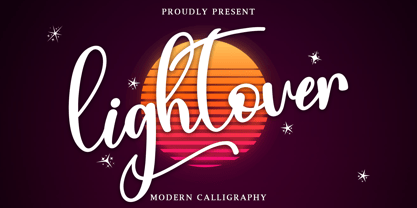 Lightover is a modern handwritten font. Lightover will look outstanding in any context, whether it’s being used on busy backgrounds or as a standalone headline! This font is PUA encoded which means you can access all of the glyphs and swashes with ease!
 - P22 Latimer by IHOF,
$24.95 Latimer is one of a series exploring a fusion of Roman and Gothic forms. Characteristics of each genre can be seen: the fluid tapering serifs and rounded shapes of the Roman form, contrasted with the angular diamond and hexagonal shapes of Gothic.
 - LTC Glamour by Lanston Type Co.,
$24.95 Glamour was originally released by Lanston Monotype in 1948. It is based on Corvinus designed by Imre Reiner. P22 Designer Colin Kahn has added some unusual variants to this family illustrating that Glamour can be taken too far and have somewhat unglamorous results.
 - Fattty by Drawwwn,
$15.00 Fattty is a chunky fun font with plenty of wobbly bits. It's perfect for bold brands and funky projects. It's friendly curves are a great fit in kids books or on chubby posters. But remember, say it loud I'm fat and I'm proud!
 - MMC Insignia Pro by MMC-TypEngine,
$42.50 MMC INSIGNIA PRO, is an Iconic & Emblematic Neogothic Geometric Display… Assembled by Trivial Squares and Diagonals Symbols Pattern from a puzzled grid Aftermath!! Includes Small Caps & Stylistic Alternates!! +Extra Monospaced Figures. In 22 styles, with Obliques, both for single display and layer Typesetting, plus OpenType Features & Bonus Blocks Fonts! MMC Insignia Pro, is the cursive version of MMC Insignia and the default or main lowercases in ‘SC’ feature plus cursive stylistic alternates and sets such as Monospaced figures… Its atmosphere stands by on both Corporative to Decorative, Modern & Fashion, Federalist, Bohemian, Romantic, Ludic, Treasured Look, Etc. This Display font-family is the result of the repeated applications of this unique infamous Icon or Symbol, of two counterpointed triangles, implicit as hourglasses, in order to compose an innovative and unprecedented typographic pattern and modulation concept through the letterforms, in an extremely Geometric style. The Graphic Sign used throughout this type, is a remarkable trend used already in Logos of different businesses, whose most famous case refers to a famous International Bank, which doesn’t need to be mentioned, as it is instantly associated! This characteristic innovation was the main motivation while creating this type. Usage Suggestions: Type Fancy Titling texts, Display Remarkable Logos, Branding Projects, Labels, Emblems, Fashion Patterns, or in everything Noble and designed for Excellence as a type of Insignia, or distinguished marks and attributes of Royalty and Power!! That’s also forwardly, the reason why it was named MMC Insignia… TIPS: 1-Combine styles into innumerous possibilities of Chromatic Typesetting, by ‘central pasting’ layers… You may dislocate layers for improvisations! 2-USE BLOCK “FREE-STYLES” 1 & 2 also to add default 3D! Change 3D directions by switching Block 1 to Block 2, that way you can Zig-Zag words and lines. *Also shift the block layer up to bottom limit, it makes the 3D direction turn upside down. Greetings! André, MMC-TypEngine.
 - Miracle Boy by NJ Studio,
$9.00 Hi...Thank for your visit :) Miracle Boy a display font. It features fun characters that will take your projects to the next level! This font is PUA code which means you can easily access all the glyphs that are full of sans! It also features many special features including glyphs. font designs that are made for various vector designs, printing such as digital wedding blogs, online shops, social media, while printing can be used in the field of product clothing, accessories, bags, pins, logos, business cards, watermarks and many others ... so it can make your product look fun and attractive, and also Multilingual support!!! Happy design ...
 - Silver Miranda by Asenbayu,
$15.00 Silver Miranda is a sans serif font with an elegant and classy. Each typeface is crafted to produce a vintage modern font. This font features can direct you to access unique typeface collections. You can make works with clean elegant and professional writing, or make attractive decorative with alternative and ligature styles. This font is great for creating any desired projects such as logos, posters, headlines, albums, quotes, clothes and many more. This font is perfect for you if you want to come up with something interesting! Please see the pictures provided. I would like to know how you can get creative with this font. Thank you!
 - Hello Cute by NJ Studio,
$9.00 Hi...Thank for your visit :) Hello Cute a playpul font. It features fun characters that will take your projects to the next level! This font is PUA code which means you can easily access all the glyphs that are full of sans! It also features many special features including glyphs. font designs that are made for various vector designs, printing such as digital wedding blogs, online shops, social media, while printing can be used in the field of product clothing, accessories, bags, pins, logos, business cards, watermarks and many others ... so it can make your product look fun and attractive, and also Multilingual support!!! Happy design ...
 - Woodruff by Greater Albion Typefounders,
$10.00 Woodruff was inspired by a piece of charmingly hand-lettered signwriters’ ornamental Roman seen on a half faded away brick wall, on the end of a row of shops. It has a naive hand drawn charm that lends a very special touch to posters, signage and headings. Woodruff is ideal where an atmosphere of primitive charm, with a little regard for aesthetics is required, and can be used in such situations without sacrificing legibility.
 - D-block A by AType,
$19.95The history of this font is those. Once I assorted the old children's books which have stayed from times of my childhood. On one of them I have seen a trade mark of a printing house consisting of two Russian letters "L" and "B". From they were begun also with my font. And though finally from these letters a little that remained, elements of these letters can be seen in font D-block B. - Churchward Tua by BluHead Studio,
$25.00 Churchward Tua and Churchward Tua Italic are two more OpenType font releases by Bluhead Studio from the exciting and unique library of Joseph Churchward type designs. The Tua fonts sport an Old West, cattle drive sort of look. One can imagine Tua being used on the swinging front doors of the local saloon or jailhouse. These fonts are perfect for headlines, posters or wherever you want to express your inner cowboy. Giddy-up!
 - Obrigado by Hanoded,
$15.00 Obrigado means 'Thank You' in Portuguese. It is my way of saying thanks to the unknown designer of a Portuguese port-wine poster from the thirties. Obrigado font is based on that poster. As I had to work with a handful of glyphs, I designed the missing ones myself. Obrigado is a quite elegant and refined art deco font, which would be ideal for posters and logos. Obrigado speaks most Roman based languages.
 - Scriptease by ITC,
$29.99Scriptease is the temperamental creation of Phill Grimshaw, based on the forms of copperplate typefaces. At the same time, the playful forms display a variety of Rococo elements. Richly ornamented with vivacious swirls, especially on the capitals, the forms of this font dance across the paper. The capitals can also be used as initials combined with other alphabets. Scriptease looks as though it were made for the light, carefree side of life. - Aduana by Fabio Ares,
$- Aduana is the first typographic product of argentine-chilean typographic archeology project called "Valpo. Ciudad de Letras" (Fabio Ares & Karin Thiers, since 2016). Based on the letter located on the front of the Customs building (Valparaíso, Chile). The resultant family can be described as display type and modern renaissance style, with geometric shapes and serif and mild line modulation. The proceeds from the sale of the fonts will be used to finance the project.
 - Killing Time by PizzaDude.dk,
$15.00 Killing Time can be quite good - if the time killed is being used on something useful ... could be if your are taking your fantasy and imagination for a walk, and let your creativity sprout. Use the soft lines and corners of Killing Time font for your comics, toys, candy, posters, postcards, invitations ... well, the list goes on - but if you need something fresh and comic, and not overdoing it, Killing Time could be your choice!
 - Tanked by Typadelic,
$14.95 Tanked is one crazy and mixed up font, perfect for any fun project you can think of! Upper and lower case letters are dispersed throughout the font, no need to use caps...just bang away on your keyboard without regard for any typographic rules. Use as a headline font or short lines of body copy, scrapbooking titles/captions...whatever! Tanked is fun and will supply a burst of energy for your projects.
 - Joseph Sophia by Fargun Studio,
$14.00 Joseph Sophia! A new fresh ans modern hand lettered font with decorative characters and a dancing baseline. So beautiful on invitation like handicraft, greeting cards, branding materials, business cards, quotes, posters, and more design concepts. Features : Unique ligatures Stylistic sets Basic Latin A-Z and a-z Numbers International Symbols included Punctuation Please send a message if you have questions or problems, and don't hesitate to say hello on Instagram https://www.instagram.com/fargunstudio/ Thank you.
 - Sweet Dreams by Fargun Studio,
$14.00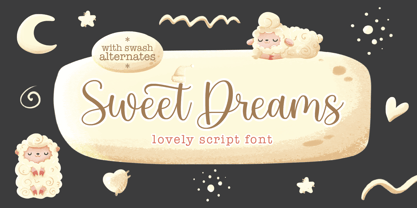 Sweet Dreams! A new fresh ans modern hand lettered font with decorative characters and a dancing baseline. So beautiful on invitation like handicraft, greeting cards, branding materials, business cards, quotes, posters, and more design concepts. Features : Unique ligatures Stylistic sets Basic Latin A-Z and a-z Numbers International Symbols included Punctuation Please send a message if you have questions or problems, and don't hesitate to say hello on Instagram https://www.instagram.com/fargunstudio Thank you.
 - Calisto by Monotype,
$29.99The appeal of Calisto as a text face lies in its very even color on the page, while its robust construction means that it can work equally well at display sizes. The slightly calligraphic treatment of letter shapes and the classical proportions give Calisto a clean elegance on the page. The Calisto font is a graceful and interesting addition to the typographer's repertoire and will prove particularly useful for book, magazine and advertising work. - ZionTrain Basic by AndrijType,
$25.00Originally ZionTrain was built as a Cyrillic typeface for public transport navigation system. We wanted comprehensible, distinctive letterforms, that can help everybody on the way from Babylon to Zion. Here, on MyFonts, we present the ZionTrain STD versions with western latin including smallcaps and oldstyle figures in some faces in TrueType format; also western, central, baltic and turkish latin charsets, smallcaps, oldstyle numerals, few alternates, some arrows and fractions in ZionTrain OT OpenType format. - HU Discopangpang KR by Heummdesign,
$25.00 "Disco Pang Pang" is the Korean name for Tagada rides. It is a characteristic typeface that is good to use when you want to make use of a unique and bouncy feeling. Light and Extrabold are made with the thickness of normal typefaces, but Left and Right have strange shapes with stroke thicknesses that are biased to one side. Its unique shape can make a strong impression on people. This font contains Korean.
 - Balloon Duwoor by Sealoung,
$12.00 Balloon Duwoor is a cute and playful display font. It looks wonderful on a variety of designs, both formal and informal. Whether you’re using it for crafting, digital designS, presentations or greeting cards, it’s perfect! What's Included: - glyphs - Works on PC & Mac - Simple installation - Can be accessed in Adobe Illustrator, Adobe Photoshop, Affinity Design. - Fonts include multilingual support. Thank you very much, this font will make your project easier. Saiful Anwar - Sealoung studio
 - Front Row JNL by Jeff Levine,
$29.00 Front Row JNL is an all-caps reinterpretation of Morris Fuller Benton's 1937 type design "Empire", and is available in both regular and oblique versions. As is often the case when a digital type font is based on a few letter examples found on a printed sample [in this case, the sheet music of the 1946 Guy Lombardo hit "What More Can I Ask For"], the missing characters were drawn from scratch.
