10,000 search results
(0.036 seconds)
- Love Santa by Illushvara,
$12.00 Love Santa merges a classic sans serif font with beautiful Christmas ornaments, creating a one-of-a-kind holiday font! Add some jolly Christmas vibes to any design project with this festive font. If you have any question, don’t hesitate to contact me by email or send me massage. Happy designing.
 - Melvin Eustace NF by Nick's Fonts,
$10.00Here’s a simple, classic hand-lettered gem, based on an old photoface named Adonis. Suitable for headline or text use, it’s a refreshing and lively alternate to Comic Sans. All versions of this font include the Unicode 1250 Central European character set in addition to the standard Unicode 1252 Latin set. - Innovate P Rounded by NicolassFonts,
$29.00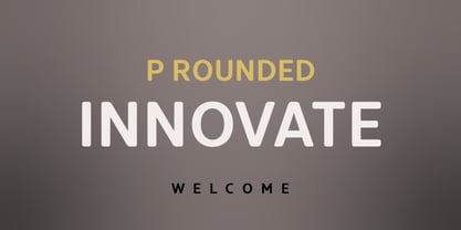 Innovate is a modern versatile sans-serif typeface based on Innovate font family. What differentiates Innovate from the other fonts is an exceptionally distinctive design. It is brilliantly suited for graphic design and display use and perfect for logotypes, t-shirts, packaging, brand identity, books, magazines, newspapers, posters, billboards, and advertising.
 - MS Gothic by Microsoft Corporation,
$39.00MS Gothic™ Japanese font features plain strokes similar to sans serif designs, and works well for on-screen display such as user interfaces. This file is 4.4 MB in size. MS Gothic is a trademark of Microsoft Corporation. MS Gothic font Character Set: Latin-1, Japanese (Code Page 932) - Placard by Monotype,
$29.99The Placard Condensed font family is based on drawings received from Germany. These narrow, heavy, sans serif typefaces were made for use in headlines and advertising display work. Placard Condensed has a large x-height, short ascenders and descenders and is capable of packing very tightly to produce forceful publicity work. - Elevator by Tyler Jamieson Moulton,
$11.00 Elevator is a variable, industrial sans serif created by TJM Type. It has two variable axes; a weight axis and a stylistic axis that raises and lowers the letters crossbars. Elevator is perfect for poster and print design, and now as a variable font, it's even more fun on the web.
 - Cooperative by Hafontia,
$99.00 Cooperative is a retro style poster font in Hebrew and Latin. Is based on a printed example of a vintage handmade wood type from the 1950's. This sans serif font is available in both regular and bold versions, with a dirty and grungy styles as well in regular and bold.
 - Grounds Crew Stencil JNL by Jeff Levine,
$29.00 The opening title from the 1943 Abbott and Costello comedy ”It Ain't Hay” shows a park bench with the words “Universal Presents” stenciled on it in a chamfered sans serif style. This served as the design model for Grounds Crew Stencil JNL, which is available in both regular and oblique versions.
 - Drama Deco JNL by Jeff Levine,
$29.00 The movie poster for the 1936 film “Dodsworth” had its title hand lettered in a thin Art Deco sans serif with a mix of both stylized and squared characters. Expanding on this unusual lettering combination, the final results became Drama Deco JNL, which is available in both regular and oblique versions.
 - Movie Star Deco JNL by Jeff Levine,
$29.00 Here’s a jaunty little Art Deco sans serif type design inspired by the headline of a feature article on Carole Lombard found in the August, 1937 issue of Hollywood magazine. This served as the inspirational model for Movie Star Deco JNL, and is available in both regular and oblique versions.
 - Lexikos by ITC,
$29.00Lexikos was designed by Vince Whitlock and based on the design of the typeface Corinthian. It is a condensed sans serif typestyle with heavier horizontal weights as vertical. Lexikos is best used with close letter and word spacing and is an excellent choice for applications requiring a clean, contemporary look. - Dance Band JNL by Jeff Levine,
$29.00 Sheet music for the song "I'm the One That Loves You" has the title hand lettered in a narrow, Art Deco-influenced sans serif, which is now available digitally as Dance Band JNL in both regular and oblique versions. The 1937 composition was popularized by Tommy Dorsey and Sammy Kaye.
 - Retail Price JNL by Jeff Levine,
$29.00 Redrawn from lettering found on a British publication circa the 1930s, Retail Price JNL is an extra bold display inline sans that’s great for catchy headlines, price cards, banners or any other attention-getters. Retail Price JNL is offered in regular, oblique, solid and solid oblique versions. Caps only Fonts.
 - Shentholla by Liartgraphic,
$23.00 Meet our newest product, we call this product Shentholla font. Shentholla font are sans serif typeface font Whit a uniqe touch and assertive. Shentholla font is very nice to use on: fashion magazine, logos, ,and photography, landing page, fliyer, What’s includes - mutilngual support - alternate - ligature Thank you, salutations Ali Sifak Muftari
 - Opkrop by Jipatype,
$25.00 Opkrom is Thai language mean Crispy or Crunchy. With informal sans serif style look like semi handwriting give feel friendly and warm . It support major Latin scripts and Thai scripts. It have stylistic set for Thai script. Opkrop is suited for headline on packaging, print ad and various graphic work.
 - 1529 Champ Fleury Initials by GLC,
$42.00 In 1529, Geofroy Tory, French scholar, engraver, printer, publisher and poet, was publishing the well known so called Champ Fleury, printed by Gilles de Gourmond, in Paris. It is a fully illustrated handbook where the author explains how to draw Roman characters. The font used for the text - a Humane/Jenson type - was not a very beautiful one, but rough and ready, and the book is well known for its capital letters designs. We are offering here the two complete historical type sets and more -- we have entirely redrawn the lacked letters: J, U and W, Eth, Lslash, Thorn and Oslash in the two initial forms. The text font, 1529 Champ Fleury Regular is now containing all characters for West European (including Celtic), Baltic, East and Central European and Turkish language, and the Initial set 1529 Champ Fleury Init is containing two complete alphabets, with a very great effort to be as close as possible to the original pictures.
 - Noobia by Scholtz Fonts,
$19.95 Noobia is a casual, energetic handwritten font, with plenty of movement. Its moving baseline creates a funky, busy, dramatic impression. With its informal, immediate style, Noobia is like a swift swash of text handwritten with a slightly overfilled ink pen. This impression is exaggerated by blobs at the beginning and end of pen strokes. Noobia makes a simple, direct statement, bypassing complexity and superficiality. It's just an in-your-face, immediate font. It 's the font you'd use for a quick, hand drawn note or notice. Noobia comes in three great styles: Noobia Smooth - use it for ad media for anything from sports equipment to slinky lingerie, wine labels to washing powder packaging. Noobia Black - use it anywhere to emphasise Noobia Smooth, and on posters and children's book covers. Noobia Rough - use it for graffiti, music videos, funky clothing hang tags and event posters. Noobia has all the features usually included in a fully professional font. Language support includes all European character sets.
 - Crisis by SIAS,
$29.90 Crisis is a child of the dictatorship of economics. Since time is money the time budget of its production has been rigidly limited. Crisis was designed and generated completely on one single day. The target was to make a useful font while investing nothing more than absolutely indispensable. The component-based glyph construction scheme of another font has been utilized, further detailing work has been strictly limited. Due to those restrictions some letters have rather unusual shapes. This straightforward and contemporary sans (320 glyphs) is of compact proportions and very legible even when set in small sizes. In printing you get more text on one page and thus save up to 30% of paper.
 - Plau Redonda by Plau,
$249.00 Humanist on one hand, geometric wannabe on the other Born from the need of having a custom font for our own branding, Redonda became too big to keep just for us. Like that, came to light Plau's 10th retail font, the first one designed by Carlos Mignot. The font's personality is a result of a search for extreme impact. Having started out as a exclusively Black geometric face, it became a full, versatile humanist sans. While it maintains the impact that inspired it, it also offers performance for both UI and body copy. This balance reflects the font's creative process: at first it referenced historic examples, but we also made sure it worked as a contemporary face.
 - Hot Script by Lián Types,
$49.00 Say hello to another of my hot and trendy scripts, Hot Script! I got the inspiration for this one in the world of sign painters. My neighbourhood, and more specifically the avenue were I live, is very well known for its ''parrillas'': For those who don't know what this means, well, it may be better to live the experience rather than reading these lines. Villa Urquiza is full of restaurants with an argentinian flavour, with a ''gauchezco'' feel. Here you can taste some of the best ''asados'' in the entire world. Ok, this made me hungry, let's go back to type: These amazing venues still mantain genuine elements from the past, and try to preserve the beauty of the handcrafted. Parrillas of Buenos Aires have all their walls, windows and doors lettered with chalk or paint. I've always wanted to make a font out of that, and Hot Script is my first attempt. I believe the results are great! Hot Script follows some rules of the flat brush (see terminals, and tails especially in caps) but its contrast of thicks and thins was manually altered to make the font better for a wider range of uses. Although the sexy curves and versatility of Hot seemed to be enough, I decided to spice it a little more by creating some layers for it: Hot Script Shine Solo or Hot Script Shades Solo combined with Hot Script will give outstanding results. (Look for them combined in the posters above and dare to deny it!) Go make your project more savory! This font is Hot, hot, hot!
 - Bodwars by Sarid Ezra,
$17.00 Bodwars is a sans based font with unique shape that will make your design looks hi-tech and modern. You can use this font for any purpose, especially to make logotype and sci-fi movie poster. You can mix and match the uppercase and lowercase to make your logo more stand out. This font also support multi language.
 - Badger Valley by Heinzel Std,
$10.00 Badger Valley is an elegant and modern sans-serif font. Fall for its ravishing style and use it to create gorgeous wedding invitations, beautiful stationary art, eye-catching social media posts, and much more! This font is PUA encoded which means you can access all of the amazing glyphs with ease! Features : Badger Valley Regular, Bold, and Italic versions, sans serif font, Numerals, and more punctuations. Multilingual support for various languages
 - Altersan by Eko Bimantara,
$24.00 Altersan is sans serif font family with extraordinary abstract alternative glyphs and icons. The initial style is humanist grotesk sans which fit for various design purposes. The complete family consist of 8 styles from thin to black with each matching obliques. Its contain 477 glyphs which covered broad latin languages. The alternative glyphs can be accessed by activating the opentype feature; Stylistic Alternates and also by opening the glyphs panel.
 - Unicore by Halbfett,
$30.00 Unicore is a large family of geometric sans serif fonts. Design wise, it is inspired by classic 20th-century typefaces like Futura, Gill Sans, and Avenir. It fuses their aura with contemporary elements, like a unique harmonisation of width and height. You can see this in the lowercase letters especially and it helps support the fonts’ legibility. The regular weights in the family are optimised for body text.
 - Conference by ITC,
$29.99Conference is a bold, playful sans serif, which was designed in 1978 by Martin Wait. Conference's letters are very curvaceous; many of them bulge lovingly outward from their centers. This typeface offers a different feeling than is available from most contemporary sans serif display faces; Conference is lively, without sacrificing readability. The type should be set in large, display sizes, where the eye can better appreciate its loving forms. - Peaceful Island by Invasi Studio,
$16.00 Peaceful Island is a handwritten combo pairing font. It combines script and handwritten sans. This font has a retro feel, playful handwritten sans, and a casual script. This attractive combination with retro vibes is perfect for your Display Design. You can use it for logo designs, title vloggers, brand imagery, quotes, merchandise, social media posts, and more. Features: - Uppercase & Lowercase - Numerals & Punctuation - Alternates and Ligatures - Multilanguage Supports 60+ Latin based languages
 - Miramonte by Ascender,
$29.99 Miramonte Pro was designed by Steve Matteson in 2006 as a friendly sans serif design suitable for user-interface design, corporate branding and publishing. The name means 'behold the mountains' in Spanish, suggesting the rustic, unrefined type design. Miramonte is based on Stanislav Marso's humanist sans serif released by Grafotechna in 1960. This revival includes a cursive style italic rather than a sloped roman. Miramonte Pro includes an extensive character set for publishing Central and Eastern European languages. Its OpenType features include proportional figures, and tabular figures.
 - Fangs ALot by Ingrimayne Type,
$9.00 FangsALot is a bizarre typeface family that was designed to alternate two character sets. These sets are alternated automatically in applications that support the OpenType feature Contextual Alternatives (calt). The template used to design characters is a distorted triangle that resembles a curved tooth or a fang. This shape can be flipped horizontally, vertically, and both horizontally and vertically to give four orientations. Two of these orientations are used in the regular style and two in what is called the italic style. I thought the fang motif did not come through clearly in the regular and italic styles. Rather the impression they give is more like graffiti lettering. To emphasize the fang motif I added two more members to the family by filling fang outlines with unadorned sans-serif characters. Then to allow more color in lettering, I added two more styles with letters on black. I then had six styles based on triangles skewed left and right. Why not fill the family out with three more styles based on an isosceles triangle? The end result is a family of nine. All members of the family are monospaced and are hard to read. The three graffiti-like styles have some alternative letters that can be accessed with the OpenType feature Stylistic Sets. Also, for each style it is possible to use only one set of characters by adding a space after each letter and then adjusting the character spacing. The graffiti-like styles can be useful in situations where the hard-to-read property is not important but where a menacing and vicious touch is needed, such as topics of sharks, teeth, biting, and vampires.
 - Bitelover by Mercurial,
$10.00 Bitelover is an enchanting font duo brush script typeface with sans serif. clad in an exquisite accents, casual-chic, perfect for you who want a perfect and fabulous font! Suitable for many design projects such as logo design, branding, packaging, blog graphics, stylizing quotes, wedding stationery, art prints, collateral design, packaging, social media, and so on. I’ve truly enjoyed the process of creating this font collection and hope that it will bring some magic into your projects! Whats i get? Bitelover. OTF Bitelover Sans. OTF Whats Includes: Uppercase and Lowercase, Numbers and punctuation, Stylistic Alternate, Discretionary Ligatures, Multilingual Languages Support, Symbols and more. It's highly recommended to use it in opentype capable software - there are plenty out there nowadays as technology catches up with design. The Open Type features can be accessed by using Open Type savvy programs such as Adobe Illustrator, Adobe InDesign, Adobe Photoshop Corel Draw X version, And Microsoft Word. And this Font has given PUA unicode (specially coded fonts). so that all the alternate characters can easily be accessed in full by a craftsman or designer and also equipped with Multilingual support. So, let's get it! Thanks and enjoy your day ...!. :)
 - Southern Nights by Breauhare,
$35.00 Based on the hit album by Glen Campbell, Southern Nights is the font with a style that’s “free as a breeze,” as the song says. It’s fun and casual, yet it has a flair for fashion and elegance. It also has an art nouveau look which lends itself to greeting cards as well as the branding of perfume, clothing, retailing, dining, and other luxury/high-end uses. This font includes alternate characters for the upper R, S, and T, the lower g and z, plus ligatures that include a double lower t and double lower l (L). As the song might say, I apologize to anyone who can truly say that they have found a better font! Digitized by John Bomparte.
 - Carpenteria by studiocharlie,
$24.00 In Carpenteria each letter is hand-designed based on a geometrical old mechanical style. You can use it for posters or impact graphics.
 - FG Ellinor by YOFF,
$19.95FG Ellinor is inspired by a handwriting I saw on a receipt once. I liked it so much I named it after me :) - Tequendama by JVB Fonts,
$30.00 A display fontface for titles inspired on Latin America, Ethnic, Native, Tribal, Mysthical, Handmade, Aboriginal, Pre-Hispanic, Pre-Columbian, Textured. By mid-1997 I was developed the early type edition was called «Muisca Sans» as my work for the degree in Graphic Design (Universidad Nacional de Colombia), based on the concept of pre-Columbian figures characteristics within some of the very few visual elements recovered from the Muisca culture, ancient pre-Columbian tribe disappeared before the arrival of the Spaniards in what is now central Colombia. In fact, the name of the capital Bogotá (the capital of Colombia) goes back to Bacatá as primary or village downtown of what was once the imperial capital of tribe Muisca. Although this unfinished early typographic project has not yet been published, Tequendama is the evolution of the first one. Tequendama reminds the myth of Muisca culture and religion of this tribe. The god Bochica, a wise old man with a white beard heard the cries of his tribe suffered against flooding of their land losing harvests before the divine punishment resulted by the offended god Chibchacun. However Bochica appeared wearing a white robe sitting on a huge rainbow and he broken the mountain towards the southwest wise old man with a golden staff broke the mountain to drain the flooded savanna. This emblematic and iconic place would later be called as «Salto de Tequendama». Tequendama name also been adopted to a nearby province to Bogotá.
 - Gilter by Shakira Studio,
$23.00 Start good day for new font! present to you, Gilter! Gilter is a font created specifically to give your designs a modern, stylish, and unique feel. With a combination of fun retro serif shapes and an elegant appearance, this font is the right choice for designs that want to display a creative impression and be different from the others. Gilter presents strong and tough-looking letter characters, but still maintains a friendly and welcoming impression. This makes this font very suitable for various types of projects, from branding, packaging, posters, to website design. What's you get? Gilter Regular Gilter Italic Unique letterforms Works on PC & Mac Simple Installations Accessible in the Adobe Illustrator, Adobe Photoshop, Microsoft Word even work on Canva! PUA Encoded Characters Fully accessible without additional design software. I really hope you'll get pleasure using Gilter font and it will be perfect addition to your font collection! If you have some questions, please write me a letter! Shakira Studio
 - Zeitung Pro by Underware,
$50.00 Zeitung is a sans serif family which works equally well on print and web. First of all: Zeitung is a sans serif made according to contemporary standards: 8 weights, romans and italics, all equipped with small caps. Lots of OpenType features, like uppercase punctuation or 5 figure styles to make sure any of your mathematical or financial charts, tables and diagrams look cool. Zeitung’s typographic palette focuses on utility and legibility, but in the farthest corners you’ll discover a rich array of flavours: punchy black weights, fashionable thin styles, carefully hand crafted true italics, distinct small caps. But Zeitung has more to offer. Its optical sizes offer the best style for each size of your text. Zeitung fonts are devided to two optical families: Zeitung Standard and Zeitung Micro. Zeitung Standard works great in most sizes, while Zeitung Micro fonts are specially made for very small sizes in print and web. Zeitung Micro fonts are perfectly legible in web, where the same technical font styles have to survive in many environments, from older browsers to most up to date mobile screens. Next to that: the lightest weights also function as grades, because they share the same metrics. This can be very handy for selecting the optimal weight for your specific situation, especially on screens or when type is printed by a newspaper press. Letters are rendered in many various ways on different screens. Maybe the interface of your next app requires a different grade than your latest website? Zeitung allows you to change the weight of your text without any further consequence for the design. That is a welcome relief during the design process. Zeitung will help to bring your message across in many different circumstances, from large text in print to small type on screens.
 - Chez Moustache by PintassilgoPrints,
$29.00 Based on Irma La Douce film opening titles, Chez Moustache is a very eye-catching display font loaded with cool special effects. It is a unicase typeface with 2 versions for each letter, each easily accessible through upper and lower case keys. To prevent double letters from displaying the same glyph, just type the alternate glyph, or use the neat OpenType feature to make things even easier: just turn on the contextual alternates in any OpenType aware program and it's all done before you can say Jack Robinson. Did you push the stylistic alternates button instead of the contextual one? Voilà, so you've got a pocketful of flowers! There's a complete set of sweet stylistic alternates to instantly flourish your way. And it's not over yet: check out the cool initial and terminal forms for that extra twist. Pick your choices with a glyphs palette or just turn on the OpenType swash feature. Now go ahead, there's a lot to do Chez Moustache. But that's another story...
 - Sommet Slab Rounded by insigne,
$22.00 Sommet Slab Round is the latest in the Sommet series, designed as a slab serif companion to Sommet Rounded. The typeface features slightly wider counters to accommodate the serifs and this more generous whitespace allows the typeface to display well on-screen and as a webfont. Rounded serifs give the face more warmth than the original Sommet Slab, which is strong, rigid and technical. Sommet Slab Rounded’s serifs are not just blunted, but slightly obliqued, giving the face dynamic forward momentum. This geometric typeface is based on bold and clean rounded rectangles. It’s soft and friendly look lends itself to a number of applications. It would be a fine choice for tech company logotypes, magazine headlines and can be used for body copy. The typeface family also includes some alternate titling forms. These alternates can be accessed by activating OpenType features and style sets. In order to use these OpenType features, you will need a program with advanced typography capabilities such as the Adobe Suite or Quark. These alternates include a group of simplified forms that can be accessed under the swash alternates. Sommet Slab is just the latest in the versatile Sommet superfamily from insigne. Be sure to check out the rest of the design family that includes serif and sans members.
 - Chameleon by Fontforecast,
$30.00 Chameleon consists of 16 fonts based on 3 completely different designs. Different but specially designed to complement each other. Together they form a well-balanced design kit suitable for many different projects, e.g. invites, menus, magazines, brochures, packaging, etc. Chameleon comes in three styles: 2 outline versions and a basic (solid) version. To combine Chameleon with Chameleon Fill, you will need an application that allows you to stack text frames. Once you start layering different fills, like a true chameleon, you can change colors and patterns. Simply place several layers on top of each other, choose from 7 fills to determine your pattern and assign a color to the fill. Always place one of the outline versions of Chameleon on the top layer. Chameleon Pen was added to give you the possibility to spice up your design with a personal touch. It is a charming handwritten font, which was first written out with a dip pen and ink, then scanned in and digitalized. It comes in regular and italic. And then there is Chameleon Sketch for a bit of nonchalance to add to your designs. The Outline, Hatch and Solid version can be used separately, or stacked to create a shadowy or multi-colored effect. On top of that, you'll find 102 glyphs of extra fun to play with in Chameleon Sketch Extra.
 - Bone Voyage by Cyberian Khatru,
$15.00 Fonts created by comicbook letterers tend to have more creatively inspired names. That's because comicbook letterers are trained as storytellers. The names they choose for their fonts seek to tell the story of what context that particular font is to be used in. Bone Voyage is inspired by coming up with the name first. This lead me to visualize a bold serif font where the shape of the serifs suggested bones. For more information: homepage.mac.com/baronvoncruzer
 - Gattermoon Handwritten Signature Font by Fontysia,
$12.00 Gattermoon Script takes you away for romantic rendezvous with your love of signature handwritten scripts. Slightly slick, slightly classy, Gattermoon is a must-have for any signature handwritten font collection. Gattermoon adds a different nuance because of its different slope. It's a little more cheerful and relaxed and tends to be more elegant. Perfect for: elegant branding, wedding stationery, romantic book cover designs, classy packaging, album covers, handwritten quotes, greeting cards, quirky social media posts and more.