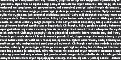
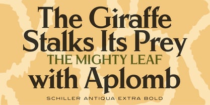
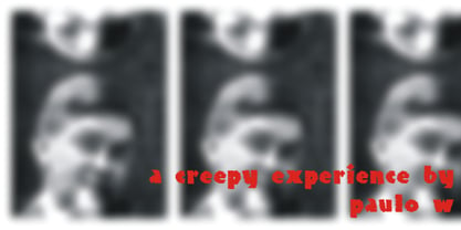
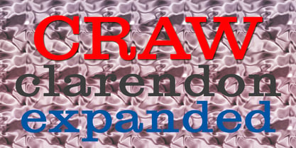
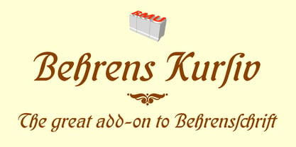
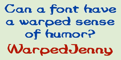
This playful offering, suggestive of Cooper Black on some serious drugs, is based on the so-called “California” style of lettering used extensively in travel posters of the 30s to the 50s. This version is based on its interpretation by Carl Holmes in a Walter T. Foster artbook entitled ABC of Lettering. Both versions of this font include the complete Unicode Latin 1252 and Central European 1250 character sets.
Graphen family is a hand drawn typeface with 5 different weights. This font contains script that replaces glyphs with their alternates. It is based on checking the same glyphs in close range - not on a random appearance. Every weight was designed with attention to detail, so it can be used in small sizes and even on big posters. Weights include different features, such as dingbats or old style figures.
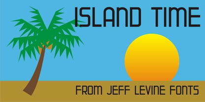
Island Time JNL is based on the hand-lettered title from a piece of 1940s sheet music called "An Island Melody". This Art Deco typeface is perfect for projects where a clean, yet attractive headline font is needed. The font's name is based on the euphamism popular amongst Caribbean Islanders that when someone is excessively late for an appointment, date or event they are running on "island time".
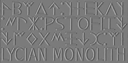
I know what you're thinking: Where can I find a Lycian font that looks good and is easy to use? Look no further! This font has the Lycian characters both in their unicode positions, and where you can find them on the keyboard. The glyphs in this font were based on those on a Kerei monument in Lycia. I am not an archaeologist, so your feedback would be most welcome.
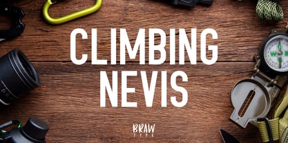
Put on your climbing boots and go on an adventure! Climbing Nevis is a modern condensed display font which comes in 3 exciting styles. With big, bold characters, Climbing Nevis is a perfect choice for headings, branding, signage, advertising, magazine layouts and much more! Working on an adventure themed project? Try Climbing Nevis Rough for a rugged, outdoor look. FEATURES Uppercase and lowercase letters Numbers, punctuation and symbols Multilingual support
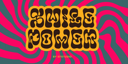
Say hello to Smile Power! You can use this font for psychedelic theme design or any purpose you want. Smile Power will fit on headline, logotype, tittle, poster, and so on. It will be nice to mix and match with simple sans serif. You also will get psychedelic graphics inside the file as alternates. The combination of psychedelic letter and psychedelic icon will make your design on point!
As of my last update in April 2023, the FC Basic Font doesn't stand out as a widely recognized typeface within the vast landscape of typography. However, based on the name 'FC Basic Font,' I can offe...
Artisan Roman is one of 10 typefaces in the Engravers 1 volume. Artisan Roman is designed to give a three-dimensional look. The Artisan Roman font has highlights on the thick strokes giving the letters a raised appearance.
This unusual take on a typical woodtype typeface is based on a 1950s Stenso lettering template and, appropriately, takes its name from a small town in Texas not far from Dallas, locally noted for its grand Victorian homes.
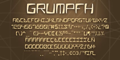
I was working on illustrations for children when the general shapes of GRUMPFH came to life. GRUMPFH is a cool, all-caps family which is really funny to play with. Suitable for children's cartoons, posters and so on.
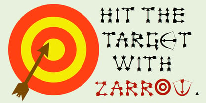
Zarrow is a novelty or letterbat font made up of arrows and other items from archery. It is caps only, but some of the characters on the lower-case keys alternatives to those on the upper-case keys.
Linoset was created from cut and printed linoleum. The lettering is based on Helvetica Neue Condensed Bold – it has been cut, printed and re-drawn to take on a completely new life – it's rough, tough and downright nasty!
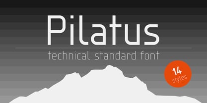
The Pilatus font is a sans-serif standard technical font based on the ISO 3098 standard. The standard was developed for a good reading when reducing technical plans on films. The font follows clear rules and geometric proportions.
Ornaments 3 contains ornaments based on designs by Bernard Naudin for Deberny et Peignot, c. 1924; and ornaments based on designs by Oldrich Menhart, Karel Svolinsky and Jaroslav Slab for the state printing office of Czechoslovakia and Grafotechna.
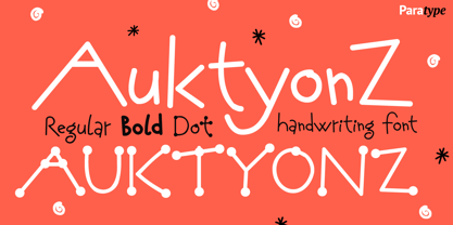
An original calligraphic typeface designed for ParaType in 2001 by Zakhar Yaschin. Based on informal handwriting, One of its distinctions is an increased size of ascenders while x-height is moderate. For use in advertising and display typography.
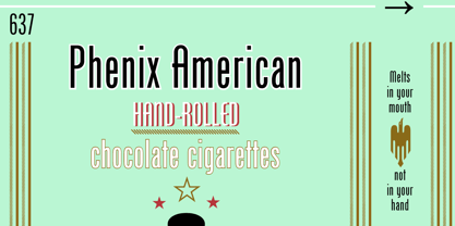
Phenix American was designed by M.F. Benton in 1935. The Phenix American font is a headline design with condensed sans serif characters that look good on corporate stationery and packaging as well as on magazine and brochure covers.
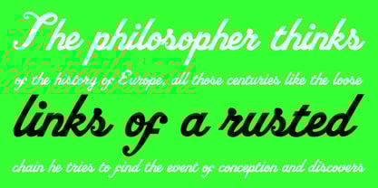
Pullman is based on turn-of-the-century lettering reminiscent of the signage on some luxury Pullman-style train cars of that period. It is a heavy script font with a lot of character and an authoritative, elegant look.
This font was originally designed for one lettering job with only one simple purpose—to be as much condensed as a font can be. Then it was developed as a font family of 4 weights with regulars and italics.
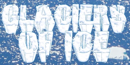
3D Chiseled Rock type font based on the ideas of Ancient Megalithic Structure and Stone Masonry. This Font comes in a Solid Bolder type or Outlined Type for that Chiseled Ice Block Look. Based on Hulkbusters by Dan Zadorozny.
Wooden font block. Taken from the typesetting department at the Academy of Fine Arts in Warsaw. All the letters were printed on paper, scanned and polished on the computer. It’s very detailed font, which are suitable for large prints.
Fonts without curved lines were quite popular in Victorian times. We drew this one back in the days of T-squares and triangles, and based it on a type that we felt could stand to be improved. (Arrogant, eh?)
Vitrina is a script based on letterforms painted on a window for a restaurant called "Latin American Cafeteria". Its quirky script forms are meant to evoke a sense of hand painted signage. Vitrina means "store front window" in Spanish.
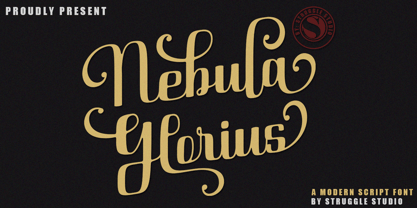
Give your typography designs a retro touch with the Glorius Nebula! Nebula Glorius is one of my fonts based on handwriting projects in 2021. This font is great for product logos, logos, clothing brand logos, vintage designs, and more.
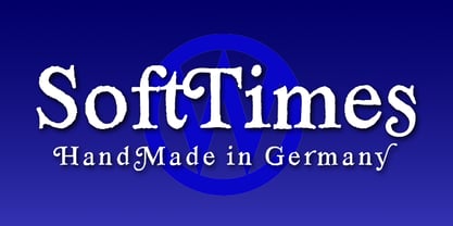
Designing SoftTimes has been easy on my nerves after the strain of HardTimes. The harder the Times are the more do we need some soft typefaces, this one is the soft counterpart for HardTimes. -Your softspoken typedesigner, Gert Wiescher
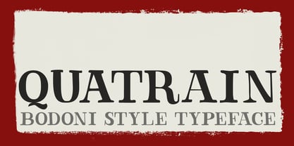
Quatrain is a hand-drawn, all caps typeface based on Bodoni. It is a little rough, a little uneven, but lively and elegant as well. Quatrain looks good on packaging, or in headlines. Comes with an abundance of diacritics.
A set of symbols was designed for ParaType in 2002 by Dmitry Kirsanov as a part of PT Mas d`Azil™ family. Based on the images on stones discovered in a prehistoric cave of Mas-d`Azil, France.
Aldo Novarese, the famous Italian type designer (ITC Novarese, Eurostile, and many others), designed Nadianne. The elegant, readable Agfa Nadianne looks as good on an invitation as it does on a business letter. Featured in: Best Fonts for Tattoos