10,000 search results
(0.031 seconds)
- Verao by insigne,
$24.99 Remember clear summer days as a kid? Remember open fields that you explored? Sun shining? Simple breezes sweeping past your face as you ran far and free? The feeling was uncomplicated and enjoyable. It was natural. That’s Verao, the simple spirit of summer. Alive and vibrant, Verao takes a turn away from the cold structure of today’s rigid creations and embraces the movement back to the value of things handmade. This artisan creation represents the rare, soul-invested fusion of the craftsman’s tools, materials, and hand movements, which shapes the solid--but beautifully defined--parts, pieces that, when put together, breathe a measure of life into everyday paragraphs and other bodies of text. Verao’s hand-written brush script, with its characters’ imperfect elegance and handmade quality, keeps your work looking organic. Write a word in more than a hundred different ways thanks to the large number of extra letters it offers. Two sets of lowercase alternative letters without connectors are included as is a set of swashed endings. Verao contains stylistic substitutions and ligatures, too, that you can combine however you like. Whichever way you design, the elements continue to appear balanced and separate and will undoubtedly add more personality to your design. So stop switching out cogs in your rigid set of fonts. Take time again to play with a natural face that’s both easy and energetic. Verao’s great temperament makes it a joy to design with. Let this spirit of summer take you away from the mundane. There’s a good chance Verao will lead you where you need to go. Production assistance from Lucas Azevedo.
 - TessieOddsNends by Ingrimayne Type,
$9.00 A tessellation is a shape that can be used to completely fill the plane—simple examples are isosceles triangles, squares, and hexagons. Tessellation patterns are eye-catching and visually appealing, which is the reason that they have long been popular in a variety of decorative situations. These Tessie fonts have two family members, a solid style that must have different colors when used and an outline style. They can be used separately or they can be used in layers with the outline style on top of the solid style. For rows to align properly, leading must be the same as point size. To see how patterns can be constructed, see the “Samples” file here. TessieOddsNEnds contains shapes that did not fit into the other Tessie fonts: TessieStandingBirds, TessieFlyingBirds, TessieMoreBirds, TessieXtraBirds, TessieSpinners, TessiePuzzlePieces, TessieAnimals, TessieBugs, TessieMiscellaneous, and TessieMoreStuff. (Earlier tessellation fonts from IngrimayneType, the TessieDingies fonts, lack a black or filled version so cannot do colored patterns. The addition of a solid style that must be colored makes these new fonts a bit more difficult to use but offers far greater possibilities in getting visually interesting results.)
 - Gromy by Eurotypo,
$28.00 Gromy is a casual, informal and friendly calligraphic font. It come with 561 glyphs, with OpenType features, swashes for all glyphs, stylistics sets, stylistics alternates and a lot of ligatures to play with your texts. Gromy can be used in works that require an informal and original feel, children's books, wedding invitations, greeting cards, posters, labels, t-shirt design, in ink or watercolour based designs, fashion, magazines, food packaging and menus, book covers and whatever your imagination holds!
 - Bondtique by PojolType,
$12.00 Bondtique is inspired by the writing of books or plain text with the same thickness and the standard typeface can be used for magazines, logos, branding, web, posters, movies and films.
 - Deco Pennant Initials JNL by Jeff Levine,
$29.00 Online auctions continue to be a surprising wealth of font design inspiration. In this instance, a number of silk embroidered Art Deco initials inside inverted triangles inspired Deco Pennant Initials JNL. The uppercase version is white lettering on a black background – similar to the originals. On the lowercase keys is a set of initials that are black on white with a black border. Since the inverted triangles resemble pennants, there’s a solid black blank on the left parenthesis key and a outlined blank one on the right parenthesis key. In this way, the initials could be used for monograms or interspersed with the blanks to form short banner messages.
 - Happenstance by Just My Type,
$25.00 Happenstance came out of a play session with Bezier curves with a sense of fun built into its being. First came play, then came work. Thomas Edison once said,”Creativity is 1% inspiration and 99% perspiration.” Nikola Tesla thought the opposite. In this case, what started as inspiration took a lot of perspiration to corral into a usable font. So maybe the reality is a) different for different people or b) somewhere in the middle. Just sayin’.
 - Contamination by Kenn Munk,
$42.00Vowels produce 'end-characters'. These are used whenever a string of symbols start or end. Consonants make 'middle-characters'. Numerals are zero-width characters. these can be used whenever you feel like it, they will float above and below the string of symbols. Puncuation adds extra spice. Hold down 'shift' and you get the individual symbols mirrored. (very useful with the vowels.) Check my website for a more graphic representation and play, for gods sake, play! - Sabotage by PintassilgoPrints,
$24.00 Sabotage is inspired by the iconic Vertigo movie poster by Saul Bass. It is a bold all-caps font that fits a wide range of eye-catching design projects surprisingly well. Check it out! Sabotage offers two versions for each letter, stored in upper- and lower-case slots. When turned on, its contextual alternates feature will instantly alternate these glyphs, preventing double letters from displaying the same letterform while boosting the nice handlettered feel of the typeface. The font is also loaded with a set of stylistic alternates and a couple of discretionary ligatures for even more flexibility. Sabotage is available in 2 flavours, solid and not-that-solid. The family also counts a cool complementary picture font which sort of draws inspiration from the minimalistic - but always striking - book-cover illustrations of Dick Bruna.
 - Industria by Linotype,
$40.99Brody’s fonts borrow elements from both Art Deco and non-Western styles. His designs received international recognition for their innovative, computer-oriented style, reaching almost cult status. Four original Brody fonts are available from Linotype Library GmbH: Insignia, Industria-Solid, Industria Inline and Arcadia. For your convenience, we have gathered all four into one package. Industria is a font which speaks of mechanical exactness, cool and reserved. Industria Inline is a lighter version of Industria Solid. - Belle Jardin by Greater Albion Typefounders,
$18.00 Belle Jardin is an Art Deco inspired display family of three typefaces, offered in in-line engraved regular and demi bold forms as well as a solid bold form. It offers upper and lower case solid slab-built forms that create an immediate atmosphere of the streamline era of the thirties and are also at home in post-war revival inspired design work. The letterforms are solidly legible and ideal for cover and poster inspired design work.
 - Diamend by Craft Supply Co,
$15.00 Diamend is an elegant sans-serif font that merges modernity with sophistication. Its sleek lines and refined aura are ideal for infusing projects with a touch of timeless class. Elevate your designs with Diamend's exquisite charm and open the door to a world of creative possibilities. This typeface is ideal for greeting card, packaging, brand identity, poster, or any purpose to make your design project look eye catching and trendy. Feel free to play with this typeface!
 - Galber by Craft Supply Co,
$20.00 Introducing Galber - Compressed Sans Serif: A commanding typeface that captures the eye with its bold, condensed design. With its impactful lines and modern allure, Galber adds a strong touch to your projects. Elevate your designs with Galber's assertive style, making a striking statement that simply can't be ignored. This typeface is ideal for greeting card, packaging, brand identity, poster, or any purpose to make your design project look eye catching and trendy. Feel free to play with this typeface!
 - MetroBots by Our House Graphics,
$- MetroBots is a fun loving, non-traditional but very functional family of 6 fonts made of big city skies, the long tropical morning shadows of ancient ziggurats and entire pueblo villages, nestled into the steep cliff-sides of sage-topped mesas in south western deserts. This is a good solid, but kind of whacky looking display type family borrowing from the heft of good old-fashioned children�s wooden building blocks and the look and feel of both modern and ancient pueblo architecture. With a bit of the not-so-subtle expressiveness of a comical robot on a WD-40 high on the side.
 - Ashbury by Hoftype,
$49.00 Ashbury derives its inspiration from 18th century transitional types such as Caslon and Baskerville. It is, however, not a revival but interprets formal aspects in a new and individual fashion. With a flowing outline, it remains warm and pleasant but assertive because of its solid stroke weights. It is very well equipped for a wide range of ambitious applications. Ashbury comes in ten styles, in OpenType format, and with extended language support for more than 40 languages. All weights contain small caps, swash capitals, standard and discretional ligatures, proportional lining figures, tabular lining figures, proportional old style figures, tabular old style figures, matching currency symbols, fractions, and scientific numerals.
 - Artusi by Zetafonts,
$39.00 Pellegrino Artusi was a celebrated Italian food writer, who is credited with the creation of one of the most influential cookbooks in the history of Italian cuisine. Taking inspiration from his legacy, Francesco Canovaro decided to work on a typographic homage to the delicacy and finesse of Italian traditional cuisine. Aptly named Artusi, the typeface is an enchanting combination of traditional Italian style, contemporary refinement and a playful touch of innovation. It is a transitional serif typeface with both text and display versions, developed on a wide range of seven weights and including a huge range of alternates, OpenType features and ligatures. Each weight of Artusi works like a different course in a balanced meal. Lighter weights are our starters, with their high contrast between thicks and thins, delicate curves, balanced proportions and subtle spiky serifs. The main course are naturally the regular and bold weights, where traditional Italian old style is enriched with a peppery kick of modern details. For dessert, the heavy weights offer luscious curves, opulent calligraphic swashes and eye-catching details, suitable for packaging and logos. When it comes to typography, let Pellegrino Artusi’s legacy inspire you. From packaging to web pages, Artusi typeface will bring a feeling of tradition, craft and quality to any project. Because, as Pellegrino would say, “To make a great impression, you have to choose the finest ingredients”... Buon Appetito!
 - Stamina by Studio K,
$45.00 Bold and compact, Stamina is a solid, sporty font that punches beyond its weight. Ideal for product logos, headlines and signage, it has both power and panache!
 - Larrikin by HeadFirst,
$17.99 The distressed letterforms hark back to early printing process using hand carved wood cut letters. The typeface is available in 6 weight with both Rough & Solid variations.
 - BD Pankow by Typedifferent,
$25.00 BD Pankow is inspired and designed during a stay in Berlin. It’s an uppercase alphabet with alternates. Bold, rock-solid, modern and ideal for branding and titling.
 - Pershal by insigne,
$29.00 Pershal is something of an oddball, and that's the point. Dynamic and fast, Pershal attracts interest. Its architecture evokes growth and progress. Inspired by the futuristic styles of the 1990s, Pershal started on an aircraft ride as a sketch on a napkin. I set the concept aside for almost a decade before I went back to play with the typeface. Pershal is planned to complement applications in consumer finance, technology firms or biotechnology. As such, it has a complete set of both tabular and proportional figures. For the lowercase, Pershal features a distinctive shape that emphasizes its x-height. Its horizontal movement is highlighted by some of its other features, such as its crossbars. To emphasize growth, acceleration and inventiveness, crossbars and other elements are cut at a dynamic angle. It's a sans serif without a lot of contrast. Another unique feature of this typeface is the vast number of OpenType alternates. If you prefer a more conventional appearance to your sans, with stylistic alternates, you have that option. Altogether, there are more than seven separate sets of stylistic alternates and about 250 alternates for characters. This enables you to mix-and-match and create your own personal typeface. For branding, this makes it very useful. For your next project that requires a dynamic and technological appearance, give Pershal a shot.
 - Blunted - Unknown license

- French Vanilla by BA Graphics,
$45.00 A creative design with modern styling. Available in plain or swash style. Great for Invitations, Fashion, Decorative Designs and much more. Just mix and match some swash characters for a little flare.
 - Garibaldi by Harbor Type,
$50.00 🏆 Selected for Tipos Latinos 6. 🏆 Selected for the 12th Biennial of Brazilian Graphic Design. 🏆 Typographica Favorite Typefaces of 2015. Garibaldi is a text typeface based on humanist calligraphy. It has an organic look and feel, while preserves the traditional construction of roman typography. It all started with a desire to learn more about the origin of the strokes on humanist typefaces. To accomplish that, Garibaldi features a 20° axis, medium contrast based on translation and expansion, asymmetric serifs, and terminals related to the broad nib stroke. Garibaldi Regular was nominated for Tipos Latinos 2014. Since then, the family was expanded with more weights and matching italics, making it a solid choice for setting books, magazines and documents. Among many OpenType features, each font contains small caps, ligatures and contextual alternates, totalling more than 750 glyphs and supporting at least 80 languages.
 - Weg by Huerta Tipográfica,
$18.00 WEG* font is an experimental type system where legibility isn’t the focus. This project studies how glyphs are constructed and how their ductus can be modified. I explored how far I can move the limits if I don’t worry about the legibility. In Weg, letters are built by a single line that connects them, along with words and paragraphs. When weight decreases, the legibility of the signs increases. This is the first stage. It’s a project in expansion. The set contains uppercase, lining figures and basic punctuation in three weights: Regular, Light and Thin. The current supported languages are Spanish, Guaraní and English. If you need any other language, please let me know. I would like to expand the character set. Second stage project WEG is an experimental in-expansion font family. Here I present to you the second stage. I’m planning the first upgrade for middle 2021. I’m preparing a pattern set for July 2021. Here you can see the first four patterns. If you buy the font before July 2021, you’ll get this upgrade! • Second stage April - July 2021: pattern set (first four ready). • This upgrade will be available on August 2021.
 - Epilepsja by Mikołaj Grabowski,
$29.00 Epilepsja is an all-caps type family perfect for display works. It has been derived from stencil-sprayed and painted letters in the city space. The glyphs are simple but unordinary. Every letter has something from 3D illusion, but is flat simultaneously. The main feature and asset of this family is the ability to create multicolor text. Epilepsja consists of three styles: Outline, Solid and Fill. Outline is the base from which the other two styles are created. When you mix Solid with Fill, you can create two-color Outline style. Solid is neat and legible in small sizes. There are alternative uppercase/lowercase characters, digits, diacritics of western, central and southeastern Europe and Africa, punctuation and symbols including currency. Use it for posters, headlines, magazines, websites or anything you like.
 - MSung Gold PRC by Monotype HK,
$523.99 M Sung Gold PRC is a modulated style Simplified Chinese typeface. Modulated font designs have apparent thick-thin contrast at the strokes, and often include special design characteristics at entry, finial and transitional points of the strokes. Modulated Simplified Chinese font design category includes traditional Song, Ming or Fang Song style typefaces which are popular for continuous reading.
 - M Smart PRC by Monotype HK,
$523.99 M Smart PRC is a modulated style Simplified Chinese typeface. Modulated font designs have apparent thick-thin contrast at the strokes, and often include special design characteristics at entry, finial and transitional points of the strokes. Modulated Simplified Chinese font design category includes traditional Song, Ming or Fang Song style typefaces which are popular for continuous reading.
 - M Gothic Gold PRC by Monotype HK,
$523.99 M Gothic Gold PRC is a modulated style Simplified Chinese typeface. Modulated font designs have apparent thick-thin contrast at the strokes, and often include special design characteristics at entry, finial and transitional points of the strokes. Modulated Simplified Chinese font design category includes traditional Song, Ming or Fang Song style typefaces which are popular for continuous reading.
 - Paris Metro by Studio K,
$45.00 Nothing is more iconic of Paris than its antique Metro signs, which are the inspiration for this typeface. The signs vary from station to station, some featuring plain block capitals, others the most exquisite Art Nouveau. This example falls somewhere in between. and should inject a strong gallic flavour into any design or publishing project. To recreate the Metro effect in Photoshop, set your text white on red, then go to Layer Style> Inner Shadow. Or with Paris Metro Reverse set your text red on white, then go to Layer Style> Drop Shadow.
 - Monologues by Calamar,
$12.00 Monologues combines two stunning and trendy fonts (signature script and sans serif caps). I've created this font for those designers who don’t have a lot of time on long searching for the best font pairs but want to get the high quality product that will helps them to create trendy and stylish branding for any business. Monologues Script features 91 ligatures and stylistic alternates for each lowercase letter giving you the options to look totally custom. Font also includes full set of uppercase and lowercase letters, multilingual symbols, numerals, punctuation. Monologues Sans Serif is a classy high contrast font that contains only uppercase characters, numerals and punctuation. It has a regular and italic versions. All fonts available for Western European, Central European and South Eastern European Languages. You can check your language typing characters in text box above.
 - Fineday by Melvastype,
$29.00 Fineday is a clean and lining brush script. It is available with two different styles of uppercases: Style One and Style Two. Style One is swashy and decorative. Style Two is more plain and straightforward. Fineday is also available with connecting and non-connecting lowercases. All the Fineday versions have fancy alternate characters like ending swashes, tales and swashy ascenders. The family has an extended character set supporting most Central European and Eastern European languages.
 - Junior Clerk JNL by Jeff Levine,
$29.00 Junior Clerk JNL is the plain sans serif version of the lettering found on the cover of the sheet music for 1919's "The World is Waiting for the Sunrise". The song title was originally set in a decorative sans serif with an engraved line adorning each character. This version of the more fanciful design is available as the companion font Legal Eagle JNL. Junior Clerk JNL is available in both regular and oblique versions.
 - Reghina by Cititype,
$16.00 Let the ink flows and create your elegant design with Reghina font. This font is PUA encoded. PUA stands for “Private Use Areas”. When a font is PUA encoded it means that you can access all special characters such as Alternates, Swash, stylistic and ligature Playing with alternate glyphs is the same thing by playing combinations according to your taste. Coupled with ligatures to reinforce the natural feel, lowercase swashes at the beginning and ending make your design framed in a flexible flow This font is great for digital signatures, photographic text, website banners and brand logos. Unique and flowing naturally makes this font worth having
 - Talsmann NF by Nick's Fonts,
$10.00 Plain and simple, here's a faithful reproduction of the Advocate font for IBM Selectric typewriters from the 1960s. Both versions support the Latin 1252, Central European 1250, Turkish 1254 and Baltic 1257 codepages.
 - Fishhook by Ingrimayne Type,
$14.95 Fishhook is a letterbat font that makes letters from fishhooks and barbs. In the plain version the fishhooks look more realistic, but the bold version may be more satisfying from a typographical perspective.
 - RosarGrad by Ingrimayne Type,
$9.95 RosarGrad is a simple but elegant calligraphic face with six style: plain, italic, medium, medium italic, bold, and bolditalic. It was inspired by hand lettering on a graduation picture from the late 1960s.
 - Spooky Adventure by AEN Creative Studio,
$15.00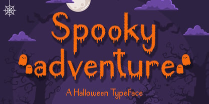 Spooky Adventure is a cool-lettered and spooky decorative font. It is perfectly suitable for any Halloween-related project or crafty idea. Add it confidently to your favorite creations and let yourself be amazed by the outcome generated!
 - Movella by Greater Albion Typefounders,
$8.00 Remember those 1970s science fiction dramas which had such charming futuristic sets and backdrops? Remember the intriguing future lettering and signage the set designers would devise-often coupled with interesting futuristic spellings? Movella is a family of three typefaces inspired by that design ethos. The three faces- regular, italic and the 3D solid form are all capitals faces which combine a feeling of retro-futuristic design with easy legibility. Take your next project into the age of the Apollo Launches, sci-fi action drama and fun!
 - Architect by Australian Type Foundry,
$30.00Based on the text on architect's plans. The designer asked friends and relatives for the plans for their house extensions, and he studied plans in the public library, then blended the best features of all the characters he could find. Architect was designed originally in 1999. - Good Robot by Haiku Monkey,
$10.00If a guitar-playing, hipster robot created a font, it might look like this. Perhaps you're charged with designing a poster for a guitar-playing, hipster robot. We recommend using this font. And alerting the media. Because a guitar-playing, hipster robot is pretty big news. - Wodehouse by The Ampersand Forest,
$20.00 If you create a lot of designs for display, then you know how invaluable a good, solid, geometric face is. Wodehouse is here to deliver. It has both a vintage, between-the-wars look and feel and a geometry with superelliptical rounds that embrace later, more modular designs. It's a little Deco, a little Moderne, a little Industrial and a lotta personality. Wodehouse has style. Wodehouse stands out. Right ho, Woodhouse!
