10,000 search results
(0.049 seconds)
- Mutamathil Taqlidi by Arabetics,
$39.00 The Mutamathil Taqlidi type family is the largest size member of the Mutamathil type style. It has one glyph for every basic Arabic Unicode character or letter and one additional, final-position, glyph for each Arabic letter that is normally connected with other letters from both sides in traditional cursive Arabic strings. With each glyph being slightly symmetrical around its vertical axis, this family is only suitable for right to left ordering. The Mutamathil Taqlidi family includes all required Lam-Alif ligatures and uses final position glyph substitutions, ligature substitutions, and marks positioning. Text strings composed using types of this family are non-cursive with stand alone isolated glyphs. The Mutamathil Taqlidi family includes both Arabic and Arabic-Indic numerals, all required diacritic marks, in addition to all standard English keyboard punctuations and major currency symbols. The fonts in this family support the following scripts: Arabic, Persian, Urdu, Pashtu, Kurdish, Baluchi, Kashmiri, Kazakh, Sindhi, Uyghur, Turkic, and all extended Arabic scripts.
 - Loscarlo by Ditatype,
$29.00 Loscarlo is a captivating serif font that seamlessly merges the timeless elegance of serif typography with the organic charm of brush details. The characters in Loscarlo showcase the classic structure of serifs, offering a sense of tradition and readability. What makes this font unique is the thoughtfully incorporated brush details, which add a dynamic and handcrafted quality to the letterforms. The result is a harmonious balance between refined aesthetics and a hint of expressive creativity. Enjoy the features here. Features: Multilingual Supports PUA Encoded Numerals and Punctuations Loscarlo fits in headlines, logos, posters, flyers, branding materials, greeting cards, print media, editorial layouts, and many more designs. Find out more ways to use this font by taking a look at the font preview. Thanks for purchasing our fonts. Hopefully, you have a great time using our font. Feel free to contact us anytime for further information or when you have trouble with the font. Thanks a lot and happy designing.
 - Goldshine by Uncurve,
$30.00 If you like old style type, ephemera or victorian era, you must be collect this font , its combination of old and modern touch ,it so adaptable and thats make an eye catching design. This unique and classic font for signage, label, poster, gold leaf, sign painting, branding and the other graphic design made. Gold shine inspired of vintage advertising and sign shop around the world. Goldshine comes with tons of alternates characters to make more eye cacthy . It is suitable for authentic logos, headings, sign painting, posters, letterhead, branding, magazines, album covers, book covers, movies, apparel design, flyers, greeting cards, product packaging, and more. To make everyone enjoyed Goldshine give you one extras font including ornament and traditional badge. If you use Goldshine with you imagination, you just combine with the another font like script , serif or san serif font and adding some effect finally BOOM..!! you get a great design for your project.
 - Alliance by Degarism Studio,
$40.00 Alliance Update to version 2.0 Alliance™ 28 weights, 14 uprights and matching italics. Each typeface contains over 592 glyphs with extensive Western, Central and Eastern European language support. ALLIANCE NO.1 Inspired by Industrial-era types from the end of the 19th century. Attempts to follow the best traditions of Grotesk typefaces. Features monolinear strokes and a good amount of contrast between the stroke thickness of each weight. With its distinctive inktraps, subtle in light versions and more visible in the black ones, Alliance No.1 was developed with unique glyphs to offer maximum flexibility. An airy metric aids good legibility in short texts. ALLIANCE NO.2 Alliance No.2 is a Display typeface. Developed from the original font family for use in large sizes. Based on the combination of contrasting shapes. This is a set useful for branding and advertising. Symbols for public areas, environment, transportation, digital and urban life. OPENTYPE FEATURES Including tabular figures, alternate characters, ligatures, fractions, case-sensitive forms, superscripts, subscripts etc.
 - Spooky Zombie by Ahmad Jamaludin,
$11.00 Just in time for your Halloween projects hopefully :) Introducing SPOOKY ZOMBIE! A font that's ready to cast a spooky spell on your designs. This eerie display font is the perfect choice for all your Halloween-related projects and crafty ideas. Plus, we've included an Outline version of the font as a little bonus. When you get Spooky Zombie, you'll also receive 26 spook-tacular Halloween doodles that perfectly complement your hair-raising projects! What's Included? Spooky Zombie Main File 26 free doodles with a Halloween theme Regular and Outline version Instructions (Access special characters, even in Cricut Design) Unique Letterforms Works on PC & Mac Simple Installations Accessible in Adobe Illustrator, Adobe Photoshop, Microsoft Word even Canva! PUA Encoded Characters. Fully accessible without additional design software. Multilingual Supports: (Afrikaans, Albanian, Catalan, Croatian, Czech, Danish, Dutch, English, Estonian, Finnish, French, German, Hungarian, Icelandic, Italian, Lithuanian, Maltese, Norwegian, Polish, Portuguese, Slovenian, Spanish, Swedish, Turkish, Zulu) Thank you, Dharmas Studio
 - Seol Sans by Monotype,
$187.99 The Seol Sans design offers a fresh palette for designers working with the Korean alphabet, particularly those looking to pair Latin and Korean alphabet (or Hangul) forms without creating typographic friction. The choices for Hangul fonts that work well with humanist Latin typefaces are limited. As Monotype’s first original Korean design, the Seol Sans typeface is a humanist take on the traditional rigid and hard designs of Hangul characters. The Seol Sans design more closely resembles the natural curve of hand-written characters. Seol Sans features Neue Frutiger for its Latin glyphs, and works harmoniously with Neue Frutiger World and Monotype’s CJK typefaces: Tazugane Gothic (Japanese) and M XiangHe Hei (Chinese). Seol Sans is a great choice for global brands using a Sans Serif design looking to maintain their visual identity, and communicate with a consistent tone of voice in the Korean market. Seol Sans has over 18,000 glyphs, and supports the Adobe-Korea1-2 and KS X 1001:2004 character sets.
 - Drop_it by Just in Type,
$18.00Drop_it is a redesign of fonts originally created to be recognized by computers using OCR (optical character recognition) softwares. Strangely, human beings fell in love for the stylistic inconsistencies of these fonts made for machines. In small sizes, Drop_it emulates the appearance of fonts in antique operational systems monitors. In large sizes, its structure is composed of capsules and pills allude the universe of medicines, drugs and rave culture. Drop_it Dingbats follow the the same grid of its alphabetic version, and can be used side by side in sign projects. Besides the traditional symbols, it present specific images from the rave culture like DJ (Disc-Jockey) and VJ (Visual-Jockey). Drop_it italic set adds velocity to text compositions using six angle variations. All the fun starts with a very unusual Break version. Fall version is a kind of "anti-italic". Slow version put your text in another rhythm. Swing have a little italic emphasis. Italic is, you know, italic. And Speed version run away. - Zilvertype Pro by Canada Type,
$29.95 Right on the heels of the tremendous popularity wave that made Hollandse Mediaeval the most used Dutch typeface during the Great War years, Sjoerd H. de Roos was asked to design a 15 point type for De Zilverdistel, Jean François van Royen’s publishing company. So between 1914 and 1916, de Roos and van Royen collaborated on the typeface eventually known as Zilvertype, and which both parties viewed as an improved version of Hollandse Mediaeveal. Like Hollandse Mediaeval, Zilvertype was based on the Jenson model, but it is simpler, with more traditional metrics, lighter and more classic in color. This Pro digital version of Zilvertype comes expanded in all directions. It contains a roman, a bold and an italic. Each font contains over 685 glyphs, including small caps, eight different sets of figures, plenty of ligatures, some Dutch ornaments, and extended language support covering most Latin languages. Zilvertype Initials is also there to round out this distinctively Dutch text family and make it ideal for immersive text design.
 - Extra Old by Mans Greback,
$59.00 Extra Old is a vintage serif typeface. With heavy strokes and miniscule serifs, this classic font family is the perfect lettering for a headline to emit genuine quality. Why not use Extra Old for a traditional logo or balanced product label. Created with pride and care, this type has the optimal appearance of a classic vintage logo but for a modern setting. The font family consists of Regular and Italic, as well as Bold and Bold Italic. Also included are the font styles Coaster and Floria Corner, two typefaces for beautiful decorative elements, combining with the lettering. The font is built with advanced OpenType functionality and has a guaranteed top-notch quality, containing stylistic and contextual alternates, ligatures and more features; all to give you full control and customizability. It has extensive lingual support, covering all Latin-based languages, from Northern Europe to South Africa, from America to South-East Asia. It contains all characters and symbols you'll ever need, including all punctuation and numbers.
 - Blue Pastel by Putracetol,
$28.00 Blue Pastel - Display Font is a bold and retro-inspired font that exudes uniqueness and groovy charm. Its display style makes it a perfect choice for various design applications. Whether you need a font for logos, branding, headlines, titles, posters, or a modern twist on retro designs, Blue Pastel is the ideal font to add a touch of nostalgia and contemporary flair to your projects. The bold display style of Blue Pastel immediately captures attention and adds a strong visual impact to your designs. Its retro-inspired elements evoke a sense of nostalgia, taking your audience on a trip down memory lane. The font's unique and groovy appearance sets it apart from traditional serif fonts, making it a great choice for those seeking a distinctive typographic solution. Whether you're creating a vintage-inspired logo, designing a groovy poster, or adding a retro twist to modern branding, Blue Pastel - Display Serif Font offers the versatility and character needed to elevate your designs to new heights.
 - MFC Heathcliff Monogram by Monogram Fonts Co.,
$19.00 The source of inspiration for MFC Heathcliff Monogram is a crudely hand drawn vintage monogram transfer depicting a wider format diamond monogram. We revised numerous letters for better clarity and a more vintage industrial vibe. MFC Heathcliff Monogram is capable of traditional two and three letter format monograms, as well as gapped and hugging framing options for each. Numerals 1-9 and 0 on the keyboard for the 2 letter framing options typed before the letters, and use the shift key on the numerals for the 3 letter framing options type before the letters. It's just that easy. Looking for an MC in one of the letter slots? Just type mc on either side of MC in the middle to get it. Otherwise, just type a lowercase, a Capital, and then a lowercase to build your monogram. As one of the most popular shape based formats for monogramming since the beginning, it must be true that diamonds are forever.
 - F2F Mekanik Amente by Linotype,
$29.99The Face2Face (F2F) series was inspired by the techno sound of the mid-1990s, personal computers and new font creation software. For years, Alessio Leonardi and his friends formed a unique type design collective, which churned out a substantial amount of fresh, new fonts, none of which complied with the traditional rules of typography. Many of these typefaces were used to create layouts for the leading German techno magazine of the 1990s, Frontpage. Leonardi and his fellows would even set in type at 6 points, in order to make it nearly unreadable. It was a pleasure for the kids to read and decrypt these messages! F2F Mekanik Amente appears as if it had once been a normal font whose letters were horribly attacked by a pair of scissors. This font could be a very creative choice for headlines. F2F Mekanik Amente is one of 41 Face2Face fonts included in the Take Type 5 collection from Linotype GmbH. Leonardi designed 11 of these himself." - The Mount Saint by Putracetol,
$28.00 The Mount Saint - Bold Luxury Serif Font. The Mount Saint is a bold vintage style serif font with strong character and soft features. The Mount Saint is equipped with Swash, Stylistic and Titling alternates as well as with Standard and Discretionary Ligatures And this font is a stylish font that is both retro and bold font. It's thick curves give a 70s groovy vibe with the serifs bringing it slightly back to traditional. Comes with alternatives and ligatures, helps to create stunning logos, quotes, posts, blog posts. branding projects, magazine imagery, wedding invitations, and much more. The alternative characters were divided into several Open Type features such as Swash, Stylistic Sets, Stylistic Alternates, Contextual Alternates, and Ligature. The Open Type features can be accessed by using Open Type savvy programs such as Adobe Illustrator, Adobe InDesign, Adobe Photoshop Corel Draw X version, And Microsoft Word. This font is also support multi language.
 - Amoresa by Andrey Sharonov,
$22.00 Amoresa script was handwritten under inspiration of traditional calligraphy and the wonderful mystic soundtrack of Wojciech Kilar. This font comes with a clean and aged version, beautiful uppercase and lowercase alternates, ligatures and end-swashes. You can easy get alternate characters just by adding number 2, 3, or 4 after any uppercase. Each of them has from one to four stylistic alternates. Lowercase has alternates too. Aurora has eight lengths of end-swashes. Just add underscore and a number from 1 to 8 after any letter at the end of the word ( _1 _2 _3 ... _8). Amoresa has multi-lingual support (Western European characters) for the following languages: English, Danish, Dutch, Estonian, Faroese, Filipino, Finnish, French, German, Hungarian, Icelandic, Irish, Italian, Norwegian, Polish, Portuguese, Spanish, Swedish. In my examples I show how this script can be used. It's very well suited for logotypes, wedding invitations, alcohol labels, romantic cards and others. Recommended to use in Adobe Illustrator or Photoshop. The special features don't work in Microsoft Word.
 - Bandoengsche by Gumpita Rahayu,
$14.00 Bandung is home to numerous examples of Dutch colonial architecture, most notably the tropical Art Deco architectural style. This typeface was adapted from the finest Art Deco landmarks and signage in Bandung, Indonesia and strongly added native elements of traditional Art Deco typefaces style. The main character is an example of a harmonious mixture between West and East architectural styles, repackaged into the Art Deco type design. With two different styles, it comes as regular and Deco styles, the regular style is constructed with all caps setting, with some different characters between uppercase and lowercase. The Deco style uses more stripes in the right shapes, it was naturally inspired with the most common art deco typefaces. The additional Opentype Features loaded in this typeface; some stylistic alternates, accessible catchwords in the discretionary ligatures, and the art deco ornaments, This typeface is highly usable with large scaling size and will fit with posters, movie titles, and signage designs.
 - Mimeograph Template JNL by Jeff Levine,
$29.00 Before ink jet and laser printers; before copy machines, the main way to make multiples of anything not provided by printing press was by a mimeograph machine or spirit duplicator. The mimeograph utilized a porous drum which inked the backside of a waxed stencil sheet. Unlike traditional stencils which have cut out areas that are directly inked or painted, a mimeo stencil has the area to be printed scratched away by removing the wax coating with a stylus. The resulting image allows the ink from the drum to seep through the sheet and transfer to the blank paper. Based on a plastic lettering guide once manufactured by the A.B. Dick Company of Chicago, Mimeograph Template JNL is available in regular and oblique versions. Albert Blake Dick, the company’s founder, coined the term ‘mimeography’. The font’s character shapes follow the routed letters of the template, complete with rounded terminals. An earlier font release [designed with flat terminals and some alternate characters] is available as Interoffice Memo JNL.
 - M Banquet P PRC by Monotype HK,
$523.99 M Banquet is a humanistic script written by a Chinese restaurant owner, which the name ‘Banquet’ comes from. It is a calligraphic style that always being seen in traditional Chinese banquet menu. Incorporated a feeling of masculinity, fill with strength and energy and attracts eyeballs of customers. It was written with a thin ball pen in a unique, personal and expressive writing style, such that it is realistic, natural and masculine. Contrast of strokes is low and the text is visible and eye-catching. Its light to medium stems (豎) make it suitable for small text to subheading with little conglutination. All strokes are irregular, inconsistent, irregularly oriented and tightly coupled. Spatial distribution, positioning, size and relative proportion of radicals fully reflect a natural and personal style. It is one of the few proportional-width font in a full scale. It is best suited for casual lively atmosphere, illustrations, set upright (non-slanted), non-condensed.
 - Lahab by Arabetics,
$39.00 A connected typeface design with a calligraphic flavor. The Lahab (Arabic for flame) font family employs visual features from the Arabic Diwani Calligraphy. It has six members, normal, bold, and light, all of which come in two styles, regular and left-slanted italic styles. This font family design follows the guidelines of Mutamathil Taqlidi type style with one glyph for every basic Arabic Unicode character or letter, as defined in the latest Unicode Standards, and one additional final form glyph, for the freely-connecting letters in traditional Arabic cursive text. Lahab employs variable x-height values. It includes only the Lam-Alif ligatures. Soft-vowel diacritic marks, harakat, are selectively positioned. Most of them appear by default on the same level, following a letter, to ensure that they would not interfere visually with letters. Tatweel is a zero-width glyph. Keying the tatweel key before Alif-Lam-Lam-Ha will display the Allah ligature. Lahab includes both Arabic and Arabic-Indic numerals, in addition to standard punctuations.
 - Newercastle by Chank,
$49.00 Newercastle is the new incarnation of a popular Chank font formerly known as "Newcastle". A consistent fan favorite since its initial release in 2005, the distressed blackletter font is new and improved. This sinister script is now bulked up with all-new capital letters, a bit of punctuation, and smattering of new crowns, griffins and other heraldic doodads. Designer Kevin Hayes opted for an assortment of gritty old icons instead of more traditional punctuation, because he felt that's just the way this type of font could perform best for you, the font enthusiast. "At-signs and percentile glyphs just aren't believable in fraktur-style fonts," says Kevin. You benefit by getting a bit of clip art with the new font instead of boring old punctuation. Use the new bats indiscriminately to add a regal air to even the most mundane newsletter. Or use layer upon layer to add a rustic richness to a poster project. Enjoy this wicked, textural type and use it with extreme force.
 - M Banquet P HK by Monotype HK,
$523.99 M Banquet is a humanistic script written by a Chinese restaurant owner, which the name ‘Banquet’ comes from. It is a calligraphic style that always being seen in traditional Chinese banquet menu. Incorporated a feeling of masculinity, fill with strength and energy and attracts eyeballs of customers. It was written with a thin ball pen in a unique, personal and expressive writing style, such that it is realistic, natural and masculine. Contrast of strokes is low and the text is visible and eye-catching. Its light to medium stems (豎) make it suitable for small text to subheading with little conglutination. All strokes are irregular, inconsistent, irregularly oriented and tightly coupled. Spatial distribution, positioning, size and relative proportion of radicals fully reflect a natural and personal style. It is one of the few proportional-width font in a full scale. It is best suited for casual lively atmosphere, illustrations, set upright (non-slanted), non-condensed.
 - Fallujah by Arabetics,
$39.00 A typeface design with extra isolated scattered letters and random careless look. It has six members, normal, bold, and medium, all of which come in two styles, regular and left-slanted italic styles. This font family design follows the guidelines of Mutamathil Taqlidi type style with one glyph for every basic Arabic Unicode character or letter, as defined by the Unicode Standards, and one additional final form glyph, for the freely-connecting letters in traditional Arabic cursive text. Fallujah employs variable x-height values. It includes only the Lam-Alif ligatures. Soft-vowel diacritic marks, harakat, are selectively positioned. Most of them appear by default on the same level, following a letter, to ensure that they would not interfere visually with letters. Tatweel is a zero-width glyph. Keying the tatweel key before Alif-Lam-Lam-Ha will display the Allah ligature. Fallujah includes both Arabic and Arabic-Indic numerals, in addition to standard punctuations.
 - Secca by astype,
$42.00 Secca is a fresh and versatile typeface series. With its workhorse qualities, Secca is perfectly suited for a wide range of applications - especially where legibility and economy are important factors. Secca is rooted in the tradition of early German Grotesk typefaces, but is tailored for the needs of today, with a wide language support and many typographic features and extras. » pdf specimen « The core family comes in nine weights from Thin to Ultra Black plus another three Hairline weights - each with italics, small caps and italic small caps. While the weights from Light to Bold perform well in text sizes, the more extreme styles give extra freedom for Headlines & Signage. For setting tables and charts, Secca offers tabular figures, fractions, currency signs and mathematic operators which share the same fixed width throughout the entire range of weights. This special feature is called “weight duplexing” and is a time saver for designers of annual reports and other figure-heavy texts.
 - Toughton by 99TyppeFoundry,
$12.00 Introducing Toughton Handwritten Font Unveil the beauty of handwritten elegance with Toughton, a font that breathes life into your creative projects. Designed to capture the essence of human touch, Toughton transforms words into a poetic dance of strokes and curves. The Art of Personalization Toughton isn't just a font; it's a journey through the art of personalization. Whether you're crafting wedding invitations, designing branding materials, or adding a human touch to your digital creations, Toughton's unique character will infuse your work with warmth and authenticity. Timeless Appeal With a timeless appeal that transcends trends, Toughton embraces the charm of handwritten script. Its fluid strokes and carefully crafted ligatures ensure that every word flows effortlessly, making it the perfect choice for projects that demand elegance and readability. Versatile Application From logos to social media graphics, packaging to editorial designs, Toughton adapts seamlessly to a variety of design contexts. Let your imagination run wild as you explore the versatility of this handwritten gem. Features and Functionality OpenType Features: Toughton comes with a set of OpenType features, including ligatures and alternates, to add depth and character to your text. Multilingual Support: Express yourself in various languages with Toughton's extensive multilingual support. Web and Print Ready: Whether it's for web design or print publications, Toughton is optimized for both digital and physical mediums. Elevate Your Creations Elevate your design game with Toughton Handwritten Font. It's not just a font; it's an artistic tool that allows you to tell your story with flair, grace, and a touch of humanity. Unlock the potential of your creative projects and make your message resonate with the world. Experience the magic of handwritten authenticity. Get Toughton today and let your words dance with elegance.
 - BF Rotwang Pro by BrassFonts,
$39.99 The BF Rotwang™ Pro is a contemporary new edition and re-design of a formerly design by Guido Schneider. Named after the C.L. Rotwang, the inventor of the Mensch-Maschine from the film Metropolis (1925/1926), BF Rotwang plays with the character traits of high-contrast transitional serif typefaces and Didone-style typefaces. BF Rotwang is a typeface characterized by balanced elegance. It is sensitive, sophisticated and self-confident, but unobtrusive. The heavy weights have the power and dynamic for strong headlines and exciting logotypes, the lighter cuts the elegance and lightness for use in continuous text. All letters and characters are a touch condensed, so the typeface looks compact and works space-saving. BF Rotwang™ Pro supports up to 200 Latin-based languages. The family comes with 7 weights plus matching Italics. Each font contains more than 1.220 glyphs, featuring a wide range of alternate characters, small caps, figure sets, fractions, more than 35 ligatures, many currency symbols, special characters and other useful symbols. The style sets give you the option to individualize and adjust the typeface to the requirement of your design, without changing the general visual feeling.
 - Open Book ING by Ingrimayne Type,
$9.00 OpenBookING is a gimmick or novelty font that has letters on pages of a book. It is caps only and monospaced. The letters on the upper-case keys are on the left-handed pages of an open book and the letters on the lower-case keys are the same letters but on the right-handed pages of an open book. One could alternate upper and lower case keys to get letters on complete books, but the Opentype feature of contextual alternatives (calt) does this automatically. Several previous typefaces from IngrimayneType used the calt feature to alternate shapes that fit together in an interlocking pattern, such as alternating concave and convex shapes. OpenBookING uses the calt feature in a different way, to alternate two halves of a symmetrical shape. To provide two copies of numbers and common symbols, some non-alphabetical characters are unavailable because their slots were taken by the second form of the number or common symbol. If stylistic set one (ss01) is turned on, spaces are replaced with empty pages. This may leave you with unwanted spaces at the end of lines, and to eliminate them, turn off the feature (or change the font) for these spaces. The empty pages can be used in a layer to add color to the text. There is also a second set of empty pages with a filled page that can also be used in layers. (See poster for examples.) These pages are on the (logicalnot multiply) and (register divide) characters for the first set and on the (ordmasculine ellipsis) and (macron trademark) keys for the second set. Finally, OpenBookING has a large set of accented characters if anyone should need them. The letters used on the books were derived from the font Myhota-Bold. For a related typeface of letters on book covers, see NewLibrary. OpenBookING has limited uses and is priced accordingly.
 - Assegai by Scholtz Fonts,
$19.00 Named for the Zulu traditional spear, Assegai evokes the long, slim outline of the weapon, and the strength of the Zulu warrior. The font combines the irregular shapes of tribal African art with the simple, clean elegance of contemporary design. It is especially useful for headings, subheading, for shorter passages and also works as a body font since it has both upper and lower case and is striking and readable.
 - Sign Sans JNL by Jeff Levine,
$29.00 The original source of design for Sign Sans JNL was an image online of an old New York drinking establishment called the Lenox Lounge. The metal channels encasing the neon had an unusual "feel" to some of the letters. While the original E,G and U of the sign looked "interesting", they didn't quite fit the font's layout. Those letters were scrapped for more traditional versions of them.
 - Corton by Greater Albion Typefounders,
$14.00 Corton was inspired by the traditional lettering on a gravestone in an English village. While that might sound a rather solemn beginning, Corton has wonderfully lively air, with distinctive lively serifs and beautifully swashed downstrokes. Eight faces are offered: regular and titular each in three weights plus regular condensed. Between them they are ideal signage and display faces, merging 'olde-worlde' charm and fun character, but remaining clear and legible.
 - Seicori by Shakira Studio,
$17.00 Say hello to new serif font, Seicori! Introducing Seicori, a captivating font that takes you on a journey into the realm of psychedelia. Falling under the category of psychedelic serif display fonts, Seicori offers a mesmerizing experience that transcends traditional typography. With its regular and outline versions, Seicori invites you to explore two distinct yet interconnected dimensions. Follow my shop for upcoming updates, and for more of my work, Thank you
 - Signpost by Studio K,
$45.00 The name says it all. Signpost is a display font purpose-designed for directional, informational and publicity signage, as well as posters, public notices and advertisments. It comes complete with a choice of 'pointing hands' symbols and quartrefoil borders of the kind used on traditional British street signs. It is essentially a drop shadow version of my Red Top font family, which has a similar range of applications.
 - Thorowgood Wide by Wooden Type Fonts,
$20.00 One of the original Clarendon types, an English design, here derived from a specimen taken from an American foundry, no identifying marks. With a tall x-height, wide version, unlike more traditional Clarendons, not a square serif but bracketed. Unique to this Clarendon are the rounded openings at the points where the horizontal and vertical stems meet in the capital B, D, P and R, not common in other Clarendons.
 - Leather Necks by Ahmad Jamaludin,
$15.00 Introducing LEATHER NECKS, a font born from the heart of traditional sign painting and American typography LEATHER NECKS offers clean and aged versions, along with captivating features like alternates, ligatures, and swashes. Plus, it embraces the global stage with its multilingual support Features: Leather Necks Main File Has 2 Families: Script and Sans Has 2 Styles: Regular and Aged Instructions (Access special characters, even in Cricut Design) Enjoy Designing! Dharmas Studio
 - Huraira by Putracetol,
$28.00 Huraira - Arabic Font, a captivating digital typeface that beautifully captures the essence of Arabic calligraphy. With a design that closely resembles traditional Arabic letters, this font features the intricate inclusion of dots on select characters, mirroring the visual elegance of classic Arabic writing. Huraira brings an air of authenticity and cultural richness to your designs, making it a versatile and impactful choice across a spectrum of design applications.
 - Han Zi by ParaType,
$25.00 The display typeface that is based on the shapes of traditional Chinese hieroglyphic characters. Designing the font for imitations in the Chinese style the author nevertheless demonstrates serious attitude and thoroughness using the table of keys of the regular Kaishu script. As a result the font looks stylistically authentic and genuine. The typeface was designed by Aleksandra Egorova, the young type designer from St. Petersburg, and released by ParaType in 2008 .
 - Klassisk by David Engelby Foundry,
$25.00 Klassisk is the Danish name for “classic” [’klasisg]. Taking its inspiration from a wide range of classic serif traditions, Klassisk can be your partner in crime for almost every kind of design job! It has the four classic weights PLUS two lighter display weights for headers and big letter sizes in general. Klassisk also comes with … a large variety in numerals (three styles) swashes and special ligatures a vibrant italic style.
 - Mondial Plus by Wiescher Design,
$49.50 MondialPlus is, as the name implies, a font meant for the whole world. MondialPlus is the newer and better version of Mondial. MondialPlus is designed to work in small sizes for bodytext. Only in bigger sizes does the font show its hidden character, it has a curved design to it, that makes it very special. Mondial is a very elegant and versatile font in the tradition of french sans typefaces.
 - Nanami by Thinkdust,
$10.00 A font inspired by the oriental flavours of Japan, Nanami a confident font with clear, clean lines which are well defined without being obtrusive. The distinctly sharp edges slice through empty space like Samurai swords, proudly wearing curves and corners like a Samurai wears their traditional ceremonial armour, and just as fierce. If Nanami isn't quite floating your boat why not check out its counterparts Nanami Rounded and Nanami Handmade.
 - Yellow Pumpkin by Illushvara,
$18.00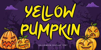 Hello, Yellow Pumpkin is a thick-lettered, brushed and spooky display font. It is perfectly suitable for any Halloween-related project or crafty idea! The only limit is your imagination. Yellow Pumpkin is PUA encoded which means you can access all glyphs and swashes with ease! Features : Uppercase and lowercase Numbers Symbols Alternates Multilingual Accent If you have any question, don’t hesitate to contact me. Happy Designing !!! Thank You, Illushvara Design
 - Kymer Awon by Brenners Template,
$19.00 The Kymer Awon font family includes 5 weights and 20 styles. Whereas traditional Sans Serif typefaces show low contrast, this family has high contrast. And It brings out modern elegance through curved variations of glyphs with diagonal bars. Alternative fonts with Small Caps inherit the vertical stem width of the default capitals. These elegant and contemporary styles have an affinity to fit into any of your design work.
 - PiS LIETZ Parilon by PiS,
$38.00 PiS Lietz Parilon invites you to the austrian countryside for an amazing ski-tour on snowy mountains back then when skilifts were sparse and mustaches were far from ironic. Use this heavy fraktur for retro tourism posters, your classic beer or schnaps brand or anything that needs a good swig of tradition! Heat up the Jagatee and enjoy the earthy taste of PiS Lietz Parilon, it will warm your heart!