10,000 search results
(0.039 seconds)
- Lager by Fenotype,
$50.00 Lager is a plump, sympathetic and tasty script family inspired by good old American commercial lettering of mid-1900s – yet there’s more to it than meets the eye. Implemented with an exceptional feature called Intelligent Swash Lager delivers perfected results with an handmade feel. Depending on the choice of letters Intelligent Swash grows and stretches swashes automatically. Accompanied by various ligatures and stylistic alternates, Lager creates beautifully completed words with minimal effort. Just make sure you activate Titling Alternates from your OpenType-menu. The Lager package will be delivered with 5 complete weights, 2 sets of well-groomed numerals and Small Caps as a great companion for the script style. Get high on Lager, it won't leave you short.
 - Janda Manatee Solid, designed by Kimberly Geswein, stands as a distinct and whimsical font that captures the imagination at first glance. This typeface, characterized by its playful yet readable styl...
- Paneur by Craft Supply Co,
$20.00 Introducing Paneur – Expressive Serif Typeface Serif Playfulness Paneur – Serif Typeface is far from your typical, formal serif font; it introduces a delightful touch of playfulness to traditional design. Informal Strokes Notably, Paneur’s strokes take on an informal quality, adding an expressive flair to your projects while steering clear of the formality usually associated with conventional serifs. Endless Expressivity What sets Paneur apart is its ability to offer endless expressivity. It’s the perfect choice for those who wish to break the monotony in design, infusing each project with an invigorating energy and dynamic spirit. Never Boring Design Indeed, Paneur is the antidote to boring and conventional design. Its informal serifs guarantee that your creations are never dull, but rather lively, captivating, and bursting with personality. In Conclusion In summary, Paneur – Serif Typeface is the font of choice for non-traditional expressiveness. It introduces a playful and informal touch to your projects, breaking free from the constraints of traditional serif fonts. By choosing Paneur, you ensure that your designs are engaging, full of life, and far from mundane.
 - Hiragino Sans TC by SCREEN Graphic Solutions,
$200.00 Hiragino Sans Traditional Chinese is a traditional Chinese font that inherits design characteristics from the Hiragino Sans (Kaku Gothic). The font satisfies the rising demand for a high-quality Big 5 embedded font for multilingual products, allowing it to be utilized in a wide range of applications.
 - Baldwin by Pen Culture,
$15.00 Introducing Baldwin, a modern retro serif font that seamlessly blends contemporary design with vintage flair. With its clean lines and classic letterforms, Baldwin exudes a timeless elegance that is perfect for a wide range of design projects. Whether you're creating branding materials, editorial layouts, or web designs, this versatile font will add a touch of sophistication to your work. Featuring a distinctive, slightly geometric serif style, Baldwin offers a fresh take on traditional serifs. Its balanced proportions and subtle detailing create a harmonious look that is both refined and approachable. Available in a variety of weights and styles, this font is designed to adapt to any design setting, from headlines to body copy. I really hope you enjoy it – please do let me know what you think, comments & likes are always hugely welcomed and appreciated. More importantly, please don’t hesitate to drop me a message if you have any issues or queries. Thank you
 - Recta by Canada Type,
$24.95 Recta was one of Aldo Novarese’s earliest contributions to the massive surge of the European sans serif genre that was booming in the middle of the 20th century. Initially published just one year after Neue Haas Grotesk came out of Switzerland and Univers out of France, and at a time when Akzidenz Grotesk and DIN were riding high in Germany and Gill Sans was making waves in Great Britain, it was intended to compete with all of those foundry faces, and later came to be known as the “Italian Helvetica”. It maintains traditional simplicity as its high point of functionality, while showing minimal infusion of humanistic traits. It shows that the construct of the grotesk does not have to be rigid, and can indeed have a touch of Italian flair. While the original Recta family lacked a proper suite of weights and widths, this digital version comes in five weights, corresponding italics, four condensed fonts, and small caps in four weights. It also includes a wide-ranging character set for extended Latin language support.
 - Rabento by Mans Greback,
$59.00 Rabento is an original serif family, with articulate and big letterforms. The typeface was drawn and created by Mans Greback between the years 2018-2021, and is designed to assure a unique and confident character to any headline, logotype or title. A display typeface made for large text displays, it is still clear and legible. With great contrast, this lettering has precise hairline thin horizontal parts, a bold and expressive outline and fat slab serifs. It has traditional traits, but a new and modern design, which together makes for an impactful and notable type setting. Rabento is provided in six high-quality styles: Regular, Italic, Bold, Bold Italic, Black & Black Italic. The font is built with advanced OpenType functionality and has a guaranteed top-notch quality, containing stylistic and contextual alternates, ligatures and more features; all to give you full control and customizability. It has extensive lingual support, covering all Latin-based languages, from North Europe to South Africa, from America to South-East Asia. It contains all characters and symbols you'll ever need, including all punctuation and numbers.
 - American Signer by Dikas Studio,
$19.00 American Signer is a script brush font that inspired from traditional 1980’s Sign Painting. Made directly based on brush lettering and through a comprehensive digitization process, an American Signer was created that is suitable to help you get a sense of sign painting letter. American Signer comes with many ligature, alternate character and swashes that very suitable for makes logo, badge, label, packaging, certificate and other vintage design.
 - Temporal by E-phemera,
$20.00Temporal is one in a series of fonts designed for use in creating replica vintage newspapers. It is inspired by the nameplates of major metropolitan newspapers from the 1920s. Its rough character is apparent at headline sizes, and it remains nicely legible at small sizes. In addition to a complete international character set, it contains east and west coast variations for some letters, along with extra ligatures traditional for blackletter typesetting. - Strongly by Olivetype,
$18.00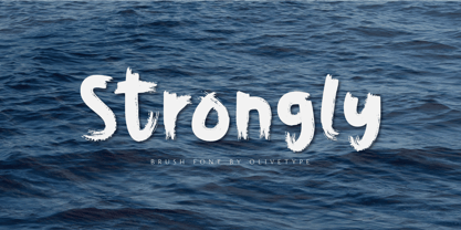 Strongly is a simple brush textured display font. This font is the perfect fit for all of your logos, branding, social media, and crafty DIY projects. Strongly is supporting Multi-Languages, which include: Afrikaans Albanian Catalan Danish Dutch English Estonian Finnish French German Italian Norwegian Portuguese Spanish Swedish Zulu. You’ll get : Basic Latin A-Z & a-z. Numbers, symbols, and punctuations. Multilingual Support. Accented Characters : ÀÁÂÃÄÅÆÇÈÉÊËÌÍÎÏÑÒÓÔÕÖØŒŠÙÚÛÜŸÝŽàáâãäåæçèéêëìíîïñòóôõöøœšùúûüýÿžß Thank You.
 - Kantarell by EchadType,
$10.99 Kantarell is a calligraphic sans-serif typeface rooted in the traditions of Roman square capitals. In all-caps Kantarell has a very grotesque look to it, while in small x-height letters sustains it's ortodox form. The family available in single style and works best in headline and display settings. Typeface supports: Latin characters with diacritical marks; Cyrillic charecters (Ukrainian, Russian); Variety of symbols for use in commerce.
 - La Jolla ES - 100% free

- York Script ES - Unknown license

- Olde European ES - Unknown license

- TE Mona Tharwat Emara by Tharwat Emara,
$35.00 TE Mona Tharwat Emara," a masterpiece of Arabic calligraphy crafted by the renowned Egyptian calligrapher, Tharwat Emara. This exquisite Ruqaa font seamlessly blends tradition with innovation, offering a timeless elegance that captures the essence of Arabic script. Tharwat Emara, a distinguished figure in the world of calligraphy, has lent his artistic prowess to create a font that is not merely a collection of characters but an embodiment of cultural richness. Each stroke of the pen reflects the heritage of Egyptian calligraphy, echoing the historical echoes of an ancient civilization. "TE Mona Tharwat Emara" stands as a testament to Emara's dedication to perfection. The font's graceful curves and meticulously designed letterforms pay homage to the classical Ruqaa style, while subtle contemporary touches infuse it with a modern flair. It is a harmonious blend of tradition and innovation, making it an ideal choice for projects that demand sophistication and cultural resonance. Designed with precision and passion, this font is not just a typographic tool; it's a work of art that brings the beauty of Arabic calligraphy to the forefront. Each character is a brushstroke of inspiration, contributing to a seamless flow that captures the eye and mesmerizes the reader. Whether you are working on a branding project, publication, or artistic endeavor, "TE Mona Tharwat Emara" adds a touch of timeless class. Embrace the elegance of Arabic script with this font, where every detail reflects the expertise of a master calligrapher. As you embark on your creative journey, let "TE Mona Tharwat Emara" be your muse. Elevate your designs, captivate your audience, and embrace the heritage of Arabic calligraphy with this exceptional font. Embrace the legacy, embrace the art – TE Mona Tharwat Emara awaits, a font that transcends time and tradition
 - Open Case JNL by Jeff Levine,
$29.00 Open Case JNL is the distant cousin to the 2009 release by Jeff Levine Fonts called Cold Case JNL, as both were based on sets of lettering stencils designed and manufactured by the Huntington Oil Cured Stencil Company (originally of Huntington, New York and later of Delray Beach, Florida). While sharing similar design traits, there are enough differences to have both type designs work well together in a complimentary setting. Open Case JNL is available in regular and oblique styles.
 - Identa by Sudtipos,
$39.00 Because we know that you will never get tired of using them and that you will always need a new tool for Identity Design, we created Identa. Conceived to translate corporate and humanist ideals in its typographic form, it seeks a dialogue between neutrality and contemporaneity. With a pragmatic attention to functionality that does not forget aesthetics. It is a Sans serif model, accessible and well-founded. All-terrain, workhorse that seeks to be reliable and durable. It solves any type of content with efficiency, intelligence and professionalism. Its clean forms and x-height make it a very competent face for both short identifiers and long text bodies, ideal for display use where legibility and personality must match new design needs within a company. It is available in eight styles, ranging from its White version to the darker Vantablack, each optimally set with its respective italic variables, and a Dingbats font designed to solve everyday cases. Each font contains 737 glyphs, macro and micro aesthetic details inspired by current visual communication systems and trends. The dingbats font includes 303 signs and is a set of icons and symbols that can be used in multiple environments, both for print and digital media. This typeface family seeks to meet the needs of brand designers looking to create an assertive appearance, whatever the case. It is a solid and self-confident typeface, without appearing overly constructed; on the contrary, its nuance makes it look fresh.
 - Belle Allure by JBFoundry,
$10.00 Belle Allure is a font for schools. It is based on the continuity of movement and simple paths which let a fast and easy cursive writing. It respects the French habits and leans on a wide character set and on the OpenType properties.
 - Virus by Chris Costello,
$22.75 This design was inspired by a laser printout of a corrupt font. I designed the entire character set from a strain of seven infected letters. Virus is surprisingly legible in spite of its distortions so let your imagination run loose with this one.
 - Gelion by Halbfett,
$30.00 Gelion is a large family of geometric sans serif fonts. It ships both as two Variable Fonts or as 16 traditional fonts. Those static fonts span eight different weights, ranging from Extralight to Black. Each has an upright and an italic font on offer. The italics are carefully crafted, with an 8° slope. Gelion is inspired by 20th-century geometric sans serifs and classic neo-grotesque designs from the late 19th century and the middle of the 20th century. Its forms remain true to the gracefully geometric look of its classic predecessors, which will surely tick off any client’s long list of branding requirements. Letters in all of Gelion’s weights are drawn with virtually monolinear strokes. Its lowercase letters have a tall x-height. Yet, that still leaves enough room for the fonts’ diacritical marks. Gelion’s default “a” and “g” each have single-storey forms by default. The dots on the ‘i’, ‘j’, and diacritics are round, as are the punctuation marks. Gelion is an excellent choice for both corporate design and editorial design projects, thanks to its range of weights and its legibility in text. The fonts include a lot of ligatures, some monochromatic emoji, a set of arrows, lovely Roman Numerals, and more. Thanks to Gelion’s stylistic alternates, if a project comes up where you do not need a geometric vibe, you can activate Stylistic Set 1. That will replace many of the fonts’ letters with more humanistic-sans alternates, giving your text the feeling of a whole other type design with just one click. Last but not least, the descending “f” available in Gelion’s italics is a nice typographic trait.
 - Soup Du Jour by PizzaDude.dk,
$18.00 "Soup Du Jour" is French and simply means "Soup Of the Day" - may not sound interesting, but I can tell you that I have had several tasty soup of the day served. I wanted to make a font that resembles that feeling of not really knowing what you get served, but you got a feeling that it is something good! The font has got 6 different versions of each letter, and they automatically changes as you type - it makes your text organic and lively, and probably quite tasty too! :) "Soup Du Jour" is also a well-known quote from one of my favourite movies: "Dumb and dumber"
 - Bethlehem Star by HiH,
$10.00 For much of the world, the last half of December encompasses the beginning of winter and the a season of gift-giving, marked by Hanukkah and Christmas. It is generally accepted that the tradition of giving of gifts at this time was begun by The Three Wisemen. As described in The Gospel According to Matthew, the wisemen, led by a star from a distant land to the east, found the baby Jesus. First, they worshipped him and then, "they presented him with gifts: gold, frankincense and myrrh." (Matthew 2:11). Thus began the tradition of celebrating the birth of Christ with the giving of gifts. There is a parallel tradition in the Jewish faith of the giving of gelt or gold at Hanakkuh to help support poor students, in keeping with the rich history of scholarship that is fundamental to the rabbinic system. Inevitably, in our secular culture, there has been a blending and a secularization of these traditions. The reasons have gotton lost in the “gimme.” What is often overlooked is what Paul realized when he told Timothy, “Neglect not the gift that is in thee.” The most importent gift is the gift inside of us, the gift of sacrificial love for others. When we let that gift be diminished in our minds amid the clutter of modern day material seeking, we can recall the prophesy of Micah over 2800 years ago, But thou, Bethlehem Ephratah, though thou be little among the thousands of Judah, yet out of thee shall he come forth unto me that is to be ruler in Israel: whose goings forth have been from of old, from everlasting." (Micah 5:2 KJV) Never underestimate the impact you have on others. Words of kindness can change people’s lives. The Talmud says that the highest form of wisdom is kindness. Be wise this holiday season. The font BETHLEHEM STAR was originally designed for the church to which I belong, The Star Bethlehem Church of Ansonia, Connecticut, USA and is based on the typeface Accent with the permission of URW++ of Hamburg, Germany. You might choose BETHLEHEM STAR for your personal greetings as well as for flyers and programs at your church this holiday season. Like most display fonts, it is most effective at 18 points and larger. Like most script fonts, it is most effective when set with both upper and lower case. All caps with this font is like eating two pieces of pecan pie — too much of a good thing.
 - M XiangHe Hei TC Variable by Monotype,
$1,049.99The M XiangHe Hei Traditional Chinese typeface merges traditional brush strokes with modern letterforms to carefully balance traditional calligraphy with humanist design. Named for the smooth movements of a flying crane, the M XiangHe Hei typeface is designed to glide across the page, and features strokes that are partly derived from the Kaishu calligraphic style – an everyday script which dates back hundreds of years. Seol Sans features Neue Frutiger for its Latin glyphs, and works harmoniously with Neue Frutiger World and Monotype’s CJK typefaces Tazugane Info (Japanese) and Seol Sans (Korean). M XiangHe Hei is a great choice for global brands using sans serif Latin typefaces looking to maintain their visual identity, and communicate with a consistent tone of voice with Traditional Chinese.¶ - Grand Prix ES - 100% free

- BulgeOpen - Unknown license

- Standing Stones by Solotype,
$19.95Redrawn from a strange type originally made about 1850, and sold by the Connors Foundry, New York. We cannot guarantee that Connors originated it, since they were among the first to have facilities for pirating other foundries' types. - Electric Newspaper JNL by Jeff Levine,
$29.00 Around 1931, the Los Angeles Times (in partnership with the Richfield Oil Company) installed on its building a moving message board similar to the one at the New York Times in New York City which they dubbed an “electric newspaper”. The style of characters used on this electronic sign were the basis for the namesake font Electric Newspaper JNL, which is available in both regular and oblique versions. A blank space to place between words is available on both the solid bar and broken bar keystrokes.
 - Pelinka by Jehoo Creative,
$18.00 Upholding aspects of geometric shapes Created Pelinka. Pelinka is a Sans serif Family that has a solid foundation of geometric shapes designed to be bold and flexible. This typeface has all the widths needed to meet various design needs, Condensed, Normal and Expanded each width has 9 weights. Pelinka also includes support for Cyrillic and Greek Alphabets. Opentype feature: aalt, frac, liga, locl, numr, onum,ordn, salt, sinf, ss01, ss02, subs, sups, kern, mark. Language support for the Americas, most of Europe,Cyrillic and Greek.
 - New Car Tag JNL by Jeff Levine,
$29.00 Around 2018 or 2019, the State of Florida introduced new letter and number characters on its auto plates. Inspired by this change, Jeff Levine Fonts offers up a digital version of this lettering named New Car Tag JNL, which is available in both regular and oblique versions (for those who want a more sporty look). Some people prefer a rounded 'zero' to differentiate between the regular zero and the letter 'O'. You can find this alternate character located on both the solid bar and broken bar glyphs.
 - Candu by Dora Typefoundry,
$17.00 Candu is a strong bold sans serif, with solid lines, paired with bold yet soft rounding. Opium will turn any creative idea into your true work of art! It's perfect for logotypes, signage, branding, apparel, posters, social media, headlines, titles, large format prints and more. FEATURES: 4 Font weight Uppercase & Lowercase Alternative Numbers & Punctuation Characters with accents Supports Multiple Languages This type of family has been the work of real love, making it as easy and enjoyable as possible. I really hope you enjoy it!
 - Performing Arts JNL by Jeff Levine,
$29.00 The sheet music for "I Used to be Color Blind" (from the 1938 Fred Astaire-Ginger Rogers movie "Carefree") had its title crafted in ornate Art Deco hand lettering. Keeping the original letter forms, the interior embellishment was simplified to a dot-and-line pattern [eliminating a secondary squiggly line] for a cleaner look. The type design is now digitally available as Performing Arts JNL, in both regular and oblique versions. For those who prefer no ornamentation, there are also regular and oblique versions in solid form.
 - Godfrey by Ludwig Type,
$45.00 Godfrey is a compact, straight-sided, sans serif with a solid and reliable personality. Particularly striking are the descenders on ‘f’, ‘j’ and ‘y’ – which are composed completely of straight lines – and the protracted points of the ‘i’ and ‘j’. This emphasis on straight lines and equal proportions lend Godfrey a very structured and clean appearance while also ensuring its very unique character. As a result, Godfrey is a legible typeface that is expressive without being distracting. Visit this minisite to see Godfrey in action.
 - Glaser Stencil by Linotype,
$40.99 The renowned American illustrator and graphic designer Milton Glaser designed Glaser Stencil in 1970. Glaser Stencil is a perfect summation of both Modernist proportion and New York-style solidity and self-assurance. An all capitals font, the shapes of the letters are reminiscent of popular sans serif faces of the time, such as Futura and ITC Avant Garde Gothic. Like everything New York-related, Glaser Stencil should be used big, in headlines and display applications, where it can play a bold, proud, and confident role.
 - Riveta by JCFonts,
$30.00 Riveta is a sharp type family available in 18 styles, designed in 2021 by Joël Carrouché. Medium and medium italic styles are 100% free to use. The typeface features a simple and solid geometric construction, with straight terminals and a very discrete triangular serif that gives the font some extra spice in big size. Riveta is equipped for advanced typography, with features such as ligatures, tabular and proportional figures, arrows and icons, stylistic alternates, case-sensitive forms, fractions, scientific inferiors and superiors, and circled figures.
 - Quickers by Arterfak Project,
$28.00 Quickers is a solid brush font who inspired from craft movement and brush lettering. You can use Quickers Typeface as a logo design, logotype, label, quotes, headline, poster, apparel, insignia, badges, invitation, even print design. Quickers Typeface, comes with many variation of characters that allows you to create dynamic lettering style. The OpenType features can be accessed by using OpenType panel such as Adobe Illustrator, Adobe Photoshop, or Adobe InDesign. Also you can simply copy-paste in Font Book (from Mac) and Character Map (from Windows)
 - Ascetic 2D by 2D Typo,
$28.00 This decorative font is based on Cyrillic Vyaz of XV-XVI centuries. This type of letters were used as display faces in sacred texts. In Vyaz, the letters are characteristically fitted to each other so the letter sequences look as one solid ornamental frieze. The font is rich in discretionary ligatures which help to accentuate the style of Vyaz. In addition to letters and standard characters there is a number of monograms and Christian symbols. These and other features are available in OTF format.
 - Upscale JNL by Jeff Levine,
$29.00 A page from an "ideas booklet" that was copyrighted in 1939 by the Sanford Ink Company displayed a hand lettered variation on the counter-less [or solid] alphabet that so typified the Art Deco style of the times. Bold, brash and beautiful, Upscale JNL evokes high-end department stores, fine millinery shops, cafeterias, night clubs and other business establishments from the Streamline era. This type of lettering style was a workhorse, and could (and still can) tackle any message with strength, clean lines and class.
 - P&A Sans by Prominent and Affluent,
$24.00 Introducing P&A Sans, a modern sans serif font that combines geometric shapes with unique and glitchy characters that will make your design stand out from the crowd. This typeface is perfect for editorial design, branding, or advertising needs. P&A Sans has a solid character structure and supports multiple languages, so it's great for anyone looking to create designs with a global impact. Whether you're a freelancer, student or professional designer, P&A Sans can help you create something truly unique and special.
 - Tuxedo Stencil JNL by Jeff Levine,
$29.00 The sheet music for the 1934 tune "Two in A Dream" had the title hand lettered in a bold type style that utilized some stencil and some solid lettering. Following through on the stencil portion of the design, Tuxedo Stencil JNL was created in both regular and oblique versions. The 1930s were the era of elegant supper clubs and night spots, and it was not unusual to find gentlemen all decked out in formal wear for an evening on the town, hence the font's name.
 - Whitehaven by Greater Albion Typefounders,
$8.95 Whitehaven is the spirit of the Art Deco movement made into a very solid and blocky Sans Serif font. The name owes its inspiration to Whitehaven Mansions, a block of flats where that greatest of 1930s detectives, Hercule Poirot lived. Use this to make bold statements, to give posters and designs a taste of thee 30s, and wherever you want to be clear and definitive. Whitehaven is offered in two widths and a range of embossed and engraved styles for flexibility in design work.


