3,720 search results
(0.02 seconds)
- Hiruko by Thinkdust,
$10.00 With 15 different styles and support for all sorts of languages, Hiruko is the open and easy sort of font that can be used in almost any situation, as long as you want your message to be readable. Smooth, simple and clear, Hiruko takes inspiration from both Swiss and Japanese styles, focusing on minimalism and function within its form, the idea that less is more and the careful, exquisite craftsmanship that makes such minor changes have a big impact. From extra-light to thick, black weights, in italics or in outlines, Hiruko can be used to convey messages in such a variety of styles that you’ll never be disappointed. Alternatively if you're looking for something a little more comprehensive, why not check out the follow up to this family Hiruko Pro.
 - Decrypt H1 by Type Innovations,
$39.00 Say hello to Decrypt H1—a geometric typeface that features highly stylized capitals with sharp corners, circular forms and generous proportions. Specifically created for visual impact—use Decrypt H1 when you want your words to stand out from the rest of the crowd. The concept is modern, futuristic and non-traditional. Perfect for display text, logos and headings. The development of Decrypt H1 started in 1997, inspired by Alex Kaczun’s best selling grotesque font family called Contax Pro. Decrypt H1 is specifically introduced here as a bold weight, but Alex plans to expand the design to include many weights, styles and alternative design treatments. Stay tuned! If you like Decrypt H1—check out it’s alternate twins Decrypt 01, Decrypt 02 and all of Type Innovations fonts at: http://www.myfonts.com/person/Alex_Kaczun/
 - Rockwell Nova by Monotype,
$40.99The Rockwell® Nova family is a sturdy, optically monoweight design with blunt, straight-edged serifs and a no-nonsense attitude. It's the quintessential example of the appealing and eminently usable slab serif type style. The 13 designs of Rockwell Nova make for a robust and adaptable typeface family. Based on the original Monotype Rockwell suite of fonts, Rockwell Nova is an exceptionally durable design that suggests feelings of frank honesty when set in text composition. It is also an exceptionally versatile display design that can be used for headlines, subheads - or virtually anyplace where a strong presence is required. Rockwell Nova OpenType® Pro fonts have extended character set supporting Greek, Cyrillic, most Central European and many Eastern European languages, in addition to providing for the automatic insertion of ligatures and fractions. - Axion SER by Type Innovations,
$39.00 Axion SER is an original design by Alex Kaczun. Axion SER is a serif style variation based on his original Axion typeface family of fonts. It is a display font not intended for text use. It was designed specifically for display headlines, logotype, branding and similar applications. The entire font has an original look which is strong, dynamic, machine generated and can be widely used in publications and advertising. Axion SER is a futuristic, techno-looking and expressive typeface with an appearance of machined parts with sharp and rounded edges. This attractive display comes in roman with lower case and lining figures.The font is also available with true small capitals and old style figures. The large Pro font character set supports most Central European and many Eastern European languages.
 - Ninova by Fontuma,
$24.00 Ninova is a historical city that was the capital of the Assyrian Kingdom and its ruins are located within the borders of Iraq today. It is also known as the city where Prophet Jonah was sent. Ninova font family consists of fonts with aesthetic forms that appeal to human taste at the maximum level. Ninova font will more than meet the needs and expectations in terms of the glyphs it contains, the weights it has and the number of styles. This font includes two font families: Ninova: A family of fonts containing only the Latin scripts Ninova Pro: A family of fonts including Latin and Arabic scripts The Ninova font can be used for multiple purposes. It can also be used in the internet environment and operating systems along with printing areas.
 - Kautiva by Sudtipos,
$35.00 Kautiva is a comprehensive modern sans serif family that includes true italics, small caps, and unicase variations. Kautiva was developed to be efficient in both text and display environments. Kautiva serves as a refreshing middle ground between serious geometric and overly humanistic design. This gives it a balance, allowing significantly more flexibility than is normally expected from a sans serif typeface. Versatile in its functionality, Kautiva is also extensive in its features. The OpenType format Kautiva Pro family is available for layout architects who want to take advantage of the numerous features of the format: from true small caps to a variety of ligatures and stylistic alternates, through proportional and tabular figures and complete support for a multitude of Latin-based languages, as well as Cyrillic and Greek scripts.
 - Cumhuriyet World by Fontuma,
$34.00 Cumhuriyet means “the form of government in which the nation holds the sovereignty and uses it through deputies elected for certain periods”. The reason why I gave this name to the font is that 2023 is the centennial anniversary of the Republic of Turkey, which was founded by Atatürk. This typeface, which is sans serif, consists of three families: ▪ Cumhuriyet: Font family with Latin letters ▪ Cumhuriyet Pro: Font family including Latin, Arabic and Hebrew alphabets ▪ Cumhuriyet World: Font family including Latin, Cyrillic, Greek, Arabic and Hebrew alphabets Cumhuriyet World is a family of multi-purpose typefaces designed in a geometric style. This font is suitable for use in printed products, media and digital media, as well as in every field that is the subject of writing.
 - 1871 Victor Hugo by GLC,
$42.00 The famous French poet and novelist Victor Hugo (1802-1885) used several handwriting styles, sometimes almost illegible. His manuscripts designated to be published was written using a script style, to be legible clearly. We have used script style manuscripts from the final part of his life (from 1859 to 1881) to reconstruct this present font, as one exemple of the Victor Hugo's hands. It is a "Pro" font containing Western (including Celtic) and Northern European, Icelandic, Baltic, Eastern, Central European and Turquish diacritics. The numerous alternates and ligatures allow the font to look as close as possible to a real hand. Using an OTF software, the features allow to vary automatically, almost every character of a word without anything to do but to select contextual alternates and standard ligatures and/or stylistic alternates options.
 - Magister Script by Great Studio,
$23.00 Magister Script is a brush script with original, clean and neat handwriting style, with a touch of personality on each curve. This master script is available in two styles. Magister Script One and Magister Script Two, accompanied by Extrudes to simplify your design. All versions Magister Script have luxurious and elegant Alternative letter characters, both for the final connection letters and Ascander and Descander letters. This typeface works very well for Logo Design, clothing, handwritten quotes, product packaging, headers, posters, merchandise, social media & greeting cards and all your artwork. Features · Basic Latin A-Z and a-z · Numbers · Symbols · Stylistic Set · Ligature · PUA Encode · Multilanguage Support Latin pro If there are problems, questions, or anything about my font, please send an email to greatstudi92@gmail.com. Thank you for viewing our new product, enjoy!
 - Sevigny by Harald Geisler,
$49.00 Sevigny is for the poetic eye. It sings to readers - luring and promising - sweet like candy. Even though it is different, you feel that you've already seen it. Sevigny seduces you to look. Look twice. Déjà vu Ease the lure. Allow your eyes to follow the rhythmic ribbon. Enjoy the wavy ride on the weavy patterns. Let Sevigny enrich your design ideas. Recommended for Christmas windows, ribbon candy packaging, lingerie labels, book covers, everything that smells good, everything for grown ups, everything for kids, Christmas carol titles, wedding invitations and wedding magazines. Sevigny is offered in three versions: standard latin letters (upper and lowercase), numbers and symbols. Sevigny PRO is packed with extra ligatures, alternate letters, OT features, more symbols, extended support for foreign languages. Sevigny CAPS has only uppercase letters & numbers.
 - Fuse by W Type Foundry,
$25.00 This font is inspired by two typographic styles, incorporating (both) geometry and humanism. It combines the rhythm of such typefaces as Meta Pro and The Sans, as well as terminations and structures from fonts like Din and Futura. This results in a font that plays with condensation and a parallel rhythm, simple and functional. Fuse is perfectly equipped with Opentype, it contains alternative glyphs, fractions, modern and old numbers, superscripts and subscripts, ligatures and Small Caps. We always kept the idea of having Fuse be humanistic, rational and universal, which makes it ideal for graphic design, printed publications, web design, motion graphics, interaction design and branding. Learn about upcoming releases, work in progress and get to know us better! On Instagram W Type Foundry On facebook W Type Foundry wtypefoundry.com
 - Decrypt 02 by Type Innovations,
$39.00 Say hello to Decrypt 02—a geometric typeface that features highly stylized capitals with sharp corners, circular forms and generous proportions. Specifically created for visual impact—use Decrypt 02 when you want your words to stand out from the rest of the crowd. The concept is modern, futuristic and non-traditional. Perfect for display text, logos and headings. The development of Decrypt 02 started in 1997, inspired by Alex Kaczun’s best selling grotesque font family called Contax Pro. Decrypt 02 is specifically introduced here as a bold weight, but Alex plans to expand the design to include many weights, styles and alternative design treatments. Stay tuned! If you like Decrypt 02—check out it’s alternate twin Decrypt 01 and all of Type Innovations fonts at: http://www.myfonts.com/person/Alex_Kaczun/
 - Decrypt He2 by Type Innovations,
$39.00 Say hello to Decrypt He2—a geometric typeface that features highly stylized capitals with sharp corners, circular forms and generous proportions. Specifically created for visual impact—use Decrypt He2 when you want your words to stand out from the rest of the crowd. The concept is modern, futuristic and non-traditional. Perfect for display text, logos and headings. The development of Decrypt He2 started in 1997, inspired by Alex Kaczun’s best selling grotesque font family called Contax Pro. Decrypt He2 is specifically introduced here as a bold weight, but Alex plans to expand the design to include many weights, styles and alternative design treatments. Stay tuned! If you like Decrypt He2—check out it’s alternate twins Decrypt H1, Decrypt 01, Decrypt 02 and all of Type Innovations fonts at: http://www.myfonts.com/person/Alex_Kaczun/.
 - EF Casanova Script by Elsner+Flake,
$35.00 The handwritten cursive by the famous Italian Casanova has inspired Petra Beiße to design a new script, the “Casanova Script Pro”, with a complement of over 1400 characters and symbols. “Casanova Script Regular” is the basic version of this font with a reduced West-Layout. “Petras Script”, the first digital script font created by the calligrapher Petra Beiße, has, for many years, met with worldwide success. Petra Beiße has resided for a long time in Wiesbaden, Germany, where she is working as a renowned calligrapher. It is rare that any of her scripts are transferred into digital format and sold worldwide as fonts. Because “Petras Script” became such a huge success, she decided to release this new design for digitization. Further information about Petra Beiße and her present workshops can be found under www.handlettering.de.
 - Driver Gothic by Canada Type,
$29.95 Driver Gothic is based on the typeface used for Ontario license plates. Although unique among Canadian provincial license plates, this face is very similar to, if not outright identical with, the face used on car plates in 22 American states: Arizona, Connecticut, Florida, Illinois, Iowa, Kentucky, Louisiana, Maine, Michigan, Mississippi, Missouri, Montana, Nebraska, Nevada, New Hampshire, New Mexico, Ohio, Oklahoma, Vermont, Washington, and West Virginia. Driver Gothic is available in all popular font formats, and is comprised of a very extended character set (over 750 characters) covering a wide range of languages, including Central and Eastern European languages, Greek, Cyrillic, Esperanto, Turkish, Baltic and Celtic/Welsh. Driver Gothic Pro, the OpenType version, contains class-based kerning and push-button stylistic alternates for use with apps that support advanced typography. Buckle up!
 - Book Jacket by Canada Type,
$24.95 Book Jacket is arguably the most famous of all typefaces done in the Typositor era. Designed by Ursula Suess over an entire year, and published in 1972, Book Jacket became an instant success story that lasted well into the 1980s (even though it was copied by Phil Martin who published it under the name Bagatelle shortly after its release). Almost 40 years later, Ursula Suess and Canada Type consolidate their talents to bring you a revised, improved and expanded digital version of this film type classic, including small caps, additional swashes and new alternative forms. Book Jacket is available as a 4-font package in Mac PostScript and universal TTF format, or a single Pro OTF which includes features for small caps, swashes, caps to small caps, stylistic alternates, and class-based kerning.
 - Down Home JNL by Jeff Levine,
$29.00 In the October 31, 1920 edition of Wid's Daily (the predecessor to The Film Daily), a block of ad copy from a 1920 film called "Down Home" had the text printed in such a fluent pen-lettered style that a bit of a shortcut was used at the beginning of the design process for this typeface. Normally, font inspirations are redrawn [and not by simply using auto-trace] except under specialized circumstances like this one where that feature is a help, rather than a replacement for the creative process. The entire block of text copy was auto-traced, then the necessary letters were selected from the available wording and cleaned up to remove any sharp points and irregular curves in an effort to make the end results as close to the original and unusual hand-drawn text. From there the missing characters needed to produce a finished type font were created utilizing the standard methods of drawing and font construction. The end results turned out very well. Using the film's title as its namesake, this design is now available digitally as Down Home JNL in both regular and oblique versions.
 - Helvetica Monospaced by Linotype,
$42.99 Born in 1831, Hermann Berthold was the son of a calico-printer. On completion of his apprenticeship as a precision-instrument maker and after practical experience gained abroad in galvanography, Hermann Berthold founded his "Institute for Galvano Technology" in Berlin in 1858. Very quickly he discovered a method of producing circular lines from brass and not, as customary at that time, from lead or zinc. The soldering normally necessary could also be dispensed with. The lines were elastic and therefore highly durable. They produced outstandingly fine results. Most of German's letterpress printers and many printers abroad placed their orders with Berthold. His products became so popular that the print trade popularized the saying "As precise as Berthold brass". In 1878 Hermann Berthold was commissioned to put an end to the confusion of typographic systems of measurement. With the aid of Professor Foerster he succeeded in devising a basic unit of measurement (1m = 2,660 typographic points). This was the birth of the first generally binding system of typographic measurement. It is still used in the trade. Hermann Berthold served as the head of the Berthold type foundry until 1888.
 - Beverly Shores Script SG by Spiece Graphics,
$39.00 If you take the South Shore Line from Chicago to South Bend, your train will pass though the small community of Beverly Shores, Indiana. The beautifully restored and highly colorful “Beverly Shores” train station sign not far from the Lake Michigan beach is the source of inspiration for this connecting script typeface. The sign’s existing ten letters have now been extended to include the entire alphabet. This old-fashioned depot letterstyle is much in the spirit of such faces as Fulton Sign and Inserat Cursive. Ascenders and descenders have been lengthened and capitals are now much larger. Alternate lowercase swashes, capitals, and small figures have been included for your convenience. And custom uphill words such as “The,” “for,” and “to” have been added for more novelty and spark in headline settings. Beverly Shores Script with Alternates is also available in the OpenType Std format. Some new characters including old style figures have been added to this OpenType version. Advanced features currently work in Adobe Creative Suite InDesign, Creative Suite Illustrator, and Quark XPress 7. Check for OpenType advanced feature support in other applications as it gradually becomes available with upgrades. All aboard for Beverly Shores!
 - Edgar Pirámide Fuente LCD diseñada con mucho cariño para recordar las pirámides que abundan por toda mi Nación de México desde playas al raz del mar como Tulum hasta lo más alto como Teo...
- Avenir Next Thai by Linotype,
$79.00 Avenir Next Pro is a new take on a classic face—it’s the result of a project whose goal was to take a beautifully designed sans and update it so that its technical standards surpass the status quo, leaving us with a truly superior sans family. This family is not only an update though; in fact it is the expansion of the original concept that takes the Avenir Next design to the next level. In addition to the standard styles ranging from ultralight to heavy, this 32-font collection offers condensed faces that rival any other sans on the market in on and off—screen readability at any size alongside heavy weights that would make excellent display faces in their own right and have the ability to pair well with so many contemporary serif body types. Overall, the family’s design is clean, straightforward and works brilliantly for blocks of copy and headlines alike. Akira Kobayashi worked alongside Avenir’s esteemed creator Adrian Frutiger to bring Avenir Next Pro to life. It was Akira’s ability to bring his own finesse and ideas for expansion into the project while remaining true to Frutiger’s original intent, that makes this not just a modern typeface, but one ahead of its time. Avenir Next Variables are font files which are featuring two axis, weight and width. They have a preset instance from UltraLight to Heavy and Condensed to Roman width. The preset instances are: Condensed UltraLight, Condensed UltraLight Italic, Condensed Thin, Condensed Thin Italic, Condensed Light, Condensed Light Italic, Condensed, Condensed Italic, Condensed Demi, Condensed Demi Italic, Condensed Medium, Condensed Medium Italic, Condensed Bold, Condensed Bold Italic, Condensed Heavy, Condensed Heavy Italic, UltraLight, UltraLight Italic, Thin, Thin Italic, Light, Light Italic, Regular, Italic, Demi, Demi Italic, Medium, Medium Italic, Bold, Bold Italic, Heavy, Heavy Italic.
 - Avenir Next Rounded by Linotype,
$42.99Avenir Next Pro is a new take on a classic face—it’s the result of a project whose goal was to take a beautifully designed sans and update it so that its technical standards surpass the status quo, leaving us with a truly superior sans family. This family is not only an update though; in fact it is the expansion of the original concept that takes the Avenir Next design to the next level. In addition to the standard styles ranging from ultralight to heavy, this 32-font collection offers condensed faces that rival any other sans on the market in on and off—screen readability at any size alongside heavy weights that would make excellent display faces in their own right and have the ability to pair well with so many contemporary serif body types. Overall, the family’s design is clean, straightforward and works brilliantly for blocks of copy and headlines alike. Akira Kobayashi worked alongside Avenir’s esteemed creator Adrian Frutiger to bring Avenir Next Pro to life. It was Akira’s ability to bring his own finesse and ideas for expansion into the project while remaining true to Frutiger’s original intent, that makes this not just a modern typeface, but one ahead of its time. Avenir Next Variables are font files which are featuring two axis, weight and width. They have a preset instance from UltraLight to Heavy and Condensed to Roman width. The preset instances are: Condensed UltraLight, Condensed UltraLight Italic, Condensed Thin, Condensed Thin Italic, Condensed Light, Condensed Light Italic, Condensed, Condensed Italic, Condensed Demi, Condensed Demi Italic, Condensed Medium, Condensed Medium Italic, Condensed Bold, Condensed Bold Italic, Condensed Heavy, Condensed Heavy Italic, UltraLight, UltraLight Italic, Thin, Thin Italic, Light, Light Italic, Regular, Italic, Demi, Demi Italic, Medium, Medium Italic, Bold, Bold Italic, Heavy, Heavy Italic. - Bradley by Oddsorts,
$29.00 Oddsorts is delighted to present Bradley Wayside and Bradley Chicopee as its début offerings. Begun in 2000 as a wedding gift for the designer’s wife and used privately for years, they’re finally available to the public. The fonts were inspired by the masterful art nouveau lettering of Will H. Bradley, whose posters for Ault & Wiborg printing inks and Victor Bicycles continue to draw collectors after more than a century. Wayside and Chicopee expand the twenty-odd characters Bradley drew into a comprehensive multiscript system that includes modern Greek and extended Cyrillic alphabets, ordinals, automatic fractions, and ornaments. Bradley Wayside and Chicopee derive much of their charm from an organic mix of shape and spacing intrinsic to hand drawings. Mimicking that spirit in type used to mean painstaking substitution and adjustment of characters. The Bradley fonts make imaginative use of OpenType’s power to achieve the same effect — minus all the work. Wayside and Chicopee contain alternate forms for every letter — up to seven for some characters. Part of what makes these Bradley types delightfully “smart” fonts is that the fonts themselves actually choose the variation best suited to a letter’s place in a word. All you need to do is turn on your software’s “Ligatures” or “Contextual Alternates” option and the Bradleys do the rest. The alternates even work in most word processors. Bradley Wayside and Chicopee are available in “Standard” and “Pro” editions. The Pro editions sport all the bells and whistles, including the alternates. They support over one hundred forty languages and include localized forms especially for setting Bulgarian, Serbian, Polish, Romanian, and Turkish. The Standard editions are geared toward casual use and are ideal for license as webfonts, where streamlined character sets mean faster load times.
 - Revolution Gothic P by Dharma Type,
$19.99 Revolution Gothic P font family is designed based on Revolution Gothic and a distressed offshoot from the original. Revolution Gothic is an arranged and extended version of PAG Revolucion released from Prop-A-Ganda type foundry in 2008. The original font is inspired by retro propaganda posters and wallpainting in Cuba from the 60s to 80s. And the original PAG Revolucion is the most popular font from Prop-A-Ganda. The glyphs that damaged by printing the original had been tweaked by hand work with great care to be looked like natural damaged effect. This Revolution Gothic P family contains basic Roman, Italic, Bold and it’s Italic to suit a wide range of your creative works and it will be one of the most powerful solutions for printing and web.
 - CAL Bodoni Palazzo by California Type Foundry,
$47.00 The Greatest Caps Of The Greatest Font Designer Bodoni's Most Beautiful Display Caps, Finally Available in Digital This font is the largest display caps that Bodoni ever made, painstakingly handcarved and now digitized to wow in any situation. It is one of the most beautiful fonts for whenever you need a stunning all caps display. The obvious and easy choice over tired standards like Trajan, Palazzo will be a highlight in your font collection. Bodoni Palazzo was updated in 2021 to include Small Caps and other new features. Previously only included the "old style" figures (top); Now with lining figures to better match all caps, and small caps numbers to match the small caps. CAL Bodoni Palazzo is a member of our Origin Series. Origin Fonts are designed to be true to the original designer's intentions and fonts. Our Bodoni origin fonts ARE Bodoni fonts, not imitations or interpretations. They were drawn by Bodoni, our team just expanded it for modern use.
 - Child's Play Trial Version - Unknown license

- Stencil Label JNL by Jeff Levine,
$29.00 In the 1943 Three Stooges comedy short “Higher than a Kite”, Curly reaches into a box with the label “hand grenades” painted on its side and pulls out one of the devices. The bold, squared stencil hand lettering on that prop inspired Stencil Label JNL, which is available in both regular and oblique versions.
 - PAG Tekov by Prop-a-ganda,
$19.99Prop-a-ganda offers retro-flavored fonts inspired by lettering on retro propaganda posters, retro advertising posters, retro packages all the world over. This is perfect font for your retrospective project. PAG Tekov is designed by extreme bold line, extreme thin line, circle, and triangle. It is so decorative, but with light and cute touch. - Zentenar Initialen by ARTypes,
$35.00Zentenar Initialen is based on the initials designed by Prof. F. H. E. Schneidler, c. 1937, for his Zentenar-Fraktur types. Alternative letters are contained in the AR font. Aa Bb Cc Dd Ee Ff Gg Hh Ii Jj Kk Ll Mm Nn Oo Pp Qq Rr Ss Tt Uu Vv Ww Xx Yy Zz - Old Earthy by Gustav & Brun,
$16.00 Old Earthy is a hand drawn font inspired by the mid 19th-century art movement with William Morris and the Pre-Raphaelite Brotherhood in the front line. The art and the patterns from that time is reflected in Old Earthy. It comes with a set of basic English/Latin letters and some west European diacritics.
 - Zenoa by Brenners Template,
$19.00 Zenoa Display Serif Font Family - They are sharp and sensitive, but connected-oriented. That's why they're designed by incorporating hook glyphs into an elegant serif style. Somewhat high contrast between vertical and horizontal, they reveal the strong individuality of each glyph, so you can create creative layouts. The meticulous design stands out so that readability and individuality can be expressed in harmony. And, these are the special excellences of this font family: Stylish Alternates and Ligatures where calligraphic subtlety is artistically connected. These OpenType features are decorative pleasures of using this font family more functionally. Please check first if the app you are using supports these features. They are easy to use in Adobe apps such as Photoshop and Illustrator. Alternates : A, B, C, D, E, F, G, H, J, K, L, M, N, P, Q, R, S, T, U, V, W, X, Y. Standard Ligatures : ff, fi, fl Discretionary ligatures : Am, Ba, Ca, Ch, De, En, Fr, Ge, Ha, In, Lo, Mi, No, Pa, Ro, Sa, Th, Va, Wo, Yo, an, bi, ck, de, ee, gn, ha,ie, lo, mo, no, oo, pr, ro, ss, st, te, um, ve, we, yo. Supported Languages: Western Europe, Central/Eastern Europe, Baltic, Turkish, Romanian
 - VVDS Ginsburg by Vintage Voyage Design Supply,
$10.00 Ginsburg it's a modern display all-caps font-family based on geometric forms and abstract wavy lines with an old school constructivism look. Inspired by Moses Ginsburg architecture projects. Playful, modern, suitable for many typography projects as headers, logos, block texts, etc. You may be more strict in your typography or you may be more groovy or playful with alternates characters. Use this family in vintage spirit for TV series, Podcasts titles, exhibition posters or design a modern extreme sport brochure, . Flexible, Catchy and Brazen — it's all about Ginsburg! Six widths: Thin / Light / Normal / Medium / Semi Bold / Bold. Opentype Features as Stylistic alternates, Oldstyle figures / Fractions. Multilingual
 - Kristopher by Vintage Voyage Design Supply,
$22.00 An elegant serif with contrasting lines and balanced curves. A lot of stylish alternates will give you many useful variations for use. Try to play with the compositions of curves / alternate letters. This font may be conservative and classic, but also may be more playful and modern. It is good for theater or art posters and for modern music, web-pictures or vinyl covers. Of course it also will be good for coffee shops, cafe's, restaurants, magazine's headers, signs or gift/post cards and weddings. Try to use it in your beauty or travel blogs, you will see how many options you will have with stylish Kristopher.
 - Sailor Vito by IKIIKOWRK,
$17.00 Introducing Sailor Vito - Traditional Serif Type, created by ikiiko. Sailor Vito is a traditional serif typeface with a with a touch of victorian and old english style. This font shape is simple form but has a strong serif hook character. This typeface is perfect for an brand logo, magazine design, travel design layout, flyer design, poster design, inspirational quotes, photography layout, or simply as a stylish text overlay to any background image. What's included? Uppercase & Lowercase Number & Punctuation Alternates & Swashes Multilingual Support Get also a good offer & FREEBIE at our site : www.ikiiko.com Enjoy our font and if you have any questions, you can contact us by email : ikiikowrk@gmail.com
 - Cenizas by Sudtipos,
$79.00 Cenizas is another masterpiece of rough-and-tumble script from the prolific Argentine duo of Koziupa and Paul. Although the overall 'wildness' of Cenizas is reminiscent of popular mid-twentieth-century English display scripts, Koziupa's Latin brush humor and ingenuity remain evident in the underlying structure of the design. Casual, care-free and adventurous, Cenizas can be a great choice for design applications relating to active behavior, like outdoor sports and travel. It also is enough of a rough script to be quite useful in a variety of other design contexts, such as the covers of art books or historical novels, museum literature, music sleeves and posters, or even map designs.
 - Vestige Grotesk by Ronny Studio,
$19.00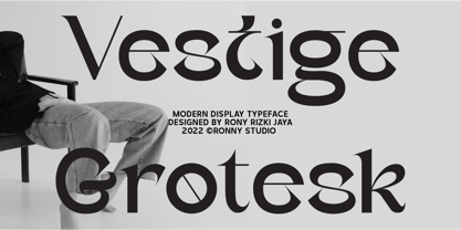 Vestige grotesk is an Modern Serif Display typeface font. This font is impressive and features a clean and elegant font, professionally shaped, and as a result, it will easily match a variety of creations that require a different touch. Add it with confidence to your projects, and you'll love the results. This typeface is perfect for elegant logos, branding, travel promotions, layout magazines, beauty products, product packaging, quotes, or simply as a stylish text overlay onto any background image. Features : - Lowercase & Uppercase - numbers and punctuation - multilingual - ligatures - alternates - PUA encoded Please contact us if you have any questions. Enjoy Crafting and thanks for supporting us! :)
 - Overseas by Hanoded,
$15.00 I traveled a lot: in the beginning on my own, later as a tour guide. I always used the English word ‘abroad’ to describe a trip to a foreign country, but I noticed that the English, Australians and New Zealanders preferred the word ‘overseas’. I then realised that they all lived on an island, so most of the foreign countries for them were across the sea. I had to think of that when I made this font! Overseas is a brush font with a certain rough elegance to it. I made it using poster paint and a brush. Use if for posters, product packaging and book covers.
 - Chronosfer by Anomali Creative,
$19.99 The concept of this font are Inspired by stories of space travel, interstellar war. social life in the galaxy. So we chose the name Chronosfer, which was said to be similar to Chromosphere. The chromosphere is the second most outer layer of the Sun. Several thousand kilometres thick, it resides above the photosphere and beneath the corona. Due to its low density, it is relatively transparent, resulting in the photosphere being regarded as the visual surface of the Sun. What Featured on this font? Glyphs count is 281 glyphs each style. Have some alternate characters International Language Support Best to use on Hi-Tech Style design Space or cosmos theme design
 - Oak Street by Three Islands Press,
$39.00 There's a little restaurant in an old house on a sidestreet in town (Rockland, Maine, USA) called Cafe Miranda. The staff is friendly, the setting intimate, and the appetizer a basket of hot bread fresh from a brick oven. Its ample menu features such entries as "Quasi-Cassoulet" and "Gentle Sole." It's among my favorite local places to dine out. But the menu got photocopied once too often, and Cindy's personable handlettering got faded and broken. So I took matters into my own hands. And here's what I delivered to the newly computerized folks at the little restaurant on Oak Street. You, too, can travel in rather heavy felt-tip style.
 - Rydhesti by Twinletter,
$14.00 Rydhesti is an enchanting and charming signature font, the beautiful and smooth curves of each letter make this font seem luxurious, clean and beautiful. not only that, this font is equipped with a flexible choice of letters to produce the right words according to your needs. Use it to add an authentic, heartfelt vibe to any design project. This font is perfect for business cards, photography studios, autographs, interior designs, model names, coffee late, travel, weddings, cosmetics, jewelry, social media posts, product packaging, watermarks, special events, or anything else. Start using this font to add an authentic and heartfelt vibe to any design project.
