10,000 search results
(0.058 seconds)
- Weroth by Twinletter,
$15.00 Weroth is a lovely, eye-catching display typeface that will keep onlookers looking at your work. This font is a lot of fun; you can use it for informal or formal occasions, and it’s still adaptable. This font is still great for perfecting any creative project, whether it’s a child, teenager, or adult theme. Don’t wait, start utilizing this font immediately. This font is perfect for games, sporting events, branding, banners, posters, movie titles, book titles, quotes, logotypes, and more. of course, your various design projects will be perfect and extraordinary if you use this font because this font is equipped with a complimentary font family, both for titles and subtitles and sentence text, start using our fonts for your amazing projects.
 - Ohanlon by Fontdation,
$18.00 Introducing our new release: Ohanlon. Ohanlon is a bold display sans with a subtle hint of reverse-contrast personality which will gives dramatic feel to your design. Packed with lots of stylistic alternate characters to let you play with various letter combinations. Go wild and experimental by combining the sans with the block or script-ish alternate letters to elevate your design game, or you can even go formal with the standard letters. Oh and also, the slanted/faux-italic version is available too. Suits best for logotype/branding, packaging design, and many other designs that need a direct punch to the face. Ohanlon is a versatile font, whether you'll go vintage or modern, this font will got your needs properly covered.
 - Portalica by Letterhend,
$19.00 Introducing our newest typeface called Portalica - A Stylish Italic Serif font. This typeface has many alternates with swashes that can make your lettering / logotype become more interesting. The clean and neat of a serif combined with the swirl swashes makes this font one of a kind! This font perfectly made to be applied especially in logo, and the other various formal forms such as invitations, labels, logos, magazines, books, greeting / wedding cards, packaging, fashion, make up, stationery, novels, labels or any type of advertising purpose. Features : uppercase & lowercase numbers and punctuation multilingual ligatures alternates swashes PUA encoded We highly recommend using a program that supports OpenType features and Glyphs panels like many of Adobe apps and Corel Draw, so you can see and access all Glyph variations.
 - Jayden Collins by Letterhend,
$14.00 Jayden Collins is the signature font that perfectly captures the beauty of a handwritten signature. With its natural feel and casual, chic style, it's the perfect choice for branding, logos, and the other various formal forms such as invitations, labels, logos, magazines, books, greeting / wedding cards, packaging, fashion, make up, stationery, novels, labels or any type of advertising purpose where a personal touch is needed. And with its two different style versions, you can create a variety of unique and eye-catching designs. Features : Uppercase & lowercase Numbers and punctuation Alternates & Ligatures Multilingual PUA encoded We highly recommend using a program that supports OpenType features and Glyphs panels like many of Adobe apps and Corel Draw, so you can see and access all Glyph variations.
 - Kevin Keyla by Bosstypestudio,
$13.00 Kevin Keyla is an cute calligraphy luxury font that comes with a very beautiful character change, a kind of classic decorative script with a modern touch, designed with high detail to present an elegant style. Kevin Keyla is attractive because the typeface is pleasing to the eye, clean, feminine, sensual, glamorous, simple and very easy to read, thanks to its many extravagant letter relationships. I also offer a decent number of stylistic alternatives for some of the letters. Classic style is very suitable to be applied in various formal forms such as invitations, labels, restaurant menus, logos, fashion, make up, stationery, novels, magazines, books, greeting/wedding cards, packaging, labels or all kinds of advertising purposes. and much more. .. Thanks & Happy Designing!
 - Codeline Mono by VP Type,
$29.00 Codeline Mono is a friendly monospaced typeface designed to appear more modern, softer and less formal than the usually robotic and strict mono fonts. Unique and highly versatile, this family includes over 400 glyphs in each of its twelve styles (six weights and six obliques). While great at all the typical mono use cases where a technical look is needed, Codeline also creates an ease of reading not commonly found in mono typefaces. This duality makes it a perfect fit for other uses in the role of a uniquely technical yet remarkably breathable display font. The character set implemented in Codeline Mono ensures full support for over 100 languages by including an extensive list of localized forms, precomposed accented letters and modifiers.
 - Gazi by Fontuma,
$24.00 Gazi is the honorary title given by the state to the commanders who defeated the enemy by showing extraordinary benefits. This title was first given to Mustafa Kemal Atatürk by the Turkish Grand National Assembly on September 19, 1921. Gazi font was designed for Mustafa Kemal Atatürk, who founded the Turkish Republic. This type face consists of two families:: ▪ Gazi: Font family with Latin alphabets ▪ Gazi Pro: Font family including Latin and Arabic alphabets The Gazi font family is ideal for those looking for a new and aesthetic serif font. This font with modern lines can be used in all broadcast and printing areas. Gazi font will meet your needs and expectations in terms of the number of glyphs and the languages it supports. The font family includes many open type features, as well as some ligatures, and many currency symbols.
 - Loxley by Canada Type,
$24.95 Drawn shortly before Jim Rimmer's passing in 2010, Loxley was designed to be used in a fine press edition of the folklore story of Robin Hood. It was named after the cited birthplace of the story's classic hero. Loxley's shapes were inspired the same early Roman faces (such as Subiaco from the late 1400s) that influenced Frederick Goudy's Aries, Franciscan and Goudry Thirty types. It exhibits the preculiarities of Jim's left-handed calligraphy, as well as his outside-the-box thinking with exit strokes and serif variations. Loxley was remastered for the latest technologies in 2013. Now it comes with a character set of over 450 glyphs, including plenty of stylistic alternates, a full compliment of f-ligatures, a Th-ligature, basic fractions, ordinals, a long s for historic setting, comprehensive class-based kerning, and extended Latin language support. 20% of this font's revenues will be donated to the Canada Type Scholarship Fund, supporting higher typography education in Canada.
 - FF Mutual by FontFont,
$50.99 FF Mutual is a friendly geometric sans serif full of subtle, unexpected details. Designer Luis Bandovas drew inspiration from an unlikely source—the credits from one of his favorite childhood shows, Space 1999—and turned that spark into a typeface that is warm and approachable, but contemporary. Bandovas built FF Mutual on a geometric skeleton, but the typeface has enough humanist touches to offset the rigidity usually found geometric designs. These touches are most apparent in the italics, where curved strokes on the “a” and “l” bring a softness to text. Generous spacing, angular details on letters like the “r” and “t,” and flared terminals on the “e,” “s,” and “c,” add further character to the design. FF Mutual’s bold shapes and retro-inspired warmth make it ideal for headlines, where the subtle details can really shine. The typeface is similarly well-suited for small blocks of text such as captions and call-outs, packaging design, and branding.
 - Spiraltwists by Aah Yes,
$0.75Spiraltwists is a family of 2 fonts giving assorted spiral shapes. In each font they're grouped in fours - the same basic spiral in 4 different orientations (N S E W almost), and Spiraltwists has solid lines making up the spirals, Spiraltwists Antique has dotted lines making up the spirals, giving them an antique or rustic appearance. Spiraltwists has heavier spirals on Upper Case, lighter spirals on lower case; plus a group of spirals with a straightened outer end and connecting lines so you get two spiral scrolls joined together by a long line at the top or bottom. (inputting UVWXYZ into the text-box on this webpage will show it). The big example on the webpage shows it all more clearly than any explanation. A fuller description, plus the above example, are included in the zipfile. Please note: for the avoidance of doubt, the font does not contain any letters, the text in these 2 examples is not Spiraltwists but Luzaine. - IL Palamede by Notope,
$25.00 IL Palamede is a typeface with just one style, referring by its name to the French chess magazine Le Palamède. Connects with chess here not only the name. Each symbol is built on a 5x5 grid with 3x3 priority. At the same time, the logic here is higher than optical compensation, so you can observe here quite dense, for example "b". Thanks to this solution, the typed text is balanced in width, and it also creates the feeling of a chess cell, where black and white cells alternate. Connects with chess here not only the name. Each symbol is built on a 5x5 grid with 3x3 priority. At the same time, the logic here is higher than optical compensation, so you can observe here quite dense, for example, "s". Thanks to this solution, the typed text is balanced in width, and it also creates the feeling of a chess cell, where black and white cells alternate. Use this font for any purpose that includes winning or enjoying.
 - Churchward Newstype by BluHead Studio,
$20.00 Originally released in 2008, Churchward Newstype is a workhorse text family, designed by the late Joseph Churchward back in the early 2000’s. If you’re familiar with Churchward’s typefaces, you might know that he always brought a little something quirky to his designs. Churchward Newstype doesn’t disappoint. The exaggerated concave serifs make a statement that is subtle, yet gives the typeface a unique flavor. The proportions and scale of the letters lend themselves to very good legibility in text applications, and the Bold weights are strong enough for headlines. Churchward Newstype is good for text copy, and headlines, and at giant point sizes, great for adding emphasis to posters! The Churchward Newstype family has four weights, Light to Bold, with 13 degree slanted italics. Each font has a second set of tabular figures. In this updated release, each weight now has an extended character set that supports most Western and Eastern European languages.
 - Black Stanky by Artisan Studio,
$18.00 Black Stanky a work that is purely a result of handwriting, has a natural characteristic. this is perfect for invitations, signatures, blogs, social media, business cards, product brands. Black Stanky has Stylistic standard, Stylistic Initial, Stylistic Teminal and ligatures. and includes uppercase and lowercase letters, numbers and punctuation marks. Accessed by using : OpenType smart programs such as Adobe Photo Shop, Adobe Illustrator, Adobe Indesign, Corel Draw and Microsoft Office. A Total of 362 Glyphs: Multilingual Support : ŠŒŸÐÀÁÂÃÄÅÆÇÈÉÊËÌÍÎÏÑÒÓÔÕÖØÙÚÛÜÝ àñáâåäãçæìíîïòóôõöøùúûüýÿèéê뢚ߞ Ligature accesed :St dd th gg pp ff wh mm of ck on we are all wr en ex ee ve oo ox ax ss so rr ot al tt ch ll rl ct ol rt at cl az 4 alternative setst accesed : a b c d e f g h i j k l m n o p q r s t u v w x y z special greetings for all, all of us all smoothly in running the routinen
 - 750 Latin Uncial by GLC,
$38.00 This font was inspired by the Latin script used in European monasteries from circa the 5th to 8th centuries, before the Carolingian “Caroline” (look at our 825 Karolus). It was a regular script, rounded, written slowly, used mainly for specially meticulous books, with a few ligatures, legible, but only with lowercase. The capitals consisted of enlarged lower cases, but here, we have preferred to use two slightly different patterns. Our lower cases are a synthesis from a lot of variants (mainly from the “First Bible” of Charles The Bald), the upper cases were mainly inspired from a 700’s manuscript from the abbey of Fécamp (France). We have adapted the font for contemporary users, differentiating between U and V, I and J, which has no relevance for ancient Latin scribes, and naturally with Thorn, Oslash, Lslash, K, W... punctuation and the usual accented characters which did not exist at the time. It can be used with 799 Insular Title.
 - Direct Mail by Partnrz,
$15.00 Direct mail designers rejoice! Finally, a font family made just for you. Created to be as in-your-face as possible: for use as a primary headline; for dates and phone numbers; and for coupon heads and price points. Tired of kerning numbers for your coupons and prices? Then you'll love this font! All of the kerning has been done for you. (No more spacey 1's!) Designed for a tight kern - just track it in on larger sizes. Instead of standard weights, this font was designed to fit different width needs. Have a long headline, but your client wants it in one line and tall? Use the extra-condensed. Need something really bold for a phone number or price point, but you don't have much height available? Use the fat. And there are two more widths for those in-betweens. And to top it off - you can get them all in an oblique as well.
 - Flumbery White by Letterhend,
$19.00 Flumbery White - Signature Script is an authentic hand writing with natural signature style. This type of font perfectly made to be applied especially in logo, and the other various formal forms such as invitations, labels, logos, magazines, books, greeting / wedding cards, packaging, fashion, make up, stationery, novels, labels or any type of advertising purpose. Features : uppercase & lowercase numbers and punctuation multilingual alternates and ligatures swashes PUA encoded We highly recommend using a program that supports OpenType features and Glyphs panels like many of Adobe apps and Corel Draw, so you can see and access all Glyph variations.
 - Lacoste Celtic by Ronny Studio,
$19.00 Introducing, Lacoste Celtic, A sophisticated ligature serif from us. This typeface has been made carefully to make sure its premium quality and luxury feel. The ligatures makes this typeface unique and stands out rather than the regular serif font, very suitable for logo, headline, tittle, and the other various formal forms such as invitations, labels, logos, magazines, books, greeting / wedding cards, packaging, fashion, make up, stationery, novels, labels or any type of advertising purpose. Features : - Lowercase & Uppercase - numbers and punctuation - multilingual - ligatures - alternates - PUA encoded Please contact us if you have any questions. Enjoy Crafting and thanks for supporting us! :) Thank you
 - Aromatic Dream by Letterhend,
$17.00 Introducing, Aromatic Dream- Astylish font with chic & classic looks. This typeface has been made carefully to make sure its premium quality and luxury feel. Very suitable for logo, headline, tittle, and the other various formal forms such as invitations, labels, logos, magazines, books, greeting / wedding cards, packaging, fashion, make up, stationery, novels, labels or any type of advertising purpose. Features : Regular & Slanted Uppercase & lowercase Numbers and punctuation Multilingual PUA encoded We highly recommend using a program that supports OpenType features and Glyphs panels like many of Adobe apps and Corel Draw, so you can see and access all Glyph variations.
 - Fresh Script by TRF,
$15.00 Fresh Script is a handwritten calligraphy font, free flowing, casual and with an elegant touch. This modern style font is perfect to be applied in various formal forms such as invitations, labels, restaurant menus, logos, fashion, make up, stationery, novels, magazines, books, greeting / wedding cards, packaging, labels or any type of advertising purpose. Fresh Script has 385 glyphs and 190 alternative characters, including various language support. With OpenType features with alternative styles and elegant ligatures. The OpenType feature does not work automatically, but you can access it manually and for the best results needed for your creativity in combining this Glyph variation.
 - Pompano by Letterhend,
$17.00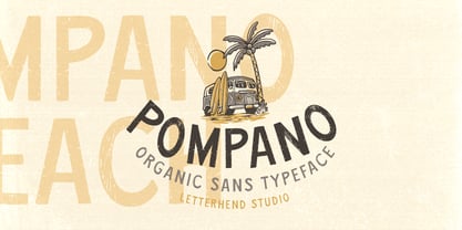 Pompano is an organic sans serif typeface which is purposely made for headline, display or logotype.This type of font perfectly made to be applied especially in logo, and the other various formal forms such as invitations, labels, logos, magazines, books, greeting / wedding cards, packaging, fashion, make up, stationery, novels, labels or any type of advertising purpose. Features : regular & stamp version uppercase & lowercase numbers and punctuation multilingual alternates & ligatures PUA encoded We highly recommend using a program that supports OpenType features and Glyphs panels like many of Adobe apps and Corel Draw, so you can see and access all Glyph variations.
 - Baverley Astone by Letterhend,
$19.00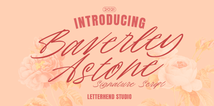 Introducing, Baverley Astone Signature Script - an authentic hand writing with natural signature style. This type of font perfectly made to be applied especially in logo, and the other various formal forms such as invitations, labels, logos, magazines, books, greeting / wedding cards, packaging, fashion, make up, stationery, novels, labels or any type of advertising purpose. Features : uppercase & lowercase numbers and punctuation multilingual alternates and ligatures swashes PUA encoded We highly recommend using a program that supports OpenType features and Glyphs panels like many of Adobe apps and Corel Draw, so you can see and access all Glyph variations.
 - Mildistance by Letterhend,
$17.00 Introducing, Mildistance Script - an old and classic style script font. The look of the font will give you nostalgic feel, very suitable for old school theme design and the other various formal forms such as invitations, labels, logos, magazines, books, greeting / wedding cards, packaging, fashion, make up, stationery, novels, labels or any type of advertising purpose. Features : uppercase & lowercase numbers and punctuation multilingual alternates and ligatures swashes PUA encoded We highly recommend using a program that supports OpenType features and Glyphs panels like many of Adobe apps and Corel Draw, so you can see and access all Glyph variations.
 - Agetta Display by Dora Typefoundry,
$20.00 Introducing Agetta Display is a bold vintage-style serif font with strong confidence. bold is inspired by something simple, elegant, usable and versatile. This serif typeface that looks amazing in both large and small settings is perfect for your design needs but still clean and elegant to apply to various other formal forms such as invitations, labels, logos, magazines, books, greeting/wedding cards, packaging. , fashion, make up, stationery, novel, label or any kind of advertising purposes. Font Features: Agetta Display Feature : Uppercase & Lowercase Alternative Style Standard Ligature Numbers & Punctuation (OpenType Standard) Accents (Multilingual characters) PUA encoded Support Multilingual Language Thank you.
 - Ardina Title by DSType,
$50.00 Ardina was designed for the Portuguese newspaper Jornal de Notícias. Right after the exclusivity period, we decided it was a wonderful addition to our type library, therefore we redesigned it and included an extended set of characters. Ardina is a soft and warm news typeface, with five weights and matching italics, three grades (Display, Title, and Text), and slightly narrow proportions but with a very nice x-height. It’s the right typeface for a serious newspaper that intends to achieve a very contemporary feeling.
 - Ardina Display by DSType,
$50.00 Ardina was designed for the Portuguese newspaper Jornal de Notícias. Right after the exclusivity period, we decided it was a wonderful addition to our type library, therefore we redesigned it and included an extended set of characters. Ardina is a soft and warm news typeface, with five weights and matching italics, three grades (Display, Title, and Text), and slightly narrow proportions but with a very nice x-height. It’s the right typeface for a serious newspaper that intends to achieve a very contemporary feeling.
 - Ardina Text by DSType,
$50.00 Ardina was designed for the Portuguese newspaper Jornal de Notícias. Right after the exclusivity period, we decided it was a wonderful addition to our type library, therefore we redesigned it and included an extended set of characters. Ardina is a soft and warm news typeface, with five weights and matching italics, three grades (Display, Title, and Text), and slightly narrow proportions but with a very nice x-height. It’s the right typeface for a serious newspaper that intends to achieve a very contemporary feeling.
 - Hua by YXType,
$14.99 Hua type family is a sans-serif with very humanist details to represent the essence of nature. It features 14 weights from the very thin to the very bold, generously covering a wide range of the natural spectrum. Aiming to represent the soft and elegant side of nature, Hua features very unique italics that have their own take on the identity. The letterforms of the italic fonts are inspired by the lineage of both traditional calligraphic approaches for serifs and much simpler forms for sans-serifs. Hua provides very crisp performances on screens and its large x-height combined with fine-tuned proportions help it retain legibility very well on smaller sizes. Features: • Support for 200+ Latin languages • Double & single storie “a” & “g” • Unique italic letterforms • Low contrast with unique details • Small caps with symbols • Arbitrary and defined fractions • Support for superscript & subscript in normal & scientific alignments • Proportional lining, proportional old-style, tabular lining, tabular old-style
 - Lhont Down by Alit Design,
$15.00 Introducing Lhont Down Typeface The Lhont Down font is designed with a serif font concept that has a decorative display style. Irregular dynamic shapes but impressively bold and unique make the font "Lhont Down" different and steal attention. The "Lhont Down" font has 2 font styles, namely decorative ones with irregular shapes with standard or normal font styles. Can be combined so that the designed design has a different rhythm. The lhon Down font is perfect for serious or non-serious design concepts, also suitable for classic retro designs, fashion, pop designs and so on. Serif typefaces such as "Lhont Down" are very easy to apply to any design, especially those with an retro and classic concept, besides that this font is very easy to use both in design and non-design programs because everything changes and glyphs are supported by Unicode (PUA). The "Lhont Down"contains 692 glyphs with many unique and interesting alternative options.
 - Cadmium by AVP,
$- Cadmium has a comprehensive latin character set and many Opentype features to enhance text, including small capitals, case-sensitive forms, superscript and subscript. Plenty of numeral variants include old-style figures, lining figures and fractions. Default numerals are proportionally spaced. Alternative styles for a handful of key characters provide some useful variations where stylistic sets can be implemented. The fonts are presented as four width-based sub-families: Expanded, Normal, Condensed and Compressed. Each width has a matching range of six weights and italics (obliques). Regular and Bold weights are style-linked, together with their respective oblique forms. Each width differs in its basic construction but all fonts share the same vertical metrics and may be used in combination with each other. Letter spacing is optimised for text sizes but is tolerant of significant tracking changes. Cadmium is good for signage, publicity and packaging, screen credits and titling, general print and publication, as well as web and screen applications.
 - Dez Now Sans by Dezcom,
$28.00 Dez Now Sans is a humanistic typeface family that was begun in 2005 by Chris Lozos of Dezcom. Since then, it has been nurtured, revised, and expanded to include 12 weights in both upright roman and true italics totaling 24 variations. This allows the user to choose the weights which best work for type-size, output device, and reproduction process. There is often a difference of opinion on what the best weight to use for normal text when setting type. The truth is, there is more than one answer. When you consider the size, weight, leading and set width—along with paper and ink specifications, you may find the need for several. The subject matter of the text with the specifics of the target audience, also increase the demand for expanding choices. Dez Now Sans was designed with several potential text weights to address any circumstance. Dez Now Sans gives you a full and varied toolbox of fonts to choose from.
 - Fallujah by Arabetics,
$39.00 A typeface design with extra isolated scattered letters and random careless look. It has six members, normal, bold, and medium, all of which come in two styles, regular and left-slanted italic styles. This font family design follows the guidelines of Mutamathil Taqlidi type style with one glyph for every basic Arabic Unicode character or letter, as defined by the Unicode Standards, and one additional final form glyph, for the freely-connecting letters in traditional Arabic cursive text. Fallujah employs variable x-height values. It includes only the Lam-Alif ligatures. Soft-vowel diacritic marks, harakat, are selectively positioned. Most of them appear by default on the same level, following a letter, to ensure that they would not interfere visually with letters. Tatweel is a zero-width glyph. Keying the tatweel key before Alif-Lam-Lam-Ha will display the Allah ligature. Fallujah includes both Arabic and Arabic-Indic numerals, in addition to standard punctuations.
 - Mifelin by Nathatype,
$29.00 Mifelin is a well-defined serif font. Serifs are small ornaments that appear at the ends of the lines of letters, giving them a neater, more structured appearance. The well-defined serifs in this font create an elegant and professional impression. This serif font has a balanced and harmonious proportion of height and width. The proportions ensure that each letter looks proportional and easy to read. The line of letters in this font has a smoothness and clarity that distinguishes each character. Sharp, clear lines give off a professional and organized impression. This clarity also helps strengthen the legibility of the font in a variety of design settings. This serif font with an elegant look has a classic style that remains relevant in modern designs. Despite having strong roots in traditional typographic design, this font is able to adapt to more contemporary design contexts and give it a touch of elegance and class. Even though it has a touch of elegance, this serif font still prioritizes good readability. Each letter is carefully designed to ensure that the text remains easy to read and understand for the reader. Prominent readability is the hallmark of this font. Enjoy the various features available in this font. Features: Stylistic Sets Ligatures Multilingual Supports PUA Encoded Numerals and Punctuations Mifelin is suitable for any designs that require a formal and official impression. This font is can be used in the design of books, magazines, reports, formal invitations, brand identities, and other design projects that require elegance and professionalism. Find out more ways to use this font by taking a look at the font preview. Thanks for purchasing our fonts. Hopefully, you have a great time using our font. Feel free to contact us anytime for further information or when you have trouble with the font. Thanks a lot and happy designing.
 - Apres RE by Font Bureau,
$40.00 Apres is a clear and comfortable typeface from David Berlow, originally designed for the Palm Pre smart phone. This humanist geometric design projects a friendly and forthright familiarity, without being static or mechanical. This version of the family is part of the Reading Edge series of fonts specifically designed for small text onscreen, having been adjusted to provide more generous proportions and roomier spacing, and having been hinted in TrueType for optimal rendering in low resolution environments.
 - Ruling Script by Linotype,
$29.99Prof. G. Pott’s Ruling Script first appeared in 1992 with Linotype-Hell. The font is a part of the package Calligraphie for Print, which also contains Sho and Wiesbaden Swing. Calligraphie for Print 2 completes the set. These packages offer modern calligraphy fonts particularly well-suited to use in posters, magazines and advertisements. Ruling Script looks like the zestful handwriting of a calligrapher but its legibility even in longer sentences set it apart from others of its type. - Cortland JNL by Jeff Levine,
$29.00Cortland JNL was modeled [in part] from lettering spotted in the opening credits of Columbia Pictures 1945 Batman® serial. The classic clean lines of the Art Deco lettering used were perfect for translating into digital format. - Compass TRF by TipografiaRamis,
$29.00 Compass TRF is a reevaluation of an existing Compass typeface dated 2002. Compass is a geometric contrast serif typeface - "contemporary Didone". New Compass consists of four styles—regular, italic, alternate and flourish initials with small caps. Compass TRF is recommended for use as display typeface. It is suggested that flourish initials font to be used for decorative purpose only, not basic typesetting. Compass TRF generated as OpenType single master format with Western CP1252 character set.
 - Rito by Wilton Foundry,
$19.00 Rito Regular and Italic is a clean, crisp and modern monospaced font ready to make your work shine. Its distinctive ink-trap inspired chiseled glyphs create a unique flavor that is more pronounced in the italics. Rito is not your typical monospaced boring font - from the outset the goal was to develop an exuberant, dynamic and contemporary mono-spaced font. Ideal for coding, writing and has plenty of attitude to stretch into display formats!
 - Calling Code by Dharma Type,
$- Calling Code — very nice monospaced font — 1. is a monospaced font family for coding and tabular layout. 2. simply consists of 4 style, Regular, Italic, Bold and Bold Italic. 3. is ready in both OpenType and TrueType formats. 4. has slightly condensed width for more useful space. 5. has good distinguishability and legibility and cute curly tails. 6. brings a fresh sensitivity to boring old existing monospaced fonts. You can try Regular style for free.
 - Easysans by Gassstype,
$23.00 Introducing Easysans is a All Caps Handmade Sans Serif Font,Textured Sans Serif Font that is written casually and quickly. Letters are made with brushes on Procreate. Then crafted carefully drawn into vector format. That is why Easysans has charming, authentic and relaxed characteristic more natural look to your text with a more natural look to your text,design more interesting. Easysans is perfect for homeware designs,branding projects, Logo design, Quotes product packaging
 - Berani by Gassstype,
$25.00 Hello Everyone, Introduce our new collection BERANI is a Strong Display Font that is written casually and quickly. Letters are made with brushes on Procreate. Then crafted carefully drawn into vector format. That is why BERANI has charming, authentic and relaxed characteristic more natural look to your text with a more natural look to your text. design more interesting. BERANI is perfect for homeware designs,branding projects, Logo design, Quotes product packaging.