1,346 search results
(0.009 seconds)
- The Smell After Rain by Tlatous Type,
$19.00 Introducing The Smell After Rain by Tlatous Type. The smell after rain is a Modern Handwritten Font. this font is perfect for product packaging, branding project, megazine, social media, wedding, or just used to express words above the background.
 - Dancing In The Rain by Pen Culture,
$14.00 Proudly present "Dancing In The Rain" Dancing in the rain is a simply nostalgic font that will always remind us of the 80s and 90s. This font has a smooth curve in both the regular and italic versions. This font can be used for both headlines and body text. you can also apply it for various other needs such as fashion, skincare, and much more. This font is has full of uppercase and lowercase letter, number, punctuation. This font also has multilingual support and of course it is PUA Encoded. I really hope you enjoy it – please do let me know what you think, comments & likes are always hugely welcomed and appreciated. More importantly, please don’t hesitate to drop me a message if you have any issues or queries. Thank you
 - A Year Without Rain by Kimberly Geswein,
$5.00 The handwriting of a teen girl- bubbly, round, legible, and cute.
 - Before The Rain Arabic by Mans Greback,
$59.00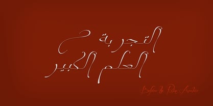
- Foot Print by Bureau Bunk,
$14.95 While Walking along the shore of our Main Port to Europe in Rotterdam, The Netherlands, my 14 year old son Jules first hardly dared to step in the mud for he was wearing his brand new sneakers. Concentrating in where he put his feet, he noticed he made a character! The FootPrint-Regular was born! The FootPrint-Regular is a powerful header-typeface, but funny enough it's usable as small copy too! Blaze your Trail! Anything you can imagine on Police investigations, Bloodhound Thrillers, Trails, Tracks and Traces, anything about Outdoor Stores, Tracking or even maybe Pedestrian Clubs, or things like Survival Sports, Walking Events or Hiking Gear; Blaze'm your FootPrint-Regular Trail on all Banners, Blimps, Ads and Doormats!
 - Set Fire to the Rain - Personal use only

- Set Fire To The Rain by Kimberly Geswein,
$5.00 This font was drawn with a round marker and is very bubbly and girly.
 - Perdido by Scriptorium,
$12.00Perdido is a classic western-style font, with the added twist of the addition of a degenerated wood grain, so that the characters naturally look like aged and cracking wood. With the addition of an appropriate texture it's very convincing. - Merry Melody by Comicraft,
$19.00 Sufferin' Succotash, was that five minutes already?! Seemed to us like that lunatic cartoon went by faster than a roadrunner being pursued by a wily coyote or a hare brained bunny dodging short sighted hunters during wabbit season. Adorn your favorite duck, pig, cat, tweeting bird or skunk with the warming strains of our merry melody font or it'll be all over for all you folks.
 - Railham by OhType!,
$25.00 RAILHAM is a slab typeface with more than 330 glyphs including uppercase, lowercase, numbers, small caps, accents, punctuation, currencies, etc. Inspired by the tracks of a railroad, with stems that narrow at the top, Railham typeface, like a train looks to the future without forgetting the fundamentals of a long road, detaining in the detail of every element to form a strong, fast and versatile family. Retaking and uniting essential concepts of typography, rounded serifs with especially wide base, forms and counterblocks that complement together, RailHam typeface neatly adapts to any topic, besides being practical and readily legible in small and large formats, joining a select list of modern slab serif fonts.
 - Tipperary eText by Monotype,
$57.99Tipperary was designed by Steve Matteson and named for a favorite 'single track' bike trail, Tipperary is a monoline Humanist Sans Serif typeface. The clear, open, letter forms curve abruptly in an almost squarish geometry much like the sharp turns on the Tipperary trail. The clear, austere forms offer exceptional legibility for both interface designs and extended reading. Small size package labels and crisp branding programs benefit from Tipperary's emphasis on clean, readable design. eText typefaces are designed to meet the challenges of extended reading in digital environments such as mobile devices or desktop screens. Their forerunners are among the world's most popular and important book typefaces for print media. These classic designs were reinterpreted to conform to technological constraints of LCD and e-Paper while retaining the properties of proportion and form which made them favorites for print. - Generation Gothic by ABC Types,
$45.00In the United Kingdom, Virgin Trains uses various weights of Generation Gothic extensively. - Wooden Log - Personal use only

- Facility Signage JNL by Jeff Levine,
$29.00 A famous 1971 photo shows boxing champ Muhammad Ali making faces through a window at Joe Frazier at the challenger’s training facility. A small sign sits in the window that says “Joe Frazier Training Headquarters” and is lettered in a simple sans serif condensed typeface. This is now available as Facility Signage JNL in both regular and oblique versions.
 - Florabet - Unknown license

- Deltoid - Unknown license

- Potomac by Context,
$15.00 A hearty utilitarian face inspired by stenciled type found on train cars and shipping crates. Ideal for posters, headlines, and titling.
 - SubwayTicker by K-Type,
$20.00Subway Ticker is based on a 5x7 grid, electronic display observed on a New York subway train in February 2005 en route to Coney Island. - Fidusmager by PizzaDude.dk,
$17.00 This is definitely a font suitable for kids toys. The letters are legible, and at the same time totally wacky! Kinda like what a kids toy should be! Fidusmager started out as a handdrawn, slightly rugged looking fon. However I ended up manually tracing each letter in order to have those smooth lines. By the way, Fidusmager is danish and actually means someone who’ll trick you - but as a kid I didn’t know that, and found that it most likely was something positive! :)
 - Seria Pro by Martin Majoor,
$49.00 The multi award-winning Seria (1996) is Martin Majoor’s second comprehensive typeface family and the successor to his popular text letter Scala. Seria explores the proportions of classical text typefaces. Its degree of sophistication is perfect to be used for poetry and other refined literature, its eye-catching details however makes Seria also suitable as a display typeface. The first sketches for Seria emerged in the summer of 1996 on the train from Berlin to Warsaw, to be precise, on July 25 – the date Majoor noted on the napkins of the train’s on-board restaurant, which he used for lack of suitable drawing paper. The italics are almost upright which contributes much to Seria’s delicately proportioned appearance. The Seria family consists of Seria Serif and Seria Sans. Combining the two creates countless possibilities of expression.
 - ForTheBirds by Ingrimayne Type,
$14.95 In For The Birds, the letters are made by bird feet or bird tracks.
 - Arts And Crafts-GS by Bannigan Artworks,
$19.95The Arts And Crafts-GS font is loosely inspired by the lettering of Charles Rennie Mackintosh (1868 - 1928) of the Glasgow School, from which Jessie receive her training. - Ares by Adam Jagosz,
$15.00 Ares is a crisp all-caps display typeface suitable for sci-fi logos and titles. It owes its peculiar futuristic vibe to angular, top-heavy letters that hang from the cap-height instead of sitting on the baseline. The typeface consists of six subfamilies available in 10 weights, as well as as two variable fonts of three axes: Weight [wght], ranging from 1 to 1000, Mid-height [MHGT], ranginf from 0 to 1000, Tracking [TRAK], ranging from 0 to -40. The mid-height axis affects the typeface's waistline, including crossbars, and divides the fonts into three subfamilies: Ares Lo, Ares, and Ares Hi. These three families are solid-stroked, and the other three families are their stencil-stylized counterparts: Ares Broken Hi, Ares Broken, and Ares Broken Lo. The tracking axis is only available in the variable versions, and proportionally affects the kerning, thus helping set the type more tightly without effort. Ares supports a wide range of Latin-based orthographies, including not only European, but also Vietnamese as well as major African languages like Hausa, Fula or Ewe.
 - Sassoon Patterns by Sassoon-Williams,
$48.00 Many children start school with their hands not ready and trained to produce the precise strokes required for forming letters and starting to write. Pattern is essential preparation. It is fun for children, building their confidence as well as training their muscles for the task. Each font has normal letters and pattern characters. Free to download resources: How to access Stylistic Sets of alternative letters in these fonts Purchasers of this font package may use their Order Number to receive a free Copybook PDF by Rosemary Sassoon recommended for effective teaching
 - Deviant Plain by TypeArt Foundry,
$45.00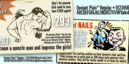 Clean companion included with Deviant Strain.
 - Interzone by MYSTERIAN,
$9.00 This type crept up the sense that it was made in Eastern Europe by poorly trained urbanites from a crippled nation, or that it is the remains of a contemporary gothic (like Eckmann) stencil. The choice of what this type signifies is up to the public. Lately I like the idea of 'putting on' (in McLuhan's sense) a genre of idea that is somewhat different from my tradition's beliefs, and fitting a core category of that toward a teleological/eschatological advantage. Therefore postmodernist/apocalyptic carelessness (which I may 'put on' by using this type) is how I abstain from the cravings of immortality, or more so that wanting it is pointless. It’s stands as memento morí; that I will have to die someday. I have to become less, He must become more. Of course, Interzone may signify a classic Joy Division track from Unknown Pleasures as well as the Cold Warish ongoings of conflicted eastern European life. I considered naming this Lunik 9.
 - Trainbridge by Curvature Creations,
$10.00 My font Trainbridge is created by Power Point shapes, Block Arc and flowchart. It resembles a train and bridge, which gives it a unique look that will be eye catching and out standing.
 - Station by Kimmy Design,
$15.00 Station is a bold headline typeface inspired by old Train Station type and graphics. It can be used in a modern and retro way, and its different patterns and styles give a unique look to any design.
 - Film Title JNL by Jeff Levine,
$29.00 A World War II training film had its opening title card “First Aid” hand lettered in a casual, Art Deco sans serif design. This is now available digitally as Film Title JNL, in both regular and oblique versions.
 - Pullman by Scriptorium,
$18.00Pullman is based on turn-of-the-century lettering reminiscent of the signage on some luxury Pullman-style train cars of that period. It is a heavy script font with a lot of character and an authoritative, elegant look. - Music To My Eyes by Comicraft,
$19.00 This singsong font is Chock Full o’Notes to help semibreviate your lettering with melodic minims, quarter notes and quavers! NOTE, however that we cannot take responsibility for any arrangement that my seem out of tune to the trained eye.
 - Screener by Canada Type,
$25.00Game over. Insert coin to continue. 1 coin, 1 play. Credits 00. Screener is the latest child of arcade alphabets. Not too trendy, not too retro, not too stand-out, yet clear and fresh. Although it boasts plenty of the traits of its origins (early screen technologies), it manages to maintain a balance between the elements of its 1980s origins and the mechanical yet transparent late 20th century techno/pop design. Precise and geometric, solid and strong, Screener looks great on screen as well as in print, in tracked small sizes as well as in teaser headlines. Screener comes in two widths and weights, with italics, and extra sets of symbols and numerals (enclosed, fractions, superiors, inferiors, etc.), as well as two weights of small caps. Screener is available in separate packages, or in a value package that contains all twelve fonts. - WolfsRain - Unknown license

- Subway Ticker - Unknown license

- Public Transportation JNL by Jeff Levine,
$29.00On the sides of freight cars, passenger trains, trolleys, buses and cable cars was once found identifying letters and numbers with a bold, yet quaint hand-painted look. Public Transportation JNL emulates the old-style look of those bygone years. - Lara by Efe Avcı,
$19.00 Design-wise, it is an elegant, fine-grained font. There are 218 glyphs.
 - Inverness by Red Rooster Collection,
$45.00 In the 1930s, it was popular to take day-trips by train to the seaside in the British Isles. Many posters were designed by the various regions to advertise these excursions; it is from one of these posters that Inverness was created.
 - Federal Streamliner by Greater Albion Typefounders,
$9.95 Federal Streamliner was inspired by lettering seen on the side of a 1950s/60s era train. It speaks of the designs of the 'streamline' era and is ideal for retro projects invoking the 30s, 50s or 60s needing a simple distinctive display face.
 - Segmenta by Librito.de,
$15.00Segmenta, a sans serif typeface developed from the gridbased type of the Hamburg S-Bahn (metro). The type is originally used for diplaying informations about the trains. The typeface contains all accents and special letters for extended latin and the baltic languages. - Word From Radio by Dharma Type,
$14.99 Based on retro vinyl records in the middle of 20th century. the mixture of funky, hippie and mid-century’s futuristics. There are three other fonts designed by in the same concept. -African Elephant Trunk -Moon Star Soul -Rebel Train Goes -Word From Radio


