7,491 search results
(0.022 seconds)
- Trigar by Maulana Creative,
$13.00 Trigar is an all caps font. With 2 style stroke, fun character. To give you an extra creative work. Trigar font support multilingual more than 100+ language. This font is good for logo design, Social media, Movie Titles, Books Titles, a short text even a long text letter and good for your secondary text font with script or handwriting. Make a stunning work with Trigar font. Cheers, Maulana Creative
 - Kticha by Typink,
$11.00 Excellent futuristic font with pretty rounded angles will fit any title or heading. It supports more than 20 European languages. This font is unique for it's elegant and thin letters. Font's idea came to the designer in the late autumn when tender yellow leaves fell to his hands. The combination of straight lines and bows had sparked a thought about the font, that could be used as awesome decoration.
 - Federico Handwriting by SoftMaker,
$15.99 Digitized handwriting fonts are a perfect way to give documents the “very special touch”. Invitations look simply better when handwritten than when printed in bland Arial or Times New Roman. Short handwritten notes look authentic and appealing. There are numerous occasions where handwritten text makes a better impression. Federico Handwriting is a beautiful typeface that mimics true handwriting closely. Use Federico Handwriting to create stunningly beautiful designs easily.
 - Drunken Tower by PizzaDude.dk,
$20.00 Drunken Tower may look like a bit like my a Drunken Hour and Drunken Shower fonts. But there are a lot differences! This font is way more distorted and rugged than its brothers! The font has got Ligatures for double upper- and lowercase and numbers as well. Plus, an alternate version for each letter - again, both upper- and lowercase! You will need to use OpenType supporting applications to use the autoligatures.
 - Pablo Handwriting by SoftMaker,
$15.99 Digitized handwriting fonts are a perfect way to give documents the “very special touch”. Invitations look simply better when handwritten than when printed in bland Arial or Times New Roman. Short handwritten notes look authentic and appealing. There are numerous occasions where handwritten text makes a better impression. “Pablo Handwriting” is a beautiful typeface that mimics true handwriting closely. Use Pablo Handwriting to create stunningly beautiful designs easily.
 - Phil Handwriting by SoftMaker,
$15.99 Digitized handwriting fonts are a perfect way to give documents the “very special touch”. Invitations look simply better when handwritten than when printed in bland Arial or Times New Roman. Short handwritten notes look authentic and appealing. There are numerous occasions where handwritten text makes a better impression. Phil Handwriting is a beautiful typeface that mimics true handwriting closely. Use Phil Handwriting to create stunningly beautiful designs easily.
 - Gambado by Shinntype,
$39.00 ‘Bounced’ is the technical (!) term for a higgledy-piggledy style of lettering in which characters are shaken up by a combination of rotation and vertical displacement from the presumed norm of upright stance on a baseline. Now, by utilizing pseudo-random contextuality in the OpenType format, Nick Shinn has created complex, default bouncing automatically through the agency of a font, rather than letter-by-letter manual adjustments at the layout level.
 - Piano Keys by Funk King,
$10.00 Piano Keys is a musically-inspired font. It can be used for commercial as well as educational projects. In other versions, I tried to accurately replicate the pattern of black and white keys across the character set. Of course when used, the randomness of text and characters often produced less than realistic results when needed. This version allows black and white keys to be accurately arranged, if desired.
 - Natalya by insigne,
$24.99 Natalya is a flashy and rhythmic script. The script has more space between characters than most for better legibility, and the basis point for the ornate swirls is the golden ratio. This makes for an especially harmonious typeface with timeless appeal. The typeface includes three alternates with variations of the ascenders and descenders. All three fonts include OpenType ligatures, oldstyle figures and ending swashes for an even more elaborate appearance.
 - Frogurt by Missy Meyer,
$14.00 Frogurt is a soft, plump, rounded slab serif font full of fun! Its fat curves make me think of frozen yogurt, and I've always preferred the shorthand "frogurt" to "fro-yo." I was inspired by a 30-year-old hand-carved wooden sign; when I went to try to find a font with a similar look, I couldn't really find anything soft and funky enough! It was a real Goldilocks situation: that one was too thin, that one's corners were too sharp, that one's baseline was too strict. So since I couldn't find something I liked, I made something I liked! I gave Frogurt big pillowy slab serifs, a slightly irregular baseline, and just enough tilt and variation to be fun while still keeping things really clean and readable. The outlines are cleaned up and sharp, so Frogurt will work well for both printing and cutting. Frogurt clocks in with just over 570 glyphs total, including all of the basics (A-Z, a-z, 0-9, and a ton of punctuation), plus over 310 extended Latin characters for language support, and over 50 alternates and ligatures to add some variety and flair. Frogurt is PUA-encoded for easy access to all characters.
 - Jazm by Arabetics,
$34.00 Jazm is an Arabetic typeface design with connected glyphs. Jazm was the earliest, pre-Islamic, script style of the modern Arabic script, before branching into Kufi and Naskh styles. The initial script had a lot less, position-dependent shapes and ligatures, and was not strictly connected. It occasionally included minuscule dots to distinguish identical shapes. This font family design is a modern visualization by the designer of the historical Jazm letter shapes following the guidelines of the Mutamathil Taqlidi type style with one glyph for every basic Arabic Unicode character or letter, as defined in Unicode Standards, and one additional final form glyph for each Arabic letter that can connect with other letters from both sides in traditional cursive Arabic strings. Jazm employs variable x-height values. It includes all required Lam-Alif ligatures and selected marks. Tatweel (or Kashida) glyph is a zero width space. Keying it before any glyph will display that glyph isolated form, if desired. Keying Tatweel before Alif Lam Lam Ha will display the Allah ligature. Jazm typeface family includes both Arabic and Arabic-Indic numerals; all required diacritic marks, in addition to Standard English keyboard punctuations and major currency symbols. Jazm is available in regular, bold, black, and corresponding italic (slated to the left) styles.
 - Saral Devanagari by Linotype,
$187.99Saral, meaning simple in Hindi, is a monolinear design supporting most Devanagari based languages. Derived from the older Linotype typeface Rohini, it has been greatly expanded into three weights and a wide character set. Saral Light, Regular, and Bold are made to coordinate with the respective weights of Helvetica. This design works well in many environments, such as corporate designs, advertising, packaging, signage, and especially for bi-lingual texts. The OpenType font format accommodates hundreds of pre-composed conjuncts, accurate placement of vowel signs, and supports varying length matras. Saral's Unicode encoding guarantees your text is rendered correctly and is compatible across different software and computer platforms. Please note that due to current operating system and application limitations the OpenType features in complex scripts such as Davanagari are not universally supported. Saral is designed to be rendered correctly in Microsoft Word on Windows running the latest version of Uniscribe. If using a Mac or Adobe products such as InDesign then many features may not function as expected. This is including glyph reordering, substitutions, and mark positioning. In the case of small passages of text, alternate input methods can be employed. Apple's character palette and Adobe's glyph palettes are two readily available options that can be used to manually insert glyphs as needed." - Carlton by ITC,
$29.99Carlton is based on a typeface designed by Prof. F. H. Ehmcke. In 1908, Ehmcke released his Ehmcke-Antiqua design through the Flinsch typefoundry in Germany. Ehmcke-Antiqua was later distributed by the Bauer typefoundry in Frankfurt am Main. The Caslon Letter Foundry in England discovered the design and released their own typeface based upon the model, which they named Carlton. Carlton entered the Stephenson Blake program after they acquired the Caslon Letter Foundry in the late 1930s. As hot and cold metal typesetting became outdated technologies, Carlton and Ehmcke-Antiqua fell out of general use. In the 1990s, Letraset revived this classic design, distributing it under its English name, Carlton. Carlton's clean and generous capitals, as well as its understated yet detailed lower case, have found popularity again in recent years. The elegance of Carlton is best used for displays with large letter and word spacing. Carlton shows all of the hallmarks of a delicate serif typeface design; its forms capture a distinct moment that was common within Central European type design during the first third of the 20th Century. Carlton is similar to several other expressive typefaces from the early 1900s, including Bernhard Modern, Koch Antiqua, Locarno, and Nicolas Cochin." - Artisinal by Stiggy & Sands,
$24.00 Artisinal, not to be confused with the term artisanal, is our revival of the Art Deco typeface known as Cubist Bold, by John W. Zimmerman for Barnhardt Bros. & Spindler in 1929, breathes new life into a classic. The original metal cast typeface was designed without a lowercase, as well as some wedge serif capitals made for not always perfect pairings. We've created a lowercase that blends well with the original design to give the typeface more usability. We've also created a fully sans version of the capitals as the default set, and moved the original wedge serif capital styles to a contextual alternates feature. And we created a few stylistic alternates for lowercase characters like the u and y and their accented styles. See the 5th graphic for a comprehensive character map preview. Opentype features include: - Full set of Inferiors and Superiors for limitless fractions. - A Standard lining figure set. - A collection of basic f Ligatures. - Stylistic Alternates for variations of several characters such as u and y. - Contextual Alternates for the original wedge variations of capitals that will mix in where appropriate. Approx. 450 Character Glyph Set: Artisinal comes with a glyph set that includes standard & punctuation, international language support, and additional features
 - Bjorn by Monotype,
$50.99 Meet Bjorn. A super usable, digital-device ready type design, refreshingly unburdened by today’s pre-conceived notions of ‘digital neutrality’. This is a typeface driven by the notion that today’s ‘digital’ shouldn’t automatically mean the devolution of typographic personality, Bjorn brings a softer-side to the idea of pixel perfect brand comms. Solid digital typography can also convey a warm tone of voice, radiate a softness, a human emotive charm whilst still maintaining all of the functional on-screen requirements of crisp easy reading fonts across viewports. Bjorn is a distinctive type design that combines a unique blend of flattened round stems (to take the edge-off), levelled inner terminals (pixel friendly) and pointed ears and feet (creating an distinct rhythm and dynamic with bowled letters). Bjorn is not a typeface following a tried and tested pattern, it’s a typeface designed to make digital brands feel special, enabling speech in a voice that brings viewers closer to their words. Bjorn is warm, yet clinical, flat and curved, elliptical and pointy. The font’s strong sense of ‘straightness’, the letter proportions and features build up its versatility across digital environments, not too wide, not too narrow, not too pointy, not too round — just right. Bjorn is available in 4 Roman styles — Light, Regular, Medium and Bold.
 - Promenade by Jen Wagner Co.,
$17.00 Introducing Promenade – a calligraphic serif that started on paper with a flat nib pen (see the 6th image), and blossomed into a full serif with italics. At its core, this font is just... beautiful. It's elegant, it's crisp, it's delicate, but can still hold its own. As I was creating the graphics, I just couldn't get over the flow of the letters – especially the italic. It's got class, but also isn't afraid to rock a pair of Doc Marten's. Funny enough, Jen from Tonic (they make beautiful websites) saw a preview of this font and said, "I'd take that font to prom." Which of course spurred a conversation about how this font would take a Mercedes G-Series instead of a limo, and wear Doc Marten's instead of heels, but still wear the most gorgeous dress, and that is 100% Promenade (and inspo for the name – thanks, Jen!). I've also been loving combining the regular and italic, especially for logos (see the "Friendfolk" logo) One thing to note about Promenade is the letter spacing. It was spaced for clean reading and intentional balance, so I recommend setting the spacing a little tighter if you want to create the display look found in many of the logo mockups(around -20 to -40 should do!).
 - Aljaraz by Cuchi, qué tipo,
$9.95 Aljaraz (meaning “small bell” in english) is a curvy typeface inspired on the “Fat face" letters with an extremely bold design from the early 19th century, but with an insolent touch of brave and psychedelic distortions. Aljaraz has a regular and italic variable, and in both styles the capital letters have a swash alternative where the naughty touch reaches its maximum expression. It is ideal to recall the lysergic era of the 60s, write funny words, or simply to express small texts in a display way that powerfully attracts attention. Let Aljaraz inspire you groovy kind of love! Designed by Carlos Campos cuchi@cuchiquetipo.com Secondary typeface: 'Escuela', also by Carlos Campos _ Aljaraz (“campanita”) es una tipografía curvy inspirada en las letras con un diseño extremadamente grueso y atrevido de principios del siglo XIX (las “Fat face”), pero con un toque insolente de valientes distorsiones psicodélicas. Aljaraz tiene una variable regular y cursiva, y en ambos estilos las mayúsculas tienen una alternativa súper decorada donde el toque travieso alcanza su máxima expresión. Es ideal para rememorar la época lisérgica de los años 60, escribir palabras graciosas, o simplemente expresar textos graciosos de una forma visual que llame poderosamente la atención. ¡Deja que Aljaraz te inspire su maravilloso amor!
 - Wedge Gothic by HiH,
$12.00 Bold, muscular, vaguely oriental, Wedge Gothic ML is the original name of this font released by Barnhart Bros. and Spindler of Chicago in 1893. The straight-forward, no-nonsense name tells us exactly what to expect: sans-serif letterforms based on wedge-shaped vertical strokes. The typeface was dropped for awhile -- it does not appear in the 1907 catalog for example -- but reappeared in 1925 as Japanette. What is the opposite of "straight-forward" anyway? According to McGrew, Wedge Gothic was originally created for the Chicago Herald newspaper. The designer is unknown. A distinctive display face, useful when a strong and unusual statement is desired. Wedge Gothic ML features: 1. Glyphs for the 1250 Central Europe, the 1252 Western Europe, the 1254 Turkish and the 1257 Baltic Code Pages. Total of 335 glyphs. 2. OpenType GSUB layout features: pnum, ornm, hist & salt. 3. 66 kerning pairs. 4. Both tabular & proportional numbers. 5. Alternate bullets. The zip package includes two versions of the font at no extra charge. There is an OTF version which is in Open PS (Post Script Type 1) format and a TTF version which is in Open TT (True Type)format. Use whichever works best for your applications.
 - Metroblack #2 by Linotype,
$29.00American graphic designer William Addison Dwiggins' (W.A.D. for short) first typefaces were the Metro family, designed from 1927 onward. The project grew out of Dwiggins' dissatisfaction with the new European sans serif typefaces of the day, such as Futura, Erbar, and Kabel, a feeling he expressed in his seminal book Layout in Advertising. Urged by Mergenthaler Linotype to create a solution for the problem, Dwiggins began a professional relationship that would span over the next few decades. The first Metro family typeface to be released was Metroblack, brought to market by Linotype in 1929 (Metroblack #2™ the only one of the two versions that Mergenthaler Linotype eventually put into production which is available in digital form). With more of a humanist quality than the geometric styles popular in Europe at the time, Dwiggins drew what he believed to be the ideal sans serif for headlines and advertising copy. Metroblack has a warmer character than the Modernists' achievements, and the type is full of mannered curves and angled terminals (Metroblack also has an astoundingly beautiful Q). The weights of the Metro family, Metromedium #2™ and Metrolite #2™, were each designed by Mergenthaler Linotype's design office under Dwiggins' supervision. In 2012 Toshi Omagari reworked the Metro family as "Metro Nova" with many weights into a modern type family that even contains the alternate characters from the origin Metro family from Dwiggins. Despite having been created more than three-quarters of a century ago, the Metro family types have aged well, and remain a popular sans serif family. Although spec'd less often than other bestsellers, like Futura, Metro continues to find many diverse uses. The typeface has appeared throughout Europe and the North America for decades in newspapers and magazines, and can even help create a great brand image when used in logos and corporate identity. Dwiggins ranks among the most influential graphic designers and typeface designers of the 20th Century. He has several other quality fonts in the Linotype portfolio, including the serif text faces Electra™ and New Caledonia™, as well as Caravan™, a font of typographic ornaments. - Birmingham New Street by Greater Albion Typefounders,
$12.50 Birmingham New Street is the latest updated development of a typeface family inspired by the hand lettered title on a 19th century railway map. The map, prepared by the London and North Western Railway was headed "Birmingham and environs". New Street, meanwhile is the great 19th century commercial road linking the city centre of Birmingham with the train station of the same name. So, in a spirit of 19th century enterprise, we present "Birmingham New Street", a fun family of three display faces, laden with open type features and late Victorian charm, ideal for posters, book covers and any other high flown design you might have in mind.
 - Rail Line JNL by Jeff Levine,
$29.00 Rail Line JNL is a font for the railroad enthusiast for making their own model train car emblems. The logos contained in this font are or may be the property of the various rail companies, their assigns and/or successors. Outside of non-profit hobby use or for historical/educational purpose under the Fair Use rules, any commercial application of these logos must be obtained by written permission by the respective logo owner or owners. Jeff Levine fonts provided Rail Line JNL strictly as a hobby font. We assume no liability for the use, misuse or misrepresentation of any of the logos contained within the font file.
 - Lucas Brandis by Proportional Lime,
$9.99 In the early days of printing everything had to be worked out from scratch. This set of lettering is based on section headings used by the Printer Lucas Brandis (no known relation), the first printer to operate in the city of Lübeck around 1473. They remind me of a medieval version of the spray paint graffiti so often seen on the sides of trains. A bit on the crude side, but also and importantly extremely noticeable. So whether you use it for creating old styled printing or some wild modern eye grabbing text item, its robust and sturdy shapes will be certain to grab the eye.
 - Project D by DM Founts,
$22.00 Project D is the fourth typeface released by DM Founts. It was inspired by the infamous graffiti atop the former Heygate Estate in South London, which I had passed by numerous times on the overground train years ago. Heygate Estate has since been replaced by soulless luxury flats, as per the gentrification agenda. The letters don't entirely match the graffiti as they were created from memory, but I thought such a profound statement should be honoured. Project D is best used for impact at large sizes, although it should scale well. Use it for computer interfaces, retro headings and anything involving defiance, espionage, infiltration and spy games.
 - Forte by Monotype,
$29.99 Forte was designed by the Austrian commercial artist by Carl Reissberger who was trained as a compositor and later taught typography and drawing in Vienna. The idea for the Forte script font came from the study of plants, individual letter forms being inspired by the long stems and furry heads of the reed. Slightly inclined, it gives the impression of having been made with a bold brush or marker, and can therefore be used in work that requires an informal appearance. Forte is a strong design which contrasts well with sans serif faces and classical modern types. Use the Forte font in advertising, flyers and labels.
 - Scriptek by ITC,
$29.99 Scriptek was created by British designer David Quai in 1992, based on the constructivist forms which became popular after the First World War with the progressing industrialization in Moskow. Typefaces such as Scriptek were often used in the propaganda of totalitarian political systems and can still be seen on monuments like the central train station in Milan or political posters of the 1930s and 40s. The robust Scriptek has strong serifs in the upper left and lower right of characters and this, together with the diagonal strokes of many lower case letters, gives the font a dynamic feel. Scriptek is best used for headlines and display.
 - Mati by Sudtipos,
$19.00 Father's Day, or June 17 of this year, is in the middle of Argentinian winter. And like people do on wintery Sunday mornings, I was bundled up in bed with too many covers, pillows and comforters. Feeling good and not thinking about anything in particular, Father's Day was nowhere in the vicinity of my mind. My eleven year old son, Matías, came into the room with a handmade present for me. Up to this point, my Father's Day gift history was nothing unusual. Books, socks, hand-painted wooden spoons, the kind of thing any father would expect from his pre-teen son. So you can understand when I say I was bracing myself to fake excitement at my son's present. But this Father's Day was special. I didn't have to fake excitement. I was in fact excited beyond my own belief. Matí's handmade present was a complete alphabet drawn on an A4 paper. Grungy, childish, and sweeter than a ton of honey. He'd spent days making it, three-dimensioning the letters, wiggle-shadowing them. Incredible. A common annoyance for graphic designers is explaining to people, even those close to them, what they do for a living. You have to somehow make it understandable that you are a visual communicator, not an artist. Part of the problem is the fact that "graphic designer" and "visual communicator" are just not in the dictionary of standard professions out there. If you're a plumber, you can wrap all the duties of your job with 3.5 words: I'm a plumber. If you're a graphic designer, no wrapper, 3.5 or 300 words, will ever cover it. I've spent many hours throughout the years explaining to my own family and friends what I do for a living, but most of them still come back and ask what it is exactly that I do for dough. When you're a type designer, that problem magnifies itself considerably. When someone asks you what you do for a living, you start looking for the nearest exit, but none of the ones you can find is any good. All the one-line descriptions are vague, and every single one of them queues a long, one-sided conversation that usually ends with someone getting too drunk listening, or too tired of talking. Now imagine being a type designer, with a curious eleven year old son. The kid is curious as to why daddy keeps writing huge letters on the computer screen. Let's go play some ball, dad. As soon as I finish working, son. He looks over my shoulder and sees a big twirly H on the screen. To him it looks like a game, like I'm not working. And I have to explain it to him again. This Father's Day, my son gave me the one present that tells me he finally understands what I do for a living. Perhaps he is even comfortable with it, or curious enough about that he wants to try it out himself. Either way, it was the happiest Father's Day I've ever had, and I'm prouder of my son than of everything else I've done in my life. This is Matí's font. I hope you find it useful.
 - Butter - Unknown license

- Apolline Std by Typofonderie,
$59.00 A Venetian serif in 6 styles The Apolline typeface family was created by Jean François Porchez as a means to study the transition from Renaissance writing into the first printing types. Rather than sticking to the method commonly used these days for the creation of revivals of Jenson or Bembo types, it seemed more interesting to try and get in the same mindset as those exceptional designers during this pivotal period in the history of typography. Thus Apolline is an exploration of the design methods used by people like Nicolas Jenson and his contemporaries for adapting handwriting with its multiple occurrences (a, a, a, b, b, b…) into single, unique signs (a, b…). Initially Jean François made drawings modelled after his own calligraphy. They were done at a very small size on tracing paper (2 cm high for the capitals) to preserve the irregularity of human handwriting. Besides emphasising the horizontal parts of the letter forms, the serifs were designed asymmetrically to reinforce the rhythm of the writing. The final drawings were produced at a large size (10 cm high for the capitals) to allow for subtle optimisation of specific details. The very narrow and fluid Apolline italic Influenced by various concepts for an ideal italic by Van Krimpen, Gill, etc. Apolline italic was designed at 8° degrees. Although the structure of the letterforms were informed by chancery scripts, the italic has full serifs like the roman. Very narrow and fluid, its unique design creates a good contrast when used in combination with its upright counterparts. Thanks to the presence of the serifs similar to roman typefaces it sets very neatly in large sizes. The next step was digitising the drawings with Ikarus (the pre-Bézier-curves era) to create the final roman and italic fonts. Two years later, when the family was expanded to six series the same method was used, this time with Fontographer. This was necessary for correcting a few problems caused by the conversion to Bézier outlines, and to add intermediate weights. Before the advent of feature-rich OpenType, quality type families consisted of several separate fonts for each weight to provide users with various sets of numerals, an extended ligature set and alternates, ornaments, and so on. Introducing Apolline Morisawa Awards 1993
 - Maga by DSType,
$40.00 Maga shares the skeleton with one of our first typefaces (Quaestor, from 2004), but we didn't want to simply expand an existent design, so we took a step forward—not just with improved features and new weights, but also making the italics more usable than its predecessor. The balance between the counters and the space between letters makes this a very space-saving typeface with plenty of legibility, yet stylish enough for contemporary magazine design.
 - Stifin by Maulana Creative,
$22.00 Stifin handwritten display font. Bold stroke, fun character with a bit of ligatures and alternates. To give you an extra creative work. Stifin font support multilingual more than 100+ language. This font is good for logo design, Social media, Movie Titles, Books Titles, a short text even a long text letter and good for your secondary text font with script or serif. Make a stunning work with Stifin handwritten display font. Cheers, Maulana Creative
 - Undine Soul by Maulana Creative,
$15.00 Undine Soul blackletter display font. Bold stroke, fun character with a bit of ligatures and alternates. To give you an extra creative work. Undine Soul font support multilingual more than 100+ language. This font is good for logo design, Social media, Movie Titles, Books Titles, a short text even a long text letter and good for your secondary text font with script or serif. Make a stunning work with Undine Soul font. Cheers, Maulana Creative
 - Antrophys by Maulana Creative,
$14.00 Antrophys is a casual signature script font. With regular mono-line stroke, fun character with a bit of ligatures. To give you an extra creative work. Antrophys font support multilingual more than 100+ language. This font is good for logo design, Social media, Movie Titles, Books Titles, a short text even a long text letter and good for your secondary text font with sans or serif. Make a stunning work with Antrophys font. Cheers, MaulanaCreative
 - Geskal by Maulana Creative,
$11.00 Geskal is a wide strong sans display font. With bold stroke, fun character with a bit of ligatures. To give you an extra creative work. Geskal font support multilingual more than 100+ language. This font is good for logo design, Social media, Movie Titles, Books Titles, a short text even a long text letter and good for your secondary text font with script. Make a stunning work with Geskal font. Cheers, Maulana Creative
 - Blakecats by Maulana Creative,
$11.00 Blakecats is a quirky handwritten font. With chunky bold stroke, upright and fun character with a bit of ligatures. To give you an extra creative work. Blakecats font support multilingual more than 100+ language. This font is good for logo design, Social media, Movie Titles, Books Titles, a short text even a long text letter and good for your secondary text font with sans or serif. Make a stunning work with Blakecats font. Cheers, MaulanaCreative
 - Slicetime by Maulana Creative,
$12.00 Slicetime is narrow handwritten font. With regular stroke, fun character with a bit of ligatures and alternates. To give you an extra creative work. Slicetime font support multilingual more than 100+ language. This font is good for logo design, Social media, Movie Titles, Books Titles, a short text even a long text letter and good for your secondary text font with sans or serif. Make a stunning work with Slicetime font. Cheers, Maulana Creative
 - 1886 Romantic Initials by GLC,
$20.00 This family of decorated initial letters was inspired from a French catalogue dedicated to engravers, embroiders and jewelers. unfortunately, we don't know the name of the illustrator, no more than the publisher, because a large part of the pages seems to have been lost or have been damaging, so, we have had to redrawn a few of figures. The font is containing standard Latin capitals without diacritics, identically repeated in lower case keys, and numerals.
 - Barkertraps by Maulana Creative,
$11.00 Barkertraps is casual script font, with thin high contrast stroke, slanted and fun character. It has Opentype features ligatures of character, To give you an extra creative work. Barkertraps font support multilingual more than 100+ language. This font is good for logo design, Social media, Movie Titles, Books Titles, a short text even a long text letter and good for your secondary text font with sans or serif. Make a stunning work with Barkertraps font.
 - MC Masitro by Maulana Creative,
$13.00 Masitro is a rounded flare serif Display font. Bold stroke, fun character with a bit of ligatures and alternates. To give you an extra creative work. Masitro font support multilingual more than 100+ language. This font is good for logo design, Social media, Movie Titles, Books Titles, a short text even a long text letter and good for your secondary text font with script or serif. Make a stunning work with Masitro font. Cheers, MaulanaCreative
 - Micaroline by Martype co,
$19.00 MICAROLINE The Classic Art Deco Font with Alternates & Ligatures Micaroline is a family Sans Serif font designed with carefully handcrafted. Also suitable for branding, T-shirt, Wedding Invitation, Classic Design, Logotype, and any project. Comes with a tons of ligature make your life more than comfortable, easier to design and adjust frustrating space in font. All Caps Fonts. You can access the stars by typing (S+1) and then put it anywhere you want.
 - Soulsteps by Maulana Creative,
$16.00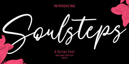 Soulsteps is a casual signature font. With high contrast stroke, slanted and fun character with a bit of ligatures. To give you an extra creative work. Soulsteps font support multilingual more than 100+ language. This font is good for logo design, Social media, Movie Titles, Books Titles, a short text even a long text letter and good for your secondary text font with sans or serif. Make a stunning work with Soulsteps font. Cheers, MaulanaCreative
