7,491 search results
(0.022 seconds)
- Sweet Sans by Sweet,
$59.00 The engraver’s sans serif—strikingly similar to drafting alphabets of the early 1900s—has been one of the most widely used stationer’s lettering styles since about 1900. Its open, simple forms offer legibility at very small sizes. While there are digital fonts based on this style (such as Burin Sans™ and Sackers Gothic™, among others), few offer the range of styles and weights possible, with the versatility designers perhaps expect from digital type families. Sweet Sans fills that void. The family is based on antique engraver’s lettering templates called “masterplates.” Professional stationers use a pantograph to manually transfer letters from these masterplates to a piece of copper or steel that is then etched to serve as a plate or die. This demanding technique is rare today given that most engravers now use a photographic process to make plates, where just about any font will do. But the lettering styles engravers popularized during the first half of the twentieth century—especially the engraver’s sans—are still quite familiar and appealing. Referencing various masterplates—which typically offer the alphabet, figures, an ampersand, and little else—Mark van Bronkhorst has drawn a comprehensive toolkit of nine weights, each offering upper- and lowercase forms, small caps, true italics, arbitrary fractions, and various figure sets designed to harmonize with text, small caps, and all-caps. The fonts are available as basic, Standard character sets, and as Pro character sets offering a variety of typographic features and full support for Western and Central European languages. Though rich in history, Sweet Sans is made for contemporary use. It is a handsome and functional tribute to the spirit of unsung craftsmanship. Burin Sans and Sackers Gothic are trademarks of Monotype Imaging.
 - Cantoni by Debi Sementelli Type Foundry,
$59.99 I have a new baby sister! Check her out in her crib: Cinque Donne The Cantoni Font family is a hand lettered font with a variety of standard and alternate characters that play together well. And with a total of 1265 glyphs, you can play for as long as you like. Now Cantoni and Cantoni Pro also come in BOLD! Additional features include: Roman numerals, Fractions, Ordinals, Ornate and Old Style numbers, Greek symbols, a set of Flourishes, Ornaments and DIY Wedding Words and Images. It also includes Western and Central European, Romanian and Turkish language support. Named after my large Italian family, the unique variety of letters based on my own fluid upright style of brush lettering, reminds me of every family I know. There are creative and conservative siblings, crazy in a good way cousins, affable aunts and corny joke telling uncles who somehow come together and form one cohesive unit. In the same way, using the Open Type features to insert a “wild t”, begin a name with a “flashy f” or end a word with a “rambling r”, the font comes to life. The party starts. The fun begins. And soon they're all laughing and dancing up and down the baseline. Like a family gathering to celebrate a special occasion, there is a palpable sense of joy expressed through the letters and images, not unlike the sharing of good food, memorable stories and lots of laughter. While Cantoni Basic gets the party started, the Cantoni Font Family Total Design offers a complete package of options for your unique creations. On behalf of the whole Cantoni family, thanks for joining in the fun. I'll see you on the dance floor. Enjoy! Debi Check out my other script fonts Belluccia and Dom Loves Mary offered through the Correspondence Ink Foundry here at MyFonts!
 - Compatil Fact by Linotype,
$50.99Compatil is the first comprehensive type system which enables all typographical elements to be used to full effect in order to reproduce the message conveyed by text information. Four different type styles with a total of 16 weights including italics have been merged into a unique typographical network. There are now no limits to the font user's creativity. The system is a product of technical innovation and constitutes a new design approach which meets the highest aesthetic standards. For almost two years, a team of experts from Linotype has been working with initiator Professor Olaf Leu under the direction of Silja Bilz, Erik Faulhaber and Reinhard Haus to create the Compatil type system. Despite the Internet and TV, it is essential today to be able to absorb information quickly by being able to read it with ease. A fact that is becoming increasingly important both on-screen and on paper. It is the role of the font to increase legibility and to ensure typographically perfect results for text design work. The new Compatil type system meets all these needs. The Compatil is a part of the Platinum Collection. The following four different styles are available: Compatil Exquisit, Compatil Fact, Compatil Letter and Compatil Text. Compatil is available in various font formats: 16 separate OT Pro fonts including the small caps and Adobe Central European character set for OpenType-supporting applications like Adobe InDesign, or as 32 separate OpenType Com fonts for office communication, with the following special features: 1. Optimized display capabilities for computer screens eXcellent Screen Fonts (XSF-quality). 2. An extended, international character set, which supports 48 different languages for Microsoft Office applications like MS Word or as 64 PostScript fonts, which can be used in non-OpenType-supporting applications like Quark XPress. - Sancoale Slab Soft by insigne,
$24.75 Ready for the designs of today, the Sancoale superfamily takes a softer turn with a rounded slab serif. Crafted from Sancoale’s simple geometry, new softened slab serifs provide a lively typeface that conveniently enhances its cousins: Sancoale Softened--a sans with blunted terminals; Sancoale Slab; and, certainly, the first Sancoale. The weights of each and every member are balanced diligently to be compatible with one another. When used alongside one another, the combination makes for robust and tight design. With weights starting with the slender thin ranging to the juicy black, Slab Soft opens the doorway to the vary of uses. Its design is legible and neutral enough for bodies of copy--both in print and on your website. The web font also stands out perfectly as a headline or a display face. Slab Soft carefully places a foot ahead, and doesn't overpower like many slabs. This font’s the choice to seize the day and get the job done. All insigne™ fonts are absolutely loaded with OpenType options. Sancoale Slab is geared up for pro typography, together with alternates with stems, compact caps and lots of alts, together with “normalized” capitals and lowercase letters. The font features many numeral sets, with fractions, old-style and lining figures with superiors and inferiors. OpenType-capable programs like Quark or the Adobe suite allow you to quickly change ligatures and alternates. You can see these options shown in the .pdf brochure. Bundled are compact caps, fractions, old-style and lining quantities, scientific superior/inferior figures, entire ordinal and inferior alphabet. The Sancoale superfamily also features the glyphs to aid a variety of languages, together with Central, Eastern and Western European languages. In all, Sancoale Slab supports around forty languages that utilize the Latin script, earning Sancoale the pick for for multi-lingual publications and packaging.
 - Compatil Fact Paneuropean by Linotype,
$103.99Compatil is the first comprehensive type system which enables all typographical elements to be used to full effect in order to reproduce the message conveyed by text information. Four different type styles with a total of 16 weights including italics have been merged into a unique typographical network. There are now no limits to the font user's creativity. The system is a product of technical innovation and constitutes a new design approach which meets the highest aesthetic standards. For almost two years, a team of experts from Linotype has been working with initiator Professor Olaf Leu under the direction of Silja Bilz, Erik Faulhaber and Reinhard Haus to create the Compatil type system. Despite the Internet and TV, it is essential today to be able to absorb information quickly by being able to read it with ease. A fact that is becoming increasingly important both on-screen and on paper. It is the role of the font to increase legibility and to ensure typographically perfect results for text design work. The new Compatil type system meets all these needs. The Compatil is a part of the Platinum Collection. The following four different styles are available: Compatil Exquisit, Compatil Fact, Compatil Letter and Compatil Text. Compatil is available in various font formats: 16 separate OT Pro fonts including the small caps and Adobe Central European character set for OpenType-supporting applications like Adobe InDesign, or as 32 separate OpenType Com fonts for office communication, with the following special features: 1. Optimized display capabilities for computer screens eXcellent Screen Fonts (XSF-quality). 2. An extended, international character set, which supports 48 different languages for Microsoft Office applications like MS Word or as 64 PostScript fonts, which can be used in non-OpenType-supporting applications like Quark XPress. - Clear Sans by Positype,
$29.00 Clear Sans™ is a… wait for it… rational geometric sans serif. It is intended to fill a niche… to provide an alternative to the somewhat based-on-vernacular signage, somewhat geometric sans. I hear the word vernacular thrown around too much and too loosely. If a typeface is based in the vernacular, based on hand-painted or hand-crafted signage, then it should be based on the movements of the hand, retain that warmth and not on a pretty geometric model. For me, clean, geometric and precise doesn't have to be cold and expressionless. The original skeleton was hand-painted in 2008 to help determine and inform my decisions going forward. The typeface was completed shortly afterwards at the behest of an old friend for their identity. As usual, I expanded it, but considered retiring it since there were so many things similar out there. Years later, I had a chance to rediscover it and came to the conclusion that it could be improved, expanded in a logical and useful way, and introduced. I would be lying if I didn't admit that the rise of webfonts and embedded type in applications influenced many of the decisions I made about reworking Clear Sans™. Completely new Text and Screen fonts were developed that utitlize larger x-heights, space-saving widths, logical (and simplified) weight offerings… to name a few alterations. Even the pricing of each variant was considered to produce a more reasonable and simple solution for the developer, designer, professional and novice. Clear Sans™ is a departure from my previous sans serifs, but the influences of Aaux Next, Akagi Pro and Halogen are evident. Enjoy a light-hearted mini-site devoted to Clear Sans™
 - Clear Sans Text by Positype,
$25.00 Clear Sans™ is a… wait for it… rational geometric sans serif. It is intended to fill a niche… to provide an alternative to the somewhat based-on-vernacular signage, somewhat geometric sans. I hear the word vernacular thrown around too much and too loosely. If a typeface is based in the vernacular, based on hand-painted or hand-crafted signage, then it should be based on the movements of the hand, retain that warmth and not on a pretty geometric model. For me, clean, geometric and precise doesn't have to be cold and expressionless. The original skeleton was hand-painted in 2008 to help determine and inform my decisions going forward. The typeface was completed shortly afterwards at the behest of an old friend for their identity. As usual, I expanded it, but considered retiring it since there were so many things similar out there. Years later, I had a chance to rediscover it and came to the conclusion that it could be improved, expanded in a logical and useful way, and introduced. I would be lying if I didn't admit that the rise of webfonts and embedded type in applications influenced many of the decisions I made about reworking Clear Sans™. Completely new Text and Screen fonts were developed that utitlize larger x-heights, space-saving widths, logical (and simplified) weight offerings… to name a few alterations. Even the pricing of each variant was considered to produce a more reasonable and simple solution for the developer, designer, professional and novice. Clear Sans™ is a departure from my previous sans serifs, but the influences of Aaux Next, Akagi Pro and Halogen are evident. Enjoy a light-hearted mini-site devoted to Clear Sans™
 - Clear Sans Screen by Positype,
$21.00 Clear Sans™ is a… wait for it… rational geometric sans serif. It is intended to fill a niche… to provide an alternative to the somewhat based-on-vernacular signage, somewhat geometric sans. I hear the word vernacular thrown around too much and too loosely. If a typeface is based in the vernacular, based on hand-painted or hand-crafted signage, then it should be based on the movements of the hand, retain that warmth and not on a pretty geometric model. For me, clean, geometric and precise doesn't have to be cold and expressionless. The original skeleton was hand-painted in 2008 to help determine and inform my decisions going forward. The typeface was completed shortly afterwards at the behest of an old friend for their identity. As usual, I expanded it, but considered retiring it since there were so many things similar out there. Years later, I had a chance to rediscover it and came to the conclusion that it could be improved, expanded in a logical and useful way, and introduced. I would be lying if I didn't admit that the rise of webfonts and embedded type in applications influenced many of the decisions I made about reworking Clear Sans™. Completely new Text and Screen fonts were developed that utitlize larger x-heights, space-saving widths, logical (and simplified) weight offerings… to name a few alterations. Even the pricing of each variant was considered to produce a more reasonable and simple solution for the developer, designer, professional and novice. Clear Sans™ is a departure from my previous sans serifs, but the influences of Aaux Next, Akagi Pro and Halogen are evident. Enjoy a light-hearted mini-site devoted to Clear Sans™
 - Compatil Letter by Linotype,
$50.99Compatil is the first comprehensive type system which enables all typographical elements to be used to full effect in order to reproduce the message conveyed by text information. Four different type styles with a total of 16 weights including italics have been merged into a unique typographical network. There are now no limits to the font user's creativity. The system is a product of technical innovation and constitutes a new design approach which meets the highest aesthetic standards. For almost two years, a team of experts from Linotype has been working with initiator Professor Olaf Leu under the direction of Silja Bilz, Erik Faulhaber and Reinhard Haus to create the Compatil type system. Despite the Internet and TV, it is essential today to be able to absorb information quickly by being able to read it with ease. A fact that is becoming increasingly important both on-screen and on paper. It is the role of the font to increase legibility and to ensure typographically perfect results for text design work. The new Compatil type system meets all these needs. The Compatil is a part of the Platinum Collection. The following four different styles are available: Compatil Exquisit, Compatil Fact, Compatil Letter and Compatil Text. Compatil is available in various font formats: 16 separate OT Pro fonts including the small caps and Adobe Central European character set for OpenType-supporting applications like Adobe InDesign, or as 32 separate OpenType Com fonts for office communication, with the following special features: 1. Optimized display capabilities for computer screens eXcellent Screen Fonts (XSF-quality). 2. An extended, international character set, which supports 48 different languages for Microsoft Office applications like MS Word or as 64 PostScript fonts, which can be used in non-OpenType-supporting applications like Quark XPress. - Compatil Text by Linotype,
$50.99Compatil is the first comprehensive type system which enables all typographical elements to be used to full effect in order to reproduce the message conveyed by text information. Four different type styles with a total of 16 weights including italics have been merged into a unique typographical network. There are now no limits to the font user's creativity. The system is a product of technical innovation and constitutes a new design approach which meets the highest aesthetic standards. For almost two years, a team of experts from Linotype has been working with initiator Professor Olaf Leu under the direction of Silja Bilz, Erik Faulhaber and Reinhard Haus to create the Compatil type system. Despite the Internet and TV, it is essential today to be able to absorb information quickly by being able to read it with ease. A fact that is becoming increasingly important both on-screen and on paper. It is the role of the font to increase legibility and to ensure typographically perfect results for text design work. The new Compatil type system meets all these needs. The Compatil is a part of the Platinum Collection. The following four different styles are available: Compatil Exquisit, Compatil Fact, Compatil Letter and Compatil Text. Compatil is available in various font formats: 16 separate OT Pro fonts including the small caps and Adobe Central European character set for OpenType-supporting applications like Adobe InDesign, or as 32 separate OpenType Com fonts for office communication, with the following special features: 1. Optimized display capabilities for computer screens eXcellent Screen Fonts (XSF-quality). 2. An extended, international character set, which supports 48 different languages for Microsoft Office applications like MS Word or as 64 PostScript fonts, which can be used in non-OpenType-supporting applications like Quark XPress. - MMC Insignia by MMC-TypEngine,
$30.00 MMC Insignia, is an Iconic & Emblematic Neogothic Geometric Capitals Display… Assembled by Trivial Squares and Diagonals Symbols Pattern from a puzzled grid Aftermath!! Includes Stylistic Alternates!! +Extra Monospaced Figures. In 22 styles, with Obliques, both for single display and layer Typesetting, plus OpenType Features & Bonus Blocks Fonts! MMC Insignia is a Small Caps Typeface, which default lowercases character set is included in the Pro family, its cursive version, apart from it, has also Exclusive Stylistic Alternates… Its atmosphere stands by on both Corporative to Decorative, Modern, Fashion, Federalist, Bohemian, Romantic, Ludic, Treasured Look, Etc. This Display font-family is the result of the repeated applications of this unique infamous Icon or Symbol, of two counterpointed triangles, implicit as hourglasses, in order to compose an innovative and unprecedented typographic pattern and modulation concept through the letterforms, in an extremely Geometric style. The Graphic Sign used throughout this type, is a remarkable trend used already in Logos of different businesses, whose most famous case refers to a famous International Bank, which doesn’t need to be mentioned, as it is instantly associated! This characteristic innovation was the main motivation while creating this type. Usage Suggestions: Type Fancy Titling texts, Display Remarkable Logos, Branding Projects, Labels, Emblems, Fashion Patterns, or in everything Noble and designed for Excellence as a type of Insignia, or distinguished marks and attributes of Royalty and Power!! That’s also forwardly, the reason why it was named MMC Insignia… TIPS: 1-Combine styles into innumerous possibilities of Chromatic Typesetting, by ‘central pasting’ layers… You may dislocate layers for improvisations! 2-USE BLOCK “FREE-STYLES” 1 & 2 also to add default 3D! Change 3D directions by switching Block 1 to Block 2, that way you can Zig-Zag words and lines. *Also shift the block layer up to bottom limit, it makes the 3D direction turn upside down. Greetings! André, MMC-TypEngine.
 - Bu Global by Butlerfontforge,
$18.00 While throned before your keys, under your drumming fingers awaits the most astounding standard computer typeface ever devised: BuGlobal. In addition to all the usual alphanumeric characters and symbols, this lone font lets you type more than 400 accented letters appearing in more than 80 English-variant languages worldwide, 70 common math and science symbols, and dozens of other useful characters —more than half a thousand all told— all within the digital parameters of one standard computer typeface, without needing any alternate keyboards or other clumsy digital luggage. Here is a sample: You can add any accent appearing in more than 80 English-variant languages used around the world to any letter appearing in all these languages simply by typing ANY letter then the accent. This includes more than 400 diacritic-laden letters in all —without needing to remember several keystrokes to type any of these letters as a few of them appear in standard computer typefaces. You can type more than 50 math/science symbols that do not appear in standard computer typefaces. These new symbols include several kinds of arrows plus constants, centerlines, dimensions, and graphs and scales that when retyped create continuous scales and graphs. Common symbols such as ballot boxes, rating stars, checkboxes, hearts, fancy fleurons, and similar motifs that do not appear in standard computer typefaces. Dozens of flashy arabesques like ========= [in BuGlobal these equal signs are kerned together so when you type them you create a continuous double line]. In this typeface more than 30 symbols that never appear twice in a row are kerned together so when you continuously type them you create all kinds of flashy arabesques that will make your typing more attractive. No other standard compute typeface allows you to do this. As for Beauty, BuGlobal’s characters are designed according to several axioms of ocular perception until each profile is as iconically simple as Shaker furniture. These axioms make BuGlobal’s letters easier to read compared to other typefaces, and a few of them are: Each letter should look much like the others but for one defining detail. The letters should be as similarly wide as possible. The letters’ midbars should be the same height and thickness. The higher the lowercase letters are compared to capital letters, the more legible and easily readable are their texts. BuGlobal has a typeface user’s guide, titled A Lovely Face, in which a description of each ocular axiom compares BuGlobal with Baskerville, Georgia, Palatino, and other commonly-used standard computer typefaces so you can quickly see why the other typefaces are inferior. You can download a pdf file of this typeface user’s guide, for free, at BuGlobal’s website, butlerfontforge.com, at any time so you can learn all about BuGlobal’s many amazingly new features before possibly buying it. BuGlobal’s plain letters are perfect for texts, its italics are gracefully emphatic, its bolds are ideal for titles and headers, and its arabesques are a fancy way to make your texts look dressy —all of which will add more shimmer to your semantic plumage. One good typeface is more useful than an infinity of poor ones. Robert Bringhurst
 - Miedinger by Canada Type,
$24.95 Helvetica’s 50-year anniversary celebrations in 2007 were overwhelming and contagious. We saw the movie. Twice. We bought the shirts and the buttons. We dug out the homage books and re-read the hate articles. We mourned the fading non-color of an old black shirt proudly exclaiming that “HELVETICA IS NOT AN ADOBE FONT”. We took part in long conversations discussing the merits of the Swiss classic, that most sacred of typographic dreamboats, outlasting its builder and tenants to go on alone and saturate the world with the fundamental truth of its perfect logarithm. We swooned again over its subtleties (“Ah, that mermaid of an R!”). We rehashed decades-old debates about “Hakzidenz,” “improvement in mind” and “less is more.” We dutifully cursed every single one of Helvetica’s knockoffs. We breathed deeply and closed our eyes on perfect Shakti Gawain-style visualizations of David Carson hack'n'slashing Arial — using a Swiss Army knife, no less — with all the infernal post-brutality of his creative disturbance and disturbed creativity. We then sailed without hesitation into the absurdities of analyzing Helvetica’s role in globalization and upcoming world blandness (China beware! Helvetica will invade you as silently and transparently as a sheet of rice paper!). And at the end of a perfect celebratory day, we positively affirmed à la Shakti, and solemnly whispered the energy of our affirmation unto the universal mind: “We appreciate Helvetica for getting us this far. We are now ready for release and await the arrival of the next head snatcher.” The great hype of Swisspalooza '07 prompted a look at Max Miedinger, the designer of Neue Haas Grotesk (later renamed to Helvetica). Surprisingly, what little biographical information available about Miedinger indicates that he was a typography consultant and type sales rep for the Haas foundry until 1956, after which time he was a freelance graphic designer — rather than the full-time type designer most Helvetica enthusiasts presume him to have been. It was under that freelance capacity that he was commissioned to design the regular and bold weights of Neue Haas Grotesk typeface. His role in designing Helvetica was never really trumpeted until long after the typeface attained global popularity. And, again surprisingly, Miedinger designed two more typefaces that seem to have been lost to the dust of film type history. One is called Pro Arte (1954), a very condensed Playbill-like slab serif that is similar to many of its genre. The other, made in 1964, is much more interesting. Its original name was Horizontal. Here it is, lest it becomes a Haas-been, presented to you in digital form by Canada Type under the name of its original designer, Miedinger, the Helvetica King. The original film face was a simple set of bold, panoramically wide caps and figures that give off a first impression of being an ultra wide Gothic incarnation of Microgramma. Upon a second look, they are clearly more than that. This face is a quirky, very non-Akzidental take on the vernacular, mostly an exercise in geometric modularity, but also includes some unconventional solutions to typical problems (like thinning the midline strokes across the board to minimize clogging in three-storey forms). This digital version introduces four new weights, ranging from Thin to Medium, alongside the bold original. The Miedinger package comes in all popular font formats, and supports Western, Central and Eastern European languages, as well as Esperanto, Maltese, Turkish and Celtic/Welsh. A few counter-less alternates are included in the fonts.
 - International by Yes Please,
$45.00 International is an homage to mid-century modernist trilines. Offering contemporary, well-balanced proportions and a lack of heavily dated styling affectations, International brings a uniquely modern sensibility to the triline style. International features OpenType standard ligatures, discretionary ligatures and stylistic alternates as well as a standard set of accents and symbols to provide a versatile end-user experience. International has played hard for Nike Women's Training, Nike Running, Nike Sportswear, Target, Showtime and more.
 - Bill Display by OGJ Type Design,
$29.00 Bill Display is a post-Max Bill font, developed in close cooperation with the Max Bill Georges Vantongerloo foundation. MAX BILL Last universal scholar, most important design teacher of the 20th century: There are superlatives, always very enthusiastic, when the importance of Max Bill is discussed. The trained silversmith studied at the Bauhaus, with personalities such as Josef Albers, Paul Klee and Oskar Schlemmer. He worked as an architect, later as sculptor and designer.
 - Grand Central JNL by Jeff Levine,
$29.00Grand Central JNL is named for the most luxurious train depot in the nation—Grand Central Station in New York City. This multi-line Art Deco font is reminiscent of all of the glitz and glamour associated with Manhattan in the 1930s and 1940s. Modeled from Jeff Levine's Parkitecture JNL, its roots go back to the popular typeface best known as Eagle—a lettering design most associated with the NRA posters of the Depression era. - Overlander by Oakstone Creative,
$6.50 Overland is a strong Art Deco typeface, inspired by the train 'The Overland' that runs in Australia, the font is perfect for headlines, display, branding and much more... even wedding stationary!. It is a bold and dense with an obvious deco inspired background, great for any projects or brands that wear the roaring 20's to 40's on their sleeve. Great for Signage, Wedding stationary, logos, branding materials, business cards, quotes, posters, and more!
 - Binario by Tarallo Design,
$14.99 Binario is a simple and friendly font with three weights and matching obliques. The geometric and modular characteristics of this typeface subtly reference the Art Deco and early modernist periods. It is an ideal choice for achieving a clean, distinctive, and contemporary aesthetic, making it suitable for branding, posters, and screen-based designs. The light weight of Binario is good for body text. The regular weight exudes confidence, making it suitable for both body and heading text. For impactful headlines, the bold weight is superb. The clear weight distinction of this family make it easy to create organized text. Binario was designed in Siena, Italy taking some inspiration from train stations and shop signage. The name Binario means train platform in Italian. Other aspects that informed the design of this font are modularity and efficiency. The interior rounded forms of the letters (counterforms) are based on shape of the Roman arch. Binario has a sibling, Binario Soft. This version has gently rounded stroke ends, which make a softer impression on the page.
 - Copacabana by Alan Meeks,
$45.00 Copacabana is heavily based on one of my favourite typefaces Goudy Old Style Italic. It is sharper and more clearly defined than Goudy yet still retains it old style characteristics. The face is slightly angled so is basically upright whilst still retaining Italic characteristics.
 - Eskos by Pesotsky Victor,
$10.00 Eskos is designed for headings. It is deliberately diagonal and gives a sharp, oblique texture in the text set. It has rough irrational knots and oblique strokes. Eskos supportsBasic Latin, Cyrillic and more than 100 languages all together. The font was designed by Viktor Pesotsky.
 - Sophia Bella by madeDeduk,
$15.00 Sophia Bella is a gorgeous handmade signature font. It includes more than 170 ligatures to make everything look natural handmade signature and is perfect for poster design, book covers, merchandise, fashion campaigns, newsletters, branding, advertising, magazines, greeting cards, album covers, and quote designs and more.
 - LoveChristmas by Karandash,
$20.00 Following the success of our LoveHearts, valentine inspired ornaments, we decided to show our love for Christmas. With more than 170 hand drawn unique designs, LoveChristmas is the perfect choice for designing Christmas greeting cards and gift wraps as well as letter signatures and accessories.
 - Magnolica by Essentials Studio,
$16.00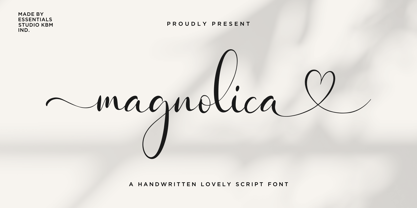 Introducing by Essentials Studio Proudly Present, Magnolina Magnolina Is a Lovely Script Font With Swash and Ligature More Than 50 Stylish love Alternate Magnolina is perfect for product packaging, branding project, megazine, social media, wedding, or just used to express words above the background.
 - LoveHearts by Karandash,
$20.00 A lovely valentine inspired set of calligraphic ornaments and frames including seamless borders and patterns. With more than 160 hand drawn unique designs LoveHearts is the perfect choice for designing romantic greeting cards and beautiful wedding invitations as well as letter signatures and anniversary accessories.
 - Rhiccus by Patria Ari,
$19.00 Rhiccus is inspired from vintage and classic look. This font is suitable for any design like branding, print templates, fashion, print templates, & more. With more than 9 variants, this font works well to mix and match with each other to best fit the occasion.
 - Stencil Octoid JNL by Jeff Levine,
$29.00 Stencil Octoid JNL was inspired by a set of twelve inch tall stencil letters and numbers made by Duro Art Industries in Chicago. The bold type style with angled rather than rounded corners gives the font a strong feel of industry or military usage.
 - Paragraph by Paragraph,
$12.00 This decorative, headline or logotype geometric font consists entirely of lowercase letters. The glyphs of uppercase are rounder than their lowercase counterparts, allowing playful interaction within words, contrasting round and square shapes. The font is the result of a new identity development for Paragraph.
 - Country Charm by Okaycat,
$28.50 Country Charm is a picture font. A cute collection of vectored sketches brought to life by designer Natsuko Hayashida. More than 50 unique illustrations. Her depictions of fruits, vegetables & herbs are beautiful organic shapes, perfect for you to use on signs, posters, invitations, and more.
 - ocr-t by FaceType,
$7.00 Being a geometric sanserif ocr-t comes in eleven weights from ultrawhite to infrablack (brightwhite, white, silver, lightgrey, grey, darkgrey, anthracite, black, jetblack). With more than 600 glyphs it covers all your typographic needs and manages to stay at the same place no matter which width you’re using. Its readability and legibility is more than fine although it needs no kerning. The infrablack is really black, in order to achieve this, the form of letters change from darkgrey to anthracite from upright to some kind of upright italic. This also gives opportunity to mix two weights with same colour but different architecture. Find also stylistic sets, alternate letters, lots of bullets, different arrows, hands and well: kind of hearts.
 - StudioSans by BrightHead Studio,
$20.00 StudioSans — is a modern representative of the class of sans-serif fonts inspired by the traditional Swiss design and typography of the mid 20th century. This is a minimal, clean and open font family with friendly forms. Focuses on functionality, has a high x-height and short ascender and descender elements. This is combined with soft circles and high legibility of characters contributing to comfortable reading. The family contains six weights from ExtraLight to ExtraBold. Each of them has in its arsenal more than 450 glyphs and knows more than 50 languages. Support for OpenType Features focused on the Oldstyle Figures (including signs of currencies and interest), Case-Sensitive Forms, Standarts and Discretionary Ligatures, Slashed Zero and Etc.
 - Savage Sword by Comicraft,
$29.00 Mother of Mitra, Crom’s Devils and other Savage WORDS! The only thing better than one dead Pict is TWO! Or THREE! Or FOUR! And what better than this SAVAGE font to sound the sword strokes of a BARBARIAN BORN?! Hack! Slice! Cut your fiendish foes into pieces with Comicraft’s SAVAGE SWORD and tell your SAVAGE TALES to all and sundry and even those you’ve sundered! BE AWARE! Handle with care and keep some neosporin or other antibacterial cream at hand -- being Savage and filled with Berserker Rage may result in unintended wounds to yourself and your kinsmen. Savage Sword features two sets of automatically alternating uppercase characters, plus support for Western & Central Europe and Vietnamese.
 - Arial Narrow OS by Monotype,
$54.99Arial was designed for Monotype in 1982 by Robin Nicholas and Patricia Saunders. A contemporary sans serif design, Arial contains more humanist characteristics than many of its predecessors and as such is more in tune with the mood of the last decades of the twentieth century. The overall treatment of curves is softer and fuller than in most industrial style sans serif faces. Terminal strokes are cut on the diagonal which helps to give the face a less mechanical appearance. Arial is an extremely versatile family of typefaces which can be used with equal success for text setting in reports, presentations, magazines etc, and for display use in newspapers, advertising and promotions. - Layfort by Identity Letters,
$29.00 What do you get when you cross Industrial Revolution with Art Déco? The raw force of steam-powered vessels with the panache of dashing streamliners? A sturdy industrial grotesque with a swanky stylized sans? We don't know, but our Layfort is a strong contender. It's a contrasted sans-serif typeface with old-style proportions: varying letter widths create a more vivid texture than your usual contemporary sans, and the true italics are narrower than the uprights. Layfort is elegant enough for fashion, art, and luxury; yet sufficiently sincere for serious business. And at 16 styles & 750 glyphs, it's ready for complex typographic demands (try the round dots at SS09). Let your designs fly!
 - Arial for Ortho Clinical by Monotype,
$45.99Arial was designed for Monotype in 1982 by Robin Nicholas and Patricia Saunders. A contemporary sans serif design, Arial contains more humanist characteristics than many of its predecessors and as such is more in tune with the mood of the last decades of the twentieth century. The overall treatment of curves is softer and fuller than in most industrial style sans serif faces. Terminal strokes are cut on the diagonal which helps to give the face a less mechanical appearance. Arial is an extremely versatile family of typefaces which can be used with equal success for text setting in reports, presentations, magazines etc, and for display use in newspapers, advertising and promotions. - Sweet Treats by Jeff Levine,
$29.00 A piece of British sheet music for “You’re Sweeter than I Thought You Were” [from the 1935 film “Jack of All Trades” starring Jack Hulbert] provided inspiration for a digital typeface based on the credits for Hulbert and the film that rather than the song’s title. What’s interesting is the lettering style was influenced by Art Nouveau at a time when Art Deco was gaining in popularity. The result is Sweet Treats JNL, which is available in both regular and oblique versions. (According to Wikipedia, John Norman ‘Jack’ Hulbert (April 24, 1892 – March 25, 1978) was a British actor, director, screenwriter and singer, specializing primarily in comedy productions, and often working alongside his wife Cicely Courtneidge.)
 - SK Synonym Grotesk by Shriftovik,
$48.00 SK Synonym Grotesk is a geometric neo-grotesk typeface, which was developed under the influence of Swiss type design and adapt to modern realities. Its sturdy and simple structure is characterized by angular joints that accent details of the letters. The font design uses a strict geometric and stable construction it's combining with organic and lively forms, it creates an unusual attractive aesthetic of the character set. SK Synonym Grotesk consist of a variety of tools for various design needs, including OpenType alternatives and a wide range of styles from Thin to Black. This typeface is multilingual, supports more than 40 languages including Extended Latin and Cyrillic sets and contains more than 450 characters.
 - Thick by Good Java Studio,
$15.00 Thick is the perfect font for all your fun designs and also for Halloween decorations. The main font file is equipped with ordinary characters, as well as more than 350 glyphs to support most Latin-based languages. Everything is made with the same brush, and everything is the same size as Thick, so you can be sure they will work well together! It is suitable for you to use in making t-shirt design, quote, label, packaging, logo type, or long writing. Because we have compiled kerning and matrices that are tailored to your needs. Thick feature: - More than 350+ glyphs - Fully coded PUA for full access to all characters - 19 languages support
 - Arial Unicode by Monotype,
$208.99Arial was designed for Monotype in 1982 by Robin Nicholas and Patricia Saunders. A contemporary sans serif design, Arial contains more humanist characteristics than many of its predecessors and as such is more in tune with the mood of the last decades of the twentieth century. The overall treatment of curves is softer and fuller than in most industrial style sans serif faces. Terminal strokes are cut on the diagonal which helps to give the face a less mechanical appearance. Arial is an extremely versatile family of typefaces which can be used with equal success for text setting in reports, presentations, magazines etc, and for display use in newspapers, advertising and promotions. - Arial Paneuropean by Monotype,
$92.99Arial was designed for Monotype in 1982 by Robin Nicholas and Patricia Saunders. A contemporary sans serif design, Arial contains more humanist characteristics than many of its predecessors and as such is more in tune with the mood of the last decades of the twentieth century. The overall treatment of curves is softer and fuller than in most industrial style sans serif faces. Terminal strokes are cut on the diagonal which helps to give the face a less mechanical appearance. Arial is an extremely versatile family of typefaces which can be used with equal success for text setting in reports, presentations, magazines etc, and for display use in newspapers, advertising and promotions. - Brillo by Alessandro Pivetta Type,
$15.00 Brillo Typeface stems from the effort of combining the modern look of a grotesque sans serif font with the elegance of the calligraphic copperplate's swashes. The result is a typeface that is perfectly suitable for modern graphic applications, such as publishing, branding and web, but which has some ornamental features that differentiate it from all the other grotesque families. Brillo doesn't want to be a neutral typeface. It's a font with a strong personality, which can give outstanding aesthetic and conceptual relevance to the graphic projects which will be used in. Brillo is a typeface thought for titling rather than for texts. For this reason it works better with character sizes bigger than 16 points.