3,936 search results
(0.049 seconds)
- Bomboloni by Goodigital13,
$20.00 will be great for any projects including : branding, logo, stationery, business card, signage, flyer, brochure etc. Almost all industries will be match for this typeface: wedding, events, rmakeup artist, travel, hotel, musician etc, food
 - Uyuni by Alejandro Arrojo,
$20.00 An imperfect handwriting and retro style font. Informal, authentic and very versatile. Lover of adventure travel, alternative sports, and home cooking. It feels more comfortable in large sizes but also can tell little stories.
 - ArchiLogo by Archiness,
$- ArchiLogo is not a regular outline-font. It has a stencil element to it and it’s a kind of indirect, because the font is basically the space between the lines. You have to read between the lines, so to speak. It’s like one of the key elements in architecture: the space between the walls. Here’s where type design meets architecture! The new version, ArchiLogo 3.0, has been improved slightly and 13 glyphs have been added to a total of 85 characters. It is still a free font. Because of the popularity of this font I decided to introduce ArchiLogo Pro. Indeed, the pro version of ArchiLogo. Besides the basic Macintosh Character Set the supported languages are Latin 1, Latin 2: Eastern Europe, Turkish, Windows Baltic. It grew to over 300 glyphs.
 - Fimfarum by Juraj Chrastina,
$39.00 Fimfarum is a word that the Czech actor and writer Jan Werich created for one of his magical fairy tales for children and adults. Fimfarum is also the name of this playful typeface equipped with various styles simulating the randomness of handwriting. You can choose to select and combine different styles either using an all-in-one pro font in an OpenType-savvy application, or with a 10 fonts family pack. Fimfarum Pro also offers an automatic random effect. The OpenType contextual alternates feature can randomly mix narrow, wide and bold characters. You can specify how through various stylistic sets. For more details, check the Fimfarum Typeface Manual. With this versatile tool your designing possibilities are immense. Well, this is Fimfarum. You can download the instruction PDF here.
 - Turmus MF by Masterfont,
$59.00 This type family is a revival of the old and famous Frank Rühl from 1924. With less contrast the 2 weights make it more readable and pleasant to the eye too. OpenType Pro Excellent support for Niqqud (Vowels). All marks are programmed to fit each glyph's shape and width. OpenType Pro includes new advanced features like Dagesh Hazak, ShevaNa, Qamatz Katan, Holam Haser and wide letters. Best used with Adobe InDesign CC that support complex Hebrew text. Please check these advanced features in this link: https://tinyurl.com/ybgdsxme Font files were re-generated to get better online screen display, as well as refined OpenType features as kerning glyph substitution. Please be aware of minor changes that might impact page layouts done with older fonts' versions. So be careful.
 - MFC Falconer Monogram by Monogram Fonts Co.,
$169.00 The inspiration source for MFC Falconer Monogram is an unusual hand-drawn design from a vintage embroidery publication which relies on rigid geometric letterforms to create an upward stepping framework. This monogram which evokes visions of it embossed or printed on antique baking tins was originally intended to adorn handkerchiefs, but the possibilities of its use are up to your imagination. This is one of many monogram designs from the early 1900’s which fall into a two letter format that is either adorned or interwoven decorative elements. Download and view the MFC Falconer Guidebook if you would like to learn a little more. MFC Falconer Monogram comes complete with Pro format fonts. You will require with programs that can take advantage of OpenType features contained within the Pro fonts.
 - Montauk by profonts,
$51.99 Montauk Pro is named after a small village in Suffolk County, New York on the South Shore of Long Island. It is the easternmost area in Long Island, and thus the easternmost area in New York State. It is home to Montauk Point State Park, site of the Montauk Point Lighthouse. It is named after the Montauk Indians. Montauk Pro is a casual, jaunty and quite beautiful handwriting script. It comes with six styles as light, light italic, regular, regular italic, bold and bold italic, each style with about 1.000 characters covering the complete Latin glyph set for West and East including Baltic and Turkish, including a large selection of ligatures, character combinations and alternates to make this beautiful script design a perfect font for OTF-savvy applications like e.g. InDesign or Quark Xpress 7.
 - Press Run JNL by Jeff Levine,
$29.00 Press Run JNL is a reinterpretation of the classic typeface Cheltenham Condensed taken from actual screen captures of vintage newspaper headlines.
 - Potomac by Context,
$15.00 A hearty utilitarian face inspired by stenciled type found on train cars and shipping crates. Ideal for posters, headlines, and titling.
 - Ongunkan Phoenician by Runic World Tamgacı,
$50.00 Phoenician/Canaanite The Phoenician alphabet developed from the Proto-Canaanite alphabet, during the 15th century BC. Before then the Phoenicians wrote with a cuneiform script. The earliest known inscriptions in the Phoenician alphabet come from Byblos and date back to 1000 BC. The Phoenician alphabet was perhaps the first alphabetic script to be widely-used - the Phoenicians traded around the Mediterraean and beyond, and set up cities and colonies in parts of southern Europe and North Africa - and the origins of most alphabetic writing systems can be traced back to the Phoenician alphabet, including Greek, Etruscan, Latin, Arabic and Hebrew, as well as the scripts of India and East Asia. Notable features Type of writing system: abjad / consonant alphabet with no vowel indication Writing direction: right to left in hortizontal lines. Sometimes boustrophedon. Script family: Proto-Sinaitic, Phoenician Number of letters: 22 - there was considerable variation in their forms in different regions and at different times. The names of the letters are acrophonic, and their names and shapes can be ultimately traced back to Egyptian Hieroglyphs. For example, the name of the first letter, 'aleph, means ox and developed from a picture of an ox's head. Some of the letter names were changed by the Phoenicians, including gimel, which meant camel in Phoenician, but was originally a picture of a throwing stick (giml).
 - Boho A Gogo NF by Nick's Fonts,
$10.00 Letterforms from the 30s, inspired by Bauhaus Bold, combine with super 70s styling to create this disco-era delight. The bold characters, rendered by prismatic multilines, create striking headlines with a strong architectural feel. Both versions of this Pro Series font contain the complete Unicode Latin A character complement, along with extended ligatures and fractions.
 - Meritage by Aerotype,
$29.00 OpenType users benefit from alternate lowercase characters, crossbar ligatures for common letter pairings, case sensitive quotes and smart apostrophes. Other goodies include optional old style numerals and a few clip-on swash elements, accessible by keyboard or supporting application’s OpenType glyph menu. Meritage Pro extends the character set to support Eastern European and Baltic languages.
 - CalliSans by 38-lineart,
$21.00 Introducing CalliSans : a revolution in typography. 14 fonts, 7 regular and 7 italic, seamlessly blend calligraphy's grace with sans-serif simplicity. Perfect for projects demanding elegance, from books to digital screens. Make a bold statement with its distinctive style. Timeless yet contemporary, it transcends trends. Your creative secret weapon. CalliSans Pro: where art meets design.
 - Graphique by profonts,
$41.99 Graphique was originally created by Swiss designer Hermann Edenbenz in 1945, and issued as hot metal font by Haas'sche Schriftgie�erei, Switzerland.German type designer Ralph M. Unger digitally remastered and expanded the typeface for profonts, and the digital OTF Pro version comprises of more than 400 characters including the complete Latin and Cyrillic glyph sets.
 - The Stroke Sans by ABSTRKT,
$35.00 The Stroke typeface is based on a broad nib pen theory taken to its extreme, using idealization of computer-generated pen stroke.
 - Tetris Quadrate by Melissa Lapadula,
$19.95This font is influenced by the advancement in graphic computer technology that has evolved since the first basic pixilated computer games. This typeface aims to be bold and brazen. The fonts primary function is heading use. - Ravenheart by Hanoded,
$15.00 I like Ravens. In fact, I like them so much that I have a tattoo of a Haida raven! Ravenheart was more or less modelled on my Qilin font, but it is completely different. It is scary and inky, but it has a certain flair as well. A bit mystical, a bit evil, but I am sure you’ll find many uses for it. Comes with a fluttering of diacritics.
 - Invites by Just My Type,
$20.00 Invites is a digital recreation of a 1920’s mechanical script that has never existed. I designed it for my wedding invitations last year and named it in honor of my (ex)wife. Who said it wasn’t her. And she was right. So now it’s called something different. I wanted a sweet, romantic name ... Iris? Taken. Lily? Taken. Iris Lily? Cumbersome. I wanted something short and inviting. Uh ... hmmm.
 - Emily Austin by Three Islands Press,
$39.00 An indomitable woman who traveled a lot, Emily Austin (Bryan) Perry was one of the children of Moses Austin, of Austinville, Virginia. Like her famous brother, Stephen F. Austin, she settled in Texas as one of that region's earliest colonists. While traveling about seeking treatment for a sickly daughter, she wrote many letters home -- letters that show a distinctively compact, legible hand. The challenge for me in designing the face: resisting the temptation to read and re-read her bossy directives and urgent appeals, all packed tightly together on a page. Emily Austin has a complete character set, and then some.
 - NS Yorkest Poster by Novi Souldado,
$25.00 Experience the around-the-world traveling vibes from the past with Yorkest Poster. It was inspired by the vintage retro national travel arts and printings from the 60s and 70s eras back in the day. Comes along with 2 styles (Serif and Script) that would never go wrong to be paired. A pack of Stylistic Alternates features to give a personal touch to your design, and also Swashes to cover your visual needs to be stronger in every appearance. Perfectly fit for logo design, headliner, signage, poster, postcard, title, postage stamp, and a lot of other printing works and stuff.
 - Breesh by Noir Typo,
$19.00 Breesh font is a dancing handwriting, quickly trace with a pointed brush. The inspiration come from both asian calligraphy, italic and copperplate alphabets.
 - Common Rejection by Dumadi,
$18.00 Common Rejection is a modern stylish font that is attractive to any project and can be applied in logos, quotes, travel titles, movie titles, blogs, show event titles, t-shirt designs, tumbler designs, community and company logos.
 - Praise by TypeSETit,
$89.00 Praise is a versatile script with variations from Casual (non-connecting) to Formal appeal. If you're a professional graphic designer, and use Adobe Illustrator®, or InDesign®, the PRO version is the way to go. With nearly 1600 Glyphs, the Praise OpenType programming gives a powerful solution to the design needs of the graphic design professional.
 - Pacifico by Aerotype,
$29.00 Subtly distressed Pacifico and Pacifico Alternate use the OpenType ligature feature to substitute unique glyphs when any upper or lower case character is keyed twice in a row. Pacifico Shadow font can be used with Pacifico to color the drop shadow separately. Pacifico Pro extends the character set to support Eastern European Latin, Baltic, Greek and Turkish.
 - Sturdy by Hackberry Font Foundry,
$24.95 Sturdy is designed to be as black as possible yet still legible. As an OpenType Pro font it has my normal complement of around 500 characters. New to this font I have added what I call ordinals: first through tenth in addition to Caps, lowercase, small caps, lining, oldstyle, and small caps figures, ligatures, and so on.
 - Francisco by Homelessfonts,
$49.00 Homelessfonts is an initiative by the Arrels foundation to support, raise awareness and bring some dignity to the life of homeless people in Barcelona Spain. Each of the fonts was carefully digitized from the handwriting of different homeless people who agreed to participate in this initiative. Please Note: these fonts include only the latin alphabet; no accented characters, no numbers or punctuation. MyFonts is pleased to donate all revenue from the sales of Homelessfonts to the Arrels foundation in support of their mission to provide the homeless people in Barcelona with a path to independence with accommodations, food, social and health care. The world is a very big place, the world is for travelling. And that’s what Francisco did, travel. Though born in Spain, he was raised in Brazil, where he worked as a graphic designer. He spent years hitchhiking round South America, his eagerness to see and learn new things preventing him from settling in one place. He returned to Spain an old man, to find his roots. Francisco never dreamed he’d end up in the street: “The experience of the street has taken away my vanity,” or that he would grow as a person there. “The only thing I’ve learnt in life is that in life you have to learn, because if you spend your life without learning you haven’t lived.” In Barcelona, the street changed his life and taught him just how tough it can be. Tough, but full of good people. He says that’s the best thing about the street.
 - Magnum Sans by FontMesa,
$19.00 Magnum Sans is a strong neutral sans serif consisting of eleven weights with true Italic, Oblique and an alt upright set called Alfa. The definition of Magnum is a large wine bottle that's twice the capacity of one 750ml bottle, today the name is used in any product offering double the capacity, Magnum Sans achieves this by offering two slanted and two upright versions plus a standard and pro set. Designed to be highly readable Magnum Sans is ideal for text, signage, headlines and media broadcasting or anywhere else quick readable lettering is needed. This standard version supports characters sets for central and eastern European countries with code-pages of 1252 Latin1, 1250 Latin 2, 1257 Baltic and 1254 Turkish. Note: for additional language support, please see our Magnum Sans Pro family, which includes Vietnamese, PinYin and Greek.
 - Goudy by Ascender,
$40.99 Goudy Forum is a revival and dramatic expansion by Tom Rickner, type designer at Ascender Corporation, of Frederic W. Goudy’s 20th typeface design, "Forum Title". The Pro font began twenty years ago while Tom Rickner was a student at the Rochester Institute of Technology (RIT). Tom printed a type specimen using the Forum Title foundry hot metal types. Then in 1993 Tom began to digitize the font from that specimen while working as an independent type designer. Fifteen years passed before Tom dusted off the digital data and began working in earnest on font with a full Latin 1 character set. Steve Matteson, type director at Ascender, encouraged Tom to take this font further still, and soon the glyph repertoire and feature set blossomed to a robust Pro font with a myriad of advanced typographic OpenType features.
 - Giulietta by GRIN3 (Nowak),
$26.00 Giulietta is a handwritten, fully connected script with ligatures and contextual alternates to help with flow and readability. It can be used for invitations, greeting cards, posters, advertising, weddings, books, menus etc. Giulietta pro is the most complete style, it contains over 830 glyphs, 7 stylistic sets, contextual alternates and ligatures. Every lowercase letter has seven variations (uppercase letter has three). To get the alternate glyphs choose various stylistic sets or just add "*1", "*2", "*3", "*4", "*5","*6" or "*7" before the letter in any OpenType savvy application or manually select the characters from Glyph Palette. Giulietta A, Giulietta B and Giulietta C have less glyphs than the Pro one, they only contain some selected alternates and ligatures. Language support includes Western, Central and Eastern European character sets, as well as Baltic and Turkish languages.
 - Linotype Aroma No. 2 by Linotype,
$40.99 Linotype Aroma No.2 appears straightforward in form, completely sans serif, yet with a trace of humanistic features that gives it that extra edge.
 - Andarillo by Franklin Veiga,
$10.00 Andarillo is a display typeface inspired by vintage travel posters and magazines. The complete glyph set contains uppercase, small caps, numerals, punctuation, ligatures and multilingual support. Andarillo is perfect for logotypes, magazines, titles, posters, advertising and branding communication.
 - SubwayTicker by K-Type,
$20.00Subway Ticker is based on a 5x7 grid, electronic display observed on a New York subway train in February 2005 en route to Coney Island. - Auchentaller by HiH,
$12.00 Auchentaller was inspired by a travel poster by Josef Maria Auchentaller in 1906. To our knowledge, it was never cast in type. Grado lies on the northern Adriatic, between Venice and Trieste. At one time the port for the important Roman town of Aquileia. With the decline of the Roman Empire, the upper Adriatic region came under the rule of the Visigoths, the Ostrogoths, the Byzantines, the Lombards, the Franks, the Germans, the Venetians and finally, in 1796, the Austrian Hapsburgs. So it remained until the dissolution of the Austro-Hungarian Monarchy in 1919, following World War I, when the seaport of Trieste was awarded to Italy. With Trieste came Montefalcone, Aquileia and Grado. The area was marked by years of political tension between Italy and Yugoslavia, exemplified by the d'Annunzio expedition to capture Fiume (Rijeka) in September, 1919. Some basic discussion of the period from 1919 to 1939 may be found in Seton-Watson’s Eastern Europe Between The Wars (Cambridge 1945) and Rothschild’s East Central Europe Between The Two World Wars (Seattle 1974). In 1965 I was traveling by train from Venice to Vienna. Crossing the Alps, the train stopped for customs inspection at the rural Italian-Austrian border, just above Slovenia. We were warned not to get off the train because there were still shooting skirmishes in the area. Through all this, Grado remained literally an island of tranquility, connected to the mainland by a only causeway and lines on a map. Auchentaller not only painted the beach scene at Grado, he moved there, living out the rest of his life in this comfortable little island town. His travel illustration contains the text from which the design of our font Auchentaller is drawn. The text translates: "Seaside resort : Grado / Austrian coastal land". Please see our gallery images to see a map locating Grado, as well as Auchentaller’s painting of the resort. Auchentaller is a monoline all-cap font, light and open in design , with a lot of typically art nouveau letter forms. Included in our font are a number of ligatures. As is frequently seen in designs by German speakers, the umlaut is embedded in the O & U below the tops of the letters. This approach led to two whimsies: a happy umlauted O and a sad umlauted U. This font has a clean, crisp look that is very appealing and very distinctive. Auchentaller ML represents a major extension of the original release, with the following changes: 1. Added glyphs for the 1250 Central Europe, the 1252 Turkish and the 1257 Baltic Code Pages. Add glyphs to complete standard 1252 Western Europe Code Page. Special glyphs relocated and assigned Unicode codepoints, some in Private Use area. Total of 336 glyphs. 2. Added OpenType GSUB layout features: pnum, liga, salt & ornm. 3. Added 116 kerning pairs. 4. Revised vertical metrics for improved cross-platform line spacing. 5. Revised ‘J’. 6. Minor refinements to various glyph outlines. 7. Inclusion of both tabular & proportional numbers. 8. Inclusion of both standard acute and Polish kreska with choice of alternate accented glyphs for c,n,r,s & z. Please note that some older applications may only be able to access the Western Europe character set (approximately 221 glyphs). The zip package includes two versions of the font at no extra charge. There is an OTF version which is in Open PS (Post Script Type 1) format and a TTF version which is in Open TT (True Type)format. Use whichever works best for your applications.
 - Summer Landscape by Selvia Design,
$15.00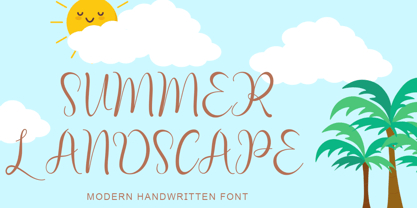 "Summer Landscape" is a beautiful and unique handwritten font. This font is equipped with uppercase, lowercase, numerals, punctuation, signatures, and multilingual support. It is suitable for summer, holidays, vacations, traveling, Father's Day, graduation, the 4th of July, and others.
 - The Rambutan by Alifinart Studio,
$10.00 The Rambutan is a unique font with a subtle and bold style. This font is very well used in a variety of designs such as menus, catalogs, invitation cards, wedding, blog, travel photographers and others. Alifinart Studio alifinart@gmail.com
 - Epically by Zamjump,
$17.00 EPICALLY is a futuristic style font with a unique style and touch, inspired by the Modern theme while maintaining simplicity and unique shapes. Great to use in your projects related to games, future technology, space travel, virtual reality & more!
 - Gotham Rail Company NF by Nick's Fonts,
$10.00An Italian travel poster from 1931 provided the inspiration for this attention-getting headline font with a strong architectural feel. The Opentype version of this font supports Unicode 1250 (Central European) languages, as well as Unicode 1252 (Latin) languages. - Gothika - Personal use only

- Quijote Sauvage by Lián Types,
$45.00 It was in the beginning of 2008 when I designed a font named Quijote, its predecessor. In the middle of 2009, I looked at it again and thought it could be a good idea to make an update of it. Variables and Features: Quijote Sauvage Pro is the most complete variable. It includes all the ligatures, alternates and swashes. It has the OpenType function in order to alternate glyphs easily when running applications which support this. The font is also offered separately. Quijote Sauvage Standard has the right glyphs to get an equilibrium between wildness and softness. It includes standard and discretionary ligatures. Quijote Sauvage Stylistic has the sharpest glyphs. Its decorative traces are discreet in order not to have problems as regards legibility. Its upper case are less wild than the other variables. Quijote Sauvage Text is the most discreet of its partners. This one was thought in order to improve legibility. Its ascenders and descenders are shorter, so the words are easier to read in small sizes. Quijote Sauvage Contextual, Swash and Titling, are the ones with wonderful terminals. They decorate words, adding a wonderful look of wildness or passion.
 - Greenhorn by Juraj Chrastina,
$29.00 Greenhorn is a hand-traced comic type for headlines. Funky, irregular and smiling. The first inspiration comes from the unique lettering of a classic czech cartoonist.
