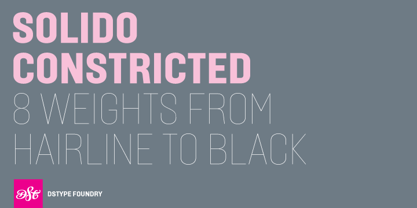
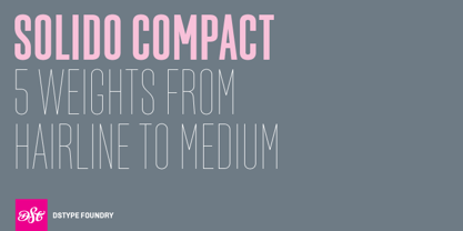
Solido is a very versatile and usable type system with five widths: Solido, Solido Constricted, Solido Condensed, Solido Compressed and Solido Compact, in a total of 35 fonts with many of alternate characters.
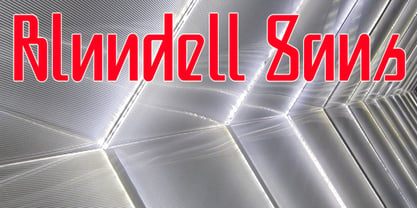
Blundell Sans is a type-hybrid that combines the precision and power of a sans serif with the elegance and humanism of a script. A resolutely upright font with a strong diagonal thrust.
Winnetka JNL was inspired by Cooley Antique Tuscan Condensed - a printer's wood type manufactured in 1859 by J.G. Cooley. Given an additional hand-made treatment, the lettering resembles characters made from cut paper.
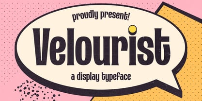
Velourist is a bold display type that’s absolutely perfect for editorial headlines with retro looks. It’s unique, bold, and slim figure make it a great fit for t-shirts, posters, and magazine covers.
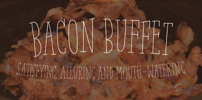
Is there anything more satisfying, alluring or mouth-watering than bacon? Comes with contextual alternates, which means that the font has got 8 different versions of each letter - this cycles as you type!
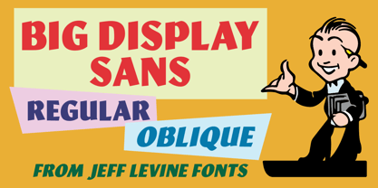
Big Display Sans JNL is an all-caps version of Ludlow’s metal type “Samson”, originally designed by Robert Hunter Middleton in 1940. This digital version is available in both regular and oblique versions.
One of the original nineteenth century designs, cut at Barnhart Brothers & Spindler in Chicago about 1880, passed on to us through ATF. Unlike most Circus types, the serifs of P.T. Barnum are bracketed.
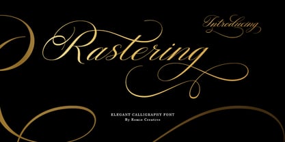
Introducing our new product called Rastering | Elegant Calligraphy Font Manu script. Rastering fonts include uppercase and lowercase letters, numbers, various types of punctuation and ending. All lowercase including last swash and alternate fonts.
Solido is a very versatile and usable type system with five widths: Solido, Solido Constricted, Solido Condensed, Solido Compressed and Solido Compact, in a total of 35 fonts with many of alternate characters.
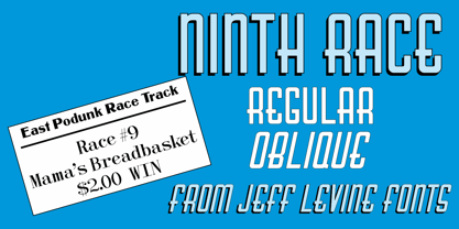
A 1930s poster advertising horse racing at Havana, Cuba’s Oriental Park inspired Ninth Race JNL – a condensed Art Deco sans serif type face with rounded corners; available in both regular and oblique versions.
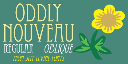
Oddly Nouveau JNL is a charming Art Nouveau design based on “Eccentric”, a metal typeface issued by American Type Founders (circa 1898). This digital version is available in both regular and oblique versions.
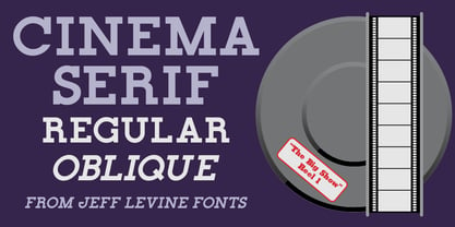
Advertisements in the September, 1936 French movie publication “La Cinématographie Française” featured a hand lettered slab serif type design that is now available as Cinema Serif JNL in both regular and oblique versions.
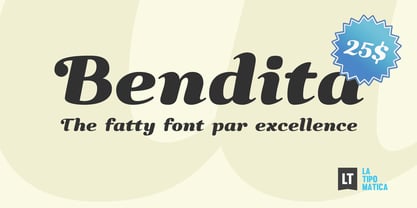
Bendita could evoke the didones of the 19th century. It has and an extreme contrast that makes it only suitable as a display typeface, with its characteristic shapes. The fatty type par excellence.
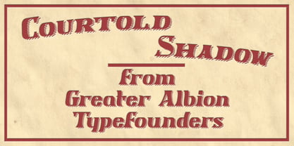
Courtold Shadow is another of our June 2017 ‘Wood Type’ collection. There is something alive and energetic about these ‘rushing’ oblique letter forms with their diagonal shadow. Ideal for signage and poster work.
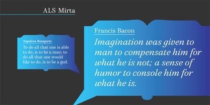
ALS Mirta is a clean text type well-suited for use in typesetting of smart volumes and kids’ books. A fine and well-balanced antiqua face is complemented by surprisingly vigorous sophisticated italics.
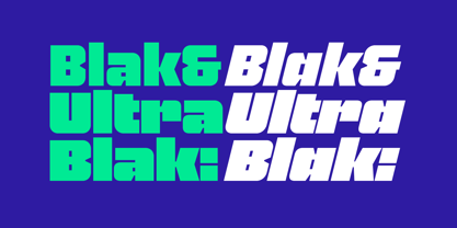
Blak belongs to the type series designed by Íñigo Jerez for the defunct magazine Suite . This chubby typeface now has a second life in our collection. Use it with confidence for big statements.
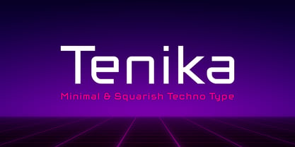
Minimal & squarish techno style type for your graphic design project. Designed based off a modified square for the small letters and developed to have the capital letters. Available in upright and oblique (italic).
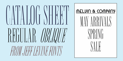
Catalog Sheet JNL is the digital version of an extra condensed serif typeface from the 1892 MacKellar, Smiths & Jordan type foundry specimen book. The font is available in both regular and oblique versions.
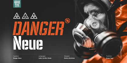
Danger Neue is the latest version of the popular Danger font. In this version, the contours of the letters are finalized and improved. Contains an extended set of glyphs and open type features.
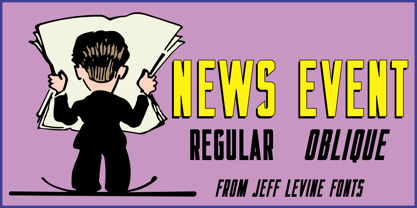
A vintage newspaper front page from June 6, 1944 proclaimed “France Invaded” in a bold, condensed wood type that has been revived as News Event JNL – available in both regular and oblique versions.
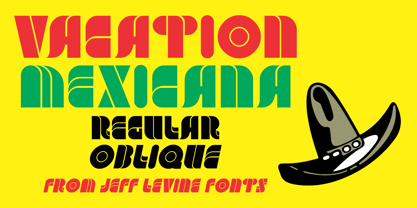
An image for a travel poster for the resort of Tulum, Mexico with its 1970s-era highly stylized semi-stencil type design inspired Vacation Mexicana JNL; available in both regular and oblique versions.
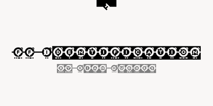
British type designer Rian Hughes created this display FontFont in 1993. The family has 5 weights, and is ideally suited for music and nightlife. It comes with tabular lining and proportional lining figures.
Barnhard Brothers and Spindler called this typeface Congo when it appeared in their circa-1910 type catalog. The design is characterized by strong Art Nouveau influences, tight spacing and a large x-height.
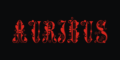
A classic and antique font design remastered by the type foundry Intellecta Design. Great display face for headers and antique-like projects. Contains a limited amount of letter designs, all uppercase letter designs.
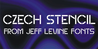
Czech Stencil JNL was modeled from examples of a 1930s-era typeface from Czechoslovokia called "Patrona Grotesk" as seen in the Steven Heller-Louise Fili book "Stencil Type" (published by Thames and Hudson).
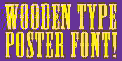
A display style font, upper case only, very typical of wooden type of the 19th century, ideal for circus posters or posters of any kind which might feature antique material and so on
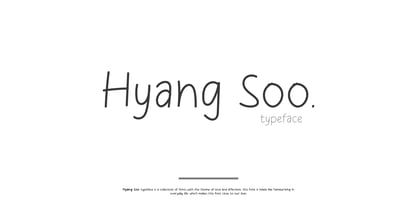
Hyang soo type face is a collection of fonts with the theme of love and affection, this font is made like handwriting in everyday life, which makes this font close to our lives.
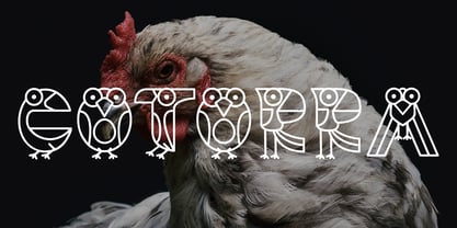
Cotorra is a birdie font with a full character set ideal to write feathered messages. Part of the official selection of Tipos Latinos 2016, Latin American Biennale of type design. Published by Letter INC.
When a type design job needs a bit of snap, yet needs to remain unconventional, think of Quirkley JNL. Its name speaks volumes - a bold, quirky sans serif - great for headlines and display work.
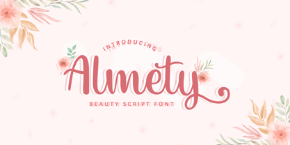
Introducing Almety by Tlatous Type. Almety is a Modern Handwritten Script Font. This font is perfect for product packaging, branding project, megazine, social media, wedding, or just used to express words above the background.
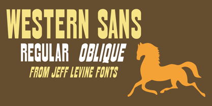
Take a classic Western wood type where the horizontals are thicker than the verticals and remove the slab serifs… The result is Western Sans JNL, which is available in both regular and oblique versions.
Grunge at its best, Mosketa looks real good typing any word, and adds a beautiful chaos without losing the balance. Try alternating uppercase with lowercase according the words to get the best of it.
Dress up your handmade holiday greeting cards, newsletters, programs, letters to Santa Claus, and party invitations with this vintage style true type font. It gives an old world feel to your Christmas paper creations.
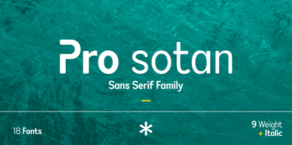
Pro sotan is a rounded sans serif font family that comes with 9 weights and matching italics. This font is ideal for typing in documents, headlines, packaging, logos, advertisements, corporate identities and much more.
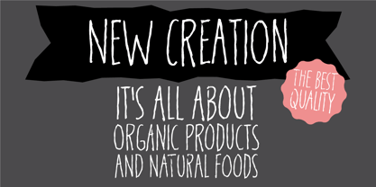
ALL CAPS font with an organic crunchy look. Very good for posters and stuff that needs a organic look. Multilingual support and 6 different versions of each letter - these cycles automatically AS you type!
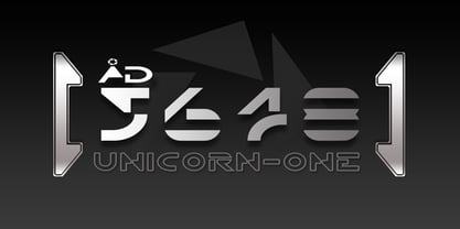
CRR NTN regular and outline, is a futuristic font family. It works well as an identity logo type and 3D work. Together using the outline and the regular font, you can create endless combinations.