10,000 search results
(0.028 seconds)
- Chumpsy by PizzaDude.dk,
$17.00 Chumpsy is clumsy - I did my best to make an awkward and bouncy hand-written font that was funky, but still legible. I added 11 slightly different versions of each lowercase letter, which automatically cycle as you type, or you can manually choose the one that suits you the best.
 - Redoura by Letterhend,
$16.00 Redoura Font is a script typeface inspired by 70's font style and Script Sports font style which is absolutely awesome for logotype / wordmark, especially for sports theme logos. Redoura Script font includes upper & lowercase characters, punctuation, numerals, and multilingual support. It also has many open type alternates and ligatures.
 - Retail Shop JNL by Jeff Levine,
$29.00 Vintage New York neon signage alongside the landmark Dubrow's Cafeteria [probably circa the 1940s] of the words "retail shop" inspired the namesake digital type design. Retail Shop JNL is a bold and somewhat eccentric Art Deco font with varying widths and unusual character forms available in both regular and oblique versions.
 - Cheap Pine by HVD Fonts,
$25.00 Cheap Pine™ is a tribute to the wood type of the eighteenth century and nineteenth century. You can use Cheap Pine Sans & Cheap Pine Shadow together to influence the color of the shadows. The font contains arrows, hands, stars and other special glyphs available through the OpenType ligatures feature.
 - Cooperative by Hafontia,
$99.00 Cooperative is a retro style poster font in Hebrew and Latin. Is based on a printed example of a vintage handmade wood type from the 1950's. This sans serif font is available in both regular and bold versions, with a dirty and grungy styles as well in regular and bold.
 - Circus Poster by Ascender,
$29.99 Circus Poster Shadow was created by Tom Rickner as a tribute to the classic Tuscan Egyptian forms used in many wood types of the 1890s. It captures the spirit of the wild west, amusement parks and ciruses. The details of Circus Poster Shadow are best reproduced at larger, display sizes.
 - Ambassador Plus by Juraj Chrastina,
$39.00 Hairline display fonts are elegant and subtle with touch of luxury. They are the Champagne of type. Ambassador Plus Family represents a set of classy typefaces best suitable for magazines, cosmetics packaging, advertising or any kind of fine and sensitive design. The quality of spacing and kerning ensured by Igino Marini.
 - FF Handwriter by FontFont,
$41.99 Italian type designer Alessio Leonardi created this display FontFont in 1997. The family contains 3 weights and is ideally suited for editorial and publishing. FF Handwriter provides advanced typographical support with features such as ligatures, alternate characters, and case-sensitive forms. It comes with tabular lining and tabular oldstyle figures.
 - Prfecox by Rômulo Gobira,
$1.50 Prfecox is a stencil typeface inspired by some characteristics of wood type and blackletter. Works best in headlines and small passages of text. The family supports almost all Latin languages available and includes the following OpenType features: Small Caps, Fraction, Oldstyle Figures, Subscript and Superscript numbers, Standard and Discretional Ligatures.
 - Busteball by Ditatype,
$29.00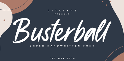 Busterball is a classy script font. Made for any professional project branding. It is the best for logos, branding and quotes. Every letter has a unique and beautiful touch. Includes: Busterball (OTF) Features: Beautiful Ligatures Multilingual Support PUA Encoded Numerals and Punctuation Thank you for downloading premium fonts from Dita Type
 - Salida by Matteson Typographics,
$19.99 Salida is a reimagining of William Page’s Series 504, a wood type created in 1887. Named for a town in Colorado on the Arkansas River, Salida is a strong and rustic display font reflecting the rugged landscape of the area. Salida is useful for impactful headlines, logos, packaging and signage.
 - Bitline by Grontype,
$15.00 Bitline is bold swirly font. comes with more alternate style each glyphs and ligature. The font is unique and modern vintage look. This is an adaptable font. Suitable for any project types, from magazine header, wedding invitation, branding design, poster or flyer header design, until logo tagline and so much more.
 - Parisian Playboy JNL by Jeff Levine,
$29.00 Sheet music for the song "My Ideal" (from the 1930 Paramount picture "Playboy of Paris" starring Maurice Chevalier) had the name of the movie hand lettered in an Art Deco, Broadway-influenced type design. This became the inspiration for Parisian Playboy JNL, which is available in both regular and oblique versions.
 - Espectro by Corradine Fonts,
$24.95Espectro is a fabulous font full of swashes and alternates. Its free strokes give to your work a special feeling doing it very expressive and mysterious. Try the Open type version if you want to access to all its wonderful possibilities. Espectro has also a set of 26 related dingbats. - Dollar Days JNL by Jeff Levine,
$29.00 The National Show Card Writer sign making set contained many different sizes and styles of lettering stencils, and additional type designs could be purchased as add-ons. This product was one of the many economical ways merchants, religious organizations, schools and others could make their own signs at low cost.
 - Alto Rey NF by Nick's Fonts,
$10.00 Originally issued by the Palmer and Rey Type Foundry of San Francisco in 1884, this typeface bore the name Octagon Condensed, and is as fresh today as it was way back when. Both versions of this font support the Latin 1252, Central European 1250, Turkish 1254 and Baltic 1257 codepages.
 - Eutheric by Typotheticals,
$10.00This plain serif can be used for a variety of purposes. Good for headlines and larger text usages. Hulbert is a comical look at the Eutheric family. It is useful for those moments where no other font will fit. Eutheric is a serif style look at the Cooper type of fonts. - Movie Star Deco JNL by Jeff Levine,
$29.00 Here’s a jaunty little Art Deco sans serif type design inspired by the headline of a feature article on Carole Lombard found in the August, 1937 issue of Hollywood magazine. This served as the inspirational model for Movie Star Deco JNL, and is available in both regular and oblique versions.
 - Bradbury Five by Device,
$39.00 A stylish cartoon sans reminiscent of lettering by Harvey Kurtzman on early issues of Mad, or other casual mid-century types. The three widths give full versatility for expressive, customised headlines and layouts, while the lighter weights can be used for text. Conveys an approachable, light touch with style and finesse.
 - Extravaganza by Solotype,
$19.95Originally, this 1870s wood type font was called Armenian. We came across a showing of alphabet at the South Street Seaport in New York, bought it and immediately drew the additional characters needed to make the font. We used it for some circus program work that was part of our livelihood. - FF Automatic by FontFont,
$41.99 Dutch type designer Donald Beekman created this display FontFont in 1999. The font is ideally suited for music and nightlife, poster and billboards as well as software and gaming. FF Automatic provides advanced typographical support with features such as ligatures and case-sensitive forms. It comes with proportional oldstyle figures.
 - Medieval Gunslinger by Ingrimayne Type,
$14.95 What would happen if one took a rather crude, squared-serifed typeface of the type popular in the 19th century and added medieval and calligraphic ornamentation? Maybe the result would be Medieval Gunslinger. The MedievalGunslingerShadOverlay font is spaced so that it can be layered with MedievalGunslingerShadow to produce bicolored lettering.
 - FF Flava by FontFont,
$41.99 Dutch type designer Donald Beekman created this display FontFont in 2003. The family contains 4 weights and is ideally suited for advertising and packaging, music and nightlife as well as poster and billboards. FF Flava provides advanced typographical support with features such as ligatures. It comes with proportional lining figures.
 - Brevet by Solotype,
$19.95Authentic copy of the original, with a couple of minor changes to the caps, making them fit better. Although made for the American market by an American typefounder, we found this font in a York, England printshop when we went on a second visit to the famous DeLittle Wood Type factory. - Invertida by Vanarchiv,
$35.00 This display decorative slab-serif typeface, contain reverse contrast which remind the old western style, there are also stencil version available (Invertida St). Invertida font family contain Latin and Cyrillic encoding characters and italic versions are also available too. Open type features can provide more options (stylistic alternates, ligatures, swash, figures).
 - Watterbite by Ditatype,
$29.00 Watterbite is a classy script font. Made for any professional project branding. It is the best for logos, branding and quotes. Every letter has a unique and beautiful touch. Includes: Watterbite (OTF) Features: Beautiful Ligatures Multilingual Support PUA Encoded Numerals and Punctuation Thank you for downloading premium fonts from Dita Type
 - Punk Vibes by Sign Studio,
$12.00 Punk Vibes is a font for display purposes that reflects creative and natural. It will be suitable for making a dramatic impression on posters, brochures, apparel, logotypes and many other types of print. This font is PUA encoded which means you can access all of the glyphs and alternates with ease.
 - Freaky Prickle by ParaType,
$25.00Freaky Prickle script was written using ink and various wooden sticks and digitized/ Autor’s target was to create the spontaneous, light, flying script with dynamics and energy at the same time. Upright and cursive styles are available. The type was planned for use as headline in fiction and display matter. - Massimo by Borutta Group,
$29.00 Massimo is a semi-serif geometric type family. For as long as I can remember, I've admired the visual style of New York – its architecture, fashion, design, and typography. After spending two weeks in Manhattan this summer, I wanted to prepare a sharp and modern typeface in Big Apple style.
 - Afternoon Edition JNL by Jeff Levine,
$29.00 Afternoon Edition JNL is another classic typeface (with Caslon influence) re-drawn from screen captures of vintage newspaper headlines. The font joins Final Edition JNL, Evening Paper JNL and Morning Paper JNL as a mini-collection of type styles used to grab a reader's attention in the 1930s, 1940s and 1950s.
 - Evil Laughter by Hanoded,
$10.00 I am working on my Halloween font collection and realised I did not have a ‘blood drip font’. So, I bought a second hand typewriter and typed all the glyphs. Then I made the blood drips using syrup, paper and gravity! The result is a halloween font with a twist!
 - Poetically Dark by Pitt's Hand,
$10.00 Poetically Dark is a font created to recall a certain type of dark and romantic writing from another century. Well-groomed letters, but written instinctively, as if in the throes of a creative frenzy. In a clash between the refined taste of the past and the ever-present speed of communication.
 - Verger by David Engelby Foundry,
$25.00The inspiration behind the design of the Verger typeface family comes from the classic Golden Type, which was originally crafted by William Morris. Although Verger is inspired by this classic typeface, it has several modern, expressive and distinctive styles of its own, especially in the design of its italic versions. - As of my last update, Besign is a distinctly versatile and contemporary font that originates from the creative studio of Misprinted Type, a foundry known for its eclectic and expressive type designs ...
- Pistacho by Estudio Calderon,
$20.00 Are you looking for an appropriate typeface for coffee shops concept? We want to introduce Pistacho, the new type family of Estudio Calderon that contains 18 fonts to design great illustrations and to be applied, especially, in coffee shops, bakeries, ice-cream shops, candy stores, pastry shops, fruit shops and all those places where food is the center. Pistacho was designed by hand using pencils and markers that let us get a handcrafted and rough texture. Below, a brief description of each style: Display: A fresh and modern type, perfect to be used in coffee shops outdoor signs. The logotype of “Central Perk”, the coffee shop of the tv show “Friends” was our inspiration to develop this beautiful font that contains 317 characters and three variables: Display 1, Display 2 and Display 3, each one has specific characteristics that will be an excellent resource for your designs. Sans: Style that contains 7 fonts that can be mixed to get interesting finishes in your designs, each variable has 363 characters with standard ligatures and stylistic alternatives. You can find this styles as: Sans 1, Sans 2, Sans 3, Sans 4, Sans 5, Sans 6 and Sans 7. Good news, you can get Sans 5 DEMO for free. Script: Script 1 and Script 2, two monolineal fonts with a generous spacing that provides contrast and movement, being a suitable complement for the rest of the types of Pistacho family. Serif: Font with a lot of style and personality, inspired in the interlock alphabets shown in «Photo-Lettering´s One Line Manual of Style». Serif 1, Serif 2, Serif 3 and Serif 4 contain a great number of ligatures that generate nice compositions by combining them. One of the characteristics of this style is the combination of upper case and lower case giving as a result a different touch in each design. Soft: Humanist type with a rustic texture and geometric forms ideal for long texts and small sizes. Dingbats: We have designed a package of 244 graphics, illustrations and ornaments that are the perfect complement to combine with each font of this family. Get Pistacho type family, enjoy using it… and do not forget your cup of coffee.
 - West Byanetta Cyrillic by Ira Dvilyuk,
$20.00 I'm happy to present to you luxurious handwritten script font West Byanetta Cyrillic. It's the best option for your branding, logo designs, invitation designs wedding stationery, social media, product packaging and other projects that require an elegant touch. West Byanetta Cyrillic is an elegant, graceful handwritten script font, as well as a West Byanetta Symbols font with 36 lovely hand-drawn flourishes and illustrations. West Byanetta script font contains the Cyrillic glyphs too. West Byanetta script Latin part contains a full set of uppercase letters and 3 full sets of lowercase letters, (standard, initial and final forms). To make a needed form just type a letter with a number such as a1, b1, c1...after that selecting the word and apply the Open Type Features in programmes such as Adobe Illustrator, Photoshop, and others) And 40 ligatures - which can be used to create a handwritten look. The Cyrillic part of the font contains the uppercase letters and 3 full sets of lowercase letters, (standard, initial and final form. To make a needed form just type a letter with a number such as a1, б1 в1... After that select the word and apply the Open Type Features in programmes such as Adobe Illustrator, Photoshop, and others) Also Cyrillic part of the font contains 31 handwritten Cyrillic ligatures. West Byanetta Symbols is a font with over 36 hand-drawn elements, floral illustrations, and swashes and can help to make your design unique and matchless. Combine and merge swashes and illustrations to create your own designs and make borders, frames, dividers, logos, and more (just use A-Z or a-z and 0-9 keys in the included West Byanetta Symbols font). A different symbol is assigned to each uppercase or lowercase standard character, so you do not need graphics software, just type the letter you need. Language Support for 32 languages: Latin glyphs for Afrikaans, Albanian, Basque, Bosnian, Catalan, Danish, Dutch, English, Estonian, Faroese, Filipino, Finnish, French, Galician, Indonesian, Irish, Italian, Malay, Norwegian Bokmål, Portuguese, Slovenian, Spanish, Swahili, Swedish, Turkish, Welsh, Zulu. And Cyrillic glyphs support for Russian, Belorussian, Bulgarian, Ukrainian and Kazakh languages. Works perfectly on the Canva platform. For Cricut & Silhouette recommended.
 - Anselm Sans by Storm Type Foundry,
$63.00One of the good practices of today’s type foundries is that they release their type families as systems including both serif and sans serif type. Usually, the sources of inspiration need to be well tried with time and practice, since production of a type family is such a laborious and complex process. From the beginning, it needs to be clear that the result will be suited for universal use. Such systems, complete with the broad, multi-lingual variations permitted by the OpenType format, have become the elementary, default instrument of visual communication. Non-Latin scripts are useful for a wide scope of academic publications, for packaging and corporate systems alike. And what about outdoor advertisement designated for markets in developing countries? Cyrillics and Greek have become an integral part of our OpenType font systems. Maybe you noticed that the sans serif cuts have richer variety of the light – black scale. This is due to the fact that sans serif families tend to be less susceptible to deformities in form, and thus they are able to retain their original character throughout the full range of weights. On the other hand, the nature of serifed, contrasted cuts does not permit such extremes without sacrificing their characteristic features. Both weights were drawn by hand, only the Medium cut has been interpolated. Anselm Ten is a unique family of four cuts, slightly strengthened and adjusted for the setting in sizes around 10 pt and smaller, as its name indicates. The ancestry of Anselm goes back to Jannon, a slightly modified Old Style Roman. I drew Serapion back in 1997, so its spirit is youthful, a bit frisky, and it is charmed by romantic, playful details. Anselm succeeds it after ten years of evolution, it is a sober, reliable laborer, immune to all eccentricities. The most significant difference between Sebastian/Serapion and Anselm is the raised x-height of lowercase, which makes it ideal for applications in extensive texts. Our goal was to create an all-round type family, equally suitable for poetry, magazines, books, posters, and information systems. - Fairplex by Emigre,
$49.00 Zuzana Licko's goal for Fairplex was to create a text face which would achieve legibility by avoiding contrast, especially in the Book weight. As a result of its low contrast, the Fairplex Book weight is somewhat reminiscent of a sans serif, yet the slight serifs preserve the recognition of serif letterforms. When creating the accompanying weights, the challenge was to balance the contrast and stem weight with the serifs. To provide a comprehensive family, Licko wanted the boldest weight to be quite heavy. This meant that the "Black" weight would need more contrast than the Book weight in order to avoid clogging up. But harmonizing the serifs proved difficult. The initial serif treatments she tried didn't stand up to the robust character of the Black weight. Several months passed without much progress, and then one evening she attended a talk by Alastair Johnston on his book "Alphabets to Order," a survey of nineteenth century type specimens. Johnston pointed out that slab serifs (also known as "Egyptians") are really more of a variation on sans serifs than on serif designs. In other words, slab serif type is more akin to sans-serif type with serifs added on than it is to a version of serif type. This sparked the idea that the solution to her serif problem for Fairplex Black might be a slab serif treatment. After all, the Book weight already shared features of sans-serif types. Shortly after this came the idea to angle the serifs. This was suggested by her husband, and was probably conjured up from his years of subconscious assimilation of the S. F. Giants logo while watching baseball, and reinforced by a similar serif treatment in John Downer's recent Council typeface design. The angled serifs added visual interest to the otherwise austere slab serifs. The intermediate weights were then derived by interpolating the Book and Black, with the exception of several characters, such as the "n," which required specially designed features to avoid collisions of serifs, and to yield a pleasing weight balance. A range of weights was interpolated before deciding on the Medium and Bold weights.
 - Anselm Serif by Storm Type Foundry,
$63.00 One of the good practices of today’s type foundries is that they release their type families as systems including both serif and sans serif type. Usually, the sources of inspiration need to be well tried with time and practice, since production of a type family is such a laborious and complex process. From the beginning, it needs to be clear that the result will be suited for universal use. Such systems, complete with the broad, multi-lingual variations permitted by the OpenType format, have become the elementary, default instrument of visual communication. Non-Latin scripts are useful for a wide scope of academic publications, for packaging and corporate systems alike. And what about outdoor advertisement designated for markets in developing countries? Cyrillics and Greek have become an integral part of our OpenType font systems. Maybe you noticed that the sans serif cuts have richer variety of the light – black scale. This is due to the fact that sans serif families tend to be less susceptible to deformities in form, and thus they are able to retain their original character throughout the full range of weights. On the other hand, the nature of serifed, contrasted cuts does not permit such extremes without sacrificing their characteristic features. Both weights were drawn by hand, only the Medium cut has been interpolated. Anselm Ten is a unique family of four cuts, slightly strengthened and adjusted for the setting in sizes around 10 pt and smaller, as its name indicates. The ancestry of Anselm goes back to Jannon , a slightly modified Old Style Roman. I drew Serapion back in 1997, so its spirit is youthful, a bit frisky, and it is charmed by romantic, playful details. Anselm succeeds it after ten years of evolution, it is a sober, reliable laborer, immune to all eccentricities. The most significant difference between Sebastian/Serapion and Anselm is the raised x-height of lowercase, which makes it ideal for applications in extensive texts. Our goal was to create an all-round type family, equally suitable for poetry, magazines, books, posters, and information systems.
 - Mariage by Linotype,
$40.99Morris Fuller Benton, the principal designer of the American Type Founders, designed Mariage in 1901. Mariage, which has been sold under a plethora of different names during the last century, is a blackletter typeface belonging to the Old English category. The term blackletter refers to typefaces that stem out of the historical printing traditions of northern Europe. These letters, called gebrochene Schriften, or "broken type" in German, are normally elaborately bent and distorted. Their forms often print large amounts of ink upon the page, creating text that leaves a heavy, black impression. The Old English style is a subset of blackletter type that dates back to 1498, when Wynken de Worde introduced textura style printing to England. Continental printers had been printing with textura style letters since Gutenberg's invention of the printing press fifty years earlier. Italian printers stopped using them around 1470. For northern Europeans, texturas remained the most popular form of typeface design until the invention of the fraktur style in Nuremberg. Mariage is heavily classicized sort of Old English type. During the Victorian era, designers admired the Middle Ages for its chivalric, community-based values and its pre-industrial lifestyle. Yet they also found the basic medieval textura letterform too difficult to read by present standards. They desired to modernize this old style. Today, this sort of update is often referred to not as "modernization" but as classicism. Benton's design for ATF builds upon earlier Victorian classicist interpretations of Old English/textura letters. For an example of what these Victorian designs looked like, check out the popular 1990 revival of the genre, Old English . Old English style types often appear drastically different from other blackletters. For contrast, compare Mariage to a classical German fraktur design, Fette Fraktur , a schwabacher style face, or the popular early 20th Century calligraphic gothic from Linotype, Wilhelm Klingspor Gotisch . Especially in the United States, classicist Old English typefaces are thought to espouse tradition and journalistic integrity. These features, together with the inherent, complex beauty of Mariage's forms, make this typeface a perfect choice for certificates, awards, and newsletter mastheads.