10,000 search results
(0.03 seconds)
- Tooth & Nail by Set Sail Studios,
$12.00 Introducing Tooth & Nail; a rustic & hearty hand-painted dry brush font, designed to work in both all-caps as well as lowercase. It also includes a bonus vector pack, featuring 24 elements designed to boost your text and reaffirm it's hand-made style. With rough bold strokes and high quality textures throughout, Tooth & Nail is the perfect workhorse font for product packaging, promotional messages, handwritten quotes, home decor and branding projects. Tooth & Nail is reliable and familiar, like meeting someone for the first time and feeling like you've been reunited with an old friend. Tooth & Nail consists of 2 styles: 1. Tooth & Nail • A handwritten brush font containing upper & lowercase characters, numerals and a large range of punctuation. 2. Tooth & Nail Alt • This is a second version of Tooth & Nail, with a completely new set of lowercase characters. If you wanted to avoid letters looking the same each time to recreate a custom-made style, or try a different word shape, simply switch to this font for an additional layout option.
 - Certainly! Picture this: You're strolling through the whimsical alleyways of Typography Town, where the buildings stretch impossibly tall, framing the sky in slivers of blue. Suddenly, you stumble up...
- Icarus by Artisticandunique,
$20.00 Icarus - Serif Font Family - Multilingual - 4 Style With its modern vintage look, Icarus font offers a wide variety of styles to help you discover the best mood for your projects, from body text to large titles, classic styles to modern and bold styles. It is very suitable for books and magazines, editorials, titles, websites, logos, branding, advertising and more. With this font you can create your unique designs. If you have a question, please contact me. Have a good time.
 - Nesans by HansCo,
$15.00 Create something elegant and classy with a modern touch. Nesans Duo Font gives a sleek, elegant look to logos, business cards, wedding invitations, quotes, advertisements, and more. Nesans is a versatile typeface that's full of character and one you'll come back to time and again. Create something beautiful today with Nesans. This typeface comes in uppercase and lowercase, with punctuation, symbols, numerals, stylistic alternates and also has multilingual support. Tutorial how to Install & use Alternate / Special Character : https://hanscostudio.com/tutorial/ Enjoy!
 - Alentzic by Nian Keun Studio,
$12.00 Alentzic font is a collection of characters with a luxurious, modern concept and a variety of uniqueness that each letter has. This luxury concept was created to make it easier for you to create a good and simple design so that you can incorporate it into your works. You can use the Alentzic Font in media such as logos, magazine covers, perfumes, skin care to hospitality. You can enjoy a wide variety of ligatures and alternatives on this Alentzic. Thank you for coming to my shop and enjoying other fonts.
 - Sangkane Sanscript by Differentialtype,
$12.00 Sangkane sanscript is a modern bold script font. This font is a combination of uppercase and lowercase which can stand alone or as a unit. For example, sans serif uppercase can be used for titles, headlines, logos, branding or others. Lowercase that can be used for wedding invitations, greeting cards, or as complementary text in each of your designs. Of course, the uppercase and lowercase combination will stand out even more if combined. Masterfully designed to become a true favorite, this font has the potential to take your every creative idea to the highest level!
 - Moshi Moshi by Unio Creative Solutions,
$10.00 Introducing “Moshi Moshi” – Inspired by Japanese street posters, this all-caps block typeface delivers modernness with some brushy imperfections. Taking inspiration from Japanese hand-painted street art, "Moshi Moshi" has rough letterforms, but at the same time communicates a modern and minimalistic style. "Moshi Moshi" includes full multilingual capabilities and a coverage of several languages based on the Latin alphabet. Ideal to add an eye-catching appeal to your logo designs, branding, quotes, product packaging, merchandise and social media posts. Specifications: - Files included: Moshi Moshi - Formats: .otf - Multi-language support (Central, Eastern, Western European languages) - OpenType features (Small-Caps, Alternate & Ligature) Thanks for viewing/downloading, Unio.
 - Nouveau Techno JNL by Jeff Levine,
$29.00 The French publication “La Lettre Dans le Decor et La Publicite Modernes” (“The Letter in the Modern Décor and Advertising”) was a 24-page booklet showcasing the then-current trends of the time (circa late 1930s-early 1940s). On one page was found a squared, extra bold sans serif alphabet set with strong Art Nouveau influences, yet it was ahead of its time by taking on the look and feel of 1980s techno typography. They say “everything old is new again”, and Nouveau Techno JNL is now available digitally in both regular and oblique versions.
 - Choosing by OKSHUtypeCO,
$12.00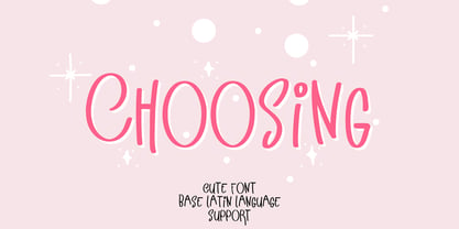 Choosing - a new fresh handmade calligraphy font. Very suitable for greeting cards, branding materials, business cards, quotes, posters, and more!This font are perfect for wedding postcard. Or you can create perfect and unique design of your logo, blog, stationery, marketing, magazines and more :) Features : UpperCase & Lowercase Numerals & Punctuations Multilingualcharacters(AÀÁÂÃÄÅCÇDÐEÈÉÊËIÌÍÎÏNÑOØÒÓÔÕÖUÙÜÚÛWYÝŸŸ ÆŒßÞàáâãäåæçèéêëìíîïðñòóôõöøùúûüýÿ)
 - Alt Fat by ALT,
$- Do you like fat fonts? Well here is a free one from me. Regular & Italic both free. Fat is a caps only font. Because of that if you type something with caps on, as you can see is typing in Greek I decide to make it like this since there no lowercase letters.
 - Bugmansta by OKSHUtypeCO,
$12.00 Bugmansta - a new fresh handmade calligraphy font. Very suitable for greeting cards, branding materials, business cards, quotes, posters, and more!This font are perfect for wedding postcard. Or you can create perfect and unique design of your logo, blog, stationery, marketing, magazines and more :) Features : UpperCase & Lowercase Numerals & Punctuations Multilingualcharacters(AÀÁÂÃÄÅCÇDÐEÈÉÊËIÌÍÎÏNÑOØÒÓÔÕÖUÙÜÚÛWYÝŸŸ ÆŒßÞàáâãäåæçèéêëìíîïðñòóôõöøùúûüýÿ)
 - Sporting by OKSHUtypeCO,
$14.00 Sporting- a new fresh handmade calligraphy font. Very suitable for greeting cards, branding materials, business cards, quotes, posters, and more!This font are perfect for wedding postcard. Or you can create perfect and unique design of your logo, blog, stationery, marketing, magazines and more :) Features : UpperCase & Lowercase Numerals & Punctuations Multilingualcharacters(AÀÁÂÃÄÅCÇDÐEÈÉÊËIÌÍÎÏNÑOØÒÓÔÕÖUÙÜÚÛWYÝŸŸ ÆŒßÞàáâãäåæçèéêëìíîïðñòóôõöøùúûüýÿ)
 - Gabilo Script by Sulthan Studio,
$14.00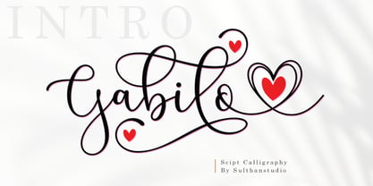 Gabilo Script font with a smooth, handwritten style. Gabilo script is perfect for branding projects, homeware design, product packaging, use in business cards, invitation cards, etc. Simply as a stylish text overlay onto a background image or anything that requires a touch of elegance. also comes with heart swashes that can be spliced.
 - Public Transportation JNL by Jeff Levine,
$29.00On the sides of freight cars, passenger trains, trolleys, buses and cable cars was once found identifying letters and numbers with a bold, yet quaint hand-painted look. Public Transportation JNL emulates the old-style look of those bygone years. - Poppy Spoor by Yumna Type,
$15.00 Would you like a legible, professional, prominent font? Well, if that is what you want, you will probably have trouble finding one as it is a time-wasting process and is a hard challenge. Let us introduce you to a perfect font for any project, the Poppy Spoor. Poppy Spoor, unlike the other display fonts, is a display font with rather square letters to show you fun, soft, modern impressions due to the thin line designs in low contrasts. This font type, giving you a clipart as a bonus, is legible and is better applied for big text sizes. You can maximize your designs with Poppy Spoor’s features to remain the best in every design at any time. Features: Alternates Ligatures Multilingual Supports PUA Encoded Numerals and Punctuations Poopy Spoor fits best for various design projects, such as brandings, posters, banners, headings, magazine covers, quotes, invitations, name cards, printed products, merchandise, social media, etc. Find out more ways to use this font by taking a look at the font preview. Thanks for purchasing our fonts. Hopefully, you have a great time using our font. Feel free to contact us anytime for further information or when you have trouble with the font. Thanks a lot and happy designing.
 - Packed JNL by Jeff Levine,
$29.00One of six fonts inspired by old stencil lettering guides, Jeff Levine has drawn a font which captures the feel of simpler times when signs and posters were stencilled by school children, teachers, librarians and shopkeepers. - Signed JNL by Jeff Levine,
$29.00One of six fonts inspired by old stencil lettering guides, Jeff Levine has drawn a font which captures the feel of simpler times when signs and posters were stencilled by school children, teachers, librarians and shopkeepers. - Shipped JNL by Jeff Levine,
$29.00 One of six fonts inspired by old stencil lettering guides, Jeff Levine has drawn a font which captures the feel of simpler times when signs and posters were stencilled by school children, teachers, librarians and shopkeepers.
 - Delivered JNL by Jeff Levine,
$29.00One of six fonts inspired by old stencil lettering guides, Jeff Levine has drawn a font which captures the feel of simpler times when signs and posters were stencilled by school children, teachers, librarians and shopkeepers. - Sealed JNL by Jeff Levine,
$29.00One of six fonts inspired by old stencil lettering guides, Jeff Levine has drawn a font which captures the feel of simpler times when signs and posters were stencilled by school children, teachers, librarians and shopkeepers. - banister by One Fonty Day,
$15.00 Banister looks both contemporary and vintage. It contains a total of 12 styles including two main styles (Normal and Loaded), and for each style it comes with two widths (Semi-condensed and Semi-Expanded) and three weights (Light, Regular and Bold). The 40’s inspired style is subtle in banister, so it comes across more contemporary. Also, slightly curved strokes can be found on some letters, which gives a more organic feeling overall. To gain full advantage of banister, you can toggle “Fill” and “Stroke” on any editable applications to experiment the style, also layering normal and loaded styles let you discover something unexpected. Banister is versatile, simple and organic looking typeface, and good for headlines, logos, tiles and any large texts.
 - P22 Garamouche by P22 Type Foundry,
$24.95 Think of Garamouche as Garamond's drunken cousin. This font replicates a long lost document ravaged by time and the elements (with a little sloppy printing for good measure.) Unlike the fake bolding option found in software programs, Garamouche Bold is a variant with more appropriate thick and thin features. The "dancing along the baseline" that has made Garamouche a favorite, is also a feature in Garamouche Bold, but the letters align and tilt in on their own terms. Using the two Garamouche fonts together can produce much more expressive results than just hitting "bold". P22 Garamouche Ornaments is a set of 72 ornamental embellishments designed to complement the Garamouche fonts but can be used with almost any layout that calls for historical decoration.
 - Berenjena by PampaType,
$40.00 Berenjena is a captivating font family designed by type designer Javier Quintana Godoy in Santiago de Chile. Berenjena has the right combination of comfort in reading and a lyric spirit. This helps keep readers in the delicate atmosphere in which novels and tales can display all their charm. Most typefaces created for books cannot reach this. Either they are too expressive so they tire the eyes of the reader, or they are dull and reading becomes a tedious task. Berenjena was designed for text use bearing in mind this concept of subtle balance. Berenjena (Spanish for aubergine or eggplant) gives your text that spicy environment in which words shapes are easy to read while letterforms maintain their capricious feeling. It comes in roman and cursive declined in four weights: Blanca, Fina, Gris, Negra. All Berenjena character sets include extensive diacritics coverage for more than 200 languages plus the usual contextual features. The Berenjena Pro fonts (available at PampaType.com) include smalls caps, elegant ligatures, cute swashes, every kind of figures, and all contextual sorts. Berenjena will give your design a very individual character. It wears captivating details of calligraphic poetry which link subtlety to vernacular sign painting from Santiago de Chile. See a pdf of Berenjena here http://origin.myfonts.net/s/aw/original/306/0/156716.pdf or visit PampaType.com for more information.
 - Posey by Graphicfresh,
$8.00 Posey is a vintage display family (All Caps) including Regular (Clean), Textured versions as well as Italic versions of each. It's perfect for logos, name card, magazine layouts, invitations, headers, or even large-scale artwork.
 - Edmund by Graphicfresh,
$8.00 Edmund is a vintage display family (All Caps) including Textured, Rough & Clean versions as well as Italic versions of each. It's perfect for logos, name card, magazine layouts, invitations, headers, or even large-scale artwork.
 - 1651 Alchemy by GLC,
$38.00 This family is a compilation created from a Garamond set in use in Paris circa 1651, but similar to those, eroded and tired, that were in use during centuries to print cheap publications, as well as in Europe than in America, and from a large choice of printed symbols—all specially redrawn—used for alchemical, pharmaceutical and astrological books, covering 1550 to late 1800s period. Each alphabet is doubled by a slightly different one, and a special OTF encoding allows to give an irregular effect with never the same twin letters in a single word. The Normal style is enriched by small caps, and the Italic style by Swashes. A lot of symbols, too, are given twice with differences. This font may be used with our calendar specialized 1689 Almanach.
 - Sennetarium JNL by Jeff Levine,
$29.00Jeff Levine first designed Sennetarium JNL back in 2004; based on the large drop caps found on intertitle cards from an old Charlie Chaplin film. The font’s name is a nod to Mack Sennett, king of the screwball comedies of the silent film era. - Christhine by Letterafandi Studio,
$14.00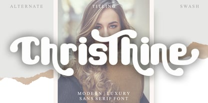 Christhine is a cool and interestingly designed display font. It will elevate a wide range of crafting ideas, from cards, to branding, labels and much more. This font is PUA encoded which means you can access all of the glyphs and swashes with ease!
 - Alayla by Ghuroba Studio,
$15.00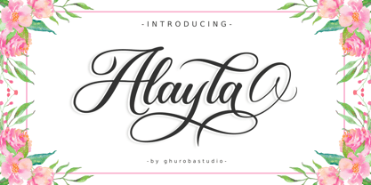 Alayla is modern calligraphy. It's feels both magical and elegant. It looks stunning for your design such as on wedding invitations, thank you cards, quotes, greeting cards, logos, business cards and every other design. This font is PUA encoded which means you can access all of the glyphs and swashes with ease! It features a varying baseline, smooth lines, gorgeous glyphs and stunning alternates.
 - Ajuslly by Stringlabs Creative Studio,
$29.00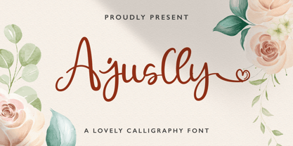 Ajuslly is an incredibly distinct, delicate and timeless handwritten font. It looks stunning on wedding invitations, thank you cards, quotes, greeting cards, logos, business cards and every other design which needs a handwritten touch. This font is PUA encoded which means you can access all of the glyphs and swashes with ease! It features a varying baseline, smooth lines, gorgeous glyphs and stunning alternates.
 - South Sand by Viswell,
$17.00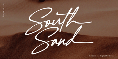 South Sand is a stylish and lovely script font. It looks stunning on wedding invitations, thank you cards, quotes, greeting cards, logos, business cards and every other design which needs a handwritten touch. This font is PUA encoded which means you can access all of the glyphs and swashes with ease! South Sand features : Uppercase & Lowercase Character Numeral & Punctuation Alternate & Ligatures Ending Swash Lowercase Multilingual
 - Bodoni Highlight by Image Club,
$29.99Giambattista Bodoni (1740-1813) was called the King of Printers; he was a prolific type designer, a masterful engraver of punches and the most widely admired printer of his time. His books and typefaces were created during the 45 years he was the director of the fine press and publishing house of the Duke of Parma in Italy. He produced the best of what are known as modern" style types, basing them on the finest writing of his time. Modern types represented the ultimate typographic development of the late eighteenth and early nineteenth centuries. They have characteristics quite different from the types that preceded them; such as extreme vertical stress, fine hairlines contrasted by bold main strokes, and very subtle, almost non-existent bracketing of sharply defined hairline serifs. Bodoni saw this style as beautiful and harmonious-the natural result of writing done with a well-cut pen, and the look was fashionable and admired. Other punchcutters, such as the Didot family (1689-1853) in France, and J. E. Walbaum (1768-1839) in Germany made their own versions of the modern faces. Even though some nineteenth century critics turned up their noses and called such types shattering and chilly, today the Bodoni moderns are seen in much the same light as they were in his own time. When used with care, the Bodoni types are both romantic and elegant, with a presence that adds tasteful sparkle to headlines and advertising. This version of Bodoni was done by Morris Fuller Benton for American Typefounders between 1907 and 1911. Although some of the finer details of the original Bodoni types are missing, this family has the high contrast and vertical stress typical of modern types. It works well for headlines, logos, advertising, and text." - Thystle by Scholtz Fonts,
$25.00 Thystle is a "font for all seasons". It has six styles ranging from fine to in-your-face, from delicate mono-weight pen strokes to fully calligraphic lines, from delicate, narrow characters to bold, powerful statements. Characteristically, all the styles abound with Anton Scholtz's energetic "creative common" style - extravagant capitals, clear characters, and bursting-with-life swashes. Three Thystle styles are calligraphic. You can use: - Regular for invitations, poems, greeting cards and body text - Black for swing tags, music media, menus and sub-headings - Fat for posters, book covers and headings Three Thystle styles are monolinear. You can use: - Mono1, which is both delicate and condensed in width, for invitations, poems, greeting cards and body text - Mono2, which is of medium weight and condensed in width, for swing tags, music media, menus and sub-headings - Mono3, which is heavier and of standard width, for posters, book covers and headings. Opentype features include alternative upper case characters, as well as a number of ligatures. (These can be used in applications that access OpenType features.) Thystle contains over 283 characters - (upper and lower case characters, punctuation, numerals, symbols and accented characters for both Text and Display caps). It has all the accented characters used in the major European languages.
 - Caslon #540 by Linotype,
$29.99The Englishman William Caslon punchcut many roman, italic, and non-Latin typefaces from 1720 until his death in 1766. At that time most types were being imported to England from Dutch sources, so Caslon was influenced by the characteristics of Dutch types. He did, however, achieve a level of craft that enabled his recognition as the first great English punchcutter. The original Caslon specimen sheets and punches have long provided a fertile source for the range of types bearing his name. Identifying characteristics of most Caslons include a cap A with a scooped-out apex; a cap C with two full serifs; and in the italic, a swashed lowercase v and w. A few of the many interpretations from the early twentieth century were true to the source, as well as strong enough to last into the digital era. These include two from the American Type Founders company, Caslon 540 and the slightly heavier Caslon #3. Both fonts are relatively wide, and come complete with small caps, old style figures, and italics. - Bongani by Scholtz Fonts,
$19.95Bongani has its origins in wood-carved African design and art. The letter forms are informal and asymmetric and the "decorative" elements are matched to each letter shape and have no mechanical rigidity. It is was designed for situations that require: -- the look and feel of Africa -- strong ornamental headlines It can be effectively used in advertising and in applications such as greeting cards and book covers. The font is fully professional: carefully letterspaced and kerned. It contains over 235 characters - (upper and lower case characters, punctuation, numerals, symbols and accented characters are present). - Archivo by Scholtz Fonts,
$19.00 Is it calligraphic? Is it handwritten? Something like a fusion - casual, handwritten and calligraphic! My aim was to bring calligraphy into the 21st century, creating a present day version of a calligraphic script. Archivo is clear, legible and extremely versatile. It can be funky and modern, pretty and feminine, serious and old-style. Use it for posters, marketing material, invitations, greeting cards, cosmetic and clothing media. Archivo has standard OpenType features, and language support includes all European character sets. We recommend that you do not use Archivo as an "all-caps" font.
 - Merlin by Linotype,
$29.00Linotype Merlin is part of the Take Type Library, which features the winners of Linotype’s International Digital Type Design Contest from 1994 to 1997. This font was designed by Anne Boskamp and its alphabet consists exclusively of capital letters. At the same time aggressive and sensitive, Merlin looks as though it were scratched onto paper with a pen tip saturated with ink. Like characters from another time, the letters fall into place and make an impression which is both vulnerable and strong, lively and reserved. Merlin’s historical roots lie in the archaic pictograms in the caves of Stone Age civilizations. - Bookseller Bk by Cyanotype,
$20.00 Bookseller Bk is a typeface designed for books and legible text at a small sizes, with an old book feeling. This typeface is the reinterpretation of a sample found in a French book, published between 1882 and 1893 and its author —Ernest Michel— lived between 1837 and 1896. This sample has influence from Didot, Scotch Roman and Clarendon (typefaces which were in use at that time). This reinterpretation expands the basic set for the contemporary era. Bookseller Bk includes small caps, old style figures, lining figures, fractions and basic Cyrillic alphabet. Everything in 3 different optical widths. You can save some lines with Reduced weight or fill some lines with Ample weight. All of them with italics, bold and bold italics. Bookseller Bk is also available in Caption size. 12 fonts for legibility at smaller sizes. Subhead & Title sizes are now in development. Finally this typeface was the result of the course Digital Reinterpretation of Classic Typography by Oscar Guerrero Cañizares at Domestika. Do you require additional glyphs? Please contact me to consider your request in order to expand Bookseller in further updates.
 - 1475 Bastarde Manual by GLC,
$38.00 This script font was inspired by the type called “Bastarde Flamande”, a much appreciated one in the Duke of Burgundy’s court at the end of 1400s for handwritten books. A book titled Histoire Romaine (Roman history), from Roman author Tite Live, translated in French by Pierre Bersuire, circa 1475, was our main source for drawing the lower case characters and many of the upper case. Each character was written by hand with a quill pen on rough paper so as to look like the originals as much as possible. This font includes “long s”, naturally, as typically medieval , also a few ligatures, final and initial characters but there aren't any abbreviations because the text was written in French rather than Latin. Instructions for use are enclosed in the file and identify how to keyboard these special characters. This font can be used for web-site titles, posters, fliers, ancient looking texts, greeting cards, indeed for many types of presentations as it is a very decorative, elegant and luxurious font. Large type size shows this font at its best.
 - Bookseller Cp by Cyanotype,
$20.00 Bookseller Cp is a typeface designed for books and legible text at a smaller sizes, with an old book feeling. This typeface is the reinterpretation of a sample found in a French book, published between 1882 and 1893 and its author —Ernest Michel— lived between 1837 and 1896. This sample has influence from Didot, Scotch Roman and Clarendon (typefaces which were in use at that time). This reinterpretation expands the basic set for the contemporary era. Bookseller Cp includes small caps, old style figures, lining figures, fractions and basic Cyrillic alphabet. Everything in 3 different optical widths. You can save some lines with Reduced weight or fill some lines with Ample weight. All of them with italics, bold and bold italics. Bookseller Cp is also available in Book size. 12 fonts for legibility at small sizes. Subhead & Title sizes are now in development. Finally this typeface was the result of the course Digital Reinterpretation of Classic Typography by Oscar Guerrero Cañizares at Domestika. Do you require additional glyphs? Please contact me to consider your request in order to expand Bookseller in further updates.