10,000 search results
(0.029 seconds)
- Romes by PeachCreme,
$16.00 Hi, peaches! Glad to introduce to you our latest “Romes” font duo that combines classy serif and cute script fonts. The exquisite curves of the serif font and natural beautiful flow of the script font can give your projects a voguish and elegant touch! Romes Script is a lovely and at the same time clear and easy-to-read handwriting font. Romes is a moderately bold font that blends traditional influences into a contemporary aesthetic. This font duo works well for branding, weddings, social media, product design, stationery, advertising, and many more.
 - Retro Thunders by Lettersiro,
$25.00 This is our newest product, inspired by retro style. We call this font "Retro Thunders". Retro Thunders is perfect for any retro project, poster, logo, label, clothing, music album cover, and many others. Comes with solid and extrude style, you can use this font easily, and make save a lot of your time in creating. Retro Thunders also contains: - Opentype Features : swash, ligatures, stylistic alternate, ss01, ss02 , ss03 - 8 end swashes - Basic Latin Language Support (AÀÁÂÃÄÅCÇDÐEÈÉÊËIÌÍÎÏNÑOØÒÓÔÕÖUÙÜÚÛWYÝŸÆßÞþ )
 - Knip by Hanoded,
$15.00 Knip, in Dutch, means ‘cut’. You can tell by the glyphs that I made this font by cutting out the shapes from black paper, gluing it onto white paper and photographing the result so I could digitalise it! I don’t make too many cut out fonts, as it is a lot of work and it often leads to nothing. Besides that, I depend on the paper supply from my kids and they happened to have black paper this time!
 - Fancy by Arodora Type,
$15.00 Fancy Font Family is a font that I have been working on since 2012 and I have been trying to complete it for a long time. Thanks to its wide lines, you can use it easily in your paragraphs and poster designs. In fact, the purpose of using a font is entirely related to your imagination and your originality. The Fancy Font Family adapts to any design format you need and does not let you down.
 - Childish by alphArt,
$20.00 Hello everyone, this time we would like to introduce a funny script font that we just made with passion and enthusiastic, this font comes with a touch of funny font. Introducing this handwritten font called "Childish | Funny Script Font", this funny font comes with uppercase letters, lowercase letters, ligatures, multilingual support, numbers and punctuation. This font is suitable for you to use as logos, quotes, instagram posts, invitations, magazines, cards, product packaging, headers and whatever your imagination.
 - Manifestor by Stawix,
$40.00 Manifestor is designed to be an urban culture typeface, it can effortlessly fit, blend and be in very situation at any time without taking up too much attention. It has a clean san-serif structure and proportion, kind to the eyes when set in texts while also look reliable when use in big scale. Manifestor has the simple - easy - comfortable feature, therefore it is a type appropriate for a very wide range of occasion. Manifestor also comes in Variable!
 - Albertina by Monotype,
$29.99Albertina was a typeface ahead of its time. It was in the early 1960s when designer Chris Brand, an accomplished calligrapher, aspired to draw a typeface based on the principles of calligraphy. Unfortunately, typesetting machines of that era put many restrictions on designers. Characters had to be drawn within a very coarse grid, which also defined their spacing. Technological limitations meant that italic designs often had to share the same character widths as the romans. Designers were forced to draw italic faces much wider and with more open spacing than what would be typical in calligraphic lettering or hand-set type. Not surprisingly, production of the first Albertina fonts went very slowly. Brand would submit his character drawings, and the Monotype Drawing Office would modify them to be compatible with the company's typesetting equipment. The new drawings would then be sent back to Brand for approval or rework. Most were reworked. The process took so long, in fact, that by the time the face was completed it was once again out of phase with the times: instead of being released as metal type for the Monotype composing machines it had been tailored for, Albertina debuted as phototype fonts for the Monophoto typesetter. The design's first use was for a catalog of the work of Stanley Morison, exhibited at the Albertina Library in Brussels in 1966. Sales of the design were not remarkable. With the advent of digital type technology, Albertina's story took a far happier turn. Frank E. Blokland, of the Dutch Type Library, used Brand's original, uncompromised drawings as the foundation of a digital revival. The Monophoto version had taken a considerable battering from the limitations of Monotype's unit system," recalls Blokland, "but there was no need for me to incorporate these restrictions in the digital version." With the full backing of Monotype and original designer Brand looking over Blokland's shoulder, a new design for Albertina emerged, displaying all the grace and verve of Brand's original drawings. The basic family drawn by Brand also grew into three weights, each with an italic complement and a suite of small caps and old style figures." - Ongunkan Bosnia Pyramid by Runic World Tamgacı,
$100.00 The signs of the Bosnian pyramids The pyramid researcher, Semir Osmanagic, began excavations in 2005 in Visoko, Bosnia, 30 km North from Sarajevo. Mr. Senad Hodocic, the curator at the local museum, pointed out at the pyramidal shape of the Visocica Mountain, which grabbed Osmanagic's attention. It is also suspected that the four adjacent hills, covered by plants and greenery, also hide the pyramids. The main sites of the excavations are called the Pyramid of the Sun and the Pyramid of the Moon, and the results achieved so far have already proved that those structures are man-made and artificial. The Pyramid of the Sun is bigger and older than the pyramid in Giza, which was built by Pharaoh Cheops 4600 years ago. Gábor Szakács, who went to the site in June 2006 for the first time, found the symbols on the megalithic blocks inside the tunnel of the Pyramid of the Sun, which correspond to the ancient Hungarian runic writings. Further information about the Bosnian Pyramids is available at the website http://www.piramidasunca.ba/. There are also researchers who do not accept the subject of the Bosnian pyramids. Time will tell the truth.
 - Hooptie Script by FDI,
$25.00 Two typefaces inspired by the car lettering of the Motor City. In contrast to other car script fonts, the Hooptie Script fonts make full use of modern OpenType technology. Just turn on contextual alternates and ligatures and watch how each letter pair always connects perfectly. The full package includes seven bonus vector images of vectorized hooptie cars. Check out the type specimen for more details.
 - Portuguesa by Sudtipos,
$49.00 Inspired by the graphic spirit of old packaging and store signs of Portugal, this font seeks to transmit the warm and sunny sound of Portuguese language in a visual way. Portuguesa has 3 partners, designed to work nicely together and to complement one with each other. Portuguesa Script, with friendly and rhythmic personality, great for titles and short text, Portuguesa Caps, with small caps and ligatures that perfectly match (and contrast) with the script version. And Portuguesa Icons, that recalls the legendary blue tiles. This last version was specially designed to mix signs up with delightful combinations for creating patterns, borders, stationary, tableware and all kind of commercial products and projects that needs a memorable strike. The possibilities are numberless. As a mantra, Portuguesa is always in a positive mood, spreading the “Portuguese art of welcoming people”. Seja Bem-Vindo!
 - Drowsy Lunch by PizzaDude.dk,
$15.00 The inspiration for this font (as well as the name!) comes from a London cafe I visited years ago. I was fascinated with the handwritten menu - irregular and awkward, yet refreshingly charming. I did my best to recall that particular look by adding 4 slightly different versions of each lowercase letter. The name of the font comes from the speed of the waiter...or the lack of it! But luckily he took his time, otherwise I wouldn't have had the time to really look at the handwritten menu! :)
 - Narrow Minded JNL by Jeff Levine,
$29.00 In the days of hand lettering, a common philosophy was "the problem creates the solution". Often times the layout artist would have to adapt the lettering style to fit the amount of copy on a line. A perfect example is during the early 1900s, when popular sheet music of the time almost seemed to be competing for how many words could be used within a song's a title. One such piece of sheet music offered up the tall, condensed and variable-width lettering found within Narrow Minded JNL.
 - Koch Schrift by Ingo,
$42.00 A heavy blackletter; Rudolf Koch’s first type from 1909. On an old page full of type specimen from the 1930s, the type is described as ”Schwabacher (used by the Deutsche Reichsbahn [German Imperial Railway]).“ As a matter of fact, it is the first print of the Offenbach script master Rudolf Koch, who came out with this typeface in 1909. At that time, it was given the name ”Neudeutsch“ (New German). Later, it became very popular under the name Koch-Schrift, and was at times the official typeface of the Deutsche Reichsbahn (German Imperial Railway).
 - Skeletons by OKSHUtypeCO,
$12.00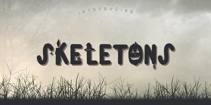 Skeletons - a new fresh handmade calligraphy font. Very suitable for greeting cards, branding materials, business cards, quotes, posters, and more!This font are perfect for wedding postcard. Or you can create perfect and unique design of your logo, blog, stationery, marketing, magazines and more :) MULTILANGUAGE Style uppercase THANK YOU!!!
 - Hamidha Script by Gatype,
$14.00 Hamidha is suitable use for market design developed at this time, this font has a model Trendy, natural and gentle, with this font you can take advantage of the opportunity in every moment of one wonderful way to highlight the celebration of the feast of your best, because this font will be advocates for purposes such as wedding invitations, party, graduation, birthday, gathering, etc. you need a program that supports Adobe Illustrator CS, Adobe Indesign & CorelDraw X6-X7, Microsoft Word 2010 or a later version. How to access all alternative characters using Adobe Illustrator: https://www.youtube.com/watch?v=XzwjMkbB-wQ Hamidha is coded with PUA Unicode, which allows full access to all additional characters without having to design any special software. Mac users can use Font Book, and Windows users can use Character Map to view and copy any additional characters for pasting into your favorite text editor / application. How to access all alternative characters, using the Windows Character Map with Photoshop: https://www.youtube.com/watch?v=Go9vacoYmBw
 - Epilogus by Artisticandunique,
$9.00 Epilogus - Serif font family - 18 Styles - Multilingual supports Epilogus is an elegant serif font family with different alternative character designs. This font provides flexibility in all your projects with the alternatives it offers you with its multiple language options, 18 styles and rich glyph options. You will have the opportunity to enrich the content of your projects with alternative characters. According to the purpose of use in typographic compositions that you will create with the aesthetic structure of alternative characters; You can enrich your titles in books or magazines, and your logos in branding. You can benefit from the elegant structure of standard characters in your plain texts. Especially for editorials, magazines, books, branding, packaging, logo design, web design, headlines, movie titles etc. If you're looking for a font with stylistic alternatives, Epilogus serif font might meet your needs. With this font you can create your unique designs. If you have a question, please contact me. Have a good time.
 - Night Sign JNL by Jeff Levine,
$29.00 For decades, the soft glow of a neon sign beckoned weary travelers to roadside rest courts, told the hungry individual where to eat; let enthusiastic revelers know where the night life was happening. There is something special about a neon sign, yet changing times, city ordinances and even technology itself is turning this staple of urban life for over a hundred years into a museum piece. Night Sign JNL emulates the craft of hand-formed neon signage and it (along with a few added special effects) can really add some good-old-fashioned pizzazz to a print or web project.
 - Impecunious JNL by Jeff Levine,
$29.00 The type design for Impecunious JNL comes from the 1939 sheet music for "You Don't Know How Much You Can Suffer (Until You Fall in Love)". The name comes from another piece of sheet music, 1899's "Impecunious Davis" [a piece of late 19th century tripe demeaning Black Americans]. However, the word "impecunious" was intriguing. According to the website Merriam-Webster.com, the simple definition of impecunious means "having little or no money". Since we've all been in that spot at one time or another, it became a perfect font name. Impecunious JNL is available in both regular and oblique versions.
 - Frequent by PizzaDude.dk,
$19.00 This font was originally meant to be my last creation of 2022, but as it turned out, it was the first font of 2023 instead! Why? Well, because it took me a lot of time to complete the 150 different swahes letter combinations, the 182 different letters (not counting numbers, accented characters etc) the small caps, the subscript and the multilingual support! Anyway, it was worth the work - the Frequent font works great as a display font, or whatever you have in mind. Play around with the different versions (Regular, Solid and Inside) for great results.
 - Kinn by Stawix,
$30.00 Kinn is an industrial san-serif typeface with an essence of squared structure inspired by a futuristic look. Kinn is robust but portray a friendly touch with a little roundness to its shape, it can also be very formal when it needs to but it is flexible and fun to use at the same time. Its wide proportion makes it ideally suited a wide range of modern applications and variety of usage from heavy display, headlines or even text. Kinn comes in 9 consecutive weights, each weight accompany with italics. Equipped with Alternates, Ligatures and 10 Cryptocurrency signs.
 - Parametra by URW Type Foundry,
$39.99 This humanistic sans serif distinguishes itself by its Japanese calligraphy influence. Being written with a felt tip rather than with a brush, its Japanese connotation is remote and non-dominant, thus providing excellent readability and a charm of its own. Parametra is a very elegant and modern typeface achieved by the strong form reduction of the individual characters and at the same time harmonizing them by given parameters. It is something of its own, but quite legible and well-suited for small text. Also, Parametra and Bohemian can be mixed perfectly since their proportions and dimensions are the same.
 - Lavenda by Aga Silva,
$29.99 Lavenda font is a result of my two year classic calligraphy studies, and is based on my own handwriting. The overall look is classic, which makes it a match for invitations, place cards or other paper goods where old time elegance is required. With the glyph count just under 1500 the font has many alternates and options which makes it flexible to use. Apart from swashes, alternates and ligatures - number of fancy dingbats is also included. Again, with vast number of glyphs contained should you write in other language than English - Lavenda comes as a natural choice.
 - Reina Neue by Lián Types,
$29.00 Hey! See Reina Neue in action here! INTRODUCTION When I designed the first Reina¹ circa 2010, I was at the dawn of my career as a type designer. The S{o}TA, short for the Society of Typographic Aficionados, described it as complex display typeface incorporating hairline flourishes to a nicely heavy romantic letterform². And it was like that; that’s what I was pursuing at that time since I was very passionate about ornaments and accolades of Calligraphy. Why? I felt that Typography, in general, needed more of them. These subtle flourishes could breathe life into letters. Maybe, I thought it was the only way I could propose something new into the field of type. However, after some years, I came across a very interesting quote: –Beautiful things don’t ask for attention– Wow! What did this mean? How could something be attractive if it’s not actually showing it. Could this be applied to my work? Sure. I think every type-designer goes through this process (aka crisis) regarding his or her career. At the beginning we love everything. We are kind of blind, we only see the big picture of a project. And that’s not because we are lazy. We actually can’t see the small mistakes nor the subtleties that make something simpler beautiful. We are not able. But, the small subtleties… They are actually everything: With experience, one puts more attention into the details and learns that every single decision in type has to be first meticulously planned. Here I am now, introducing a new Reina, because I felt there was a lot of it that could be improved, also the novelty of Variable Fonts caught my attention and I had to take that to my type library. THE FONT A thing of beauty is a joy forever Now, a decade later, I’m presenting Reina Neue. This font is not just an update of its predecessor: –A thing of beauty is a joy forever– is the first line of the poem ‘Endymion’ by John Keats, and despite the meaning of “beauty” may vary from person to person, and even from time to time (as read in the last paragraph), with Reina I always wanted to bring joy to the eye. In 2010, and now, in 2020. I believe the font is today much better in every aspect. It was entirely re-designed: Its shapes and morphology in general are much more clean and pure. The range of uses for it is now wider: While the old Reina consisted in just one weight, Reina Neue was converted into a big family of many weights, even with italics, smallcaps and layered styles. The idea behind the font, this kind of enveloping atmosphere made out of flourishes, is still here in the new Reina. This time easier to get amazing results due to the big amount of available alternates per glyph and also more loyal from a systemic point of view. However, and as read in the introduction -Beautiful things don’t ask for attention-, if none of the flourishes are activated the font will look very attractive anyway. Reina Neue is ready to be used in book covers, magazines, wedding cards, dazzling posters, storefronts, clothing, perfumes, wine labels and logos of all kind. Like it happened with the previous Reina, I hope this new font satisfies every design project around the world if used, and can be a joy forever. SOME INSTRUCTIONS Before choosing the right style for your project, hear my advice: -Reina Neue Display was meant to be used at big sizes. If you plan to print the font smaller than 72pt, I suggest using Reina Neue, not Display. Otherwise, if the font will be BIG or used on a digital platform, Reina Neue Display should be your choice. For even smaller sizes, use Reina Neue Small. This style was tested and printed in 12pt with nice results. (Note for variable fonts: Print them in outlines) -Reina Italic is not a slanted version of the roman, and this means some flourishes are different between each other. The Italic version has other kind of swirls. More conservative, in general. -All the styles of Reina Capitals have Small Capitals inside. -Reina Capitals Shine should be used/paired ONLY with Reina Capitals Black. The engraved feeling can be achieved if Reina Capitals Black and Reina Capitals Shine are used as layers, with the same word. Variable fonts instructions: -For more playful versions, choose Reina Neue VF, Reina Neue Italic VF or Reina Neue Capitals VF: With them you can adjust between 3 axes: Weight (will change the weight of the font) – Optic Size (will thicken/lighten the thin strokes and open/close the tracking) – Accolades (will modify the weight of the active flourishes). SOME VIDEOS OF REINA NEUE VF https://youtu.be/8cImmT5bpQM https://youtu.be/1icWfPmKAkg https://youtu.be/YC9GkJDL1a8 NOTES 1. The original Reina, from a decade ago: https://www.myfonts.com/fonts/argentina-lian-types/reina/ 2. In 2011, Reina received an honourable mention by S{o}TA. “Great skill is shown in the detailing, and an excellent feel for the correct flow of curves and displacement of stroke weight.” https://www.typesociety.org/catalyst/2011/ Reina was featured in the “Most Popular Fonts of the year” in MyFonts in 2011 https://www.myfonts.com/newsletters/sp/201201.html In 2012, the font was also selected in Tipos Latinos, the most prestigious competition of type in Latinoamerica. https://www.tiposlatinos.com/bienales/quinta-bienal-tl2012/resultados Also, chose as a “Favorite font of the year” in Typographica. https://typographica.org/typeface-reviews/reina/
 - Escuela by Cuchi, qué tipo,
$9.95 Escuela typeface is born in an attempt to reflect so many current influences of modern grotesque fonts that are trying to better reflect the values of today's world. Its compact proportions and high x-height, but at the same time with sort kind of modulation and open inktraps, propose a visual game that is worth enough to use it many places; Escuela can be striking and ideal for headlines in large text and heavy weights, but at the same time serious and readable in smaller bodies or regular and fine weights. Its wide range of characters, which includes a set of emoticons ideal for signage, work and evaluation documents, as well as inclusive, is ideal for educational centers, whether they are more playful (schools) or more pragmatic (universities). In fact, "Escuela" means “School” in English. For this reason, Escuela is your best ally when it comes to preparing texts that transcend students through a contemporary and different, but functional, character. Designed by Carlos Campos www.cuchiquetipo.com Dummy text from wikisource.org (1911 Encyclopædia Britannica/Universities).
 - Ernest & Emily by Nicky Laatz,
$15.00 I’d like to introduce you to Ernest and Emily :) ....The happiest font duo you'll ever meet :) They are completely in love with each other, and always get along like a house fire :) Ernest and Emily consist of two lovingly handwritten fonts. A brushed quirky-casual script, and a playful all-caps sans-serif font. Perfect for Type-based creations, branding, websites, merchandise, packaging, quotes, invites, greetings and so much more! All they need is a blank canvas, and they work their magic for you! The brush script comes in 3 variants - Regular, Slanted and Upright- each with its own twist to fit the look you need. Four sweet little heart glyphs can be found by typing the characters { } and [ ] individually. Well now that I've introduced you, I'll let you get properly acquainted! :)
 - Galactic Core by Thomas Käding,
$9.00 A clean and easy-to-read Aurebesh font, inspired by writing in the Star Wars (TM) movies and at Disney's Hollywood Studios (TM). Includes special characters for CH, AE, EO, KH, NG, OO, SH, and TH. If your software supports this feature, then these replacements are automatically made while you type. If you do not want to use them, and you are unable to disable the feature in your software, then please use the GalacticCore_NoSubs file. That file has automatic replacements disabled. It has a different font name, so both files can be installed at the same time. Also includes both styles of numerals, Sabacc dice faces, and card suits. We created this font to be used for typesetting books and stories. But feel free to use it for t-shirts, artwork, or whatever.
 - Chopader by Letterhend,
$17.00 Introducing, Chopader - a vintage sans serif font duo. Inspired by 50s 60s signages, this font made to bring back the good ol' days. This type of font perfectly made to be applied especially in logo, headline, signage and the other various formal forms such as invitations, labels, logos, magazines, books, greeting / wedding cards, packaging, fashion, make up, stationery, novels, labels or any type of advertising purpose. Features : Two fonts (Thin and bold style) numbers and punctuation multilingual PUA encoded Only caps We highly recommend using a program that supports OpenType features and Glyphs panels like many of Adobe apps and Corel Draw, so you can see and access all Glyph variations.
 - Albion's Very Old Masthead by Greater Albion Typefounders,
$15.00 Albion’s Very Old Masthead is inspired by traditional newspaper mastheads. A heavy Black Letter which brooks no argument, and can be emphatic and refined (emphatically refined?) at the same time. Very Old Masthead has been deliberately weather to suggest that it has been set with timeworn, well-used, type.
 - Monsterific BB by Blambot,
$20.00 Monsterific BB was inspired by classic 70s horror magazine titles, and features a large complement of European characters and over 160 Opentype Autoligatures! Perfect for Halloween or any spooky time of the year!
 - Hanger by Wordshape,
$20.00 Hanger is a limited character display typeface. Based on the shapes of the alphabet if made out of a bent wire hanger, Hanger is suitable for apparel design, merchandising, and identity design projects.
 - Ellyshabeth by DLetters Studio,
$13.00 Ellyshabeth Signature Script Font is perfect for Logo, Signature, Social Media Posts, Advertisements, Magazine, Product Packaging, Label, Sticker, Photography, invitation, Business Cards, and any projects that need handwriting taste. Each basic character (“A”) is followed by Unicode variants of the same character (Á, Ä…), then OpenType variants (small caps, alternates, ligatures, Swash…). This way you can see all the variations on a single character in one place. Thanks for your support, please kindly send us a message for any question about our product. Hope you like it.
 - Gwidon by GRIN3 (Nowak),
$19.00 Gwidon is a family of three quite distinct fonts that perform together very well. Gwidon Regular and Gwidon Line are elegant, fully connected scripts with ligatures to help with flow and readability. Gwidon Caps is all capital letter font which include 2 version for each letter, easily reachable through keyboard upper and lower keys. Gwidon can be used for invitations, greeting cards, posters, advertising, weddings, books, menus etc. Language support includes Western, Central and Eastern European character sets, as well as Baltic and Turkish languages.
 - CHILLOUTTE by Fontysia,
$12.00 Chilloutte is a cute, cool, and friendly display font. A playful all-caps Display font that includes five versions of each letter which can be used separately or on top of each other to achieve a different look. This font is PUA encoded which means you can access all of the glyphs and alternates with ease! (please type the preview to see if I have what you need!)
 - Stettinum Nicodemus Pro Sansum by Wardziukiewicz,
$20.00 Stettinum Nicodemus Pro is a project to revitalize lettering from tenement houses in Szczecin. The project includes the digitization of letter remains from ul. Kaszubska in Szczecin to form functional fonts. The main idea of the project was to preserve the disappearing remnants of Szczecin's typographic past, which, despite the span of glyphs limited by time, can be an inspiration for many future extensions of the already established family. Stettinum Nicodemus Pro Sansum is a family of typefaces consisting of 7 variations. The block structure with a regular structure and a relatively high minuscule allows for many different applications. Versions 700, 800 and 900 are intended for titles, headings and emphasis, typefaces 300 to 600 are text typefaces.
 - Karlo by The Northern Block,
$28.95 Karlo is a super family of several branches, originating in the same lightweight skeleton. The lightweights are based on a pen of an even stroke-width. Inspired by the writings of calligrapher Edward Johnston, the family moves on in two directions in the heavier weights. Johnston demonstrated that the broad nib pen can produce different writing styles. Following this, one heavy weight has a humanistic low stroke contrast (KarloSerifBold and KarloSansBold), and another has a high stroke contrast of vertical axis with references to the 19th century jobbing typefaces (KarloOpen). The latter is inspired by Johnston’s demonstration of the broad nib pen, where he suggested fastening two pencils together. With each pencil representing an edge of the pen, it becomes more evident how the pen works in writing. The friendly informal look makes KarloSans and KarloSerif usable for both running text and for display sizes. KarloOpen, on the other hand, is solely designed for display purpose showing few words at a time. In Denmark, a guy named Karlo would typically be an old fellow with a slick hairstyle that makes an effort with his appearance. He is a handyman who can do a bit of this and that when needed. He is a happy go lucky kind of guy that takes one day at a time. To me, the typeface family has some of the same qualities. Check out Pyke which is a great pair for Karlo.
 - Kentrell Scripts by eyetype,
$14.00 Nigthfall a work that is purely a result of handwriting, has a natural characteristic. this is perfect for invitations, signatures, blogs, social media, business cards, product brands. Nigthfall a work that is purely handwritten, has its own characteristics with the style of monoline It is perfect for invitations, signatures, blogs, social media, business cards, product brands, also equipped with 52 ligature. OpenType features can be accessed by using OpenType smart programs such as Adobe Photo Shop, Adobe Illustrator, Adobe Indesign, Corel Draw and Microsoft Office. can also be accessed through the character map.
 - Crooked Hooks by Sarid Ezra,
$15.00 Crooked Hooks is all caps font with street style brush. It's contain uppercase and lowercase in different style, number, symbol, and also with multilingual support! Caps Only Fonts. There is a lot of stylistic ligatures in this font. This font also contain opentype feature for adding line under a word, You can access it from ligature, simply type underscore + number (1-3) in the middle of the text. For example: Mar_3ker. You can use this font for any project such as a branding, poster, or quotes! Happy Creating!
 - Paiute by insigne,
$9.99 Feast your eyes on Paiute, the sultry script that'll have your design looking hotter than a Vegas summer! This font is so seductive, it'll make your audience swoon harder than when Elvis was at the Sands. The exaggerated top stroke and sharply slanted terminals give Paiute a look that's straight out of the vintage Vegas scene. It's like the Rat Pack meets Marilyn Monroe in a smoky casino bar. Whether you're designing a magazine cover, book cover, or movie poster, Paiute is the perfect choice for that extra touch of va-va-voom. It's like sprinkling glitter on your design - except it won't get stuck in your hair. So why settle for boring fonts when you can make your project stand out like a sequined jumpsuit? Let Paiute help you bring that authentic 1960s Vegas vibe to your marketing. Your audience will be shouting "Viva Las Paiute" in no time!
 - Adegianty by Awan Senja,
$14.00 Adegianty feels equally charming and elegant. It looks stunning on wedding invitations, thank you cards, quotes, greeting cards, logos, business cards and every other design which needs a handwritten touch. This font is PUA encoded which means you can access all of the glyphs and swashes with ease! It features a varying baseline, smooth lines, gorgeous glyphs and stunning alternates.
 - Gista Danes by Aqeela Studio,
$20.00 Gista Danes feel equally charming and elegant. It looks lovely on wedding invitations, thank you cards, quotes, greeting cards, logos, business cards, and every other design that needs a handwritten touch. This font is PUA encoded, which means you can easily access all of the glyphs and swashes! It features a varying baseline, smooth lines, gorgeous glyphs, and stunning alternates.