10,000 search results
(0.048 seconds)
- DT Skiart Serif Leaf by Dragon Tongue Foundry,
$10.00 ‘Skiart Serif Leaf’ has been on a long growing path getting to where it is now. Originally inspired by the san serif font ‘Skia’ by Mathew Carter for Apple. ‘Skiart’ was designed to feel more like a serifed font, but without any serifs. It took a step between sans serif and serif fonts. Next on the path towards a serif font came Skiart Serif Mini, with tiny serifs added. This was a true serif font, although they were subtle. This font ‘Skiart Serif Leaf’ is the next in the series. After many reiterations, ‘Skiart Serif Leaf’ was built and rebuilt many times until finally, this version deserved to be presented to the world. Style and flow had been added to this font. It remained fully readable and feels as clean and normal as any of the best body copy serifs, and yet has an original modern flair to it. The font feels strong and solid while having a subtle organic flow in its form. If compared to one of the more commonly used serifs like ‘Times New Roman’, the ‘Skiart Serif Leaf’ lowercase is more open with a taller x-height, increasing its readability and friendliness. The serifs are smaller and less distracting. They are not pretending to be ligatures. This font may be organic but is not in anyway script like. Where ‘Times’ makes its p q b d forms out of a barely touching oval and stem, the ‘Serif Leaf’ forms are much more firmly attached, appearing clearly as single letters. The standard setting for the a’s and g’s are round single story, feeling warmer and more inviting in the ‘Serif Leaf’ font. Much more friendly than the stuffy double storied versions in fonts like ‘Times’ etc. ‘Skiart Serif Font’ comes with a somewhat organic italic.
 - Ronet by yasireknc,
$10.00 It can be tricky to find typefaces that can convey the feeling of personal warmth that comes from a handwritten note, custom brandings, special series of products, especially as we type more and more and write with a pen or pencil less and less. To add some more of that warmth to a font, I’ve made Ronet. A duo font based on the my handwriting. Double eponymous styles of the font —Ronet and Ronet Alternative— each have a unique flavor with its own rhythm and character. It can be used on branding designs, product labels, invitation cards, social purposes which is bloggers, influencers but they were capable of so much more, and I’m happy to share them for general use. Ronet has extraordinary alternative characters, that makes these fonts so impressive. These two styles have dynamic substitution, alternates, and beautiful kerning! Nevertheless, they each support an impressive range of languages using the Extended Latin alphabets and because they were designed to work well in a simple tool, a rare feature of these fonts is that they look just as good no matter where you use them. LOTS of writing, and then even more care once I developed and refined digital outlines from the samples. Ronet and Ronet Alternative each wrote pages and pages of letters to produce lots of examples for comparison and selection, in order to get the most authentic overall texture that captured the spirit of my left hand.. Ronet feels friendly and personal, like a neighbor or local shopkeeper who always seems happy to see you. This will perk up your social feeds in a snap. Start with Ronet and just add in your design to make it perfect. What started with a simple pen and paper has become a diverse and ever-expanding creative outlet that blends hand-drawn creativity with cutting-edge technology — and the end results are popping out everywhere, from advertising to design and decor to art and DIY.
 - Aire by Lián Types,
$37.00 Aire is what Sproviero would call a < big display family >. We recommend seeing its user’s guide. After his success with Reina, Sproviero comes out with this big family of 7 members: Each of them loaded with lots of sophisticated ligatures, alternates and the entire cyrillic alphabet. The overall impression that the font gives is lightness and delicateness; that’s the reason the designer chose to call it Aire, or Air, in English. "Aire was somehow having a rest from my fat face Reina [...] It started as a really thin style of Reina, but it rapidly migrated from it and grew up alone. And how it grew..." The inspiration came from his own past creations: “The heavy strokes of Reina were shouting for a more delicate thing. Something more feminine. More fragile. Something which had a lot of elegance and fresh air inside”. Aire responds to this: Sproviero found that many of the typefaces of nowadays which are used for headlines (best known as display fonts) have almost always just one, maybe two weight styles. This was his opportunity to try something new. Aire makes it easier for the user to generate different levels/layers of communication thanks to its variety of styles. With this font you can solve entire decorative pieces of design with just one font, and that was the aim of it. Aire was designed to be playful yet formal: While none of its alternates are activated it can be useful for short to medium length texts; and when the user chooses to make use of its open-type decorative glyphs, it can be useful for headlines with dazzling results. On March of 2012, Aire was chosen to be part of the most important exhibition of typography in Latinoamerica: Tipos Latinos 2012. TECHNICAL Aire is a family with many members. In total, the user can choose between almost 6,000 (!) glyphs (1,000 per style). Each member has variants inside, which are open-type programmed: The user decides which glyph to alternate, equalizing the amount of decoration wanted. Every decorative glyph has its weight adjusted to the style it belongs to. Exclusively for decoration, Aire Fleurons Pro is an open-type programmed set of ornaments. And last but not least, remember Aire is delicate. What’s my point? It is not recommended to activate all the alternates at the same time. It is typo-scientifically proved: A maximum of 3 or 4 alternates per word would be more than enough.
 - pks-masry - 100% free

- Symbolic Prophecy by Hanoded,
$15.00 I am not one for prophecies of impending disaster and all that, don’t worry! I just liked the name and it seems to suit this handmade font quite well. Symbolic Prophecy was made with a broken bamboo satay skewer and Chinese ink. I quite like using broken satay skewers, as they give a fantastic ‘random’ effect. Use Symbolic Prophecy for your posters, your product packaging and, just maybe, a sign about the end of times… ;-)
 - Bradia by Locomotype,
$20.00 Going back in time, Locomotype presents Bradia, a classic style font that brings out a vintage and old-fashioned feel. Available in three weights: Light, Regular and Bold. Discrectionary Ligatures feature is also included to enhance some letter pairs when applied to typographic designs. Bradia is a stylish and versatile typeface perfectly suitable for a wide range of applications, especially headlines and short lines of text, posters, packaging, logotype, in both print and digital media.
 - Kari by Positype,
$39.00 Kari is a complete redraw and expansion of the award-winning typeface originally released in 2005. Featuring both upright and ‘italic’ styles, this soft and curvy script is perfect for packaging, expressive headlines, and fun settings. Feature-rich and flexible, Kari is stocked full of alternate characters, swashes, titling options, expanded numeral sets, new dingbats, and a lot more… and for the first time, the much-requested ‘Medium’ weight is now available.
 - Absundo by Kaer,
$19.00 ABsunDO PROJECT is a playful font for your fun and happy design projects. The main idea of this font is a quirky replacement of uppercase and lowercase symbols. Uppercase is heavy and bold, at the same time lowercase is light and narrow. You'll get a playful font for fun advertising, fashion stickers, summer posters, wedding logos, retro sale themes, and much more. Please feel free to request to add characters you need: kaer.pro@gmail.com
 - Bietka by ROHH,
$25.00 Bietka is a high quality squarish display font - geometric, modernist and playful at the same time. It supports multiple languages, as well as open type features, alternate styles, lining, old style, proportional and tabular figures, fractions, ordinals, subscript and superscript, arrows, symbols and special characters. It was designed for all kinds of display uses - great for posters, headlines, banners, logos and short paragraphs of text. Bietka comes in two styles - regular and italic.
 - Anziano Pro by MAC Rhino Fonts,
$59.00 Anziano follows the direction staked out with Delicato. When creating traditional typefaces, it is inevitable to be influenced by earlier designs. Anziano does show touches of another classic typeface – Weiss (by Emil Rudolf Weiss, 1926). Weiss is often misjudged and overlooked. Perhaps the most well known Swedish typeface – Berling (by Karl-Erik Forsberg, 1914–1995) is actually based largely on Weiss. MRF have appreciated the design of Weiss uprights for a long time. When Stefan Hattenbach bought the first Swedish edition of The Lord of the Rings (1959–61), in 2004, he was amazed by the excellent flow of the text presented on each page. Despite the very original character that Weiss has, it was a pleasure to read a book set in such a typeface. MRF realized that several major foundries had already done interpretations of Weiss, more or less true to the original. MRF didn’t want to add on to that list! Instead Stefan tried to find his own path. Anziano consists of three core styles, Regular, Italic and Bold; each with small caps, ornaments, stylistic ligatures, and extended Latin accents. Lining, tabular, oldstyle and smallcap numerals help round out Anziano’s typographic range and function.
 - Aprilis by Eurotypo,
$34.00 Are you looking for a new casual and organic script font? Please, take a look to the Aprilis! In times of early Roman calendar, "Aprilis" followed and preceded "Martius" "Maius" when spring came, was green nature and flowers burst into colours to greet the sun. And Aprilis font was conceived in April... The Aprilis font is the perfect blend of elegant and casual. (It is best used in OpenType-aware software). With the total number of 625 glyphs, is equipped with plenty of OpenType features. Uppercase letters can alternate between at least two different forms and lowercase letters have leastways four choices more to avoid repetition. These effects include start and end forms of lowercase letters, which are automatically substituted in at beginnings or ends of words. To activate the optional glyphs you may click on Swash, Contextual, Standard Ligatures, Stylistic or Discretionary Ligatures buttons in any OpenType savvy program or manually choose the characters from Glyph Palette. Also, there’s a set of 50 ornaments designed to support the font (access the ornaments through the Glyph Palette). The Aprilis font might be the choice to use on creating headlines, logos & posters for branding and packaging purposes. Hope you enjoy.
 - Roses Queen by Nathatype,
$29.00 Roses Queen is an exquisite serif font made in uppercases that reigns with elegance and beauty. What sets Roses Queen apart is the meticulous addition of ornate details, transforming each letter into a regal work of art and bestowing a sense of opulence to the overall appearance. The characters in Roses Queen boast a commanding size, evoking a sense of authority and grace. The stability of the letter size ensures a harmonious visual flow, contributing to the font's overall sense of refinement. The real magic, however, lies in the intricately designed ornaments that adorn each letter, adding a touch of sophistication and enchantment. In addition, enjoy the features here. Features: Alternates Multilingual Supports PUA Encoded Numerals and Punctuations Roses Queen fits in headlines, logos, posters, flyers, branding materials, greeting cards, print media, editorial layouts, and many more designs. Find out more ways to use this font by taking a look at the font preview. Thanks for purchasing our fonts. Hopefully, you have a great time using our font. Feel free to contact us anytime for further information or when you have trouble with the font. Thanks a lot and happy designing.
 - Hiruko by Thinkdust,
$10.00 With 15 different styles and support for all sorts of languages, Hiruko is the open and easy sort of font that can be used in almost any situation, as long as you want your message to be readable. Smooth, simple and clear, Hiruko takes inspiration from both Swiss and Japanese styles, focusing on minimalism and function within its form, the idea that less is more and the careful, exquisite craftsmanship that makes such minor changes have a big impact. From extra-light to thick, black weights, in italics or in outlines, Hiruko can be used to convey messages in such a variety of styles that you’ll never be disappointed. Alternatively if you're looking for something a little more comprehensive, why not check out the follow up to this family Hiruko Pro.
 - Bellinda by Krafted,
$10.00 Introducing Bellinda - A Stylish Signature Font. Modern and tasteful, Bellinda is fantastic if you’re aiming for elegance. You can use this font for web pages, ads, promotions, banners, printed cards, clothing, merchandise, and anything else your business needs. What you’ll get: Multilingual & Ligature Support Full sets of Punctuation and Numerals Compatible with: Adobe Suite Microsoft Office KeyNote Pages Software Requirements: The fonts that you’ll receive in the pack are widely supported by most software. In order to get the full functionality of the selection of standard ligatures (custom-created letters) in the script font, any software that can read OpenType fonts will work. We hope you enjoy this font and that it makes your branding sparkle! Feel free to reach out to us if you’d like more information or if you have any concerns.
 - Yesternight by Letterhend,
$19.00 Introducing, Yesternight, A Vintage Script. This typeface has nostalgic feel because of its style, so the font is really match for your project with retro / vintage theme. The swashes make this typeface unique even more so you can use it to create beautiful vintage lettering in a sec. This font perfectly made to be applied especially in logo, and the other various formal forms such as invitations, labels, logos, magazines, books, greeting / wedding cards, packaging, fashion, make up, stationery, novels, labels or any type of advertising purpose. Features : uppercase & lowercase numbers and punctuation multilingual ligatures alternates swashes PUA encoded We highly recommend using a program that supports OpenType features and Glyphs panels like many of Adobe apps and Corel Draw, so you can see and access all Glyph variations.
 - Devin by Linotype,
$29.99Devin is designed mainly for the benefit of the advertising industry, and it surely is a nice typeface for headings, isn't it? And you should see what a nice body type it makes! I had no other typeface in mind when working with it, but I can now find several typefaces it is related to. It reminds of the egyptienne group, but I did't really plan that. The name Devin is taken from my birth region. There is a castle with that name on the northern Adriatic coast (known even from Rilke's Duino elegies - Duino is another name of the same castle). A castle ruin called Devin, too, can be found on a height above the Danube in Slovakia, not far away from its capital Bratislava. Devin was released in 1994. - The Goodier by Letterhend,
$17.00 The Goodier is a sophisticated display serif typeface. The ligature character makes this typeface unique and stands out rather than the regular serif font. There are 4 type of style you can choose from. Very suitable for logo, headline, tittle, and the other various formal forms such as invitations, labels, logos, magazines, books, greeting / wedding cards, packaging, fashion, make up, stationery, novels, labels or any type of advertising purpose. Features : numbers and punctuation multilingual ligatures alternates PUA encoded We highly recommend using a program that supports OpenType features and Glyphs panels like many of Adobe apps and Corel Draw, so you can see and access all Glyph variations. How to access opentype feature : letterhend.com/tutorials/using-opentype-feature-in-any-software/ Email us to letterhend@gmail.com if you need something! Happy Designing!
 - Earthgate by Letterhend,
$19.00 Introducing, Earthgate, A Vintage Script. This typeface has nostalgic feel because of its style, so the font is really match for your project with retro / vintage theme. The swashes make this typeface unique even more so you can use it to create beautiful vintage lettering in a sec. This font perfectly made to be applied especially in logo, and the other various formal forms such as invitations, labels, logos, magazines, books, greeting / wedding cards, packaging, fashion, make up, stationery, novels, labels or any type of advertising purpose. Features : uppercase & lowercase numbers and punctuation multilingual ligatures alternates swashes PUA encoded We highly recommend using a program that supports OpenType features and Glyphs panels like many of Adobe apps and Corel Draw, so you can see and access all Glyph variations.
 - Lile Dahliya by Alcode,
$20.00 Lile Dahliya is a classic font, I built it with my relaxed hands. Designed as a classic font but having a modern element in it makes it particularly suitable for wedding media, book covers, greeting cards, logos, branding, business cards and certificates, in fact for any design work that requires a classic, formal or luxury look. Try Lile Dayliya, enjoy the richness of OpenType features and let her fun and elegant excitement make you happy and enhance your creativity! You can use this font very easily. There are many features in it. Contains the full set of lowercase and capital letters, punctuation, numbers, and multilingual support. This font also includes some ligatures and alternative styles Stylistic Set For those of you who have software that is able to work OpenType (Corel Draw / Photoshop / Illustrator / InDesign).
 - Kotomi Display by The Paper Town,
$26.00 Kotomi Display is a high contrast all-caps serif font with an elegant calligraphic touch. Inspired by didones, it features thin bracketed serifs, sleek lines, proportioned curves, angled axis...all, with a sense of fashion. Designed for high end branding, Kotomi Display is intended for large titles and big headers where its sharp and refined finish is particularly appreciated. The font is equipped with beautiful alternates and countless ligature variations that flows in harmoniously to achieve a well balanced combination and a legible composition. With a set of 1414 glyphs, Kotomi Display can serve a wide range of projects from editorial to branding, logos, posters, magazines, blog titles, packaging, wedding invitations, social media and more. Included case sensitive punctuation, numerals, symbols and multilingual support for western, central and south east European languages. Caps Only Fonts.
 - Christmas Notes by PhoenixXWay,
$17.99 Each character in this font is thoughtfully crafted using delightful musical notes, creating a visually captivating representation of the Christmas season. Functional As far as we know, this font includes basically everything you would want to write sheet music. Holiday Greeting Cards: Create heartwarming and visually appealing Christmas cards that resonate with the holiday spirit, featuring messages that sing with festive joy. Decorations: Craft eye-catching decorations for your home, office, or holiday party that capture the magic of Christmas in a unique and musical way. Gift Wrapping: Design personalized gift tags and wrapping paper that showcase the beauty of music, making your presents even more special. Digital Media: Elevate your online presence with Christmas-themed social media posts, banners, and website elements that spread the holiday spirit to your virtual audience.
 - Adventures Unlimited by My Creative Land,
$29.99 Please welcome a new contemporary font family: an adventurous pair of ultra condensed sans serif and a monoline signature script. Both fonts are charged with ligatures and swashes and will make your design journey even more enjoyable! The ultra condensed sans serif comes in three weights while the script font - in two. You can mix-n-match all five to enhance your design and to invigorate your ideas. The font family is perfect for all kind of designs: quotes, t-shirt, branding, social media, magazines, cards, packaging etc. All fonts are fully unicode mapped and can be used in any software - either using OpenType panel of the application in use or your OS default Font management software - Character Map or FontBook - by copy-pasting the glyphs you need. Enjoy!
 - Pokelor by Nathatype,
$29.00 Pokelor is a display serif font beautifully designed with harmony between function and beauty showing you elegant, modern yet less formal impressions. The little hooks’ continuity elements help the eyes to keep flowing from one letter to another. With wide spaces and easily noticeable letters, this font is truly legible with which you can apply for any text sizes. Furthermore, enjoy the interesting features available in this font. Features: Stylistic Sets Multilingual Supports PUA Encoded Numerals and Punctuations Pokelor fits best for various design projects, such as posters, banners, logos, magazine covers, quotes, headings, printed products, invitations, name cards, merchandise, social media, etc. Find out more ways to use this font by taking a look at the font preview. Thanks for purchasing our fonts. Hopefully, you have a great time using our font. Feel free to contact us anytime for further information or when you have trouble with the font. Thanks a lot and happy designing.
 - 1557 Italique by GLC,
$38.00 Italic type was invented by Aldus Manutius in 1499 or 1501, first, before to be a style name, it was a plain font familly name. This Italique style font was inspired from these who was used by Jean de Tournes in Lyon (France) to print La mÈtamorphose d'Ovide figurÈe, a splendid book with numerous gothic style wood carved pictures. The original font contains almost all modern usual characters except accented ones, no longer in use on that time. They have been added, with some others, with respect for the original design. . A render sheet, enclosed in file, help to identify various others unusual letters on keyboard. It is used as successfuly as web-site titles, posters and fliers design, editing ancien texts or greeting cards, invitations, gastronomic menus... and much more, as a very decorative and elegant font... It supports easily as enlargement as small size, remaining clear and easy to read from 8 or 9 points to 72 and more, particularly on prints.
 - Edison by HiH,
$12.00 Edison, is it Victorian or is it Art Nouveau? While this typeface may be found in Petzendorfer’s Treasury of Art Nouveau Alphabets, I believe the decorative spirals are more Victorian than “New Art.” To me, they looked tacked on, rather than organic -- with the industrial mechanics of a coiled spring, rather than the tendrils of a growing plant as the philosophical wellspring. Originally released by ATF in 1894 as Houghton, this typeface was re-released shortly thereafter by Bauer and Berthold in Germany as EDISON. Please do not make the mistake of thinking the font we offer here is no better than freeware fonts in cheap rip-off collections. This font has a set 218 characters and represents many hours manipulating the bezier curves to produce acceptable results. Available freeware fonts are often little more than raw scans with little accuracy of letterform. The muddy line intersections are a dead give-away. Frequently all you get is the alphabet itself. No numbers, no punctuation and don't even think about diacriticals. The font we offer represents a tremendous value. Considering the hours of work involved, I have no business charging so little. I could make better money cooking hamburgers or bagging groceries. But we want very much to encourage you to purchase and enjoy these fascinating historical typefaces and are making it as easy as possible for you to do so. So please encourage us and order Edison today.
 - FF Kievit Slab by FontFont,
$65.99FF Kievit Slab is an industrial strength, do anything, go anywhere, kind of design. Its exceptional legibility and straightforward strength contrasts with a friendly humanistic underpinning. Michael Abbink and Paul van der Laan carefully revised character shapes and stroke contrast of FF Kievit, when they adapted them to FF Kievit Slab. The result is that the striking and powerful FF Kievit Slab easily complements the other members of the FF Kievit super family, that also includes FF Kievit and FF Kievit Serif, and stands on its own in as a multi-talented design. Though created from the sans, FF Kievit Slab is not FF Kievit with slabs serifs tacked on. The family is the fruit of a four-year collaboration between Abbink and Van der Laan, to make the perfect companion to the FF Kievit family. Each glyph was painstakingly adjusted and to achieve proper density, contrast, and balance, while remaining a perfect companion to its sans serif and oldstyle cousins. Its nine weights and italics also harmonize perfectly with the original FF Kievit design. Each of the FF Kievit styles is a typographical all-rounder that is equally at home in headlines as it is in text copy. Together, the three designs of the FF Kievit super family span a wide and deep typographic universe in which they support one another perfectly. These fonts will help you achieve your typographic goals, no matter how lofty. Featured in: Best Fonts for Websites - Tomato by Canada Type,
$22.95Tomato is the digitization and quite elaborate expansion of an early 1970s Franklin Photolettering film type called Viola Flare. This typeface is an obvious child of funk, the audio-visual revolution that swept America and put an end to the art nouveau period we now associate with the hippy era. Funk is of course little more than jazz with a chorus and an emphatic beat. Nevertheless, it became the definition of cool in the 1970s, thanks to blaxploitation movies with excellent soundtracks like Shaft and Superfly. Funk began as a commercial audio experience, then later expanded its signature to cover everything, from design to fashion to the later birth of disco, which is really a further simplification of funk. Funk had very strong and unique typographical elements, particularly a kind of titling with an essentially western, wooden core that suddenly changed and flared in unexpected areas until a very individual brand was achieved. Everything that can be tacked on to the alphabet was used towards that individuality. Things like curls, swirls, swashes, ligatures were always plentiful in funk, sometimes giving the titling a specific gender, sometimes bulging, sometimes speeding, sometimes fading in the distance, sometimes doing nothing but crazily aligning with other design elements, but the result was always a fascinating creature that seemed to invariably want to dance and have fun. Tomato was built in exactly that spirit. The original film type certainly had enough swashes and curls to be an unmistakable funk font in itself, but our further expansion of it cements it and makes it the definite font for the genre. With as many as 12 different possibilities for some letters, the designer's choices for a titling set in Tomato are virtually limitless. The Postscript and True Type versions of Tomato come in five fonts, including two fonts for alternates, one font for ligatures, and one font for swashes. These are split into two affordable packages. The entire family package is also available at an even more affordable price, and includes complimentary Cyrillic, Greek, Turkish, and Central European versions of Tomato. A Tomato Pro OpenType version is also available. It is a single font that includes over 650 characters, glued together with extensive programming for convenience of use in OpenType-friendly applications, where you can watch the letters morph and dance as you push the buttons and change the options of your OT palette. Now you know which font will come to mind when someone says the word "funky". - Asparocus by Prestigetype Studio,
$16.00 Asparocus is a modern and clean font duo that includes all caps sans serif and script font style. Sans serif style comes in 16 weights with italics + variable fonts. Designed with a modern minimalist mind, Asparocus is suited for display, advertising, web design, headline, branding, logo, text, business card, and many editorial design purposes. What you will get: All caps sans serif and script font style Numbers and punctuation Multilingual Ligatures Alternates Opentype features Future Updates Available We highly recommend using a program that supports OpenType features and Glyphs panels like many Adobe apps and Corel Draw so you can see and access all Glyph variations. We hope you enjoy our font - please do let us know by emailing us at info@prestigetype.com or prestigetypestudio@gmail.com if you need something!
 - Bentley Script by dotHK Studio,
$25.00 Bentley Script Font is a casual dry brush font with a bunch of letter variations to make that perfect and unique design. Ideal for the header, logos, handwritten quotes, product packaging, poster, merchandise, social media & greeting cards. Bentley Script This font has been equipped with OpenType features and has many glyphs. and of course by having many of these glyphs will be able to choose the letters according to your liking, lots of variations and options for each letter, so you can customize your design choices and also have other languages supported This font is perfect for use with programs that support OpenType features like Adobe Photoshop Cs / Adobe Photoshop CC, Adobe Illustrator CS / Adobe Illustrator CC, Adobe Indesign and Corel Draw and many more programs that support OpenType, and I've also included a special alternative so you can use any program, this font can be used by everyone. if you have any question, please feel free to contact me by email. Thanks and congratulations designing :-) ariefmoenandar2@gmail.com
 - Yellowish by Daily Studio,
$15.00 Yellowish - a typeface designed by Daily Studio. This font is a curls-style font, it can make your design more cheerful. you can enjoy and play with the uppercase or lowercase to make it more entertaining. Perfect for header, poster, title, and cards. Yellowish contains full uppercase, lowercase, punctuation, and multilingual letters.
 - Rosalita by Forberas Club,
$16.00 The Rosalita font is a cute and playful font. This font was born for crafter, you can use it as T-Shirt Design, merchandise, greeting card, invitation card, cricut design, decorative, or making some artwork. Lighter weights are well-suited for body text while heavier ones are ideal for high impact headlines.
 - Adellia Heart by Rotterlab Studio,
$15.00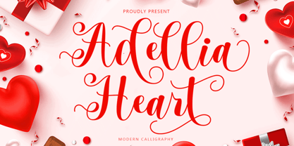 Adellia Heart is a modern calligraphy font created especially for Spring. Adellia Heart is great for unique branding, photo overlays, watermarks, greeting cards, posters, business cards, invitations, weddings, photography, fashion, clothing, letters, stationery, etc. This font is PUA encoded which means you can access all the glyphs and sweeps easily! Thank You
 - OKASA by Twinletter,
$15.00 Okasa, our newest typeface, is now available. We present to you a quirky and contemporary typeface, which you can use to produce an optimal visual display in each of your projects and to impress all of your audience with the unique look of your project. Because everyone does not necessarily understand Japanese letters, we supply fonts with letters that can be utilized for your project. We produced this display font with a Japanese theme or an Asian font, which we designed to fulfill the needs of your Japanese-themed project. Of sure, your initiative will be understood by people all around the world. Logotypes, food banners, branding, brochure, posters, movie titles, book titles, quotes, and more may all benefit from this font. Of course, using this font in your various design projects will make them excellent and outstanding; many viewers are drawn to the striking and unusual graphic display. Start utilizing this typeface in your projects to make them stand out. Caps only fonts
 - Splatterpunks by Wing's Art Studio,
$10.00 Splatterpunks - A Halloween Brush Font Introducing a fresh terror this Halloween, Splatterpunks is a hand-drawn brush font inspired by the blood-soaked pages of horror comics from the 1970s and 80s. This textured all-caps lettering evokes a spine-tingling tension that will leave your readers on tenterhooks. With a creeping, stretched look like that of a surprised cat, it offers of set of diabolical tools worthy of any horror fan! The Splatterpunks font family includes all-caps uppercase and lowercase characters, along with numerals, punctuation, symbols and language support. Also included are a complete set of alternative characters and additional paint marks, drips and splashes. Wingsart Studio Design Tip! The uppercase and lowercase characters work great when mixed in an alternating fashion, with shapes that combine to create a dynamic, almost unhinged look that's perfect for the Halloween season. Add the alternatives and paint marks into the mix and you'll have yourself a title or header design that looks truly custom-made.
 - Beauty Athena by 38-lineart,
$19.00 Introducing the OpenType font ‘Athena’, the beautiful calligraphy script. It’s inspired by Athena, goddess of wisdom, courage, inspiration, mathematics, strength, strategy, the arts, crafts, and skill. Athena font is a font that comes with very beautiful changing characters, a kind of classic decorative copper script with a modern touch, designed with high detail to bring stylish elegance, clean, feminine, sensual, glamorous, simple and very easy to read, because there are many letter connections. This is the representative of two styles; you can use it for modern minimalism and also classic expert penmanship styles. Both of these style can be applied in various formal forms such as invitations, labels, restaurant menus, logos, fashion, make up, stationery, novels, magazines, books, greeting / wedding cards, packaging, letterhead, labels or any type of advertising purpose. ‘Athena' has a lot of alternate characters, including various language support and numerals & punctuation. Please contact me if you need any help by drop a messages. So… Enjoy Athena and best regards. - 38.lineart studio
 - Simplicity Angela by Ahmad Jamaludin,
$15.00 Say hello to Simplicity Angela! Simplicity Angela is an elegant modern calligraphy font inspired by delicate inky hand lettering, a gorgeous wedding calligraphy for trending minimal branding designs. This beautiful font is for those who are needing elegance for their designs and is particularly well suited for wedding invitations, cards and feminine branding. I have wanted to create such combination a long time and can’t believe that it is here. I’m super excited and hope you’ll like it too. Now all you need for perfect wedding invitation design is in one product. I think this decision will help you to save your time What's included? - More than 100 beautiful swashes in this font - Works on PC & Mac - Simple Installations - Accessible in the Adobe Illustrator, Adobe Photoshop, Adobe InDesign, even work on Microsoft Word. - PUA Encoded Characters - Fully accessible without additional design software. Multilingual Support : ÁĂÂÄÀĀĄÅÃÆĆČÇĊÐĎÉĚÊËĖÈĒĘĞĢĠ ÍÎÏÌĪĮĶĹĽĻŁŃŇŅÑ ÓÔÖÒŐŌØÕŔŘŖŚŠŞŤŢÚÛÜÙ ŰŲŮẂŴẄẀÝŶŸỲŹŽŻ áăâäàāąåãæćčçċďđéěêëėèēęíîïìīįĺľļłńňņñóöòőōøõŕřŗśšşßúûüùűūųůẃŵẅẁýŷÿỳźžż I hope this font is suitable for your project.
 - Master Script by Solotype,
$19.95An unusual angular vertical script. In late Victorian times it was seen mostly in advertising work, seldom in social stationery and announcements. - ITC Scram Gravy by ITC,
$29.99The 1928 logotype for Sertal Toiletries consisted of a stylized woman's head, a very snaky S, and five fine, fat deco caps spelling out the rest of the brand name. From these five clues, designer Nick Curtis divined the rules" of the typeface and drew a complete alphabet, including a lower case. The result: ITC Scram Gravy. The finished product could be described as Bodoni on steroids. Tight curls in characters like the 'm,' 'r' and 'y' soften the lower case and give the design a light-hearted flavor. ITC Scram Gravy takes its name from one of many running gags in the screwball comic strip "Smokey Stover," which had folks alternately splitting their sides and scratching their heads from 1935 to 1973. Those familiar with Bill Holman's strip will recall Smokey's car, the Foomobile, and one of his famous nonsense declarations: "No foo-ling, that scram gravy ain't wavy."" - Beatnik by Type Innovations,
$39.00 I was working at Bozell Worldwide, an advertising agency, on their yearly promotional pitch. An art director was looking for a condensed informal headline treatment to be used on one of the new ad campaigns. I took several different font designs and started to condense and scale the proportions in the hopes of finding several good solutions. They finally settled on a version of Times Roman, scaled horizontally to about 50 percent proportions. I liked the look so much that I later went back to the drawing board and refined the concept by adding slanted serifs and a varying alignment on all the letter forms giving the typeface a very casual and informal appearance. At about that time, I was reading a book by Jack Kerouac, and was so inspired by his writings on the ‘beat generation’ that I decided to name the font ‘Beatnik’. Afterwards, I added a set of true small capitals and old style figures. I'm currently working on additional weights and variations to expand this ‘hip’ new font series. Groovin' baby.
 - Conrad by Linotype,
$29.00The award-winning Conrad was created by Japanese type designer Akira Kobayashi. Its design was based on the fifteenth-century type by Conrad Sweynheym and Arnold Pannartz, two German printers active in Rome at that time. They produced a unique, slightly unbalanced yet attractive type. Kobayashi says of his typeface, “I have designed a couple of typefaces inspired from the past, but this time the original print acted merely as a reference. The distinctive lowercase ‘a’ and some other letters were inspired by Sweynheym and Pannartz’s second roman type, but I revived the type in a more informal way. Here I used the historical type as a springboard. The resulting type looks different, taking on a rather temporary and lively look. I assume that the Conrad is the first revival of the Sweynheym and Pannartz type, though it does not closely resemble the original.” Conrad won first prize for the text typeface category in Linotype’s Third International Typeface Design Contest (2000) as well as the Certificate of Excellence in Type Design from the Type Directors Club (2001).
