10,000 search results
(0.021 seconds)
- Sightseeing Tour JNL by Jeff Levine,
$29.00 Samuel Welo was a sign painter who had published in the 1920s and again in 1960 his “Studio Handbook – Letter and Design for Artists and Advertisers”, prolifically hand lettering all of the type style examples within the pages of the publication. In 1930 Welo also published “Lettering - Practical and Foreign”. From this book comes a thick-and-thin hand lettered Art Deco alphabet – now available digitally as Sightseeing Tour JNL in both regular and oblique versions.
 - Retroscope by Supfonts,
$19.00 Retroscope - a charming serif in retro style of the 80s and 90s with nostalgic notes! The dense structure will give an incredible retro vibe to your project. Come in two versions, one of which is strict and straight, and the second is playful and inclined Font is an open type with clean shapes and precise kerning. Language support: All European languages Don't forget to subscribe so you don't miss out on the new awesome fonts Dima
 - Louis by Canada Type,
$24.95 Louis is a faithful digital rendition and expansion of a design called Fanfare, originally drawn by Louis Oppenheim in 1927. Redrawn digitally by Rod MacDonald, and engineered in-house by Canada Type, Louis includes the many alternates that came with the original design, and then some. It was also expanded into three variations, including a soft-cornered style, and a rough woodcut one. And of course, the codepage support covers the majority of Latin-based languages.
 - Chift by Alexandra Korolkova,
$20.00Chift is a quite narrow serif font for both body text and headlines in periodicals, where economy of space is needed. The type family consists of ten faces: five styles of low contrast for body text sizes and five styles of high contrast, including Hairline and Black, for display purposes. One of the main features of the typeface is its professionally-designed Cyrillic, which won one of the special prizes at Modern Cyrillic 2009 competition in Text category. - Bogart by Zetafonts,
$39.00 All the nine weights of Bogart, as well the matching true italics forms, feature an extended charset of over 1600 glyphs, covering 219 languages using latin, cyrillic and greek alphabets, and sporting a complete set of Open type features. To add flexibility for editorial usage, a text-oriented Bogart Alternate set of nine weights was added to the family keeping the design more similar to its modern old style model and allowing for a heavy readable mid-weight range.
 - Denso Sans High by DSType,
$40.00 An eye-catching and practical type family that doesn't intend to be retro or evoke any geometrical cliché. Ranging from a low contrasted thin to a vigorous black, Denso is available in both low and high contrast versions. All consistently developed across two styles, Serif and Sans. Marked by the vertical rhythm, enhanced by the enormous x-height, Denso has the typographic qualities that will allow the design to be highly readable, with a strong stylish statement.
 - Hanse Textura by RMU,
$30.00 Inspired by a former Hermann Zapf design, Hanse Textura was completely redrawn and redesigned as an English-style blackletter font with a calligraphic touch. It comes also with the historical long s which can be reached either by typing [alt] + b or by using the OT feature historical forms. I strongly recommend to activate both OT features, standard and discretionary, to access all ligatures built in the font. The keys pi and product are occupied with beautiful border elements.
 - Denso Sans by DSType,
$40.00 An eye-catching and practical type family that doesn't intend to be retro or evoke any geometrical cliché. Ranging from a low contrasted thin to a vigorous black, Denso is available in both low and high contrast versions. All consistently developed across two styles, Serif and Sans. Marked by the vertical rhythm, enhanced by the enormous x-height, Denso has the typographic qualities that will allow the design to be highly readable, with a strong stylish statement.
 - Havin Bride by Letterhend,
$17.00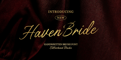 Haven Bride is the beautiful brush script font that perfectly captures the casual of a handwritten. With its natural feel and casual, chic style, it's the perfect choice for branding, logos, and the other various formal forms such as invitations, labels, logos, magazines, books, greeting / wedding cards, packaging, fashion, make up, stationery, novels, labels or any type of advertising purpose where a personal touch is needed. Features : Uppercase & lowercase Numbers and punctuation Alternates & Ligatures Multilingual PUA encoded
 - Telingater Display by ParaType,
$30.00 PT Telingater Display™ was designed in 1959 by a well-known Soviet book designer Solomon Telingater (1903-1969) at Polygraphmash type design bureau. The typeface was awarded the Silver Medal at the International Book Art Exhibition (IBA-59) at Leipzig (Germany) in 1959. Light flared sans serif with calligraphic flavor and low contrast between main strokes and hairlines. For use in title and display typography. The digital version was developed for ParaType in 2001 by Lyubov Kuznetsova.
 - Halender by Kartiny Type,
$14.00 Halender Script is an Elegant script font that comes with very beautiful character changes, a type of classic copper decorative script with a modern touch, designed with high detail to present an elegant style. Halender script is interesting because the typeface is pleasing to the eye, clean, feminine, sensual, glamorous, simple and very easy to read, because of the many luxurious letter connections. I also offer a number of decent stylistic alternatives for some of the letters. Thank You
 - Vintage Stencil Borders JNL by Jeff Levine,
$29.00 Vintage Stencil Borders JNL collects twenty-six decorative vintage and antique stencil border motifs for embellishing word copy set in stencil type or for any other decorative purpose. Please note: Commercial reproduction of these designs as stencils, stickers, decals, transfers, ink stamps or other decorative stand-alone products for resale requires a separate license. Contact Jeff Levine through the email address located in the PDF file provided with the font or from the online EULA text.
 - Config by Adam Ladd,
$25.00 Config was influenced by geometric sans with circular forms but the proportions have been condensed by incorporating straight sides for a design that is sturdy and efficient yet friendly. The neutral design with subtle details makes it functional for type setting in small and large sizes. Its clean nature makes it readable at small sizes but the touch of character—as seen in the notched joints, rounded details, and horizontal/vertical terminals—make it interesting at large sizes.
 - Salacious by PizzaDude.dk,
$18.00 Salacious is my soft/rough all-caps font, inspired by both comics and grafitti. The weight and width of the letters varies a bit. Not in a disturbing way, but more in a lively and organic way. I've added 5 (slightly) different versions of each letter (which automatically cycles as you type!) The letter shapes are a bit rough, due to the fact that they are handmade, and all corners are rounded, which gives a nice soft look!
 - Kamerik 105 Cyrillic by Talbot Type,
$19.50 Based on the popular Talbot Type Kamerik 105 , this Cyrillic variation is now available for the first time. Kamerik 105 is inspired by the classic, geometric sans-serifs such as Futura and Avant Garde, but has shallower ascenders and descenders for a more compact look. It's a versatile, modern sans, highly legible as a text font and with a clean, elegant look as a display font at larger sizes. The Kamerik 105 Cyrillic family comprises of five weights.
 - TwentyFourNinetyOne by steve mehallo,
$19.91 TwentyFourNinetyOne [2491] is a reinterpretation of the alphabet of 1919 by Theo van Doesburg; the original a true rendering of the thinking of the Dutch-based art movement “de Stijl.” Jump forward to 1980 and prop lettering used on the Buck Rogers in the 25th Century television series; a vernacular typeface that was a utilitarian mix of geometry and pixel-based forms, used to symbolize the futuristic universe of 2491. At times it would appear on spaceships, laser guns, signage at space ports or in one episode, a Spandex tapestry. It only seemed logical to combine and rethink the letterforms, add ligatures + other extras, and see what the results would be. Futuristic, fun and bold to read! 2491: In the future, all type will look like this.
 - Multipolar by MYSTERIAN,
$9.00 This typeface was designed as the house style by and for design studio Mysterian. It was drafted and completed during most of 2020. The intention of the design of the forms was to develop a unique signification in the mind, but one that could have potential relevant associations such as with sci-fi. The solution, brought along with a fascination with this rarely seen pattern in type, was to taper round forms. The name 'Multipolar' was inspired by the term used by game theorist Daniel Schmachtenberger, which is a kind of event that seemed relevant to the Covid-period in which the font was made. Alternate characters include: Two Ampersands Upper and Lowercase PI Upper and Lowercase Eszett Latin Characters
 - Ezekiel by MYSTERIAN,
$9.00 Ezekiel Script is the font become flesh—mythic gesture imposed upon forms of mechanical medium. Typography has changed the internet; our phasing mimetic desires tend toward posture rather than rationale, and the face is a concept that explores that concept. Obviously some reading of McLuhan has infliunced this concept of analysis. The script has ample diacritic extensions, as well as an alternative for the ampersand (characteristic of MYSTERIAN type) and the eszette: an upper and lower case. The upper and lower case alphabets are diverse in that the majuscules do not have linking strokes while the miniscules do. This was the first script that I've made, and great attentiveness was taken to ensure that links were set accurately, and spacing harmonious throughout.
 - Parliament by Hoefler & Co.,
$49.99 The Parliament typeface was designed by Jonathan Hoefler beginning in 1995. A burlesque typeface in the Regency Blackletter style, Parliament was inspired by the ‘Four-line Pica Black No. 1’ typeface of William Caslon Jr (1821), whose enigmatic design for the letters E, G, I, N, V and Y hinted at a broader ambition to modernize the arcane shapes of the gothic alphabet’s capital letters. Parliament completes this project for the first time by including two sets of alphabets, one archaic and one modern, along with a third set of ‘small caps’ that restores to the blackletter the versatility of Roman type. Parliament was first used for the 1998 ATypI Conference in Lyon, and was published by Hoefler&Co in 2022.
 - Printers in Marks by Proportional Lime,
$19.99 In the early days of printing it was soon recognized that there was a need to identify the printer and publisher behind the printed work. So these industrious people created marks to identify themselves to clients. This font contains over 160 marks dating back to the early years of printing with the likes of Fust, Ratdolt, Manutius, Caxton, and a whole host of others represented. Some of these printers were very influential and altered the course of history, some merely enabled the broader public to access the classics. Some were imprisoned and others helped foment revolutions. But all were riding the new current of this technology of moveable type that helped transform our world through the enabling of easily exchanging information.
 - Linotype Startec by Linotype,
$29.99Linotype Startec, from Jan Tomás, is part of the TakeType Library, chosen from the entries of the Linotype-sponsored International Digital Type Design Contest 1999 for inclusion on the TakeType 3 CD. This is another fun font from Tomás, who also designed Alphabat, and the two share some characteristics. Linotype Startec is an outline font whose unique forms are reminiscent of futuristic dreams and space adventures. It should be used in point sizes of at least 18, but the phrase 'the bigger the better' fits this font well. The careful details and figures of the alphabet turn into UFOs and space ships from another world when set in very large point sizes. Linotype Startc is best for very short texts and headlines. - MFC Distinto Borders by Monogram Fonts Co.,
$19.95 The inspiration source for Distinto Borders are the Black & White and Running Borders from the 1906 Abridged Keystone Type Foundry Specimen Book. Nine Black & White Borders and Thirteen Running Borders are compiled within this font, all of which can be formatted in various manners to allow maximum versatility. While we've adjusted the metrics in this font, your program of choice may override and use their own settings. Make certain that the point size and the leading size are the same so that the borders connect properly. For instance, the font set at 12 points, should also be set to have 12 points of leading. It's that easy! Download and view the Distinto Borders Guidebook if you would like to learn a little more.
 - Gothico Antiqua by MADType,
$21.00 Gothico Antiqua is the result of grunging up one of my early sans-serif type designs. It strangely works very well and looks authentic at small to medium settings.
 - Bordeaux by Solotype,
$19.95This font was inspired by the lettering on a shop sign along a very classy shopping street in Bordeaux, France. There were similar styles among mid-nineteenth century types. - Swing Band JNL by Jeff Levine,
$29.00 Swing Band JNL is a casual, playful type design inspired by the title lettering from "Hi-De-Ho", a 1930s all-black cast film starring legendary bandleader Cab Calloway.
 - Table Wood JNL by Jeff Levine,
$29.00 Concave Tuscan Extra Condensed is a classic wood type sans serif design that is the basis for Table Wood JNL, which is available in both regular and oblique versions.
 - Rock Wood by Kprojects,
$15.00 Rock Wood is a fresh version of old western wood type. With its strong and sinuous lines it has a taste of vintage and modern at the same time.
 - Madigan by Hoftype,
$49.00 Madigan is a high-contrasted, crisp, and attractive typeface. While situated firmly in the category of ‘modern’ types, it appears fancy and lively, showing extravagant details in display sizes.
 - Kindred by Rachel Kick,
$9.00 Kindred is an organic and hand-lettered sans typeface. It has a friendly and organic feel that works great for branding, social media, and marketing! Kindred is inspired by hand lettering art - incorporating many letters that fit into each other and swashes that add a hand-drawn feel. The corners are slightly rounded to give it an organic and friendly feel. With so many alternatives and ligatures, each word can be customized to fit the needs of your project. The Details: 34 Standard Ligatures: Enabled by default to create a hand-drawn feel! (Make sure your open-type features are enabled!) These can also be switched out depending on the look you're going for. Over 90 Alternatives: These are the perfect way to make the type look custom-made for your project. Add small details, change double letters, or add swatches that fit around surrounding letters. Language Support: Danish, English, French, German, Irish, Italian, Portuguese, Spanish, Swedish, & Swiss German.
 - Haakke by Dawnland,
$13.00 Haakke (or Håkke) - a casual, hand drawn (Stabilo OH pen, Fine) font with 4 alternates to all upper and lower case letters (a-z + å ä ö) as well as numbers for a realistic hand written look and feel! “Ligatures” have been created for double letters (TT, tt, ff, ll & LL (open type version of the font and open type compatible layout application required). Of course it holds all(?) the special characters that you will ever need. 451 glyphs... Haakke also includes symbols. Zodiak signs (letter a-l, upper case A-L write the corresponding name of the sign), planet signs (m-z, upper case M-Z write the corresponding name of the planet) triangles, squares and stars (from pentagrams (5 pointed) to Dodecagrams (12 pointed). (Write a 4, or shift-4 ("euro-sign", european keyboard, or "dollar sign", american keyboard) before your star or triangle and you will get a circle around it).
 - Eurobrush by profonts,
$41.99 Eurobrush Pro is a new handwriting script designed by German type designer Ralph M. Unger. He produced not only the standard Western character complement, but added all of the Eastern European Latin glyphs and, on top of that, even the complete Cyrillic characters. Born and grown up in Th�ringen, former East Germany, Unger has a fair knowledge of Polish and also Russian (Cyrillic). Eurobrush Pro is a very beautiful, casual, informal and modern handwriting in `brush-style of a contemporary type designer. Even though a digitized handwriting, it keeps a very natural and pleasant look, at the same time being generous and well-readable. The individual characters combine quite easily and perfectly with no need for extra variants (although Unger included a number of ligatures). Eurobrush Pro is well-suited for plenty of applications, e.g. personal correspondence, invitations, greeting cards, headlines etc. Eurobrush Pro is supplied in the complete Latin character set (West + East) including ligatures, plus Cyrillic.
 - HWT Unit Gothic by Hamilton Wood Type Collection,
$39.95 The Unit Gothic series was released by Hamilton Manufacturing Co. in 1907. This sans serif family features one of the first multi width/weight type 'systems' anticipating the Univers font system by 50 years. This set of 7 fonts was designed to aid in press room efficiency and with its incremental variation in widths gave poster printers unprecedented flexibility in fitting copy while using consistently harmonious fonts. This HWT release is the first ever digital version of these fonts. Each font contains 600 glyphs including Greek and Cyrillic character sets as well as alternate characters which are based on the actual special character production patterns from the Hamilton Wood Type Museum collection. HWT Unit Gothic system features: •HWT Unit Gothic 716 - 50% wider •HWT Unit Gothic 717 - 25% wider •HWT Unit Gothic 718 - (Standard width which others are based on) •HWT Unit Gothic 719 - 25% narrower •HWT Unit Gothic 720 - 50% narrower •HWT Unit Gothic 721 - 62.5% narrower •HWT Unit Gothic 722 - 75% narrower
 - Auro Rumpthut by Khaiuns,
$10.00 Auro Rumpthut is a modern calligraphy font with contemporary, sophisticated accents. It is perfect for logo, badge, packaging, headline, poster, t-shirt/apparel, greeting card, and wedding invitation. The flowing characters are ideal to make attractive messages Auro Rumpthut includes full set of gorgeous uppercase and lowercase letters, numerals, a large range of punctuation and ligatures. All lowercase letters include beginning and ending swashes, giving realistic hand-lettered style. All uppercase letters include beginning swashes, that makes the font look fabulous! In order to use the beautiful swashes, you need a program that supports OpenType features such as Adobe Illustrator CS, Adobe Photoshop CC, Adobe Indesign and Corel Draw. Photoshop CC and higher have a glyph panel where you can access the swashes & alternates. Select the font and go to Window Glyphs and double-click on the glyph you want to use. For Illustrator choose Type Glyphs or Window Type & Tables Glyphs. Follow my instagram for update khaiuns Thanks and have a wonderful day.
 - Fishwrapper by E-phemera,
$25.00 Fishwrapper is a three-member font family (Regular, Bold, and Italic) designed to replicate the look of authentic vintage newspaper typography. The fonts are rough and are meant to be used at newspaper sizes. All three fonts have a complete alternate alphabet built in: using the contextual alternates feature will automatically substitute alternate versions of most glyphs, so that identical characters do not appear side by side, thus helping to create the look of metal type. Fishwrapper Regular has a complete set of small caps built in. Each font features assorted rule lines and other decorative material, many accessible through the discretionary ligature OpenType feature (three em dashes in a row, for example, will become a rule line), as well as fractions and a full international character set. Used in conjunction with some of E-phemera's vintage headline fonts, the Fishwrapper family is intended as a complete vintage newspaper and job-printing type solution.
 - Cobbler by Juri Zaech,
$30.00 Cobbler is a friendly type family in six weights. With proportions of geometric type, Cobbler is a contemporary sans on the inside and an ultra soft display typeface on the outside. Not a single sharp corner and only a hand full of straights make Cobbler extra warm and huggable. In fact, the few straight horizontal lines give the typeface the stability of a workhorse while keeping the gooey playfulness that characterizes Cobbler so much. And to make all this even more fun, there is a pile OpenType features built in. For example loads of Discretionary Ligatures that make capital letters interlock left and right – just fun! Or automatic fractions, case sensitive punctuation and contextual alternates – for serious typesetting. Cobbler works great for branding, packaging, editorial or any display application – and it comes with an expansive character set that covers Underware’s Latin Plus and with it over 200 languages. Furthermore Cobbler is manually kerned and auto-hinted for crisp display on screen also in small sizes.
 - Seribu Bulan by IKIIKOWRK,
$21.00 Introducing Seribu Bulan - Arabic Type, created by ikiiko. Seribu Bulan is inspired by term in the Islamic world about the night of Lailatul Qadr in the month of Ramadan. Seribu Bulan is a display type adapted from the form of a slab serif style. This typeface has a wide selection of alternative styles to choose from. From hooked letters, to the typical symbols of arabic letters, you can play around by using various stylistic sets to form the character you want. This typeface is perfect for an logo, magazine layout, header & headline design, food & beverages product, packaging, poster, quotes, or simply as a stylish text overlay to any background image that need an a middle east vibes. What's included? Uppercase & Lowercase Number & Punctuation Complete Stylistic Set Complete Alternates Multilingual Support Get also a good offer & FREEBIE at our site : www.ikiiko.com Enjoy our font and if you have any questions, you can contact us by email : ikiikowrk@gmail.com
 - Melina BT by Bitstream,
$50.99Melina Plain and Melina Fancy are characterized by graceful lines, strong contrast and nostalgic overtones. These typefaces are patterned after two members of a type family named Greco, released by Fundición Tipográfica Richard Gans of Madrid, Spain, in the 1920s. Melina Plain is a refined version of Greco Bold, and Melina Fancy is based on Greco Adornado, with the notable addition of a lowercase, which was not a part of the original design. Melina is based on two typefaces (ca. 1920) from the Fundición Tipográfica Richard Gans in Madrid, Spain. Nick Curtis first found Greco Adornado in a type specimen at the Library of Congress. It was a cap only design. He made a cut of the original (Melina Fancy) and created his own lowercase, and many other characters to support contemporary character sets. Later he came across Greco Bold, which had a lowercase, but he chose not to use it and instead, adapted his Melina Fancy to create Melina Plain. - Fabrikat Kompakt by HVD Fonts,
$40.00 Fabrikat Kompakt (formally known as Fabrikat) is a type family designed by Christoph Koeberlin with creative input of Hannes von Döhren. The Sans Serif family is published by HVD Fonts and consists of seven weights plus matching italics. Its geometric design is based on German 20th century engineers’ typefaces and has a plain and precise appearance. The shapes are optically corrected, yet retain an uncut charm. They work best in display as well as text sizes. The type family is equipped for complex, professional typography with OpenType Features like alternate letters, arrows, fractions and an extended character set to support Central and Eastern European as well as Western European Languages.
 - Sentcita by Scratch Design,
$10.00 Introducing Sentcita! It's a modern script font with a signature-style look. This font's highly recommended for you who want to make some designs with a natural signature style. Sentcita will work for invitation design, wedding design, posters, packaging, book cover title, quote, social media post, etc. Open your Opentype features while using the script font to use the ligatures and swashes, your text will look like a natural signature or handwriting as you type. Features: Stylistic Alternates & Ligatures Numerals & Punctuation Swashes Accented characters Multiple Languages Supported How to access alternates characters Open the glyphs panel: In Adobe Photoshop go to Window - glyphs In Adobe Illustrator go to Type - glyphs
 - Lucky Spark by Letterhend,
$19.00 Introducing, Lucky Spark Script - an enchanting script. What makes this font unique than the other is its beautiful swashes which will make the lettering looks customized. This type of font perfectly made to be applied especially in logo, and the other various formal forms such as invitations, labels, logos, magazines, books, greeting / wedding cards, packaging, fashion, make up, stationery, novels, labels or any type of advertising purpose. Features : uppercase & lowercase numbers and punctuation multilingual alternates and ligatures swashes PUA encoded We highly recommend using a program that supports OpenType features and Glyphs panels like many of Adobe apps and Corel Draw, so you can see and access all Glyph variations.