10,000 search results
(0.026 seconds)
- Rebahan by Zeenesia Studio,
$14.00 The Rebahan, A vintage style font for your awesome next project! This font created for straight forward text in big display but also good and readable in smaller paragraph size. Best suitable for branding, packaging, posters, wall sign, print titles, t-shirt design, ads, and similar projects. No lower case included in this first pack but might be added in the next update. Hope you like this all caps font!. If you find any bug or issue using this font please let me know, I’ll work on it as fast as i can.
 - Homela by Gatype,
$12.00 Homela is a bold script font that is simple and unique looking. This customizable font will look great on a variety of design ideas such as Christmas themes, valentines, posters, invitations, weddings, branding projects, social media posts, magazines, book covers and more! This will add a fun and friendly touch to any of your projects! This font is PUA encoded which means you can access all the glyphs and sweeps easily.
 - Blacker Valentine by Letterara,
$12.00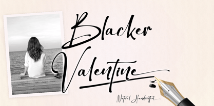 Blacker Valentine is a elegant handwritten font that is simple and unique looking. This customizable font will look great on a variety of design ideas such as Christmas themes, valentine's, posters, invitations, weddings, branding projects, social media posts, magazines, book covers, and more! This will add a fun and friendly touch to any of your projects! This font is PUA encoded which means you can access all glyphs and sweeps easily.
 - Vallenta by Letterara,
$14.00 Vallenta is a bold script font that is simple and unique looking. This customizable font will look great on a variety of design ideas such as Christmas themes, valentine's, posters, invitations, weddings, branding projects, social media posts, magazines, book covers, and more! This will add a fun and friendly touch to any of your projects! This font is PUA encoded which means you can access all glyphs and sweeps easily.
 - Stitch Warrior by Roland Hüse Design,
$19.00 Stitch Warrior is a a gothic style stitch font. It's made of cross stitches ("x") even the kerning - the distance between the letter pairs varies between 1, 2 or 3 stitches distance. I was trying to be as accurate and close to reality as possible. It can be pefectly used for stitch lettering or text pattern to create visual effects.
 - Haboro Contrast by insigne,
$- Meet Haboro Contrast, the stylish little sister of the Haboro hyperfamily. While built from the same clean, geometric shapes of Haboro Sans, this new addition has been rebalanced for elegant performance with her high-contrast sans letterforms and has been adjusted to provide the greatest impact for each weight. It's a personality all her own, gentle in approach yet refined and modern with a confident appearance. Capitalize on Contrast's style with OpenType features, too. Packed with options like OpenType ligatures, stylistic sets, fractions, crafted small caps and old-fashioned figures, this font will keep your work fresh and attractive. If you need even more combinations for the right statement, use the entire Haboro hyperfamily and create the right balance to capture your reader's eye. Haboro Contrast (along with the rest of the Haboro family) has been tested for the web and is ready for use in both print and digital applications. Designed to serve as a display character for such publishing projects as magazines and company brochures, Contrast gives you comfort in having a great amount of versatility in the fonts you rely on. It's a prime example where high contrast simplicity lends itself to achieve excellent design results.
 - Haboro Serif by insigne,
$- The polls are in. Now here by customer request--Haboro Serif, the newest edition of the Haboro Hyperfamily. The Haboro fonts are an outstanding upstart success from the first part of 2016. Following the release of the popular Haboro, Haboro Sans and Haboro Slab have both been welcomed additions to the family, too. Now, Haboro Serif continues to build on the base of these related designs. Serif maintains the unique, script-like terminals of the original. These terminals, along with the optimized stroke weight of this face, make it useful for text settings. Prefer standard serifs? These are also available as OpenType alternates within the font, giving you a wider variety of options without compromising its effectiveness in the same text settings.. Haboro Serif works with many other members of the Haboro family as well. Try the original Haboro for your headlines, and pair your Serif text with Haboro Sans for a balanced design that appeals to the reader. Add Serif to your box today, and try this all-around “Renaissance man” of a typeface for a touch of practical elegance on your next job.
 - Arcandias Downtown by BlackLotus,
$20.00 Arcandias Downtown is a serif with high contrast combined with alternates so that it can match projects created using this font with trends in modern times.This font is made with precision for each character so as to create a quality font that is beautiful to look at. Arcandias Downtown can be used in various projects, both Magazine Titles, Posters, Newspapers, and others. This font has a variety of alternatives, so that any project that uses this font will look striking, beautiful, and modern.
 - Sweet Cupcake by MlkWsn,
$15.00 Sweet Cupcake fun fonts with 4 styles and can be applied to many of your precious moments, this font is specially designed in layered style, equipped with multi-language and OpenType, don't forget there are also alternative letters and ligature that make this font so fun. There are more additions dashed line that you can enter manually to look different styles and there are dozens of additional doodle & badges completing this font. You can make as posters, titles, games, packaging, invitations and more.
 - Ruskin by Fine Fonts,
$29.00 The origin of Ruskin was a commission for Michael Harvey to design a signage font for the Dean Gallery in Edinburgh. The style of the letterforms was to complement the period of the building which was originally an orphanage built in 1839. Only uppercase letters were created at first with the lowercase letters—and other characters necessary for a font—added later. With elegant and slightly extended letterforms, Ruskin fulfilled its rôle well as a signage font. It also functioned extremely well as a general display font. It is particularly suited to item descriptions and placards in galleries and museums which are frequently read from an angle, as well as head-on. The fonts have both proportionally and monospaced numerals.
 - Yacimiento - Personal use only

- Festivo Letters by Ahmet Altun,
$19.00 Festivo Font Family is a handmade layered font which includes several textures, shadows. Different font types can be created using various combinations of Festivo Fonts and colors. All fonts of Festivo letters are created as hand-drawn design based on F.L. NO:8 Font's Letters. The fonts No:16, No:17 and No:19 have the same metric and kerning structure than the other Festivo Fonts except No:18. So each one of these 3 fonts are a layer. But they can also be use as wide spaced fonts. No:18 is specific with its metric and kerning structure which was formed by No:17 but No:18 is its bold version. It was designed as a supplemental font. The fonts No:12 and No:15 can be used as shadows. This font family also includes a few ornaments. For your convenience, the files of the fonts were termed by their numbers. The various possibilities of the Festivo Font Family allows you to create a lot of great works such as posters, magazines, printings, t-shirts etc.
 - Scorpio by Fine Fonts,
$25.00 Scorpio is a font based on lettering Michael Harvey drew for the card “The Sign of The Nudge” which was designed in collaboration with the concrete poet, Ian Hamilton Finlay. The purpose of the card was to prompt those owing monies to IHF, into paying promptly. Michael also used it on some of the many book jackets he designed. As such, it is a condensed design necessary to enable a lot of text to be fitted with a restricted space. Scorpio has both style and verve. It was designed to attract the attention of potential purchasers browsing the shelfs in bookshops. In fulfilling this rôle, it succeeded admirably. In all these respects, it is unquestionably a unique Michael Harvey design. When Michael died in 2013, this font existed as a drawing of the basic upper and lower case letterforms plus numerals. Andy Benedek’s contribution to Scorpio was to digitise the existing letterforms and then create the remaining characters necessary for a modern font.
 - Linotype Projekt by Linotype,
$29.99Linotype Projekt was created by German type designer Andreas Koch with both a well-defined inspiration and goal. It occurred to me that typefaces like Helvetica and Univers seemed to have a higher quality in hot-metal composition as with modern digital typesetting. They are stronger and livelier. This is in part due to the printing process, which presses the characters onto paper, and in part to the forms of the letters, which differ from the PostScript version of the same typeface. An important aspect of printing is the slight increase in character width resulting from the pressure which also serves as an optical correction to the forms. (True exact squares appear slightly barrel-formed to the eye.) I wanted to revive this peculiarity, not because of a nostalgic feeling, rather just because it is more attractive." The result is Linotype Projekt, a text font which is harmonious, clear and extremely legible. Koch lives in Bielefeld, Germany, and is a freelance book and type designer." - Celtic Knots by Clanbadge,
$20.00 While it is obvious that this is an ornamental style font, it is more than that: it is a Celtic Knotwork design tool! Irish, Scottish, Welsh, even Norse and Viking cultures have used knotwork designs for millenia. These ancient traditional interwoven designs are experiencing a revival as Celtic culture gains exposure in the modern world. Intricate Celtic knots are featured everywhere from jewelry to tattoos. While many enjoy them simply for their beauty and fascinating twists, they can also be used to add an air of myth, magic and mystery to any project. The interlaced lines make them perfect for wedding invitations, borders, dividers and rules, web graphics, and logos. I began using Celtic knotwork designs in my own work as part of my knifemaking and jewelry making hobbies. I read all of the books I could find about Celtic knots and at first I drew them by hand with pencil and paper. Then as I realized how nice it would be to have "undos" I switched over to using Corel Draw. Draw proved to be a natural for this type of artwork with tools like contour and the trim function. But even with these great tools, it was still tedious to create these designs. I noticed that I was able to reuse a lot of parts in repetitive sections. I developed a small library of reusable bits and chunks of Celtic designs. I found them so useful and fun to work with that I began thinking about ways to market my Celtic design kit. I thought about CDR and EPS formats, but then I thought of creating this toolset as a True Type Font. That way anyone with ANY program that uses fonts could easily create Celtic knotwork designs. Word processors, embroidery programs, engraving programs, jewelry design programs, CAD/CAM programs...almost every program can use fonts. I was also interested in CNC work and thought that this font would work well for applications such as laser etching, vinyl signs, and machining. With that in mind, I designed each character of the font with extremes of accuracy. If one character from the font is used at one inch tall, every control point will be placed to an accuracy of better than 0.0001 inch. I wanted every piece to meet exactly with the next, with no possibility for misalignment. The different styles are all very carefully created to fit accurately with each other. So the Filled Style fits exactly into the Outline Style, and the Inverse Style fits precisely around the Outline Style so as to make up the background behind the knotwork. Combining the styles allows you to have complete creative control. By assembling the nearly 200 pieces it is quite easy to produce very complex designs. It is actually a bit like playing with a puzzle and many people really enjoy putting the pieces together to make designs. In fact, I have had many customers tell me of how they love playing with this font and making knots into the wee hours of morning. If you like puzzles then you will absolutely love this font! And creating the patterns is just the beginning of the fun! If you apply your favorite Photoshop tricks on them you can make anything from dazzling chrome knotwork to carved stone. Photoshop plug-ins like SuperBladePro are great for converting knotwork text into corroded bronze or rusted iron. Use your knotwork to add texture to a virtual landscape, or add them as surface embelishments on architecture and furniture. You can also make round knotwork by using this font with "WordArt" (WordArt is included with every copy of Microsoft Word. See http://clanbadge.com/round_knots.htm for a tutorial on how to make round knotwork). For Crafters there are limitless uses for this font. It has been used for embroidery, jewelry, leatherwork, stencils, stained glass, quilting, painting, pyrography, woodcarving and lots more. We have even sold copies to monks for use in decorating handmade books!
 - Trilight by Pelavin Fonts,
$12.00 Trilight is a result of my fascination (obsession?) with how the appearance of a typeface can impact on the tactile as well as visual sense to strengthen and guide its imapct. It consists of simple block characters with a triple highlight to give the effect of dimension. The Trilight family consists of both highlighted and solid characters to provide a two color display without the need to convert characters to outline.
 - Z3non by SB type,
$35.00 A bold retro-future font ~ cosmic, weighty & groovy. Each letterform began with a rounded edge box as the base and ovals as a way to create negative space. In instances where the oval was not enough, a series of simple additional arced or straight cuts were made. What resulted is a unique and original font with a lot of personality. Stylistically, the font has a space-age vibe while possessing sleek, futuristic characteristics that ultimately make it feel fresh. It is not meant to be a go-to font for articles with a lot of text, but meant to expand ones library and in the right moment it will bring a lot of energy and major impact. Please note that this family has a limited character set and does not contain €, $, ¢, £, ¥ and other punctuation marks. Please check the glyphs tab to ensure this font will work for you!
 - ITC Goudy Sans by ITC,
$29.99 Frederic W. Goudy designed three weights of this friendly-looking sans serif font from 1922-1929 for Lanston Monotype in the United States. Goudy was attempting to impart freedom and personality to the sans serif form at a time when geometric sans serifs, such as Futura, were gaining rapid world-wide popularity. To achieve this challenging goal, he looked to lapidary inscriptions and manuscript writing for inspiration. He included elements such as slight swellings of terminal strokes, slab serifs on a few of the caps, alternate uncial forms, and a few swash strokes. The result is uniquely Goudy: charming, instinctive, and just right for adding warmth to magazine or advertising layouts. The design staff at ITC updated and filled out the family for a total of eight styles in ITC Goudy Sans. ITC Goudy Sans® font field guide including best practices, font pairings and alternatives.
 - Labernia by Tipo Pèpel,
$22.00 In 1864, a new edition of ‘Labèrnia dictionary’ was published. The book is commonly known under this name as a homage to the author. The typeface used in this publication has been taken as the main reference for the design of a new type family. Labernia is a didone design that includes several variations in width, weight, and contrast. Labernia is a stylish typeface, which pushes its design features to the limit. The high-contrast strokes—seen in most modern typefaces—give a delicate softness to the titling cuts of Labernia. Meanwhile, the characters in the condensed version have a very compact body so they create a highly expressive text. In the italic letterforms, the long terminals aim to connect the characters without touching. And, if we look at the figures we will see a more decorative design, which helps to build a strong personality.
 - Aprek Febux by Twinletter,
$15.00 "Welcome to the vibrant and bold world of typography!" Aprek Febux is a display typeface that adds sharpness, aggressiveness, and excitement to your projects. Aprek Febux, with its unequaled capacity to generate spectacular displays, is the ideal answer for your diverse variety of visual creations. Aprek Febux offers more than simply lovely letters. This font enables maximum versatility and creativity in every step of your design with excellent features such as ligature and alternate. You may quickly construct one-of-a-kind letter combinations to add a personal touch to your projects. We also recognize the significance of engaging with a worldwide audience. As a result, Aprek Febux supports numerous languages, guaranteeing that your communications are clearly received by everyone on the planet. Enhance your projects with the powerful visual appeal of Aprek Febux. Get this font right away and see how your every design becomes more impressive and stylish!
 - Dear Sarah Pro by Betatype,
$119.00 Carefully considered letters written long-hand, sealed in an envelope and sent across continents were once the only connection for distant friends and lovers. Dear Sarah is a type that evokes the emotion of those handwritten messages. Using alternates, ligatures and a complex system for randomization and natural connected characters, Dear Sarah seeks to push the boundaries of digital type. The guiding question that drove the design of Dear Sarah was whether it was possible to create a natural looking script that worked well in running text. Hand-written types often work for two or three words, but as soon you you look at them in a paragraph, their unnatural textures make them feel contrived. As one of the first serious types to explore OpenType for a connected script, Dear Sarah uses a unique system to create natural connections. Often script types rely on one connecting point to make sure that all their characters fit together properly. Characters that naturally connect much higher, such as the ‘o’ or ‘v’ are distorted to connect at the same point as an ‘a’ or a ‘c’. Dear Sarah uses multiple sets of lower-case characters to connect at multiple points, creating a much more natural looking script. OpenType is also used to create variety, by using randomization techniques to insert disconnected characters as well as alternates, ligatures, swashes and ink blots to create a natural rhythm across multiple lines.
 - Mofid Mahdi by Linotype,
$187.99Mofid Mahdi is a distinctive, bold Arabic display face, suitable for heading and titling work in Arabic newspaper and magazine composition. In this typeface the rounded internal counters and dots contrast with the angular and more robust outlines of the letterforms to give a decorative, harlequin-like appearance. The design was originally developed for use in dry-transfer format, and was first produced as a digital font by Linotype-Hell Ltd. in the early 1980s. Initially a simplified face, with its inherent limited range of letterforms, Mofid Mahdi was enhanced during the late 1980s by the introduction of medial letterforms to improve character spacing and balance. The recent advent of OpenType has led to the release of Mofid Mahdi. This OpenType font includes Latin glyphs from Memphis Extra Bold, allowing users to set text in both most Western European and Arabic languages without switching between fonts. Mofid Mahdi incorporates the Basic Latin character set and the Arabic character set, which supports Arabic, Persian, and Urdu. The font also includes tabular and proportional Arabic, Persian, and Urdu numerals, as well as a set of tabular European (Latin) numerals. - Breadley Serif by Ardyanatypes,
$10.00 Breadley Serif It was a continuation version of the previous one (Breadley Sans) that come up with Serif type look, surely including small decorative on the ends of some of the strokes that make it more expressive. Still stunning great with an elegant look and stands strongly on its own as a heading and brand logo. This Serif version of BREADLEY fancier within sexy touch for business utilities use like business card, name sign, uniform as brand elevation, and many more. This serif BRADLEY typeface, obviously fit to embossed as an exclusive brand tag or even decorating your enormous office corner. You can view all of the available characters in the screenshots above, and you can try out the brand new BRADLEY SERIF now for any design matter. Breadley Serif also has five weights, plus an extra superbold weight, Ligatures, small caps, old-style numerals, and other OpenType features Latin and multilingual support A guide to accessing all alternatives can be read at http://adobe.ly/1m1fn4Y Adobe Photoshop go to Window – glyphs Adobe Illustrator go to Type – glyphs Thank you and have a nice day
 - Guillotine by Canada Type,
$24.95 Guillotine is inspired by an uncredited early 1970s film face called Rhythm Bold. While the original film type had plenty of round forms that were uneven and somewhat badly drawn to fit within the overwhelming pop wave of the time, this digital incarnation disposes of all curves, relies on a much sharper grid, and adheres to specific parameters of stroke widths and angles. Guillotine is a thick poster classic, mechanically constructed yet clearly exhibiting the idiosyncratic traits of hand drawing. Its forms embody the amalgamation of a multitude of influences, such as woodcut letters, punch card forms, and the unique art nouveau concepts that were popular in the 1960s and 1970s. The totality of the font is a strong display aesthetic that plays very well anywhere the eye is meant to see a strong but casual, sharp but hand crafted message. This font comes in all popular formats for all common platforms, and includes expanded language support to cover Western, Eastern and Central European Latin languages, as well as Baltic, Celtic/Welsh, Esperanto, Maltese, and Turkish. A few alternate characters are sprinkled throughout the character map.
 - Ozana Pro by Mostardesign,
$99.00 Ozana Pro is a bracketed serif font family adapted to the professional requirements of graphic designers, web designers and mobile app developers. Comprised of 24 styles including 12 styles designed especially for headlines and 12 styles for text and long paragraph design, Ozana Pro is a very versatile family of fonts that can be used in many projects such as editorial design, branding or corporate identity creation, design of posters or logos, the creation of websites or the development of mobile applications. This serif font family, with a resolutely modern aspect, also hides a unique typographic design since it has 2 distinct styles (Roman and Display) which have 2 different optical sizes in order to graphically differentiate the appearance of titles, subtitles and long paragraphs. With this design of glyphs differentiated by the optical size according to the styles, the titles have a very graphic aspect while the long texts have a more classic design in order to keep an optimal readability in all cases. Ozana Pro is also equipped with powerful OpenType features such as case sensitivity, true small caps, ligatures, tabular figures, old styles figures, numbers circled. Ozana Pro is also available as a variable font family.
 - Kardust by ARToni,
$9.00 Kardust is geometric basic typeface with smooth touch of rounded corner. It is based on single line brings consistent width and character on each style. Each style is crafted separately without auto transformation to maintain the consistency as well as the characteristic itself.
 - Streamwood JNL by Jeff Levine,
$29.00 Streamwood JNL is an outline sans wood type re-drawn from vintage source material. The design bears strong resemblance to Woodlawn JNL; but is a bit narrower and has a much different set of numbers as well as a more stylized letter "Q".
 - Eingrantch Mono by Harmnessless Type,
$30.00 Eingrantch Monospaced is a monospaced sans serif based typeface, inspired by an old Continental typewriter in sans serif version. Available in 7 weights from thin to black. Well suited for modern logotypes, branding, editorial design as well as web and screen design.
 - Stencil Product JNL by Jeff Levine,
$29.00 The hand lettered title on the 1940 sheet music for "Pledge to the Flag" is a stencil design with wider rounded letters (such as the C, G and O). It is now available as Stencil Product JNL in both regular and oblique versions.
 - Celtics Modern by Dharma Type,
$14.99 Inspired from ancient Celtic lettering such like insular-half-uncial. New interpretation of Celtic letters bring a whole new feel to old letterings. At the same time, the font has handwritten-style glyphs as if they were handwritten same as the ancient letters.
 - Classification JNL by Jeff Levine,
$29.00 Sometimes it's easy to find a name to fit a font design, other times it's a struggle because of the sheer number of digital fonts available and the number of names already taken. Classification JNL stretches a point to arrive at its name. The attractive sans design was found as a hand-lettered title on a piece of vintage sheet music called "My Hawaiian Souvenirs". During the 1940s, the popular mode of travel to other countries was by steamship. Steamship passengers were assigned their accommodations by the type of passage they booked (such as First Class and Tourist), thus they were in various levels of classification. This aside, Classification JNL is a nice alternative to "standard" condensed fonts for design projects.
 - Honesty by Océane Moutot,
$32.99 Honesty is sans serif font with flared stems. As such, it belongs to the incise genre which is historically inspired by the roman civilisation and letters carved in granite or marble. One of the major example of it is the Trajan’s Column in Rome which inspired a font called Trajan, designed by Carol Twombly in 1989. Honesty is also inspired by more brutal font such as the Albertus, designed in 1938 by Berthed Wolpe, and its shape is highly influence by the work of the hammer. Despite this brutality and urgency due to the carving technique, the design of Honesty bring softness to it thanks to its low contrast and smooth curves. Honesty’s design include 16 styles, from thin to black in roman and italic.
 - Friendly Monster by Putracetol,
$24.00 Friendly Monster - Character Monster Font. Friendly Monster funny font is a kid's friendly spooky monster for your projects. When we talk about monster, it's not always the one that really scary. We can all have a cute, adorable, and friendly monster as well. Friendly Monster comes just like that. Friendly Monster has a strict style, but still gives a cheerful impression, making it very easy to read and apply in all design projects such as poster designs, clothing, logos, quotes, album covers, books, business cards, product designs, and many more design projects The alternative characters were divided into several Open Type features such as Swash, Stylistic Sets, Stylistic Alternates, Contextual Alternates, and Ligature. The Open Type features can be accessed by using Open Type savvy programs such as Adobe Illustrator, Adobe InDesign, Adobe Photoshop Corel Draw X version, And Microsoft Word. This font is also support multi language.
 - Technical SCRIPTURE by MMC-TypEngine,
$19.00 ‘Technical Scripture’ 2015-2021 A manuscript look, Pixel labyrinthine Display Type System… Plus, an Optical “Layered Game”, Retro Futuristic Sci-Fi Digital interface evolving placeholder… Now with 3D Styles! It was designed as a pair to its brother font ‘Technical Signature’ a Small Caps Font, both inspired by antique Greek, mosaics zig-zag ornaments “ancient times computer” intentionally as a Romanic variation with same metrics... Searching for Technical Solutions, it resulted in many combined styles by matching the primary ones so there’s plenty variations for multi-purpose texting like layered typesetting or simply monochromatic designs… Plus got accurate streaming resolution, therefore some sub-families like Stamp and Texture implicates greater points for minimum size as Regular and Light is appropriated to Small Optical Text reductions. *The New 3’s Upgraded Edition Improvements consisted of Correct ‘Font Info’ (verified data-debugging) rescaled glyphs, quick design review, better style linking with correspondent renamed fonts, addition of automatic OT features encoding, 3D Styles and Italics. Ps. This actual Typeface was quickly re-edited for technical reasons and hasn’t yet reached the intended design, it will soon receive a more tangible redesign upgrade, mainly in lowercases to enhance cursive style. Due to other priorities. Tip: Give preference to THE LYSERGIC UPPERCASES! Multilanguage Support: Western & Eastern European, Baltic, Turkish, Greek, and Cyrillic. This Type is pleasant to Technician Compositions, Such as Briefs layouts manuscript, Old Engineering & Crafts Logos or Support Text, Op-Art Posters, Stamps, Labels, movies and Cartoons Ludic Scripts, sites and of course Video Games! Try ‘Technical Scripture’ & Have some Power to the Pixel! Padang!
 - Haarlemmer by Monotype,
$29.00 Haarlemmer is a recreation of a never-produced Jan Van Krimpen typeface that goes one step beyond authentic: it shows how he wanted it to be designed in the first place. The original, drawn in the late 1930s, was created for the Dutch Society for the Art of Printing and Books and was to be used to set a new edition of the Bible, using Monotype typesetting. Hence the problem: fonts for metal typesetting machines like the Linotype and Monotype had to be created within a crude system of predetermined character width values. Every letter had to fit within and have its spacing determined by a grid of only 18 units. Often, the italic characters had to share the same widths as those in the roman design. Van Krimpen believed this severely impaired the design process. The invasion of Holland in World War II halted all work on the Bible project, and the original Haarlemmer never went into production. Flash forward about sixty years. Frank E. Blokland, of The Dutch Type Library, wanted to revive the original Haarlemmer, but this time as Van Krimpen would have intended. Blokland reinterpreted the original drawings and created a typeface that matched, as much as possible, Van Krimpen's initial concept. While Van Krimpen's hand could no longer be on the tiller, a thorough study of his work made up for his absence. The result is an exceptional text family of three weights, with complementary italic designs and a full suite of small caps and old style figures. Van Krimpen would be proud.
 - Caldina by Artegra,
$29.00 Caldina is a delicious font family that adds a great taste to any given project. From light to bold, it comes with 10 fonts with matching true italics. Each font contains 659 glyphs which offers a great amount of language support including the Greek, Russian and other languages using the Cyrillic alphabet. Each glyph has been designed to perfection and kerned with countless amount of kerning pairs. When it comes to Opentype features it has oldstyle figures, tabular lining, tabular oldstyle, ligatures, subscript and superscript, fractions and language localizations (such as the Polish kreska). It’s great for display purposes but also its high legibility makes it a great text font as well. Although not limited to, it’s perfect for food, beverage and coffee brands as well as the cos- metic brands. Let it be branding, advertising, packaging or posters, Caldina is there to add that special flavor that you’re looking for.
 - Bettrisia Script by Great Studio,
$18.00 Bettrisia Script is a modern and elegant calligraphy script font that comes with very beautiful character changes, a kind of classic decorative copper script with a modern touch, designed with high detail to bring stylish elegance. Bettrisia Script Interesting scripts as smooth, clean, feminine, sensual, glamorous, simple and very easy to read, because there are many fancy and simple letter connections. I also offer a number of alternative styles that are appropriate for many letters. This font style is perfect for various designs of your work, such as invitations, labels, restaurant menus, logos, fashion, makeup, stationery, novels, magazines, books, greeting cards / wedding, packaging, labels and others. Bettrisia Script has 680+ glyphs and 487 alternative characters, including various language support. With the OpenType feature with alternative styles and elegant ties. The OpenType feature does not function automatically, but you can access it manually and for the best results needed for your creativity in combining this Glyph variation. The OpenType features can be accessed using OpenType savvy programs such as Adobe Illustrator, Adobe In Design, Adobe Photoshop versions of Corel Draw X, and Microsoft Word. And this font has given PUA unicode (special code font) so that all alternative characters can be easily accessed in full by craftsmen or designers. Need help? If you need help or advice, please contact me by e-mail at greatstudio92@gmail.com Thank you for your purchase!
 - Nimbus Sans by URW Type Foundry,
$35.00 The first versions of Nimbus Sans have been designed and digitized in the 1980s for the URW SIGNUS sign-making system. Highest precision of all characters (1/100 mm accuracy) as well as spacing and kerning were required because the fonts should be cut in any size in vinyl or other material used for sign-making. During this period three size ranges were created for text (T), the display (D) and poster (P) for small, medium and very large font sizes. In addition, we produced a so-called L-version that was compatible to Adobe’s PostScript version of Helvetica. Nimbus was also the product name of a URW-proprietary renderer for high quality and fast rasterization of outline fonts, a software provided to the developers of PostScript clone RIPs (Hyphen, Harlequin, etc.) back then. Also in the 80s, a new, improved version of the Nimbus Sans, namely Nimbus Sans Novus was designed. Nimbus Sans Novus was conceptually developed entirely with URW’s IKARUS system, i.e. all styles harmonize perfectly with each other in terms of line width, weight, proportions, etc. On top of that, Nimbus Sans Novus contains more styles than Nimbus Sans. Now, Nimbus Sans is also available as Round (like the popular URW fonts Futura Round and Eurostile Round). The Round versions are intended to facilitate the work of designers and typographers. The fonts can be used directly, without further preparatory work in graphic programs as finished, high-quality Rounds.
 - Nimbus Sans Round by URW Type Foundry,
$35.99 The first versions of Nimbus Sans have been designed and digitized in the 1980s for the URW SIGNUS sign-making system. Highest precision of all characters (1/100 mm accuracy) as well as spacing and kerning were required because the fonts should be cut in any size in vinyl or other material used for sign-making. During this period three size ranges were created for text (T), the display (D) and poster (P) for small, medium and very large font sizes. In addition, we produced a so-called L-version that was compatible to Adobe’s PostScript version of Helvetica. Nimbus was also the product name of a URW-proprietary renderer for high quality and fast rasterization of outline fonts, a software provided to the developers of PostScript clone RIPs (Hyphen, Harlequin, etc.) back then. Also in the 80s, a new, improved version of the Nimbus Sans, namely Nimbus Sans Novus was designed. Nimbus Sans Novus was conceptually developed entirely with URW’s IKARUS system, i.e. all styles harmonize perfectly with each other in terms of line width, weight, proportions, etc. On top of that, Nimbus Sans Novus contains more styles than Nimbus Sans. Now, Nimbus Sans is also available as Round (like the popular URW fonts Futura Round and Eurostile Round). The Round versions are intended to facilitate the work of designers and typographers. The fonts can be used directly, without further preparatory work in graphic programs as finished, high-quality Rounds.
 - Ernie by Jim Ford,
$39.99 Ernie is a new animated typeface by Jim Ford, intended as a complimentary serif design to Freeman Craw’s fun retro hit, Ad Lib. The serif drawings mimic the behaviors of Ad Lib, on a Clarendon-esque structure. The application of Ad Lib’s behaviors to a serif design highlights it's quirky characteristics; notably in the added contrast, the bending of serifs and the translation to Ernie’s ball terminals. The lowercase g is probably the most extreme example of this "translation." Ernie has a savvy system of text animation built in; with dualing lowercase alphabets, 34 ligatures, and an extensive glossary of custom words, all programmed to automatically make intelligent pseudorandom wordshapes. It's called RMS, aka the Randomagic System. The glossary of “buzz” words is based on the most common and powerful words in marketing and advertising, as well as words that are specific to Ernie’s intended uses.. Additionally, Ernie Alt provides the opposite randomization effects in lowercase text, thus reversing the rhythm of the bounce. Ernie Sorts is a bonus font which includes fun printers fists, expandable banners and other graphic elements. The Ernie character and cartoons were created by Johnny Sampson, as a visualization of the typeface, it's character and it's unique features.
