10,000 search results
(0.236 seconds)
- M Qing Hua HK by Monotype HK,
$523.99 Among the world of Chinese commercial fonts, M Qing Hua has a relatively high flexibility to be used in different areas, for instance, media of advertising. Its design concept is to combine the neatness of Hei typeface with the roundedness of Yuen typeface. The typeface tries to revitalize the boring traditional design by adding energy, simplicity and modernness to it, which could be shown in the small features in strokes like delicate and curvy finishings. More is the appropriate mix of masculinity and femininity, so as to enable a more effective communication, stronger visual attractiveness and higher affections.
 - Kono by Thinkdust,
$10.00 Kono is a font straight from the modern, gritty, warfare computer game genre. Rough and ready, with letters that double as numbers and look fit to be sprayed on a bunker wall, Kono brings you a bleak example of the near-future, where pragmatism rules out over artistry. Kono itself, ironically, is stylistically crafted to capture this feeling, carefully selecting the perfect mix between flat, straight lines and rounded corners, using wide, squat characters to mimic practical architectural styles. Kono is great for capturing a bleak but somewhat heroic attitude, whether you want to use that to encourage optimism or advertise pessimism.
 - Linked Now by Jehoo Creative,
$16.00 Linked Now is so named because this Typeface has Multiple Discreationary Ligatures that unite two different letters to make a striking shape. Is a powerful grotesque typeface designed to be versatile in a wide range of contexts. Having more than 50 stylish Dsicreationary Ligatures on Uppercase letters and unique Alternate on certain letters makes it seem like they have various shapes, so they are great to use as display fonts. To complete it, Linked Now typeface is equipped with 8 weights from Extralight to black and each includes italic. More than 485 glyphs on each and support most European languages .
 - Quitos by Nathatype,
$29.00 Want to transport your audience to a world of wonder with your branding? Want your headings to spark happiness and engagement? Quintos-Serif Font A modern and elegant serif font that’ll make your audience swoon and enhance your branding projects, printed materials, and website design. This font was created to bring out modernity and style. Ideal for social media banners; posts, and ads, printed quotes, t-shirt designs, packaging, or even as a modern text overlay to any background image. Features: Stylistic Set Alternates Swashes PUA Encoded Numerals and Punctuation Thank you for downloading premium fonts from Nathatype
 - M Qing Hua PRC by Monotype HK,
$523.99 Among the world of Chinese commercial fonts, M Qing Hua has a relatively high flexibility to be used in different areas, for instance, media of advertising. Its design concept is to combine the neatness of Hei typeface with the roundedness of Yuen typeface. The typeface tries to revitalize the boring traditional design by adding energy, simplicity and modernness to it, which could be shown in the small features in strokes like delicate and curvy finishings. More is the appropriate mix of masculinity and femininity, so as to enable a more effective communication, stronger visual attractiveness and higher affections.
 - Modica by Monotype,
$25.99 Modica is a strong and agile Geometric Sans type family comprising 18 fonts. This typeface began life as “Meccanica” – a quirky, heavy, engineering typeface, that later evolved into the more conservative “Technica” type family. And now, the typeface has been distilled down to its simplest and most perfect form to become “Modica”. Modica is a nimble typeface that can handle a multitude of applications – everything from body copy to retail fashion to corporate identities... why not put Modica to task today? Key features: • 9 weights in Roman and Italic • Full European character set (Latin only) • 450+ glyphs per font.
 - Vocaloid - Personal use only

- DT Meman by DT Foundry,
$25.00 Meman is a practical sans serif that was enthusiastic about adding details to have more personality compared to a neo-grotesque typeface. The typeface was crafted between the concepts of mechanical oval forms and serpentine curves, with the help from open terminals, contrast joints. These 2 concepts are very different, but they balanced each other to help remain the neutral feeling as a whole. Many details are optimized so that on small scales, Meman has nothing special. But when use on bigger scales, letters are revealed to have been dived in visual flourishes, such as the "e". Also, to avoid broken fragments and remain neutral, some details were converted to alternatives. Meman has 9 upright weights (from Thin to Black), and some OpenType features like fractions, ligatures, custom decorative icons, and alternatives for "A", "E", "V", "Z", ... or "a". There are more than 660 glyphs, which support a wide range of Latin languages, including Vietnamese. For usability, the typeface was balanced and versatile, it can be pinned up as a headline or logo, and can still blend in a small paragraph.
 - Bentara Script by Alpha Bento,
$12.00 Bentara Script is a calligraphy font that comes with beautiful alternative characters. Calligraphy of copper plate with handlettering style. Designed to convey stylish elegance. Bentara Script attracts like a typeface that is soft and luxurious, clean, feminine, sensual, glamorous, simple and very easy to read. Its classic style is very suitable to be applied to all kinds of formal items such as invitations, labels, menus, Logos, fashion, make up, stationery, letterpress, romantic novels, magazines, books, greeting / wedding cards, packaging, labels. Bentara Script including multiple language support. With OpenType features with stylistic alternates, ligatures and swash characters, that allows you to mix and match pairs of letters to fit your design To enable the OpenType Stylistic alternates, you need a program that supports OpenType features such as Adobe Illustrator CS, Adobe Indesign & CorelDraw X6-X7, Microsoft Word 2010 or later versions. (Windows), Font Book (Mac) or a software program such as PopChar (for Windows and Mac). If you need help or advice, please contact me by e-mail: alphabento.16@gmail.com Thank you, Alpha Bento
 - Hassan by Linotype,
$187.99Hassan is a traditional-style Arabic text face designed by Hassan Sobhi Mourad, an experienced calligrapher and teacher of the art and first produced by the Linotype Design Studio (U.K.) as a PostScript font in 1993. An individual Naskh style, Hassan cleverly combines elegant proportions, echoing an inscriptional Thuluth in its tall vertical stems and deeply rounded final jim and ain. The effect of verticality is enhanced by the tense, reined-in kerning strokes of ra and waw, the well-poised lam-alif, and the compactly drawn ligatures. The broad-band strokes of Hassan Bold smooth some of the angularity and relax the tension apparent in the Light. The traditional-style ligatures are rendered with an easy flow. Because of the economical character count, Hassan Light and Bold text may be headed by the compact titling styles (Hisham, Mariam) as well as designs like Ahmed or Kufi which answer to the inscriptional qualities of Hassan. In addition to other uses, Hassan would be particularly suited to document text-setting. Hassan’s two OpenType weights include Latin glyphs from Janson Text Roman, and Janson Text Bold, respectively, inside the font files, allowing a single font to set text in both most Western European and Arabic languages. The OpenType glyph ranges incorporate Basic Latin and the Arabic character set, which supports Arabic, Persian, and Urdu. The fonts include tabular and proportional Arabic, Persian, and Urdu numerals, as well as a set of tabular European (Latin) numerals. - Mah Jongg by Bogusky 2,
$10.00No, it's not the complete set but a great way to send out invitations for Mah Jongg Parties, Notices, Posters, Banners and Flyers. Here's a menu of what's contained and take a look at the Character Chart for some close-ups. It may seem complicated but not really. Shift, Alphabet keys will give you caps Mah Jongg characters, tiles beside a letter of the alphabet. The "lower case" alphabet is the same letter font used in the caps but without a tile. The regular keys "1 through 9" are the actual Crack tiles with the correct oriental glyph. Numerals to match the "lower case" are found using Shift and the Number keys. The $ sign is the Forward Slash and the "¢" sign is the Back Slash Dragons: Left & Right brackets Nice One Bam symbols: Shift, Left & Right brackets Hitting Option & the keys, "A,S,F & C" will reveal attractive flower designs. Punctuation, period, comma, quotes, etc. are in their usual locations. You may want to print this menu as a handy guide. The license agreement stipulates that you may disassemble and use elements from this font to create colorful art as in the illustration shown with the font listing. - Nicolette Script by Cooldesignlab,
$13.00 Nicolette is a handwritten script font that is given a modern touch and front and back swashes. Can be used for various purposes. Suitable for Branding, Happy New Year, Logos, Greeting Cards, Stationery, Weddings and Offers. Such as titles, signatures, wedding invitations, t-shirts, letterhead, signboards, labels, music titles, news, posters, badges etc. if you want to use it for your work, this font can be used easily and simply because there are many features in it to load a lower complete set of letters and include initial letters and terminals, alternatives, binding and support for many languages. File included: Nicolette. otf To activate the OpenType Stylistic alternative, you need a program that supports the OpenType feature such as Adobe Illustrator CS, Adobe Indesign & CorelDraw X6-X7, Microsoft Word 2010 or a newer version And this Font has provided a PUA key code (special letters coded). There are additional ways to access alternatives / swash, using Character Map (Windows), Nexus Fonts (Windows), Font Books (Mac) or software programs like PopChar (for Windows and Mac). If you need help or advice, please contact me via email "cooldesignlab@gmail.com"
 - Daiquiri by Wiescher Design,
$39.50 Daiquiri is a revival of a handlettered font in two weights, from an ad for Puerto Rico Rum dating back to the forties or fifties. I found the ad on a French antique market on my last visit for Mardi Gras in Nice. The ad read "Breeze through the heat, be a Daiquiri fan". That's why they had this "fan" in the illustration! Did they want you to rotate like a fan when you had enough Daiquiris? Or did they just do it for that little "Jeu des mots"? Anyway I found the handlettering very pretty, so I took those few letters and made a whole font out of them. I think Daiquiri has that touch that brings those happy and uncomplicated times back when advertising was still fun. I started something like 20 years later in advertising and things had gotten more stringent. We already had to satisfy those marketing guys with their scholarly attitude. They have taken all the fun out of the job, for the creators as well as for the consumers. I would like to see more uncomplicated ads like this again, yours Gert Wiescher
 - Demon Beast Blackmetal by Sipanji21,
$19.00 Demon Beast is a font filled with dark and menacing vibes, making it a perfect choice to evoke an intense Black Metal atmosphere that aligns well with Halloween themes. Inspired by terrifying creatures and symbols associated with darkness, each character in the Demon Beast font portrays power and fear. With sharp lines and angular shapes, it exudes a strong and mysterious impression, creating an eerie and captivating aura. This font embraces gothic elements, featuring intricate artistic touches and sharp details. Each letter resembles icons related to the supernatural world, as if conjuring up frightening creatures from the depths of darkness. With Demon Beast, you can create text that is captivating, powerful, and enchanting. It is well-suited for use in designing posters, stickers, greeting cards, or graphic elements to celebrate Halloween, adding a mystical and spine-chilling touch necessary to set the right atmosphere for Halloween-related projects. If you're seeking a font that exudes a strong Black Metal aura and embodies terrifying darkness, Demon Beast is the perfect choice. With its captivating and mesmerizing appearance, this font will serve as a powerful asset in embodying the aesthetics associated with Halloween and the Black Metal music genre.
 - Inka by CarnokyType,
$49.00 Inka is the name by which the closest-ones called my partner. Inka is also the name of a text typeface – in its form very friendly and welcoming. The same way as relationships develop through the life, text typefaces develop, too. I had started the work on this typeface about the same time as I met Inka, while reaching the final output has been a long and progressive process. Inka is a modern serif typeface with wide universality in functions (various editorial usages as books, magazines, annual reports…). The concept and the scope of the complete type family are based on the principle of optical sizes of the typeface designed for the particular use of the size of typesetting. Inka consists of several drawing variations for the typesetting of small sizes (Small), text typesetting (Text), larger typesetting sizes (Title), and headlines sizes (Display). Two constructive alternatives, differing in the height of the construction of the font signs, further extend the variability of the usage of the typeface. Inka A has classical proportions ideal for book typesetting. Inka B has lower ascenders and descenders, lower uppercase glyphs and numbers. Typeface with such construction allows us to use the typesetting efficiently while using tighter leading and still looking more contemporary. Each of the font set (Display, Title, Text, Small) consists of four weights (Regular, Medium, Bold, Black), each has wide character set and a lot of OpenType features. “Inka is dedicated to Inka.”
 - Bacode by Ditatype,
$29.00 Your design tells who you really are and should represent your personality. Without the right font, it will be hard to be prominent and to impress your audience. Therefore, Bacode is the answer to your necessity. Bacode is a font type to produce manual brush-looking displays to show natural, casual, informal impressions to make people feel close to the brand or design displayed. Its letter proportions are equal, yet high in contrast to be more visually attractive. However, brush fonts are less legible in lengthy texts. As a result, they are more suitable to apply for short texts. You can also enjoy the available features here. Features: Multilingual Supports PUA Encoded Numerals and Punctuations Bacode fits best for various design projects, such as brandings, posters, banners, headings, magazine covers, quotes, invitations, name cards, printed products, merchandise, social media, etc. Find out more ways to use this font by taking a look at the font preview. Thanks for purchasing our fonts. Hopefully, you have a great time using our font. Feel free to contact us anytime for further information or when you have trouble with the font. Thanks a lot and happy designing.
 - PIXymbols Flagman by Page Studio Graphics,
$40.00The numerals and alphabet of the Semaphore Flagging Code, as well as black and white version of the flags and pennants of the International Code of Signals. - P22 Floriat by IHOF,
$24.95 Rich curvilinear borders and corner pieces, based on organic forms, for use as individual ornaments or as repeat units in the creation of complex shapes and patterns.
 - Hungaria by Trim Studio,
$13.00 Hungaria is a script with an elegant touch and feel, as well as additional swash weights. Hungaria can match nicely with your products, magazines and much more.
 - Classic Cool by Celebrity Fontz,
$19.99An original calligraphic typeface blending the penmanship of French royalty with smooth, modern strokes. The result is a classical flowing design. Includes many accented characters from the Latin-1 Supplement set and others as well as kerning pairs for a tighter look in applications such as Word for Windows that support font kerning. - DejaVu Sans Condensed - Unknown license

- DejaVu Sans - Unknown license

- Orchidea Pro by Mint Type,
$40.00 Orchidea Pro is a typeface balancing on the verge of sans and serif. Called a stressed sans or a serifless serif, it does not feature any serifs, but resembles a serif typeface by build, and features unilateral nibs that speed up the reading and create a particular distinction in the form. Such solution results in a contemporary-looking yet elegant type, virtually unique in texture, that exists in the same stylistic space as flared serif families. Orchidea Pro will fit particularly well for use in magazines of any theme, as well as in branding for beauty-related products. The typeface comes in 8 weights + corresponding real italics, each supporting numerous Latin-based languages as well as major Cyrillic languages. It is packed with OpenType features like ligatures, small caps, 5 sets of digits, 4 stylistic sets in romans and 1 in italics, superiors and inferiors, fractions, ordinals, respective punctuation varieties including all-cap punctuation, as well as language-specific alternates.
 - Neo Retro by Set Sail Studios,
$17.00 Disclaimer: An unhealthy amount of energy drinks were consumed while creating this product Bring some loud, bright, and nostalgic fun to your designs with the Neo Retro font pack! Create bold, vibrant, 90s-inspired designs in just a few clicks—giving you more time to hang out at the mall, go to a drive-in, kick-ass at the arcade or go make the perfect mix-tape (you get the idea). Here's a run through the font family; Neo Retro Font • A high energy font with clean edges and sharp ends. An all caps font, but with a larger and smaller variation included as upper and lowercase sets. Neo Retro Alt Font • This is a second version of the Neo Retro Font, with a completely new set of upper & lowercase characters drawn in the same style. If you wanted to avoid letters looking the same each time to recreate a custom-made style, or try a different word shape, simply switch to this font for an additional layout option. Neo Retro Icons Font • A set of 36 fun, hand-drawn icons designed to match with the Neo Retro font. Includes doodles, shapes, zig-zags, underline swashes & more. Simply install as a separate font and type any A-Z or a-j letter to generate an icon. Language Support; English, French, Italian, Spanish, Portuguese, German, Swedish, Norwegian, Danish, Dutch, Finnish, Indonesian, Malay, Hungarian, Polish, Croatian, Turkish, Romanian, Czech, Latvian, Lithuanian, Slovak, Slovenian.
 - Pratfall by Jeff Levine,
$29.00 For 138 years, the Milton Bradley Company (of Springfield, Massachusetts) has been the leading producer of board games, toys and educational/instructional materials. The company was acquired by Hasbro in 1984. It was merged with the also-acquired Parker Brothers in 1991 and became Hasbro Games until both brand ID's were dropped in 2009. “The Moving Picture Game” was a 1920s-era board game created by Howard R. Garis (credited as ‘the author of the Uncle Wiggily game’) and capitalized on the still-new motion picture industry. On top of the storage box is the game’s name – hand lettered in a free-flowing Art Nouveau sans serif that more closely resembles the titles found within animated cartoons or in the ‘bubble letters’ a school child doodles on notebook paper. Recreated as a digital typeface, Pratfall JNL (named after the slips, trips and falls taken by silent era film comedians) is available in both regular and oblique versions.
 - FF DIN Round by FontFont,
$93.99 This welcome addition to FontFont’s most popular family brings a softness to FF DIN’s simplicity and industrial sterility. FF DIN Round is more than a “search-and-replace” rounded version of its predecessor. Albert-Jan Pool and his team redrew each letterform to maintain the structure of the original. This ensures FF DIN and FF DIN Round will work well together in logos, slogans, price tags, etc. as compatible parts of advertising campaigns and corporate identities. FF DIN Round is not only a good companion to FF DIN, its smooth and friendly curves make it work on its own for branding strategies for family cars, bikes, household appliances, sportswear, shoes, or medical products. It’s also very legible on screen. This FontFont is a member of the FF DIN super family, which also includes FF DIN.
 - Luce Stilren by Objectype,
$20.00 Luce Stilren is a serif font with a modern and geometric design from Objectype Studio. With clean lines and bold shapes, this font adds a professional and contemporary touch to any design project. The main feature of this font is its flexibility. Whether you’re working on a branding project, logo design, magazine headlines, or wedding invitations, Luce Stilren is the perfect choice. This font is designed to provide reading comfort, making it a great choice for both print and digital publications. Luce Stilren supports various languages and includes various typographic features such as ligatures, old-style numbers, and letter-style variations. With these possibilities, you can customize the font according to your needs. With Luce Stilren, you can take your designs to the next level. Get it now and start creating!
 - Novin Shadow by Naghi Naghachian,
$105.00 Novin-Shadow is an outline Font with Shadow. It is based on Novin font family but as a separate headline font with Arabic and Latin characters. It is a typeface that gives the typographer and other graphic artists the possibility to use modern headline. It enables, moreover, the use of this typeface for decorative headlines and is suitable for manipulations in both vector-based and pixel-based graphic programs. Typographies in countries worldwide, whose alphabets derive from the Roman and Arabic, are dependent on such innovations in order to meet the increasing demands of modern communication. This typeface implies at the same time an enrichment of the possibilities for typographical design, which in turn increases the delight in such design. It gives me great pleasure to present this new typeface to my creative colleagues worldwide.
 - Rainbow Pancake by Yumna Type,
$15.00 Looking for a font with playful style? This is it. Rainbow Pancake is a display font that generates fun and cute feels. What's particularly nice about this font is the readability and the weight that bring strength when you apply it. This font makes designing look easy to do. As a special extras you will get 15 illustrations that you can to beautify your designs. Features: Stylistic Sets Multilingual Supports Uppercase and lowercase PUA Encoded Numerals and Punctuation It is can be used on your branding, logos, social media quotes, stickers, posters, wall art, merchandise, social media, and many more. Get more inspiration about how to use it by seeing the font preview. Thank you for purchasing our fonts. If you have any further questions, don't hesitate to contact us. Happy Designing.
 - Varidox by insigne,
$35.00 Varidox, a variable typeface design, allows users to connect with specific design combinations with slightly varied differences in style. These variations in design enable the user to reach a wider scope of audiences. As the name suggests, Varidox is a paradox of sorts--that is, a combination of two disparate forms with two major driving influences. In the case of type design, the conflict lies in the age-old conundrum of artistic expression versus marketplace demand. Should the focus center primarily on functionality for the customer or err on the side of advancing creativity? If both are required, where does the proper balance lie? Viewed as an art, type design selections are often guided by the pulse of the industry, usually emphasizing unique and contemporary shapes. Critics are often leading indicators of where the marketplace will move. Currently, many design mavens have an eye favoring reverse stress. However, these forms have largely failed to penetrate the marketplace, another major driving factor influencing the font world. Clients now (as well as presumably for the foreseeable future) demand the more conservative forms of monoline sans serifs. Typeface designers are left with a predicament. Variable typefaces hand a great deal of creative control to the consumers of type. The demands of type design critics, personal influences of the typeface designer and the demands of the marketplace can all now be inserted into a single font and adjusted to best suit the end user. Varidox tries to blend the extremes of critical feature demands and the bleeding edge of fashionable type with perceptive usability on a scalable spectrum. The consumer of the typeface can choose a number between one and one-thousand. Using a more conservative style would mean staying between zero and five hundred, while gradually moving higher toward one thousand at the high end of the spectrum would produce increasingly contemporary results. Essentially, variable fonts offer the ability to satisfy the needs of the many versus the needs of the few along an axis with a thousand articulations, stabilizing this delicate balance with a single number that represents a specific form between the two masters, a form specifically targeted towards the end user. Practically, a user in some cases may wish to use more conservative slab form of Varidox for a more conservative clientele. Alternatively, the same user may then choose an intermediate instance much closer to the other extreme in order to make a more emphatic statement with a non-traditional form. Parametric type offers a new options for both designers and the end users of type. In the future, type will be able to morph to target the reader, based on factors including demographics, mood or cultural influences. In the future, the ability to adjust parameters will be common. With Varidox, the level of experimentality can be gauged and then entered into the typeface. In the future, machine learning, for example, could determine the mood of an individual, their level of experimentality or their interest and then adjust the typeface to meet these calculated parameters. This ability to customize and tailor the experience exists for both for the designer and the reader. With the advent of new marketing technologies, typefaces could adjust themselves on web pages to target consumers and their desires. A large conglomerate brand could shift and adapt to appeal to a specific target customer. A typeface facing a consumer would be more friendly and approachable, whereas a typeface facing a business to business (B2B) customer would be more businesslike in its appearance. Through both experience, however, the type would still be recognizable as belonging to the conglomerate brand. The font industry has only begun to realize such potential of variable fonts beyond simple visual appearance. As variable font continues to target the user, the technology will continue to reveal new capabilities, which allow identities and layouts to adjust to the ultimate user of type: the reader.
 - World Pressure by Haksen,
$14.00 Introducing: World Pressure A rustic, dapper handwritten font with a personal charm. With quick dry strokes and a signature style, World Pressure is perfect for branding projects, homeware designs, product packaging - or simply as a stylish text overlay to any background image. World Pressure includes 4 font styles and additional swashes: World Pressure Regular handwritten script font containing upper & lowercase characters, numerals and a large range of punctuation. World Pressure Alternate This is a second version of World Pressure, with a completely new set of both lower and uppercase characters. If you wanted to avoid letters looking the same each time to recreate a custom-made style, or try a different word shape, simply switch to this font for an additional layout option. World Pressure Slant This is a third version of World Pressure, with a completely new set of both lower and uppercase characters in slant version. If you wanted to avoid letters looking the same each time to recreate a custom-made style, or try a different word shape, simply switch to this font for an additional layout option. World Pressure Alternate This is a forth version of World Pressure, with a completely new set of both lower and uppercase characters in slant version. If you wanted to avoid letters looking the same each time to recreate a custom-made style, or try a different word shape, simply switch to this font for an additional layout option. World Pressure Swashes A set of 26 hand-drawn swashes, the perfect finishing touch to underline your Northwell text. Simply install this as a separate font, select it from your font menu and type any A-Z Uppercase and Lowercase also Number 0-9 character to create a swash. Fonts are provided in OTF formats. Fonts include multilingual support. Ligatures are also available for several lowercase characters (double-letters which flow more naturally). These are only accessible via software with opentype capability or a glyphs panel, e.g. Photoshop/Illustrator.
 - TT Frantz by TypeTrends,
$24.00 Useful links: Using the variable font in Illustrator Working with a variable font in Photoshop TT Frantz is an experimental variable font, distinguished by its slimness and lightness. The variation in the font affects the change in the height of the mean line - by moving the axis adjustment slider you can easily raise or lower the mean line of the font. In TT Frantz, you can find small references to the art deco aesthetics, which are expressed in significantly lowered or, conversely, heightened waist of the letters. In addition, depending on the position of the axis adjustment slider, the closedness of the aperture changes for some letters. In order to preserve the main feature of the font—the change in the height of the main line—we made lowercase characters as tall as uppercase ones, but at the same time we kept small kerns. An interesting fact is that in Cyrillic letters з с а е, the variability of the aperture follows a different scenario in comparison with their Latin sisters. When working on TT Frantz, we tried to make it so that when changing the variability, the width of the characters would not change, and the font would remain monospaced. And in order to avoid holes in the set, we made contextual alternates and several ligatures. Frantz consists of 470 glyphs, and in addition to broad language support (Latin and Cyrillic) it can offer standard and old-style figures, including their tubular versions, as well as ligatures. Important clarification regarding variable fonts. At the moment, not all graphic editors, programs and browsers support variable fonts. You can check the status of support for the variability of your software here: v-fonts.com/support/ But do not despair—even if you do not have access to the necessary software, you still have the opportunity to use TT Frantz in your projects. Especially for you, we have prepared three separate non-variable styles (Frantz A, Frantz B, Frantz C), each of which is responsible for a certain location of the mean line of the font and where this line is already fixed in a certain position (high, medium and low).
 - Aerle by Hackberry Font Foundry,
$24.95 My first font for 2009 was Aerle. It is a new dark sans serif font in my continuing objective of designing book fonts that I can really use. It made a little ripple in the industry, but more than that I found that I loved it with Aramus and Artimas — my latest book font family with the same proportions. In many ways, Aerle is a very different direction for me built on what I have learned on Aramus and other recent developments in my style. The concept came to me while using Bitstream's Mister Earl on a site online—though there is no direct reference. I wanted a more playful heavy sans with a much smaller x-height than I have been using lately, plus taller ascenders. As I was using Aerle, I constantly needed a light and bold version. The new direction I am taking is a result of a decision that my fonts, though I loved the character shapes, produced an even type color that is too dark or a little dense. Aerle was an attempt to get away from that look even though the letterspacing is quite tight. For Aerle Thin I pushed a little further in that direction and increased the letterspacing. The hand-drawn shapes vary a lot, many pushing the boundaries of the normal character. This gives a little looseness and helps the lightness in feel I am looking for. It will be interesting to see where this all goes. Most new type around the world is far too perfect for my taste. While the shapes are exquisite, the feel is not human but digital mechanical. I find myself wanting to draw fonts that feel human — as if a person crafted them. In most ways this is a normal font for me in that it has caps, lowercase, small caps with the appropriate figures for each case. These small caps were very small (x-height as is proper). So Aerle's small caps are a little oversize because they plugged up too bad at x-height size. The bold is halfway between. These size variations seem important and work well in the text. This font has all the OpenType features in the set for 2009. There are several ligatures for your fun and enjoyment: bb gg sh sp st ch ck ff fi fl ffi ffl ffy fj ft tt ty Wh Th and more. Like all of my fonts, there are: caps, lowercase, & small caps; proportional lining figures, proportional oldstyle figures, & small cap figures; plus numerators, denominators, superiors, inferiors, and a complete set of ordinals 1st through infinity. Enjoy!
 - Metanoia by VP Creative Shop,
$20.00 Introducing Metanoia - Display font Metanoia is creative and elegant font with multilingual support. It's a very versatile font that works great in large and small sizes. This font is perfect for branding projects, home-ware designs, product packaging, magazine headers - or simply as a stylish text overlay to any background image. FEATURES Uppercase, numeral, punctuation & Symbol Multilingual support No special software is required to type out the standard characters of the Typeface. Canva friendly Feel free to contact me if you have any questions! Mock ups and backgrounds used are not included. Thank you! Enjoy!
 - Fun Time Nouveau JNL by Jeff Levine,
$29.00 “One Hundred Alphabets for the Show Card Writer” was published in 1919 to afford sign artists the ability to create signs and show cards in then-contemporary lettering styles. One such alphabet was big, bold and representative of the Art Nouveau stylings popular in the early part of the 20th Century. Most likely it was applied to store sales and public events that were casual and informal, for its letter forms are free of any constraints. This design is now available as Fun Time Nouveau JNL in both regular and oblique versions.
 - Karmella by Mantype Studio,
$20.00 Karmella a classy serif font with a handful of curvy ligatures. Think Wild Mango with a twist! This font is both bold and elegant.. modern yet vintage.. either way, it is sure to bring attention to your brand and designs! Karmella includes alternate letters (letters with the curvy swashes). These letters are embedded into the font file and easily accessible in programs such as photoshop and illustrator. You can access these in more basic design programs but you will need to use your character map or font book
 - Valliciergo by Tipo Pèpel,
$44.00 This font is inspired by the samples of the booklet "Caligrafía inglesa" published in Madrid in the late nineteenth century by the spanish calligrapher Vicente Fernández Valliciergo. Hundred of new glyphs have been added, taking advantage of Opentype features. Ligatures, decorative figures, initials and final forms, inspired in the samples of English Calligraphy as shown in "The universal penman" by George Bickham have been added to the font. The result is Valliciergo, a font with more than 1000 glyphs, meant to be a useful tool to simulate the master strokes of the great calligraphers.
 - Leftover Crayon by Hanoded,
$15.00 My kids have a tin box filled with crayon and pencil leftovers: bits and pieces that have fallen or broken off, but are still good enough to use. For me it is a treasure trove, as I often find a nice bit of crayon to use for a new font. In this case, I created Leftover Crayon. Leftover Crayon is a fat, crumbling and seriously eroded crayon font. Completely hand made, completely legible and full of character. Use it for your bedtime stories, product packaging and invitations. Comes filled to the brim with diacritics.
 - Morkis by Ekahermawan,
$14.00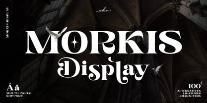 Morkis is an elegant serif font that specially designed to make your design looks more unique and attractive. The alternatives and ligatures characters make this font more unique and stand out with an elegant style. Morkis is perfect font to apply in many different projects such as logo design, branding, poster, magazines, labels, quotes card, wedding card, merchandise, invitation, presentation, advertising and so much more! FEATURES: OpenType support Playfull to use (with ligatures and alternatives characters) Multilingual support PUA Encoded Thank you so much..I really hope you enjoy when using it
 - MultiType Glitch by Cyanotype,
$- MultiType Glitch, an all caps typeface focused in display purposes. 9 styles with a glitchy look. This is the third release of an expanding multiverse of mixable fonts. The whole family of typefaces has been designed to work at big sizes and display purposes such as branding, headlines, thumbnails, posters and animations. You can swap between the three additional alternate sets through all the styles to add diversity to your composition, even in Cyrillic. MultiType Glitch is inspired glitch effects, errors and hacks. Have fun mixing all the styles in your projects.


