10,000 search results
(0.012 seconds)
- Your Flames by Bogstav,
$17.00 A slightly wild brush script suitable for posters! Comes with contextual alternates - meaning the font has 5 different versions of each letter, which automatically cycles as you type!
 - Your Song by Fikryal,
$15.00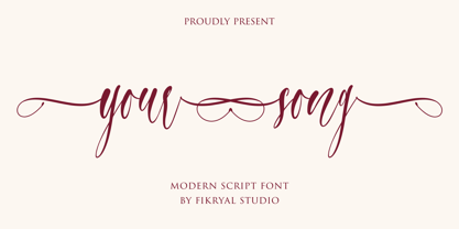 Your Song is a beautiful calligraphy font perfect for crafting, branding, invitation, stationery, wedding designs, social media posts, advertisements, product packaging, product designs, label, photography, watermark, special events or anything. Your Song comes with full set of uppercase and lowercase letters, swash alternates, ligatures,multilingual symbols, numerals and punctuation.
 - Sour Crunch by DM Studio,
$15.00 Introducing Sour Crunch! It's a 'crunchy' comical Display Font, inspired by pop art style comic fonts. It's a good choice for both personal and commercial project purpose, for creating logos, packaging, posters, headers, wall arts, cafe banners, t-shirt designs, advertisements, kids stuff, social media posts and much more! Sour Crunch feature : - All in CAPS with standard character set, including numeric and symbols. - Multilingual Supports ( Afrikaans, Albanian, Catalan, Danish, Dutch, English, Estonian, Finnish, French, German, Italian, Norwegian, Portugese, Spanish, Swedish, Zulu ) If you have any question please kindly send us a message. Hope you enjoy this font. Thanks and Stay Creative!
 - Spicy Hour by PizzaDude.dk,
$17.00 Spicy Hour can be used for all your dishes and designs that needs that extra seasoning. Just mix, and you are ready to go! The ingredients includes contextual alternates, which in this case means that every letter has 5 different versions, which automatically cycles as you type. In other words, it spices up your text! Multilingual support is also a part of the dish!
 - Torus Variations by Monotype,
$25.99 Torus Variations are an addition to the original monoline Torus family from 2017. The four new styles are Biline, Outline, Inline and Notched. The Torus family has been designed specifically for use in logo design, headlines and for branding purposes. While the default character sets are distinctive in their own right, graphic designers will love playing with the numerous alternate glyphs that will help them create unique wordmarks and logo designs. Torus’ simplistic forms and soft terminals make this a lovely, warm typeface perfect for a multitude of typographic applications. Key features: • 4 styles • 6 weights • 49 Alternates (via 2 Stylistic Sets) • Full European character set (Latin only) • 550+ glyphs per font.
 - Whiskey Sour by Fenotype,
$25.00 Whiskey Sour, a robust vintage serif that is as delightful as it is confident. With its soft and warm aesthetic, this typeface effortlessly captures the essence of approachable confidence, making it a tasteful choice for your typographic needs. Whiskey Sour is based on Tomato Ketchup, an earlier release of Fenotype. It has larger and taller uppercase and plenty of differences in lowercase characters, the most significant ones being letters a, h, m and n. Whiskey Sour is an excellent choice for modern graphic design, offering a distinctive touch of familiarity. Whether gracing logos, packaging, restaurant graphics, or any display application, this versatile typeface shines in headlines and shorter texts. Experiment with reduced tracking for a more compact visual impact, or, when using it in small sizes, add a touch of tracking to ensure legibility. Whiskey Sour is naturally equipped with lots of OpenType features: try spicing up your designs with Swash, Stylistic, or Titling Alternates or Discretionary Ligatures. In total Whiskey Sour has 134 Alternate glyphs that can be accessed from OpenType controls or Character Window. See the full selection of Alternates in the specimen posters.
 - Your Everything by Yoga Letter,
$15.00 "Your Everything" is a very beautiful and unique calligraphy font. This font is decorated with a unique and attractive butterfly. This font is perfect for valentine, christmas, winter, wedding, photography, promotion, and others. The decoration on this font is very easy to use, because it has been specially designed and there are instructions for its use in the preview. Thank you:)
 - NTF Tout by Noble Type Foundry,
$10.00 A new experimental display typeface from Noble Type Foundry. Inspired by the hard 45 degree cuts of traditional blackletter type but simplified for a digital age, this unique evolution commands a strong geometric presence in any design.
 - Early Hours by Epiclinez,
$18.00 Early Hours is a fun crafty font. A little bit quirky, this font looks incredibly adept in a wide variety of contexts, such as children's craft, teaching material, quotes, apparel, or any other design that needs a touch of fun and playfulness. The font Early Hours contains 203 glyphs, supporting 66 languages from Africa, Albanian to English, and Zulu. The font Early Hours contains 8 ligatures in 1 OpenType feature. Thank You
 - Drunken Hour by PizzaDude.dk,
$20.00Drunken Hour is not your everyday-ransom-note font! It has autoligatures for both double numbers and letters, and a good handful of the most common letter combinations...even the accented characters has got their own unique look! Well, that means you can make your next punk-grunge project look like YOU actually did all the cutting of letters! :) You will need to use OpenType supporting applications to use the autoligatures. - Four Seasons by Latinotype,
$39.00 Four Seasons is a display handwritten typeface inspired by nature and its four seasons. The font was designed by Coto Mendoza and Luciano Vergara during the winter of 2010 and 2013. Four Seasons’ real handmade stroke allows for an authentic lettering and makes the font perfect for photography and illustration composition. Four Seasons comes with an extensive character set and includes OpenType features such as titlings, endings, initials, swashes, ligatures and alternates plus a sweet set of ornaments, dingbats and words, all inspired by branches, leaves and flowers.
 - Fleurons Four by Wiescher Design,
$39.50 Fleurons are embellishments and here is my fourth round. I found some nice old ones and made some new. These go very well with my scripts Nadine and Ellida!!! Yours once more in a beautiful mood, Gert Wiescher
 - Uncle Hours by Adante Creative,
$23.00 Introducing by Adante.Creative Proudly Present, Uncle Hours Uncle Hours is A Bold Display Typeface Font Uncle Hours is perfect for product packaging, branding project, megazine, social media, wedding, or just used to express words above the background. Enjoy the font, feel free to comment or feedback, send me PM or email.
 - Petit Four by Hanoded,
$15.00 A "Petit Four" is a small, bite-sized, French pastry. The font before you is a bite-sized Hanoded original. It is hand made, fun to use and comes with a lot of calories. Like its namesake, use Petit Four sparingly and it will be the cherry on top of your design.
 - Youre Gone by Typodermic,
$11.95 Typography is the art of crafting letters and shaping language, and for designers, selecting the right font is crucial. Every typeface has its unique personality and can evoke different emotions, which is why selecting the right one for your project is essential. With that in mind, we introduce to you the You’re Gone typeface—a true gem in the world of typography. This rounded techno typeface with an industrial vibe from the 1980s is the perfect way to add a unique, technical edge to your message. Its dauntless strokes and mellow, rounded edges create an industrial look with a contemporary twist, making it the ideal choice for designers looking for something fresh and modern. With its distinct, detached letterforms, You’re Gone is perfect for capturing attention and leaving a lasting impression. This typeface is ideal for all kinds of design projects, from branding and packaging to websites and social media graphics. Its bold, techno look is perfect for businesses in the technology, manufacturing, and industrial sectors. You’re Gone is a versatile typeface that can be used in a variety of ways. Its rounded edges and thick strokes create a distinctive and memorable look, while its technical vibe adds a sense of professionalism and expertise to your message. It’s the perfect way to stand out in a crowded marketplace and make a bold statement with your design. Overall, if you’re looking for a typeface that combines industrial vibes with a contemporary twist, then You’re Gone is the perfect choice. With its bold, rounded strokes and detached letterforms, it’s sure to make a lasting impression and give your message the edge it needs to stand out. Most Latin-based European writing systems are supported, including the following languages. Afaan Oromo, Afar, Afrikaans, Albanian, Alsatian, Aromanian, Aymara, Bashkir (Latin), Basque, Belarusian (Latin), Bemba, Bikol, Bosnian, Breton, Cape Verdean, Creole, Catalan, Cebuano, Chamorro, Chavacano, Chichewa, Crimean Tatar (Latin), Croatian, Czech, Danish, Dawan, Dholuo, Dutch, English, Estonian, Faroese, Fijian, Filipino, Finnish, French, Frisian, Friulian, Gagauz (Latin), Galician, Ganda, Genoese, German, Greenlandic, Guadeloupean Creole, Haitian Creole, Hawaiian, Hiligaynon, Hungarian, Icelandic, Ilocano, Indonesian, Irish, Italian, Jamaican, Kaqchikel, Karakalpak (Latin), Kashubian, Kikongo, Kinyarwanda, Kirundi, Kurdish (Latin), Latvian, Lithuanian, Lombard, Low Saxon, Luxembourgish, Maasai, Makhuwa, Malay, Maltese, Māori, Moldovan, Montenegrin, Ndebele, Neapolitan, Norwegian, Novial, Occitan, Ossetian (Latin), Papiamento, Piedmontese, Polish, Portuguese, Quechua, Rarotongan, Romanian, Romansh, Sami, Sango, Saramaccan, Sardinian, Scottish Gaelic, Serbian (Latin), Shona, Sicilian, Silesian, Slovak, Slovenian, Somali, Sorbian, Sotho, Spanish, Swahili, Swazi, Swedish, Tagalog, Tahitian, Tetum, Tongan, Tshiluba, Tsonga, Tswana, Tumbuka, Turkish, Turkmen (Latin), Tuvaluan, Uzbek (Latin), Venetian, Vepsian, Võro, Walloon, Waray-Waray, Wayuu, Welsh, Wolof, Xhosa, Yapese, Zapotec Zulu and Zuni.
 - 112 Hours by Device,
$9.00 Rian Hughes’ 15th collection of fonts, “112 Hours”, is entirely dedicated to numbers. Culled from a myriad of sources – clock faces, tickets, watches house numbers – it is an eclectic and wide-ranging set. Each font contains only numerals and related punctuation – no letters. A new book has been designed by Hughes to show the collection, and includes sample settings, complete character sets, source material and an introduction. This is available print-to-order on Blurb in paperback and hardback: http://www.blurb.com/b/5539073-112-hours-hardback http://www.blurb.com/b/5539045-112-hours-paperback From the introduction: The idea for this, the fifteenth Device Fonts collection, began when I came across an online auction site dedicated to antique clocks. I was mesmerized by the inventive and bizarre numerals on their faces. Shorn of the need to extend the internal logic of a typeface through the entire alphabet, the designers of these treasures were free to explore interesting forms and shapes that would otherwise be denied them. Given this horological starting point, I decided to produce 12 fonts, each featuring just the numbers from 1 to 12 and, where appropriate, a small set of supporting characters — in most cases, the international currency symbols, a colon, full stop, hyphen, slash and the number sign. 10, 11 and 12 I opted to place in the capital A, B and C slots. Each font is shown in its entirety here. I soon passed 12, so the next logical finish line was 24. Like a typographic Jack Bauer, I soon passed that too -— the more I researched, the more I came across interesting and unique examples that insisted on digitization, or that inspired me to explore some new design direction. The sources broadened to include tickets, numbering machines, ecclesiastical brass plates and more. Though not derived from clock faces, I opted to keep the 1-12 conceit for consistency, which allowed me to design what are effectively numerical ligatures. I finally concluded one hundred fonts over my original estimate at 112. Even though it’s not strictly divisible by 12, the number has a certain symmetry, I reasoned, and was as good a place as any to round off the project. An overview reveals a broad range that nonetheless fall into several loose categories. There are fairly faithful revivals, only diverging from their source material to even out inconsistencies and regularize weighting or shape to make them more functional in a modern context; designs taken directly from the source material, preserving all the inky grit and character of the original; designs that are loosely based on a couple of numbers from the source material but diverge dramatically for reasons of improved aesthetics or mere whim; and entirely new designs with no historical precedent. As projects like this evolve (and, to be frank, get out of hand), they can take you in directions and to places you didn’t envisage when you first set out. Along the way, I corresponded with experts in railway livery, and now know about the history of cab side and smokebox plates; I travelled to the Musée de l’imprimerie in Nantes, France, to examine their numbering machines; I photographed house numbers in Paris, Florence, Venice, Amsterdam and here in the UK; I delved into my collection of tickets, passes and printed ephemera; I visited the Science Museum in London, the Royal Signals Museum in Dorset, and the Museum of London to source early adding machines, war-time telegraphs and post-war ration books. I photographed watches at Worthing Museum, weighing scales large enough to stand on in a Brick Lane pub, and digital station clocks at Baker Street tube station. I went to the London Under-ground archive at Acton Depot, where you can see all manner of vintage enamel signs and woodblock type; I photographed grocer’s stalls in East End street markets; I dug out old clocks I recalled from childhood at my parents’ place, examined old manual typewriters and cash tills, and crouched down with a torch to look at my electricity meter. I found out that Jane Fonda kicked a policeman, and unusually for someone with a lifelong aversion to sport, picked up some horse-racing jargon. I share some of that research here. In many cases I have not been slavish about staying close to the source material if I didn’t think it warranted it, so a close comparison will reveal differences. These changes could be made for aesthetic reasons, functional reasons (the originals didn’t need to be set in any combination, for example), or just reasons of personal taste. Where reference for the additional characters were not available — which was always the case with fonts derived from clock faces — I have endeavored to design them in a sympathetic style. I may even extend some of these to the full alphabet in the future. If I do, these number-only fonts could be considered as experimental design exercises: forays into form to probe interesting new graphic possibilities.
 - Scary Hours by Seemly Fonts,
$12.00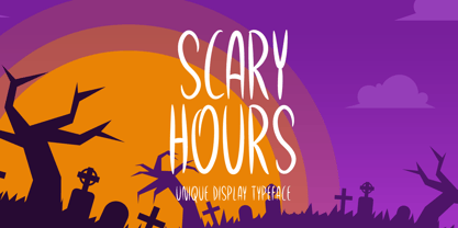 Scary Hours is a unique and spooky display font. It is perfectly suitable for any Halloween-related project or crafty idea! The only limit is your imagination.
 - Le chant des Albatros - Personal use only

- B de bonita shadow - Personal use only

- Les oeufs de Cassowary - Personal use only

- vtks sábado de chuva - 100% free

- Marquis De Sade Ornaments - 100% free

- Chemin De Fer NF by Nick's Fonts,
$10.00The basic letterforms for this typeface were found on a 1920s French poster for Les Arts de Feu by an unnamed artist. The stark geometric forms have been dressed up with an outline treatment, a drop-up shadow and a non-traditional small cap arrangement to make it even more striking, in a spooky kind of way. Both versions of the font include 1252 Latin, 1250 CE (with localization for Romanian and Moldovan). - Mr De Haviland Pro by Sudtipos,
$45.00 The Charles Bluemlein Script Collection is an intriguing reminder of the heady days of hand lettering and calligraphy in the United States. From the early 1930s through World War II, there were about 200 professional hand letterers working in New York City alone. This occupation saw its demise with the advent of photo lettering, and after digital typography, became virtually extinct. The odd way in which the Bluemlein scripts were assembled and created - by collecting different signatures and then building complete alphabets from them - is a fascinating calligraphic adventure. Because the set of constructed designs looked nothing like the original signatures, fictitious names were assigned to the new script typefaces. The typeface styles were then showcased in Higgins Ink catalogs. Alejandro Paul and Sudtipos bring the Bluemlein scripts back to life in a set of expanded digital versions, reflecting the demands of today’s designer. Extreme care has been taken to render the original scripts authentically, keeping the fictitious names originally assigned to them by Bluemlein.
 - Chanson De Paris JNL by Jeff Levine,
$29.00 A couple of pieces of sheet music from France [circa 1925] offered the inspiration for Chanson De Paris JNL (Song of Paris), which is available in both regular and oblique versions. This hand lettered Art Nouveau style features a unique take on thick-and-thin lettering which foreshadows the Art Deco typefaces to come during the 1930s.
 - Plus De Vagues NF by Nick's Fonts,
$10.00The original release notes from England’s Stephenson Blake Type Foundry say it all: “a type of some waywardness in design, judged from any typographical standard…a type that seems unable to decide whether to be a roman or a script." Stephenson Blake called their release "Recherché"— sought after or in great demand, which seems quite appropriate. Both versions of the font include 1252 Latin, 1250 CE (with localization for Romanian and Moldovan). - Cirque De La Lune by Dawnland,
$9.00 Once a year Through mist and rain October soon to end Have no fear Beneath the full moon we gather. Welcome to the show! Now - Silence... Cirque de la Lune is an uppercase only poster/display/headline font in two variants - Eclipse (regular) & Fullmoon (outline). Alternate, nudged or slightly rotated uppercase letters are placed on the lower case keys!
 - Dia De Los Muertos by Intellecta Design,
$21.90 Dia de los Muertos is a colorful collection of skulls based on the lively Mexican fiesta celebration where skulls are used as humorous epitaphs of people still alive, besides being a symbol of celebration. A work of Iza W that can be used for children in arts, arts crafts, among other applications. Buying "Dia de los Muertos" you get FREE a amazing set of eps vectors : 39 naive, intrincated and colored funny skulls, ready to use."
 - San Pedro de Atacama by RodrigoTypo,
$25.00 San Pedro de Atacama is inspired by the north of Chile, which was based on rustic elements, 4 elements were added, which contains linear, filled and textured, also accompanied by "Ruina" for the titles.
 - Parfum De Paris JNL by Jeff Levine,
$29.00 Parfum de Paris JNL is an all lower case Art Deco-inspired design that features counterless letters in a thick-and-thin style reminiscent of 1930s text styles. Casual and at the same time elegant, this font is perfect for perfume labels, menu headings and other 'stylish' titling evoking the look and feel of the 'Streamline Era'.
 - Fiesta De Los Muertos by Mvmet,
$10.00 Fiesta De Los Muertos is a fun and festive display font! Not only can be used for Halloween theme needs, you can use it too for other things for daily needs. Use it on t-shirts and clothing, book designs, greeting cards, stickers, posters, banners, or anything that needs a fun touch. Try it to create fabulous designs and feel the fun and cool vibes with it!
 - De Roos Mediaeval NF by Nick's Fonts,
$10.00 Here’s a classic face from Dutch master type designer Sjoerd H. de Roos. Use it where timeless elegance is the goal. Both versions of this font support the Latin 1252, Central European 1250, Turkish 1254 and Baltic 1257 codepages.
 - De Vinne Stencil JNL by Jeff Levine,
$29.00De Vinne Stencil JNL is a stencil treatment of Theodore L. De Vinne's classic serif font. - Jeu De Mots NF by Nick's Fonts,
$10.00A 1970s Photolettering catalog indentified the pattern for this typeface as "Exotique" ...from France, no less. Named for a French expression meaning “pun,” this face is, indeed, witty and playful, with nary a groan in sight. Both versions of this font include the complete Unicode 1252 Latin and Unicode 1250 Central European character sets. - Crème de la Rue by Benedict Herr,
$39.00 Crème de la Rue is an urban-art-influenced stencil font. Cut outs and spraying or painting in huge sizes are possible as well as display use for headlines or short paragraphs in mid and large scale. The Stencil cut is available with 246 glyphs, numbers, accents, arrows and ligatures.
 - Our Generation by Seemly Fonts,
$12.00 Our Generation is a brand new handwritten font. Our Generation is perfectly suited for stationery, logos, t-shirt, paper, print design, website header, photo frame, flyer, music cover, poster, image slider, and much more.
 - Our Valentine by Letterara,
$12.00 Our Valentine is a unique blend of a classic and modern font. It has a perfect style with a romantic touch. It’s perfect for wedding invites, events, invitations, escort cards, table numbers, header menus, displays, logos, slider blogs, custom addresses, stamps, packaging, greeting cards, and much more! This font is PUA encoded which means you can access all of the glyphs and swashes with ease!
 - Our Stories by Krntype Studio,
$16.00 Our Stories is a cute bubbly monoline font. The anatomy of each letter is playful, making this font look cute bubbly and clean. Our Stories has a fun taste with a cute and bubbly impression. This font is perfect for making quotes, T-shirts, mugs, or just annotating photos, and many other things.
 - Face Your Fears - Personal use only

- Dot Your Eyes - Personal use only


