10,000 search results
(0.016 seconds)
- Gunterz by Locomotype,
$22.00 If you like a bold and powerful all-caps sans-serif font to make your message stand out, Gunterz can be the choice to maximize your goals. Available in four weights and its matching italics, Gunterz is designed to meet font needs in a variety of different situations. To make it more attractive, Gunterz also provides opentypes features such as stylistic alternates and a stylistic set. Others, this font also supports Cyrillic language. Gunterz is suitable for poster titles, packaging design, headlines, logotypes, motion graphics, movie titles, sports promotion and future technology.
 - HS Sporaces by Helipad Space,
$10.00 Introducing, HS Sporaces! An Experimental Slab Serif Display Font with four styles. It looks strong and stylish that can be used for all your project needs. This font can be used at any time and on any project. So, HS Sporaces font can't wait to give its touch to all your design projects such as sport theme, magazine, movie, poster design, printing, personal branding, promotional materials, logotype, product packaging, etc. In use, it can be mixed and matched in every word in a design project. Thank You HS
 - Snooker by Fenotype,
$35.00 Snooker is a playful and rounded low contrast type family with sans and script styles. The styles work great together or alone, making Snooker a versatile typographic tool. There are four weights in both sans and script, from the elegant Extra Light to the attention grabbing Bold weight. The exceptionally long ascenders and descenders give Snooker it’s distinct personality which helps your designs to stand out from the crowd. The script styles are packed with opentype alternates for customising your design. The family is perfect for branding, packaging and advertising purposes.
 - Insignia by Linotype,
$40.99 Brody’s fonts borrow elements from both Art Deco and non-Western styles. His designs received international recognition for their innovative, computer-oriented style, reaching almost cult status. Four original Brody fonts are available from Linotype Library GmbH: Insignia, Industria-Solid, Industria Inline and Arcadia. For your convenience, we have gathered all four into one package. Insignia has the basic forms of constructed grotesque fonts and was influenced by the New Typography of the Bauhaus during the 1930s. Its image reflects the Zeitgeist of that age, suggesting technology and progress.
 - Etero by Larin Type Co,
$15.00 Etero is a modern and elegant serif font that includes four typefaces: regular, outline, italic, and outline italic. This font has a light weight and looks amazing in logos, branding, arranging wedding invitations, business cards, packaging, titles and much more and also works perfectly with text, it is very readable and recognizable. This font includes alternates for Uppercase and Lowercase, with them you can make your project more elegant and unique and the slanted style will add dynamics to your design. This font is easy to use has OpenType features.
 - AJ Quadrata by Adam Jagosz,
$25.00 Once, Blackletter was a calligraphy style. Full of ligatures, with letters bumping into each other to create an unapologetic picket-fence pattern. Some even claimed that the regularity improved legibility! But then Blackletter was cast into metal, and only a handful of established ligatures survived, while most interletter connections were disentangled. Everyone since followed suit, and hundreds of years later, digital Blackletter fonts were modelled mostly on the metal fonts that prevailed rather than the original handwriting. Up until now! AJ Quadrata is an authentic revival of the textura quadrata hand, and its major inspiration is a 15th-century Latin manuscript of the Bible from Zwolle, the Netherlands. The typeface is delivered in two flavors. The default cut is a modern take on textura quadrata that can be useful for today and tomorrow. The standard ligatures feature employs nearly all letters. The tittle of i retains its original, hasty squiggle form (except for the Turkish localization). Discretionary ligatures include medieval ligatures da, de, do, pa, pe, po (and their mixed-case counterparts!). Stylistic sets allow to use historic letter variants such as long s and rotunda r, closed-counter a, and alternate capitals. AJ Quadrata Medieval is perfect for setting Latin. Default forms of capital F, H and O are swapped with the alternates. The squiggles above i only appear for disamibiguation nearby m, n or u, as in original manuscripts. Discretionary ligatures and historic variants are promoted to the standard ligatures feature to make room in the discretionary ligatures feature for a variety of scribal abbreviations. Dedicated stylistic sets include medieval punctuation and justification alternates — glyphs with elongated terminals used for lengthening lines that end up too short. The Rubrum styles can be layered and colored to create the illuminated effect on the capital letters. Besides a faithful rendition of extended Latin including Vietnamese, numerous synthetic additions are included: polytonic Greek, Armenian, and Cyrillic (with Bulgarian and Serbian/Macedonian localizations). Both flavors of the typeface can be considered a starting point that can be further customized using OpenType features, including Stylistic Sets (some features differ between AJ Quadrata and AJ Quadrata Medieval): ss01 Alt E ss02 Descending F / Roman F ss03 Uncial H / Roman H ss04 Angular O / Round O ss05 Contextual closed-counter a ss06 Diamond-dot i j / Always dotted i, j ss07 Contextual rotunda r / No r rotunda ss08 Contextual long s / No long s ss09 Dotless y ss10 Serbian Cyrillic ss11 Alt Cyrillic de ss12 Alt Cyrillic zhe ss13 Alt Cyrillic sha ss14-ss17 [reserved for future use] ss18 Scribal punctuation ss19 Alt linking hyphen ss20 Justification alternates
 - Krul by Re-Type,
$99.00 ‘Krul’ is a typographic interpretation of the lettering style created by Dutch letter painter Jan Willem Joseph Visser at the end of the 1940s, which decorated the traditional brown bars of Amsterdam. In the beginning, these letters were strongly associated with the pubs connected to the Amstel brewery, given that Visser was the company’s official painter. As the years passed, the style became increasingly popular, and various business owners in Amsterdam and other Dutch and Belgian cities also commissioned its use. In the 1970s and 1980s, Leo Beukeboom, another talented letter painter, continued and expanded this lettering tradition while employed under the Heineken brand. Much of his work can still be found in the Jordaan and De Pijp neighborhoods in Amsterdam. The Amsterdamse Krulletter, or Amsterdam’s curly letter, is strongly inspired by the calligraphic works of the 17th century Dutch writing masters, of which Jan van den Velde was a central figure. However, distinct characteristics of this style, for example, its unusual and beautiful ‘g’, originate from a model that was published by Johannes Heuvelman in 1659, which J. W. J. Visser referenced. Typographic circles have somehow overlooked the Amsterdamse Krulletter and its heritage. The Dutch calligraphic hands preceded and influenced the formal English penmanship which has inspired numerous typefaces in the Copperplate style. In contrast, the models from van den Velde, Heuvelman, and Jean de la Chambre, among others, are a missing chapter in Dutch typographic history, and had never been turned into typefaces until now. Conscious of the cultural and identity issues that arise in reviving a unique style, and concerned about the speed with which the lettering style was disappearing, Ramiro Espinoza focused the project of designing ‘Krul’ on digitally recreating the calligraphic complexity of these beautiful letters. Created through several years of research, ‘Krul’ is not a direct digitization of the Amsterdamse Krulletter, but instead, an interpretation that incorporates numerous alternative characters absent in the original model, and improves upon details where necessary, resulting in an optimal performance on the printed page. The typeface is presented in Open Type format, with an abundance of intricate ligatures, fleurons, and swashes, which permit the creation of numerous calligraphic effects. The very high contrast and rhythm of the strokes in this typeface make it especially suited for media applications conveying a sense of elegance and sophistication. Designers of feminine magazines, advertisements, and corporate identities within the fragrance and fashion industries will find in this typeface to be an extremely useful and appropriate resource.The great Amsterdamse Krulletter is finally back, and we are proud to make it available to you.
 - The "Somalove" font, crafted by the imaginative folks at Happy Lovers Town, stands out as a beacon of warmth and endearment in the realm of typography. At its heart, Somalove is a celebration of love...
- Wrought by Jon Cartagena,
$10.00 Wrought is a bold geometric display font by Jon Cartagena. It's purpose is to give a rugged, heavy feeling to your designs. Wrought is available in four weights: Thin, Light, Regular, and Bold. Each character is carefully designed to be vertically aligned at the center. This gives Wrought a unique flair, while promoting a harmonious look through each word.
 - Washida by Crowntype Studio,
$14.00 Washida is a script type family of four fonts. It is inspired by Lovely Fonts and has a soft and welcoming look. Washida can be used for branding, packaging and wherever you need a script font that is easy to read and smooth. Washida has many ties, strokes, and alternative characters that will make your designs unique and beautiful.
 - Breda Two by Eurotypo,
$24.00 Breda Two is the condensed version of the Breda family, but it is presented as an independent family of fonts because they can work as a single face in your design. As a Breda font, this style is austere, functional and clear, emerged from straight lines and primary shapes. Breda Two is released in four weights with two italics.
 - Marybeth by Crowntype Studio,
$12.00 Marybeth is a script type family of four fonts. It is inspired by Lovely Fonts and has a soft and welcoming look. SMarybeth can be used for branding, packaging and wherever you need a script font that is easy to read and smooth. Marybeth has many ties, strokes, and alternative characters that will make your designs unique and beautiful.
 - Tacky Font by Ingrimayne Type,
$14.95 Four letters for this font came from a puzzle in a 1983 Games magazine. After seeing them, I could not resist the temptation to do a complete set of letters made from push pins or tacks, a truly tacky font. Most of the letters on the lower case keys are alternatives--choose the one works best for your purposes.
 - Borex by Twinletter,
$17.00 Introducing Borex, the ultimate font for all your sport racing needs. With its bold and dynamic letterforms, it captures the excitement and energy of the race track. And with four unique variations, including regular, slant, and taper styles, you can customize your designs to fit the tone and theme of your project. Not to mention, the font also comes equipped with alternate characters and unique ligatures to add an extra touch of creativity. So rev up your designs with Borex and get ready for the finish line! What’s Included : - File font - All glyphs Iso Latin 1 - Alternate, Ligature - Simple installations - We highly recommend using a program that supports OpenType features and Glyphs panels like many Adobe apps and Corel Draw so that you can see and access all Glyph variations. - PUA Encoded Characters – Fully accessible without additional design software. - Fonts include Multilingual support
 - ITC Bodoni Seventytwo by ITC,
$29.99Giambattista Bodoni (1740-1813) was called the King of Printers; he was a prolific type designer, a masterful engraver of punches and the most widely admired printer of his time. His books and typefaces were created during the 45 years he was the director of the fine press and publishing house of the Duke of Parma in Italy. He produced the best of what are known as modern" style types, basing them on the finest writing of his time. Modern types represented the ultimate typographic development of the late eighteenth and early nineteenth centuries. They have characteristics quite different from the types that preceded them; such as extreme vertical stress, fine hairlines contrasted by bold main strokes, and very subtle, almost non-existent bracketing of sharply defined hairline serifs. Bodoni saw this style as beautiful and harmonious-the natural result of writing done with a well-cut pen, and the look was fashionable and admired. Other punchcutters, such as the Didot family (1689-1853) in France, and J. E. Walbaum (1768-1839) in Germany made their own versions of the modern faces. Even though some nineteenth century critics turned up their noses and called such types shattering and chilly, today the Bodoni moderns are seen in much the same light as they were in his own time. When used with care, the Bodoni types are both romantic and elegant, with a presence that adds tasteful sparkle to headlines and advertising. ITC Bodoni™ was designed by a team of four Americans, after studying Bodoni's steel punches at the Museo Bodoniana in Parma, Italy. They also referred to specimens from the "Manuale Tipografico," a monumental collection of Bodoni's work published by his widow in 1818. The designers sought to do a revival that reflected the subtleties of Bodoni's actual work. They produced three size-specific versions; ITC Bodoni Six for captions and footnotes, ITC Bodoni Twelve for text settings, and ITC Bodoni Seventytwo - a display design modeled on Bodoni's 72-point Papale design. ITC Bodoni includes regular, bold, italics, Old style Figures, small caps, and italic swash fonts. Sumner Stone created the ornaments based on those found in the "Manuale Tipografico." These lovely dingbats can be used as Bodoni did, to separate sections of text or simply accent a page layout or graphic design." - ITC Bodoni Twelve by ITC,
$29.99Giambattista Bodoni (1740-1813) was called the King of Printers; he was a prolific type designer, a masterful engraver of punches and the most widely admired printer of his time. His books and typefaces were created during the 45 years he was the director of the fine press and publishing house of the Duke of Parma in Italy. He produced the best of what are known as modern" style types, basing them on the finest writing of his time. Modern types represented the ultimate typographic development of the late eighteenth and early nineteenth centuries. They have characteristics quite different from the types that preceded them; such as extreme vertical stress, fine hairlines contrasted by bold main strokes, and very subtle, almost non-existent bracketing of sharply defined hairline serifs. Bodoni saw this style as beautiful and harmonious-the natural result of writing done with a well-cut pen, and the look was fashionable and admired. Other punchcutters, such as the Didot family (1689-1853) in France, and J. E. Walbaum (1768-1839) in Germany made their own versions of the modern faces. Even though some nineteenth century critics turned up their noses and called such types shattering and chilly, today the Bodoni moderns are seen in much the same light as they were in his own time. When used with care, the Bodoni types are both romantic and elegant, with a presence that adds tasteful sparkle to headlines and advertising. ITC Bodoni™ was designed by a team of four Americans, after studying Bodoni's steel punches at the Museo Bodoniana in Parma, Italy. They also referred to specimens from the "Manuale Tipografico," a monumental collection of Bodoni's work published by his widow in 1818. The designers sought to do a revival that reflected the subtleties of Bodoni's actual work. They produced three size-specific versions; ITC Bodoni Six for captions and footnotes, ITC Bodoni Twelve for text settings, and ITC Bodoni Seventytwo - a display design modeled on Bodoni's 72-point Papale design. ITC Bodoni includes regular, bold, italics, Old style Figures, small caps, and italic swash fonts. Sumner Stone created the ornaments based on those found in the "Manuale Tipografico." These lovely dingbats can be used as Bodoni did, to separate sections of text or simply accent a page layout or graphic design." - ITC Bodoni Ornaments by ITC,
$29.99Giambattista Bodoni (1740-1813) was called the King of Printers; he was a prolific type designer, a masterful engraver of punches and the most widely admired printer of his time. His books and typefaces were created during the 45 years he was the director of the fine press and publishing house of the Duke of Parma in Italy. He produced the best of what are known as modern" style types, basing them on the finest writing of his time. Modern types represented the ultimate typographic development of the late eighteenth and early nineteenth centuries. They have characteristics quite different from the types that preceded them; such as extreme vertical stress, fine hairlines contrasted by bold main strokes, and very subtle, almost non-existent bracketing of sharply defined hairline serifs. Bodoni saw this style as beautiful and harmonious-the natural result of writing done with a well-cut pen, and the look was fashionable and admired. Other punchcutters, such as the Didot family (1689-1853) in France, and J. E. Walbaum (1768-1839) in Germany made their own versions of the modern faces. Even though some nineteenth century critics turned up their noses and called such types shattering and chilly, today the Bodoni moderns are seen in much the same light as they were in his own time. When used with care, the Bodoni types are both romantic and elegant, with a presence that adds tasteful sparkle to headlines and advertising. ITC Bodoni™ was designed by a team of four Americans, after studying Bodoni's steel punches at the Museo Bodoniana in Parma, Italy. They also referred to specimens from the "Manuale Tipografico," a monumental collection of Bodoni's work published by his widow in 1818. The designers sought to do a revival that reflected the subtleties of Bodoni's actual work. They produced three size-specific versions; ITC Bodoni Six for captions and footnotes, ITC Bodoni Twelve for text settings, and ITC Bodoni Seventytwo - a display design modeled on Bodoni's 72-point Papale design. ITC Bodoni includes regular, bold, italics, Old style Figures, small caps, and italic swash fonts. Sumner Stone created the ornaments based on those found in the "Manuale Tipografico." These lovely dingbats can be used as Bodoni did, to separate sections of text or simply accent a page layout or graphic design." - ITC Bodoni Brush by ITC,
$29.99Giambattista Bodoni (1740-1813) was called the King of Printers; he was a prolific type designer, a masterful engraver of punches and the most widely admired printer of his time. His books and typefaces were created during the 45 years he was the director of the fine press and publishing house of the Duke of Parma in Italy. He produced the best of what are known as modern" style types, basing them on the finest writing of his time. Modern types represented the ultimate typographic development of the late eighteenth and early nineteenth centuries. They have characteristics quite different from the types that preceded them; such as extreme vertical stress, fine hairlines contrasted by bold main strokes, and very subtle, almost non-existent bracketing of sharply defined hairline serifs. Bodoni saw this style as beautiful and harmonious-the natural result of writing done with a well-cut pen, and the look was fashionable and admired. Other punchcutters, such as the Didot family (1689-1853) in France, and J. E. Walbaum (1768-1839) in Germany made their own versions of the modern faces. Even though some nineteenth century critics turned up their noses and called such types shattering and chilly, today the Bodoni moderns are seen in much the same light as they were in his own time. When used with care, the Bodoni types are both romantic and elegant, with a presence that adds tasteful sparkle to headlines and advertising. ITC Bodoni™ was designed by a team of four Americans, after studying Bodoni's steel punches at the Museo Bodoniana in Parma, Italy. They also referred to specimens from the "Manuale Tipografico," a monumental collection of Bodoni's work published by his widow in 1818. The designers sought to do a revival that reflected the subtleties of Bodoni's actual work. They produced three size-specific versions; ITC Bodoni Six for captions and footnotes, ITC Bodoni Twelve for text settings, and ITC Bodoni Seventytwo - a display design modeled on Bodoni's 72-point Papale design. ITC Bodoni includes regular, bold, italics, Old style Figures, small caps, and italic swash fonts. Sumner Stone created the ornaments based on those found in the "Manuale Tipografico." These lovely dingbats can be used as Bodoni did, to separate sections of text or simply accent a page layout or graphic design." - ITC Bodoni Six by ITC,
$40.99Giambattista Bodoni (1740-1813) was called the King of Printers; he was a prolific type designer, a masterful engraver of punches and the most widely admired printer of his time. His books and typefaces were created during the 45 years he was the director of the fine press and publishing house of the Duke of Parma in Italy. He produced the best of what are known as modern" style types, basing them on the finest writing of his time. Modern types represented the ultimate typographic development of the late eighteenth and early nineteenth centuries. They have characteristics quite different from the types that preceded them; such as extreme vertical stress, fine hairlines contrasted by bold main strokes, and very subtle, almost non-existent bracketing of sharply defined hairline serifs. Bodoni saw this style as beautiful and harmonious-the natural result of writing done with a well-cut pen, and the look was fashionable and admired. Other punchcutters, such as the Didot family (1689-1853) in France, and J. E. Walbaum (1768-1839) in Germany made their own versions of the modern faces. Even though some nineteenth century critics turned up their noses and called such types shattering and chilly, today the Bodoni moderns are seen in much the same light as they were in his own time. When used with care, the Bodoni types are both romantic and elegant, with a presence that adds tasteful sparkle to headlines and advertising. ITC Bodoni™ was designed by a team of four Americans, after studying Bodoni's steel punches at the Museo Bodoniana in Parma, Italy. They also referred to specimens from the "Manuale Tipografico," a monumental collection of Bodoni's work published by his widow in 1818. The designers sought to do a revival that reflected the subtleties of Bodoni's actual work. They produced three size-specific versions; ITC Bodoni Six for captions and footnotes, ITC Bodoni Twelve for text settings, and ITC Bodoni Seventytwo - a display design modeled on Bodoni's 72-point Papale design. ITC Bodoni includes regular, bold, italics, Old style Figures, small caps, and italic swash fonts. Sumner Stone created the ornaments based on those found in the "Manuale Tipografico." These lovely dingbats can be used as Bodoni did, to separate sections of text or simply accent a page layout or graphic design." - Phinney Jenson by HiH,
$12.00 Phinney Jenson ML is a font with deep historical roots firmly planted in the fertile soil of the Italian Renaissance. Twenty years after Lorenzo Ghiberti finished his famous East Doors, the Gates of Paradise, of Santa Maria del Fiore in Florence and about fifteen years before Sandro Botticelli painted his “Birth of Venus,” a French printer by the name of Nicolas Jenson set up a small print shop in the powerful city-state of Venice. The fifteenth century marked the end of the plague and the rise of Venetian power, as the merchants of Venice controlled the lucrative trade of the eastern Mediterranean and sent their ships as far as London and even the Baltic. In 1470, Jenson introduced his Roman type with the printing of De Praeparatio Evangelica by Eusebuis. He continued to use his type for over 150 editions until he died in 1480. In 1890 a leader of the Arts & Crafts movement in England named William Morris founded Kelmscott Press. He was an admirer of Jenson’s Roman and drew his own somewhat darker version called GOLDEN, which he used for the hand-printing of limited editions on homemade paper, initiating the revival of fine printing in England. Morris' efforts came to the attention of Joseph Warren Phinney, manager of the Dickinson Type Foundry of Boston. Phinney requested permission to issue a commercial version, but Morris was philosophically opposed and flatly refused. So Phinney designed a commercial variation of Golden type and released it in 1893 as Jenson Oldstyle. Phinney Jenson is our version of Phinney’s version of Morris' version of Nicolas Jenson’s Roman. We selected a view of the Piazza San Marco in Venice for our gallery illustration of Phinney Jenson ML because most of the principal buildings on the Piazza were already standing when Jenson arrived in Vienna in 1470. The original Campanile was completed in 1173 (the 1912 replacement is partially visible on the left). The Basilica di San Marco was substantially complete by 1300. The Doge’s Palace (not in the photo, but next to the Basilica) was substantially complete by 1450. Even the Torre dell'Orologio (Clock Tower) may have been completed by 1470—certainly by 1500. Phinney Jenson ML has a "rough-and-ready" strength, suitable for headlines and short blocks of text. We have sought to preserve some of the crudeness of the nineteenth-century original. For comparison, see the more refined Centaur, Bruce Rogers's interpretation of Jenson Roman. Phinney Jenson ML has a strong presence that will help your documents stand out from the Times New Roman blizzard that threatens to cover us all. Phinney Jenson ML Features: 1. Glyphs for the 1252 Western Europe, 1250 Central Europe, the 1252 Turkish and the 1257 Baltic Code Pages. Accented glyphs for Cornish and Old Gaelic. Total of 393 glyphs. 400 kerning pairs. 2. OpenType GSUB layout features: onum, pnum, salt, liga, dlig, hisy and ornm. 3. Tabular (std), proportional (opt) & old-style numbers (opt). 5. CcNnOoSsZz-kreska available (salt).
 - Elvaretta by Create Big Supply,
$15.00 Discover the beauty and elegance of Elvaretta, a stunning script handwriting font designed to add a touch of sophistication to your creative projects. With its graceful curves and flowing strokes, Elvaretta brings a sense of charm and authenticity to your typography. This versatile font features both uppercase and lowercase letters, allowing you to create captivating designs with ease. Whether you're working on invitations, logos, branding materials, or any other project that calls for a stylish handwritten touch, Elvaretta is the perfect choice to elevate your work. In addition to its aesthetic appeal, Elvaretta is designed with practicality in mind. It includes a comprehensive set of numbers and punctuations, ensuring seamless integration of numerical information into your designs. The font also boasts multilingual support, enabling you to communicate your message effectively in various languages and reach a global audience. Elvaretta has equipped with PUA (Private Use Area) encoding, granting access to special characters, ligatures, and alternate letterforms. This feature empowers you to customize your typography and add unique touches to your designs, making them truly one-of-a-kind. Visit our store at MyFont to download Elvaretta and unlock a world of creative possibilities. Enhance your designs with the elegance and charm of this script handwriting font, and let your creativity flourish.
 - Budge by Flavortype,
$12.00 Budge, a new carefully crafted layered Italic Typeface. The ideas of this fonts come from a wide range of reference and deserts and beverages are our main focus for this font family. Budge will give a versatile, fun, cute and beauty feel to your projects. Budge was created with beautiful swashes, and also comes with 3 Layer : Regular, Shadow and line. Perfectly fitted layers to give you more contrast, and a bolder look. Every glyphs for alternates is curated for the best and without eliminating the characteristic of this fonts. Budge also comes with a Sans Serif as Font Pair that completes the needs for your design. Our creation on the display give you a reference of what it looks like on your projects such as branding, headers, logotypes, posters, magazines, packaging, food menus, and more. It shows that Budge clearly can accommodate various design style. Type Specimen here : http://tiny.cc/y9mfnz
 - Bikerboys by Gassstype,
$27.00 Hello Everyone, introduce our new product Font Biker Boys This Is Hand Drawn Display Font.This is a Textured Natural Style and classy style with a clear style and dramatic movement. This font Biker Boys is great for your next creative project such as logos, printed quotes, invitations, cards, product.
 - Southwood by Timurtype,
$14.00 Introducing by Timur type Proudly Present, Southwood Southwood A Handwritten Script Font Southwood is perfect for product packaging, branding project, megazine, social media, wedding, or just used to express words above the background. Southwood also multilingual support. Embelish your designs with our original fonts.Enjoy the font,Thank you!
 - Dimetone by Timurtype,
$14.00 Proudly presented by Timur Type: Dimetone – A handwritten script font Dimetone is perfect for product packaging, branding projects, magazine, social media, wedding invitations, or just used to express words above the background. Dimetone has multilingual support. Embellish your designs with our original fonts. Enjoy the font, thank you!
 - Green Berry by Gassstype,
$28.00 Introducing of our new product Green Berry it is a unique font and also has vintage display 2 style font. Can make it easier to convey the message in your design. Use for awesome display, labeling, movie sceen, poster, movie title, gigs, album covers, logos, and much more.
 - The Wave by Bluestudio,
$15.00 Introducing our latest product The Wave. The Wave fits all the needs of design projects for clothing, t-shirts, branding, quotes, covers, magazine, posters, books and others. What's included? Multilingual support - spread your message globally AÀÁÂÃÄÅCÇDÐEÈÉÌÍÎÏIÌÍÎÏNÑOØÒÓÔÕÖUÙÜÚÛWYÝŸÆßÞþ Encoded PUA CharactersFonts are fully accessible without additional design software . Happy designing!
 - Murisa Marishka by Murisa Studio,
$10.00 marishka is our best offering for people like you. If you want a bold and elegant font, then this font is perfect for you. Use this font in your products and designs, and get a charming elegant impression. Beautiful, firm, authoritative, that's what you get. Have it now.
 - Booked by Gassstype,
$27.00 Hello Everyone, introduce our new product Font Booked This Is Rough Display Font.This is a Textured Natural Style and classy style with a clear style and dramatic movement. That is has charming, authentic and relaxed characteristic more natural look to your text. You can activate 4 Ligatures OpenType panel.
 - Zalena by Gatype,
$14.00 Hello my name is Zalena font, our new and fun font collection. Combining hand drawn style with a modern twist. Zalena comes with a ligature alternative that you can use to give your projects more options. Perfect for logos, notes, posters, t-shirts, stickers, posters, mugs, labels, etc.
 - Gastonila by Timurtype,
$14.00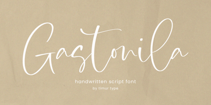 Introducing by Timur type Proudly Present, Gastonila Gastonila A Handwritten Script Font Gastonila is perfect for product packaging, branding project, megazine, social media, wedding, or just used to express words above the background. Gastonila also multilingual support. Embelish your designs with our original fonts.Enjoy the font,Thank you!
 - Kittendust by Timurtype,
$14.00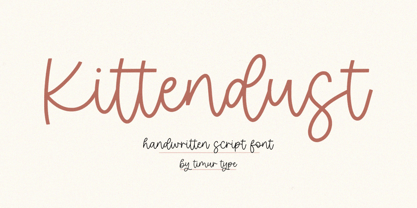 Introducing by Timur type Proudly Present, Kittendust Kittendust A Handwritten Script Font Kittendust is perfect for product packaging, branding project, megazine, social media, wedding, or just used to express words above the background. Kittendust also multilingual support. Embelish your designs with our original fonts.Enjoy the font,Thank you!
 - Demon Say Hi by Gassstype,
$27.00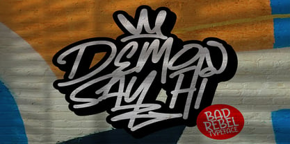 Hello Everyone, introduce our new product Demon Say Hi is Rebel Typeface Font with a natural feel. This handmade font will make your design has a beautiful natural touch for each details. This font is PUA encoded which means you can access all of the magical glyphs with ease!
 - Gasstock by Gassstype,
$27.00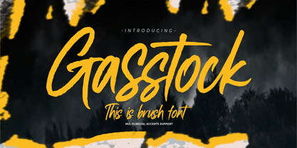 Hello Everyone, introduce our new product Font Gasstock This Is Brush Font.This is a Textured Natural Style and classy style with a clear style and dramatic movement. That is has charming, authentic and relaxed characteristic more natural look to your text. You can activate 32 Ligatures glyphs OpenType panel.
 - Dotoria Slant by Gassstype,
$19.00 Hello Everyone, Introduce our new collection Dotoria is a Handwritten Brush font with comical type. Crafted manually with love and passion, This font is great for your next creative project such as logos, printed quotes, invitations, cards, product packaging, headers, Logotype, Letterhead, Poster, Label, Game project and etc.
 - Strangelove NextSlab by FaceType,
$12.00 Strangelove NextSlab is a serif version of our bestseller Strangelove Next. It contains 3 styles with two weights each. (Be sure to have ‘Contextual Alternates’ activated in your design app of choice to get a more lively look when it comes to subsequent letters like ee, gg ... etc).
 - Golfmind by Timurtype,
$14.00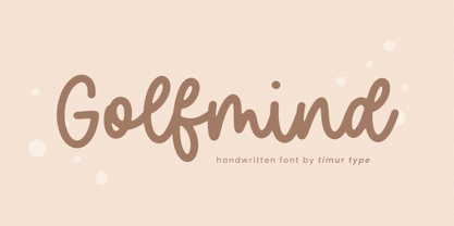 Introducing by Timur type Proudly Present, Golfmind Golfmind A Handwritten Script Font Golfmind is perfect for product packaging, branding project, megazine, social media, wedding, or just used to express words above the background. Golfmind also multilingual support. Embelish your designs with our original fonts.Enjoy the font,Thank you!
 - Fontazia Motyl by Deniart Systems,
$24.00 Fontazia Motyl features 52 unique fantasy butterflies motifs. These whimsical glyphs are great for backgrounds, accents, greetings, and even tattoos. Add one or add them all - these dingbats are a sure thing for all your inspirations! For more butterfly fun, check out our butterfly inspired florals: Fontazia Papilio .
 - Jimmy Jamets by Gassstype,
$29.00 Hello Everyone, introduce our new product Font Jimmy Jamets This Is Hand Drawn Font.This is a Textured Natural Style and classy style with a clear style and dramatic movement. This font Jimmy Jamets is great for your next creative project such as logos, printed quotes, invitations, cards, product packaging,
 - Brush Besh by Gassstype,
$25.00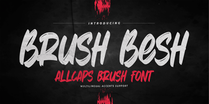 Hello Everyone, introduce our new product Font Brush Besh is AllCaps Brush Font.This is a Textured Natural Style and classy style with a clear style and dramatic movement. This font Brush Besh is great for your next creative project such as logos, printed quotes, invitations, cards, product packaging, headers.