10,000 search results
(0.017 seconds)
- Wakerobin by Monotype,
$50.99 Wakerobin takes its charming swagger from the hand-painted billboard, poster and signage lettering of the mid-19th century. These showy styles did everything they could to stand out from the background cacophony of advertising, with signwriters using sharp and high contrast serif letters, squared block shapes, or art nouveau forms to grab the attention of passersby. Wakerobin embraces the spirit of these letterforms, bringing these various styles together in one typeface - as if users had their own sign painter on hand. Just as lettering artists had to adapt to a variety of sizes - from wide streetcar lettering to compressed forms that squeezed into narrow Victorian windows - the variable version of Wakerobin scales up and down in width to fit whatever environment the user’s working in. The static fonts come in three widths and five weights. As well as its adaptability, Wakerobin is bursting with vintage flavour, making it hard to ignore. Its distinctive, spiky serifs would be right at home on food and drinks packaging, as well as shop windows, adverts, and any other place that calls for some typographic showmanship. It performs particularly well in busy environments, or anywhere with a lot of visual noise - just as its historic predecessors did. And while Wakerobin is first and foremost a display typeface, it’s surprisingly elegant when used at text size, or in the lighter end of the weight spectrum.
 - Wakerobin Variable by Monotype,
$209.99Wakerobin takes its charming swagger from the hand-painted billboard, poster and signage lettering of the mid-19th century. These showy styles did everything they could to stand out from the background cacophony of advertising, with signwriters using sharp and high contrast serif letters, squared block shapes, or art nouveau forms to grab the attention of passersby. Wakerobin embraces the spirit of these letterforms, bringing these various styles together in one typeface - as if users had their own sign painter on hand. Just as lettering artists had to adapt to a variety of sizes - from wide streetcar lettering to compressed forms that squeezed into narrow Victorian windows - the variable version of Wakerobin scales up and down in width to fit whatever environment the user’s working in. The static fonts come in three widths and five weights. As well as its adaptability, Wakerobin is bursting with vintage flavour, making it hard to ignore. Its distinctive, spiky serifs would be right at home on food and drinks packaging, as well as shop windows, adverts, and any other place that calls for some typographic showmanship. It performs particularly well in busy environments, or anywhere with a lot of visual noise - just as its historic predecessors did. And while Wakerobin is first and foremost a display typeface, it’s surprisingly elegant when used at text size, or in the lighter end of the weight spectrum. - System Overload by Hanoded,
$15.00 I sometimes think that we live in strange times: a lot of good (and bad) things seems to happen all at once. System Overload font is based on the protest posters from the seventies. You can use it for your own protest posters, your restaurant signs or whatever you fancy. Comes with several interesting discretionary ligatures as well!
 - Mene One Mexicali by Handselecta,
$38.00This style mimics the flare or upward fade that comes with the use of a spray paint can, as the tops of the letters flare, and become wider. An original font style, named after the border town of Mexicali, this font style falls under the larger umbrella of what is called Cholo-graffiti style. Originally from New Jersey, MENE has made his home in, New York City. He had a brief albeit satisfying career of street bombing in the late 90s that saw its end with a brief encounter with the Vandal Squad. Now a family man, Mene has dedicated himself to the preservation and education of style in its many forms. - Like Butterflies by Bogstav,
$10.00 Now here's a font that is named Like Butterflies, but has got nothing to do with butterflies! What? Why? Well, I recently heard the song "Even flow" by Pearl Jam and took a trip down memory lane - back to my early twenties. I remember how the lyrics affected me, and had an impact on how my life changed the years to follow. Maybe the style of the font does not reflect the inner meaning of the song, but it does reflect a look back in time for me - and the change that took place. Nevertheless, I hope you enjoy the somewhat simple, handmade style of Like Butterflies and the 4 versions that works very well together! Please notice that each letter has got 5 slightly different versions to choose from!
 - Doodlebears - Unknown license

- Personal Manifesto by Thomas Käding,
$15.00 This holographic font is great for writing your own manifesto, or for giving your anonymous letters to the government that personal touch that shows you care. Also good for children’s books.
 - Troutbeck by Hanoded,
$15.00 I used to live in the English Lake District - in a town called Ambleside to be precise. It was a nice time in my life, as living in the Lake District gave me the opportunity to go out every day and enjoy the beautiful nature! Troutbeck is a small, old fashioned village on the narrow and hilly road from Windermere to Penrith. If you ever make it there, you will discover that the area is a walhalla for hikers! Troutbeck font is a pleasing, handmade all caps font. It would look great on product packaging or book covers, or maybe postcards reading ‘Greetings from the Lake District’.
 - Wed Dings by Design23,
$39.00 This font will help the beginner designer create their own wedding invitations.
 - Hoosegow JNL by Jeff Levine,
$29.00Sagebrush John, your bank robbin' days are over. I'm throwin' you in the hoosegow! Hoosegow JNL isn't a small town jailhouse, but it is Jeff Levine's take on a classic wood type that brings out the Old West in any design layout. The beauty of many of these vintage wood type alphabets is their "imperfect" letter forms - giving your work a touch of the old days of letterpress printing. - Fredericksburg by Nick's Fonts,
$10.00In his book of 100 Wood Type Alphabets, Rob Roy Kelly called this face "Teutonic". This version adds lowercase letters, missing in the original, plus a few woodcut dingbats in the brackets, bar, section and florin positions. Named for a charming town in the Texas Hill Country, founded by German settlers in the mid-1850s. Both versions of the font include 1252 Latin, 1250 CE (with localization for Romanian and Moldovan). - Karsten by Nasir Udin,
$25.00 The first development of Karsten typeface was inspired by signs on some old Dutch-buildings in Java. Then in the making, it blends with modern style. It's a synthesis between two cultures, the East & the West. The typeface was named after the Dutch architect who gave major contributions to architecture and town planning in Indonesia, Herman Thomas Karsten. It comes in nine weights from thin to black with matching italics. Its mixture of weights provide a wide range of styles that will help you find the best vibe for your projects, for headlines or a short paragraph. See the full presentation on Behance
 - Thanks Bunny by Andrey Font Design,
$14.00 Thanks Bunny is a cute and jolly looking display font, carefully handcrafted to become a true favorite. Its casual charm makes it appear wonderfully down-to-earth, readable and, ultimately, incredibly versatile. Thanks Bunny will look outstanding in any context, whether it’s being used on busy backgrounds or as a standalone headline!
 - Merry Script by Letterara,
$14.00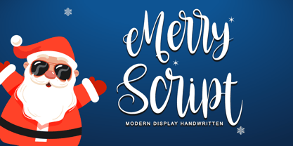 Merry script font that is simple and unique looking. Its beautiful charm makes it appear wonderfully down-to-earth, readable, and, ultimately, incredibly versatile. This will add a fun and friendly touch to any of your projects! This font is PUA encoded which means you can access all glyphs and sweeps easily.
 - Christmas Script by Letterara,
$16.00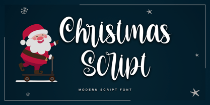 Christmas script font that is simple and unique looking. Its beautiful charm makes it appear wonderfully down-to-earth, readable, and, ultimately, incredibly versatile. This will add a fun and friendly touch to any of your projects! This font is PUA encoded which means you can access all glyphs and sweeps easily.
 - Nick and Daddy by Awan Senja,
$14.00 Nick and Daddy is a cute comic font, carefully handcrafted to become a true favorite. Its casual charm makes it appear wonderfully down-to-earth, readable and, ultimately, incredibly versatile. Nick and Daddy will look outstanding in any context, whether it�s being used on busy backgrounds or as a standalone headline!
 - Analfabeto by Type-Ø-Tones,
$40.00 The Brazilian illustrator, Flavio Morais, devised this amusing display alphabet to have his own font for his former website. We helped to digitalize it and encouraged him to complete it with a series of “chiringuito” drawings. More about his work here.
 - Morable by Malindo Creative,
$10.00 Morable is a modern hand based typeface, This font consists of letters that flows irregularly, either between top-down and with the letter afterwards, which makes it suitable for Logotype, posters, businness card, merchandise, wedding invitations, greeting cards, blog banners, apparel, design of water-based paints/prints, correspondence, quotes and a variety of other! Morable has given PUA encoded (specially coded fonts). Files included: morable.otf If you want other files that are not here, please let me know. I will be happy to help. If you have any questions, please contact me at. malindocreative@gmail.com. Thanks for Support Feel free to contact me if you have any questions, I am happy to help you.
 - Pocatello JNL by Jeff Levine,
$29.00 The hand-lettered title, cast and crew credits for 1943's "Presenting Lily Mars" (starring Judy Garland and Van Heflin) inspired Pocatello JNL, but the name of this typeface has another Judy Garland connection. In the 1954 remake of "A Star is Born", Judy sings of being born in a trunk in a theater located in Pocatello, Idaho. The name of this Midwest town had such a great sound to it, so it was the perfect choice for the font's name. Available in regular, oblique, bold and bold oblique versions.
 - Quandary by Winnie Tan,
$39.00 The Quandary Font is created for a horror theme in use with an illustrated book ‘The Predicament’ by Edgar Allan Poe. It is designed as a highly expressive face to accentuate a sense of mystery and the macabre. A comparatively more carefree and free-spirited face, it comes as a uni-case single weight family used exclusively as the main face for the book. The characters are developed from the numeric glyphs found on the astronomical clock-face at Prague Old Town Square, Czech Republic. http://www.behance.net/gallery/Quandary/383204
 - Venereal - Unknown license

- My Sallome by RahagitaType,
$15.00 My Sallome is a beautiful script in a natural handwritten style. Its casual charm makes it appear wonderfully down-to-earth, readable and - ultimately - incredibly versatile. My Sallome will look outstanding in any context, whether it’s being used on busy backgrounds or as a standalone headline.
 - Missiva by DSType,
$20.00The first inspiration for Missiva was a sixteen century letter from S. Francisco Xavier (St. Francis Xavier) but then I adapted my own handwriting in order to have the basic character set. - Black Mountage by Sarid Ezra,
$12.00 Black Mountage is brush font that contain stylistic alternate, swash, etc to create your own customized signature, quotes, and also great for apparel. This font is support multi language. Also Support PUA.
 - Lourdes by insigne,
$24.99 Lourdes is an informal script font drawn with quick, thick brush strokes. The script appears to be quickly dashed down, and the characters were carefully designed to create a subtle rhythm. The strokes are slightly muted to avoid an overly aggressive appearance. Lourdes has a wonderful active tempo that works well for headlines, logotypes and signage.
 - Tuscaloosa by Greater Albion Typefounders,
$7.00 Tuscaloosa is a classic American 'Wild West' Tuscan typeface-we thought it would make a suitable Independence Day tribute to our many American clients. It's ideal for wherever that 'Western' feel is wanted. Posters, signage, the sides of stagecoaches etc... Three faces are offered, a pristine and sharp regular form, a somewhat distressed 'Rustic' face and the rather more distressed 'Extremely Rustic'. So why not mosey on down the saloon with Tuscaloosa!
 - Umbilical Noose by Hanoded,
$15.00 Umbilical Noose is a rather scary typeface. It is quite similar to an older font of mine: Nyctophobia. The name comes from a Nirvana song called Heart Shaped Box, in which Kurt Cobain sings: "throw down your umbilical noose, so I can climb right back". I have always liked that phrase a lot. Umbilical Noose is an all caps font, but upper and lower case are different and you can easily interchange the glyphs.
 - Lazy Morning by Hanoded,
$15.00 I can’t remember when I had a true lazy morning.. I was a looong time ago, before I had children! Even now, when I’m down with the flu, I can’t stay in bed for too long - it really seems like a waste of time! Lazy Morning is a nice handwritten font. I made it with a Sharpie pen. It comes with all diacritics and double letter ligatures for you to play with.
 - Funkboy by PizzaDude.dk,
$20.00 Funkboy looks like something that was made 20 years ago. You know, when Grandmaster Flash was scratching to the beat and graffiti was totally underground. Funkboy was made to look 100% oldschool, and now you can make your own bad-boy oldschool graffiti, using your computer! Comes with two hard knock alternate letters: the peace 'o' + the heart dotted 'i' You will need to use OpenType supporting applications to use the autoligatures.
 - Elevator Boy by PizzaDude.dk,
$20.00Watch Elevator Boy bounce up and down, a playful, whimsical display type that looks like fun and tastes like Saturday morning cartoons. Mmmmmm.... it's like font candy! - Tasci Kursiv by Abdullah Tasci,
$30.00Tasci Kursiv is a typeface which is transformed from the designer’s own calligraphy. - Deliscript by Alphabet Soup,
$29.00 Although initially inspired by the neon sign in front of Canter’s Delicatessen in Los Angeles, the design of Deliscript Upright and Deliscript Slant soon took on a life of its own–and its own distinctive look. Like its sibling Metroscript, Deliscript has many features that expand its usability such as the the variable length tails which can be accessed in 6 different styles, and the never before seen crossbars which can be extended outward in either direction from the lower case “t”. Throw in the special “WordLogos”, tons of ligatures and foreign accented characters, and you have a recipe for typesetting that approaches the look of hand-lettering. For a better understanding of its unique features please download The Deliscript User Manual—available in the Gallery section.
 - FS Joey Paneuropean by Fontsmith,
$90.00Kangaroo FS Joey was the offspring of a project with Rudd Studio to develop a logotype for an online streaming TV service, in 2008. While under wraps, the secret project was code-named Kangaroo. The logotype led to a second project, to design a corporate typeface for the service. It was the first big project Fernando Mello had worked on with Jason Smith. “Like any designer who just joined a team, I was very excited about it, drawing and sketching lots of ideas. I remember Jason and I experimenting with lots of possibilities, for both the logo and the typeface.” Online As the font for a Spotify-style, internet-based service, FS Joey needed to be highly legible on-screen, including at very small sizes. There had to be a range of weights, and they’d have to work well in print, too. It was also important that it felt corporate, not too quirky, while still having a strong character of its own. Quirkiest “We designed three weights specifically for use on the Web,” says Jason Smith. “There was the usual fight between me and my team. I wanted at least one identifiable letter that was a quirk. As always I went straight for the lowercase ‘g’, and it was drawn numerous times with lots of variation. I got the quirkiest one accepted by the client.” But, later in 2009, the Competition Commission blocked Project Kangaroo, and Fontsmith were left with a couple of weights of an as yet unused font. From Kangaroo, Joey was born. A favourite “Straight away, people started to notice the typeface,” says Jason. “I can take the credit for pushing the art direction and standing up for the quirks. But it was Fernando who was the key to pulling it all together and adding his own distinct flavour. Now it’s one of my favourite designs in our library.” Fresh and friendly, geometric and energetic, Joey is available in five weights, all with italics, all finely-tuned for both screen and print. - FS Joey by Fontsmith,
$80.00 Kangaroo FS Joey was the offspring of a project with Rudd Studio to develop a logotype for an online streaming TV service, in 2008. While under wraps, the secret project was code-named Kangaroo. The logotype led to a second project, to design a corporate typeface for the service. It was the first big project Fernando Mello had worked on with Jason Smith. “Like any designer who just joined a team, I was very excited about it, drawing and sketching lots of ideas. I remember Jason and I experimenting with lots of possibilities, for both the logo and the typeface.” Online As the font for a Spotify-style, internet-based service, FS Joey needed to be highly legible on-screen, including at very small sizes. There had to be a range of weights, and they’d have to work well in print, too. It was also important that it felt corporate, not too quirky, while still having a strong character of its own. Quirkiest “We designed three weights specifically for use on the Web,” says Jason Smith. “There was the usual fight between me and my team. I wanted at least one identifiable letter that was a quirk. As always I went straight for the lowercase ‘g’, and it was drawn numerous times with lots of variation. I got the quirkiest one accepted by the client.” But, later in 2009, the Competition Commission blocked Project Kangaroo, and Fontsmith were left with a couple of weights of an as yet unused font. From Kangaroo, Joey was born. A favourite “Straight away, people started to notice the typeface,” says Jason. “I can take the credit for pushing the art direction and standing up for the quirks. But it was Fernando who was the key to pulling it all together and adding his own distinct flavour. Now it’s one of my favourite designs in our library.” Fresh and friendly, geometric and energetic, Joey is available in five weights, all with italics, all finely-tuned for both screen and print.
 - Roma by Canada Type,
$29.95 Tom Lincoln's award-winning type design work since the 1960s has been one way or another of expressing his fascination for the Roman majuscules inscribed at the base of the Trajan Column in Rome. This time he has really outdone himself by bringing us Roma, a definitive, contemporary, mature sans serif expression of those majuscules. With Roma, Lincoln is not satisfied with simply creating a proper "Trajan Sans". He goes on to make it a family of four weights, with built-in small caps and oldstyle figures, then he really goes to town with the options he makes available for shading and multi-color settings. Precise renderings of the Roma capitals are provided in different fonts that can function individually or be layered atop each other for two- or three-color treatments. The Roma family comes with extended language support that spans the majority of Latin-based languages. For more information on the design, complete character sets, technological features, and print tests, consult the accompanying PDF.
 - Elicit Script by Monotype,
$40.99 Elicit Script is a hybrid script family, that can be as casual or formal as the occasion demands. Created by Laura Worthington and Jim Wasco, the design is based on pointed pen Spencerian Script handwriting. “It’s like one of those German italics from the early 20th century, that have beautiful shapes that hold their own,” says Wasco. Elicit Script spans five weights, from Extra Light to Bold, and three styles – Formal, Normal and Casual. This makes it an incredibly versatile script design, easily paired with other typefaces and able to be dressed up or down, depending on what it’s used for. The monoline Casual style offers a more relaxed tone of voice, while Formal sits at the more decorative end of the spectrum. Designers can keep things straightforward, tidy and practical with the typeface’s simple caps, or add in swash caps if they need more exuberance and expression. Generous spacing means Elicit Script works well at smaller sizes as well. Elicit Script Variable Set is a single font file that features two axes: Weight and Contrast. The Weight axis has instances from Extra Light to Bold. The Contrast axis has instances from Casual (low contrast) to Formal (high contrast).
 - Tattooflash Fingers by Otto Maurer,
$15.00 Tattooflash Fingers is a special Font for Finger-Tattooing. The Glyphs come in 3 Sizes for short fingers, normal fingers and long fingers. The Font is made for the little Space on a Human Finger. You can make your own Tattooflash! To Color your Tattooflash take the PART version!. After Install the Fonts you can use the part-version in Photoshop or better in Affinity Photo or Affinity Designer to color your Flash. Use the Swashes to make your tattoo flash better, make your own TattooDesign! You are a Tattooartist? This Fonts are made for YOU!
 - Scribbler by Hanoded,
$15.00 Scribbler, like Double Quick (another one of my fonts), is a handwritten typeface, designed to look like a quick grocery list, a hasty 'I Love You' note penned down on a Post-it or a home improvement to-do list. Scribbler is a little messier than Double Quick, but this may be just your style!
 - Allisabeth by Letterara,
$14.00 Allisabeth is a bold script font that is simple and unique looking. Its casual charm makes it appear wonderfully down-to-earth, readable, and, ultimately, incredibly versatile. This will add a fun and friendly touch to any of your projects! This font is PUA encoded which means you can access all glyphs and sweeps easily.
 - Strawn by PizzaDude.dk,
$20.00 Strawn is my Wobbly and curvy funk font with bouncy serifs. Watch it bounce its way down the street, or into your next project - you know, that one that needs a fresh breath of fun! Comes with both fi and fl ligatures! You will need to use OpenType supporting applications to use the autoligatures.

