1,209 search results
(0.014 seconds)
- Nolde by Brownfox,
$21.99 Nolde is a new titling typeface named after the German-Danish painter and printmaker Emil Nolde, one of the first artists to work in the Expressionist style. Not unlike the work of Nolde the artist, the seemingly rhythmical characters of Nolde the typeface conceal expressive tension of form and nervous line quality. While its letterforms hearken to the early-20th c. foundry types, this font makes a fresh and decidedly current impression, making it suitable for cutting-edge display use. Nolde capitals are available in two weights: regular and outline, and support over 60 languages that employ Latin and Cyrillic scripts.
 - Constroke by Ingo,
$24.00 Strictly geometrically constructed character forms with an even stroke width The idea behind it: to construct letters according to geometric principles — without correcting the inevitable optical imbalances and unsightly thickening. The round shapes are really circular too. The main feature of the Constroke is the constant stroke width. Another typical feature of almost all geometric fonts is the round small a. Many characters are also available as stylistic alternates. This gives the font a completely different look. A total of 7 style sets and unusual ligatures invite you to play with alternate forms. Constroke also includes tabular figures, circled numerals and directional arrows.
 - Tautier by Sihan Wu,
$25.00 Tautier is a display font based on the specimen of Enge Mediaeval-Antigua, published in 1900 from the Bauer Type Foundry. It is intentionally redrawn to keep its overall narrow proportions. Based on the existing basic alphabets, Tautier is redrawn to appear more classical and friendly, as you can notice in the rounded corners around the beaks, as well as the lachrymal terminals in lowercases. Tautier is a display typeface suitable for large applications, for example, headlines for editorial design, branding, webpages, and environmental design. It currently comes as a single-styled typeface disposed to extend with an italic version.
 - Mixta Essential by Latinotype,
$20.00 Mixta Essential is a contemporary sans-serif typeface with characteristic and defined features. This font was inspired by the idea of mixing different types of terminals in order to give the font a singular appearance. Its design is composed of diverse styles such as Didone and classic typefaces as well as current font trends. This new essential version of Mixta does not include Cyrillic support, alternate styles or OpenType features. Mixta Essential, with a basic language support, has been adapted for optimal use on macOS and Windows environments. Mixta Essential was specially designed for branding, advertising, Tv and social media.
 - Mozaquen by Javatypestd,
$10.00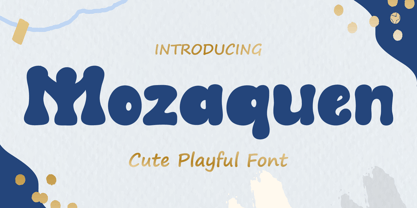 Introducing Mozaquen is a cute font with a modern style and made in a way that follows current trends, a quirky font perfect for all of your craft projects! Mozaquen best uses for Logotype, heading, cover, poster, logos, quotes, product packaging, header, merchandise, social media & greeting cards and many more. This font is also support multi language. What’s Included : - Standard glyphs - Works on PC & Mac - Simple installations - Accessible in Adobe Illustrator, Adobe Photoshop, Adobe InDesign, even work on Microsoft Word. - PUA Encoded Characters – Fully accessible without additional design software. - Fonts include multilingual support Thank you for your purchase! Hope you enjoy our font!
 - Highfield by Surplus Type Co,
$9.00 Highfield is a luxury sans serif type family of three weights plus matching italics. It’s influenced by the modern and elegant style sans serif typefaces that are popular in high class editorial design. The fonts are based on geometric forms that have been optically corrected for better legibility. While the bold weight is a great performer in display sizes the light and regular wights are well suited to longer body & supporting text. Highfield is equipped for complex, professional typography. The OpenType fonts have an extended character set to support Central and Eastern European as well as Western European languages.
 - Propisi by ParaType,
$25.00The typeface was designed at ParaType (ParaGraph) in 1997 by Manvel Shmavonyan for Russian primary school sample writing schoolbooks. The typeface is based on script fonts presented in the book 'Rodnoy Mir' by. L.I.Tikunova. The first version of the font included just letters of Russian alphabet and basic set of figures and signs. The second version with extended set of alphabetic letterforms was developed in 2004 by Gennady Fridman. Current third version that covers full Cyrillic and Western code pages was prepared by Gennady Fridman and released in 2009. Medium style also was added by him in 2009. - Premis by Fenotype,
$20.00 Do you often find yourself looking for a font that is universal and neutral on the one hand, and distinctive and special on the other? Here's one for you. Premis is a fairly broad font family that is suitable for versatile use, but still has plenty of original details, such as straight endings in the letters r, t and f. Equally current and timeless, Premis is available in three different widths. In terms of features, Premis is sensibly designed to meet demanding use, including, for example, capital letters and several different number styles. Make Premis your premise.
 - Hercules by Storm Type Foundry,
$26.00Where Modern is too fragile and Century too boring, Hercules comes with its elegant forms and, at the same time, with sufficient firmness to be usable for longer texts. In its heavy, bold designs it approaches Falstaff, while in the light ones it has some features which are taken over from Didot or from Modern. The text designs have been corrected for small sizes. The range of its use is, therefore, quite extensive - from dictionaries and technical literature through magazines to art posters and advertising materials. Suitable combination: Splendid Quartett (especially recommended), Excelsor Script, Plagwitz, but also Zeppelin and Compur. - Stencil Box JNL by Jeff Levine,
$29.00 The lettering for Stencil Box JNL was found on the packaging of a children's toy stencil set circa the 1940s. Popular for years, Pencil Stencils were a series of "connect the line" stencils where a series of dashed lines were traced from the cutouts and the lines connected to complete pictures of animals or other subjects. Although the packaging itself was often updated to reflect the current times during the life of the product, it was this hand-lettered example of stencil-meets-Art Deco from the 40s that proved worthy of saving as a digital typeface.
 - Replica Rough SG by Spiece Graphics,
$39.00 Here’s an edge-tattered, slightly distorted typeface that was developed from hand stamping using ink. You’ll find it ideal for both display and text situations where legibility is a big concern. This version holds up in very small sizes. Replica Rough SG Regular and Bold are now available in the OpenType format. This OpenType version includes stylistic alternates, discretionary ligatures, small caps, petite caps, ornaments and oldstye figures. Advanced features currently work in Adobe Creative Suite InDesign, Creative Suite Illustrator, and Quark XPress. Check for OpenType advanced feature support in other applications as it gradually becomes available with upgrades.
 - Rams by TipografiaRamis,
$30.00 RAMS is a Sans Serif type family of four weights with matching italics. The typeface’s design was influenced by the geometric style of Sans Serif faces of the 30s. The letter shapes – based on geometric forms – have been optically corrected for better legibility, thus enabling geometric concepts to be adapted by typographic tradition. While the typeface is intended for use in display sizes, it is also quite legible in text and is well suited for editorials. Rams is released in OpenType format with extended support for most Latin languages and includes some opentype features – proportional/tabular figures, slashed zero, ligatures, fractions...
 - Talent Stencil by Jeff Levine,
$29.00 Stencils have played a number of roles over the years, from decorative patterns to military markings; from labeling shipping containers to a student’s school project. One unusual application of a stencil alphabet was some metal letters spotted for sale at an online auction site. These antique letters were used for promoting the current show on a theater marquee just as plastic ones are used nowadays. Following the auction images as a guide, the Roman stencil font from those marquee letters is now preserved digitally as Talent Stencil JNL; which is available in both regular and oblique versions.
 - Hearth Stone by Mightype,
$15.00 Hearth Stone Script is a modern calligraphy font with the current handwriting style, this font is perfect for branding, wedding invites, magazines, mugs, business cards, quotes, posters, and more, you can try first if you want to buy this font. Hearth Stone Script is equipped with 309 glyphs. With so many glyphs, you can choose the letters according to your liking. There are many variations and options for each letter, so you can customize based on your design needs. This font contains: Hearth Stone Script OTF If you have any question, do not hesitate to contact me by email: mightype89@gmail.com
 - Brockies by Ronny Studio,
$19.00 Brockies is a sporty, strong, and elegant typeface, with a college style. Inspired by design styles that are currently popular, this is the answer to every need for ideas that you will pour in this modern era, with a thick and sturdy style in each letter as if this font has a soul in it. It excels on posters, social media, headlines, headlines, large format print - and anywhere else you want attention. Features : - Lowercase & Uppercase ( All Caps ) - numbers and punctuation - multilingual - Ligature - alternates - PUA encoded Please contact us if you have any questions. Enjoy Crafting and thanks for supporting us! :) Thank you
 - ITC True Grit by ITC,
$29.99ITC True Grit is the work of American designer Michael Stacey, a bold distinctive typeface. An enthusiastic collector of vintage graphic design, Stacey says that he is especially intrigued by lettering styles from the days when most display typography was done by hand. The style for ITC True Grit was taken from the 1930s and updated for digital imagine. Stacey say his goal was to retain the casual feel of handlettering yet impart the crisp finish of current precision typography." ITC True Grit is a hybrid design, a cross between German Blackletter and brush script with a hint of Jugendstil thrown in." - Sujoka by Twinletter,
$15.00 Sujoka is a distinctive and elegant font with a Japanese flavor that we created. This typeface will suit your demands for a variety of branding projects that require a distinct, distinctive, and appealing design. Use this typeface to respond to your current demands. Logotypes, food banners, branding, banners, posters, movie titles, book titles, quotes, and more may all benefit from this font. Of course, using this font in your various design projects will make them excellent and outstanding; many viewers are drawn to the striking and unusual graphic display. Start utilizing this typeface in your projects to make them stand out.
 - Skaryna 2017 Title by Koval TF,
$9.98 Skaryna 2017 Title is a revival of the original typeface designed and cut by Francisk Skaryna in 1517–1519. Skaryna 2017 Title is designed to celebrate the 500th anniversary of the original work by Francisk Skaryna (lat. Franciscus Scorina de Poloczko) — scientist and educator from Polotsk (current Belarus). The original designs contain only Cyrillic characters. So Latin and additional characters were added to make the legacy of Francisk available for the World. The revival was designed to stay close to the original and remain a little bit inaccurate as early Renaissance printing technologies were. This project was sponsored by Anton Bryl.
 - Zirkel by Ondrej Kahanek,
$35.00 Zirkel is a geometric sans serif typeface which includes 16 fonts – eight weights and eight matching italics. Each character is geometrical, but optically corrected for better readability. Featuring austere lines, the font gains its strength in the final layout, which is created by the user. Zirkel Sans is suitable for headlines of all sizes, but it can be used in variety of long text as well. This font supports Western, Central and Eastern European languages, ligatures, alternate characters such as A, V, w, etc., and will find its place in the beginning, centre or end of any word. Geometry rulezz...
 - Malmo Sans Pro by Martin Lexelius Core,
$33.00 Malmö Sans was born from the preconception that geometry is neutral, and neutral fonts have a wide application window. No ornaments, no quirks – just clean. Design process: establishing the main proportions, grids and library of geometric shapes. However, people are not math, people are not built from grids. We are irregular, not always logical, and, foremost, we are human. So: humanisation – define parts and areas, and make the needed adjustments to shapes and forms, although being mathematically correct. Basically, changing it into something that pleases the eye. Much effort has been made to achieve equal parts minimalism, aesthetics and legibility.
 - JWX Memo by Janworx,
$15.00 Memo, designed by Janet Valdez of Janworx, is a digital version of her own personal penmanship, currently displayed in abundance on sticky notes all over her desk and monitor. Although its basis is in actual handwriting, it's perfectly legible, offering a casual alternative typeface for everyday correspondence or simple things, ranging from event flyers to children's birthday party invitations. Memo performs well at regularly used correspondence sizes, but at a larger size can also be manipulated in graphics software for interesting effects. The letters can be moved randomly from the baseline, overlapped, and then contoured with good results for a casual look.
 - Maison Paris by Shakira Studio,
$19.00 "Introducing Maison Paris - Where Modern Elegance Meets Timeless Sophistication! Maison Paris is the font that defines contemporary style, making it an absolute must-have in today's design scene. This font effortlessly marries modern chic with timeless sophistication, embodying the very essence of what's trending now in the world of typography. With a versatility that knows no bounds, Maison Paris is your key to creating stunning designs that demand attention in today's competitive landscape. Whether you're crafting a high-end brand's logo, a cutting-edge editorial layout, or a minimalist wedding invitation, this font adds an element of tasteful extravagance that's currently sought after. Don't miss the chance to infuse your designs with the most sought-after modern stylish serif font of the moment. Maison Paris is your ticket to ensuring your projects are impeccably current and stylish. Embrace the future of design today with Maison Paris!" Here's what you get: Regular, Italic All Multilingual symbol Opentype features ( ligature, alternate ) Accessible in the Adobe Illustrator, Adobe Photoshop, Adobe InDesign, even work on Microsoft Word. PUA Encoded Characters - Fully accessible without additional design software. Multilingual character supports : (Afrikaans, Albanian, Catalan, Croatian, Czech, Danish, Dutch, English, Estonian, Finnish, French, German, Hungarian, Icelandic, Italian, Lithuanian, Maltese, Norwegian, Polish, Portuguese, Slovenian, Spanish, Swedish, Turkish, Zulu) Follow my shop for upcoming updates, and for more of my work, Thank you!
 - Oxima by Graviton,
$24.00 Oxima font family has been designed for Graviton Font Foundry by Pablo Balcells in 2021. It is a technical sans serif typeface with rounded endings that provide a mixture between strong general aesthetics and soft elaborated details. Its strong and industrial, yet legible shapes make it perfect for contemporary and futuristic oriented projects and suitable to be used in any sizes, from headlines to body text and everything in between. Oxima consists of 8 styles, each containing small caps and glyph coverage for several languages.
 - Contacta by Linotype,
$29.00Linotype Contacta is part of the Take Type Library, which features winners of Linotype’s International Digital Type Design Contest. Ralf Weissmantel designed this font to display no stroke contrast at all. Instead of using conventional letter forms, Contacta is a more designed-oriented font, with some characters recognizable only in context, not necessarily at first glance. The technical, unconventional forms look almost like a maze, especially when set together. This font is not suitable for text but makes a unique impression in logos and headlines. - Smack by ITC,
$29.99Smack, from American designer Jill Bell, is oriented toward a young generation who does not want to mind the rules. The font invites unconventional and playful use. The figures seem to be almost coincidentally shaped. Letters alternate between thin and thick strokes alternate and are accompanied by fine dots which almost look like accidental drops of ink on the paper. Smack is an illustrative font with unmistakable handwriting character and is perfect for cartoons, comics and anything else which is not supposed to take life too seriously. - Smudger by ITC,
$39.00 Smudger, from designer Andrew Smith, is oriented toward a young generation who does not want to mind the rules. The font invites unconventional and playful use. The figures seem to be almost coincidentally shaped. Letters alternate between thin and thick strokes alternate and give the font the smudged look that inspired its name and gives the font its unmistakable character. Smudger is a font that just cannot settle down. It is best used for headlines and short texts in point sizes of 12 or larger.
 - Kinryu_No14 - Unknown license

- Savage Garden by Putracetol,
$24.00 Savage Garden - 3 Quirky Playful Fonts are a delightful trio of typefaces that exude a sense of whimsy and playfulness with their unique and irregular letterforms. This font family includes three distinct versions: clean/regular, decorative, and block/fill, allowing for creative versatility. The fun and playful vibe of this font makes it a perfect choice for child-related themes or baby-oriented designs. It's well-suited for logos, printing materials, branding, quotes, posters, greeting cards, birthday cards, invitations, children's books, and more, adding a touch of joy and creativity to your projects.
 - Nipon by URW Type Foundry,
$39.99 Nipon has an affiliation with the Far East. The first character I designed for this alphabet was the capital P. The stepped thin lines are linking to the Japanese characters and the circle shape is a classic Japanese element which means literally: the origin of the Sun, Nippon. So this is where the name comes from, I skipped one P in the name, so my Nipon gets his own identity. Next to this oriental look it also carries a light resemblance with a juwel box. Precious and elegant shapes for the gentle touch in writing.
 - DIN 1451 by Linotype,
$40.99 DIN stands for Deutsche Industrienorm, German Industrial Standard. In 1936, the German Standard Committee settled upon DIN 1451 as the standard font for the areas of technology, traffic, administration, and business. The committee chose a sans serif font because of its legibility and easy-to-write forms. This font was not seen in advertisements and other artistically oriented uses, and there were disagreements about its aesthetic qualities. Nevertheless, this font was seen everywhere on German towns and traffic signs and hence made its way into advertisements because of its ease of recognition.
 - MFC Chaoxiang Monogram by Monogram Fonts Co.,
$269.00 The inspiration source for Chaoxiang Monogram is another hand-drawn treasure from a vintage embroidery publication which plays on the anglo-version of chinese letters with stabbing strokes and the charm of the orient. While the original intent of this monogram style is uncertain, the possibilities of its use are up to your imagination. This is one of many monogram designs from the early 1900’s which fall into a two letter format bound within a framing element. Download and view the MFC Chaoxiang Guidebook if you would like to learn a little more.
 - Saturknight by Echopraxium,
$13.50 Saturnight Regular is a proportional and kerned typeface. The name is a variation of Saturnight, which is itself the anagram of Unstraight. This is because vertical lines are Unstraight sticks. It's a consequence of the Design rule * Glyphs are built from segments on a triangular tessellation (cf. poster 1) Note 1: Unstraight lines depend from the chosen tesselation orientation (here the tesselation has horizontal lines and thus Unstraight verticals). Note 2: The encoding is Windows Latin 'ANSI', which includes Icelandic characters (as illustrated by poster 3).
 - Insignia by Linotype,
$40.99 Brody’s fonts borrow elements from both Art Deco and non-Western styles. His designs received international recognition for their innovative, computer-oriented style, reaching almost cult status. Four original Brody fonts are available from Linotype Library GmbH: Insignia, Industria-Solid, Industria Inline and Arcadia. For your convenience, we have gathered all four into one package. Insignia has the basic forms of constructed grotesque fonts and was influenced by the New Typography of the Bauhaus during the 1930s. Its image reflects the Zeitgeist of that age, suggesting technology and progress.
 - Fini by Atlantic Fonts,
$26.00 Fini. Done. You've just discovered an infinitely useful font that polishes things with youthful and stylish vigor. Fini provides playfulness with double letter ligatures with a twist of friendly sophistication. Fini Things, also designed by illustrator and font designer, Amy Dietrich, is a decorative collection of 26 loopy, spotty repeating border designs and kid oriented icons (like a pea coat, owl hat, hoodie, rubber duckie etc, plus a coffee cup - for mom and dad). Fini Things coordinates with Fini font, and in fact, works very nicely with Merci, and other Atlantic Fonts.
 - TessiePuzzlePieces by Ingrimayne Type,
$9.00 After exploring tessellations for several years, I decided to see how many ways I could tessellate puzzle pieces. I began with a square template and used the same asymmetrical shape for all four edges. By flips or rotation each edge could be fitted in four ways. Eventually I discovered that, given this way of forming tiles, there were 15 distinct shapes that tessellate and these shapes can take a total of 96 orientations. (A note in the November 2016 issue of Mathematical Gazette has the proof for the 15 shapes.) This typeface contains those 15 shapes and 96 orientations. A pdf note here shows some of the tilings possible using only one shape in a pattern. An unlimited number of patterns are possible if shapes are mixed. There are two members of the family, a solid style that must have different colors when used and an outline style. They can be used separately or they can be used in layers with the outline style on top of the solid style. For rows to align properly, leading must be the same as point size. (Earlier tessellation fonts from IngrimayneType, the TessieDingies fonts, lack a black or filled version so cannot do colored patterns.)
 - Toma Sans by JAM Type Design,
$- Toma Sans is a sans serif type family of seven weights plus matching italics. Influenced by the geometric-style sans serif faces that were popular during the 1920s and 30s, the fonts are based on geometric forms that have been optically corrected for better legibility. Toma Sans has a functional look with a friendly open touch. While the ExtraLight and the black weights are great performers in display sizes the light, regular and medium weights are well suited to longer texts. The small x-height and the restrained forms lend it a distinctive elegance. The typeface has an extended character set to support most European languages.
 - Fabrikat Kompakt by HVD Fonts,
$40.00 Fabrikat Kompakt (formally known as Fabrikat) is a type family designed by Christoph Koeberlin with creative input of Hannes von Döhren. The Sans Serif family is published by HVD Fonts and consists of seven weights plus matching italics. Its geometric design is based on German 20th century engineers’ typefaces and has a plain and precise appearance. The shapes are optically corrected, yet retain an uncut charm. They work best in display as well as text sizes. The type family is equipped for complex, professional typography with OpenType Features like alternate letters, arrows, fractions and an extended character set to support Central and Eastern European as well as Western European Languages.
 - Barbieri by Re-Type,
$45.00 Barbieri is a casual sans type family, based on a German lettering style from the 1960s. The original hand-drawn alphabet was used in a rather peculiar edition of Der Barbier von Bagdad, an opera composed by Peter Cornelius. Our efforts to identify the cover designer have been, so far, unsuccessful. As fans of informal typography and popular lettering styles, we thought these few thin letters deserved a re-incarnation as a complete type family. Andrés Torresi and Marta Sánchez Marco were in charge of the production work. Now Barbieri has 6 weights suitable for packaging, posters, and music covers. It resembles a certain 'Americana' spirit, though with a Germanic twist.
 - Puntino by Fontador,
$18.99 A dotted script typeface Puntino is (maybe the first) dotted script typeface and not made up of grid-based dots. They are optical corrected and there is always the same distance between the dots, with the aim to create more harmonic letterforms. The dots also vary gradually in size to reflect the thickening and thinning of strokes, giving the letterforms a sophisticated overall look. Puntino comes up with 4 styles and is perfectly suited for logos, brands, congratulation cards … The language support includes Western, Central and Eastern European character sets, as well as Baltic and Turkish languages. OPEN TYPE FEATURES: Standard ligatures and contextual alternates should be activated.
 - Vigran Maroll by Ergibi Studio,
$19.00 Introducing Vigran Maroll Inspired by today's modern logo with a unique style but with an elegant shape. So we tried to do and create fonts as per the current market needs. VIGRAN MAROLL is perfect for BRANDING and LOGO DESIGN. You will get a classy, elegant, and of course aesthetic logo with this font. Besides that, this font has a unique ligature which is very suitable for various types of work such as posters, packaging, T-shirts, coffee shops, restaurants, magazine's headers, signs or gift/post cards, cafe's and weddings or any type of advertising purpose. if you have any questions, don’t hesitate to contact us Ergibi Studio
