965 search results
(0.018 seconds)
- URW Erbar D by URW Type Foundry,
$35.00 The Erbar font was designed by Jakob Erbar for the Ludwig & Mayer/Neufville foundry in 1930.
 - Torino by URW Type Foundry,
$35.99 The Torino font family was designed by Alessandro Butti in 1908 for the Nebiolo foundry in Turin. Torino is a narrow face in the Bold weight; the condensed weight is so narrow that it should be used in over 14pt.
 - Torino by T-26,
$19.00 - Torino by ITC,
$39.00The Torino font family was designed by Alessandro Butti in 1908 for the Nebiolo foundry in Turin. Torino is a narrow face in the Bold weight; the condensed weight is so narrow that it should be used in over 14pt. - Tomino by Mans Greback,
$59.00 Tomino is a dot serif, or a sans-serif decorated with dots. It's wide and clear, and works great in small and large sizes.
 - Torio by DSType,
$55.00 Our main purpose while developing this typeface was to reconstruct, in the most precise way, the first ten plates of the “Arte de Escribir”, in a chapter named “Enseñanza de la letra italiana, y sus principales variaciones, autores, sistemas, &c.”, dedicated to the analysis of the Italian Script. We decided by this plates because those are the few that don’t refer, directly or indirectly, to any author in particular. We strongly believe that these plates reflect the freedom of his very own calligraphy and are closely related to the calligraphic style that was a success among the spanish calligraphers: the Spanish Bastarda.
 - Trinos by Arterfak Project,
$17.00 Trinos is a strong character font that combines racing style and techno with a slightly expanded letterform and sharp edges. The sharp spur on the top of letterforms, bold weight, and fully geometric represent strength, honor, and brave. Speed up your pulse with Trinos font available in Stencil and Solid style. This all-caps font is perfect for sports, great for automotive, and looks cool for techno themes. You can apply this font for jerseys, decals, flags, logos, posters, magazines, packaging, and many more! Not only that. Trinos is equipped with much of alternates characters, and elegant ligatures to boost your design look more powerful! What you'll get : Uppercase & smallcaps Numbers & punctuation Multilingual support Stylistic alternates Ligatures Sincerely, Ramz
 - Torino Modern by BA Graphics,
$45.00A redesign of Torino, a great feel with many possible uses. Also has a matching Italic version. - PL Torino by Monotype,
$29.99PL Torino Outline was designed by Ed Benguiat in 1960 after Alessandro ButtiÆs 1908 typeface, Torino. - URW Geometric by URW Type Foundry,
$35.99 URW Geometric® is a sans serif typeface inspired by the German geometric typefaces of the 1920s but designed for modern usability. The character shapes have optimized proportions and an improved balance, the x-height is increased, ascenders and descenders are decreased. Special glyphs, which are often designed afterwards for the original geometric typefaces from the 1920s, are perfectly integrated in the URW Geometric® . These design characteristics increase the usability and legibility tremendously. With its 10 weights ranging from Thin to Black, plus 10 additional oblique styles, it has a great versatility in mind. The extreme light styles shine bright in large sizes, the middle weights are perfect for body copy and the bolder variants for the use of emphasis information or bring a strong impact to headlines and information. The optically balanced styles are designed to work in perfect harmony together. URW Geometric® is functional, strong, simple and harmonized in form, and at a glance appears as a modern variant of its predecessors. Apart from the basic characters the design has an extra focus on the special glyphs. These are designed for todays needs. For example: the email glyph looks modern and unique, including a perfectly balanced spacing. The numero sign, in modern use called “hashtag”, is space saving and optically balanced for body text. Additionally, various extra and alternate glyphs are designed to provide a friendly usability. Including a wide Latin language support and character sets, URW Geometric® is perfectly designed for today’s requirements. Please have a look at the URW Geometric® Type Specimen (PDF) for further information.
 - URW Form by URW Type Foundry,
$35.99 URW Form by Volker Schnebel is the quintessence of a modern sans. Originally inspired by the timeless classic Futura, URW Form is a mix of classic and modern geometric typefaces, yet still incorporates the fundamental rules of design and looks and functions like a contemporary sans. In addition to its strong identity, URW Form has all the quality characteristics we come to expect from a Schnebel typeface. Available in 80 styles and four widths, there is also a much sought-after semi-condensed extension to broaden its creative spectrum. Weights range from the filigree Thin to the forceful Poster, making it a truly versatile sans serif typeface.
 - URW Dock by URW Type Foundry,
$35.99URW Dock is a contemporary geometric type family inspired by the square sans typefaces of the 60s, notably the Eurostile, which is still used in countless applications to the present day. Designed to meet today's requirements for a multifunctional font, this reinterpretation includes numerous enhancements and optimizations to ensure a professional use in today's digital age. Including a wide range of styles, an extended character set and a careful composition, it has the potential to give brands, artworks, and interfaces a modern, professional and unique touch. Its high legibility and clear informative and technological appearance are perfectly suitable for infographics, signage and way-finding systems. And especially when embedded in app, gaming and infotainment software it will display its strength. While the upright styles communicate a clear, professional and informative message, the italics express a technological, dynamic and forward-thinking spirit. An extensive language support, several figure sets and a wide range of OpenType Features will make the URW Dock font family a perfectly suitable partner for a wide range of print, web and app projects. For more information please have look at the URW Dock PDF Type Specimen. - URW DIN by URW Type Foundry,
$49.99 The digital outline fonts, DIN 1451 Fette Engschrift and Fette Mittelschrift were created by URW in 1984 and are the basis for all DIN font families. Both typefaces were designed for the URW SIGNUS system and were mainly used for the production of traffic signs. They have since become so popular in other areas that we have developed a complete DIN font family with 48 styles in OpenType Pro: URW DIN. It is semi-condensed, which is unique among the DIN fonts, so it has a broad spectrum of typographic uses. Its large x-height makes it perfect for use in e-publishing (web, apps, e-Books etc) and its adjusted stroke width between the regular and bold weights enhances its quality and distinguishability in print.
 - URW Akropolis by URW Type Foundry,
$39.99 The design of this display face is based on the hot metal typeface Acropolis, issued by the German type foundry Ludwig Wagner in Leipzig in 1940. To further increase its usefulness a Cyrillic was added to it: URW Akropolis, redrawn and digitally remastered by Coen Hofmann for the URW Font Forum, is a true display design that should not be set below 48 point if you want to preserve it's fine details like the open triangular sections, e.g. in L, G, S, T etc. and gain the full typographic splendidness of this beautiful typeface.
 - URW Grotesk by URW Type Foundry,
$102.99 URW Grotesk was designed exclusively for URW by Prof. Hermann Zapf in 1985. At the same time, Zapf designed URW Antiqua to go with URW Grotesk. At that time, we were working with a large German publishing house (Axel Springer) on type design solutions to replace certain of their newspaper fonts. Test pages of large German newspapers (e.g. Bildzeitung) were printed with URW Grotesk and URW Antiqua font families. For reasons not disclosed to us, the project was dropped and Springer never used URW Grotesk and URW Antiqua for that purpose. Anyway, Zapf finished his designs and URW produced both families. Zapf’s intention for the two typefaces was to design two highly legible, open and classical fonts that could be used for any kind of typography, especially books, newspapers, magazines, etc. However, we realized later on, that URW Grotesk is very well suited for multi media applications on screen.
 - URW Antiqua by URW Type Foundry,
$89.99 URW Grotesk was designed exclusively for URW by Prof. Hermann Zapf in 1985. At the same time, Zapf designed URW Antiqua to go with URW Grotesk. At that time, we were working with a large German publishing house (Axel Springer) on type design solutions to replace certain of their newspaper fonts. Test pages of large German newspapers (e.g. Bildzeitung) were printed with URW Grotesk and URW Antiqua font families. For reasons not disclosed to us, the project was dropped and Springer never used URW Grotesk and URW Antiqua for that purpose. Anyway, Zapf finished his designs and URW produced both families. Zapf's intention for the two typefaces was to design two highly legible, open and classical fonts that could be used for any kind of typography, especially books, newspapers, magazines, etc. However, we realized later on, that URW Grotesk is very well suited for multi media applications on screen.
 - Torgny.. - Unknown license

- Varino by Arterfak Project,
$15.00 Varino is a futuristic font. A font family inspired by the visual of technology that we can find in logos, Sci-Fi movies, games, and the present gadgets. Designed with minimalist style and unique letterforms, Varino is a perfect choice to use for logos, labels, posters, packaging, books, movies, presentations, games, and much more! Varino, complete with some elegant ligatures, will make your design look more futuristic and dynamic. Varino comes in Light, Normal, Bold, Outline and Extrude.
 - Amorino by Eurotypo,
$34.00 Amorino is a new casual and organic calligraphic font. Is the perfect blend of elegant and casual. With the total number of 889 glyphs, is equipped with plenty of OpenType features. Uppercase letters can alternate between at least four different forms and lowercase letters have up to thirteen choices more to avoid repetition. These effects include start and end forms words. To activate the optional glyphs you may click on Swash, Contextual, Standard Ligatures, Stylistic or Discretionary Ligatures buttons in any OpenType savvy program or manually choose the characters from Glyph Palette. Amorino font might be the choice to use on creating headlines, logos & posters for branding and packaging purposes. Hope you enjoy.
 - Bovino by Eko Bimantara,
$21.00 Bovino is a display serif font family. It was formed in a strong and sharp characters. The moderate x height and high contrast strokes make it attractive for titles and large size usage. Bovino contain more than 400 glyphs which covered broad latin languages, its consist of 9 styles from thin to black with each matching italics.
 - Thorin by Flawlessandco,
$9.00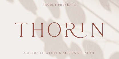 Thorin is a Serif Typeface with Elegant vibes in each character with some alternate. There's some connected letters and some alternates that suitable for any graphic designs such as branding materials, t-shirt, print, business cards, logo, poster, t-shirt, photography, quotes .etc This font support for some multilingual. Also contains uppercase A-Z and lowercase a-z, alternate character, numbers 0-9, and some punctuation. If you need help, just write me! Thanks so much for checking out my shop!
 - Torcao by insigne,
$24.00 Torcao is one of the sporks of the font universe, a useful and functional outlier. Half square, half circle, this uncommon squircle of a family with its asymmetry of curved and angular shapes drives through headlines and body copy with forward velocity. The robust, technical appearance is light-hearted and inviting, and its organic nature plays off of its one-of-a-kind kinks and hybrid forms. Torcao is not merely an experimental font, though. The figures have been crafted and refined into a functional, hard-working typeface that lends itself to many sizes and environments. The font family features a tall x-height and light modulation, which give the typography its unique color highly effective in headlines but still quite legible in longer text. This family contains a comprehensive range of nine weights--slender to black--and features condensed and extender selections for a complete set of forty-eight fonts. The font has been decked out for experienced typographers, together with swash alternates and simplified titling. The typeface also contains a range of numeral sets, together with fractions and old-style figures. OpenType-capable programs including Quark or the Adobe suite allow quick changes to ligatures and alternates. Previews of these options can be found in the .pdf brochure. Torcao also features the glyphs to enable all Central, Eastern, and Western European languages. In all, the font supports around forty languages that utilize the prolonged Latin script, making it an excellent option for multi-lingual publications and packaging. Simple, technical, and open, the Torcao type family could just be the perfect choice for your web type or print project.
 - Moreno by Typedepot,
$29.00 Meet Moreno – a semi serif typeface full of personality and flavor. A display typeface in its nature Moreno is free and informal yet stable and trustworthy. Moreno comes with extensive OpenType support - with its more than 15 OpenType features Moreno is giving you a great variety of stylistic alternatives as well as wide range of ligatures, tabular lining numerals, oldstyle numerals, fractions and many more. It comes in 8 carefully chosen weights from Extra Thin to Black plus their matching italics. Together with the 4 additional styles, Moreno becomes a diverse type family of 80 fonts suitable for a wide range of design needs like retail, package, food, branding etc. With its language support - over 200 languages, Cyrillic included - it is ready for world domination!
 - Garino by Julien Fincker,
$34.99 About Garino: Garino is a modern sans-serif typeface family. It gains its expressive character from a dynamic sweep in the curves and high-contrast transitions. The thinner and thicker weights are particularly suitable for strong headlines, while the middle weights can be used for typographic challenges and body text. As a result, it can be used in a reserved as well as an expressive way. Thanks to an extensive character collection, it becomes a real workhorse. A versatile allrounder that is up to all challenges – for Corporate Identity, Editorial, Branding, Orientation and Guidance systems and much more. Features: The Garino family has a total of 20 styles, from thin to heavy with matching italics. With over 1165 characters, it covers over 200 Latin-based languages. It has an extended set of currency symbols and a whole range of Open Type Features. There are alternative characters as stylistic sets, small caps, automatic fractions – just to name a few. Arrows and numbers: In particular, the extensive range of arrows and numbers should be highlighted, which are perfectly suited for use in orientation and guidance systems. Thanks to Open Type Features and an easy system, the various designs of arrows and numbers can also be simply "written" without first having to select them in a glyph palette. Get the Variable Font here: https://www.myfonts.com/fonts/julien-fincker/garino-variable/
 - Toriga by JAM Type Design,
$12.00 The Toriga typeface was named after the Portuguese grape variant known as Touriga Nacional. This fun typeface boasts the features of a well-balanced, versatile, modern sans which is highly legible as a text font and with a clean, elegant look as a display font at larger sizes. The rounded terminals give it a friendly, approachable look. Comprising 6 weights with equivalent italics, this font family is perfect for your more playful designs. It was created to be enjoyed, so enjoy creating with it!
 - Yoriko by URW Type Foundry,
$19.99 Yoriko is a Latin display type from Frank Lüdicke. Its design was heavily influenced by Japanese brush stroke glyphs.
 - TOCinRings by Ingrimayne Type,
$14.95 TOCinRings has letters in circles. The letters are from a typewriter font called TiredOfCourier. The typeface contains characters that can add color to letters. There are two ways to do this. One uses layers and the other a combination of characters, some with zero width. This pdf file explains the how this can be done.
 - Lourino by Mans Greback,
$59.00 Lourino is a flowing script typeface, drawn by Måns Grebäck during 2018 It is a high-quality font with cute letter shapes and large, round capitals. The font has an extensive set of characters and supports all Latin based European languages.
 - TypographerGotisch D - Personal use only

- Tricky D by URW Type Foundry,
$39.99 Tricky is a modern and dynamic design which is enhanced and supplemented by Tricky Tracky following soon.
 - [D]ONLINE by Don Citarella,
$20.00 [D]ONLINE is the first font family designed by Don Citarella for his blog, [D]ONLINE, and was created to provide a signature feel for its namesake. It combines a strong, medium stroke with arching end caps to embue the typeface with a futuristic curvilinear feel. This display font is best used for headlines, identities, wordmarks and other instances involving minimal copy and maximal whitespace The typeface includes 300 characters, including 45 accented glyphs and 30 ligatures.
 - Project D by DM Founts,
$22.00 Project D is the fourth typeface released by DM Founts. It was inspired by the infamous graffiti atop the former Heygate Estate in South London, which I had passed by numerous times on the overground train years ago. Heygate Estate has since been replaced by soulless luxury flats, as per the gentrification agenda. The letters don't entirely match the graffiti as they were created from memory, but I thought such a profound statement should be honoured. Project D is best used for impact at large sizes, although it should scale well. Use it for computer interfaces, retro headings and anything involving defiance, espionage, infiltration and spy games.
 - Doyen-D by Substance,
$12.00 A distorted, broken & cracked typeface. Doyen-D.ScreenRegular uses the same letter forms as the rest of the Doyen-D family, however the letters have gone through a halftone screen print process, resulting in even further distortion of the typeface.
 - Ornata D by Wiescher Design,
$39.50 Ornata D is the fourth of a series of old ornaments that I am trying to save from oblivion. I am completely redesigning the ornaments from scratch, trying in this one to keep the rough "letterpress" character. These ornaments have been first designed by Auriol around 1910. This set is perfect to design a great number of frames. Your digitizing type-designing savior, Gert Wiescher
 - Drei D by Volcano Type,
$19.00 - D Hanna by W Type Foundry,
$29.00
- Corner D by CarnokyType,
$20.00 Corner D is a part of Corner type family. This subfamily is designed with inverse rounded shapes in the corners. The concept of the typeface Corner is based on variation of corner shapes in font characters, from what is also its name derived. The basis is a bitmap modular principle, to which by simple addition of “the missing pixels” in corners of the characters ( Corner A ) to the shape of diagonal ( Corner B ), curvature ( Corner C ), or inversion curvature (Corner D), three more font variations are created. The basic monolinear bitmap weight is supplemented by two more extreme thicknesses – hairline and fat weight. The character set supports the complete Latin, while the x-height of lowercase is drawn at the same height as in the uppercase characters. Corner is a strong display typeface, which allows you to easily experiment and to combine it with its mutual font variations.
 - D Blues by W Type Foundry,
$29.00 D Blues its a sans serif typefamily of 9 weights plus matching italics. It is inspired by the neo humanist typefaces with a mix of 20st grotesque sans typeface. D Blues serve very well in web & print design areas, body text, excellent web-font legibility etc… D Blues is equipped with a complete set of opentype features including alternative glyphs, fractions, ligatures and many more. It is perfectly suited for highlighting lettering, magazines, web, interaction design, advertising & logotypes.
 - Litera D by URW Type Foundry,
$35.99 - Augusta Torino Ornaments by Intellecta Design,
$10.00 Intellecta Design, in partnership with Monocracy Types (Paulo W) launches Augusta Torino Ornaments. Classic art deco ornaments digitized from the font catalogues of "Società Augusta Torino", also Nebiolo Fundicion, one of the most important european extinct typefoundry from last century. Soon, more fonts of that collection.


Page 1 of 25Next page