10,000 search results
(0.063 seconds)
- Adoreles by Nathatype,
$29.00 Adoreles is a distinctive sans-serif display font that stands out with its elegance and unconventional charm. Crafted with a delicate touch, this font creates a visual experience that is both refined and uniquely artistic. With Adoreles, you have a sans-serif display font that redefines the expected. The characters in Adoreles are presented in uppercase, each possessing a subtle sophistication. By eschewing boldness, the font embraces a refined simplicity. The true magic of Adoreles lies in its inlines—irregular, yet meticulously designed to add a touch of unpredictability and individuality to each letter. Enjoy the features here. Features: Multilingual Supports PUA Encoded Numerals and Punctuations Adoreles fits in headlines, logos, posters, flyers, branding materials, greeting cards, print media, editorial layouts, and many more designs. Find out more ways to use this font by taking a look at the font preview. Thanks for purchasing our fonts. Hopefully, you have a great time using our font. Feel free to contact us anytime for further information or when you have trouble with the font. Thanks a lot and happy designing.
 - Fallujah by Arabetics,
$39.00 A typeface design with extra isolated scattered letters and random careless look. It has six members, normal, bold, and medium, all of which come in two styles, regular and left-slanted italic styles. This font family design follows the guidelines of Mutamathil Taqlidi type style with one glyph for every basic Arabic Unicode character or letter, as defined by the Unicode Standards, and one additional final form glyph, for the freely-connecting letters in traditional Arabic cursive text. Fallujah employs variable x-height values. It includes only the Lam-Alif ligatures. Soft-vowel diacritic marks, harakat, are selectively positioned. Most of them appear by default on the same level, following a letter, to ensure that they would not interfere visually with letters. Tatweel is a zero-width glyph. Keying the tatweel key before Alif-Lam-Lam-Ha will display the Allah ligature. Fallujah includes both Arabic and Arabic-Indic numerals, in addition to standard punctuations.
 - Jacky Chan by Asd Studio,
$15.00 Introducing, Jacky Chan - Brush Font Jacky Chan font preserves all the high definition detail of the original handwritten letters. This font it truly looks realistic. Take your design to the up level with a hyper-realistic font that truly looks hand painted. Jacky Chan uses feature Bitmap Trace in Inkscape that makes way for more authentic looking fonts and is sure to grab the attention of customers and designers alike. Jacky Chan installs like any other font, and can be used in any color, on any background. What's Included? :: Uppercase & Lowercase (Regular and Italic Version) :: Numbers & Punctuation : Swashes Ligature :: Multilingual Support Enjoy our font, thank you.
 - Teenage Tropics by Teenage Foundry,
$19.00 Teenage Tropics is a vintage typeface display font that exudes a unique blend of retro style and tropical vibes. This font is designed to capture the essence of the 1950s and 1960s, with its bold and playful letterforms that are reminiscent of old-school signages and advertisements. The characters have an artistic touch, featuring curved lines and ornate flourishes that add a sense of whimsy and nostalgia. Teenage Tropics is perfect for projects that aim to evoke a sense of fun, adventure, and a retro aesthetic, such as retro-themed designs, vintage-inspired logos, posters, and packaging.
 - Mister Earl by Bitstream,
$29.99Mister Earl, released by Bitstream in 1991, was designed by Jennifer Maestre. Inspiration came from a page in a ‘how-to’ book published in the 1930s. Later versions of Extra Light, Light and Bold were added by Jim Lyles, with the help of Wally Petty. Mister Earl is named in honor of Earl Biscoe, a Bitstream designer who retired in the mid-1980s because of illness. In the winter of 1994–1995, Richard Stetler accidentally left a copy of Mister Earl outside his Alaska home... In the spring, amazed to discover the unfortunate font was still just about alive, he decided to release the result to a wider public as Snow Cap. - Kajju by Twinletter,
$15.00 Introducing Kajju, a premium font family designed to help you create visually stunning projects of any kind. Kajju San Serif comes in 18 different styles and has everything you need for your design projects. This is an all-in-one font pack with a wide variety of font styles to choose from. So whatever your needs, Kajju can do the job! of course, your various design projects will be perfect and extraordinary if you use this font because this font is equipped with a font family, both for titles and subtitles and sentence text, start using our fonts for your extraordinary projects.
 - AW Conqueror Std Carved by Typofonderie,
$59.00 Engraving inspired typeface The AW Conqueror Carved encapsulates perfectly the lettering styles in fashion during the 19th century quite often in the frontispieces of books. It wasn’t rare to see these kinds of typefaces, with their variations in depth and relief effects, adorning boxes and other forms of packaging of the time. AW Conqueror superfamily AW Conqueror Didot is part of a larger family, who include 4 others subfamilies with great potential: They’re but based on same structure, with some connection between them (width for example), to offer a great & easy titling toolbox to any designers, from skilful to beginner. Each of the members try their best to be different from the others because of their features. They should work harmoniously in contrast. Club des directeurs artistiques Prix 2010 European Design Awards 2011
 - Jorge Jenks by Colllab Studio,
$14.00 "Hi there, thank you for passing by. Colllab Studio is here. We crafted best collection of typefaces in a variety of styles to keep you covered for any project that comes your way! If you are looking for a font that is perfect to make your designs look hip and fresh, go no further. Jorge Jenks has got it all. It’s simple, organic, versatile, and super modern – but not too futuristic. It will set you above the rest of the market. Jorge Jenks is an urban brush font reflecting the urban freedom and organic flow of city life. it has strokes that are made of multiple connected nodes and his forms are unique and imperfect. This makes him a great match for both display and text typography, as well as logo design. A Million Thanks www.colllabstudio.com
 - Nov Schmoz Kapop NF by Nick's Fonts,
$10.00The logotype lettering of a 1927 issue of Motion Picture magazine provided the inspiration for this playful romp through the alphabet. Named after an expression of the same time whose origin and meaning are shrouded in mystery. Both versions of this font include the complete Unicode Latin 1252 and Central European 1250 character sets. - Plantain by CastleType,
$49.00 Plantain Stencil is based on Plantain which in turn is my interpretation of Plantin Adweight, which was one of my first commissioned projects (by Smarter Image, long before they went bankrupt). Plantin Adweight is one of the most beautiful designs of the Plantin family, which is a modern revival typeface, cut under the direction of F. H. Pierpont in 1913, who based the design on that of a famous 16th century printer, Christophe Plantin, for whom Pierpont’s font was named. The stencil cut of Plantain adds a bit of sparkle to the design. Supports most European languages that use the Latin alphabet.
 - Futura BT by Bitstream,
$39.99 Futura is the fully developed prototype of the twentieth century Geometric Sanserif. The form is ancient, Greek capitals being inscribed by the Cretans twenty-five hundred years ago at the time of Pythagoras in the Gortyn Code, by the Imperial Romans, notably in the tomb of the Scipios, by classical revival architects in eighteenth century London, which formed the basis for Caslon’s first sanserif typeface in 1817. Some aspects of the Geometric sanserif survived in the flood of Gothics that followed, particularly in the work of Vincent Figgins. In 1927, stimulated by the Bauhaus experiments in geometric form and the Ludwig & Mayer typeface Erbar, Paul Renner sketched a set of Bauhaus forms; working from these, the professional letter design office at Bauer reinvented the sanserif based on strokes of even weight, perfect circles and isosceles triangles and brought the Universal Alphabet and Erbar to their definitive typographic form. Futura became the most popular sanserif of the middle years of the twentieth century. Ironically, given its generic past, Futura is the only typeface to have been granted registration under copyright as an original work of art, and, further irony, given the key part played by the Bauer letter design office, the full copyright belongs to Renner and his heirs. This decision in a Frankfurt court implies that a further small group of older typefaces may also be covered by copyright in Germany, particularly those designed for Stempel by Hermann Zapf. This situation appears to be limited to this small group of faces in this one country, although protection of designers’ rights in newer typefaces is now possible in France and Germany through legislation deriving from the 1973 Vienna Treaty for the protection of typefaces. Mergenthaler’s Spartan is a close copy of Futura; Ludlow’s Tempo is less close. Functional yet friendly, logical yet not overintellectual, German yet anti-Nazi... with hindsight the choice of Futura as Volkswagen’s ad font since the 1960s looks inevitable.
 - Bell Martellus by Chank,
$99.00 Full of texture and regal personality, Bell Martellus was derived from a book published in 1475 by Henricus Martellus entitled “Liber Insularum.” The writing style is based on the Carolingian Script created by the Emperor Charlemagne and his scribe, Alquin of York, in the 9th century A.D. This old world lettering comes with new world OpenType capabilities, including swash caps and small caps. The James Ford Bell Library at the University of Minnesota commissioned Bill Moran to develop this font as a means of introducing their amazing collection of rare books, maps and manuscripts to a wider audience. Once the historic script was fontified by Bill, it was forwarded to Chank Co, where we added some snazzy baubles for the discriminating typographer. Everybody can enjoy the antique genuine nature of Bell Martellus, but advanced OpenType users also get extra features in Adobe CS applications.
 - Peanut Ache by PizzaDude.dk,
$17.00 I don't know what it is with me and peanuts. I simply love it! I like peanuts in all kinds of meals: breakfast, lunch, dinner and even in desserts! But with an addiction like this, an overload of peanuts sometimes appear...and I guess that's where the name of this font comes from :) The Peanut Ache font is super clean, and super steady - use it for anything that needs a clean look! I've added 5 slightly different versions of each letter, and this really helps making your text to look even more fresh and lively!
 - Extrakt by Hof3,
$25.00 The font EXTRAKT references the grotesque fonts and elementary typography as developed at the Bauhaus (ITC Bauhaus, Futura). Extract originated from a child's game: How many matches are needed to write the word EXTRAKT? (https://hof3.com/arbeitsweise/extrahieren) In the development of the typeface "EXTRAKT", the design principle of reducing the letters to the most necessary strokes was central. In addition to the reference to Bauhaus, EXTRAKT also has a futuristic feel. ("The Expanse")
 - 1920 French Script Pro by GLC,
$42.00 This font was inspired by one of a standard French manual styles in use from the beginning of 1900s to the end of World War II, when people were writing most often with pen holders and metal nibs. This typeface is easily legible as it was used for the lithographic printing of university textbooks. All lower cases from a to z and numerals from 0 to 9 are doubled by a slightly different one to allow a varying manual aspect in texts. We have added a lot of diacritic characters, covering West (including Celtic) and North European, Icelandic, Baltic, Eastern European and Turkish language. A few special glyphs allows to make final loops or underlining.
 - Mr Eaves Modern by Emigre,
$59.00 Mr Eaves is the often requested and finally finished sans-serif companion to Mrs Eaves, one of Emigre’s classic typeface designs. Created by Zuzana Licko, this 2009 addition to the Emigre Type Library expands the versatility of the original Mrs Eaves with two complimentary families: Mr Eaves Sans and Mr Eaves Modern. Mr Eaves was based on the proportions of Mrs Eaves, but Licko took some liberty with its design. One of the main concerns was to avoid creating a typeface that looked like it simply had its serifs cut off. And while it matches Mrs Eaves in weight, color, and armature, Mr Eaves stands as its own typeface with many unique characteristics. The Sans version relates most directly to the original serif version, noticeably in the roman lower case letters a, e, and g, as well as in subtle details such as the angled lead in strokes, the counter forms of the b, d, p, and q, and the flared leg of the capital R, the tail of the Q. The distinctly loose-fitting letter spacing of Mrs Eaves was applied also to the Sans version. This, together with generous built-in line spacing due to a small x-height and extended ascenders and descenders, renders the same kind of lightness and airiness when setting text that is so characteristic of Mrs Eaves. Deviations from the original Mrs Eaves are evident in the overall decrease of contrast, as well as in details such as the flag and tail of the f and j, and the finial of the t, which were shortened to maintain a cleaner, sans serif look. And the lower case c had to be balanced out differently after it lost its top ball terminal. And with the loss of serifs, Mr Eaves set width is slightly narrower. Mr Eaves Italic also carries over many forms from its Mrs Eaves model, most notably the v, w, and z, which are unusually flamboyant for a sans italic design. It also utilizes lead in and terminal tails that are reminiscent of the serif italic. The biggest departure here is the width of the characters. The extra narrow gauge and delicate features seemed more appropriate for the Serif than the Sans. To allow for a comfortable fit, Mr Eaves Italic has a more robust design and wider character width. Meanwhile, the Modern family provides an overall less humanistic look, with simpler and more geometric-looking shapes, most noticeably in the squared-off terminals and symmetric lower case counters. This family has moved furthest from its roots, yet still contains some of Mrs Eaves’ DNA. The Modern Italic is free of tails, and overall the Modern exhibits more repetition of forms, projecting a cleaner look. This provides stronger differentiation from the serif version whenever a more contrasting look is desired. Each version (Sans and Modern) contains its own set of alternates providing unique options for applications such as headlines, word logos, letterheads, pull quotes, and other short text settings. Both the Sans and Modern come in six weights. The simpler forms of a sans-serif provide the opportunity of more weights than do serif letter forms, which are more complex in structure, making it difficult to accommodate additional weight without distortions. Regular and Bold match the original Mrs Eaves weights, while the Heavy provides an additional weight for extra emphasis.
 - Mr Eaves Sans by Emigre,
$59.00 Mr Eaves is the sans-serif companion to Mrs Eaves, one of Emigre’s classic typeface designs. Created by Zuzana Licko, this 2009 addition to the Emigre Type Library expands the versatility of the original Mrs Eaves with two complementary families: Mr Eaves Sans and Mr Eaves Modern. Mr Eaves was based on the proportions of Mrs Eaves, but Licko took some liberty with its design. One of the main concerns was to avoid creating a typeface that looked like it simply had its serifs cut off. And while it matches Mrs Eaves in weight, color, and armature, Mr Eaves stands as its own typeface with many unique characteristics. The Sans version relates most directly to the original serif version, noticeably in the roman lower case letters a, e, and g, as well as in subtle details such as the angled lead in strokes, the counter forms of the b, d, p, and q, and the flared leg of the capital R, the tail of the Q. The distinctly loose-fitting letter spacing of Mrs Eaves was applied also to the Sans version. This, together with generous built-in line spacing due to a small x-height and extended ascenders and descenders, renders the same kind of lightness and airiness when setting text that is so characteristic of Mrs Eaves. Deviations from the original Mrs Eaves are evident in the overall decrease of contrast, as well as in details such as the flag and tail of the f and j, and the finial of the t, which were shortened to maintain a cleaner, sans serif look. And the lower case c had to be balanced out differently after it lost its top ball terminal. And with the loss of serifs, Mr Eaves set width is slightly narrower. Mr Eaves Italic also carries over many forms from its Mrs Eaves model, most notably the v, w, and z, which are unusually flamboyant for a sans italic design. It also utilizes lead in and terminal tails that are reminiscent of the serif italic. The biggest departure here is the width of the characters. The extra narrow gauge and delicate features seemed more appropriate for the Serif than the Sans. To allow for a comfortable fit, Mr Eaves Italic has a more robust design and wider character width. Meanwhile, the Modern family provides an overall less humanistic look, with simpler and more geometric-looking shapes, most noticeably in the squared-off terminals and symmetric lower case counters. This family has moved furthest from its roots, yet still contains some of Mrs Eaves' DNA. The Modern Italic is free of tails, and overall the Modern exhibits more repetition of forms, projecting a cleaner look. This provides stronger differentiation from the serif version whenever a more contrasting look is desired. Each version (Sans and Modern) contains its own set of alternates providing unique options for applications such as headlines, word logos, letterheads, pull quotes, and other short text settings. Both the Sans and Modern come in three weights. The simpler forms of a sans-serif provide the opportunity of more weights than do serif letter forms, which are more complex in structure, making it difficult to accommodate additional weight without distortions. Regular and Bold match the original Mrs Eaves weights, while the Heavy provides an additional weight for extra emphasis.
 - Backover by Alit Design,
$19.00 Introducing “Backover Typeface” – Unleash the Power of Words with a Heroic Twist! 🔥 Immerse yourself in the epic realm of typography with our latest creation, the “Backover Typeface.” Inspired by the valor of superheroes and the chivalry of knights, this font is a visual journey into the heart of heroic tales. 🗡️ Strike with Power: Channel the strength of legendary warriors as each letter in “Backover Typeface” is meticulously crafted to embody the essence of a hero’s decisive strike. The sharp angles and bold lines evoke the precision of a superhero’s punch or a knight’s swordplay. 🛡️ Defend with Style: The font doesn’t just pack a punch; it defends with flair! Each curve and contour replicate the resilience of a shield, offering a typographic fortress that stands strong against the ordinary. Let your words be the armor that shields your message with distinction. 👤 Unleash Your Inner Hero: “Backover Typeface” isn’t just a font; it’s a transformation. Feel the power surge as you type words that resonate with the bravery of classic heroes. This font empowers your message to become a beacon of courage, ready to take on any adventure. ⚔️ Warrior’s Arsenal: Immerse your audience in the visual feast of classic warrior illustrations included with “Backover Typeface.” Swords clash, shields protect, and helmets gleam with the promise of valor. These meticulously designed elements seamlessly integrate into your typography, allowing you to create a visual narrative that echoes the grandeur of heroism. 🎮** Level Up Your Designs:** Whether you’re working on a superhero movie poster, a knight-themed game interface, or any project that demands a touch of legendary charm, “Backover Typeface” is your ultimate companion. Elevate your designs, captivate your audience, and let the font be the hero of your creative journey. 🌟 Key Features: Heroic Typography Superhero and Knight Theme Sword, Shield, and Helmet Illustrations Perfect for Movie Posters, Game Graphics, and more 🚀 Elevate your design game with “Backover Typeface” – where every word becomes a heroic adventure! Download now and embark on a typographic journey like never before. Unleash the hero within your words! ⚡️
 - Sadina CA by NumidiaType,
$20.00 Sadina™ CA is a small caps version of Sadina™ font family, designed separately to minimize the font incompatibility for applications that cannot support this feature. Generally, some applications support this feature, but not exactly with the right stems. For example, in some apps, all glyphs applied with this feature are scaled only, which makes characters not have the approximative proportional thickness with capital characters. Specimen
 - Dupont Gothic by Hexagon Foundry,
$19.00 Dupont Gothic is a sleek and contemporary sans-serif font that embodies elegance, clarity, and modernity. With its clean lines, balanced proportions, and distinctive character, Dupont Gothic is a versatile typeface that can be used in many ways. The simplicity of Dupont Gothic lends itself to a wide range of applications. Whether used for headlines, body text, or branding, this font possesses a quality to effortlessly adapt to different design contexts. The font comes in 10 weights with matching oblique characters, 2 widths, and 2 style sets that ensure the endless combinations and possibilities.
 - Artisan Paris by Jolicia Type,
$25.00 Artisan Paris, a true embodiment of Parisian finesse and grace, is a mesmerizing display font crafted with a delicate and aesthetic feminine style. Characteristics: Aesthetic Feminine Style: Artisan Paris showcases a refined, feminine aesthetic that speaks of sophistication and beauty. Its design embraces the elegance synonymous with Parisian artistry. Intricate Craftsmanship: The font is meticulously designed, with every character bearing intricate details reminiscent of the craftsmanship seen in the heart of Paris. Delicate curls and ornate elements define this font, showcasing the skilled artistry of Parisian artisans. Two Weights: Artisan Paris provides versatility with two distinct weights – Regular and Italic. The Regular weight exudes a balanced and poised demeanor, while the Italic weight adds a playful and dynamic touch, enhancing your creative expressions. Usage: Artisan Paris is the font of choice when you want to infuse your designs with the grace and allure associated with Parisian artistry. Ideal for headlines, titles, branding, invitations, and any design project seeking an elegant and feminine touch. Designer: Artisan Paris was meticulously designed by a team of dedicated artists and designers, drawing inspiration from the chic and timeless femininity of Paris. Every element in this font reflects their passion for capturing the essence of Parisian artisans.
 - Nazanin by Linotype,
$187.99Nazanin, originally named Haghighi, is a modern Arabic text face first produced by Linotype in 1978. Its popular design was converted into OpenType format in 2005, taking full advantage of digital technology to allow accurate positioning of diacriticals and kerning refinements. The counters and inter-character proportions of Nazanin are characteristic of Persian display lettering and typography. This is particularly true of Nazanin bold, which gives a strong image when used for display purposes. Nazanin possesses fuller, deeper characters than is normally exhibited in Arabic typography: its angled counters contributing to fluid, well-balanced, yet vibrant, letterforms. Originally designed for Farsi typesetting, Nazanin has now become popular for Arabic typesetting as well. Nazanin is available in two OpenType weights: Nazanin Light and Nazanin Bold. Both of the fonts include Latin glyphs (from Palatino Roman and Palatino Bold, respectively) inside the font files, allowing a single font to set text in both most Western European and Arabic languages. Nazanin incorporate the Basic Latin character set and the Arabic character set, which supports Arabic, Persian, and Urdu. They include tabular and proportional Arabic, Persian, and Urdu numerals, as well as a set of tabular European (Latin) numerals. - Cold Cuts by Good Gravy Type Co,
$12.00 Cold Cuts is an assorted spread of delicious fonts pre cooked to perfection. This 10 weight font family is $30 for a limited time it is the perfect way to stock your font fridge. Cold Cuts a lean upright font family with a lowercase caps option to give you bonus typesetting choices. A sleek modern vintage style which has a wide variety of display uses. Bon Appétit!
 - Switched On by Type Innovations,
$39.00 Switched On and Switched Off where two fonts developed by placing points on a pre-defined square grid template. The experiment was to explore all the variations possible by just using straight connecting lines on a grid. I stumbled on the final concept, almost accidentally, and was amazed by the numerous possibilities. Both designs where created to work together. By adjusting the stroke and inline proportions between the two fonts, I was able to achieve a good overall color balance between 'Switched On' (dark letters on a light background), and the 'Switched Off' design as a knockout treatment (light letters on a dark background). Used in this way, both fonts visually appear similar in overall weight and proportion. They harmonize well together. Used separately, they make for some interesting visual effects and headline treatments. The fonts are best used at large point sizes, but they are still legible in a variety of smaller sizes. I think that by experimenting with these two fonts one can achieve some stunning visual effects. Explore and have fun.
 - Motobreath by Epiclinez,
$18.00 Introducing Motobreath, the bold typeface that is sure to turn heads. This font is inspired by the energy and power of hard rock music and the thrill of the racing car scene. With Motobreath as your secret weapon, you'll instantly add excitement and attitude to any design project. The simple angles yet energetic lines give this typeface an unmistakable edge that sets it apart from other fonts on the market. Whether you're looking to create a bold headline that demands attention or a logotype that conveys strength and power, Motobreath has got you covered. Motobreath features : Standard Latin Numbers, symbols, and punctuations Multilingual Support. Fully accessible without additional design software Simple Installations Works on PC & Mac Thank You.
 - LAMPOH by Afkari Studio,
$13.00 LAMPOH - The Handmade Scratch Display Font LAMPOH is an artistic and captivating handmade display font, meticulously crafted by a talented type designer to bring uniqueness and authenticity to your creative projects. With its scratch-inspired design, LAMPOH stands out as a one-of-a-kind font that exudes a raw and artisanal charm, making it perfect for various artistic endeavors. Every character in LAMPOH has been meticulously hand-drawn with love and passion, ensuring that each glyph carries a distinct and organic feel. The imperfections and irregularities of the scratch strokes add an element of human touch, providing a genuine and authentic character to the font. LAMPOH comes in both regular and bold styles, giving you the flexibility to choose the perfect weight for your design needs. The regular style boasts elegance and subtlety, while the bold style makes a powerful statement, ideal for headlines and emphasis. LAMPOH's versatile design makes it an ideal choice for a wide range of projects. Whether you're creating eye-catching headlines, attention-grabbing posters, logo designs, merchandise branding, or anything that requires a touch of artistic flair, LAMPOH will effortlessly enhance the visual appeal of your work. The uppercase characters of LAMPOH are bold and expressive, demanding attention with their captivating presence. On the other hand, the lowercase letters bring a touch of playfulness, offering quirky alternatives to add delightful variations to your text. LAMPOH comes complete with a set of thoughtfully crafted standard characters and ligatures, allowing you to elevate your designs even further. These unique elements enhance the font's versatility, making it easy to create visually engaging and harmonious compositions. LAMPOH is designed to seamlessly integrate into various design software, making it effortless to use in your preferred creative tools. From Adobe Illustrator to Photoshop, InDesign, and beyond, the font's compatibility ensures a smooth and hassle-free design process. LAMPOH's high-quality design ensures that it looks equally stunning in both print and digital formats. Whether you're producing posters, brochures, social media graphics, websites, or any other project, this font will consistently deliver outstanding results. LAMPOH is not just a font; it's a work of art that adds a touch of human craftsmanship to your creative projects. With its handmade scratch-inspired design, versatile usage, and expressive characters, LAMPOH brings a unique and authentic flair to any design. Unlock your creativity and let LAMPOH illuminate your artistic vision with its captivating charm. Choose between regular and bold styles to create striking and memorable designs that leave a lasting impression on your audience.
 - Discord by Neder,
$19.00 Inspired in the machine aesthetics and in the human conflict with them, Discord is a flexible family of sixteen fonts designed to be used in a wide range of work. Ready for multilingual support and with advanced OpenType features such as Small Caps and Old Style Numbers.
 - Mixbox by Sabrcreative,
$20.00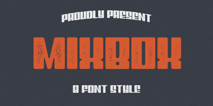 Evoke the spirit of a bygone era in your designs with the enchanting Mixbox Vintage Retro Display Font. This typeface seamlessly merges vintage charm with modern versatility, making it an ideal choice for designers seeking to infuse their projects with a touch of nostalgia and sophistication.
 - Troublemarker by PizzaDude.dk,
$15.00 Real trouble is going to hit you with this font! In fact, you most like didn't know what hit you! Perhaps one of the 5 different versions of each letter?! Well, these cycles automatically as you type! Besides all the trouble, Troublemarker has got extensive language support!
 - Echo Soul by Set Sail Studios,
$14.00 Introducing Echo Soul; a free-flowing and carefree brush font duo, hand painted with love. Echo Soul speaks from the heart and doesn't hold back. With elongated brush strokes and a natural flow, it's the perfect choice for handwritten quotes, product packaging, and logo designs with a personal and affectionate touch. The Echo Soul family consists of; 1. Echo Soul • A handwritten script font containing upper & lowercase characters, numerals and a large range of punctuation. 2. Echo Soul Alt • This is a second version of Echo Soul, with a completely new set of lowercase characters. If you wanted to avoid letters looking the same each time to recreate a custom-made style, or try a different word shape, simply switch to this font for an additional layout option. 3. Echo Soul Sans • An all-caps font containing uppercase-only characters, perfect for supporting text to compliment the Echo Soul Script font. Also includes numerals and a large range of punctuation. Stylistic Alternates • Are also available for several lowercase characters - these have elongated tails and look great when placed at the end of a word. These can be used by turning on 'Stylistic Alternates' in OpenType capable software, or accessing via a Glyphs panel.
 - Yo Quiero Taquitos NF by Nick's Fonts,
$10.00The basic letterforms of this typeface were found in a lettering book, Rotalución Decorativa, published in Barcelona in the 1940s. Add a lowercase and a few flourishes suggested by a hand-painted sign seen at a neighborhood tavern on Staten Island, and you have a seriously fun face. To add even more spice, the font also contains alternate characters in the Logical Not, ASCII circumflex and tilde positions. It also contains a few alternate characters in the ASCII circumflex and tilde positions to perk things up. Both versions of the font contain characters to support all major European languages. - Traseraha by IbraCreative,
$17.00 Traseraha – A Retro Cartoon Font Traseraha, a captivating retro cartoon font, effortlessly channels the whimsical charm of classic animated aesthetics. Designed by the creative minds at Traseraha Studios, this font pays homage to the golden era of cartoons with its playful curves and vibrant personality. Each letter exudes a nostalgic vibe, reminiscent of vintage comic strips and animated shows, making it an ideal choice for projects seeking a touch of retro flair. The Traseraha font seamlessly blends fun and readability, allowing it to shine in a variety of applications, from logo designs to creative headlines. With its unique character and timeless appeal, Traseraha captures the essence of a bygone era while injecting a dose of lighthearted energy into contemporary design projects. Traseraha is perfect for branding projects, logo, wedding designs, social media posts, advertisements, product packaging, product designs, label, photography, watermark, invitation, stationery, game, fashion and any projects. cartoon font, cute font, traseraha font, retro, vintage, 90s, 80s, 70s, cartoon, cartoon font, comic, comic font, delicious, display, display font, distressed, hand drawn, handwritten font, headline, holiday font, lettering, mexican, mexico, mexico font, packaging, playful, poster, retro, sticker, vintage font Fonts include multilingual support for; Afrikaans, Albanian, Czech, Danish, Dutch, English, Estonian, Finnish, French, German, Hungarian, Italian, Latvian, Lithuanian, Norwegian, Polish, Portuguese, Slovak, Slovenian, Spanish, Swedish.
 - Pilgrim by Linotype,
$29.99 Pilgrim is a re-cut of a Linotype face that Eric Gill originally designed for a book published by the Limited Edition Club of New York. Admired for its tranquil dignity, the Pilgrim type is both firm and elegant. Its general appearance resembles that of Gill’s Joanna font family. The contrast of the font is not very strong. The serifs are bracketed. Eric Gill, who designed the type on which Pilgrim is closely based, observed one sort of model for his lettering - the incised monumental letter of Roman origin. This is clearly seen in his capitals, but is also true of his lowercase letters, which have little of the calligraphic or engraved qualities of most other type designs. Gill’s types are Roman in the classic sense, yet also particular to Gill himself.
 - Fancy Glow by Nathatype,
$29.00 Are you ready to rock your design project? Now you can make stunning design project with Fancy Glow. A touch of sophisticated yet fancy style font. The perfect way to brighten up your project. Fancy Glow is a script font that resembles actual handwriting. This one is suited to any sizes of text. The curves of the characters convey a sense of elegance and will not go out of style. In addition, it has more fascinating features that allows you maximize your design. Features: Stylistic Sets Ligatures Multilingual Supports Numerals and Punctuations PUA Encoded It can be used for many design projects, such as poster, logo, book cover, branding, heading, printed product, merchandise, quotes, social media campaign, etc. Learn more about how to use it by seeing the font preview. Thank you for purchasing our fonts. Please don’t hesitate to contact us, if you have any further question or issues. We’re happy to help. Happy Designing.
 - Jasmine Century by Timurtype,
$14.00 Introduced by Timurtype Studio! Jasmine Century is a Handbrushed Font This fonts are a beautiful and artistic type of font that mimics the look of letters created by hand using a brush or paint. Each character in a handbrushed font is carefully crafted with fluid brush strokes, resulting in a unique and natural handwritten appearance. These fonts add a touch of authenticity, creativity, and a sense of personalization to any design project. Whether used for logos, branding, invitations, or social media graphics, handbrushed fonts bring a charming and organic feel that can convey a wide range of styles, from casual and playful to elegant and sophisticated. With their versatility and ability to evoke emotions, handbrushed fonts have become a popular choice for designers looking to add a touch of artistic expression to their artwork. Jasmine Century Font also supports multilingualism. Enhance your designs with our original fonts, feel free to comment or provide feedback, Enjoy the fonts 😊 Thank You
 - Cabrito Flare by insigne,
$35.00 Cabrito Flare joins the Cabrito font family, a family designed to help younglings with the recognition of letter shapes. The original fonts are part of the development of a children's book, The Clothes Letters Wear. Cabrito Flare combines the simplicity and readability of the original Cabrito with an elegant flare serif. Now, this latest addition brings a new flavor to the table. Cabrito Flare brings fluid, carefree, medium contrast fun. It takes a more calligraphic direction than most. Cabrito combines structure and handwriting. There's a fluid balance of both characteristics, and Flare is no exception. It’s a unique combination of functional elegance with a little spice and a dollop of friendly. Fifty-four well-designed fonts give you many readable options to work with while developing your design. Cabrito Flare includes a suite of OpenType features. Alternative forms, ligatures, figures, and titling caps are all here. Preview these functions in the interactive PDF manual. There are glyphs for 72 languages; more than 600 glyphs await you. Cabrito Flare is an excellent choice for websites, as well as for brochures and packaging. Like Cabrito, used by several visible brands, Cabrito Flare is also an excellent option to define your logo. Try the taste of Cabrito Flare and be sure to dip in and sample some of the other Cabrito members: Original flavor, Didone, Sans, Serif, Semi, Contrast, and Inverto.
 - Lamebrain BRK Pro by CheapProFonts,
$10.00 The first handwritten font from CheapProFonts - and what a beauty it is! The original font had no diacritics at all, so all have been designed to fit. This friendly looking font is ready to scribble some notes or something. ALL fonts from CheapProFonts have very extensive language support: They contain some unusual diacritic letters (some of which are contained in the Latin Extended-B Unicode block) supporting: Cornish, Filipino (Tagalog), Guarani, Luxembourgian, Malagasy, Romanian, Ulithian and Welsh. They also contain all glyphs in the Latin Extended-A Unicode block (which among others cover the Central European and Baltic areas) supporting: Afrikaans, Belarusian (Lacinka), Bosnian, Catalan, Chichewa, Croatian, Czech, Dutch, Esperanto, Greenlandic, Hungarian, Kashubian, Kurdish (Kurmanji), Latvian, Lithuanian, Maltese, Maori, Polish, Saami (Inari), Saami (North), Serbian (latin), Slovak(ian), Slovene, Sorbian (Lower), Sorbian (Upper), Turkish and Turkmen. And they of course contain all the usual "western" glyphs supporting: Albanian, Basque, Breton, Chamorro, Danish, Estonian, Faroese, Finnish, French, Frisian, Galican, German, Icelandic, Indonesian, Irish (Gaelic), Italian, Northern Sotho, Norwegian, Occitan, Portuguese, Rhaeto-Romance, Sami (Lule), Sami (South), Scots (Gaelic), Spanish, Swedish, Tswana, Walloon and Yapese.
 - Ability by Scholtz Fonts,
$15.00 Ability is a family of stylish and contemporary handwriting fonts that combine the vigor of hand-drawn fonts such as Affable with the elegance of fonts such as Blythe. What is unusual about Ability is that it enables a word to be formed from a group of letters in a variety of ways: not only the conventional linking of letters as in a cursive script or the placing of letters close to each other on a common baseline, but it uses the overlapping of the swashes and swirls that contribute to the individuality of the characters to integrate the letters into a single word. Ability comes in a number of styles: Legacy - Regular (medium weighted and the basic type of the other styles); - Black (a vigorous and dramatic version of Regular); - Condensed Medium - Condensed Light - Linear 45 (medium-weight font made from a mono-width line) - Linear 25 (light-weight font made from a mono-width line) Suggestions for use: - wedding stationery - greeting cards - valentines day media - beauty products media - lingerie tags - women’s magazine pages - classical music media - award certificates - magazine pages The font is fully professional: carefully letterspaced and kerned. It contains over 235 characters - (upper and lower case characters, punctuation, numerals, symbols and accented characters are present). It has all the accented characters used in the major European languages.
 - Discota by Craft Supply Co,
$20.00 Discota - Fluffy Display Font embodies the retro coolness of the 80s and 90s, exuding a playful and groovy aesthetic reminiscent of those iconic decades. Its rounded, boogie-inspired design with soft edges and friendly appearance makes it an ideal choice for projects aiming to evoke nostalgia or a carefree, energetic atmosphere. Discota effortlessly captures the spirit of the past, making it the perfect choice to infuse your creative work with a touch of nostalgia and a whole lot of fun. Choose Discota to bring the funky and stylish aesthetics of the 80s and 90s to your designs, creating a memorable and captivating visual experience. This typeface enhances a wide range of design projects, including greeting cards, packaging, brand identity, posters, and more, adding eye-catching and trendy appeal.
 - Rollik by Alit Design,
$19.00 Presenting the ✨Rollik Typeface✨ by alitdesign. Inspired by music posters of the 70s and 80s, the Rollik font was created in a calm and simple style but still gives it a uniquely retro and playful feel. Besides that, combined with a dynamic serif style makes the Rollik font more stylish and retro elegant, especially if the design to be made uses swash on alternative fonts for creativity, for example lettering or logotypes designed to make your design look cool and different. The Rollik font is very suitable for making designs with retro concepts, simple and playful designs, for example making magazine cover designs, music covers, YouTube thumbs, text headers, logotypes and so on with an elegant retort theme. Besides that this font is very easy to use both in design and non-design programs because everything changes and glyphs are supported by Unicode (PUA). The Rollik font has a total of 940 glyphs including symbol, multilingual and alternative glyphs. We really enjoyed the process of making the Rollik font, we hope you are also happy when using the Brolike font.