10,000 search results
(0.061 seconds)
- Spectrum by Monotype,
$29.99Spectrum font is based on a design by Jan van Krimpen, who worked on his font from 1941 to 1943 for use in a Bible of the Spectrum publishing house in Utrecht. The bible project was later cancelled but the font was so beautifully formed and universal that the Monotype Corporation in London completed it. Distinctive are the reserved elegance and unmistakeable beauty of form. The italic was kept fine and is a wonderful complement to the other weights, making it perfect for emphasis in text. The form of the lower case italic g is reminiscent of van Krimpen's italic for Lutetia and Romanée. A similar font in form is the Perpetua from Eric Gill. It displays not only similar forms to those of Spectrum, both fonts also have uniquely designed old style figures. The 7 is particularly unusual with its slanted horizontal stroke and marked bend to the left in the lower third of the form. Spectrum is an extremely legible font even in smaller point sizes and is just as suitable for headlines as for long texts. - Hayasi by Twinletter,
$13.00 Introducing "HAYASI Font" - Embrace the Essence of Summer in Your Designs. Experience the vibrant spirit of summer with HAYASI Font. This font encapsulates the lively and carefree atmosphere of the season, making it the perfect choice for infusing a touch of summer into your creative projects. What’s Included : File font All glyphs Iso Latin 1 Alternate, Ligature Simple installations PUA Encoded Characters – Fully accessible without additional design software. Fonts include Multilingual support
 - Geometry Soft Pro by CheapProFonts,
$10.00 The Geometry Pro family has been designed to be the final word in purely geometric fonts, and this rounded “Soft” sub-family is the ultimate web 2.0 style font collection. Even though it is strictly geometric (as drawn with a compass and a ruler fixed to 90 and 45 degree angles) it is not slavishly modular: letters have differing widths, and the sidebearings, spacing and kerning has been finely adjusted to create smooth text. The Soft family contains three weights each with 6 variants: A is the basic form and the starting point B has more dynamic and modern shapes C has open and swirly shapes X is the serious text version Y has a very horizontal look Z is a collection of all the remaining more funky shapes Mix and match to your heart’s desire! Please enjoy the free “Bold N” version - this “notched” variant lets you test out the quality of the outlines and the language support. ALL fonts from CheapProFonts have very extensive language support: They contain some unusual diacritic letters (some of which are contained in the Latin Extended-B Unicode block) supporting: Cornish, Filipino (Tagalog), Guarani, Luxembourgian, Malagasy, Romanian, Ulithian and Welsh. They also contain all glyphs in the Latin Extended-A Unicode block (which among others cover the Central European and Baltic areas) supporting: Afrikaans, Belarusian (Lacinka), Bosnian, Catalan, Chichewa, Croatian, Czech, Dutch, Esperanto, Greenlandic, Hungarian, Kashubian, Kurdish (Kurmanji), Latvian, Lithuanian, Maltese, Maori, Polish, Saami (Inari), Saami (North), Serbian (latin), Slovak(ian), Slovene, Sorbian (Lower), Sorbian (Upper), Turkish and Turkmen. And they of course contain all the usual “western” glyphs supporting: Albanian, Basque, Breton, Chamorro, Danish, Estonian, Faroese, Finnish, French, Frisian, Galican, German, Icelandic, Indonesian, Irish (Gaelic), Italian, Northern Sotho, Norwegian, Occitan, Portuguese, Rhaeto-Romance, Sami (Lule), Sami (South), Scots (Gaelic), Spanish, Swedish, Tswana, Walloon and Yapese.
 - Tatline Neue by Groteskly Yours,
$12.00 Tatline Neue is a serif font family of 14 fonts encompassing a wide range of weights — from Thin to Heavy. Tatline Neue was modelled after the original Tatline display font, but this major overhaul resulted not only in updated and tweaked shapes and smother curves, but also in addition of 13 new weights, making Tatline Neue a perfect tool for designers and typographers alike. Each font contains 450 glyphs, multiple sets of numbers, stylistic alternatives for certain glyphs, ligatures, numerators, denominators, old style figures, and other symbols. Tatline Neue can be freely used across Western European, Central European, South Eastern European languages. Tatline Neue was designed from the scratch to keep glyphs consistent across all weights. Thinner fonts are more uniform, with little to no variation in the weight of the strokes. Bolder fonts, on the other hands, are chunky and somewhat comic —in a good way. Tatline Neue was born out of a display font, losing none of its original quirkiness and vibe. While serif fonts are often seen as vintage and orthodox, Tatline Neue strikes a livelier note: one of cheekiness, bizarreness, quirkiness, and expressiveness. Thanks to a wide range of weights, Tatline Neue is a great tool for a variety of projects: whether it's used for plain text in a larger body of text or as a headline font, or even as a key element in a logo creation or brand identity. Tatline Neue is a serif font for those who are tired of seeing the boring in the typography and design; it's a font for explorers, for adventurers, for those who seek to find their own voice.
 - Santoro Script by Jukebox Collection,
$36.99 Santoro Script is a fun, happy script font created in the style of handpainted sign lettering. The first brand-new font added to the Jukebox library since 2011, it displays a jubilant attitude which will add a spontaneous, warm and friendly look to any design. The typeface contains three versions of every letter found under the Swash and Stylistic Alternates OpenType features as well as a few additional letter versions and ligatures under the Titling and Discretionary Ligatures OpenType features. These extra alternates help give the font a hand painted feeling. Jukebox fonts are available in OpenType format and download packages contain both .otf and .ttf versions of the font. They are compatible on both Mac and Windows. All fonts contain basic OpenType features as well as support for Latin-based and most Eastern European languages.
 - Normandia by Canada Type,
$30.00 Designed over three years after the second World War, and published in 1949 by the Nebiolo foundry, Normandia was Alessandro Butti’s take on the fat face. As it usually was with Butti’s designs, this face effectively injected a catchy yet expertly calculated calligraphic spin into its source of inspiration — which was the essentially geometric/deco, thicker model of Bodoni’s very popular aesthetic. The metal Normandia saw some widespread use for a handful of years after its publication, not least because of the multitude of sizes in which it was available. It stepped out of the limelight by the mid-1950s, due to a combination of the popularity of cold type and Nebiolo’s refusal to retool its faces for new technologies. It was copied by a few small film typesetting outfits on both sides of the Atlantic, but never really found its way back to the mainstream. By the time computer type became the norm, Normandia was pretty much relegated to a type historian’s collection of anecdotes. This digital update of the classic series revives and refines the three original metal designs (Tonda/Regular, Corsiva/Italic, and Contornata/Outline) and expands the character set to more than 600 glyphs per font, including small caps, six types of figures, fractions and nut fractions, a full set of f-ligatures, some stylistic alternates, and other fine typography niceties.
 - Hello Miracle by Letterafandi Studio,
$16.00 Hello Miracle is a cool and interestingly designed display font. It will elevate a wide range of crafting ideas, from cards, to branding, labels and much more. This font is PUA encoded which means you can access all of the glyphs with ease!
 - Montesla Diamond by Letterena Studios,
$9.00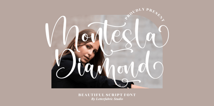 Montesla Diamond is an enchanting handwritten font. This versatile script font has a wide spectrum of applications ranging from greeting cards to headlines. Montesla Diamond is PUA encoded which means you can access all of the amazing glyphs and ligatures with ease!
 - Cupcake Cuties by IbraCreative,
$23.00 Cupcake Cuties is a delightful and whimsical handwritten font that brings a touch of sweetness and playfulness to all things related to cooking and kids. Its charming letterforms, adorned with playful swirls and endearing curves, evoke the joy and magic of baking and childhood. With each character carefully crafted as if with a sprinkle of fairy dust, Cupcake Cuties adds a whimsical and inviting flair to cookbooks, recipe cards, children’s menus, and party invitations. From delectable cupcake illustrations to delightful kitchen-themed designs, this font captures the essence of culinary creativity and the enchantment of childhood, making it a perfect choice to create a truly delightful and memorable experience for little chefs and their families.
 - Accia Variable by Mint Type,
$159.00 Accia is one of the world’s first true sans-to-serif variable fonts. Its weight axis ranges form Thin to Extra Bold, and its serif axis ranges from Sans to Forte. Accia is designed to be perfectly usable at every possible point of the design space, and its different instances work together perfectly as an infinitely flexible type system. The typeface contains a total of 879 glyphs supporting multiple Latin-based and Cyrillic- based languages, together with added sets of numbers and punctuation, small capitals, ligatures and other commonly supported OpenType features. Accia is also available as separate font families.
 - Populaire by PintassilgoPrints,
$29.00 Populaire is a hand-drawn font that mimics true handcrafted lettering. Counting 4 glyphs for each letter, the laborious kerning table ensures that the glyphs are really exchangeable. Yet, there’s a cool set of ornaments and a kind-of-magic OpenType feature. When the Populaire font is used in OpenType-savvy applications, its Contextual Alternates feature produce a striking random-like effect on glyphs distribution, achieved by cycling through alternates. When not using the Contextual Alternates feature, you can still pick the alternates in the Glyphs palette or use the alternates available from the keyboard upper and lower case.. Inspired by the electrifying posters from May 1968 by Atelier Populaire, this dynamic font is flexible enough to bring freshness and energy to a wide range of design applications. Used in the titles for the 2012 movie Life of Pi.
 - Loyolliams by Eyad Al-Samman,
$5.00 “Loyolliams” is my first designed Latin typeface which has special meanings and unforgettable memories for me. The font's name, Loyolliams, consists of two mixed syllables stand for two different names. The first syllable is derived from the name “Loyola” and the second syllable is derived from the last five letters of the name “Williams.” These two names are related to “Concordia University”—located in Montreal in Canada—where I studied at a short academic term and spent in a very special period of my life in the late 2005. This renowned Canadian academic institution was created following the 1974 merger of “Loyola College” (1896) and “Sir George Williams University” (1926). This conglomeration formed “Concordia University” and the name Concordia itself was taken from the motto of the city of Montreal, Concordia salus (meaning ‘well-being through harmony’). This font comes in two different weights; light and regular. “Loyolliams” is a square, geometric, techno, and modern font. It is suitable for T-shirts, books' covers, websites’ addresses, advertisement light boards, and titles in technical, artistic, and other types of magazines and signboards. “Loyolliams” can be used also in posters, surfaces of electrical and electronic tools, digital devices and chips, geometrical machines, trucks, tractors, calculators, mobile phones, watches, laptops, personal computers, power equipments, digital cameras, technical magazines, and other digital and electronic tools. This fonts can be effectively used in titles especially when its uppercase and lowercase letters are mixed together and when it is used in its italic mode. "Loyolliams" is suitable for writing and printing small textual paragraphs in cards, magazines advertisements, and also posters. The main characteristic of "Loyolliams" Typeface is its non-curve style in most of its alphanumeric letters. The characters are deliberately designed to have only angular and square shapes.
 - Espiritu by Sudtipos,
$39.00 Espíritu is the first font illustrated and designed by talented Graphic Designer, lettering artist, illustrator and musician Agustín Pizarro Maire. For this entirely made-by-hand project, Agustín pushed his limits forward, significantly improving his notions in the type field, by applying his expertise and experience as an illustrator and letterer. With Type Direction and design assist by Guille Vizzari, both joined forces to face this voyage together. The result is a peculiar font family that seeks for a free spirit, one that is imperfect and unpretentious. With its soul deeply rooted in wanderlust, just enjoying the journey, like an endless road trip. Espíritu is a type family guided by the impulse of the hand, getting lost in the details of infinite drawn letters and icons, that perfectly fit meticulous designs, achieving also great impact when needed. Espíritu consists of five styles that complement each other to get different voice tones for each kind of design piece. Espíritu Regular, the heaviest one and most versatile; Espíritu Condensed, for tall and compact compositions; Espíritu Expanded, a wide serif style that’s great for billboards and short messages; Espíritu Script, a mono-weight cursive to add softness to the family; and finally a huge set of illustrations, symbols, badges and more in Espíritu Dingbats. Each of the alphabetical fonts offer an overflowing amount of alternates, swashes, and ligatures to maximize their capabilities. To all the wild spirits out there, meet Espíritu, join the ride.
 - Slowmoon by Alit Design,
$23.00 Introducing Slow Moon - The Retro Display Font with Timeless Elegance Unveil the beauty of bygone eras with Slow Moon, a font that encapsulates the essence of retro design while offering an extensive range of dynamic alternatives and ligatures. With 976 meticulously crafted character glyphs, multilingual support, and PUA Unicode, Slow Moon is the quintessential choice for designers seeking to infuse a touch of nostalgia into their projects. Key Features: Timeless Retro Charm: Slow Moon embodies the spirit of the past, bringing to life the aesthetics of vintage signage and typography. Its classic appeal effortlessly transports your audience back to the golden days of design. Dynamic Alternatives and Ligatures: Slow Moon is not just a font; it’s a design toolkit. With an array of dynamic alternatives and ligatures, you can create eye-catching compositions that seamlessly flow from one character to the next. This feature allows you to achieve a genuinely unique and handcrafted look. 976 Unique Glyphs: Slow Moon’s extensive character set ensures that you’ll have the perfect letterform for any project. From decorative swirls to bold serifs, every character is designed with precision and care. Multilingual Support: In our globalized world, Slow Moon understands the importance of inclusivity. It offers multilingual support, making it versatile for projects spanning multiple languages and regions. PUA Unicode: Slow Moon is equipped with Private Use Area (PUA) Unicode encoding. This feature simplifies the process of accessing alternate characters and ligatures in various design software, enabling smooth integration into your creative workflow. Ideal for a Range of Applications: Slow Moon is the perfect choice for a myriad of design projects. Whether you’re crafting vintage-inspired posters, retro-themed branding, stylish packaging, or captivating web graphics, this font will lend an air of sophistication to your work. Its versatility allows it to effortlessly transition from glamorous and elegant to rugged and bold, depending on your creative vision. Get Creative with Slow Moon: Indulge in the allure of a bygone era and elevate your designs with Slow Moon. Its exquisite blend of retro charm, dynamic alternatives, ligatures, and extensive character set will empower you to create typography that stands the test of time. Whether you’re a seasoned designer or just starting your creative journey, Slow Moon is your trusted partner in delivering unique and unforgettable designs. Don’t wait to embark on a design journey that captures the magic of yesteryears. Choose Slow Moon and let your creativity shine in the soft, enchanting glow of nostalgia.
 - Jalopy JNL by Jeff Levine,
$29.00 History, as it's said, tends to repeat itself. The round-point pen lettering used in the 1920s logo and ads for Dodge Brothers cars (pre-General Motors) is an early predecessor to the techno type styles of the 1980s. Square in shape, with unique stylization to some letters, Jalopy JNL can cross the decades and be used for a 1920s period piece and still look fresh in an ad for computer parts. Rather than round out the inside lines of the characters to fully emulate the strokes of a lettering pen, the inside lines have straight intersections for the contemporary side of this font's design.
 - Twombly by SAMUEL DESIGN,
$19.00 The name of this font is TWOMBLY, which is inspired by the abstract art master Cy Twombly. This original typeface has an Art Deco style with a firm, straightforward, confident character. Its self-respect is HEAVY, but it is very elegant and has a literary temperament. This font reveals a calm and calm temperament from Northern Europe. The details of the triangle used as a transition in the serif are full of playfulness, which makes the whole font have a youthful and cutting-edge feeling.
 - Alt Gotisch by HiH,
$12.00 Alt-Gotisch Verzierte is a typeface of decorative initials that is Victorian in style and bears a close family resemblance to the many ornamental tuscans cut throughout the nineteenth century by British foundries. Instead of the bifurcated terminals of the archetypical tuscan (see Figgins Tuscan by HiH or Stereopticon by Dan X. Solo), these letters display what Nicolete Gray might call a “wedge and bite” design -- as if they started with the wedge serif of a latin form and someone came along and took a perfectly round bite out of the wedge. We need not dwell on the lack of teeth marks. The calligraphic curls and flourishes are often graceful, sometimes a bit contrived, but always complex. There is a busyness that marks the style of the period. If you ever see an old photograph of a well-appointed Victorian parlor, you will recognize that same quality of busyness. Overdone is a word that frequently comes to mind. Alt-Gotisch Verzierte means “adorned or decorated old gothic.” The typeface is attributed by Alexander Nesbitt to an unidentified German foundry of the nineteenth century (Decorative Alphabets and Initials, Dover, New York 1987, plate 92). The designer is unknown. Our font is supplied with a lower case that is similar to the upper case, but is 15% shorter and is simplified by the omission of the decorative vines. For the lower case, alternate letters A, E, & T; and ligatures LE, OT & LY have been supplied. In addition, a few small decorative vines were planted here and there for optional use. An accented upper case is not part of the original design and is not here supplied. This design is also seen under the name “Sentinel” -- as always, it is worthwhile to compare the completeness of the character set and the faithfulness of the rendering. We believe you will agree that we provide a balance of quality and value that is unmatched in the contemporary marketplace. Alt-Gotisch Einfach is a simplified version of Alt-Gotisch Verzierte. The vine-less lower case of the Verzierte font is the upper case in Einfach. For a lower case for Einfach, the letters were further simplified by stripping away the three-dimensional outline, down to the bare bones and bites, as it were. Einfach, in fact, means “simple” or “plain.” It is interesting to note that this bare bones & bite lower case bears (I have a special license to use two homonyms in the same sentence) a striking resemblance to the 15th & 16th century ornamental letters from Westminster Abbey shown in Plate 47 of Alexander Nesbitt’s Decorative Alphabets and Initials (Dover, New York 1987).
 - Monotalic by Kostic,
$30.00 Monotalic was created as a fun experiment, exploring better solutions for the monospaced type design. Most monospaced (fixed-width) typefaces have the same main design problem regarding the lowercase – filling the empty space around l, f, i, j and r. That usually brings the addition of slab serifs to those narrow characters, causing many monospaced fonts to look and feel alike. Monotalic solves that problem by adopting the handwritten (or cursive) form for those problematic characters, which allows them to be defined in more strokes, thus getting a better distribution of form in that fixed-width space. On the other hand, cursive writing usually lacks the legibility of a Roman (Regular upright) style, so Monotalic was created to be a hybrid, taking the best of both worlds. Monospaced fonts today are mostly used for coding. Modern code editors use colored text in order to differentiate between different kinds of code. So, in that environment there’s actually no need for traditional text styling by adding Italics, Bold or other styles, because the code lines are overstated as it is. That is why Monotalic focuses on one style only, in three widths and four weights. The weights allow users to choose the perfect contrast of text on screen, depending on their monitor resolution and background color in the editor. Movie scripts are almost exclusively set in 12pt Courier. It became the industry standard because when set in the specific “screenplay format" it helps with the breakdown of the schedule and budgeting process of the film production. Although it looks completely different, text set in Monotalic (Normal width) will take the same amount of space as Courier.
 - Rick Griffin by K-Type,
$20.00 The Rick Griffin fonts are based on the 1960s psychedelic poster lettering of the Californian artist. Rick Griffin is the regular font without outlines. The Rick Griffin Contour font has the additional outline characteristic of many Griffin posters, and the matching Rick Griffin Contour Ground font can be overlapped to create bicolor artwork.
 - Nanami Rounded by Thinkdust,
$10.00 Nanami Rounded is a heavily engineered follow up to the hugely successful Nanami, which debuted at MyFonts #1 Hot New Fonts for over 2 weeks. Nanami Rounded is a carefully engineered take on the original Nanami family. We kept the curve very slight in order to keep the clean corporate balance, and not to go into a style that was too friendly. Nanami Rounded consists of 18 weights ranging from Thin through to Black. It has also extensive support for over 50 languages, and as a font family that works well both in headlines and bodycopy, Nanami Rounded is the perfect choice for a whole variety of creative briefs. The gentler, softer follow-up to the popular Nanami, Nanami Rounded is also motivated by the artistry of Japan. Smoothing the hard lines and definite corners of its predecessor just slightly, Nanami Rounded is still clearly defined and crisp enough to work in whatever context you need. If Nanami is a battle hardened Samurai, Nanami Rounded is the lotus blossom favour handed to him as he leaves his home village to go to war. If Nanami Rounded isn't quite floating your boat why not check out it’s counterparts Nanami and Nanami Handmade.
 - Just Heavenly by Nicky Laatz,
$18.00 Say hello to JUST HEAVENLY - A flamboyant & natural-looking, textured brush font with a really big heart! Just heavenly is intended to give your type designs a natural and fresh handwritten look. To make your designs look even more natural and unique, Just Heavenly has a large selection of ligatures and alternate letters built in. Just heavenly actually has a whole extra set of uppercase AND lowercase alternate letters - so you are guaranteed to find just the right feel for your project. These are all provided as a whole extra font for folks without special Opentype capable software :) That's not all :) Just Heavenly comes with 62 lovely flamboyant swashes and ornaments as a separate font - Just add a swash, and watch your design pop in an instant :)
 - Art School by AVP,
$25.00 Faithfully reproduced from my father’s design drawings made at The Municipal School of Arts and Crafts, Wolverhampton in 1939. Strong nostalgic influences of Art Nouveau and Art Deco. What caught my eye was the consistency with which each particular character was formed: every ‘R’ like every other, every ‘S’ the same. Tight letter spacing and loose word spacing characterised his titling but he didn’t trust himself to print without first ruling guidelines, a hint of which remain in this font.
 - Jalal by Linotype,
$187.99Jalal is a modern Arabic text typeface with two weights: Jalal Light and Jalal Bold. Both of the fonts ship in the OpenType format, and include Latin glyphs (from Optima Demi Bold and Optima Bold) inside the font files, allowing a single font to set text in both most Western European and Arabic languages. The Jalal fonts incorporate the Basic Latin character set and the Arabic character set, which supports Arabic, Persian, and Urdu. They include tabular and proportional Arabic, Persian, and Urdu numerals, as well as a set of tabular European (Latin) numerals. - Cynapse OT by Positype,
$29.00 Several years ago I was faced with a project that required very small type to be used in a directory. In general, there was a need for a lot of 'fine print'. Faced with this, all of the tests I was making with existing faces were producing too much bleed of the individual glyphs...Cynapse was born. It evolved into this pseduo-techy looking type that standardized and glorified the ink trap (the small, tiny allowances of white space that reduces the amount of ink hitting the page, and in effect, reducing the appearance of bleed). The results was promising. The new OT version contains additional OpenType features that include expanded ligature sets, fractions, 5 sets of numerals as well as small caps and Central European diacritics.
 - Sys 2.0 by FSD,
$60.27Sys is a condensed font designed to work well at small sizes (i.e. phone books, maps, or the like) but it has enough personality to be used at big sizes, too. The TrueType version, thanks to its incredibly accurate hinting, may be used to replace amazingly well TrueType system fonts in every platforms, in web or other screen applications. After the succcess by the first version designed ten years ago, the version 2.0 has numerous improvements in the design of the glyphs, new Unicode ranges, useful OpenType features and enhanced readability. - Megre by JAB,
$16.00The courageous Russian author of the best seller Anastasia, Vladimir Megre, once said that this remarkable woman would inspire creative people around the world to produce their best work. Since I consider myself a creative person who has been deeply touched by her story, I sincerely hope that this will be true for me also. Anastasia talks a lot about God, the wonders of the natural world and how all things have been created so perfectly. This belief in universal perfection, however, is not confined to mystics alone. Many great mathematicians and scientists, including Albert Einstein, were of the same opinion. Having read Dan Brown’s The Da Vinci Code, I became quite fascinated with the so-called Fibonacci series; "a sequence of integers in which each integer (Fibonacci number) after the second is the sum of the two preceding integers; specif., the series 1, 1, 2, 3, 5, 8, 13, . . ." (Webster’s Dictionary). These mysterious numbers, which are said to give divine proportions, are found throughout nature in everything from a rose to a spiral galaxy. Many believe that this reinforces the argument that there is a divine intelligence back of creation. With that in mind, I thought it would be interesting to see if I could somehow create a font using these numbers in the design process. If I have succeeded - even partially - in attaining these mystical proportions, it will definitely have been worth all the hard work. And, I sincerely hope that many will enjoy using this font in producing their own best work. - Square Spray by Blankids,
$22.00 Introducing of our new product the name is Square Spray Graffiti Font, Square Spray inspired by graffiti style with a fun theme very good for graffity poster, Hip Hop music, kids poster, flyer, childrenbook, cartoon, comic etc
 - Bomber Throw by Blankids,
$21.00 Introducing of our new product the name is Bomber Throw Graffiti Font, Bomber Throw inspired by graffiti style with a fun theme very good for graffity poster, Hip Hop music, kids poster, flyer, childrenbook, cartoon, comic etc
 - Street Lord by Blankids,
$23.00 Introducing of our new product the name is Street Lord Graffiti Font, Street Lord inspired by graffiti style with a fun theme very good for graffity poster, Hip Hop music, kids poster, flyer, childrenbook, cartoon, comic etc
 - Psychotropic Experience by Mysterylab,
$12.00 Here's a unique and unusual font pack in the tradition of late 1960s psychedelic poster and album cover styles. Perfect for that flaming psychedelia vibe from the Haight-Ashbury scene in the Summer of Love era. Combine Regular and Fill versions to create a two-toned design for a super offbeat and eye-catching look. Once loaded on your system, the three versions of the font show in your menu as the following three "weights": Psychotropic Experience Regular, Psychotropic Experience Fill, and Psychotropic Experience Solid. The 3-alphabet collection works together seamlessly to allow you to assign one color to the body of the letter, and a second color to the inset fill areas. Just copy your text block, paste in place, reassign the font to the Fill version, choose a complimentary color, and off you go. All caps Fonts.
 - Skarpa by Aga Silva,
$23.99 This is long awaited thorough revision to Skarpa family. The revision has inculded both another look at letter shapes as well as kerning and metrics of the files. The shapes encapsulated in this font stem from old time architectural drawings hand executed at drawing board with tracing paper and rapidographs. Think of lettering stencils sliding across the tracing paper and craftily exectuted drawing descriptions. The font is based on geometric forms devoid of excessive flourishing. Would suit modern designs either in fashion, technology or laboratory setting. Would look good on door plaques in pharmacy or simple drawer plaques - especially Medium or Bold specimen.
 - TT Trailers by TypeType,
$39.00 Meet the new TT Trailers! The first version of TT Trailers was conceived as a font suitable for the film industry. The font harmoniously looks in posters, it is ideally suited for setting titles. However, the font has gained wide popularity among designers, and now you can find TT Trailers on the covers of magazines, on restaurant signs and on the main pages of websites. TT Trailers useful links: Specimen | Graphic presentation | Customization options Since 2019 when we released the first version, the TypeType studio team has released dozens of fonts, constantly improving our skills. In 2022, we decided to look at TT Trailers again, improving and expanding the font. In the new TT Trailers, we expanded the character set, corrected the contours, and improved the technical content. We have added extended Latin and Cyrillic characters, new symbols, and additional sets of numbers. The number of glyphs in one style has increased from 1081 to 1242. The inclined styles were long-awaited. The italics in TT Trailers are as eccentric as the upright fonts. The 15-degree tilt looks absolutely harmonious, complementing the character of the font family. We added italics to the variable font, so the new font changes along two axes at once, weight and slant. From the technical point of view, TT Trailers has become more modern and correct, and the number of OpenType features has increased from 29 to 42. We have added new alternative versions of glyphs and created a large number of localized features. The font retained all the qualities thanks to which designers fell in love with it, but became even more convenient. TT Trailers in the new version is suitable for titles and posters, for websites and printed materials. The font will embellish in restaurant and cafe signs and look beautiful in posters. There are 19 styles in TT Trailers: 9 upright, 9 italic and 1 variable font.
 - Neon Love by Schriftlabor,
$29.99 Neon Love was designed originally for a circle coaster design with a quote by the Beatles’ “All you need is Love, Love is all you need”. The inspiration of the lettering was a neon sign style where a cursive script is kind of bended from those glass wires. The idea was to get the overall look and feel of neon signs into a font, as well as creating a good raw material to use for some further photoshop effects to enhance the visual presentation. Neon Love has many OpenType features that allow for choices that can make the lettering unique. Neon Love has two versions of the font a Smooth one which is connected and the Cutout version which can be used to create neons and for this it is in parts. Design by Roland Hüse and Schriftlabor team.
 - Automobile Contest by Asd Studio,
$15.00 Introducing the new font Automobile Contest - Handbrush, the new version of Qillsey Einstein Font, a type of script that has a natural scratch texture. I made by using a brush pen that makes the impression seem natural. My font is complete with two StylisticSet which will make the writing more beautiful and charming. This typeface is suitable for use in a variety of design fields, such as event advertisements, product promotions, book titles, activity titles, logos, adventure, and others. This font can when paired with serif font types will make your design project more beautiful and perfect. I highly recommend using a program that supports OpenType featuresand Glyphs panels such as Adobe Illustrator, Adobe Photoshop CC, Adobe InDesign, or CorelDraw, so you can see and access all Glyph variations. This font is encoded with Unicode PUA, which allows full access toall additional characters without having special design software. Mac users can use Font Book, and Windows users can use Character Map to view and copy one of the extra characters to paste into your favorite text editor / application. I hope you enjoy the font, thank you.
 - F2F Monako Stoned by Linotype,
$29.99The Face2Face (F2F) series was inspired by the techno sound of the mid-1990s, personal computers and new font creation software. For years, Alexander Branczyk and his friends formed a unique type design collective, which churned out a substantial amount of fresh, new fonts, none of which complied with the traditional rules of typography. Many of these typefaces were used to create layouts for the leading German techno magazine of the 1990s, Frontpage. Branczyk and his fellows would even set in type at 6 points, in order to make it nearly unreadable. It was a pleasure for the kids to read and decrypt these messages! F2F Monako Stoned was inspired by the Apple system font Monaco, and is one of 41 Face2Face fonts included in the Take Type 5 collection from Linotype. Branczyk designed 16 of these himself." - Pellony Kind by FadeLine Studio,
$17.00 This is a cute handwritten script. This font is created with a semibold handwriting style. Made with careful consideration, in order to create a comfortable impression when using it. And with available various types of ligatures make this font look natural. There are 572 glyphs in it and 368 of them are ligatures like is the current trend, it's just that this font comes with a semibold style. With a style like this, this font will be suitable in use for logo's, branding projects, homeware designs, product packaging, mugs, quotes, posters, shopping bags, logo's, t-shirts, book covers, name card, invitation cards, greeting cards, and all your other lovely projects.
 - Silken by Scholtz Fonts,
$19.92 Silken is a stylish and contemporary handwriting font that combines the elegance of fonts such as Zapfino with the immediacy of handwriting fonts such as Affable. There are many handwriting fonts out there, but many of them border on being grungy and irregular. This font combines beauty with individuality and spontaneity. Silken comes in a number of styles, the primary style of which is Silken Scarf. This style has a strength and sophistication that is particularly appropriate for headlines and short passages of text (such as invitations, certificates, greeting cards etc.) Silken Thread is a variant of the font family that is even more delicate and polished than Silken Scarf. The third style, Silken Book, with a greater x-height and less dramatic capitals, is more readable and less extreme than the other two styles. It should be used for longer passages or where readability is of primary importance. Suggestions for use: - wedding stationery - greeting cards - valentines day mediaa - beauty product media - lingerie tags - women's magazine pages - classical music media - award certificates The font is fully professional: carefully letterspaced and kerned. It contains over 235 characters - (upper and lower case characters, punctuation, numerals, symbols and accented characters are present). It includes all the accented characters used in the major European languages.
 - Sinova by Linotype,
$29.99 The simplified letterforms of Sinova™ make it an ideal choice for those settings where you really don't want the type to shout too loudly or draw unnecessary attention to itself. Christian Mengelt has drawn five weights: Thin, Light, Regular, Medium, and Bold, all with complimentary obliques. Sinova is an OpenType family that is unfussy, functional, and legible, with extensive language support (some 48 languages). Thanks to its clear and straightforward design and dynamic rhythm, one of the main characteristics of Sinova is its excellent legibility, irrespective of whether it is used in longer passages as a stylish book script or for text in the digitalised office environment. But Sinova also happily adapts itself to being used as a titling font in combination with Renaissance Antique serif typefaces. For this reason, another potential application for the font family is as a graceful and elegant titling and text script for job printing and in publicity texts. The two complementary stroke widths, light and bold, are perfect for commercial applications.
 - Ziggy Stardust NF by Nick's Fonts,
$10.00Sheet music from the 1921 edition of the Ziegfeld Follies provided the blueprint for this sparkly, sprightly font. Upper and lowercase characters are identical, with the exception of the letter s, which offers a version of the letter with a big caboose rather than an overbite. Named for David Bowie’s 1972 breakthrough album. Both versions of this font contain the Unicode 1252 (Latin) and Unicode 1250 (Central European) character sets, with localization for Romanian and Moldovan. - RM Whiteletter by Ray Meadows,
$19.00 It is reasonable to assume that a majority of people interested in typography will attempt some variation on the blackletter theme at some time or another. However, there seems to be a paucity of open-faced designs in this style and, having played around with a few thoughts, eventually I came up with RM Whiteletter. Light in appearance but classical in design, this clean looking open-face font provides a good counterpoint to more traditional blackletter designs. This font includes both the full Latin-1 Supplement & Latin Extended-A sets.