10,000 search results
(0.197 seconds)
- Bittersoni by Letterara,
$14.00 Bittersoni is an enchanting handwritten font. This versatile script font has a wide spectrum of applications ranging from greeting cards, logos to headlines and is guaranteed to add a romantic or casual feel to your next project. Add it confidently to your projects, and you will love the results. This font is PUA encoded which means you can access all the beautiful glyphs and swashes with ease!
 - Forgotten Futurist - Unknown license

- Metaverse Display by Brenners Template,
$19.00 Metaverse Display Font Family The basic skeleton structure of this font family is based on block-shaped rectangles and arcs. Therefore, it contains the possibility of being simple, but free of transformation. Alternates are designed to give individual glyphs a special transforming effect, and can be used as a means to emphasize contextual characteristics. 94 Alternates are included, and it is designed to maximize the characteristics of glyphs through defiant and irregular free deformation, not just width deformation. These Alternates can be used in most apps that support Opentype. It is included in Stylistic Set 1 and 2 for uppercase and Stylistic Set 3 and 4 for lowercase. The function of the App to switch on Alternates, refer to the Opentype provided by each App.
 - Handsome by Shinntype,
$50.00 Handsome was the first digital typeface to resemble nice, ordinary, fully cursive handwriting. Or neon. In 2005, Handsome Pro was one of the first script typefaces to utilize the OpenType format to simulate the natural quality of writing, by automatically substituting alternate contextual glyphs. The effect follows the conventional “joining rules” of calligraphy, which are a formalization of the way in which letter forms are modified in cursive handwriting for the sake of speed and efficiency—and also perhaps to make life more interesting. For the look of real handwriting, Handsome is most convincing at around 15 pts. At much smaller or larger sizes it works differently. At display size, the feel of the non-nib styles is very slick, more like a speedball Kauffman, owing to the smoothness of the finish. As script fonts go, Handsome has a relatively large x-height, which can be useful if you don't want the “writing” to look too small.
 - Zekton Free - Unknown license

- Pakenham Free - Unknown license

- Mufferaw Free - Unknown license

- Larabiefont Free - Unknown license

- Betthofen Script by Ferry Ardana Putra,
$12.00 Betthofen |Handwriting Bouncy Script font manufactured by Ferry Ardana Putra, this typeface support OpenType features and includes numeral, punctuation, ligatures and it also supports multi-languages. Combine this bouncy font with its ligature and ton of ornaments that you can freely choose for your precious project! This font is perfect for branding projects, wedding designs, advertisements, product packaging, product designs, label, photography, invitation, quotes and any project spiced up! Betthofen features: A full set of upper & lowercase characters Numbers & punctuation Multilingual language support PUA Encoded Characters +350 Glyph Ligatures Swashes Ornaments OpenType Features ——— ⚠️To enable the OpenType Stylistic alternates, you need a program that supports OpenType features such as Adobe Illustrator CS, Adobe InDesign & CorelDraw X6-X7, Microsoft Word 2010 or later versions. There are additional ways to access alternates/swashes, using Character Map (Windows), Nexus Font (Windows), Font Book (Mac) or a software program such as Pop Char (for Windows and Mac). ⚠️For more information about accessing alternative, you can see this link: http://adobe.ly/1m1fn4Y ——— 🔑Important tutorial from the author: Tutorial for Mollusca font trio: https://lnkd.in/d984CQD6 How to use Midway | Retro Script Font on illustrator: https://lnkd.in/eusbZd7s How to use Midway | Retro Script Font on Photoshop: https://lnkd.in/evsYrwgs ——— ❤️Get in touch with the author: Instagram: https://www.instagram.com/ardana619 Behance: https://www.behance.net/ardana619 ——— 📢Shout out to: https://unsplash.com (for awesome photos) https://graphicburger.com (for outstanding mockups) ——— 🔥Thankyou for purchasing our product, hope you like and have fun with our product. If you have any queries, questions or issues, please don't hesitate to contact us directly. If you satisfied with our product, please give 5 stars rating. ——— Happy Designing...😊
 - Stanford Breath by Arterfak Project,
$20.00 Introducing 'Stanford Breath' a vintage decorative font inspired by the western typography and victorian style. this font has strong look with the rounded serif, all-caps, and decorative uppercase. Collected from many references such as vintage signage, logo, badges, and old-fashioned graphics. Stanford Breath is complete with extra ornaments that look great to combine. This font is perfect for many display purposes. You can use this font for posters, labels, logos, signboards, t-shirts, book covers, decorations, merchandise, and more! Multilingual support with a ton of alternate characters! Fonts Featured : Uppercase Smallcaps Numbers & punctuations Stylistic Set 01-14 Custom ligatures Accented characters: ÀÁÂÃÄÅÆÇÈÉÊËÌÍÎÏÑÒÓÔÕÖØÙÚÛÜÝÞŒŠŽßàáâãäåæçèéêëìíîïñòóôõöøùúûüýþÿœšž Stanford Breath font is PUA Encoded which means you don't need any special software to access the OpenType features.
 - Chicago Ornaments by HiH,
$6.00 Chicago Ornaments is a collection of decorative cuts cast by the Chicago Type Foundry of Marder, Luse & Co. of 139-141 Monroe Street in Chicago, Illinois. This collection was shown in their 1890 Price List. According to William E. Loy, at least some of them were designed by William F. Capitain. Chicago was one of the innovative Midwest type foundries, introducing the American Point System. These designs represent the late Victorian period. After 1890, with the posters of Jules Cheret taking Paris by storm, Art Nouveau gradually began to displace Victorian style. In type design, both styles competed against each other until about the end of the century. Designers may want to consider using these ornaments when using Victorian style typefaces, like our Cruickshank, Edison and Freak - as well as faces by others such as Karnac, Kismet and Quaint Gothic. Included in the font are a set of Dormer-inspired caps, numerals and a few other glyphs - also from the Victorian period.
 - Thick Fun by PizzaDude.dk,
$17.00 This is not a brush font! This is an imitation of brushstrokes, done by pen. But I guess you've already noticed that - the brushstrokes are way too obvious, to have been made by brush. Although being a "fake", the letters leaves you with quite a good impression. Letters were inspired by an old horror movie poster, but is very useful for something less terrifying!
 - Makeba Retro Funky Groovy by Beast Designer,
$15.99 Makeba Retro Funky Groovy Font is a fun and funky display font that brings back the spirit of the 70s. Its bold, rounded letters feature groovy curves and playful embellishments that exude a retro vibe. This font is perfect for creating eye-catching titles and headlines for posters, album covers, and other retro-inspired designs. The font’s energetic and upbeat personality is sure to make any project stand out.
 - Retroxoid by PizzaDude.dk,
$20.00 You may recognize the looks of Retroxoid - if not, then let me help you out: Retroxoid is actually a font I made back in 2007. I ran prints of the font, through a very bad copymachine, used a wet cloth to make the print look worn, scanned the prints and voila! Retrozoid, my very first Open Type font, was born! Now in 2010, Retroxoid has risen from the past, and is ready to burst your designs with clean, round and futuristic shapes!
 - Oxford Street by K-Type,
$20.00 Oxford Street is a signage font that began as a redrawing of the capital letters used for street nameplates in the borough of Westminster in Central London. The nameplates were designed in 1967 by the Design Research Unit using custom lettering based on Adrian Frutiger’s Univers typeface, a curious combination of Univers 69 Bold Ultra Condensed, a weight that doesn’t seem to exist but which would flatten the long curves of glyphs such as O, C and D, and Universe 67 Bold Condensed with its more rounded lobes on glyphs like B, P and R. Letters were then remodelled to improve their use on street signs. Thin strokes like the inner diagonals of M and N were thickened to create a more monolinear alphabet; the high interior apexes were lowered and the wide joins thinned. The crossbar of the A was lowered, the K was made double junction, and the tail of the Q was given a baseline curve. K-Type Oxford Street continues the process of impertinent improvement and includes myriad minor adjustments and several more conspicuous amendments. The stroke junctions of M and N are further narrowed and their interior apexes modified. The middle apex of the W is narrowed and the glyph is a little more condensed. The C and S are drawn more open, terminals slightly shortened. The K-Type font adds a new lowercase which is also made more monolinear so better suited to signage, loosely based on Univers but also taking inspiration from the Transport typeface both in a taller x-height and character formation. The lowercase L has a curled foot, the k is double junctioned to match the uppercase, and terminals of a, c, e, g and s are drawn shorter for openness and clarity. A full repertoire of Latin Extended-A characters features low-rise diacritics that keep congestion to a minimum in multiple lines of text. The font tips the hat to signage history by including stylistic alternates for M, W and w that have the pointed middles of the earlier MOT street sign typeface. Incidentally, Alistair Hall (‘London Street Signs’, Batsford, 2020) notes that when the manufacturer of signs was changed in 2007, Helvetica Bold Condensed was substituted in place of the custom design, “an unfortunate case of an off-the-peg suit replacing a tailored one” and a blunder that has happily since been rectified, though offending nameplates can still be spotted by discerning font fans.
 - Aethelred NF by Nick's Fonts,
$10.00This unicase typeface, with alternate characters in several of the lowercase positions, is patterned after Mosaik, designed by Martin Kausche for Schriftgeißerei Stempel in 1954. A stencil treatment has been employed, and the outlines have been roughened to enhance its ancient feel. The typeface is named for a king of England, Æðelred the Unready, who ruled over a millenium ago. Unlike its namesake, this typeface is quite ready to do yeoman's duty on your next project. The Opentype, Truetype and Windows Postscript versions of this font contain both the Windows 1252/ANSI character set and the 1250/Central European character set. - Sculptura CT by CastleType,
$29.00 A wonderful, very condensed, 3D font. A few years ago, I was commissioned to digitize the letters from this typeface for the words 'LEGENDS OF RODEO' and liked the look of it so much that I went ahead and digitized the rest of the alphabet. This CastleType revival is very clean-cut and contains uppercase, numerals, and punctuation. Sculptura was originally designed by the Swiss designer, Walter J. Diethelm (1913-1986) in 1957.
 - Neoland by Josstype,
$16.00 Neoland is a round Comic display font, a very unique trendy font with a combination of modern character bindings, and I think this product suits the teaser display theme in every headline design, business cards, leaflets, magazines, children's events, and brand screen printing. Available Fonts: Neolan Font File. Come on, take a look and be happy to hear the review. If you have suggestions about this product, please let your work environment know whether this product is good for them. Thank you so much for everything!!
 - Merry Old Soul NF by Nick's Fonts,
$10.00This jaunty display face was discovered in one of the many books on sign writing produced by Eric Matthews. The work was signed “King Cole", hence the font’s name. This typeface’s large x-height and tight spacing make it highly suitable for attention-grabbing headlines. Both versions of this font include the complete Unicode Latin 1252 and Central European 1250 character sets. - Slothy Jelly by Scratch Design,
$12.00 Introducing Slothy Jelly! A fun font for everyone. Slothy Jelly is a cute handwritten font that has fun and happy characteristics. This font is authentically handwritten with the marker pen for a consistent look. This font also has alternates so you can mix and match the letters and make it more fun! For some extra hand-drawn cuteness, this font is also thrown in a bonus font with symbols like emojis, hearts, underlines, arrows, and circles - and drawn with the same pen to perfectly go with the writing. So it will help to make your design more cute and happy. This font is suitable for branding, posters, children's books, magazines and others. Your download will contain the following fonts such as Slothy Jelly Regular - a pretty and cute handwritten including a set of uppercase, lowercase, alternates, ligatures and multilingual support. Slothy Jelly Symbols - a dingbat font of many hand-drawn elements These fonts will work in any program, but please note that the alternates and ligatures of the font can only be accessed on software that supports OpenType features. Thank you for your purchase! Hope you enjoy this font
 - Rolling Brush by Ditatype,
$29.00 Rolling Brush is a script font that gives handwriting appearance with original and personal brush details. This font is made beautifully so that the letters are connected to each other, creating a continuous and flowing look. Each letter is attached to the previous letter and continues to the next letter, creating beauty in writing unity. This font shows brush details on each letter. Brush strokes displays a rough, organic texture to the edges of the letters, adding dimension and visual life. These details give a unique impression to this script font. On the other hand, even though it has a rough border, this script still maintains a natural and elegant aesthetic touch. Some letters may have dramatic twists, while others are simpler. This flexible shape creates an expressive and creative look to the lettering. Because it is designed with a rough border, it would be better if you use this font at a large text size so it is more easy to read. Enjoy the various features available in this font as well. Features: Alternates Ligatures Multilingual Supports PUA Encoded Numerals and Punctuations Rolling Brush is suitable for any designs that want to convey a warm, personal and alluring impression. You can use this font in the design of greeting cards, invitations, logos, labels, and many other design projects that want to create uniqueness through a natural, handwritten touch. Find out more ways to use this font by taking a look at the font preview. Thanks for purchasing our fonts. Hopefully, you have a great time using our font. Feel free to contact us anytime for further information or when you have trouble with the font. Thanks a lot and happy designing.
 - Quasar by VP Creative Shop,
$12.00 Introducing the delightful Quasar sans serif font – a true gem in the world of typography! With its clean and modern design, Quasar brings a touch of elegance to any project. This font family consists of not one, but six distinct weights, offering you a versatile range of options to choose from. Whether you're aiming for a bold and impactful statement or a more subtle and refined look, Quasar has you covered.
 - Bestfriend Monkey by Mvmet,
$12.00 Bestfriend Monkey is a fun and playful hand-lettered font, mixing modern calligraphy and contemporary art in the process of creation. It will elevate a wide range of design projects to the highest level. You can use this font for many design ideas such as stickers, t-shirt designs, amazing logo designs, magazine or book covers, comics, cartoon drawings, and many more. This font will add a super cool touch to your designs!
 - Titanium by Ascender,
$29.99 Titanium is a geek-ed out, über-technoid specimen of plasma-type. Designed by Steve Matteson, this typeface is the perfect display font for your star cruiser or the weekend interplanetary lander. Like its namesake, Titanium is the strongest design for its weight capable of withstanding the jump to lightspeed without paradoxical distortions. Titanium is now available for use on home world computing devices to capture the essence of galactic travels.
 - P22 Barabajagal by IHOF,
$29.95 P22 Barabajagal is a unique take on the display fat face by way of doodling fun. Somewhat informed by the shapes of an early 1970s film type called Kap Antiqua Bold, this font’s aesthetic is the stuff of boundless energy and light humour, where an uncommon “peak” angle drawing perspective results in sturdy trunks, fat bottom curls, and active ascenders eager for mobility in space. This is the kind of font that makes you wonder whether it was drawn with rulers, protractors and compasses, or just by a mad doodler’s crazy-good free hand. Regardless, Barabajagal easily turns the geometry of modern forms into an exercise in sugar-loaded fun. It’s a very good tool to use in design geared at kids and young adults, such as food and toy packaging, books, animation, cartoons and games. Barabajagal comes with over 550 glyphs, lots of alternates, and a few ligatures and swash caps. It also contains extended support for Latin languages.
 - Wasty Pudding by PizzaDude.dk,
$15.00 Wasty Pudding was made by drawing a lot of letters, over and over again - and not caring so much about the looks, but focusing more on the speed of drawing, because I wanted a font that represented the way I write, when I am taking notes for myself. It’s not pretty, but it’s legible and scribbeliciously beautiful! :) Anyway, I think the purpose of this font is massive amounts of text. Song lyrics, novels, stories, diaries, manuscripts, books, etc. I bet you can fool someone with them thinking that this is not a font, because I have added 6 different versions of each lowercase letter!!!
 - DT Skiart Serif Mini by Dragon Tongue Foundry,
$9.00 ‘Skiart Serif Mini’ is now available online. Originally inspired by the san serif font ‘Skia’ by Mathew Carter for Apple. ‘Skiart’ was designed to feel more like a serifed font, but without any serifs. It took a step between sans serif and serif fonts. Next on the path towards a serif font comes Skiart Serif Mini, with tiny serifs added. This is a true serif font, all be it on the small side. It remains fully readable and feels as clean and normal as any of the best body copy serifs, and yet still has the strong solid bones of all the other Skiart font familys. If compared to one of the more commonly used serifs like ‘Times New Roman’, the ‘Skiart Serif Mini’ lowercase is more open with a taller x-height, increasing its readability and friendliness. The serifs are smaller and less distracting. They are not pretending to be ligatures. Where ‘Times’ makes its p q b d forms out of a barely touching oval and stem, the ‘Serif Mini’ forms are much more firmly attached, appearing clearly as single letters. The standard setting for the g’s are round single storied, (the italic a’s are also), feeling warmer and more inviting in the ‘Serif Mini’ font. Much more friendly than the stuffy double storied versions in fonts such as ‘Times’ etc.
 - Grand Paradiso by Ardian Nuvianto,
$49.00 Grand Paradiso is a luxurious and elegant display font that will add a touch of sophistication to any design. With its bold and dramatic curves, this font is perfect for headlines, titles, and branding projects that require a touch of elegance and class. Inspired by the grandeur of nature and the beauty of mountains, Grand Paradiso is designed to capture the essence of nature and the majesty of the great outdoors. Its unique and artistic letterforms make it ideal for creating logos, posters, and other design projects that require a touch of originality and creativity. Whether you're designing for a luxury brand or creating a beautiful piece of typography, Grand Paradiso is the perfect choice for your next project.
 - Perron by Fontforecast,
$39.00 Meet the successor of our bestselling design kit 'Chameleon': Perron. The concept of designing multiple contrasting designs under the same name was first introduced by Fontforecast in TyfoonSans and TyfoonScript. Two font families that were designed to complement each other. And that's exactly what this new release does. With the three designs in Perron, which means 'platform' in dutch, you will be able to take your design projects where ever you want them to go. This flexible kit consists of 7 fonts in three basic designs, and when combined Perron No1, No2 and No3 reïnforce each others charm. This offers great potential for creating lively layouts for many different projects, e.g. invites, menu's, magazines, brochures, packaging, greeting cards, T-shirts, etc. Perron No1 is a serif display font with large and small Caps. This font requires an Opentype savvy application to reach its full potential. Turn on contextual alternates and beginning and ending characters are replaced by their alternative versions, as you type. Stylistic sets and swashes offer even more variations. Perron No1 comes in two versions: No1 and No1 Shade. They can be used separate or layered for a colorful or shaded effect (if your application allows you to stack text frames). Perron No2 is a charming handwritten font, with slightly rough contours, that was added for an extra personal touch. It comes in regular and Italic. Perron No3 is a clean, tall and very skinny font family. It has large and small Caps and comes in three weights: Light, Regular and Bold. Because of its clean appearance No3 adds a modern touch to the design kit.
 - P22 Vincent by P22 Type Foundry,
$24.95 This set is inspired by the work of Vincent van Gogh. The alphabet captures the essence of van Gogh's handwriting style, using his extensive correspondence with his brother Theo as the primary reference. This lettering style presents a bold brush-stroke appearance which bears striking similarities to the painting style of Van Gogh. A full international charcter set is featured. The extras feature selected imagery from van Gogh's drawing and paintings.
 - Mahameru by NamelaType,
$29.00 Mahameru is the name of the peak of Mount Semeru, mean "The Great Mountain" in Sanskrit. This font gives a firm and soft character, with the terminal point on straight and curved strokes. The family has 9 weights ranging from Thin to Black and offers a lot of features flexibility that will help you find the best typographic color for your project.
 - Supertuba by Tipos Pereira,
$10.00 Supertuba is a :) geometric sans vernacular humanist :) display type family with 6 weights. There's literally dozens of ligatures in this font so It works very well for flyers, package, stickers and posters, also you can use it as a text font if you're looking for something slightly bold. Supertuba has multilingual support and useful open type features. Letter boards that used to be seen in churches, dive bars and butcher shops are the main inspiration for this typeface. The name Supertuba came from an old supermarket that no longer exists in the city of Indaiatuba , I just believe this name is super fun (at least in Portuguese) and wanted to keep it alive. I was in Indaiatuba when I get started designing this typeface so this is fair enough. Supertuba the third piece of a particular trilogy of fonts that Stubby and Stubby Rough take part, from the lazy vernacular drawing to an unusual geometry. Enjoy!
 - DT Partel by Dragon Tongue Foundry,
$9.00 DT Portal: This stylised, partially serifed font, made with a slightly rounded square form, may have been inspired initially by old cathode ray tubes and computer screens. Although not intended to be purely a ‘tech’ font, it can have a strong tech feel to it. More suited to being a headline font than body text. It also appears to have a monospaced look to it, since most letters, (other than letters like ‘i, l and t’), do have the same width. There is some automatic contextual shape adjustment happening in places, to avoid taking up too much space, so contextual ligatures should be turned on. As is the case with most of my fonts, when given the choice, ‘metric’ spacing should be used in preference to ‘optical’. Initially this font was going to be called ‘DT Portal’, because its form was similar to that of a window or doorway. But due to other fonts already having that name, I chose to rename it as ‘DT Partel’, for no reason other than it is only a very small change visually.
 - White Signature by Lunas Type,
$19.00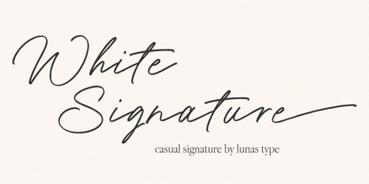 Introducing, White Signature! A versatile and captivating font that combines the casual charm of handwriting with the elegance of a signature style. This font is designed to elevate various design needs, offering a perfect balance between approachability and sophistication. With its fluid letterforms and relaxed strokes, White Signature brings a sense of authenticity and personality to any project. Whether used for branding, invitations, packaging, or social media graphics, this font adds a touch of refinement and individuality. Let White Signature be your go-to choice for creating designs that exude a casual yet elegant vibe, making a lasting impression on your audience.
 - Planetype by CozyFonts,
$20.00 The Planetype Font Family is Modern. It has 6 Font Styles: X-Light, Light, Medium, Inline, Bold, & X-Bold. Each style has a consistent weight with a square serif of equal weight to its vertical and horizontal strokes. Planetype™ for short or Planet-Type font styles all have extremely clean edges and are sharply defined. There is a standard kerning applied, however evenly letter-spacing these family members give a distinct personality and continues to command the negative space just as in tight kerned examples. The compatible relationship of these font family members, weight to weight, and X-Light to X-Bold is seamless and the overall design coloring of words and sentences is well balanced and extremely legible. The Planetype Family fonts are matching members glyph to glyph. This family works in modern, contemporary and vintage settings. The Planetype Medium matches the outer weight of Planetype Inline. Their are several unique Glyphs that set the character of this family, such as: Caps B, M, Q, R, X and Lower Case a, e, k, r, z to begin with. The numerals and dingbats also have several unique glyphs that flow with the family Style in every matching weight. These characteristics lend well in designing logos, brands, and even monograms. Starting with Planetype X-Light the designer has a command of the clean lines yet expressing Modernism and a touch of Architectural structure. Planetype Medium & Planetype Inline are a dynamic duo giving a positive/negative readability.
 - Bipolar Poster by VersusTwin,
$39.00 The Bipolar Poster family of fonts adds extra weight and width to the Bipolar family to fonts. A mechanical blackletter enhancing readability while retaining ornamentation elements of the historical blackletter form.
 - Wild & Brave by Krafted,
$10.00 do that. Make a statement! This bold brush font is perfect for anything indie, adventurous, and direct. A real head-turner for your presentation, designs, website illustrations, and much more. Enjoy the standard Latin characters along with multilingual character support, as well as numerals and punctuation characters. What you’ll get: Multilingual & Ligature Support Full sets of Punctuation and Numerals Compatible with: Adobe Suite Microsoft Office KeyNote Pages Software Requirements: The fonts that you’ll receive in the pack are widely supported by most software. In order to get the full functionality of the selection of standard ligatures (custom created letters) in the script font, any software that can read OpenType fonts will work. We hope you enjoy this font and that it makes your branding sparkle! Feel free to reach out to us if you’d like more information or if you have any concerns.
 - CA Smut by Cape Arcona Type Foundry,
$19.00 Sometimes the ugliest pets can be the cutest ones. And the dirtiest fonts can be the most charming ones. Like CA Smut which comes in two styles that can be stacked on top of each other. “Regular” is the shadow, while “Fill” is the filling. Create little masterpieces by playing with different colors, offset or deviating tracking. You can even try to use the “Fill” style on its own, but do so at you own risk. The spacing and kerning is optimized for the use with “Regular”, so be open minded for surprising results. If you ever had the intention to design a horror movie poster, there’s no way around CA Smut.
 - Morris Sans by Linotype,
$40.99 Morris Sans is a newly revised and extended version of a small geometric family of typefaces originally produced by Morris Fuller Benton in 1930 for ATF. His initial design consisted of an alphabet of squared capital letters with a unique twist that characterized its appearance: corners with rounded exteriors and right-angle interiors. The types were intended for use in the fine print found on business cards, banking or financial forms, and contracts. But over the ensuing decades, this design became a popular element in all sorts of design environments, and several foundries revived the typeface in digital form. Since digital fonts are bicameral, with slots for both upper and lowercase letters, new cuts of the type opted filled the lowercase slots with small caps. In 2006, Linotype commissioned its own version of the typeface-an extension for 21st century use. Under the advisement of Linotype's type director Akira Kobayashi, Dan Reynolds redrew the uppercase and added an original lowercase for the first time. Additionally, a number of extras were brought into the fonts, including six figure styles (tabular and proportional lining figures, tabular and proportional oldstyle figures, and special tabular and proportional small cap" figures). Small caps, which have become an iconic element over time, are accessible in each font as an OpenType feature. To differentiate this version from the original, Linotype's new family is named Morris Sans, in honor of Morris Fuller Benton. All fonts in the Morris Sans family are OpenType Com fonts; they include a character set capable of setting 48 European languages that employ the Roman alphabet, including all Central and Eastern Europe languages, those from the Baltics, and Turkish. This glyph coverage extends to the small caps as well. Morris Sans is a wide typeface, especially in its regular widths; the condensed faces set a more conventional line of text. The new lowercase letters are less geometric than the uppercase, except for those that share the same basic forms (e.g., c, o, and s). Instead of following this geometric trend, the new lowercase tends to strengthen the humanist elements that were present in several characters from the original type, including the uppercase D and the figures 5, 6, and 9. Morris Sans also sports a number of glyphic flares, like the stroke found on the original uppercase Q. Morris Sans is a clean, modern design best suited for headlines, advertising, posters, expressive signage (especially on storefronts), and corporate identity work."
 - Bebopalula by Studio K,
$45.00 No prizes for guessing this font family was inspired by the 1950s - the sounds (Buddy, Eddie, Elvis), the styles (polka dots, petticoats and Dior's New Look), and the kitsch, from furry dice above the dashboard to plaster ducks over the mantlepiece! A particular point of reference is the furnishings and fabrics of the Fifties (with their distinctive kidney shapes and angular curves) as showcased in the Festival of Britain 1951. See also my other fun fonts Barrowboy, Calypso and Pier Arcade.


