10,000 search results
(0.032 seconds)
- Le Greg by Maulana Creative,
$15.00 Le Greg is a modern soft sans display font. With bold stroke, fun character with a bit of ligatures and ton of stylistic alternates. To give you an extra creative work. Le Greg font support multilingual more than 100+ language. This font is good for logo design, Social media, Movie Titles, Books Titles, a short text even a long text letter and good for your secondary text font with sans or serif. Make a stunning work with Le Greg font. Cheers, Maulana Creative
 - ITC Bradley Hand by ITC,
$40.99 ITC Bradley Hand is a calligraphy font from Richard Bradley, designed in 1995. The contours make it look as though it were written by hand with a felt tip pen on rough paper and it has all the details which give it a handwritten character. The font has a balanced, harmonious look and lends correspondence a personal touch. Bradley Hand is legible in point sizes as small as 8 and is good for headlines and short to middle length texts.
 - Appelstroop by Hanoded,
$15.00 Appelstroop literally means ‘Apple Syrup’ in Dutch, but it is also know as Apple Butter; a slightly sweet & sour goo that you can use to sweeten things, or, as we do in Holland, spread it on a sandwich. It’s delicious, give it a try! Appelstroop font is a chunky, slightly eroded affair. It is mostly all caps, with a few lower case glyphs thrown in for good measure. Use this sticky font for your product packaging, toys and kids book covers!
 - Partita by Mevstory Studio,
$15.00 Introducing, Partita. A reverse contrast bold font suitable for display especially. Perfect for your daily project like for headline poster, packaging, social media, branding, or anything about pop and fun design. Features : numbers and punctuation ligatures multilingual PUA encoded We highly recommend using a program that supports OpenType features and Glyphs panels like many of Adobe apps and Corel Draw, so you can see and access all Glyph variations. Email us to lettercornerstudio@gmail.com if you need something! Happy Designing!
 - Koons by SAMUEL DESIGN,
$19.00 The name of this font is KOONS, which is inspired by an artist we respect very much. The font style is optimistic and positive, with pop art features. The lines of the font are highly geometric, preserving the original combination of strokes. In terms of details, on the basis of sans serif fonts, it is equipped with detailed and fun serif details. All treatments are done to ensure that this typeface remains highly recognizable, but also has attractive details and taste.
 - Sallymoores by Maulana Creative,
$11.00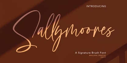 Sallymoores signature script font, with contrast felt-tip stroke, slanted and fun character. It has Opentype features ligatures of character and alternate lowercases, To give you an extra creative work. Sallymoores signature script font support multilingual more than 100+ language. This font is good for logo design, Social media, Movie Titles, Books Titles, a short text even a long text letter and good for your secondary text font with sans or serif. Make a stunning work with Sallymoores font. Cheers, MaulanaCreative
 - Triple Shots by Maulana Creative,
$14.00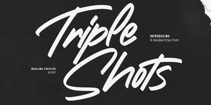 Triple Shots is a casual handwritten display font. With slanted bold felt tip stroke, fun character with a bit of ligatures and alternates. To give you an extra creative work. Triple Shots font support multilingual more than 100+ language. This font is good for logo design, Social media, Movie Titles, Books Titles, a short text even a long text letter and good for your secondary text font with sans or serif. Make a stunning work with Triple Shots font. Cheers, MaulanaCreative
 - Shecarea by Putracetol,
$24.00 Shecarea is a beautiful script font with 2 style, fill style and line style. This font has a modern and unique font feel, there is more feminine style too. Shecarea is perfect for is perfect for logotype creation, lettering compositions, wedding invitations, fashion projects, book design cover, magazines typography, cards, packagings, posters, branding and more. Come with open type feature like a lot of alternates and also ligatures. Its help you to make beautiful lettering. This font is also support multi language
 - Little Pea by Creativemedialab,
$14.00 Little Pea is a cute and fun handwritten font, comes with four family weights: light, regular, medium and bold. the idea in making this font is the wishful thinking of childhood memory, where everything looks so cheerful, colorful and fun. Little Pea font will make your design look modern but still fun. Easy to read and perfect for any design that need a colorful and fun concept like children comic or picture books, greeting cards, toys, posters, song lyrics, website, and much more.
 - ASF Diana by Edik Ghabuzyan,
$30.00 ASF Diana is a Serif family font. It has 5 upright weights and their Italics and supports Latin, Armenian and Cyrillic alphabet systems. The weights from Regular to Bold and their Italics can be used as text fonts. ASF Diana can be used as Display fonts too. It is an easily readable two side serif font and the eyes don't get tired while reading. ASF Diana has a contrast style and at the same time is quite bright and clear.
 - Edward Peters by Maulana Creative,
$16.00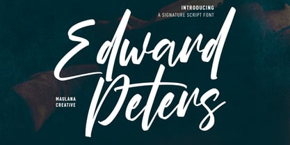 Edward Peters is a stunning modern signature script font. With high contrast felt-tip stroke, fun character with a bit of ligatures and alternates. To give you an extra creative work. Edward Peters font support multilingual more than 100+ language. This font is good for logo design, Social media, Movie Titles, Books Titles, a short text even a long text letter and good for your secondary text font with sans or serif. Make a stunning work with Edward Peters font. Cheers, MaulanaCreative
 - Paintruck by IKIIKOWRK,
$19.00 Proudly present Paintruck - Retro Bold Type, created by ikiiko. A bold vintage serif font with a strong, powerful style that instantly evokes a sense of the past with its pop-retro vibes. The ability of Paintruck to conjure a sense of nostalgia while still seeming current and new is what truly sets it distinct. Get also a good offer & FREEBIE at our site : www.ikiiko.com Enjoy our font and if you have any questions, you can contact us by email : ikiikowrk@gmail.com
 - Tahiti Sans by Sharkshock,
$100.00 Tahiti Sans is a playful, all caps display sans available in 2 versions. At first glance it appears to be the offspring of a rather uniform font and a wacky one. The variations of letterforms as well as random angles are minimal. They’re tall by nature so squeezing text into tight spaces should be easy. Characters are slightly jumbled in a childlike manner and misaligned with varying degrees of spacing. Use it for youth sports, social media, toy packaging or advertising.
 - Morgenfrisk by Hanoded,
$10.00 Morgenfrisk is one of those words you cannot really translate: it is Danish for ‘feeling refreshed after a good night’s sleep’. Morgenfrisk font is a handmade, thin school class font - very legible, very neat and very nice too. I found the original letters in a Speedball™ Text Book. There were only so many of them, so I designed the missing ones myself. I adjusted some of the original letters to a more contemporary look. Comes with a frisk amount of diacritics!
 - Andora by Letterara,
$12.00 Introducing Andora, a beautiful, full-featured modern calligraphic font with tons of alternate characters and OpenType features. Andora hand-lettered is particularly well-suited for invitations, branding and editorial design. Perhaps the most fun thing about Andora is that it includes multiple versions of all ascending and descending letters, making it lots of fun to play with layouts and compositions. The OpenType features can be very easily accessed by using OpenType-savvy programs such as Adobe Illustrator and Adobe InDesign.
 - Astavilla by Maulana Creative,
$11.00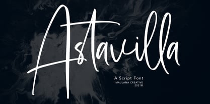 Astavilla handwritten script font, with contrast felt-tip stroke, uprights and fun character. It has Opentype features ligatures of character and alternate lowercases, To give you an extra creative work. Astavilla script font support multilingual more than 100+ language. This font is good for logo design, Social media, Movie Titles, Books Titles, a short text even a long text letter and good for your secondary text font with sans or serif. Make a stunning work with Astavilla font. Cheers, MaulanaCreative
 - Belita by Gatype,
$12.00 Belita Modern & Feminine Script Fonts are suitable for branding, invitations, stationery, wedding designs, social media posts, advertising, product packaging, product design, labels, photography, watermarks, special events and many more. OpenType can be accessed very easily using programs that understand OpenType such as Adobe Illustrator and Adobe InDesign. (You can access most of these great features in Microsoft Word and other similar programs too, but you'll need to familiarize yourself with Word's font menu's advanced tab. If you need help with this, ask me!)
 - The Impostor by Maulana Creative,
$15.00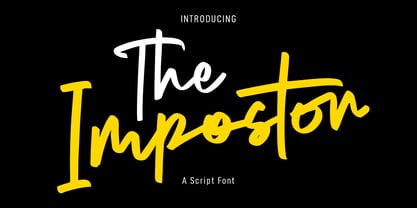 The Impostor is a regular casual script font. With sharp felt-tip stroke, slant and fun character with a bit of ligatures. To give you an extra creative work. The Impostor font support multilingual more than 100+ language. This font is good for logo design, Social media, Movie Titles, Books Titles, a short text even a long text letter and good for your secondary text font with sans or serif. Make a stunning work with The Impostor font. Cheers, MaulanaCreative
 - Fit Fleet by Maulana Creative,
$11.00 Fit Fleet is a casual script font, with a light felt-tip stroke, slanted and fun character. It has Opentype features ligatures of character, To give you an extra creative work. Fit Fleet script font support multilingual more than 100+ language. This font is good for logo design, Social media, Movie Titles, Books Titles, a short text even a long text letter and good for your secondary text font with sans or serif. Make a stunning work with Fit Fleet font. Cheers, MaulanaCreative
 - Trinculo by Scriptorium,
$12.00Trinculo is a cursive font which combines traditional letter forms with ridiculously ornate embellishments and flourishes. It's rather like what an 18th century clerk might have done with his lettering if he was bored to distraction with writing the same old letters again and again. The upper case characters are more complex with simpler versions of the same characters in the lower case. Trinculo is a lot of fun, though if you use it too much it may become overwhelming. - 99 Names of ALLAH Compact by Islamic Calligraphy75,
$12.00 We have transformed the “99 names of ALLAH” into a font. That means each key on your keyboard represents 1 of the 99 names of ALLAH Aaza Wajal. The fonts work with both the English and Arabic Keyboards. We call this Calligraphy "Compact" because as you can see everything is very close and decorative symbols are at a maximum. The first "alef" has neither a "hamzit wasel" nor a "fatha", this indicates to skip that first alef so instead of saying "AR-RAHMAAN" you say "R-RAHMAAN". (in the zip file you will find a pdf file explaining the differences in the "harakat", pronunciation and spelling according to the Holy Quran). The calligraphy is anything but traditional & we have used all the decorative letters except for the "Ye". In other calligraphy you don't usually find the decorative letters: "Dal, Ra & Ye" but we like them and we use them, the important thing is that they don't change the pronunciation or the meaning. Decorative letters used in this calligraphy: "Mim, Aain, Sin, HHe, He, Kaf, Alef, Ta, Dal, Ra & Saad". Purpose & use: - Writers: Highlight the names in your texts in beautiful Islamic calligraphy. - Editors: Use with kinetic typography templates (AE) & editing software. - Designers: The very small details in the names does not affect the quality. Rest assured it is flawless. The MOST IMPORTANT THING about this list is that all the names are 100% ERROR FREE, and you can USE THEM WITH YOUR EYES CLOSED. All the “Tachkilat” are 100% ERROR FREE, all the "Spelling" is 100% ERROR FREE, and they all have been written in accordance with the Holy Quran. No names are missing and no names are duplicated. The list is complete "99 names +1". The +1 is the name “ALLAH” 'Aza wajal. Another important thing is how we use the decorative letters. In every font you will see small decorative letters, these letters are used only in accordance with their respective letters to indicate pronunciation & we don't include them randomly. That means "mim" on top or below the letter "mim", "sin" on top or below the letter "sin", and so on and so forth. Included: Pdf file telling you which key is associated with which name. In that same file we have included the transliteration and explication of all 99 names. Pdf file explaining the differences in the harakat and pronunciation according to the Holy Quran. Here is a link to all the extra files you will need: https://drive.google.com/drive/folders/1Xj2Q8hhmfKD7stY6RILhKPiPfePpI9U4?usp=sharing
 - 99 Names of ALLAH Complete by Islamic Calligraphy75,
$12.00 We have transformed the “99 names of ALLAH” into a font. That means each key on your keyboard represents 1 of the 99 names of ALLAH Aaza Wajal. The fonts work with both the English and Arabic Keyboards. We call this Calligraphy "complete" because this is the only calligraphy where the complete set of decorative letters have been used. The calligraphy is more on the traditional side, letters don't overlap, the "ye" at the end of the names doesn't have the two dots, and a decorative "ye" has been included. The first "Alef" doesn't have a "hamzit wasel" nor a "fatha", this indicates to skip the pronunciation of that first letter. So instead of saying "AR-RAHMAAN" you say "R-RAHMAN". (in the zip file you will find a pdf file explaining the differences in the "harakat", pronunciation and spelling according to the Holy Quran). In other calligraphy you don't usually find the decorative letters: "Dal, Ra & Ye" but we like them and we use them. Decorative letters used in this calligraphy: "Mim, Aain, Sin, HHe, He, Kaf, Tah, Dal, Ra, Alef, Ye & Saad". Purpose & use: - Writers: Highlight the names in your texts in beautiful Islamic calligraphy. - Editors: Use with kinetic typography templates (AE) & editing software. - Designers: The very small details in the names does not affect the quality. Rest assured it is flawless. The MOST IMPORTANT THING about this list is that all the names are 100% ERROR FREE and you can USE THEM WITH YOUR EYES CLOSED. All the “Tachkilat” are 100% ERROR FREE, all the "Spelling" is 100% ERROR FREE, and they all have been written in accordance with the Holy Quran. No names are missing and no names are duplicated. The list is complete "99 names +1". The +1 is the name “ALLAH” 'Aza wajal. Another important thing is how we use the decorative letters. In every font you will see small decorative letters, these letters are used only in accordance with their respective letters to indicate pronunciation & we don't include them randomly. That means "mim" on top or below the letter "mim", "sin" on top or below the letter "sin", and so on and so forth. Included: Pdf file telling you which key is associated with which name. In that same file we have included the transliteration and explication of all 99 names. Pdf file explaining the differences in the harakat and pronunciation according to the Holy Quran. Here is a link to all the extra files you will need: https://drive.google.com/drive/folders/1Xj2Q8hhmfKD7stY6RILhKPiPfePpI9U4?usp=sharing
 - Guilloche A by Wiescher Design,
$80.00 Guilloches were – in the old days – used to make the falsification of banknotes more difficult. The engraving of these intricate lines was done by a highly specialized mechanical machine, which was operated by an equally highly specialized engraving artist. Once the settings for a specific curve were changed back to zero it was very difficult, if not impossible to set them back to the old design. I have designed a useful set of Guilloches that join to form ribbons that create a kind of op-art 3d effect. Under the keys A-U and a-u you find joining pieces. Under the keys V-Z and v-z I placed start- and endpieces. 0-4 are different lenght straight extensions and 5-9 are not quite so straight extensions. All other keys are corner pieces that can be used as stand-alones or put in rows to make for superb decoration. With a little bit of experimentation and maybe colored overlays you can achieve super-phantastic designs. Your elegant type designer Gert Wiescher.
 - Vintage Stages by Ditatype,
$29.00 Vintage Stage is a gracefully designed script font that captures the essence of classic calligraphy with a modern twist. Crafted with a weight that is delicately balanced—not too thick nor too thin—this font offers a subtle elegance and a versatile appearance. The consistent sizing ensures that the font maintains a rhythmic flow, resembling traditional handwriting, but with the clarity and readability required in contemporary design. The relatively low contrast of the strokes further enhances the font’s legibility while maintaining a soft and approachable feel. One of the most captivating characteristics of Vintage Stage is the inclusion of swinging ends on select letters. In addition, enjoy the features here. Features: Ligatures Stylistic Sets Multilingual Supports PUA Encoded Numerals and Punctuations Vintage Stage fits in headlines, logos, posters, flyers, branding materials, greeting cards, print media, editorial layouts, and many more designs. Find out more ways to use this font by taking a look at the font preview. Thanks for purchasing our fonts. Hopefully, you have a great time using our font. Feel free to contact us anytime for further information or when you have trouble with the font. Thanks a lot and happy designing.
 - Wolves, Lower - Unknown license

- Antelope H - Unknown license

- Doctor Azul - Unknown license

- Quincey by AdultHumanMale,
$20.00 Quincey is a display font with the feel of old style signpainter’s works with a hint of hand drawn elements too. It has over 350 glyphs and several variations on the standard alphabet with all those €xtra pesk¥ foreign characters too. Some extra Glyphs in there too. It is available in 2 weights regular and medium.
 - Vasarely by B2302,
$33.00 VASARELY has famous roots, its name is related to optical arts own Victor Vasarely. Dropping the field of Op-Art, you already know where we have been aiming at. The REGULAR and LIGHT cuts of VASARELY are quite ordinary, rectangular, but legible typefaces, but with the BOLD and EXTRABOLD versions you will be able to build diverse illusive type illustrations and layouts. Being build on a strict grid with same dimensions, the eye-affecting black-and-white contrast should trigger different optical effects. As an extra we build an EXTRUDED version as well. Have fun!
 - Alphaluxe by Poole,
$48.00Alphaluxe is a distinctive new typeface from Wesley Poole of Hawai’i. This vertical script packs a velvet punch. It compels attention like the best of the futuristic Moderne scripts from the 1930s, (refined by the 1950s) with none of the bulk. The shapes are strong, their rendering light. Fortunately, Mr. Poole can't break his addiction to elegance and sophistication. It's a classy alphabet. but not self-conscious or stereotypical. Contributing mightily to this effort is Rod Cavazos (Psy/Ops, San Francisco). Among today's typefaces, Alphaluxe is a rare achievement. - Rival Sans by Mostardesign,
$25.00 A sans serif with a dynamic look for complex typographic work. Rival Sans is a sans serif font family possessing many strengths. Its 32 fonts and 2 styles, make Rival Sans a very versatile family and suitable for many graphic design projects such as branding, signage, editorial creation, advertising, packaging, broadcasting or logo creation. With the endings cut at 10 degrees and sharp cuts on the top of the stems of certain characters (like the l, b or the d) Rival Sans gives dynamism and readability to the lengthiest of editorial content. This beveled font design also gives rhythm to a text's sentences as well as a very functional look. All these design details give this new font family a modern, energetic and humanistic look. Rival Sans also has many powerful OpenType features such as case sensitivite forms, small capitals, old style and tabular figures, slashed zero, ligatures, fractions,and alternative characters to give personality to graphic design projects. Designed also for complex editorial content, this typeface has a powerful home kerning system called "Pro Kerning". With more than 2500 pairs of glyphs and many languages, Pro Kerning optimizes headlines, subtitles, texts as well as long paragraphs in real time. In addition to these extended features, the italic styles of this fonts family have been drawn as fully-fledged styles with different designs from their regular version so that the italic texts look like calligraphic phrases. Rival Sans has an extended character set with over 930 glyphs. This family covers over 130 languages from Western Europe, Eastern Europe and Central Europe. In addition to all the features of its kind, Rival Sans is part of a very complete "type system" with style variants such as the serif version Rival Serif or the slab version Rival Slab. With all these typefaces, you have 62 styles to make your own vibrant and professional graphics or web creations while maintaining consistency in your creations.
 - Busted by Canada Type,
$24.95 Busted is the very strange and out-of-character outburst of Bill Troop, a guy who was classically trained in everything, from classical piano and literature to classical photography and type design. As far as we could tell, Bill Troop is the kind of guy whose appearance and voice instantly trigger thoughts of black and white photos, fedoras, and pre-industrial age Europe. A few years ago, he even moved from the United States to England, where it took him less than a week to feel at home and start sounding like a Norwich native. Then something happened and the poor dude just snapped. Busted is the controversial result of the blood rushing to his head. If you know what exactly happened to him, please let us know. Concern, consideration and human interest story aside, Busted is a fascinating thing. It is a set of four interchangeable thick outline fonts where the same letter forms turn from wild to wilder to broken to somewhat clean. Mix them up in a setting and you have words that snarl with a sneer. Life's too short. Take it all with a grain of salt. Scream whenever you feel like it. Busted Pro is a single font combining all four character sets, and rigged with an OpenType pseudo-randomizer in the contextual alternates feature, which you can disable or enable anywhere in your setting for maximum visual shock just the way you like it. Works just as well in PAL or SECAM. Don't be fooled by imitations, and don't get caught with your drawers down.
 - Preta by Lián Types,
$39.00 Preta, portuguese for a very pure kind of black, has its name very related to its concept: I wanted to make the fattest/darkest script ever. People who follow my work may notice its forms are very related to works of my past (1) but this time the challenge was to be very cautious with the white spaces between letters. Not only I followed some rules and ductus of the copperplate style of calligraphy but also I took a lot of inspiration in posters of the early Art Nouveau (specially in Alfred Roller of the Vienna Secession) where letters forms looked like black squares if not looked from a close distance. With Preta, I wanted to achieve that same idea of “darkness” and thanks to the always welcomed question -what if?- the font grew a lot. The result is a very fat font, that looks delicious. Due to possible customer needs, I designed Preta Small, so it can be used in smaller sizes. Preta Ao Sol (which literally means under the sun!) is a style with those lovely tiny details to give the sensation of bright. Preta Ao Sol Solo was made to be used as a layered font with Preta. Finally, Preta Capitals serves as a company for Preta. Hope you enjoy the font as much as I did when designing it: The fact that it’s full of alternates, swashes, ligatures and swirls makes it really pleasurable at the moment of using it. Give it a try and dance with Preta! TIPS For better results, use Preta with the ‘standard ligatures’ feature activated. NOTES (1) Beatle in 2014. Seventies in 2015.
 - Super Sabretooth by Set Sail Studios,
$13.00 Take your typography to the next level with Super Sabretooth. A vigorous, rebellious brush font designed to bring the noise, start the fun, and leave any inhibitions at the door. It pushes lettering limits to the extreme and breaks down any boundaries on it's journey there. Super Sabretooth is packed full of great features & added extras, providing everything you need to create highly charged typography designs. Here's what this family consists of: Super Sabretooth • A high energy brush font containing upper & lowercase characters, numerals and a large range of punctuation. Super Sabretooth All Caps • This is a second version of Super Sabretooth, with all lowercase characters replaced with a brand new set of small-caps. Use this font as a larger & louder alternative to the regular version. Quick Tip! If you want more freedom, you can combine the two font sets together to create truly awesome customised typography, they will work in harmony as well as being strong standalone fonts. There are no rules with it - play around, mix it up, have fun, and enjoy the ride! Super Sabretooth Swashes • Still looking for even MORE features? Alrighty, check out this extra font containing 17 swashes and 9 paint splatters, designed to add the perfect finishing touch to underline & exaggerate your Super Sabretooth lettering. Simply type any a-z character in this font to generate the extras. Fonts include multilingual support for the following languages; English, French, Italian, Spanish, Portuguese, German, Swedish, Norweigen, Danish, Dutch, Turkish, Polish, Finnish, Romanian, Hungarian, Estonian, Filipino, Indonesian, Icelandic, Romansh, Welsh Thanks for checking it out, and remember: Push the Limits.
 - Charpentier Sans Pro by Ingo,
$41.00 A humanistic sans serif The first version of this font was created in 1994 within the framework of the bid placed by the city of Graz to become the location for the Winter Olympics in 2006. Appropriately, its original name was ”Olympia.“ The font is intended to embody classic ideals as well as to meet modern demands. The proportions of Charpentier Sans are directly derived from Roman capitals and the humanistic book-face. The contrast between strokes and thin strokes is based on medieval uncial script. And thus, a modern serif sans was created emphasizing thick and thin strokes together. Thanks to its traditional form language, Charpentier Sans is very legible, adapts to various forms of content and expresses a kind of calmness and certainty. Details resulting from writing with the quill guarantee that the font doesn’t appear too rough and unemotional. Even the tiny, pointed mini serifs contribute to the unmistakable appearance of the font. They create an exciting contrast to the soft flowing forms of the letters and are, to a great extent, conducive to the legibility. Consequently Charpentier Sans always appears with an extremely sharp and clear outline. Charpentier Sans Italique has an even more distinct ductus derived from writing. Especially the rounded forms from a, e, f, g and y reflect the handwritten humanistic cursive. Charpentier Sans is comprised of many ligatures, including discretional ones, plus proportional medieval and capital figures for the normal type as well as disproportional tabular figures with a consistent width. Above and beyond the ”normal“ Latin typeface system, small caps are available as an especially elegant form of distinction.
 - Albion Signature by TofinoType,
$90.00 Albion Signature is a value packed font of exceptional character, with lots of old world charm to make your next project personal and special. Containing over 2,200 glyphs, it’s large enough to handle any demanding project, big or small. It also contains over 400 flourishes in three sections (dingbats, geometric shapes, and misc. geometric shapes) in numerous styles, that can be used in endless combinations. It’s like several fonts in one. Everything you need to do a stellar project is included. A script font that lines up perfectly with a few extra endings and hidden treasures spread throughout. It also contains a complete easy to use PDF index, so you will be able to find exactly the glyph you are looking for fast. This font can only enhance the fonts that you already own, making them more versatile and useful. On its own, it is a very elegant calligraphy script, that will make every project you create look great. The capital letters overlap and intertwine just like in days gone by, for a unique style. Also included are tools that can give you very precise spacing, right inside a word processor. Usage: Photoshop styles, InDesign, personal promotion logos, monograms & signatures.... That’s where it shines, yet it’s still great for art, cards, fancy documents, really fancy labels & even notes to Mom. Imagine, most people used to write letters like these at one time. Now you too can have documents that look like the work of a studied penman.
 - Able by T-26,
$39.00The history of Able’s connection with the Harry Potter phenomenon is really up in the air. It’s a catch-22 in this business - you either promote your own work and negotiate expensive exclusive licenses, or you work with a promoter and sell your designs to anyone and everyone. It could have been an in-house designer at Rowling’s publisher, Scholastic, or a freelancer who proposed Able for the headings and such. The responsible party licensed it from T26, and JK Rowling’s storytelling made it a star. (I suppose it’s ironic that there’s a whole lot of unwritten history in the typography business.) Able’s rise to fame really is a classic love story between reading and type design. If the books weren’t so popular, Able might still be waiting for some Mexican fast food chain to pick it up for packaging design. The movie deal certainly made the font all the more recognizable, what with its merchandising campaign. Popularity can also cripple a great decorative face. It’s always being recognized as “The Harry Potter Font.” It might just have to wait a few decades for the Potter phenomenon to subside to be freed from the “Chamber of Pigeonholed Fonts.” In the meantime, I’m sure that a lot of fledgling graphic design apprentices are reading their new Potter books, being charmed by the idea of type design when they’re not turning the pages too fast to notice. - Casagrande by Italiantype,
$39.00 Casagrande Collection has been designed in 2020 by the Italiantype Team (Manuel Alvaro, Valentino Coppi and Mario De Libero), working in close collaboration with Italian lettering artist, illustrator and calligrapher Alberto Casagrande, with help from the Zetafonts Team (Francesco Canovaro, Andrea Tartarelli and Cosimo Lorenzo Pancini). The goal of the project was to use as inspiration Alberto's colorful, vintage themed digital illustration style to develop a suite of closely related typefaces that, used together, would allow designers to replicate the nostalgic charme of Italian poster and product design from the thirties and the forties. Two color overprints, coarse dithering, handmade calligraphy, reminiscences of art deco, hints of modernism and pop culture references: all this and more mixed in a exuberant and playful collection, created with illustrators, poster artists and book cover designers in mind. The final product is 24-font package with six display families with styles varying from the thirties-inspired Antifascista (3 weights + 3 dithering weights) and Deco (3 weights + 3 inline weights), to the modernist Casabau (5 weights), to the geometric Grind (4 widths), to the vintage elegance of the two script families, Reclame and Casatiello. The collection is complemented by a two-color icon set font, Casagrande Ornaments, allowing any designer to easily explore the creative possibilities of this incredibly powerful creative collection. Please Note: Casagrande Antifascista Ombra simulates fine dithering and may be processor intensive for some older computers. Use Casagrande Antifascista if it slows down your system.
 - Brailganta Script by Strong,
$20.00 Brailganta Script is the font of choice for writing things beyond words. This typeface is designed with great detail to convey stylish elegance. So, it can be said, the character of the transformation is very beautiful, a kind of classic ornamental copper script. The Brailganta script provides alternative variants of most fonts, binders, and many calligraphy tips, ideal for elegant labels, high-end packaging, stationery and compositions for certain brands, beautiful titles, verses, letters and short text, intended for read only with the eyes or meant to be whispered into someone's ear. To enable the OpenType Stylistic alternative, you need a program that supports OpenType features such as Adobe Illustrator CS, Adobe Indesign & CorelDraw X6-X7, Microsoft Word 2010 or a later version. (Windows), Font Book (Mac) or a software program such as PopChar (for Windows and Mac). How to access all alternative characters using Adobe Illustrator: https://www.youtube.com/watch?v=XzwjMkbB-wQ How to use the font style set in Microsoft Word 2010 or later versions: https://www.youtube.com/watch?v=NVJlZQ3EZU0 There are additional ways to access the alternative/swash, using the Character Map (Windows), Nexus Font (Windows) Font Book (Mac) or a software program such as PopChar (for Windows and Mac). How to access all alternative characters, using the Windows Character Map with Photoshop: https://www.youtube.com/watch?v=Go9vacoYmBw If you need help or advice, please contact me by email Thank you for watching!
 - Super Puff MX by Xuveki,
$12.00 Super Puff MX is a Y2K inspired variable display typeface that takes from early 2000's futurism, pop, and cartoon aesthetics. Due to its heavy weight and alternates it offers, it's perfect for a variety of logos, 3D, and motion graphics. SPMX was designed specifically for those use cases, and its wide range of styles and alternates gives you lots of freedom for creating unique graphics that still capture the same fun, futuristic, and playful early 2000's aesthetic. Features & What's Included: Variable font file that allows you to choose any slant degree from Regular to Full Tilt. OTF font files in 4 styles or slants, from Regular to Full Tilt. This is included because many young, talented designers around the world don't have access to programs that can take advantage of a variable font. I want them to have the option of using properly slanted and kerned oblique instances of Super Puff. Robust OpenType features including a vast pool of alternates and stylistic sets giving you lots of choices when choosing letters, numbers, and punctuation. Two stylistic sets for letters and numbers One stylistic set for punctuation and symbols One stylistic set that replaces punctuation with Y2K style icons Extensive Latin language support covering almost all of Europe and South America. All multilingual glyphs have access to alternates as well. Super Puff MX was designed and developed by Abe Zeinali/Xuveki.


